
VIRTUAL OPEN STUDIOS WINTER 2021: Art 161B Relief/Mixed Media Printmaking
Instructor - Jimin Lee
Art 161B Class Collaborative Project : Sanctuary
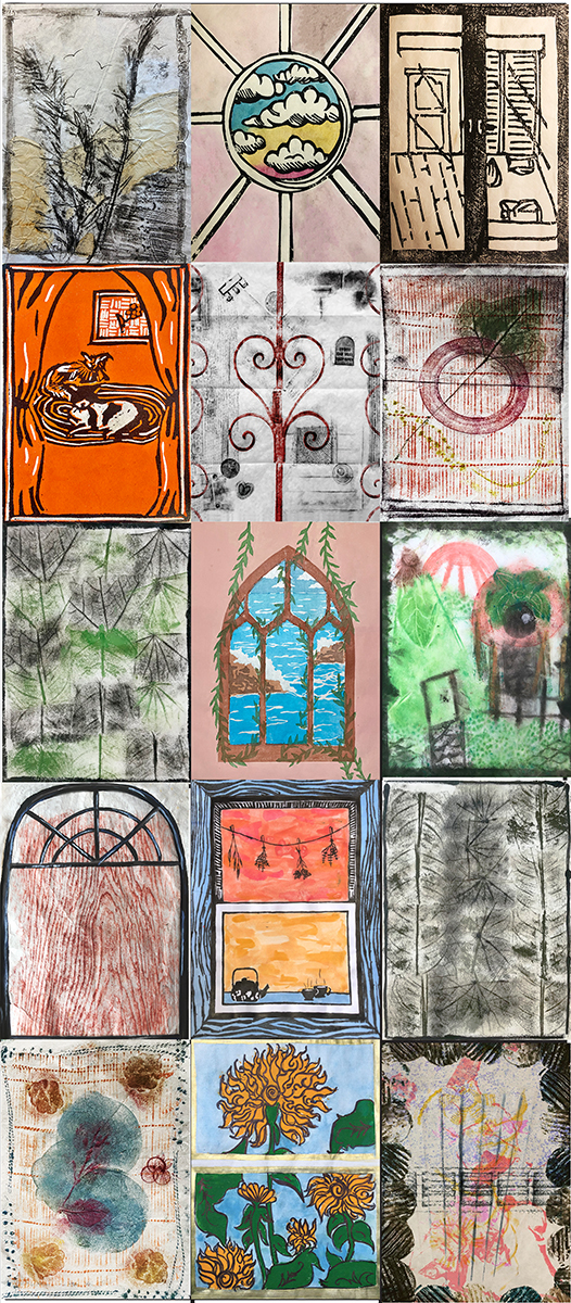
The class picked “Sanctuary” as a theme for each artist to create an image within a window frame that represents their own interpretation of what sanctuary means to them. Each print size is 8 x11 inches. 15 prints were combined digitally for this final result.
Artists: Reya Borbridge, Clarissa De Jesus, Shelby Dinh, Jasmine Djavahery, Erica Earl,
Zoe Forsyth, Anya Lehman, Michaela Martinez, Abby Mcphillips, Christine Pinetta, Natalia Ramirez, Huan Ye, Christy Yee
Medium: Mokuhanga, Takbon, Mixed Media
Abby McPhillips
“Boxes and Belts”
Takbon
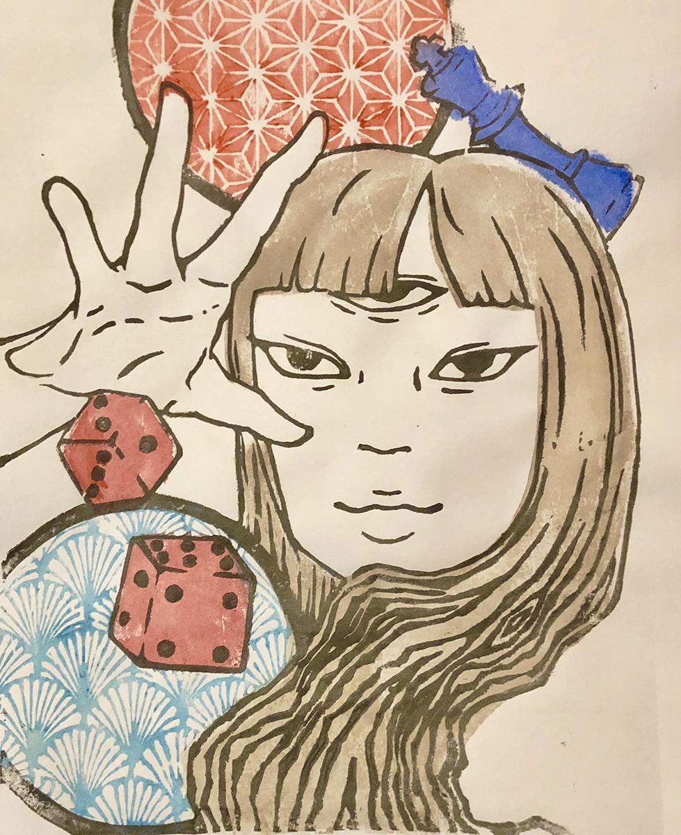
“Mind Games”
Mokuhanga

“Cats Meow”
Mokuhanga
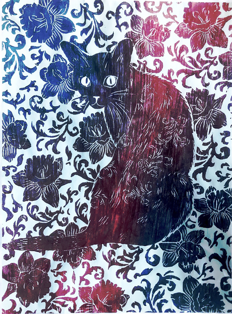
“Cats Meow”
Mokuhanga
Anya Lehman
Anya Lehman
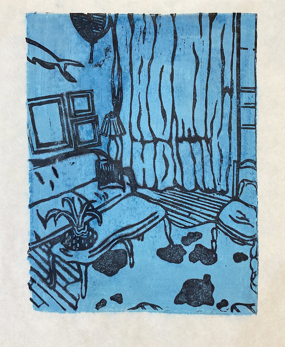
“Room”
Mokuhanga woodblock print on Kozo paper.
This piece aims to create a dynamic space in the form of a room. Based in reality with added imaginary elements.
Anya Lehman
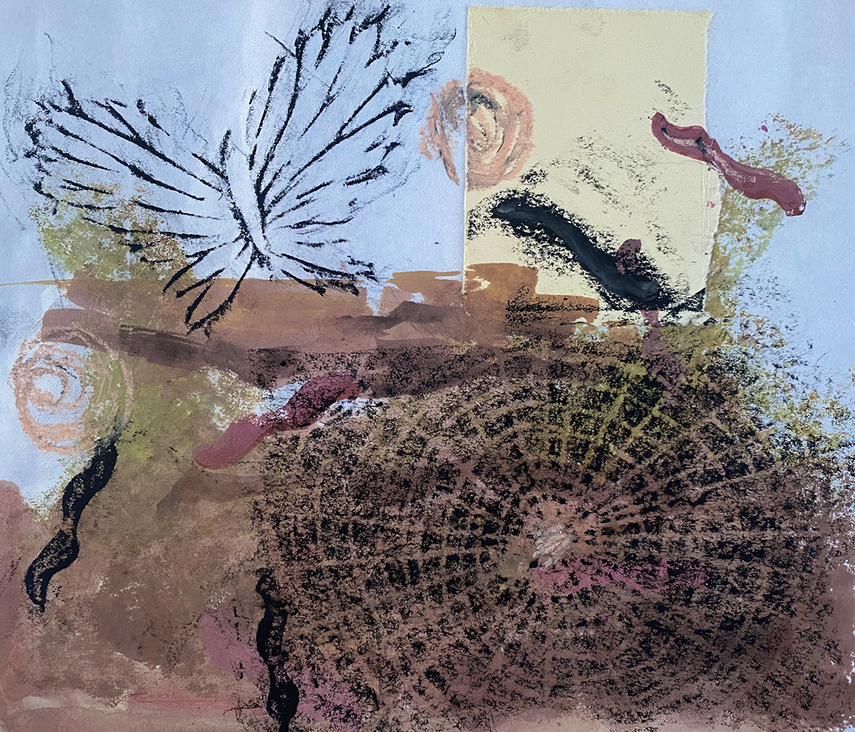
“Slice of Life”
Mixed media (gouache, oil pastel) takbon print on Kozo paper.
“Slice of Life” touches on the importance of nature and it’s intertwined elements.
Anya Lehman
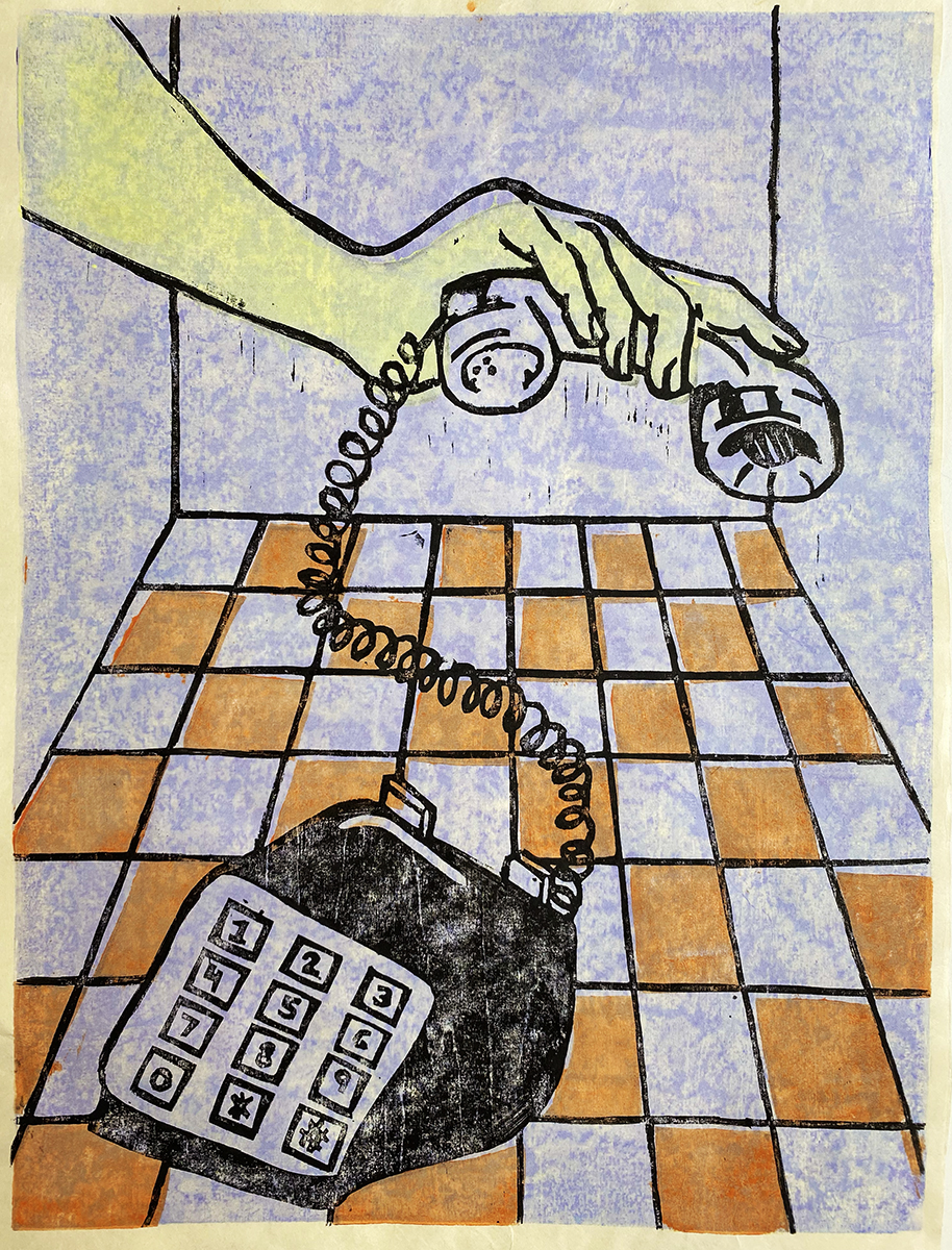
“Calls”
Mokuhanga double woodblock print on Kozo paper.
Color scheme and texture are a main element in this work. I wanted to include some lighter feelings while also encoding a sense of mystery.
Anya Lehman
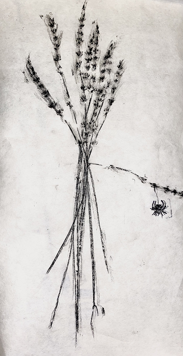
“It’s Simple”
Takbon print on Kozo paper.
A monochromatic piece with a sweet but spooky feel to it.
Christine Pinetta
Christy M Yee
Christy M Yee
“Escape”
Takbon print on Kozo
My takbon series, a korean printmaking medium, evokes forms of escape that exist in our world. Whether it may be how nature is slipping through our grasp, the escape of food, or our demanding need to escape the coronavirus pandemic. This covid-19 centralized piece tries to speculate on how the pandemic is blasted onto our consciousness and is inescapable as it grows and shifts. It's a daunting, puzzling and mysterious escape.
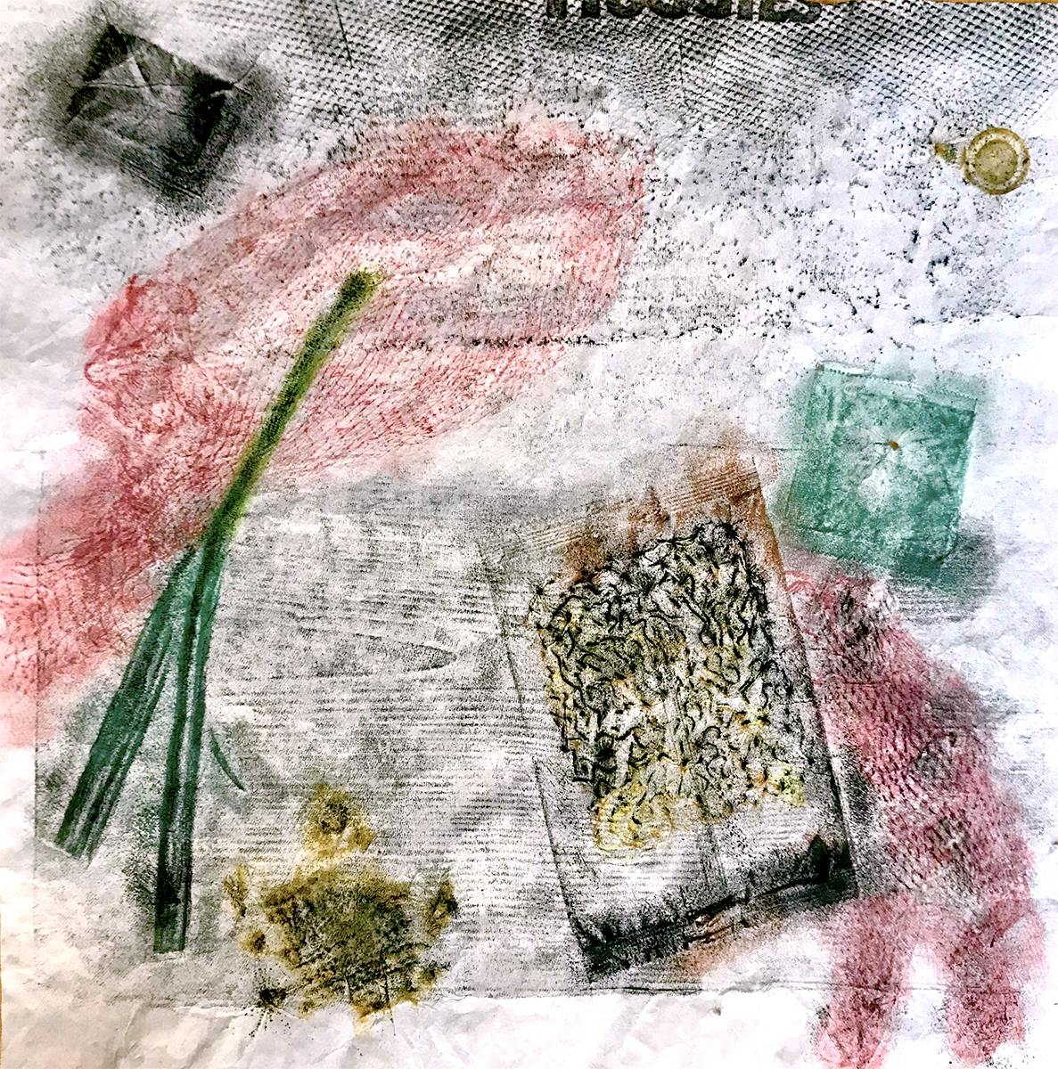
Christy M Yee
“Noodle Soup for Escape”
Takbon print on Kozo
This colorful food focused piece draws on the ability of a meal to provide escape. Its vibrant colors and textures warps the individual to a nostalgic bubble. I hope you can find peace and warmth through your next meal.
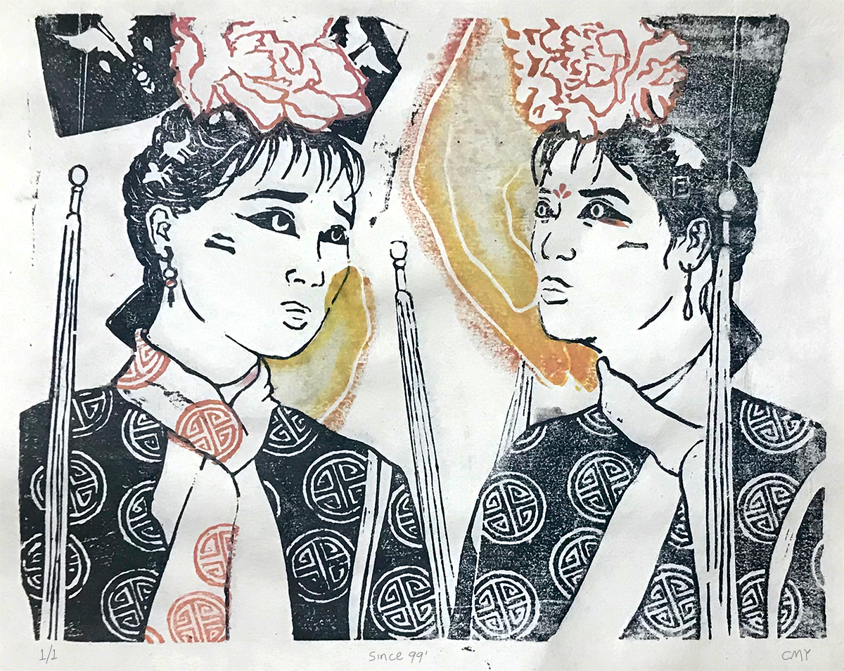
Christy M Yee
“Since 99”
Mokuhanga block print
When I was 5, my family sat together on the couch after dinner and watched 還珠格格 (My Fair Princess, the 1998 version✨) on cable. “It follows tomboyish and innocent Xiaoyanzi, originally an orphaned and semiliterate vagrant in Beijing who, after befriending the emperor's illegitimate daughter Xia Ziwei, becomes a princess by accident” (my fair princess - Wikipedia).
My dad and grandma used to tell me how much I was alike xiaoyanzi, unmannerly, high energy and talkative. And the other princess was no other than my cousin Jennifer, her nickname was fafa (flower flower). From the shared nap times, birthdays and distant memories, she was the poised pink princess and I was the crazy phoenix eyebrowed climber. Suddenly, one trauma followed the next, she was never the same, our bubble together broke and the years washed by. Moreover, this piece pays homage to the relationship I had with my cousin, the reality that once was and what remains today.
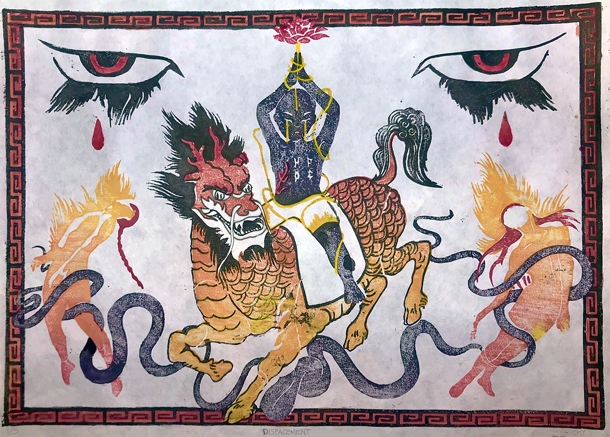
Christy M Yee
“Displacement”
Mokuhanga block print
The piece touches on the diaspora and displacement of peoples. The creature, Qi Li, in the center comes from Chinese mythology (with hooves, antlers like a deer, body like a horse, head like a dragon, scales like a fish). It only appears when there is a passing of a great sage. The person forfeiting the lotus to the sky depicts Gajendra Moksham from Hinduism, a story of surrender through enduring an endless pain and egotism.
It hopes to captivate pain, transcendence and power. Who gains power in the displacement of people and how do the displaced find a sense of self when wrapped up in the blindness of others. It provokes the viewer to ask, who is good and who is bad? Are the figures on flames in pain or in peace?
Tieing this piece to current events, it encompass the ongoing turmoil the asian community: racism and hate crimes, Uighur Muslim concentration camps in China, Hong Kong’s fight against the CCP, military coup in Myanmar...
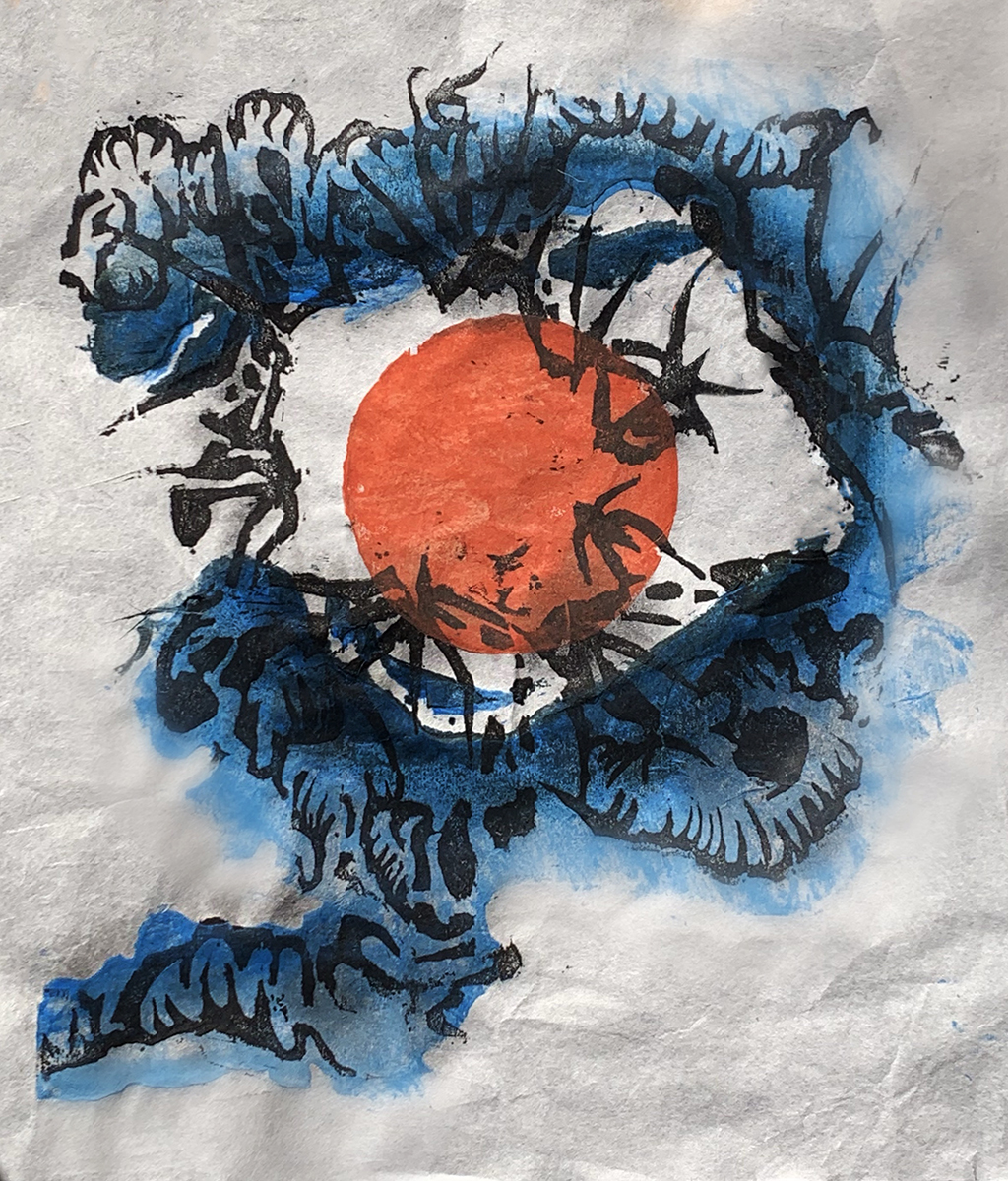
Clarissa De Jesus
In my first Mokahonga, midterm project titled “Letting go,” I tackle the conflicting aggressive emotions we encounter in the process of moving on from pain. Imagery of mosquitos and a bold, red, central circle, all play into the symbolism behind releasing deep passionate emotions. Being my first time doing Mokahonga, the process of refining my lines when carving was a challenge, however worked out perfectly for the message I intend to bring forward. Overall, in the journey of both battling and dancing with the printmaking errors, the result effectively encompases the mind of my own and the deep emotions expressed through practicing the medium itself.
Takbon printmaking in my practice really allowed me to understand the power in patience and control. I chose to use minimalistic, Wabi-Sabi themes to better translate this new appreciation over moving more slowly in my life and in my practice. In this way, I was very opened up to a new, adventurous side of expressing my art that helps me represent my art in a more authentic way.
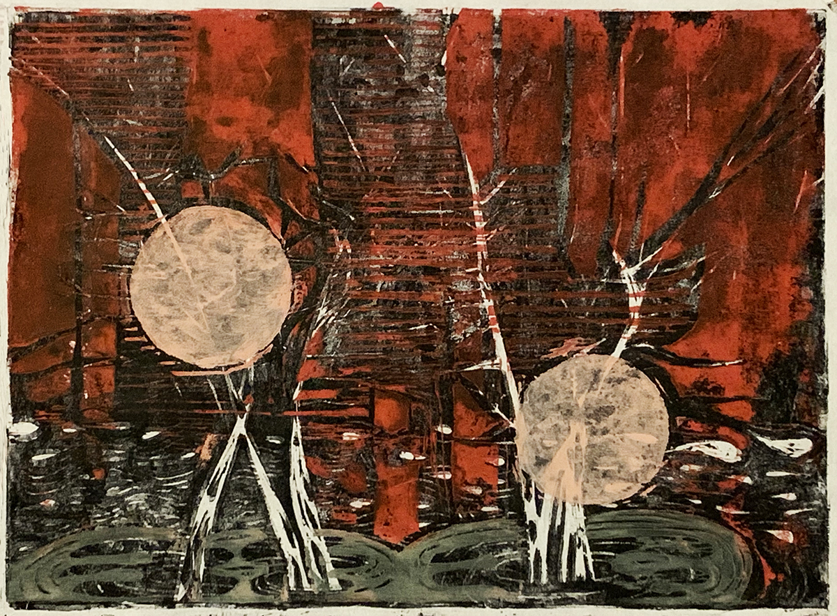
Finally, the last Mokahonga series of prints I created really reflect the exciting and loving feelings I grew to appreciate more as the month of Feburary came and many other life events that unveiled the abundance I have. Two birch trees entangled together represent the partnership me and my significant other share in our journey through growth as we get older. Using the same circle shapes with a lighter, gentler color such as pink, represent the soft and affectionate passion that we both have for ourselves and each other. Juxstaposing the painterly imagery with dynamic, man made shapes further emphasize the abilities we have to move through the challenges that come with living in a society that can sometimes introduce distractions in our relationship.

Clarissa De Jesus
“Wabi-Sabi Part 1”
Sumi and guache on Takbon kozo paper. Takbon printmaking.
This print is meant to resemble the influential and minimalistic use of space embraced in wabi-sabi style.
“Wabi-Sabi Part 2”
Gouache, pastel and color pencil on kozo paper. Takbon printmaking.
This is the second print from my Wabi-sabi series that more so highlights use of color in wabi-sabi art.
“Release”
Sumi, gouache and nori paste on kozo paper. Mokuhanga printmaking
In this print, symbolic use of mosquitos, the color red and a central circle all have to do with the act of letting go of passionate, unwanted feelings.
“February”
Gouache and nori paste on kozo paper. Mokuhanga printmaking.
The use of circles to resemble portals yet using a lighter pink is meant to reflect the gentile passion me and my partner share for ourselves and one another, including the winter birch trees I enjoy in our backyard that represent us and our union.
Huan Ye

Huan Ye
“Flower in Snow”
Mokuhanga print
Designed based on a picture took in Lan Su Chinese Garden in Portland, Oregon.
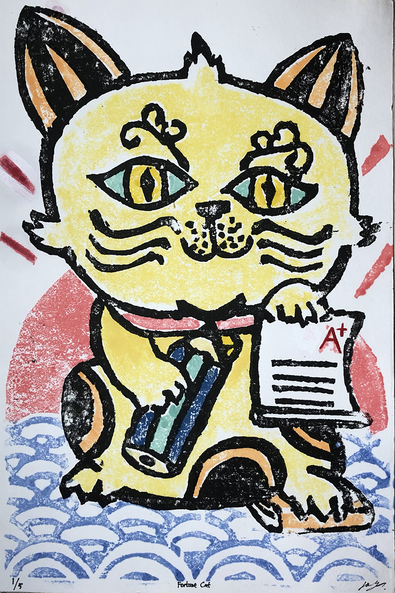
Huan Ye
“Fortune Cat”
Mokuhanga print
My idea of the final mokuhanga design came from a book called The Pattern of Japan. There is an image called Maneki Neko. A cat would bring money and fortune, got my attention. So I redesigned it based on the concept. I made a new fortune cat for students like me, who have a demand for a good grade.
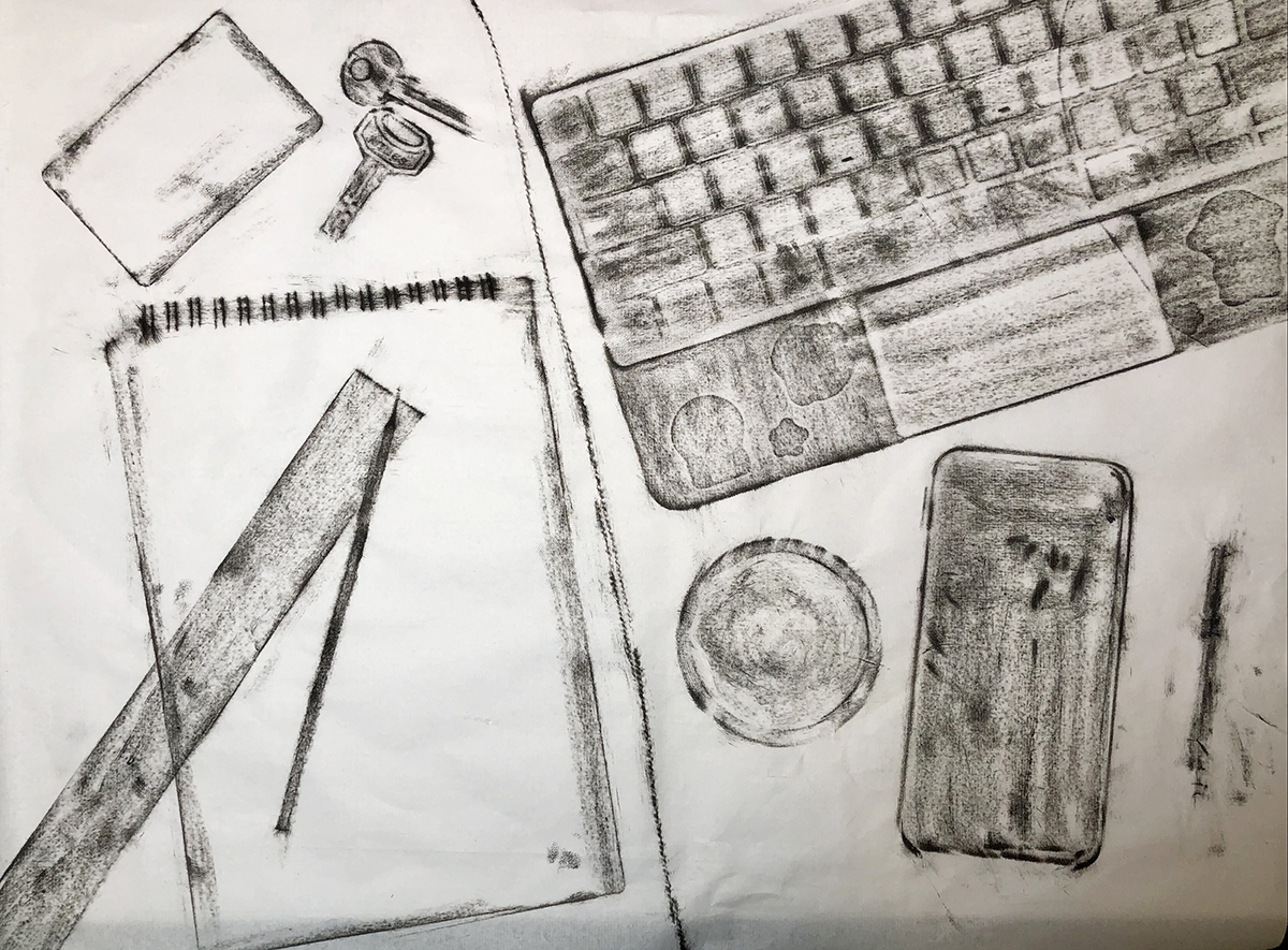
Huan Ye
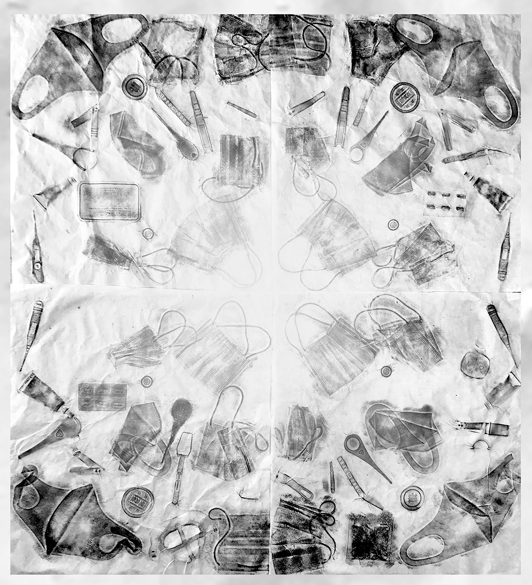
“New Normal- Academic”
Takbon print
On the left side is the academic life I used to have. Before the COVID-19, we used to have class in person. I need to take my keys and student ID with me and spend most of my time studying in the library. The new normal now, is everything is done remotely.
Huan Ye
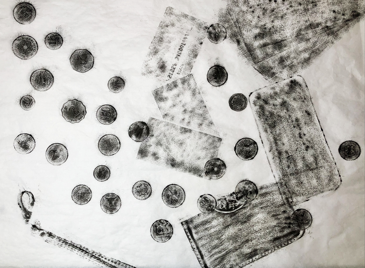
“New Normal- Currency”
Takbon print
From left to right is the changing of the payment preference I had throughout the time. The left starts with coins. Those are my collection of the money from different countries where I traveled. I used to spend only cash. Later on I have my own cards for payments. The very right side is my cell phone. During the current circumstances, I am only making online payments, which is a new normal.
Jasmine Djavahery
“Workin 5-9”
Mokuhanga block print
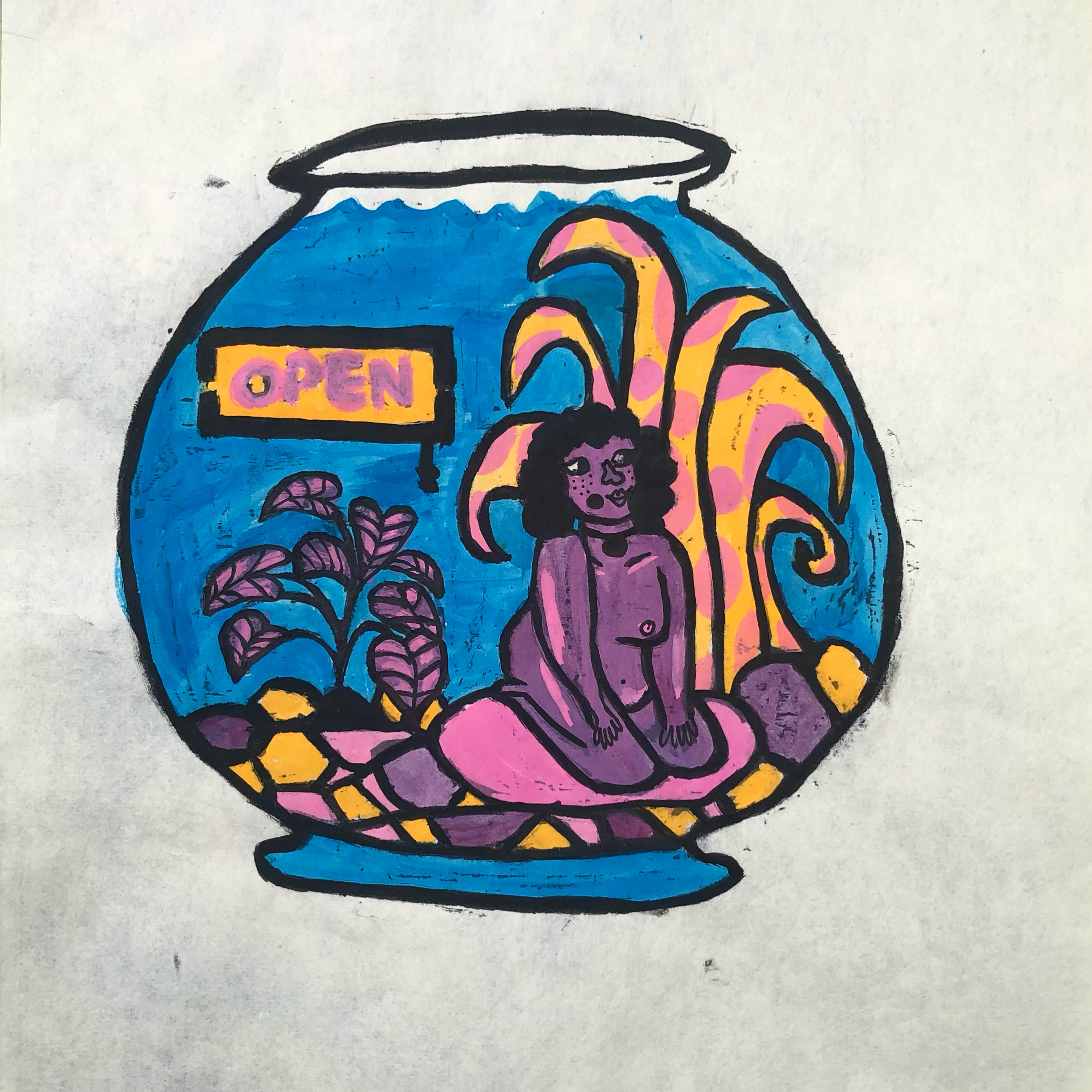
“Fruit Sanctuary”
Mokuhanga block print
“Future”
Takbon print

“Hide n Seek”
Takbon print
Michaela Martinez
I made my takbon and Mokuhanga prints during a period of melancholy and uncertainty. My three Takbon prints, representing the concept “Be”, are impressions of the wooden step entering my front door, the doormat following my back door, and objects found floating around inside my home. My home was my place of origin as a kid, and is now a place of being for the briefly directionless student I am currently. I simultaneously do not want to be here, and am terrified of leaving. But I am also grateful to have a place to be. Pastel colors with a watery hue represent my hesitation to start out in a new direction, and the soft shapes are my gratitude for having a semblance of a structure during the pandemic.
My Mokuhanga prints titled “The Return” represent the return of endangered sea turtles to their nesting sites in record numbers. The pandemic was negative for many of us, but it was a chance for an otherwise hopeless species to repopulate and become stronger. I am inspired by these turtles and they remind me there is always light at the end of the tunnel.
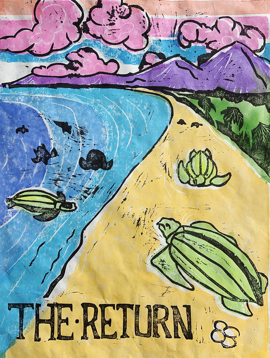
Michaela Martinez
“The Return”
Mokuhanga Wookblock print
Documenting the return of an endangered sea turtle’s return to their breeding ground during the pandemic.
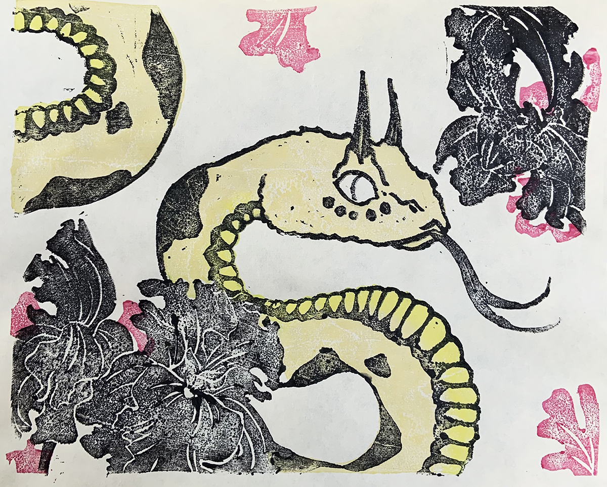
Michaela Martinez
“Jordanian Sand Viper”
Mokuhanga Woodblock print
A print made for my partner featuring a Jordanian Sand Viper and Black Irises local to the same area.
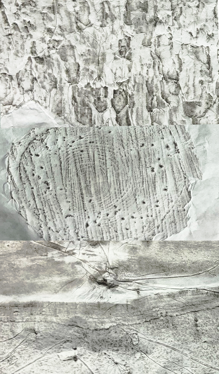
Michaela Martinez
“Our Planet”
Takbon Print, Sumi Ink
Takbon prints taken of wood cuts and tree bark in my forested backyard.
Natalia Ramirez
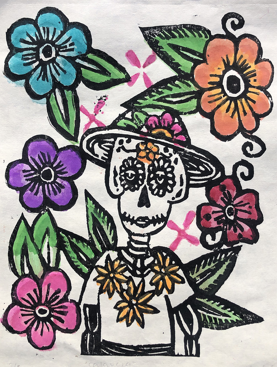
“Calavera”
Mokuhanga Print on Kozo Paper
My first attempt at the Japanese Woodblock printing method. I was inspired by my trip to Guanajuato, Mexico where my father is from, and decided to imitate the way flowers were drawn there on clothing or in street art. I also saw love for Mexican skulls called “Calaveras” which is something I take pride in as well. This beautiful city in Mexico is so colorful and bright and I wanted to capture some of that color and love for Calaveras in my print.
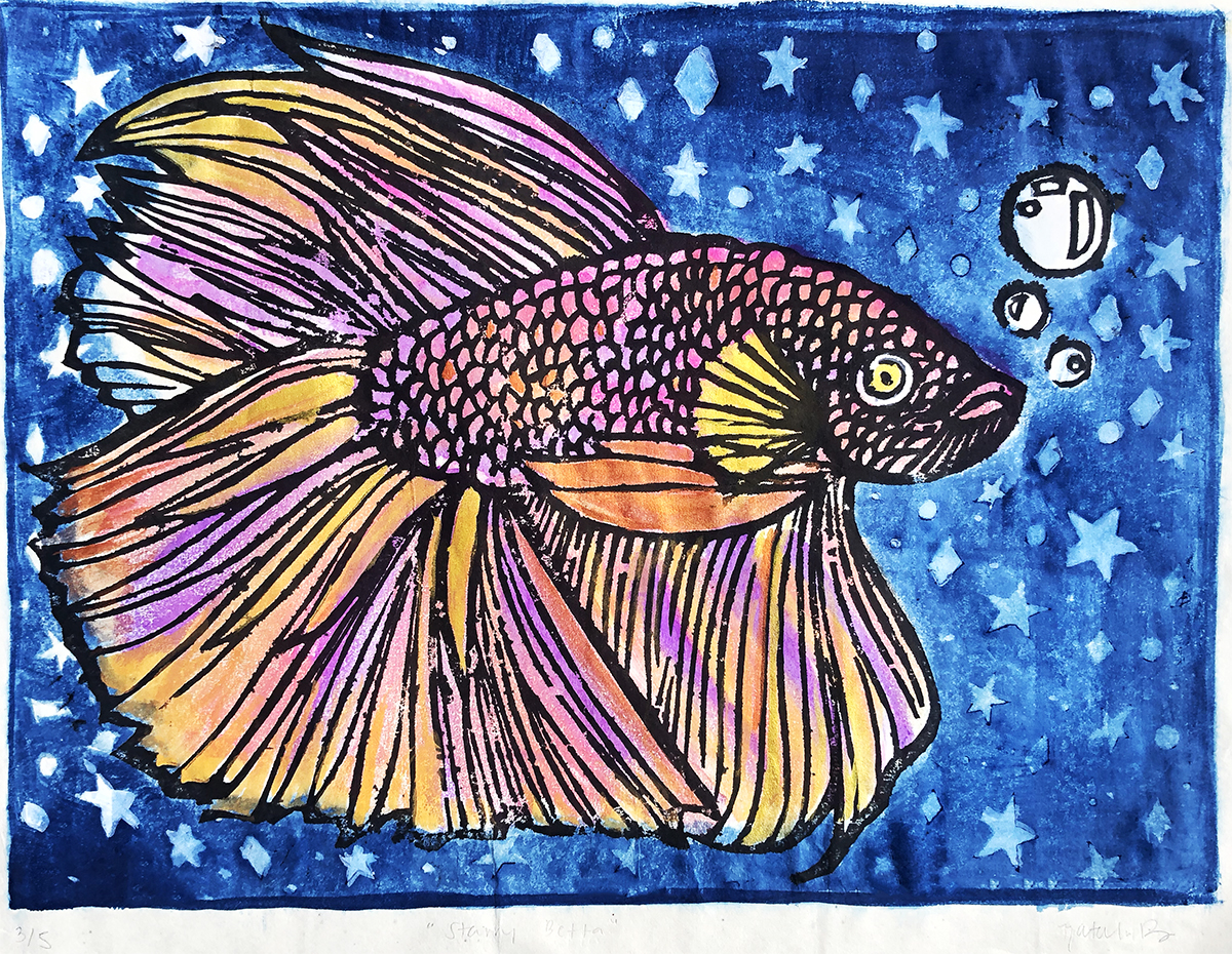
“Starry Betta”
Mokuhanga Print on Kozo Paper
For my Mokuhanga final project, I decided to create an image of a betta fish with a starry night background. The name of this print is “Starry Betta”. I have always been drawn to this image in my sketchbook and I am so glad I was able to bring it to life with this amazing new process I have learned this quarter, I gave it the background of a starry night because I wanted this fish to feel relaxing to look at which is somewhere where I personally find comfort looking at which is up at the stars. Due to the background being so dark I decided to give the betta some warm colors to also give my viewer a feeling of relaxation. I also used shimmery pigments to give this fish an extra glow just like the stars would have if you are staring at the sky.
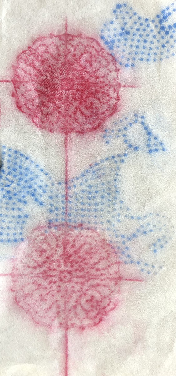
“Sanctuary”
Takbon Print on Japanese Paper
My first set of takbon prints after being introduced to this process this quarter. I took prints of a pattern on my candle holder because having a lit candle with a relaxing scent is an ideal part of my sanctuary also the pattern is so beautiful, which is the red design on the left. The blue is some rhinestones I glued on paper to create some interesting textures and shaped to print.
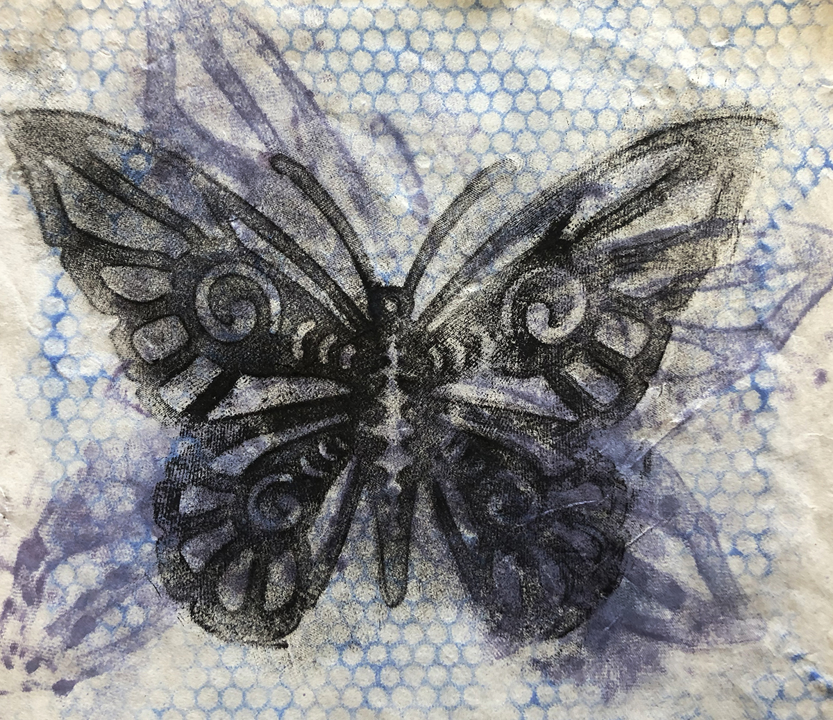
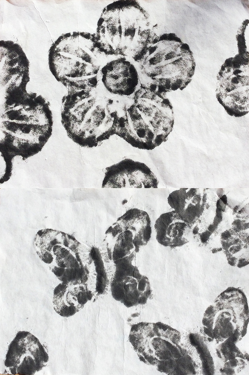
“Metamorphosis”
Takbon Print on Japanese Paper
My mother has a beautiful butterfly that is part of her garden that was a perfect texture/pattern to print. This butterfly was a perfect representation of metamorphosis itself but I decided to print it multiple times to show its growth.
Reya Borbridge
Reya Borbridge
“Looking Out”
Mokuhanga Woodblock Print
This print was hand carved on both sides of the wood block and hand printed.

“Leaves and Rings”
Takbon Print
This technique is used with homemade daubers to ink rice paper, using objects underneath the paper to create a print of texture and design. For this print I used rings, leaves and a necklace.
“Household objects”
Takbon Print
This technique is used with homemade daubers to ink rice paper, using objects underneath the paper to create a print of texture and design. For this print I used rings, textured paper, kitchen appliances, necklaces and a jewelry box.
Shelby Dinh
Shelby Dinh
“Flutter”
Mokuhanga Woodblock Print on Washi Paper
Edition Varie
Shelby Dinh
“Flutter”
Mokuhanga Woodblock Print on Washi Paper
Edition Varie
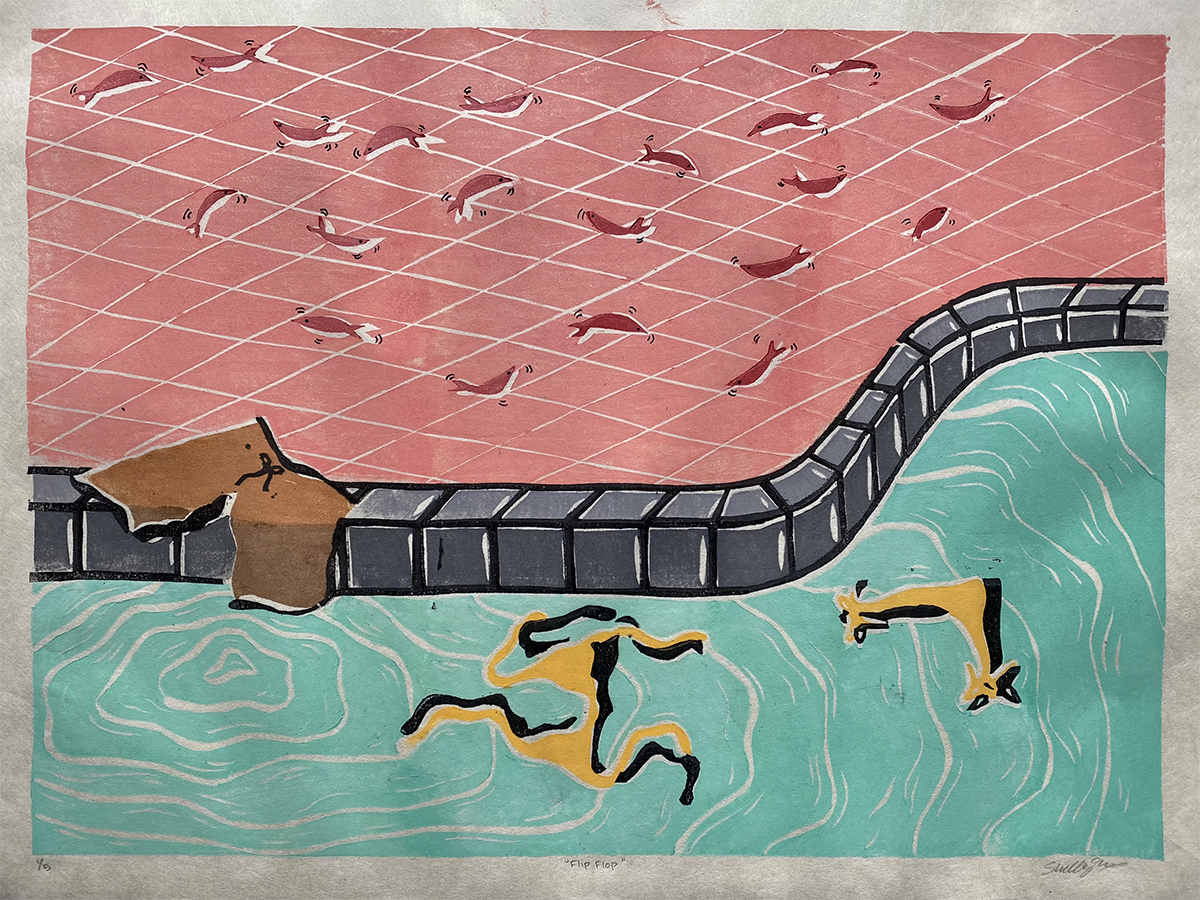
Shelby Dinh
“Flip Flop”
Mokuhanga Woodblock Print on Washi Paper
The inspiration for this print came from my love of swimming and being in the water. I grew up playing water sports my whole life, such as competitive swimming and water polo. I wanted to create a fun, bright colored print that embodied my love for the pool.
Shelby Dinh
“Wabi-Sabi”
Takbon Print on Kozo Paper
This print is part of a series of two other prints that are based on the theme Wabi-Sabi, meaning to embrace the beauty of imperfection found in nature. I wanted to create prints that were seemingly symmetrical to represent how society views being perfect. However, upon further inspection of the print, the imperfections and inconsistencies are obvious, thus embodying the idea of Wabi-Sabi.
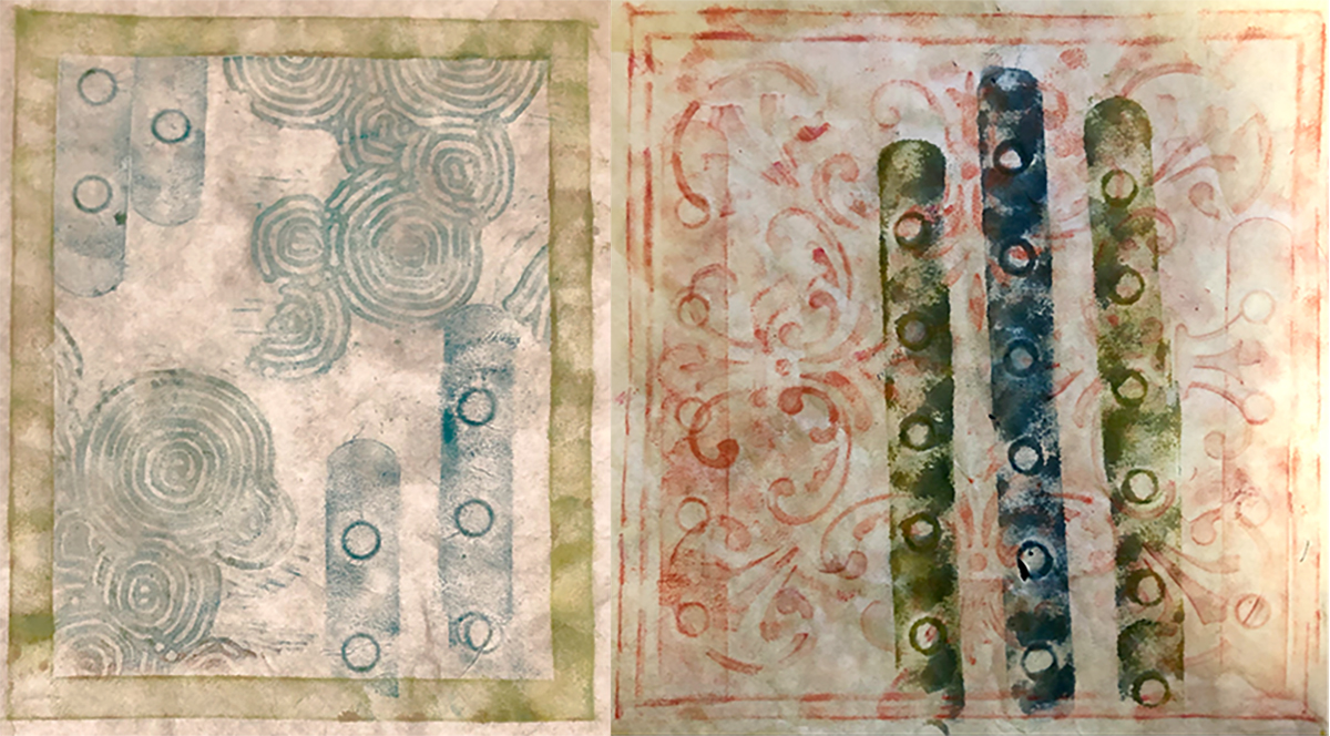
Zoe Forsyth
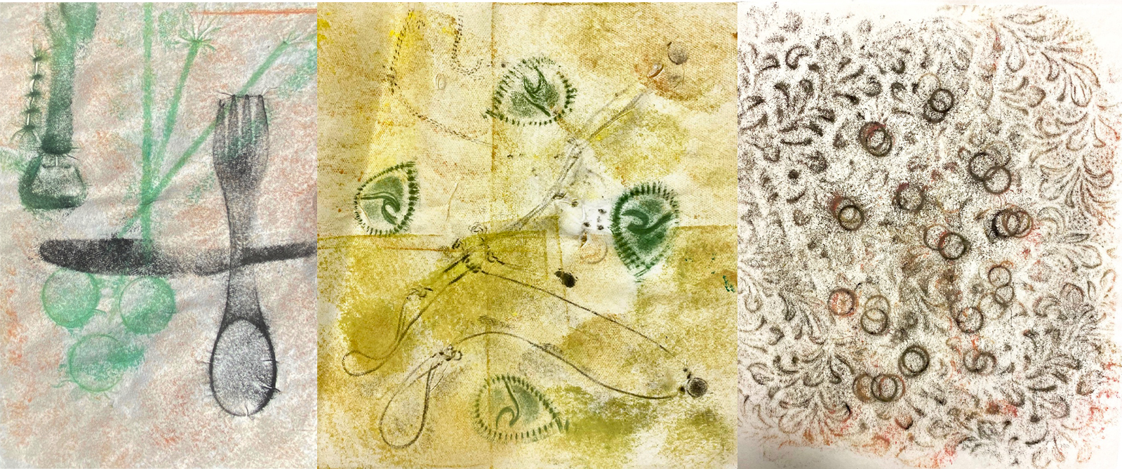
My quarter began experimenting with Takbon printmaking. A traditional Korean printmaking technique for transferring the textures of objects onto paper. The materials were unruly and I had to listen to them closely to understand how to apply the correct movements in order to control the ink. I felt humbled by the non-hierarchical relationship between me and Takbon. It reminded me of my mother, her patience, her talents for steering me in the right direction and our gentle push and pull dynamic. This process greatly inspired the conceptual ideas behind my takbon “Mother” series. My compositions often included two circles connected by a string, hoping to suggest two floating organisms or wombs receiving life source from an umbilical cord. I focused on capturing the textures of household items to represent themes of domesticity, familiarity and sacrifice.
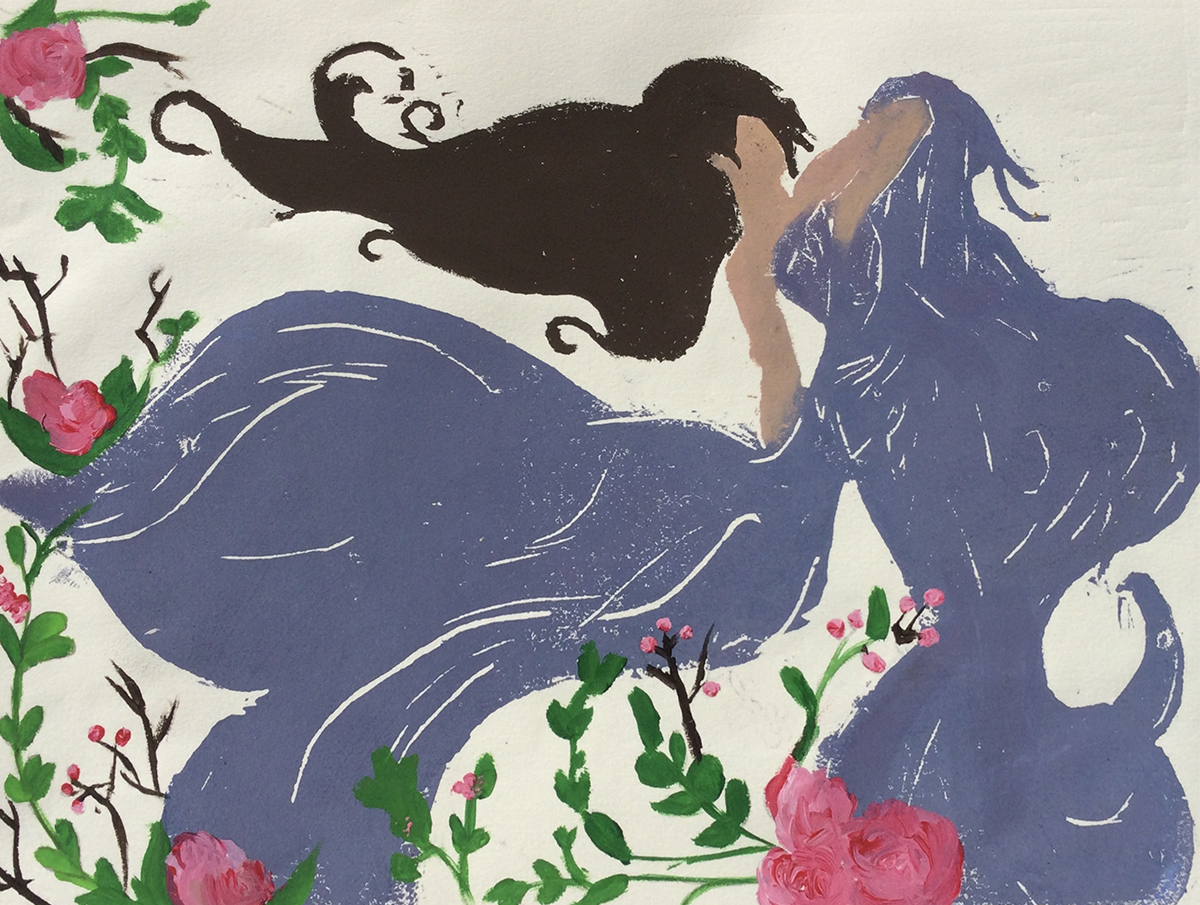
The ideas I formed during my experience with Takbon translated to my eventual exploration with Mokuhanga. Mokuhanga is the traditional water based printing technique, originating in China and perfected in Japan. Mokuhanga inspired me to practice texture and movement with my carving onto a woodblock. I wanted to create a scene reminiscent of medieval folklore. Four mysterious women positioned under tree with swaying branches, encased in fog. Two of the women are lying with their arms stretched out, connected by their hands, the others are hunched over or sprawled, both confronting the viewer. The imagery explores themes of vulnerability, power, shame and fear. My process pushed me to examine how color can influence a narrative. Ultimately, I hope that my works throughout this quarter portray my interest in creating complex, emotional atmospheres.
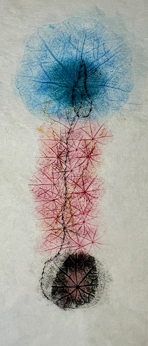
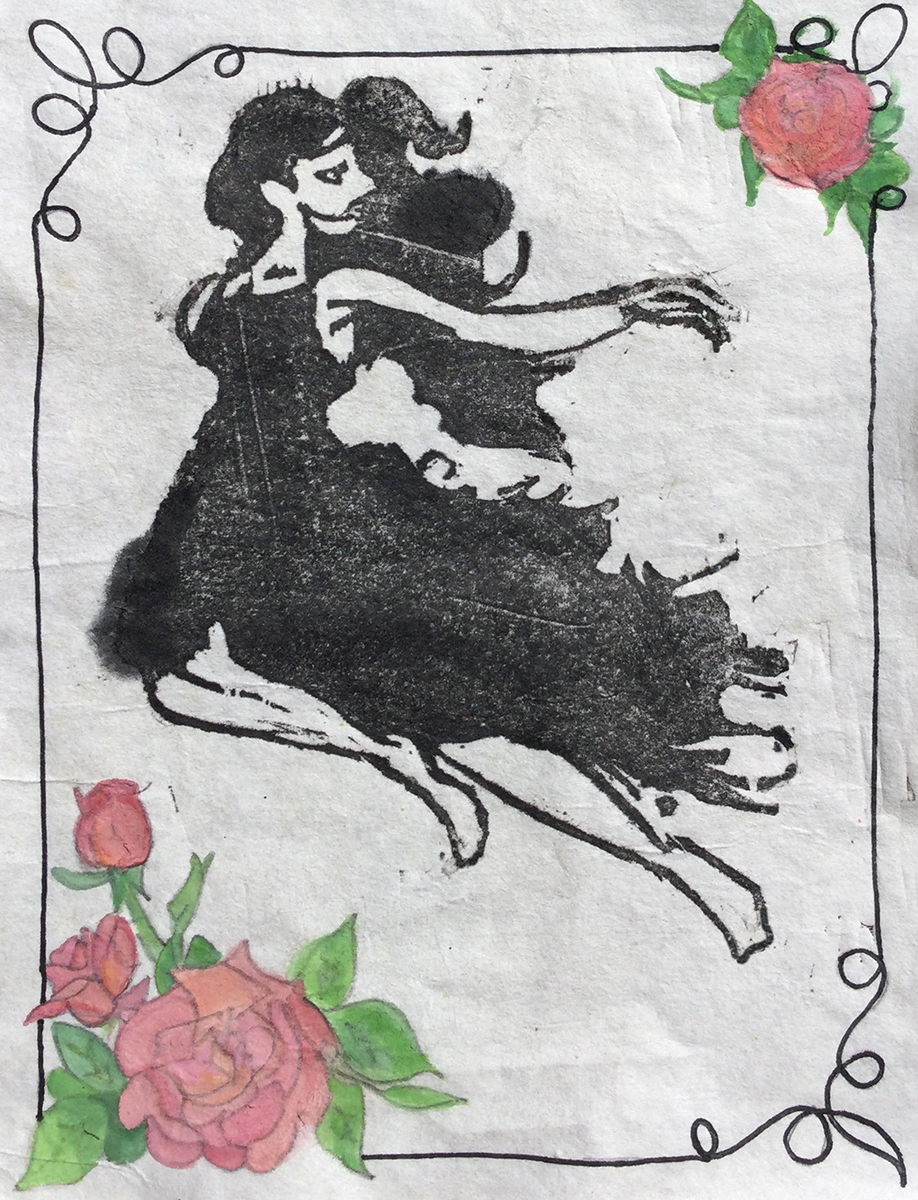
Zoe Forsyth
“Mother”
Sumi ink on Kozo paper
Explores themes of: Motherhood, connection, domesticity and sacrifice.
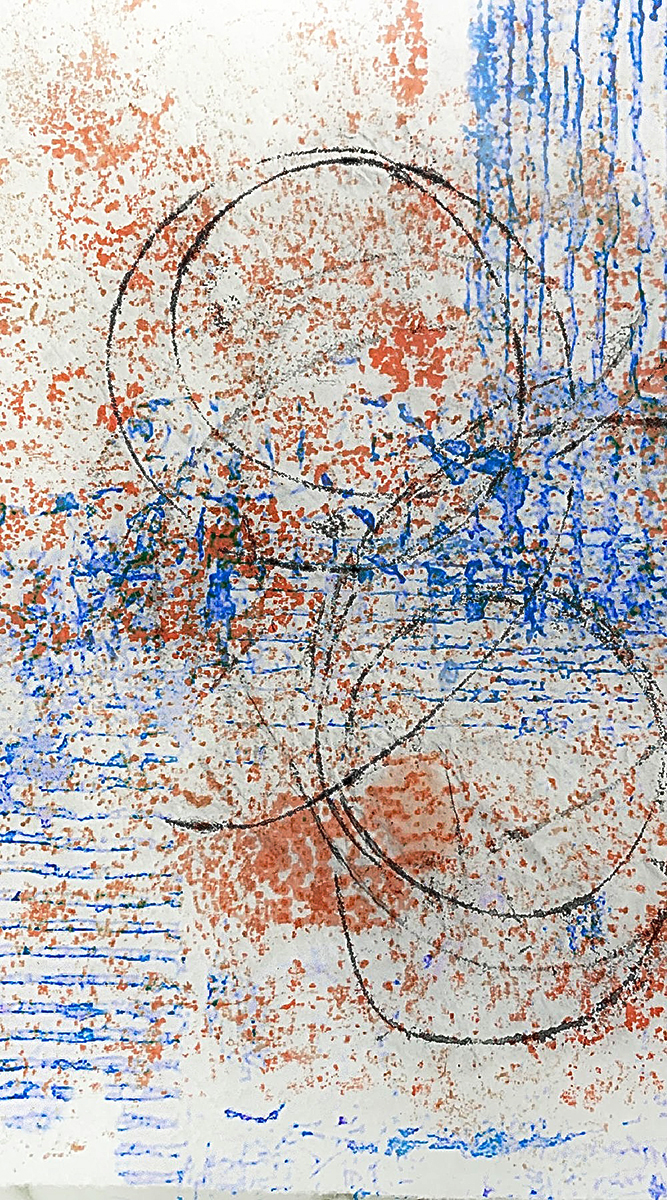
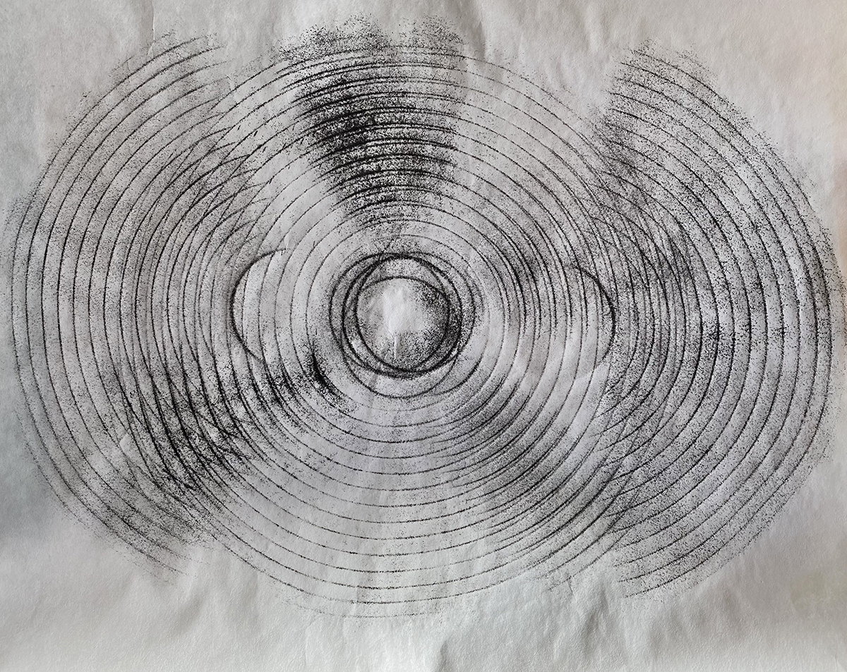
Zoe Forsyth
“Circling”
Sumi iart161k on Kozo paper

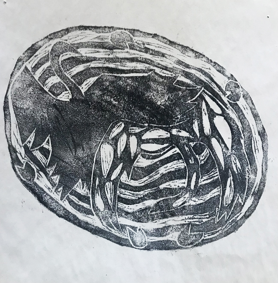
Zoe Forsyth
“Gunk, Shit, Black Bodily Waste”
Sumi ink on Kozo paper
Explores themes of: containment, scrutiny, surveillance.
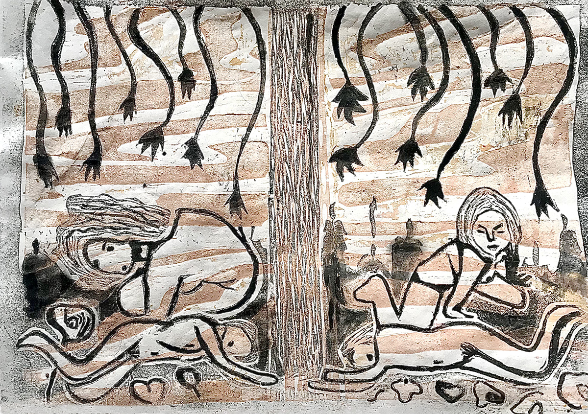
Zoe Forsyth
“Ritual Transgression”
Explores themes of: fear, shame and power.