
VIRTUAL OPEN STUDIOS WINTER 2021: Art 182 Materiality of Color
Instructor - Laurie Palmer
Class website - https://libraryofcolor.sites.ucsc.edu/
Bailey Jones

Cassidy Skillman

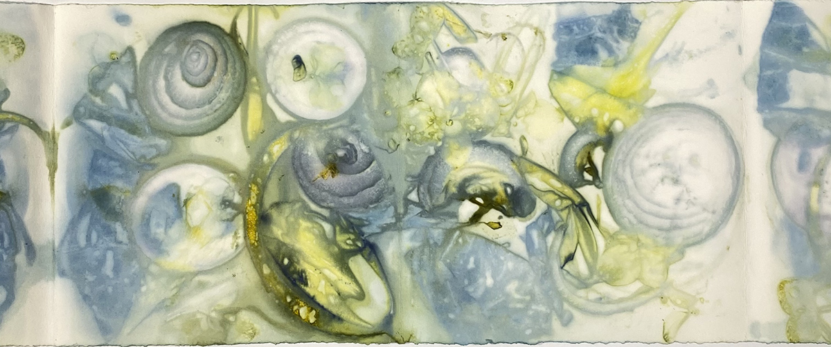
Cassidy Skillman
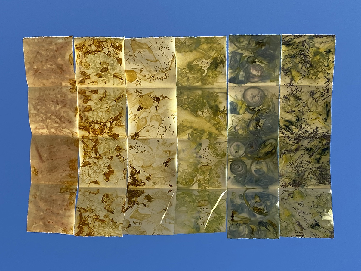
“Eco Print Spectrum”, 2021
Eco Prints on Arnhem Paper Suspended in the Sky
I am inspired by this eco friendly method of printmaking and am in awe with the colors that can be printed from tannin rich organics. After learning the eco print process I have had many questions and ambitions for this medium. Through my experimentation with eco printing I have tested approximately 20 specimens consisting of vegetables, foliage, seeds and flowers. The largest limitation to this project was the seasonal availability to plants. This color experiment allowed space to explore the range of winter color in preparation for the variety of spring interest. This is an ongoing project in hopes I can continue to form a rich spectrum of colorful eco prints.
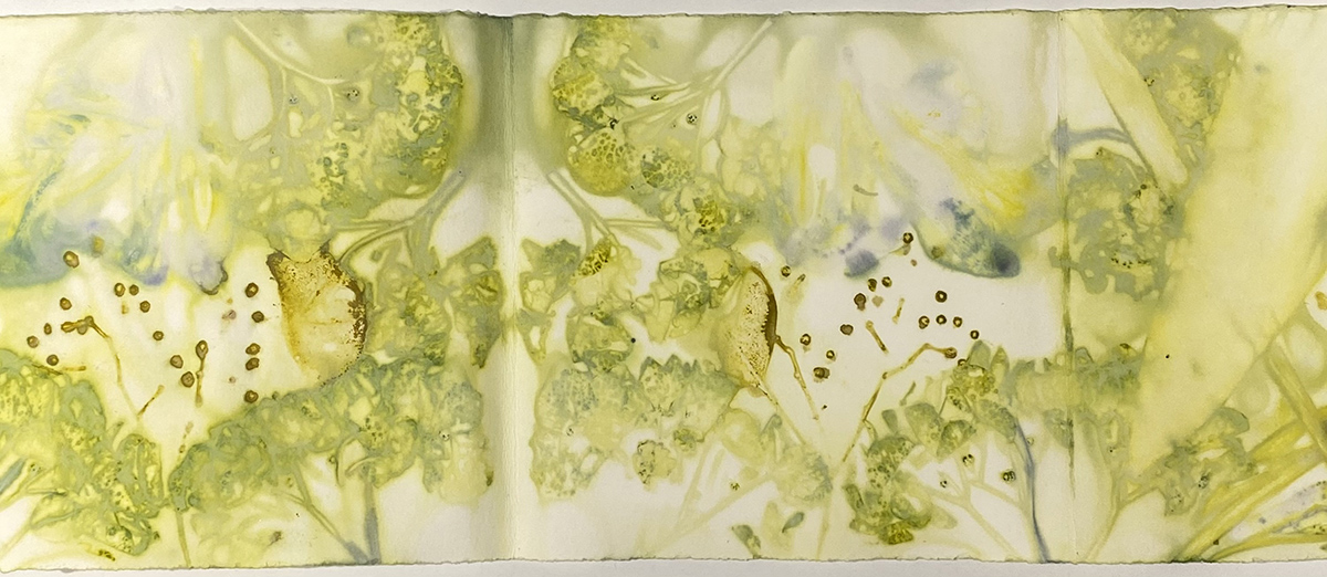
Cassidy Skillman
“Eco Print Spectrum” Close-up of Green, 2021
Eco Print on Arnhem Paper, 5.5” x 20”
Cassidy Skillman
“Eco Print Spectrum” Close-up of Blue, 2021
Eco Print on Arnhem Paper, 5.5” x 20”
Eliza Convis
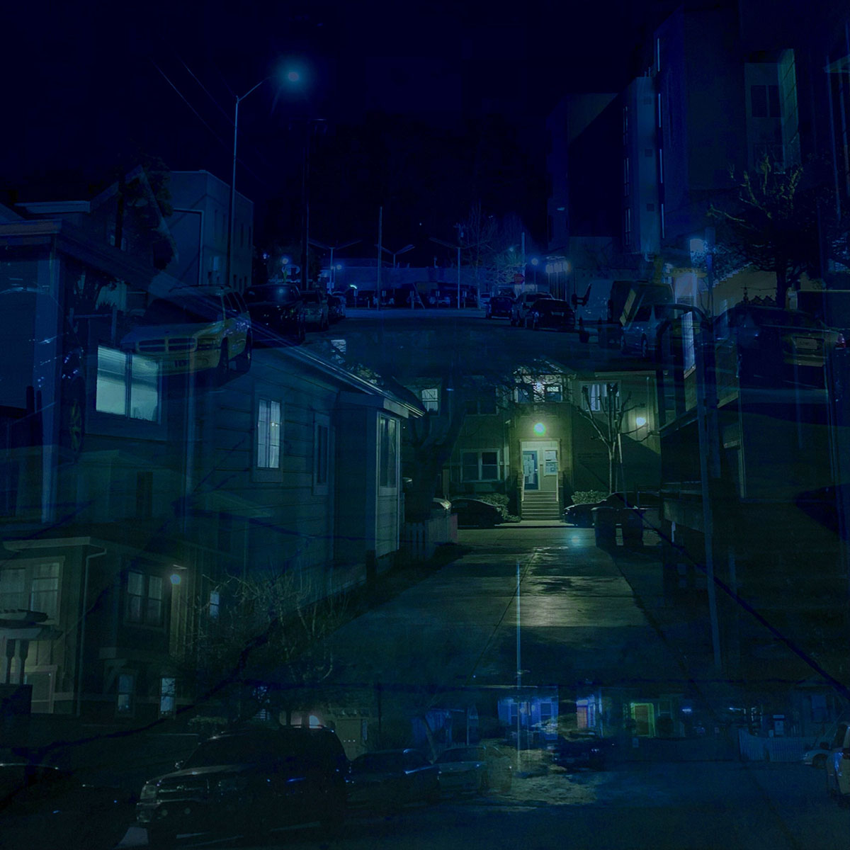
Eliza Convis
“Velvet Street”
Digital Photography
This pieces hopes to capture the very special environment of a quiet suburban street in the middle of the night, when it’s almost too cold and the streetlights glow so softly they almost radiate warmth. Its quiet and peaceful, and perhaps a few stars twinkle through the lights of the street. To me, this feeling and environment is the epitome of the color blue.
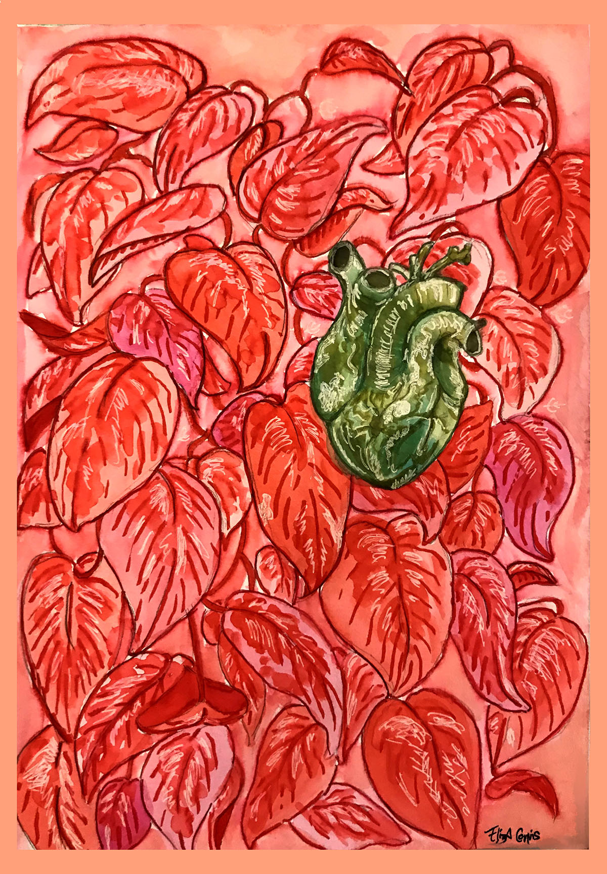
Eliza Convis
“Our Hearts”
Watercolor, Colored Pencil, and Marker
After looking up at the heart-shaped leaves of a pothos plant every night for years, this piece nearly made itself. There’s a connection between our veins and hearts and the leaves and veins of a plant, and by reversing the colors the piece puts emphasis on what we share with plants, and hopes to start a dialogue where we explore more of our interspecies similarities.

Eliza Convis
“Bodies”
Colored Pencil
Ive always wanted to do a big piece where I could randomly choose colors, so thats exactly what I did for this piece. I drew 125 bodies on a 9x12 paper, and assigned 20 colored pencils each a number from 1-20. To color, I would select a body, and roll a 20-sided dice to see which color it would be, and the highlight colors were whatever number I rolled minus 1. I've always had a strange relationship with color: i loved it so much but i never knew which colors would look best together, and I would always second guess every color choice I made, and imagine endlessly what other colors I could put instead. With this piece, I took all of it out of my own hands so that I couldn’t question anything, since this piece was a collaboration with fate, or chance, or maybe god, or maybe just a piece of plastic and gravity. Whichever it is, it wasn't me making the color decisions.
Kaitlyn Bean
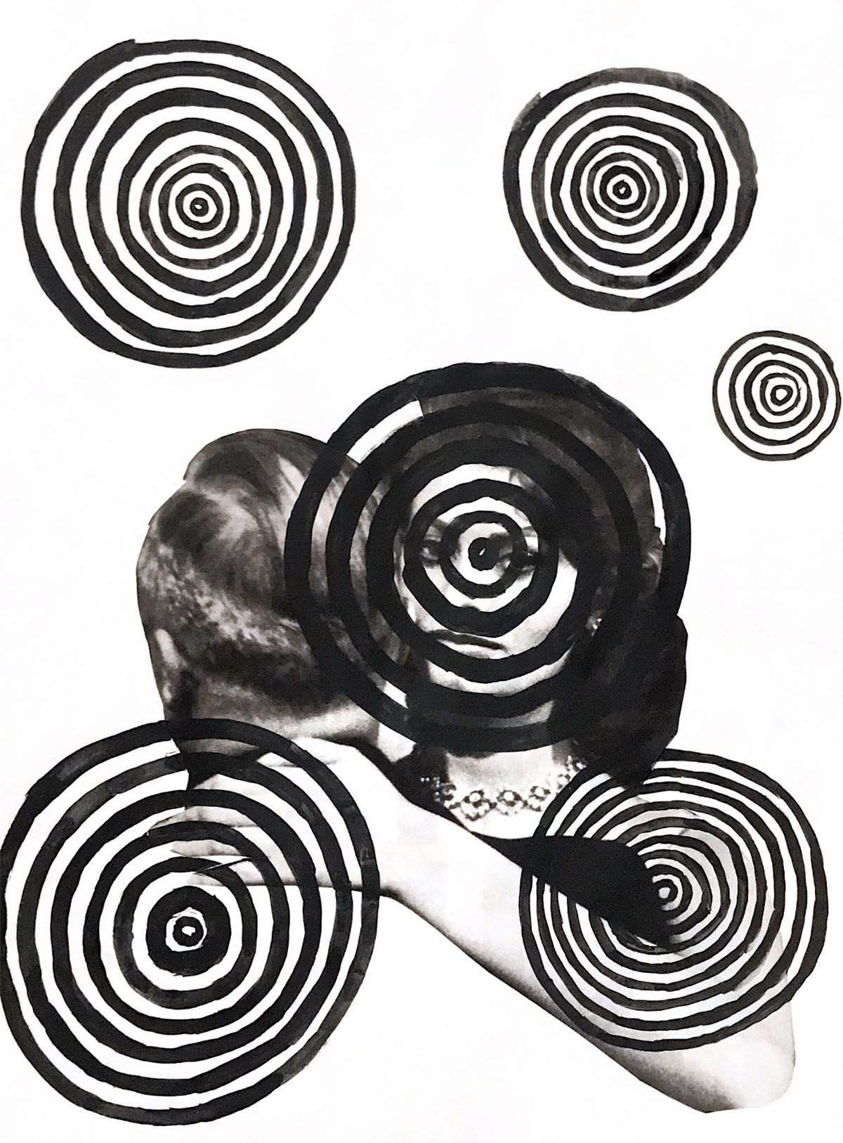
Kaitlyn Bean
“She Lives in Vertigo”
Paper collage and acrylic on paper
Description: A woman suffering from the viscosity and liquidity of vertigo, leaving her stumbling,falling, and equally entranced.
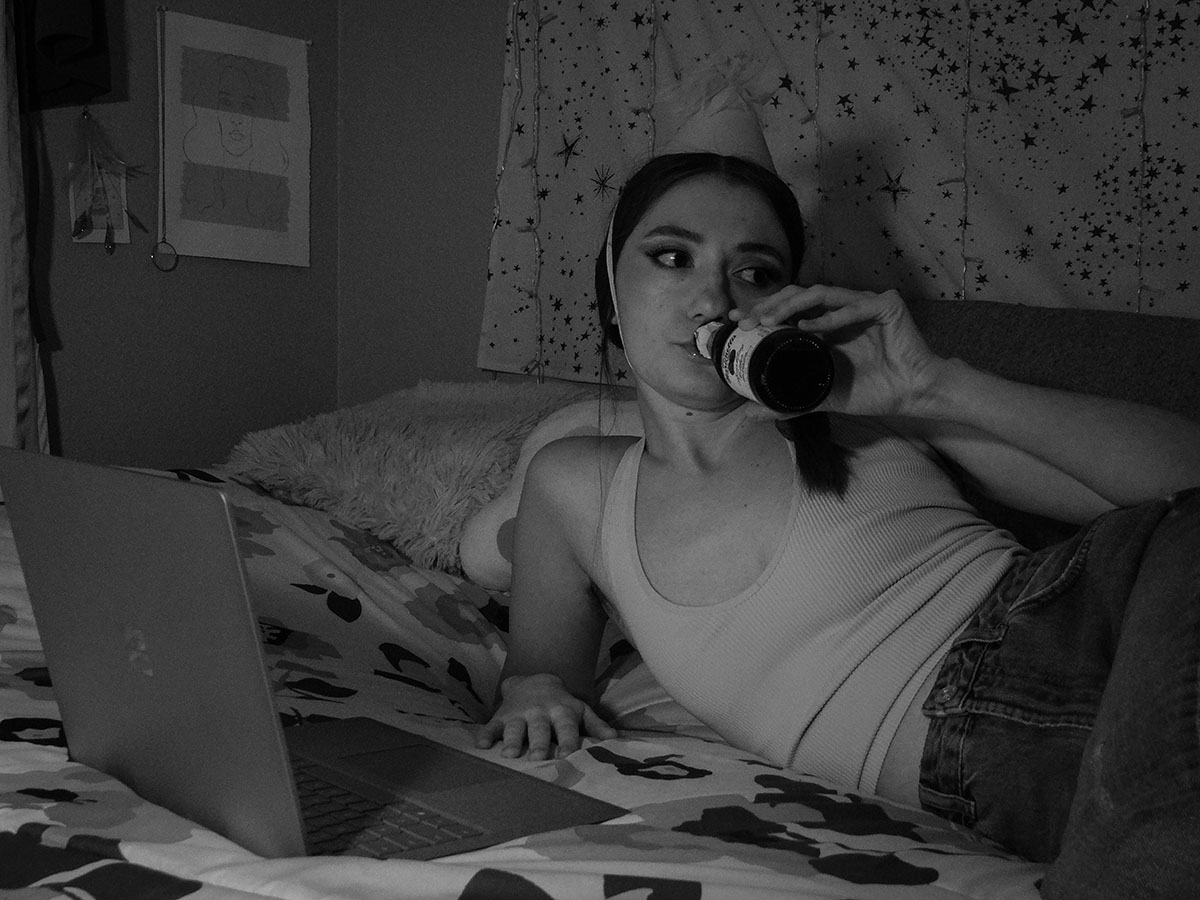
Kaitlyn Bean
“Quarantine Birthdaze”
Photograph
Description: Photo 1/6 of my Quarantine Birthdaze series.
Kaitlyn Bean
“Quarantine Birthdaze”
Photograph
Description: Photo 2/6 of my Quarantine Birthdaze series.
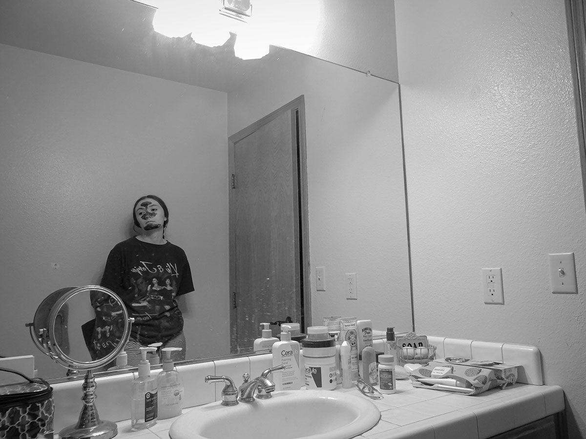
Kaitlyn Bean
“Quarantine Birthdaze”
Photograph
Description: Photo 3/6 of my Quarantine Birthdaze series.
Lauren Baldock-Wood
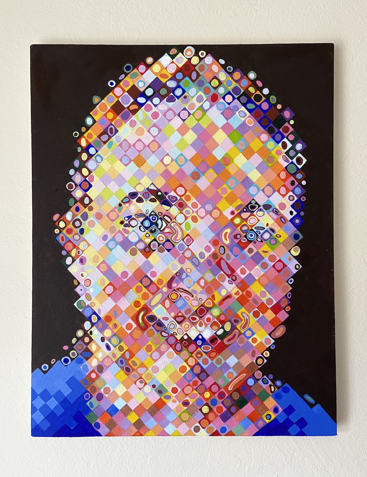
“Mom”
Acrylic on Canvas
This painting was made to explore how different colors can interact with one another depending on how they are combined, and how these combinations might change when observed from different distances. To do this, I did my best to mimic the style of artist Chuck Close, who paints large-scale portraits by layering colors in a grid system.

“Black Koi Fish”
Food Coloring in Water
For this piece, I created liquid blackness by combining different food colorings in water. This was conceptualized based on the idea that black is often thought to be the absence of color, yet it can actually be created by combining red, blue, and yellow. I did this to demonstrate one of the ways in which our eyes are unable to perceive certain colors.
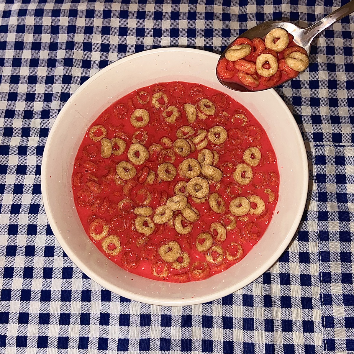
“Eat Your Breakfast”
Food
Red is frequently attributed to intense feelings such as anger, love, and lust. For this reason, to have red communicate the opposite of what it typically symbolizes, I made a red bowl of Honey Nut Cheerios. Cereal is a very common aspect of American life. Therefore, I turned the cereal red with the hopes that viewers would experience intensity in something that is not ordinarily thought of as exceptional.

“Sun Flowers”
Acrylic on Paper
For this piece, I created a labor intensive, obsessive task for myself. Feeling confined by having to quarantine during the pandemic, I have been longing more and more for the outdoors. This piece gave me an opportunity to meditate and reflect on what I really care about, which largely includes nature. Yellow, which I associate with happiness, mimics the sunlight I have been missing.
Noah Fox
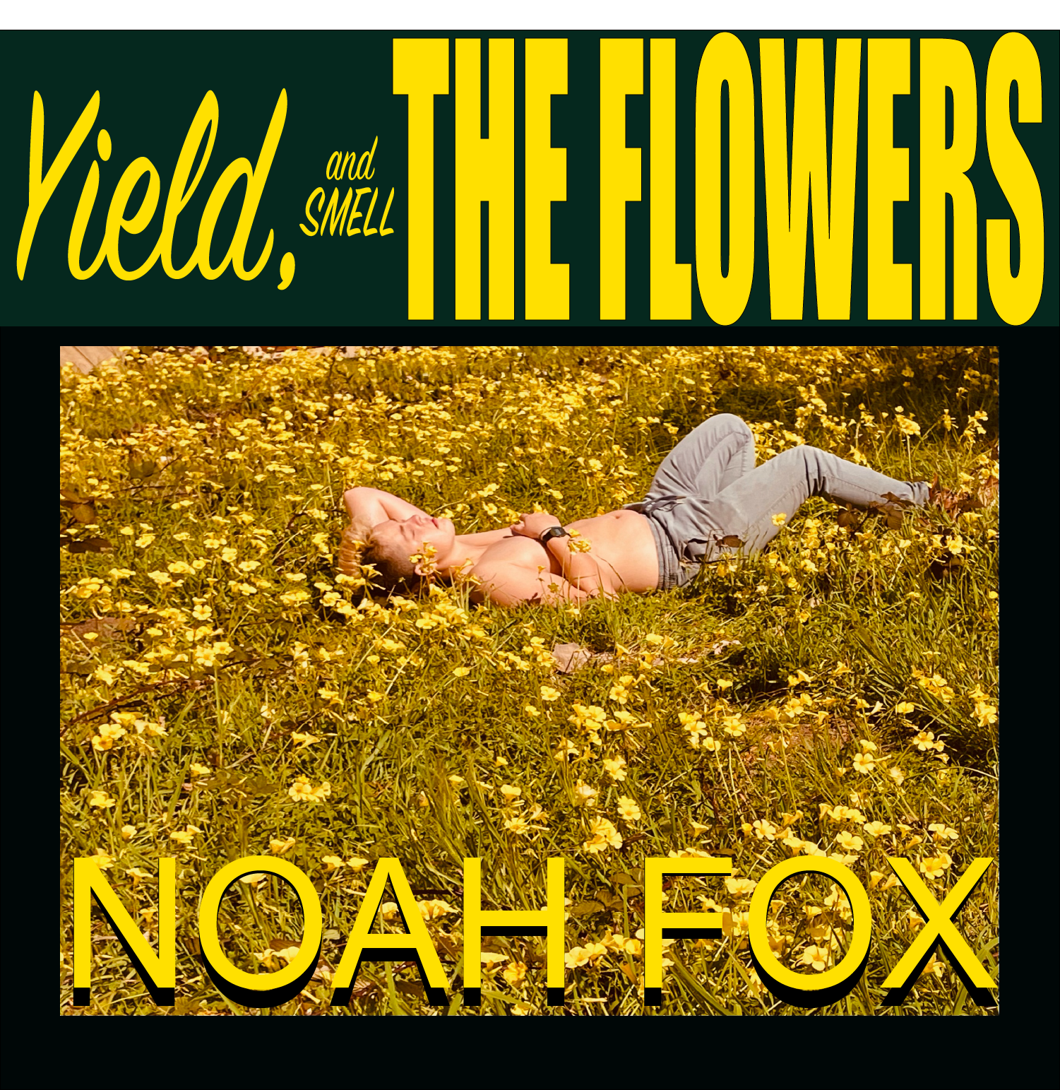
Noah Fox
“Yield, and Smell the Flowers”
Photography
This album represents nostalgia and the fading feeling the color yellow brings. Shortly after the photoway taken, the flowers were cut and the scene was gone forever, further adding to the emotional experience of yellow. This cover is a reminder to appreciate what you have while you have it because nothing lasts forever.
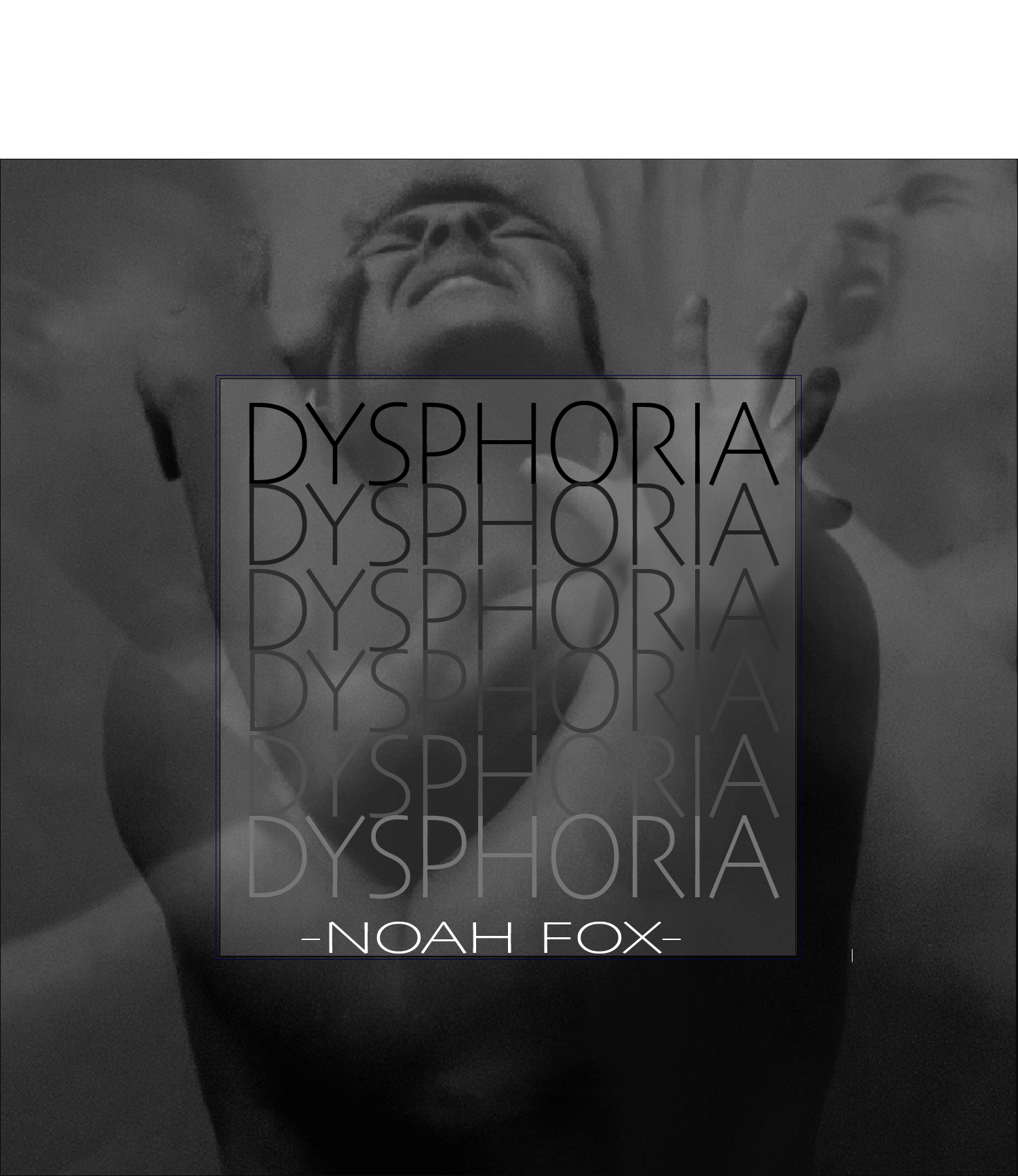
Noah Fox
“Dysphoria”
Photography
This album shows the darkest parts of myself, when I am the most unhappy. It is an overwhelming physical feeling, but taking these photos was strange because it all happened the week before my surgery. Now all I have left are the photographs and memories from that time in my life.
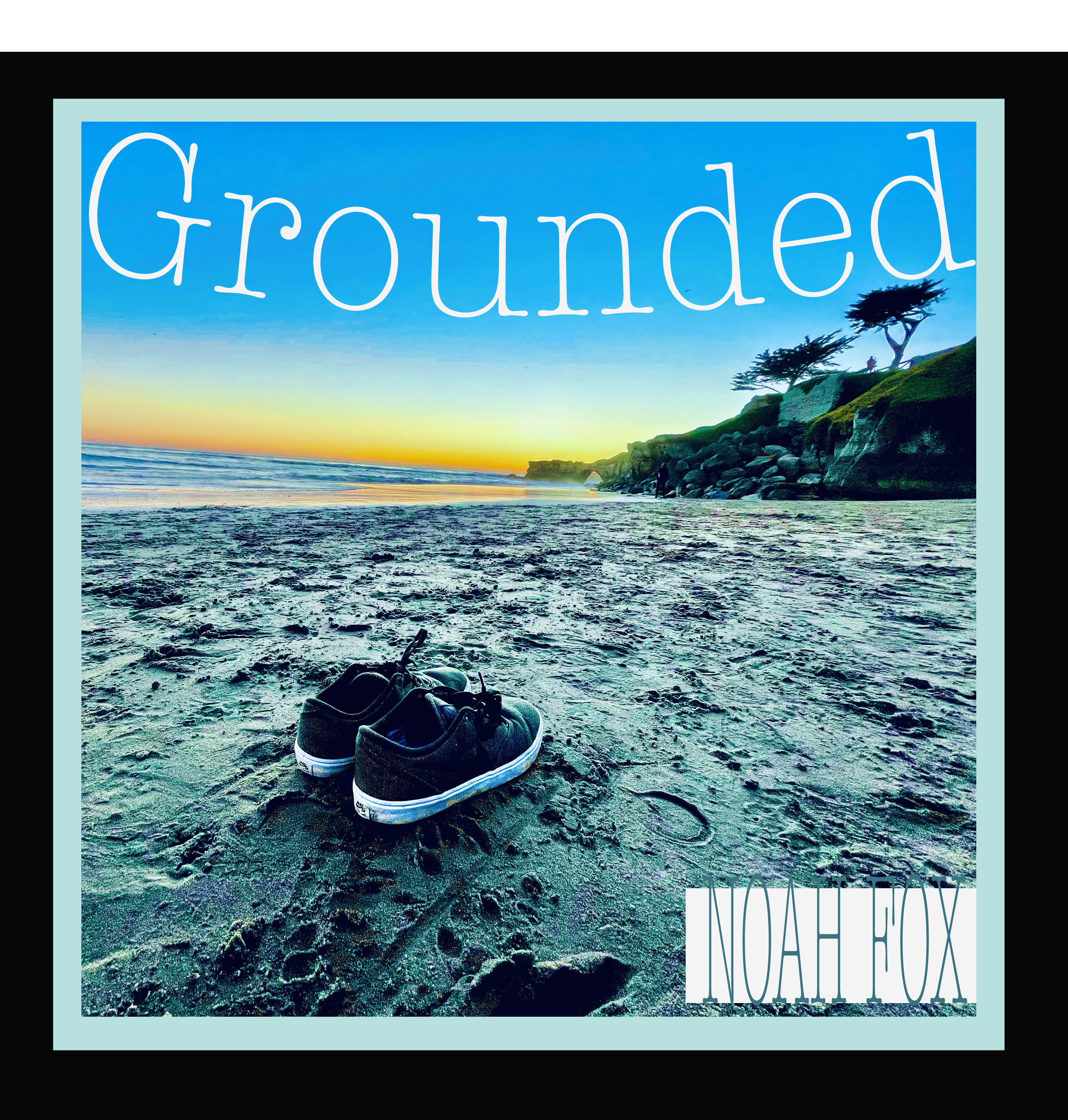
Noah Fox
“Grounded”
Photography
This album is the opposite of the one before it. When I am in the darkest times the one thing that can pull me out is surfing or even taking off my shoes and running my toes through the sand. Blue was the perfect color for this, not only because it is my favorite but also because of the deep emotional ties it holds and its calming properties.
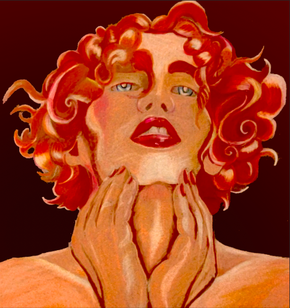
Noah Fox
“SOPHIE”
Colored Pencil on Paper
My own take on SOPHIE’s iconic “It’s Okay to Cry” image, created hours after her death. The original image is blue and bright featuring blissful undertones. I changed this by making it a red centered image and added a feeling of tragedy or angish to make it my own and honor the singer’s life while working through my own grief over an important member of my own community.