
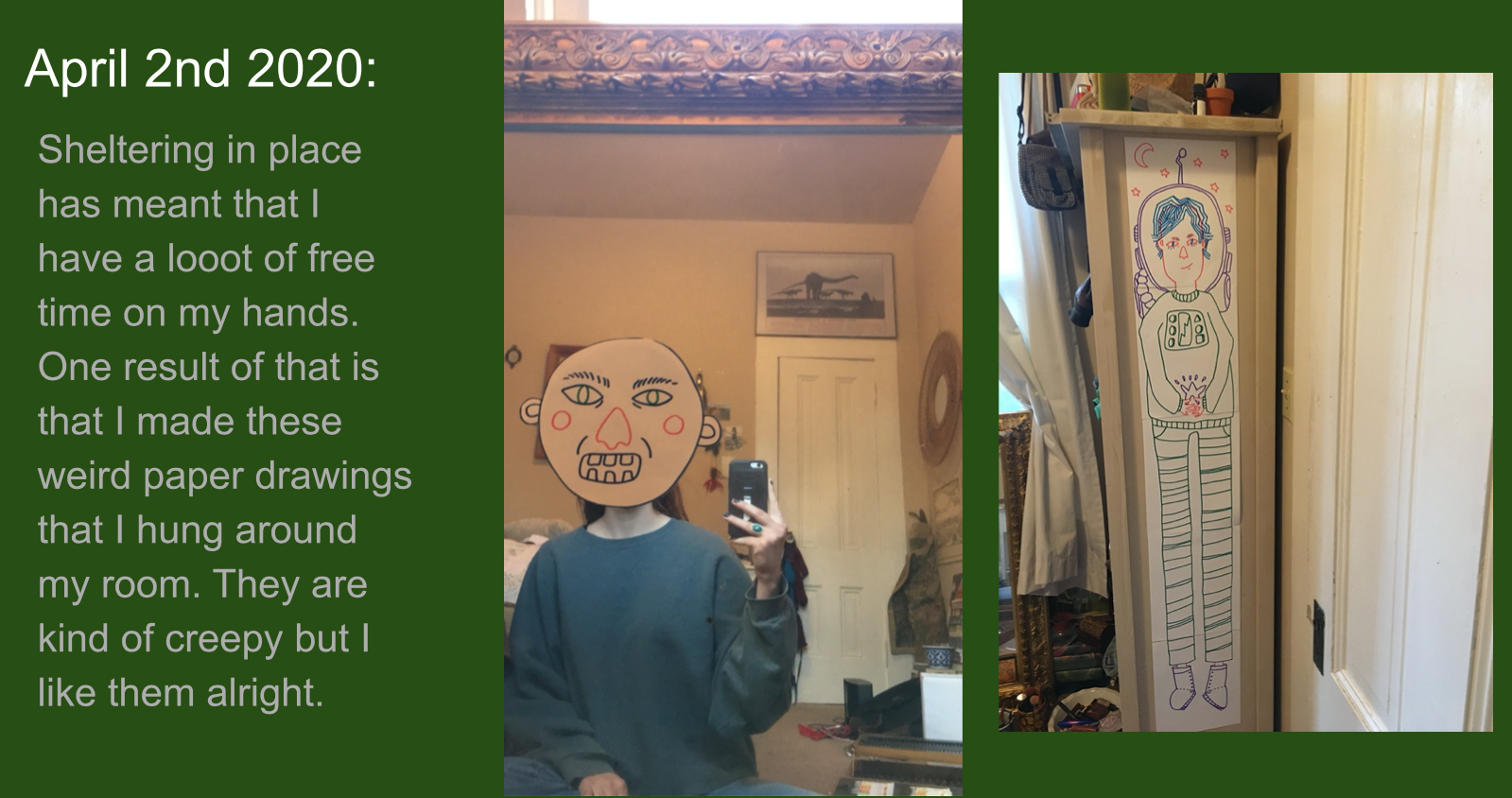
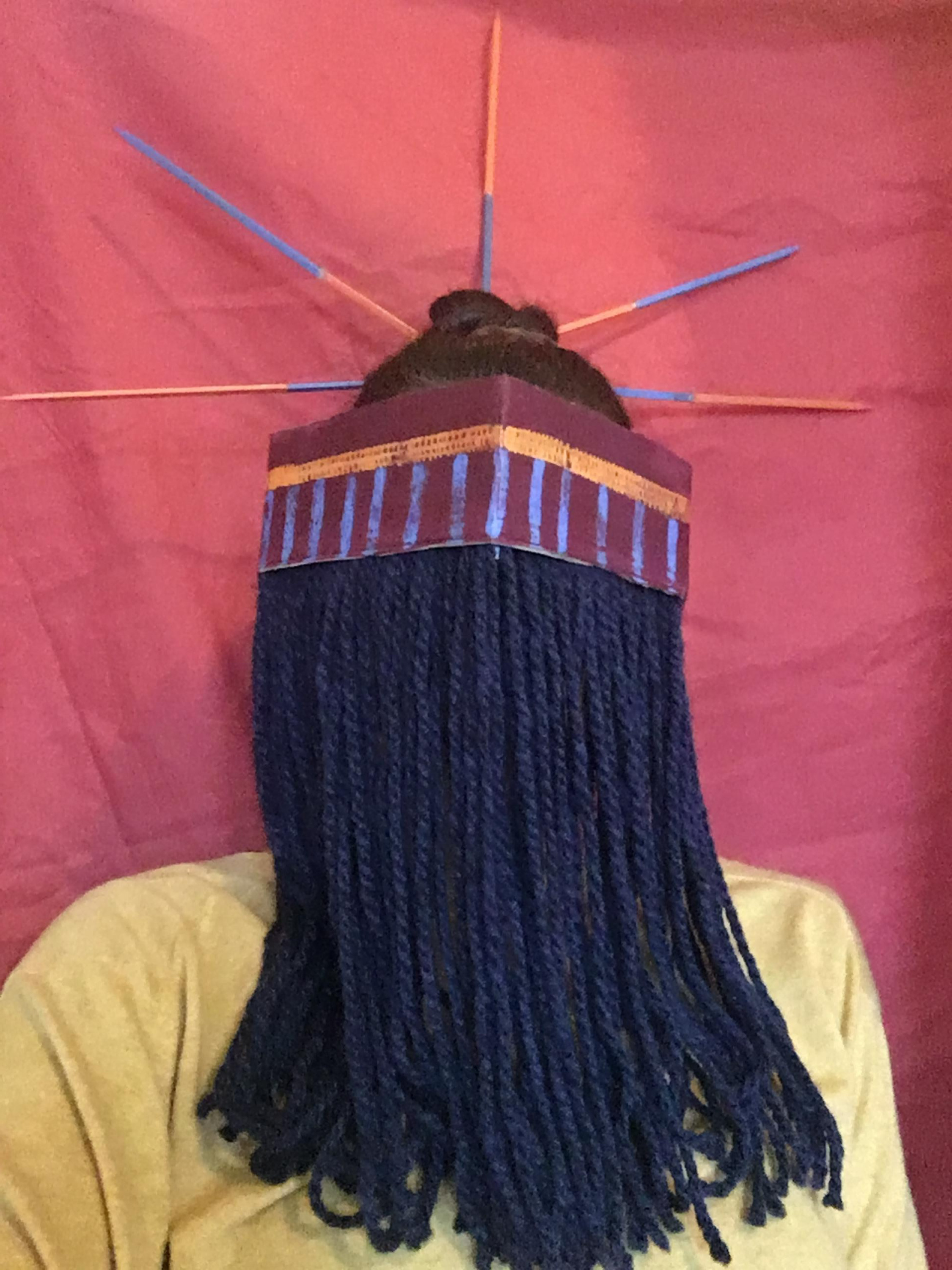
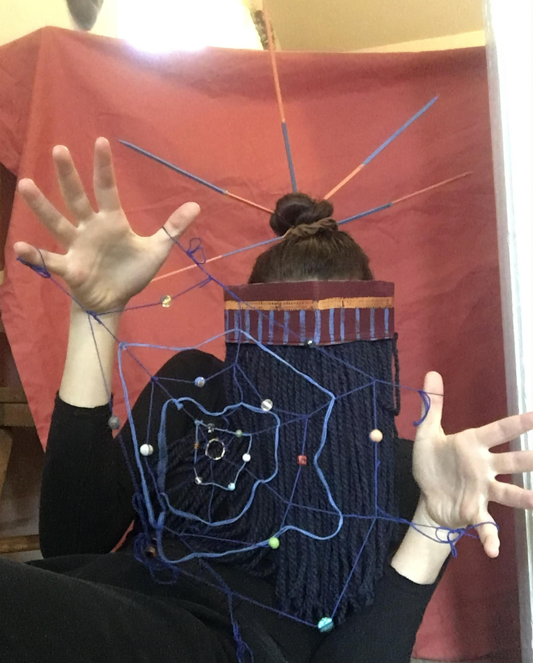
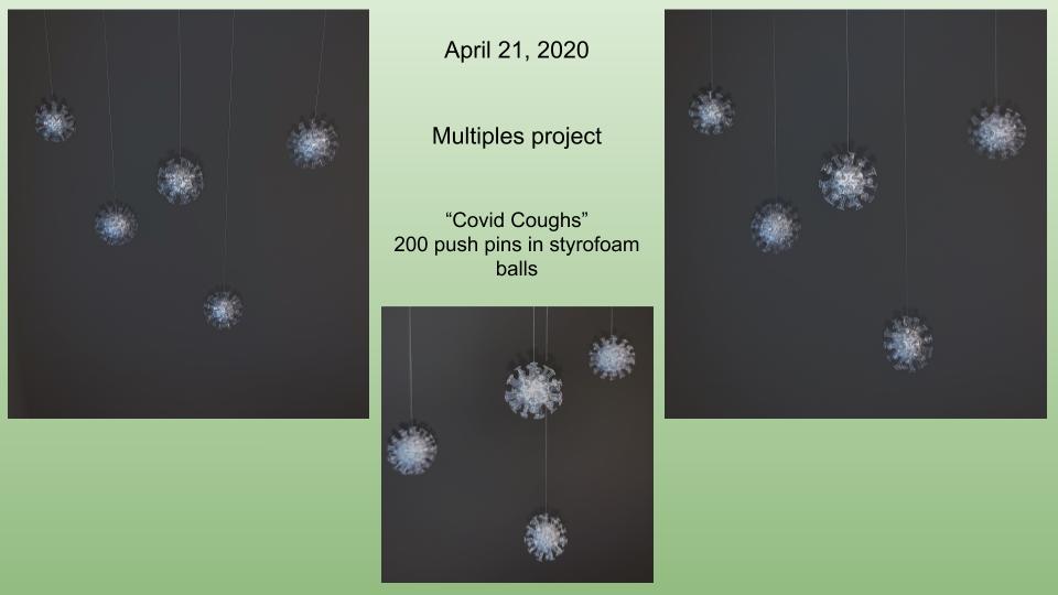
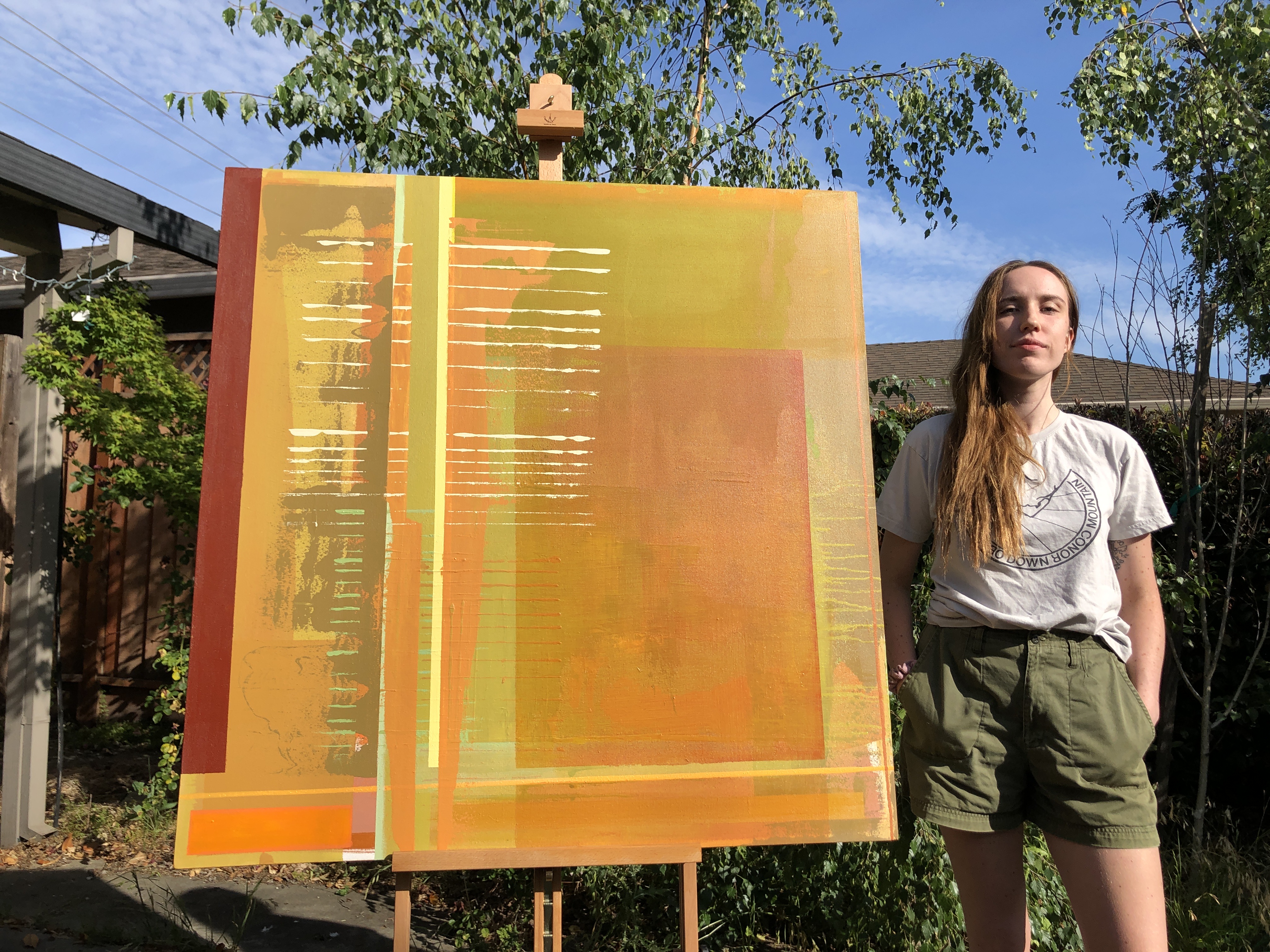
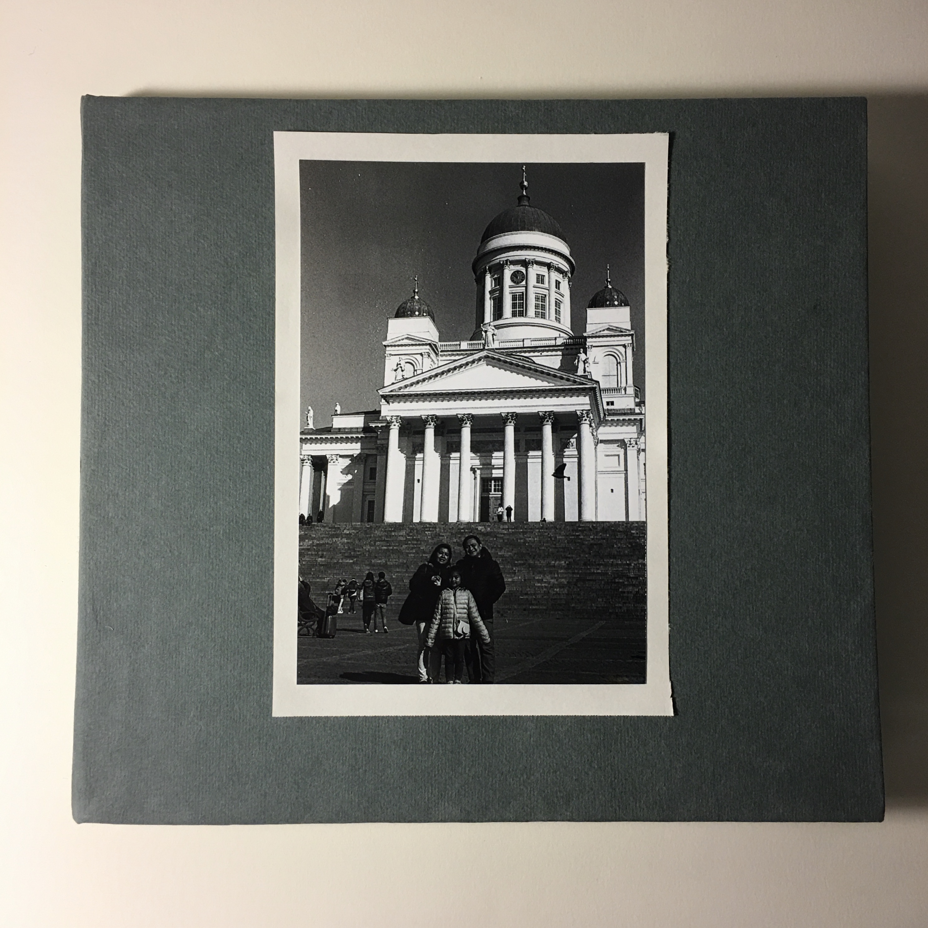
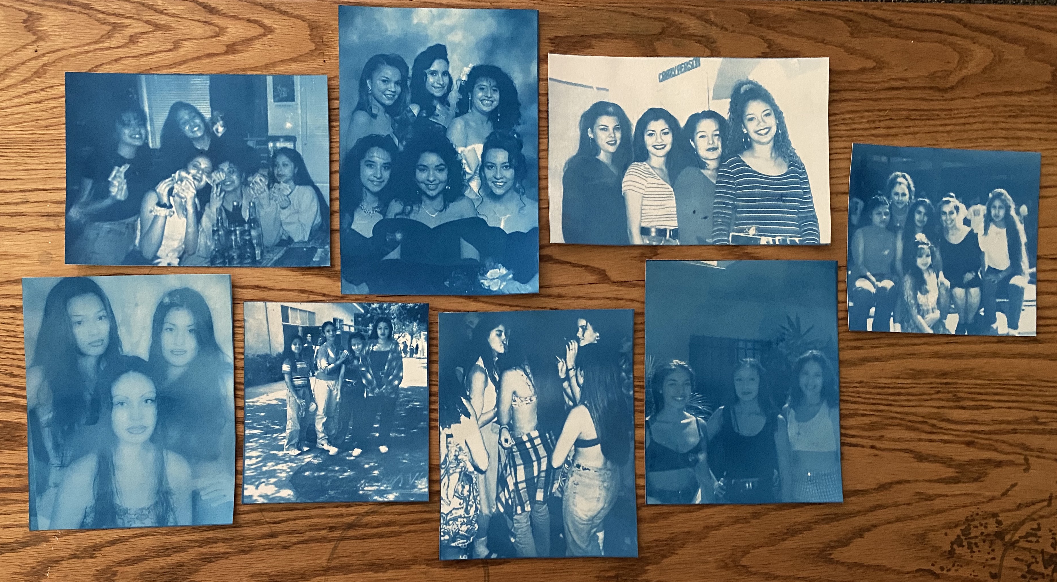
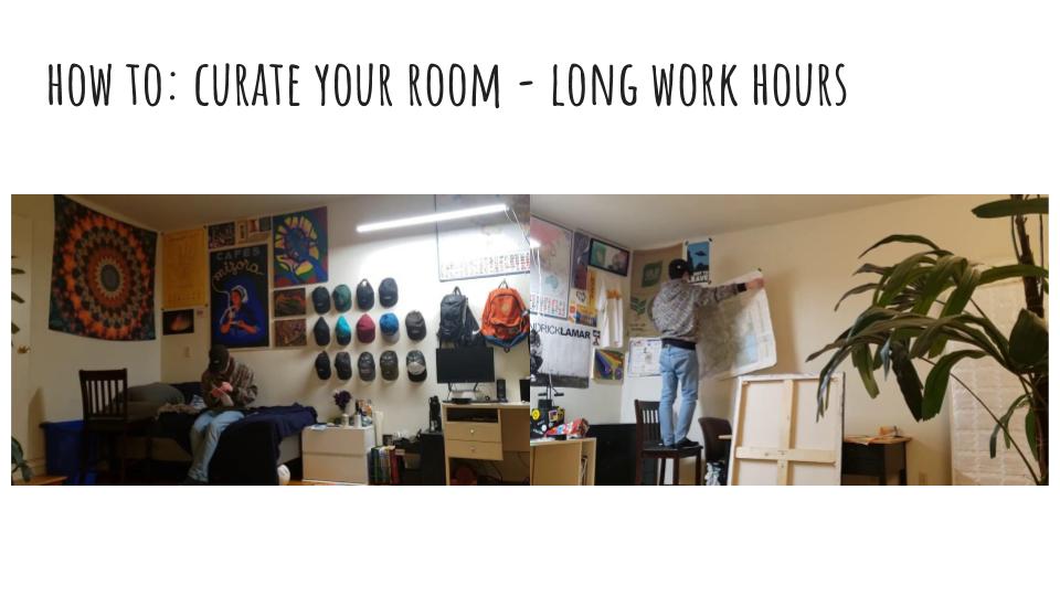
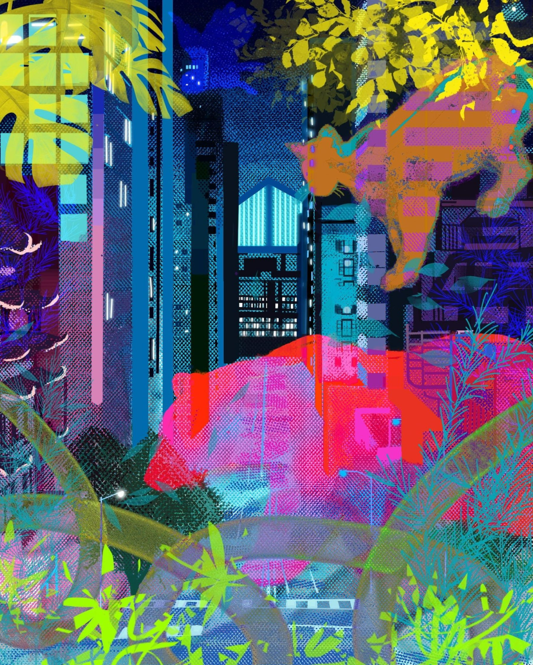
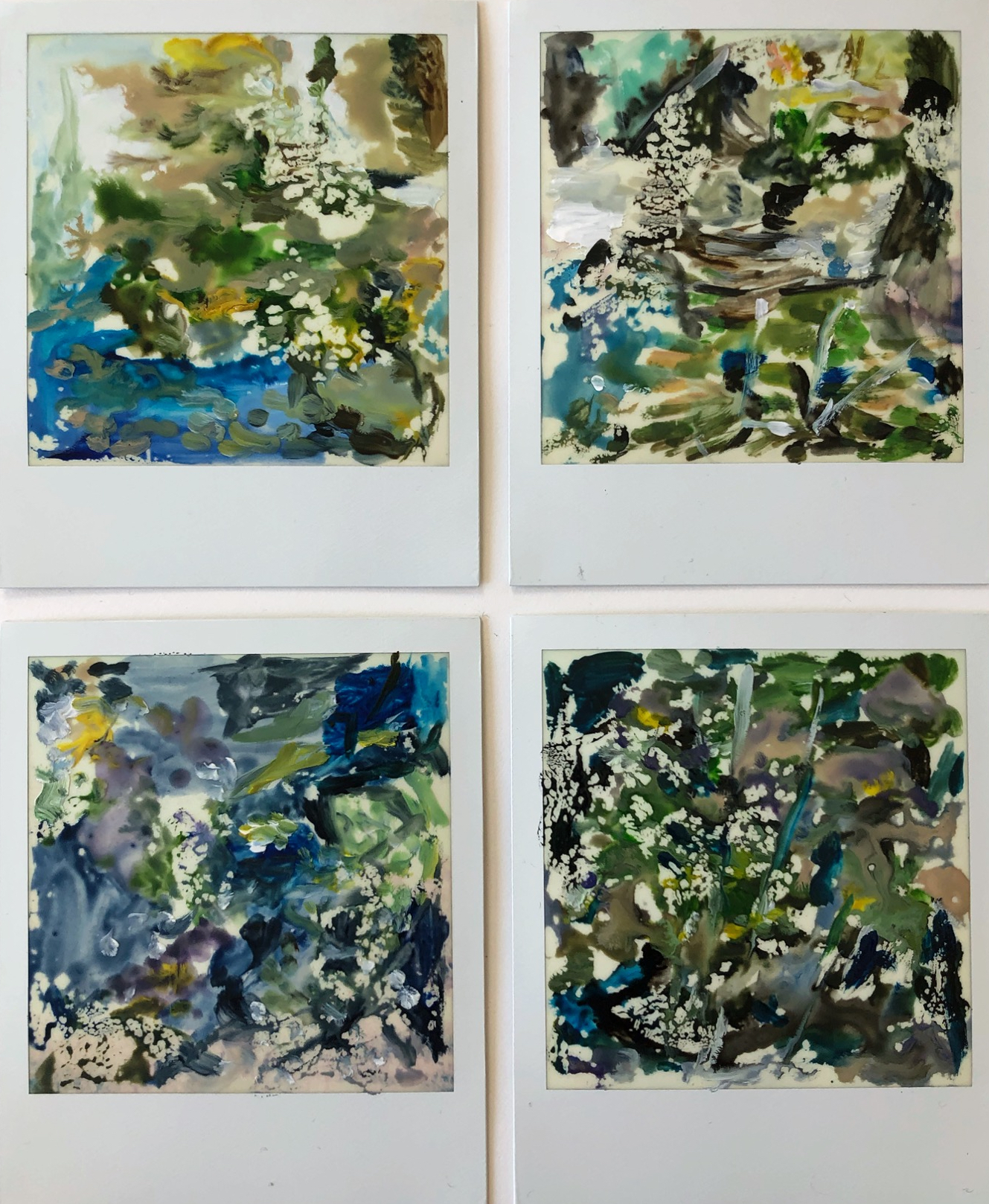
Spring 2020 Virtual Open Studios Group Show
(Click on any image below for a larger view of the image)
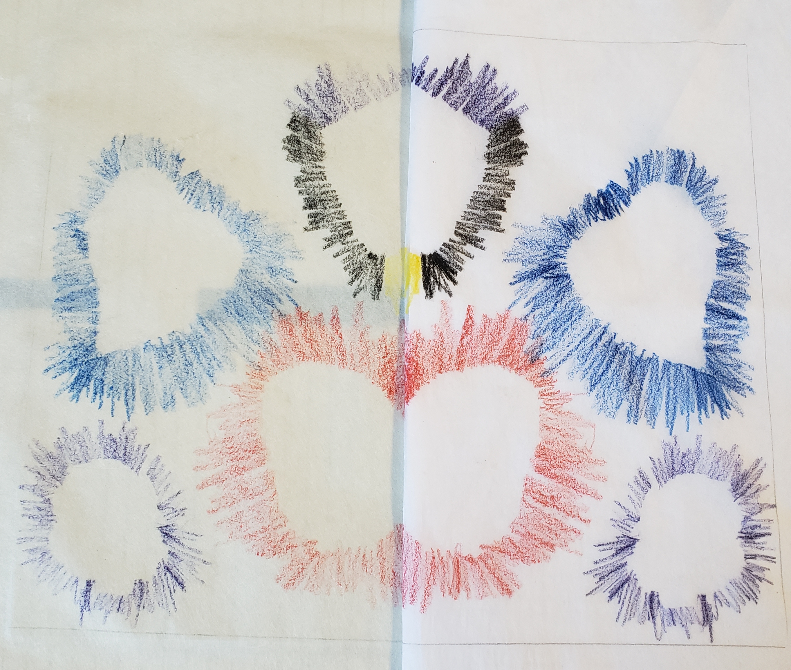
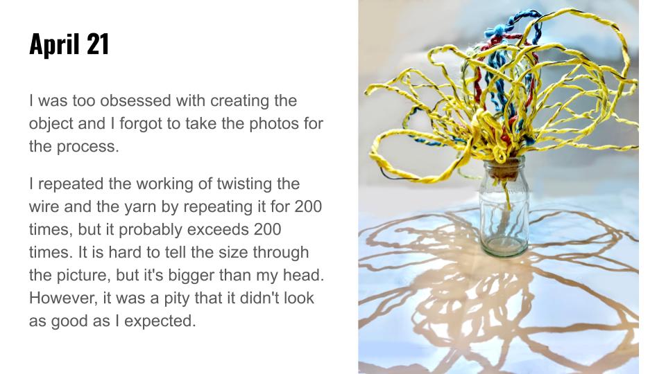
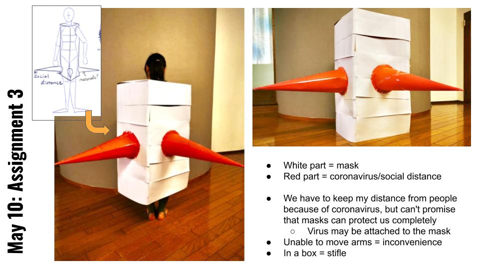
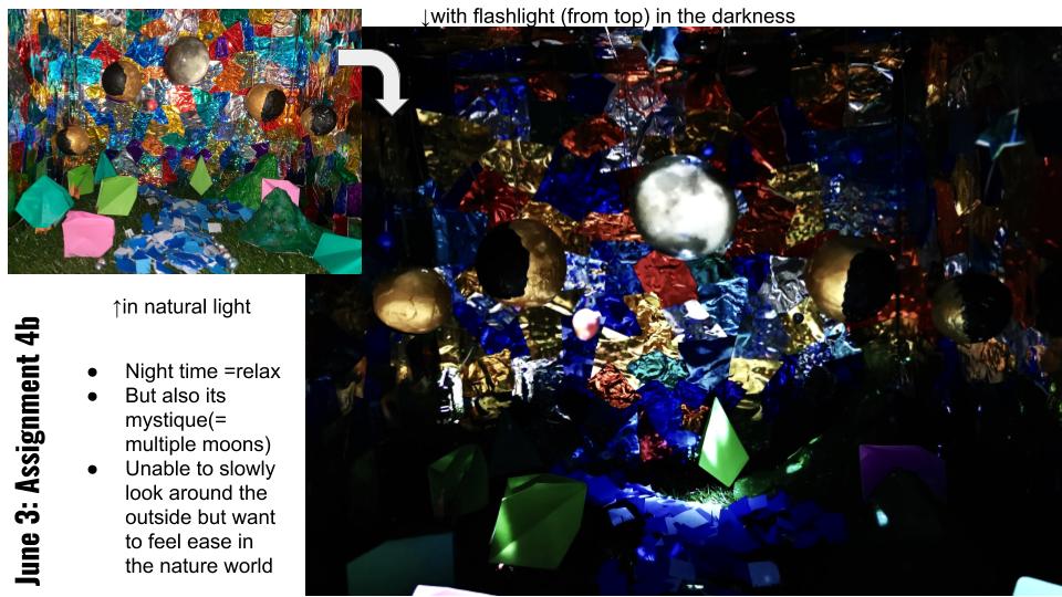
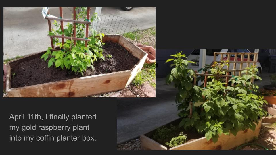
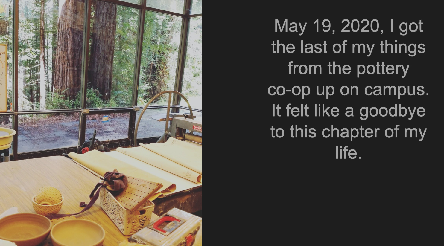
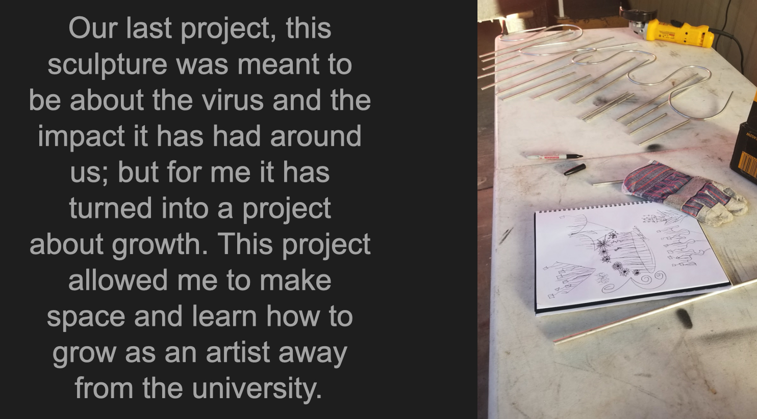
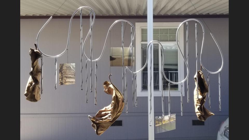
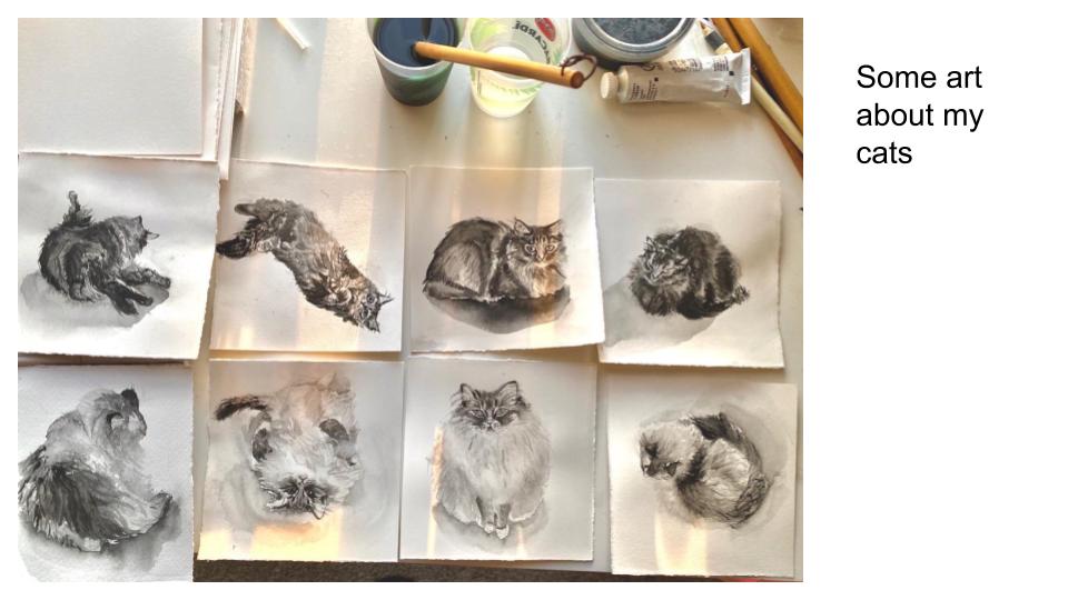
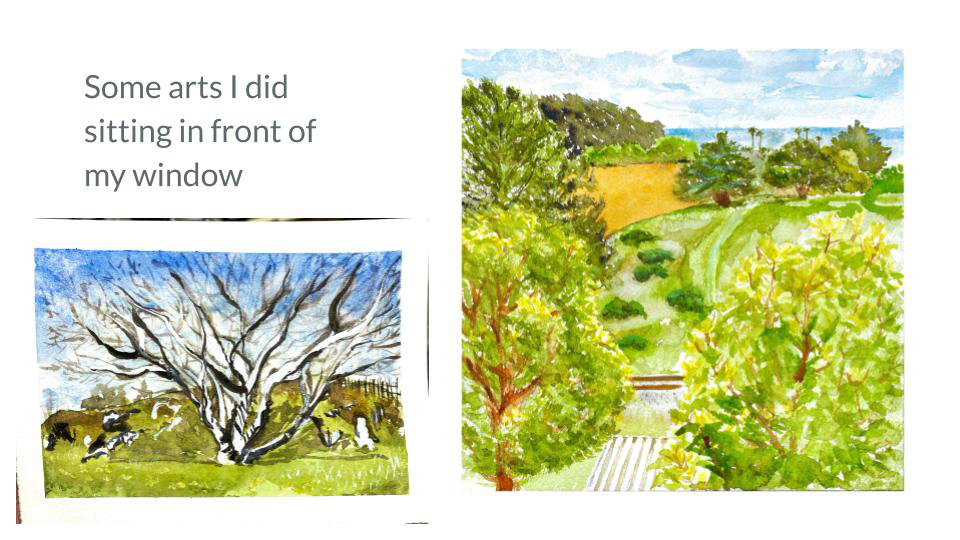
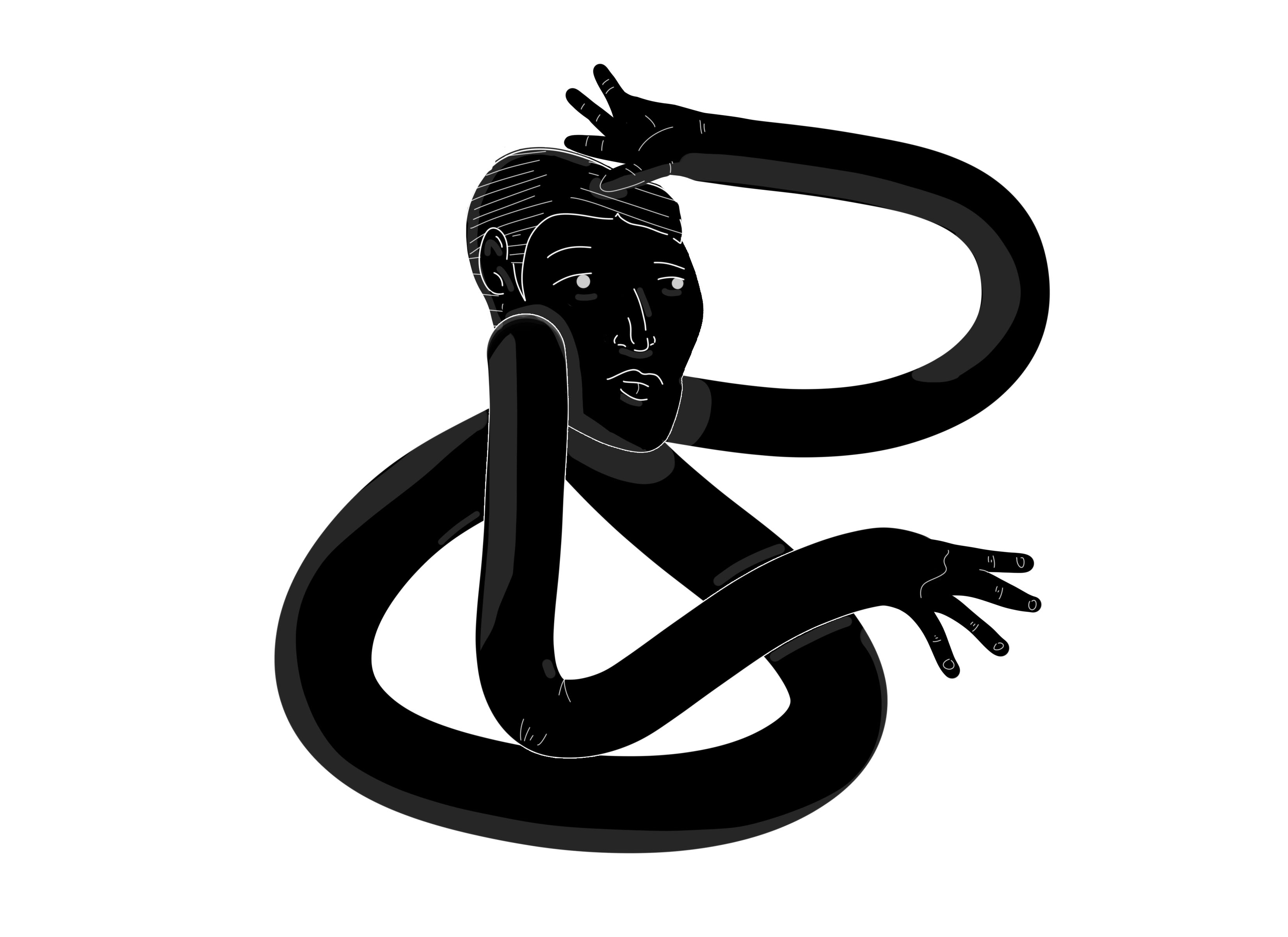
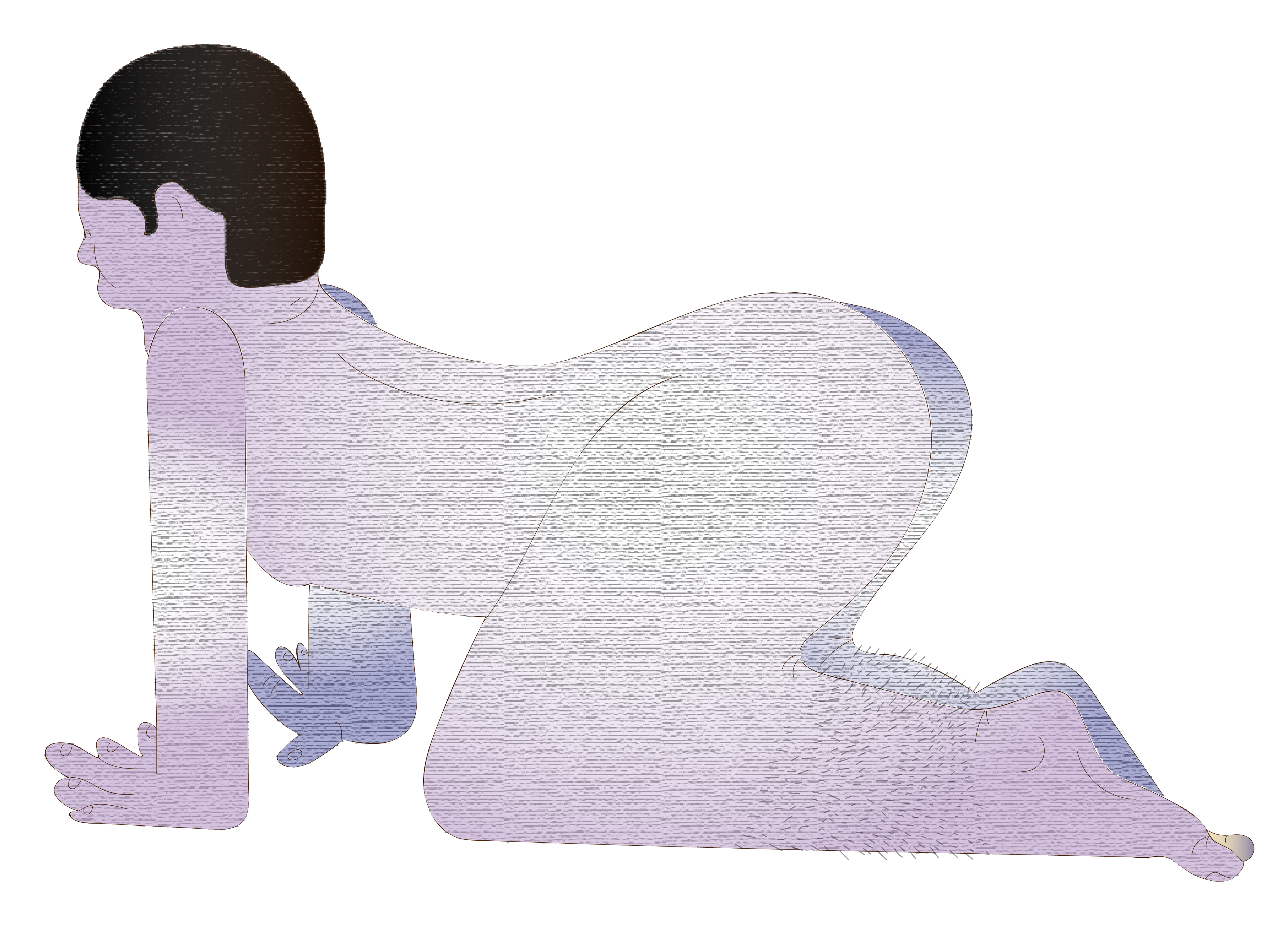
Art 10F: 4D Foundation
- Kristen Gillette
Sunny Rolfs:
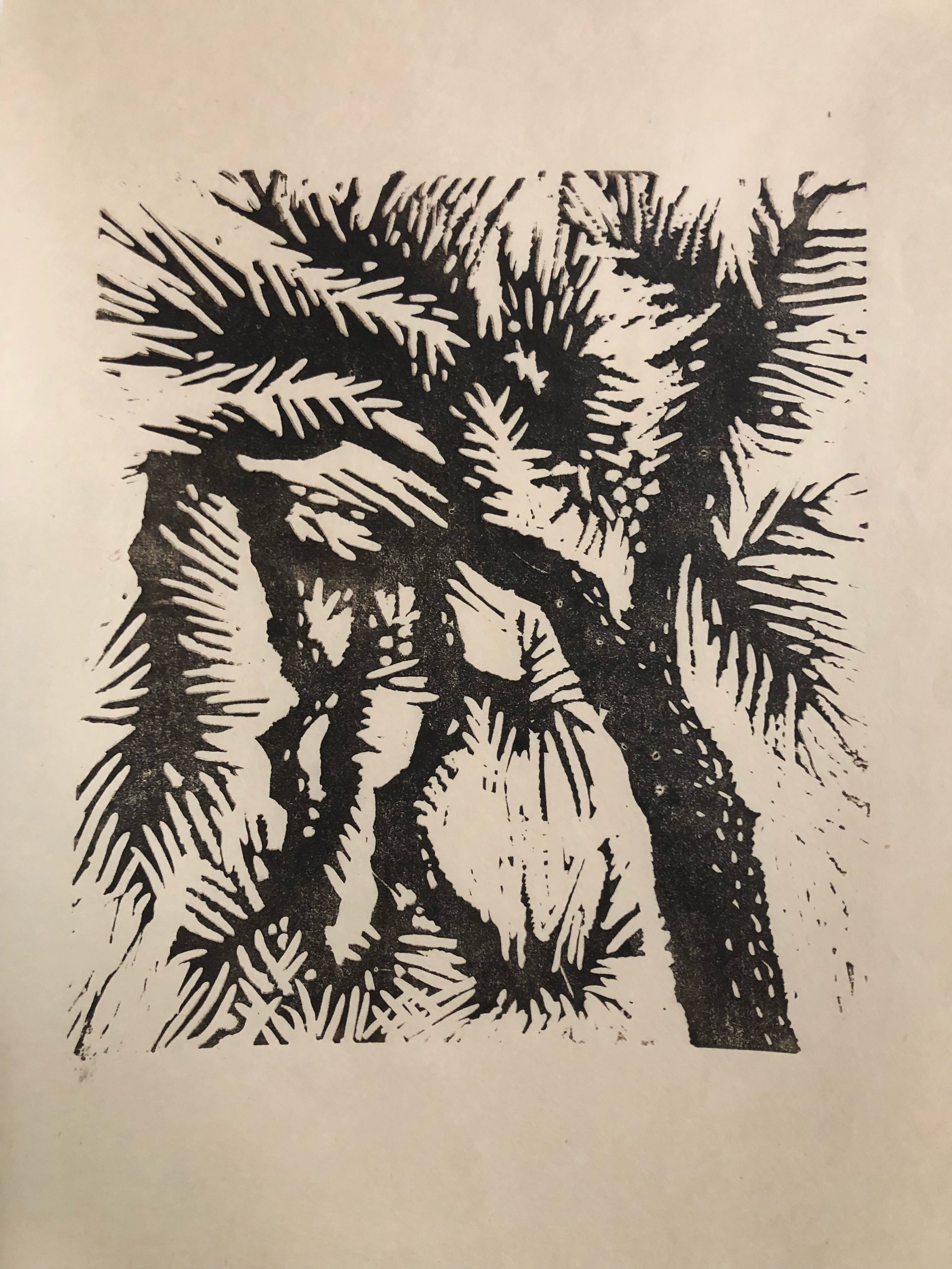
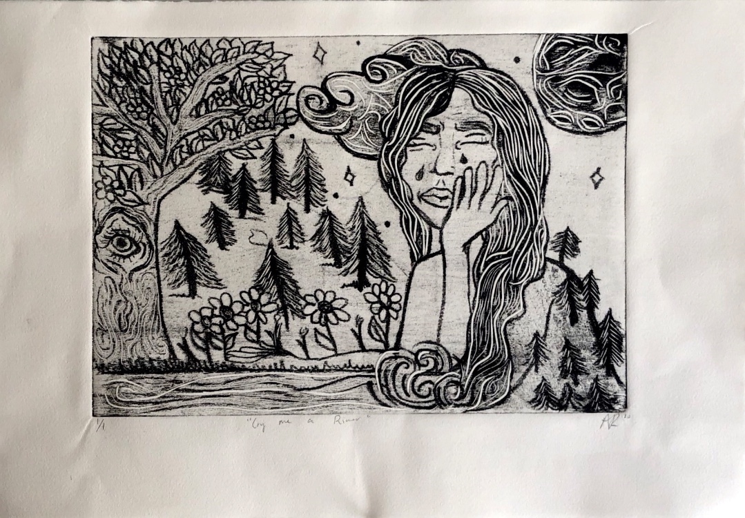
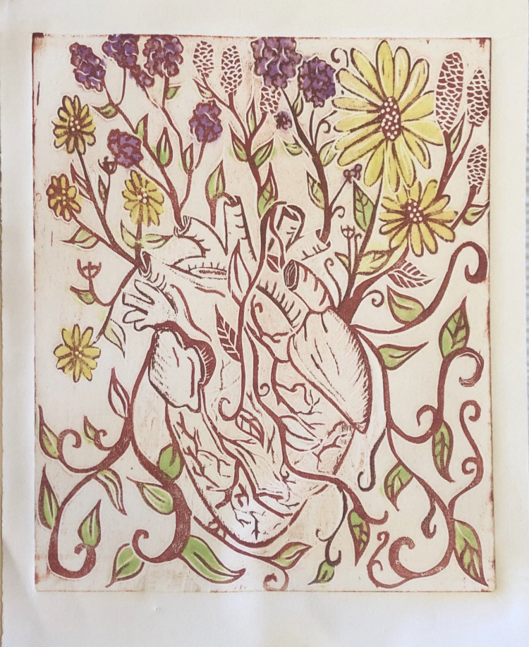
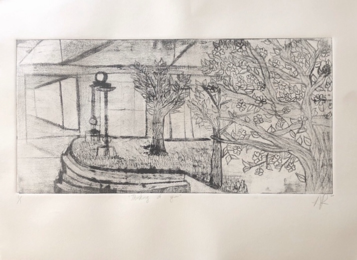
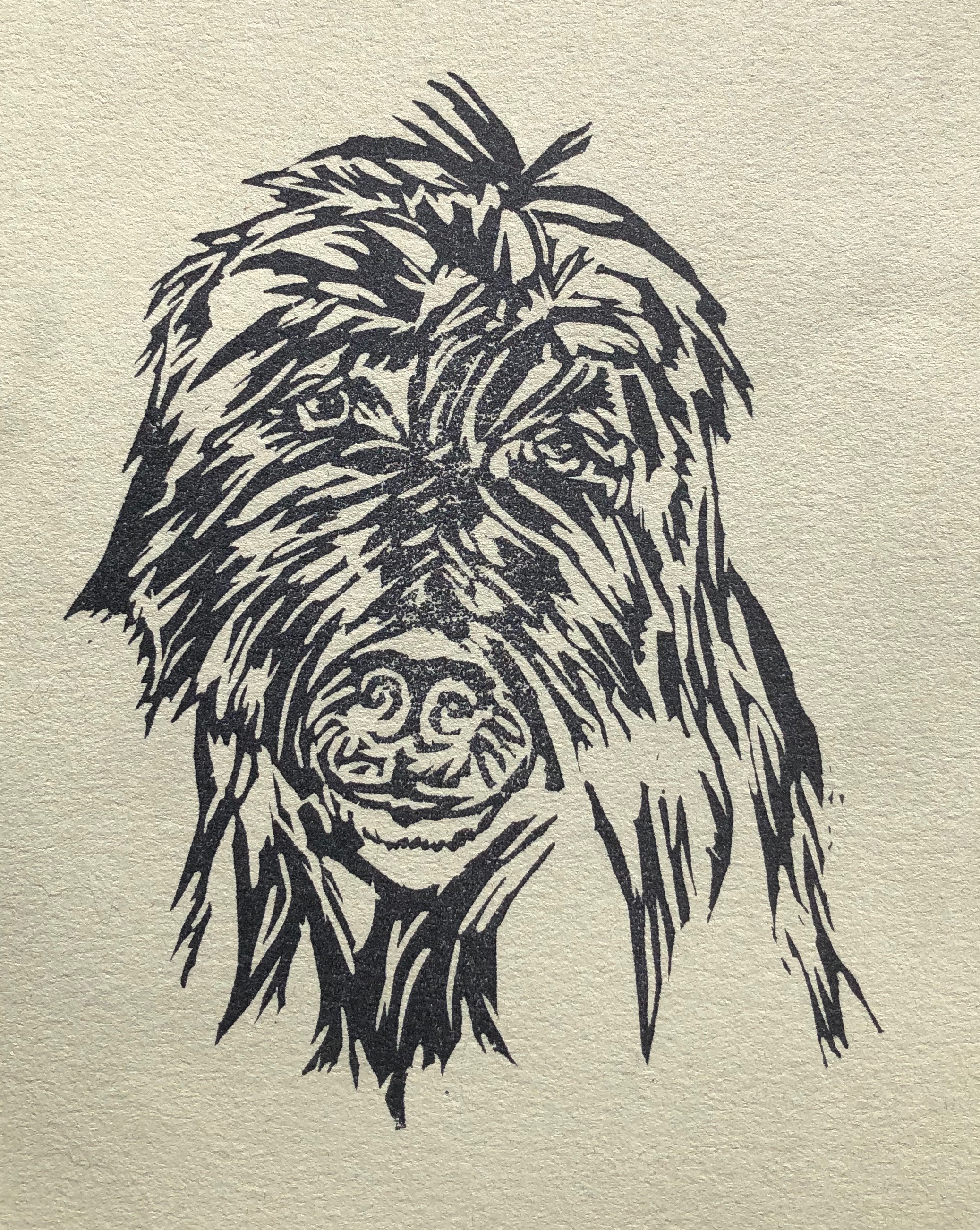
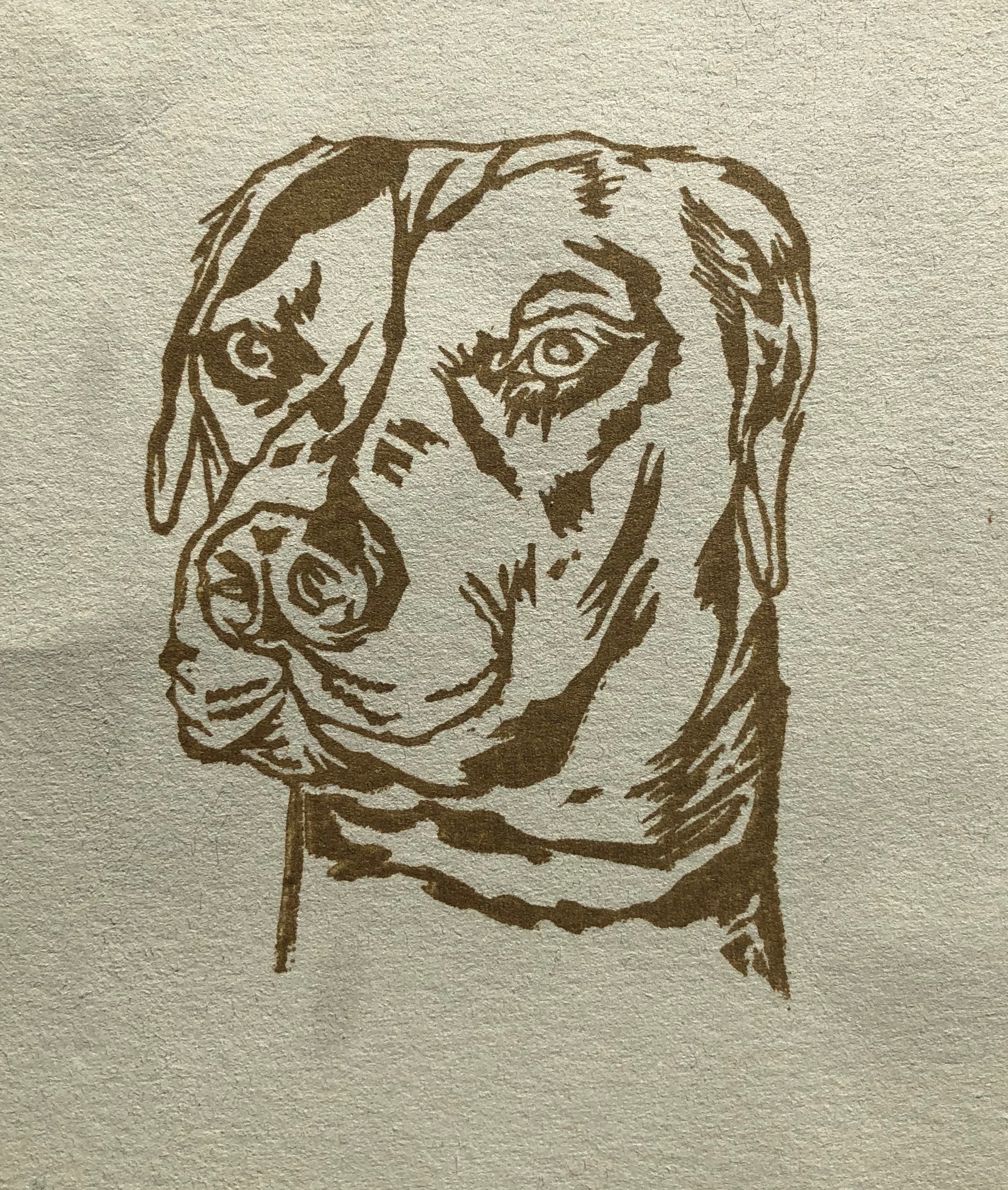
Art 20G: Introduction to Print Media and Drawing
- Enrique Leal
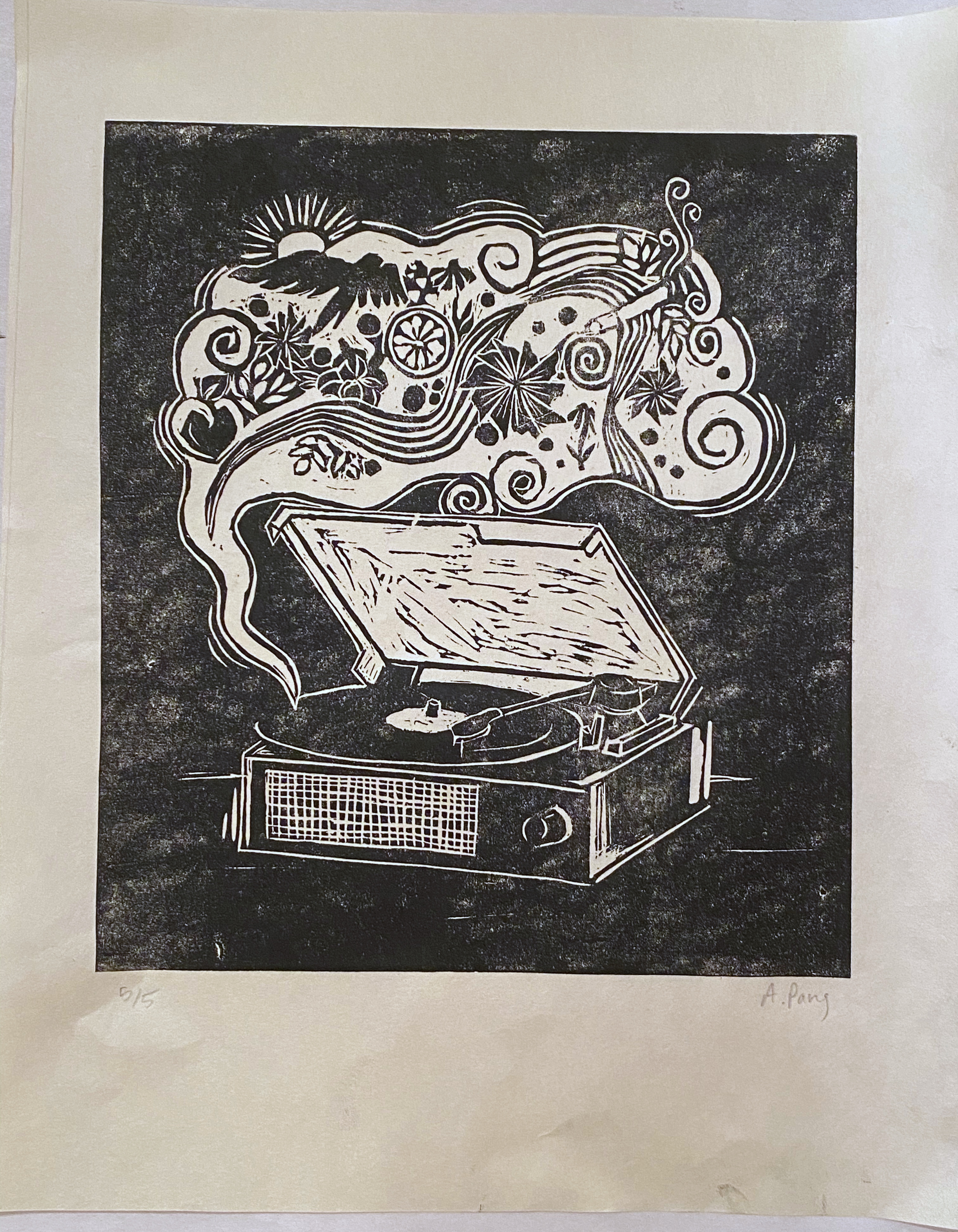
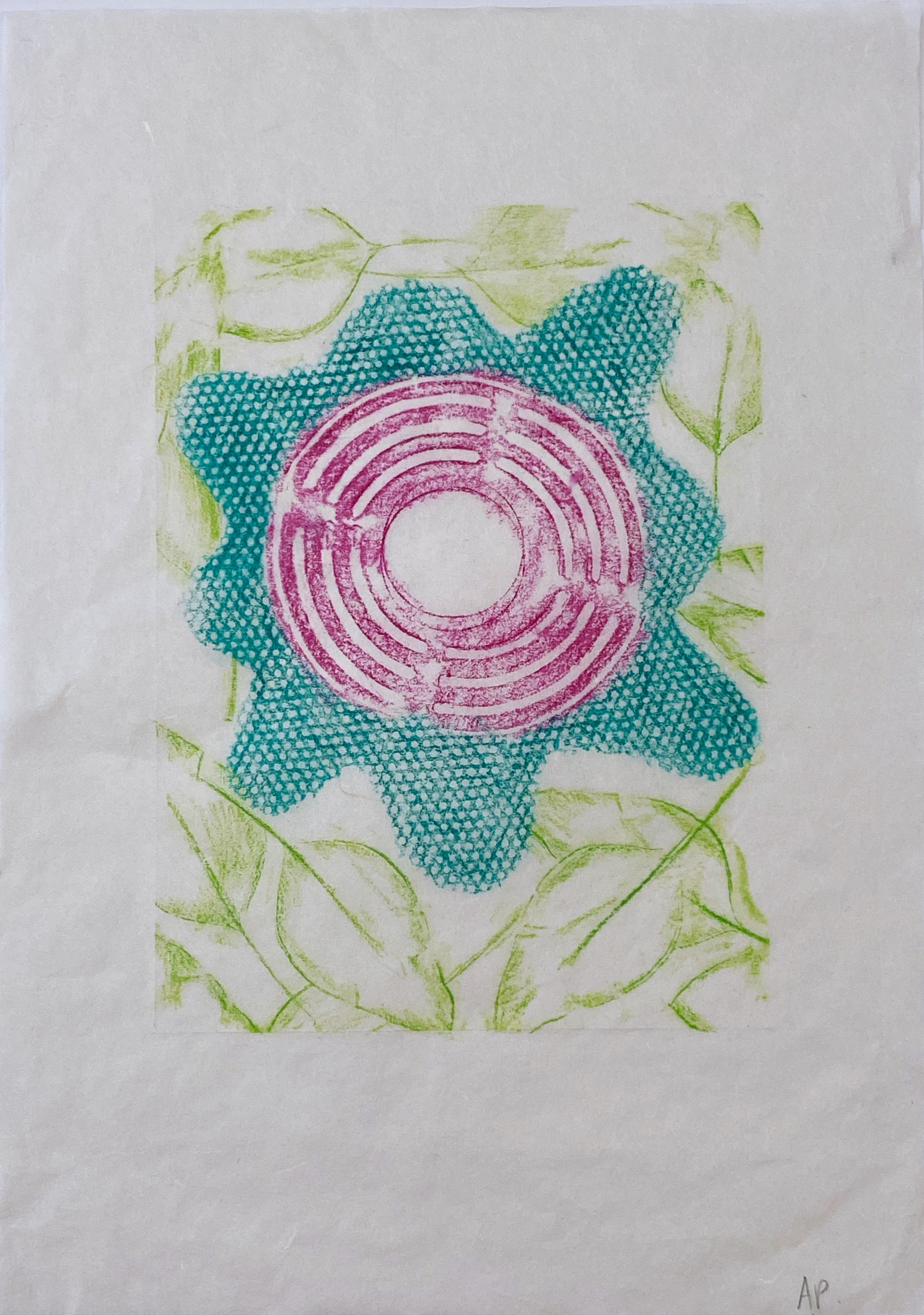
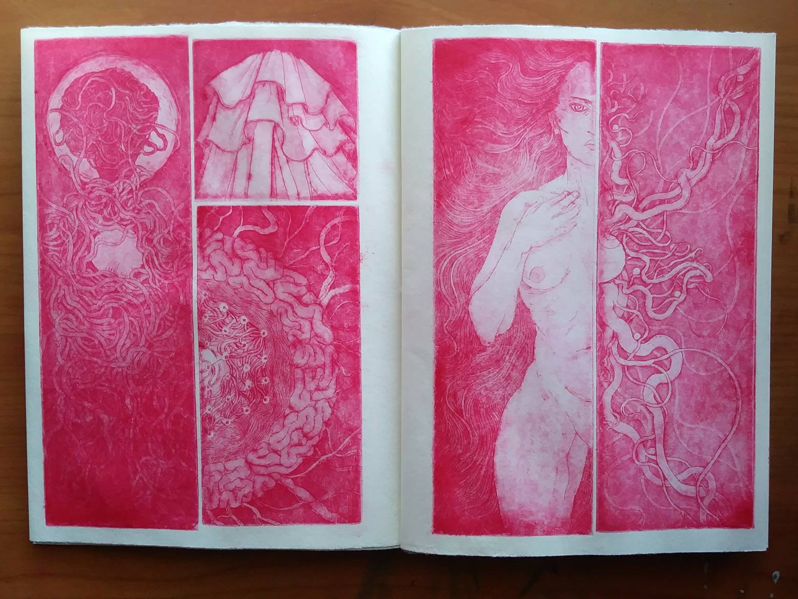
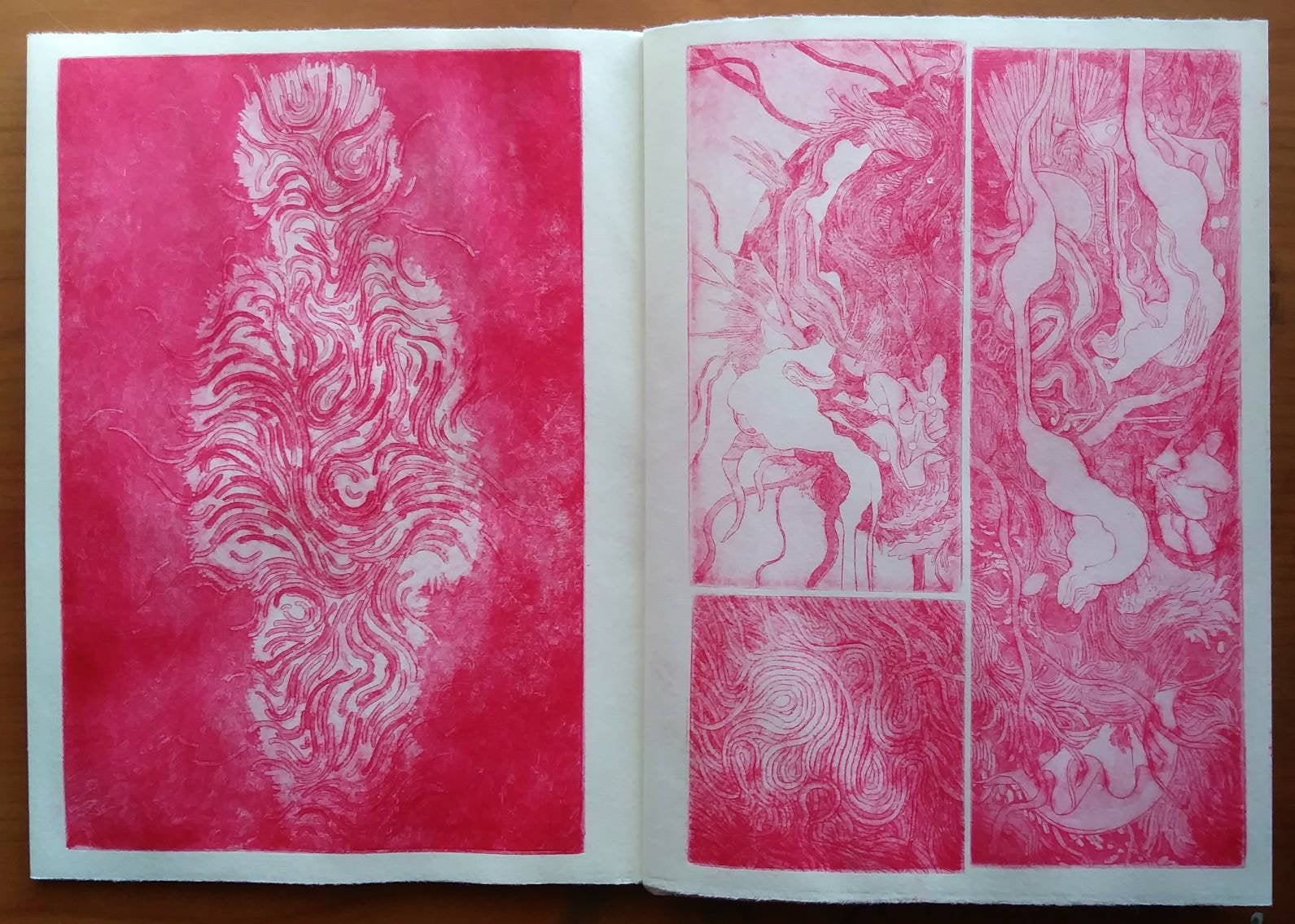
Anita Pang:
Ava Shields:

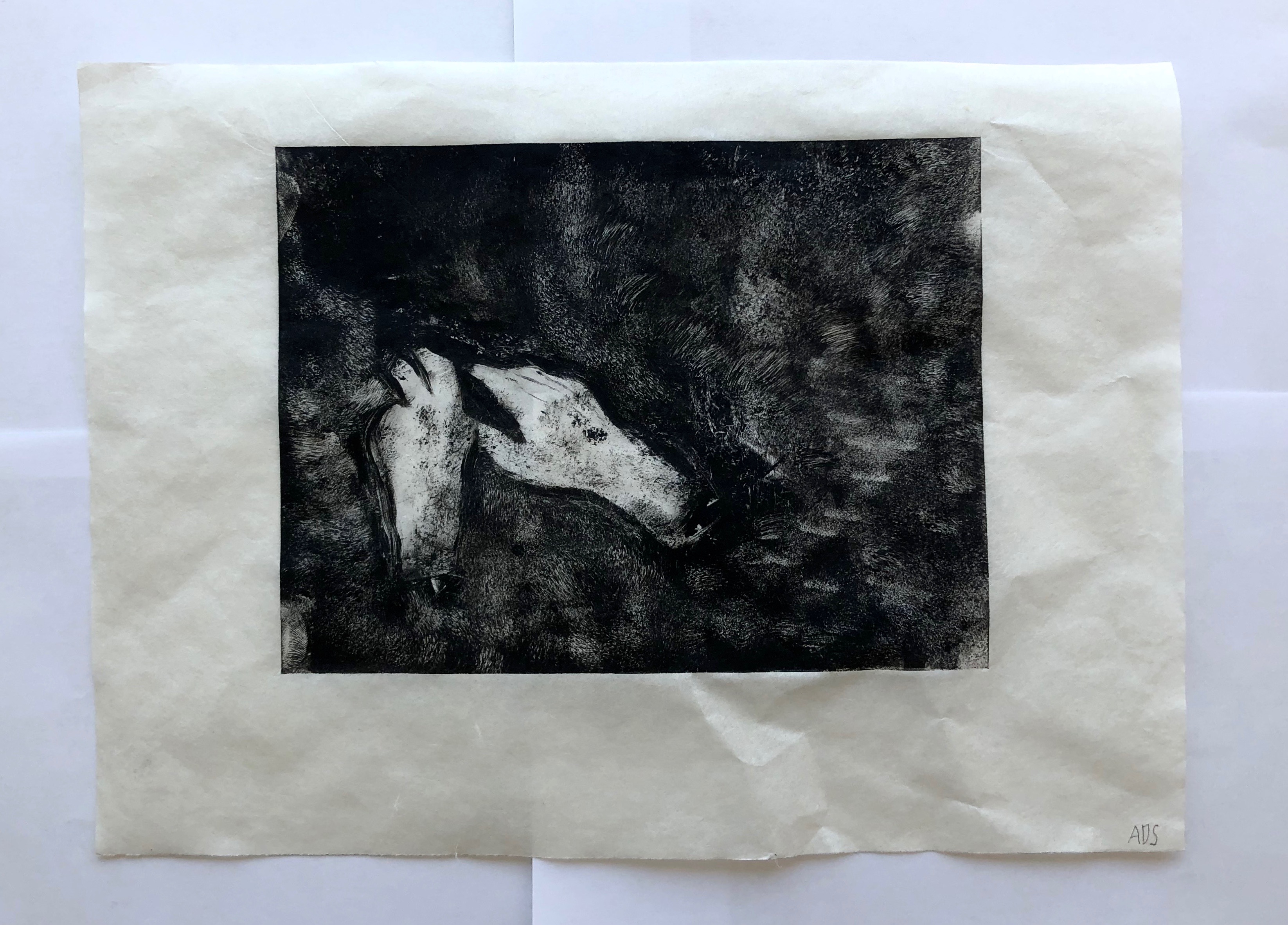
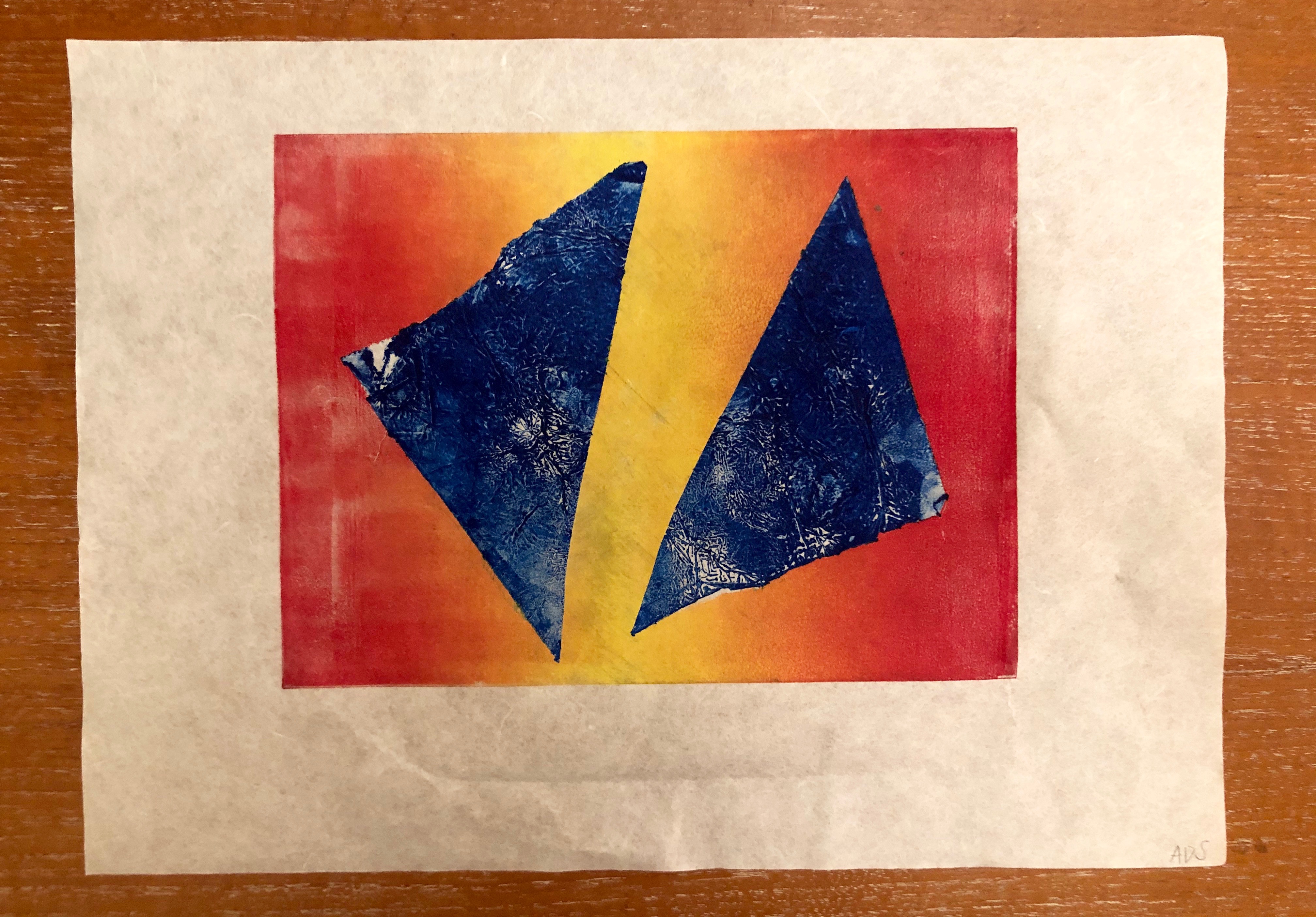
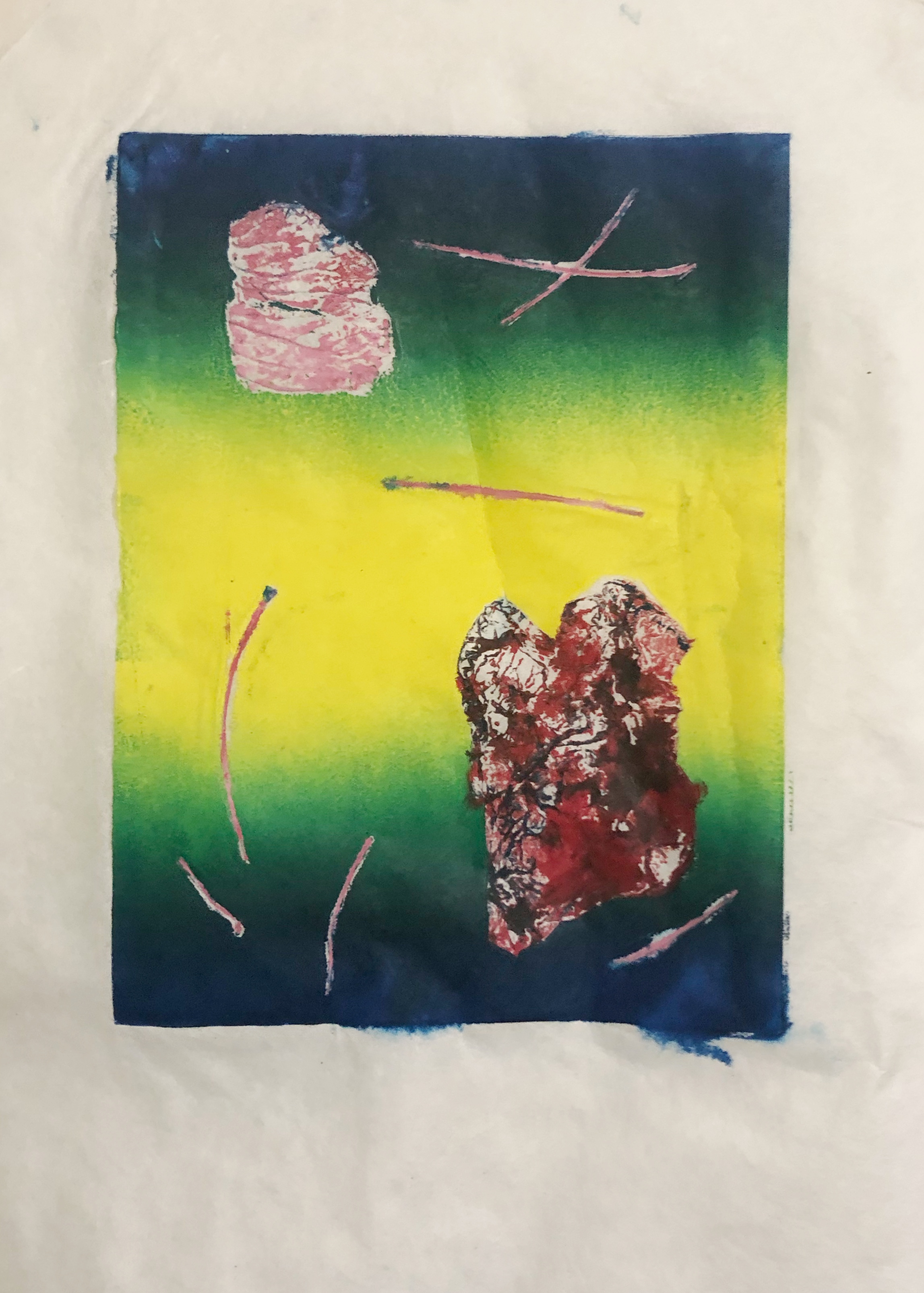
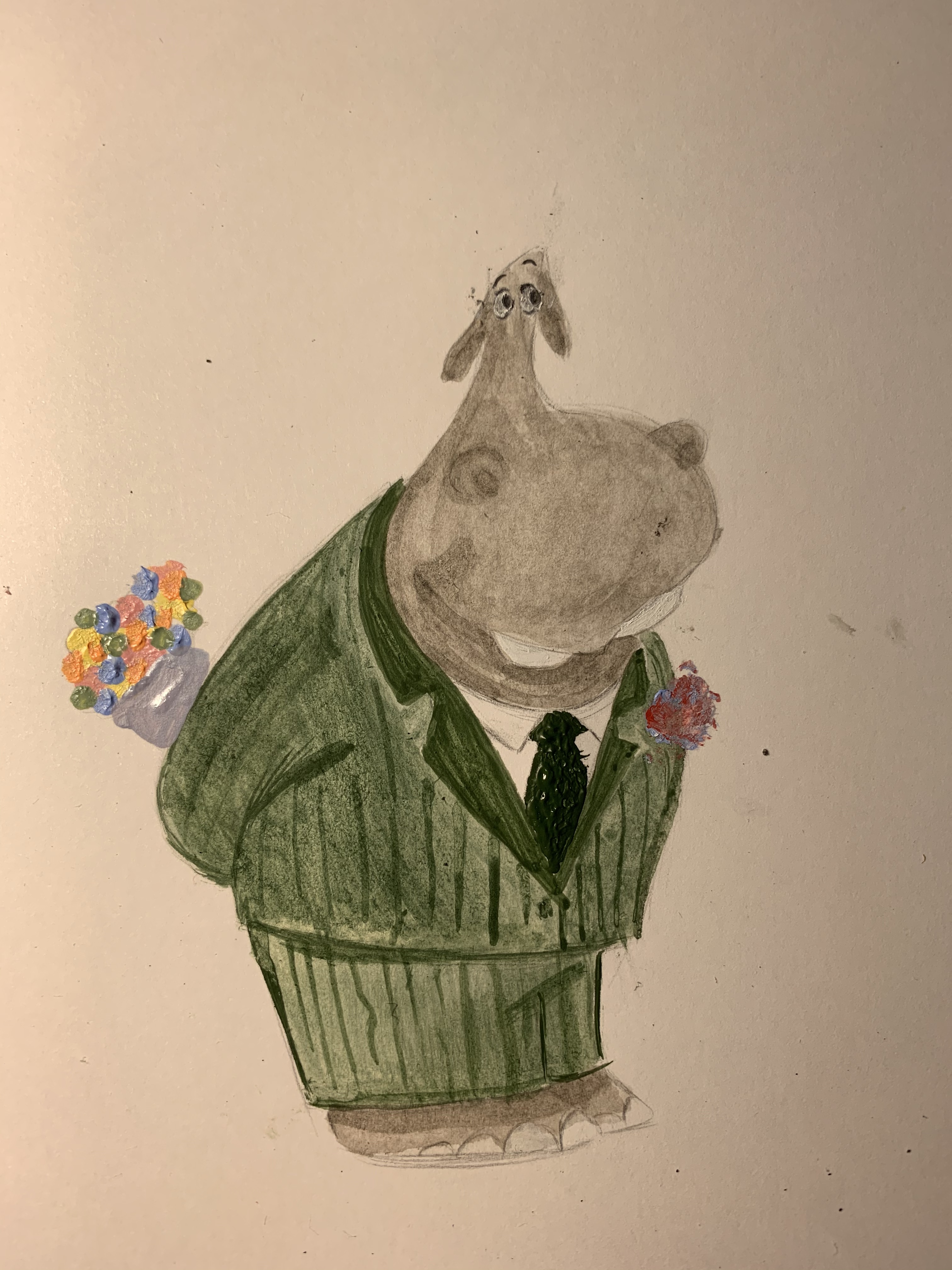
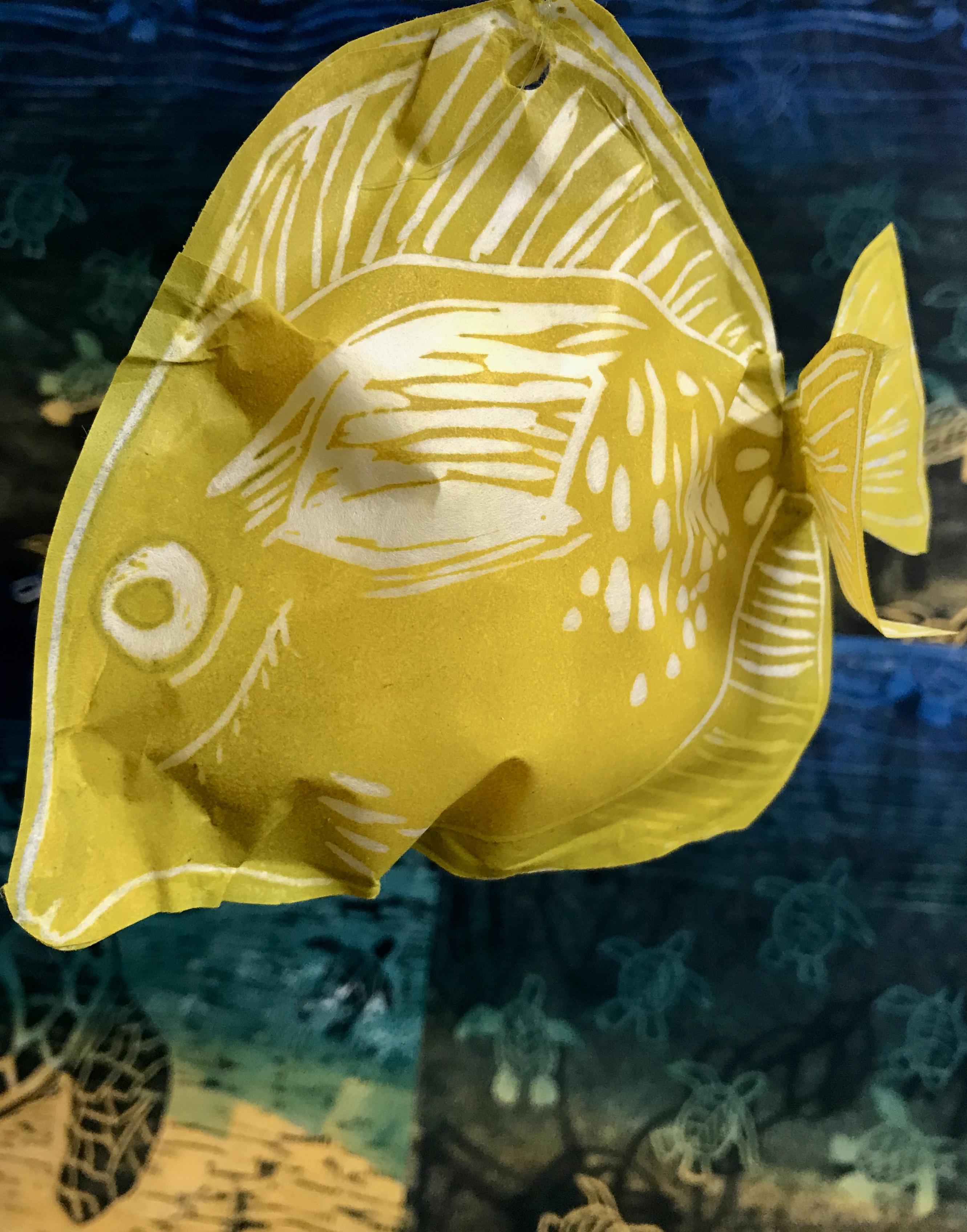
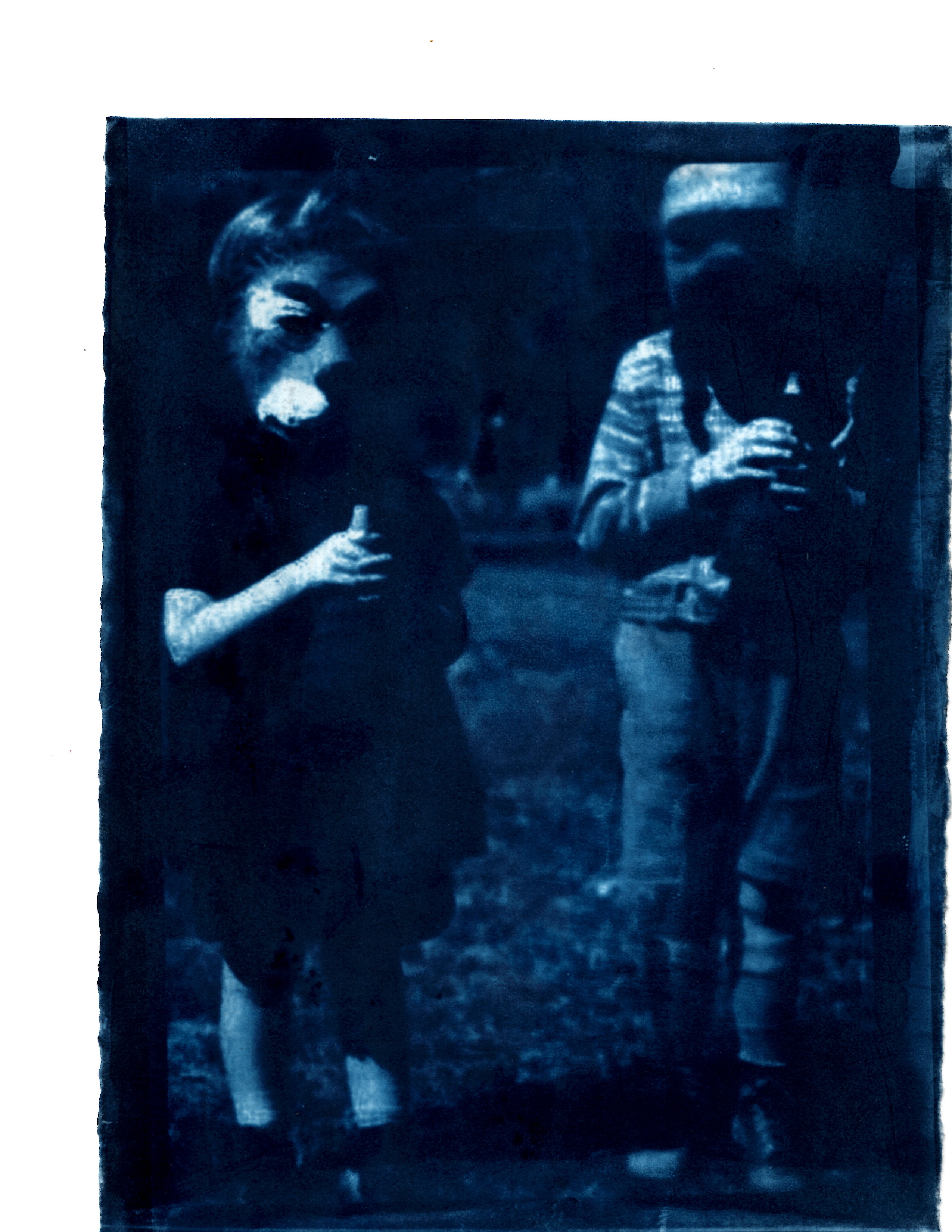
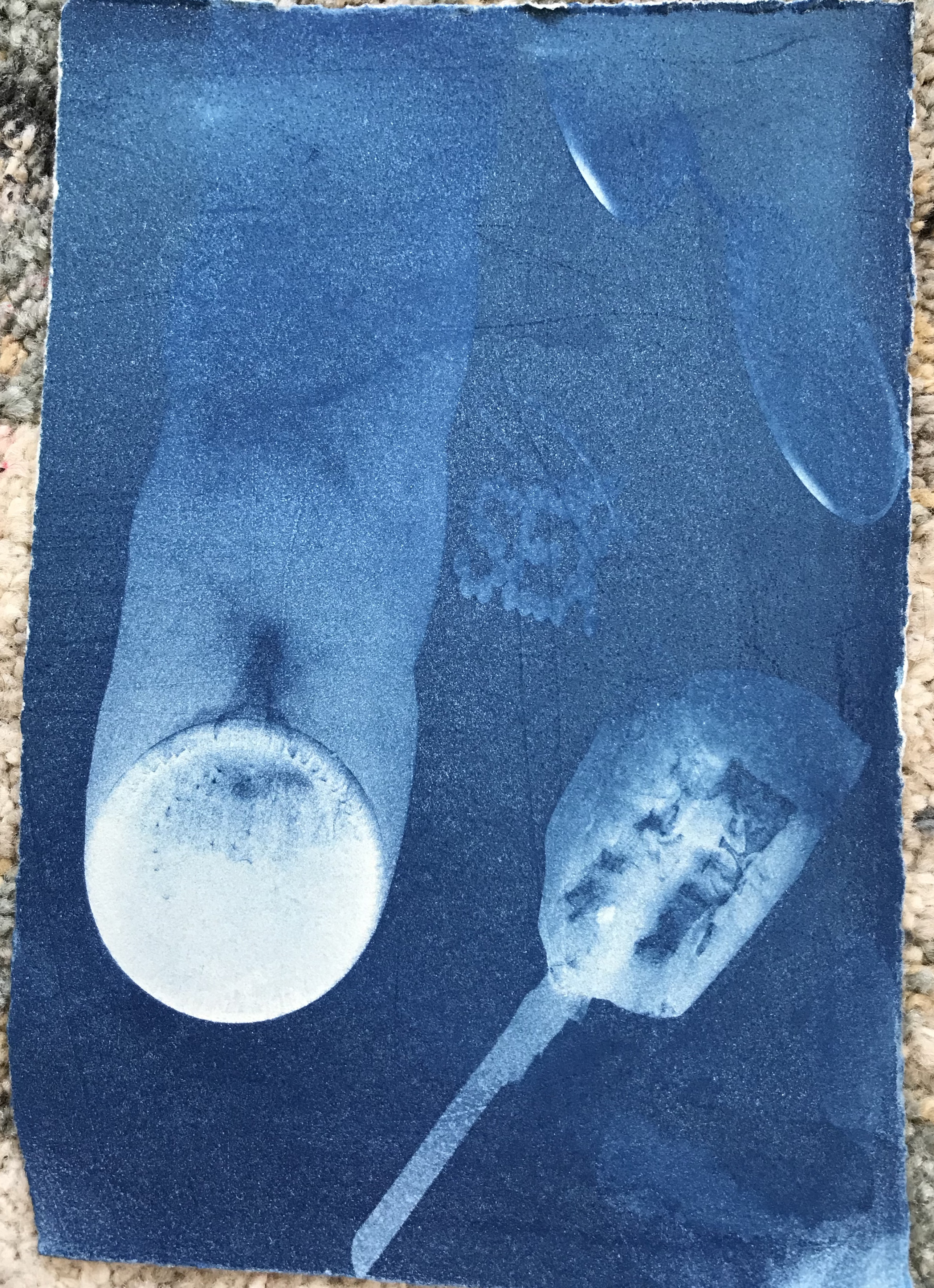
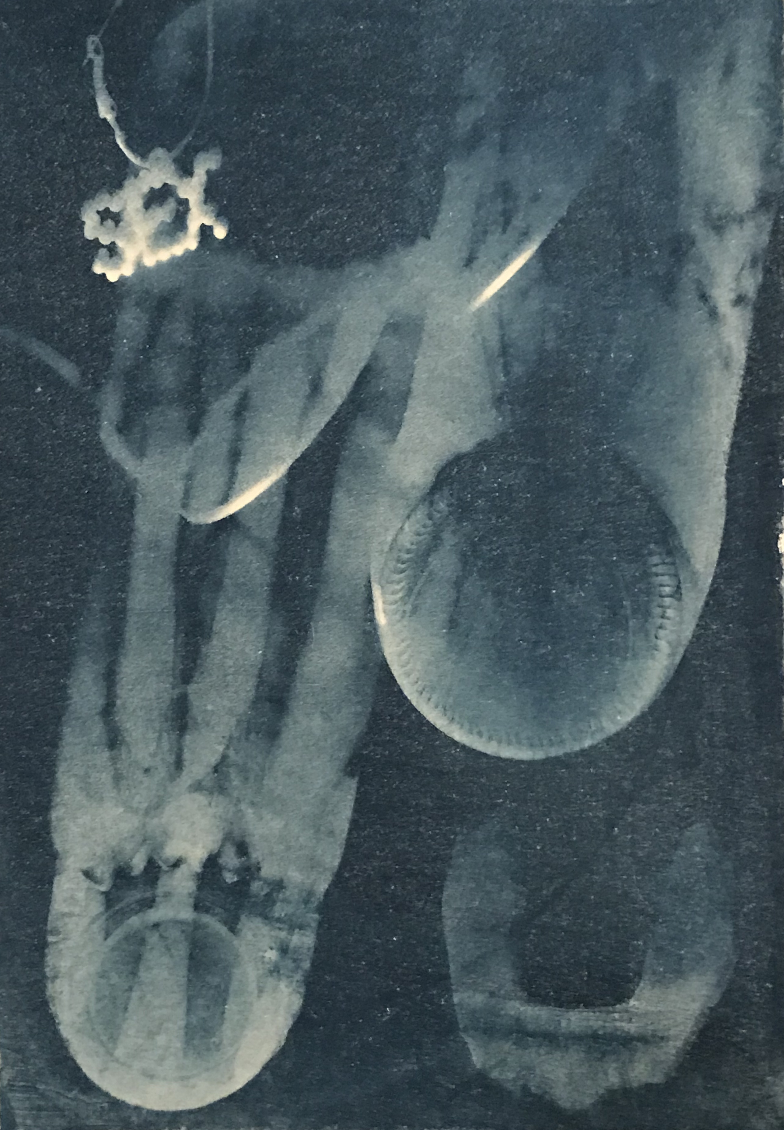
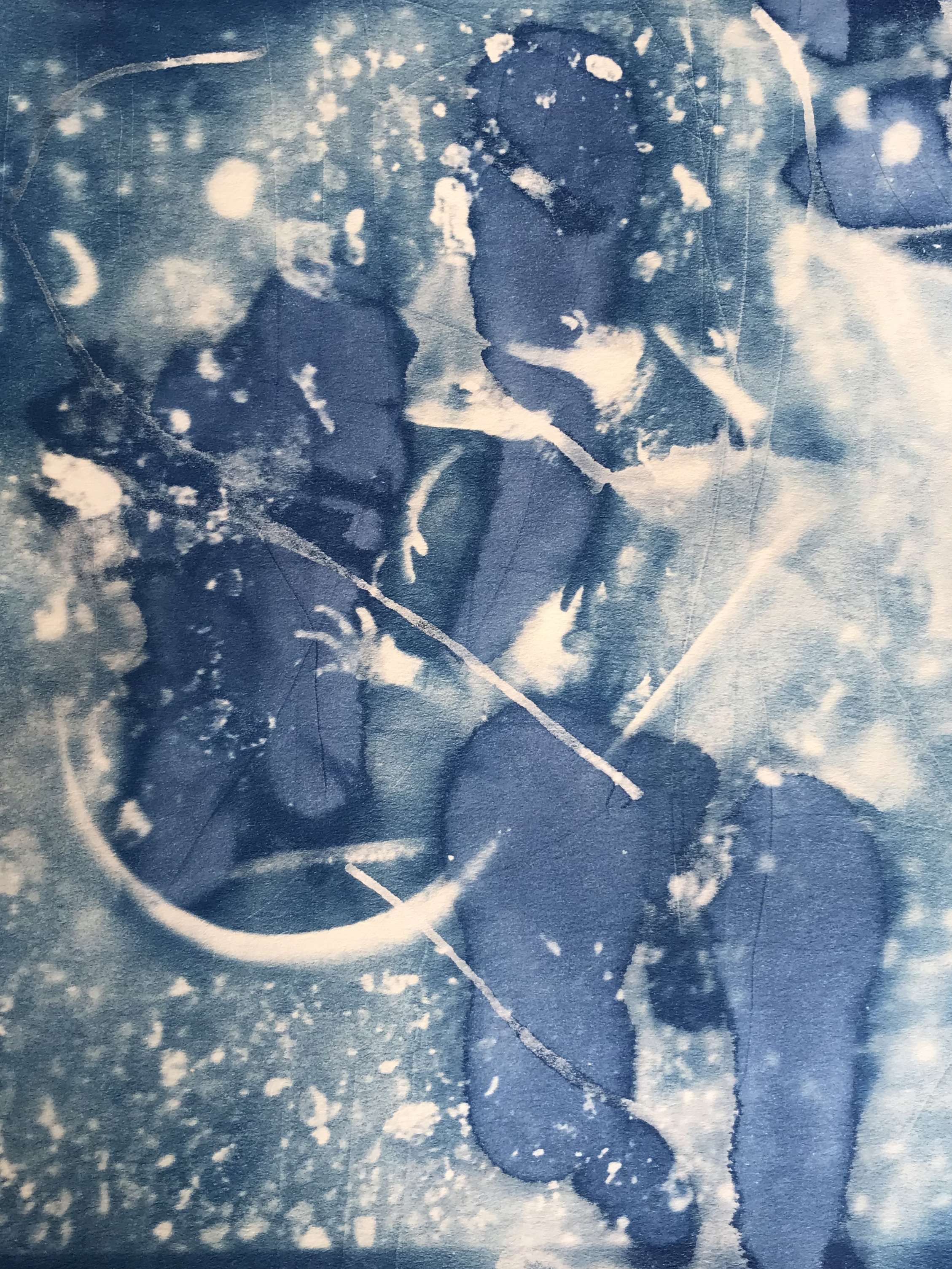
Connor Alexander:
“Night” linoleum relief print

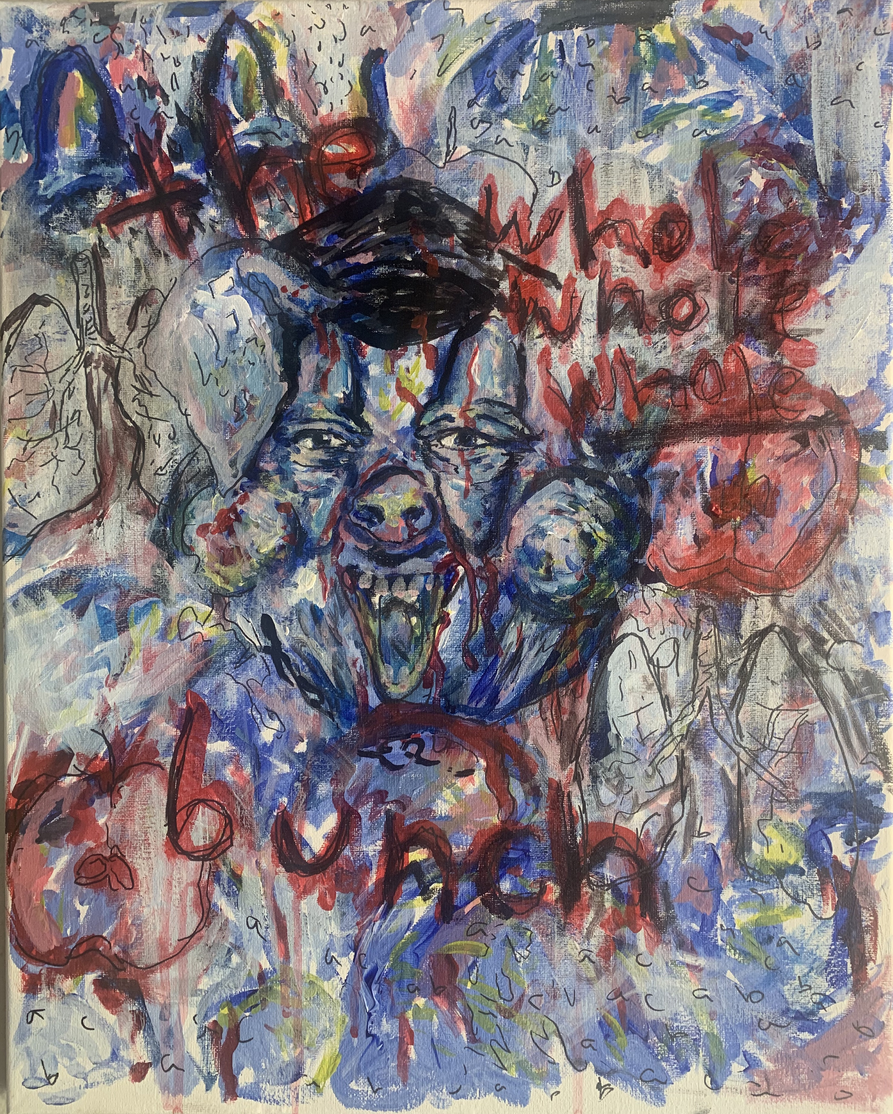
“Our Existence isn’t a Debate” 3 color reduction linoleum print
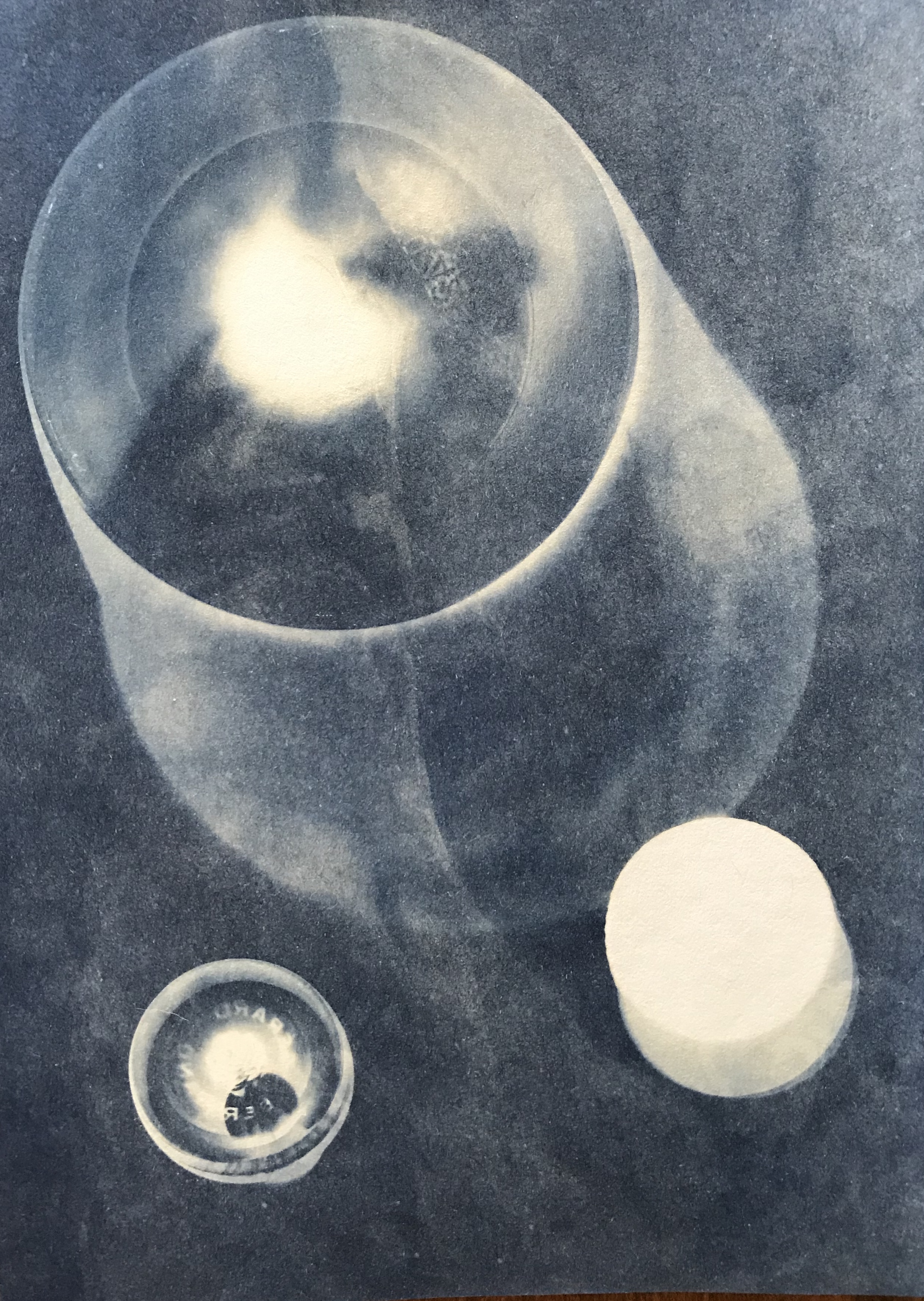
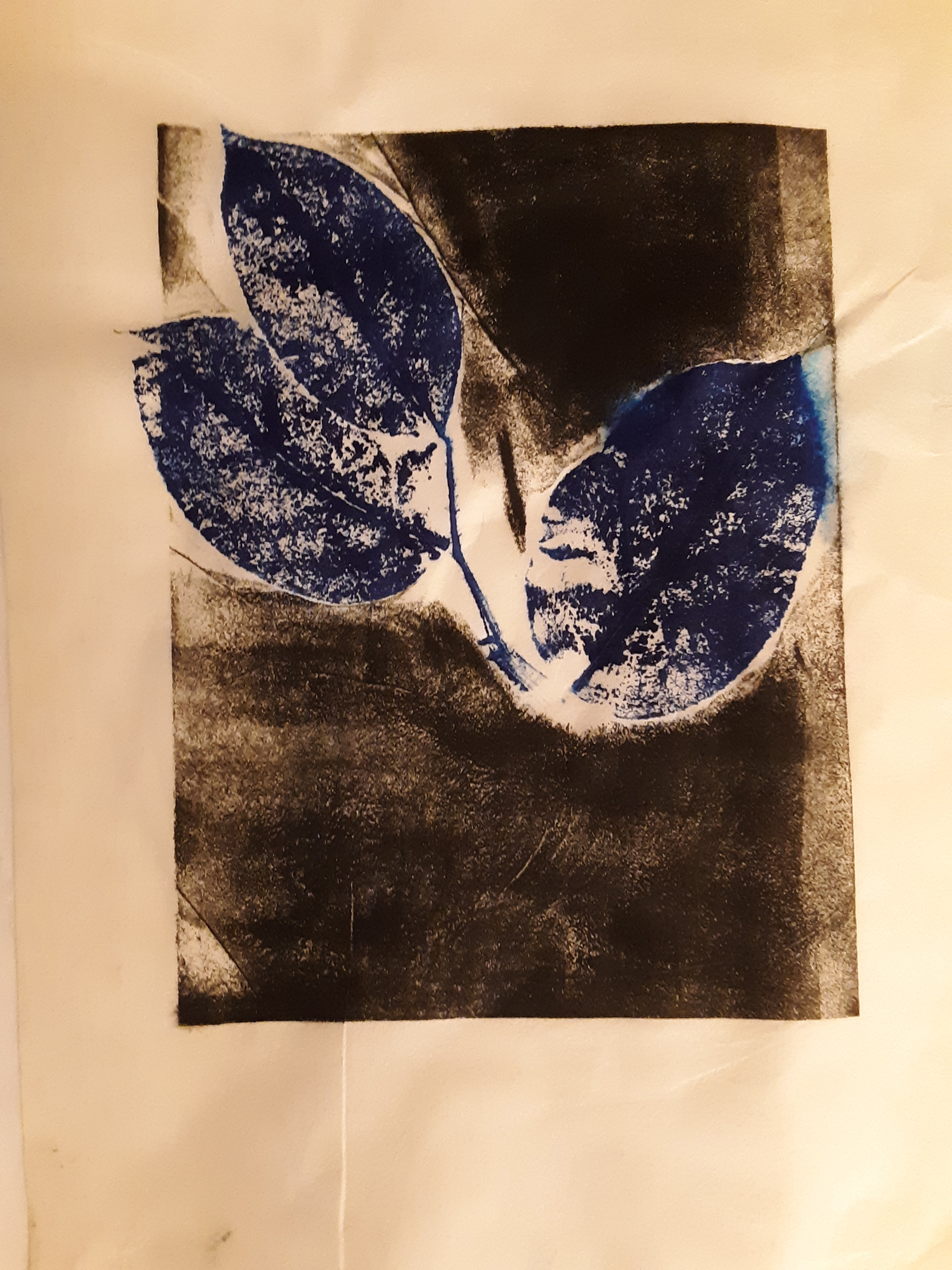
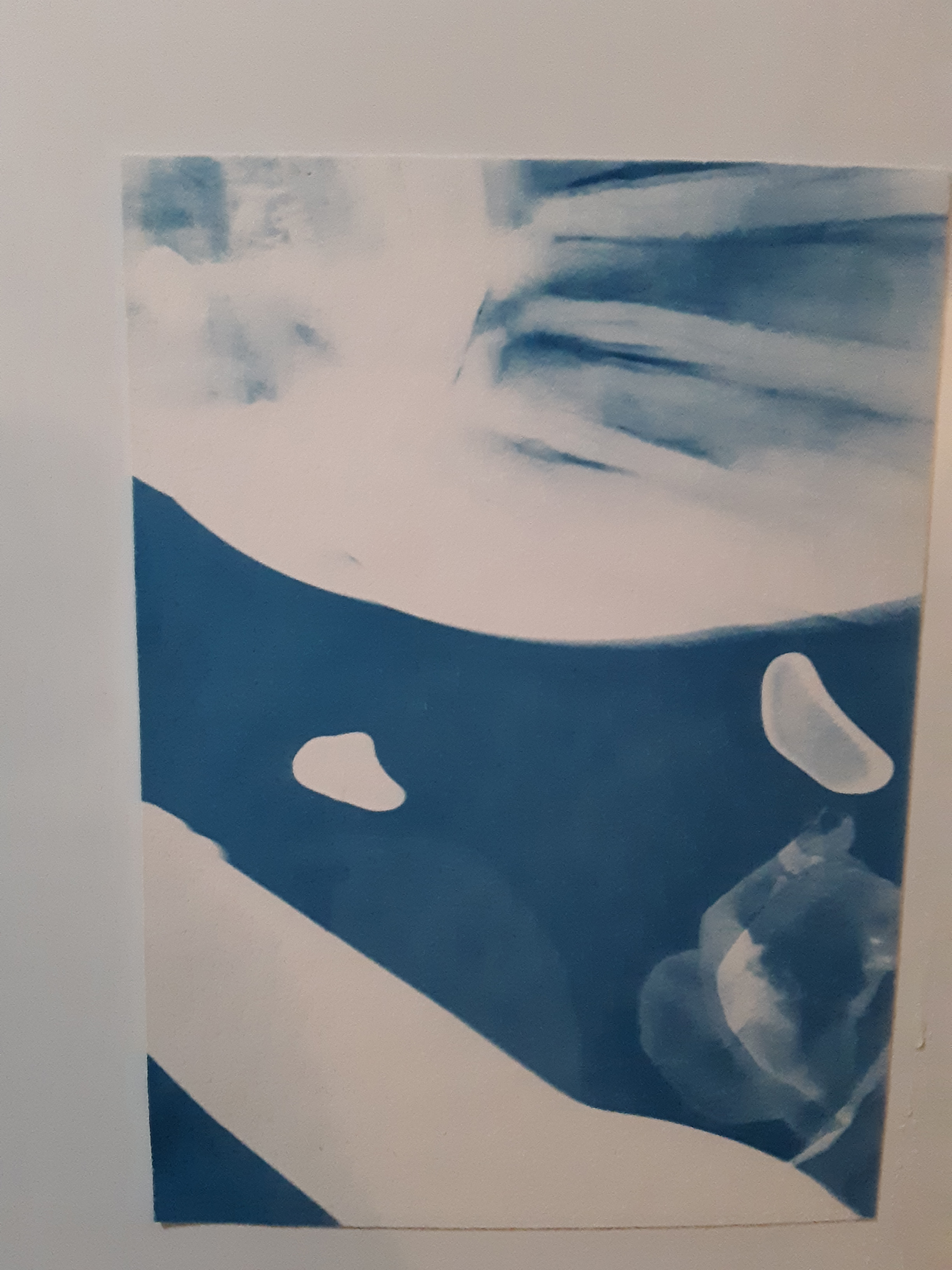
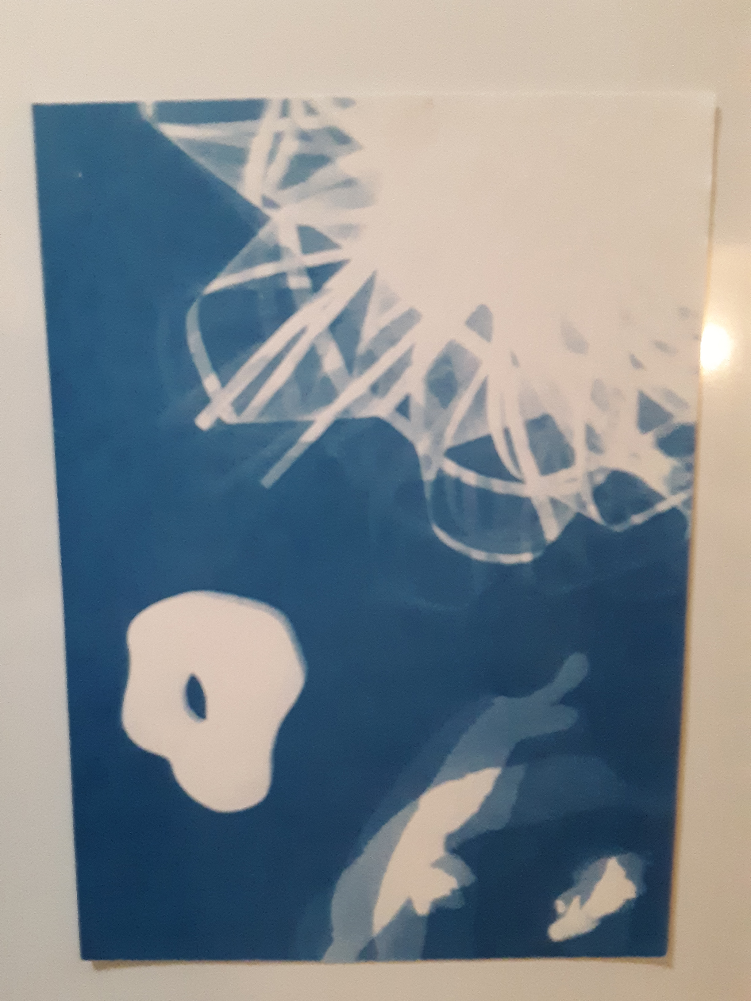
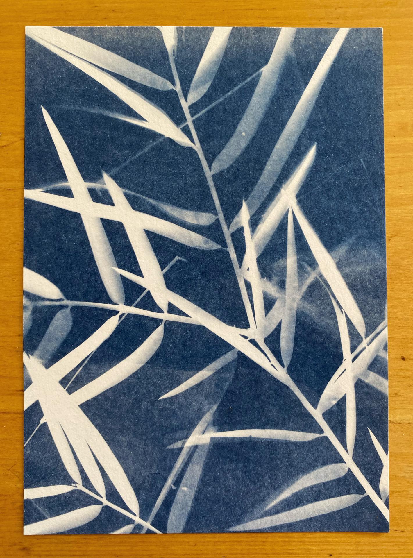
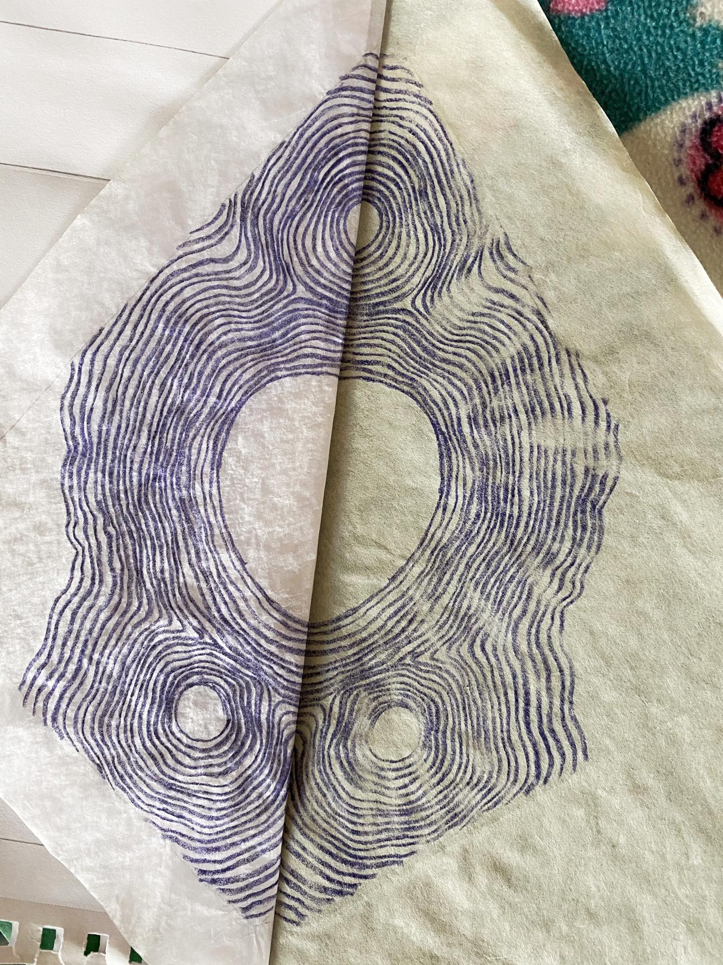
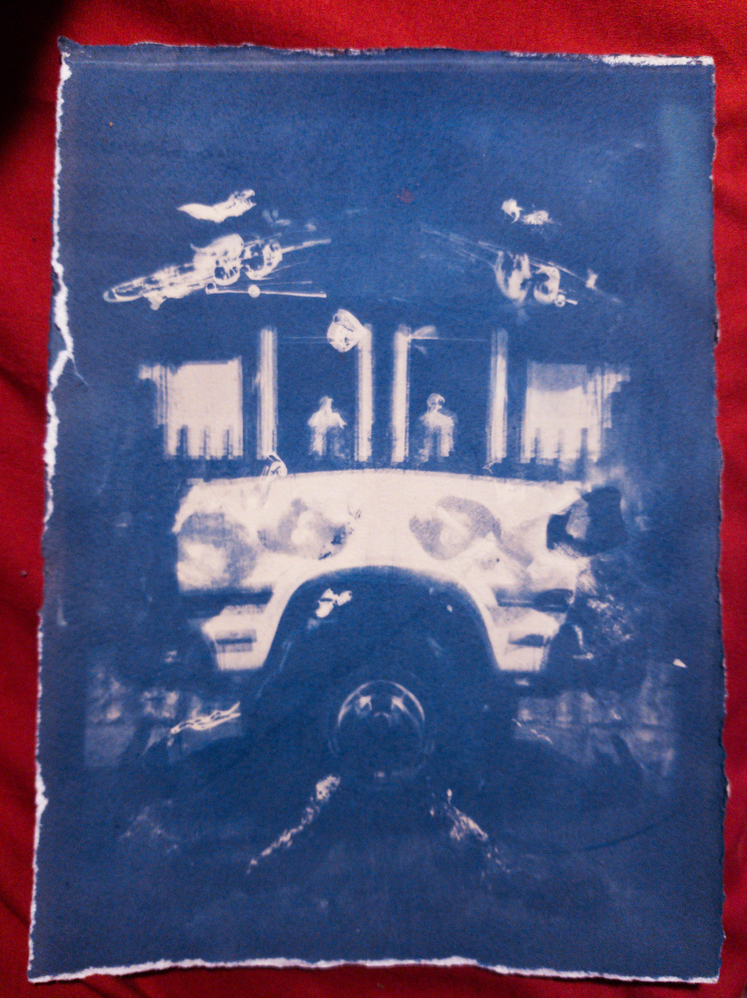
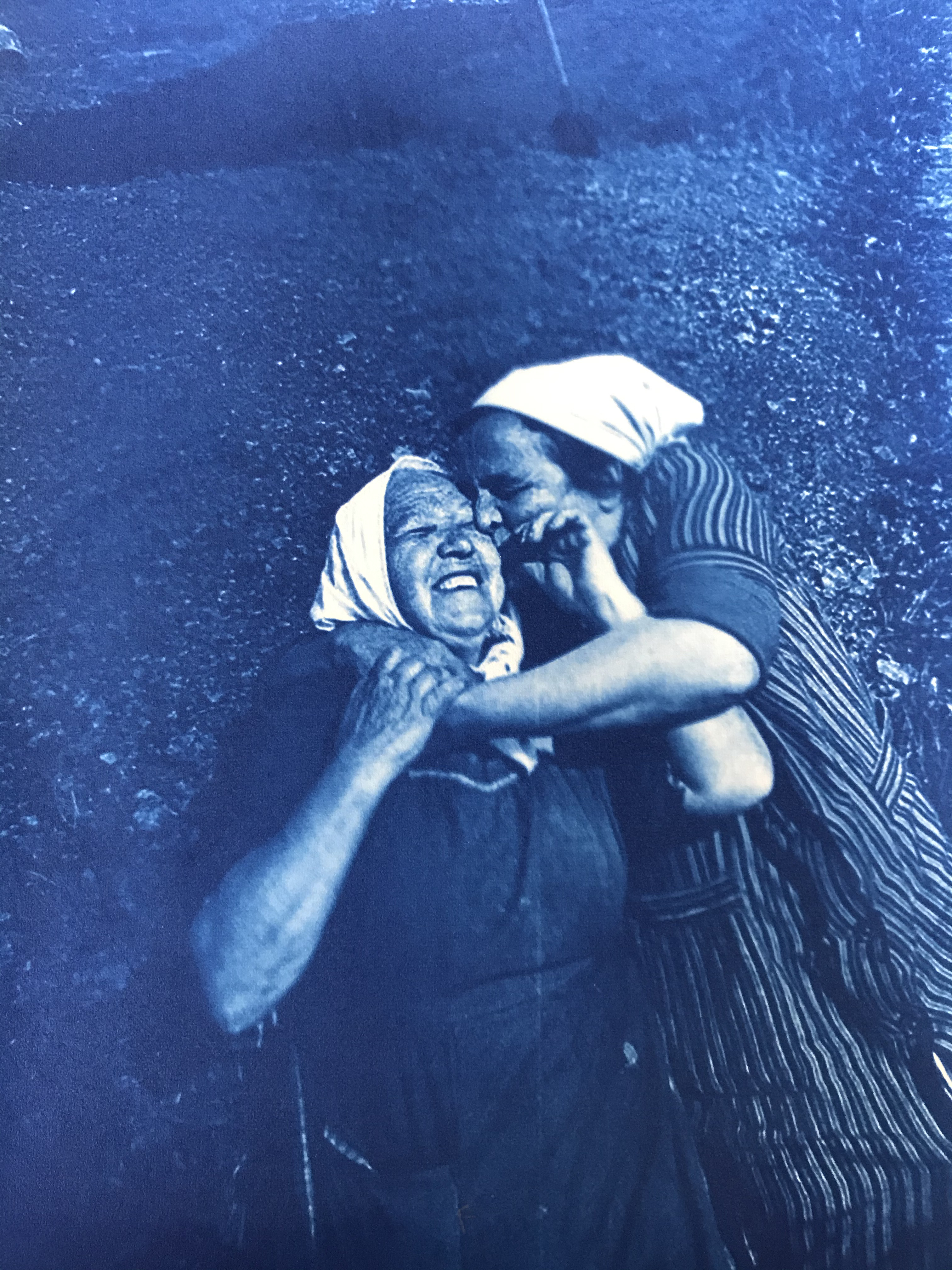
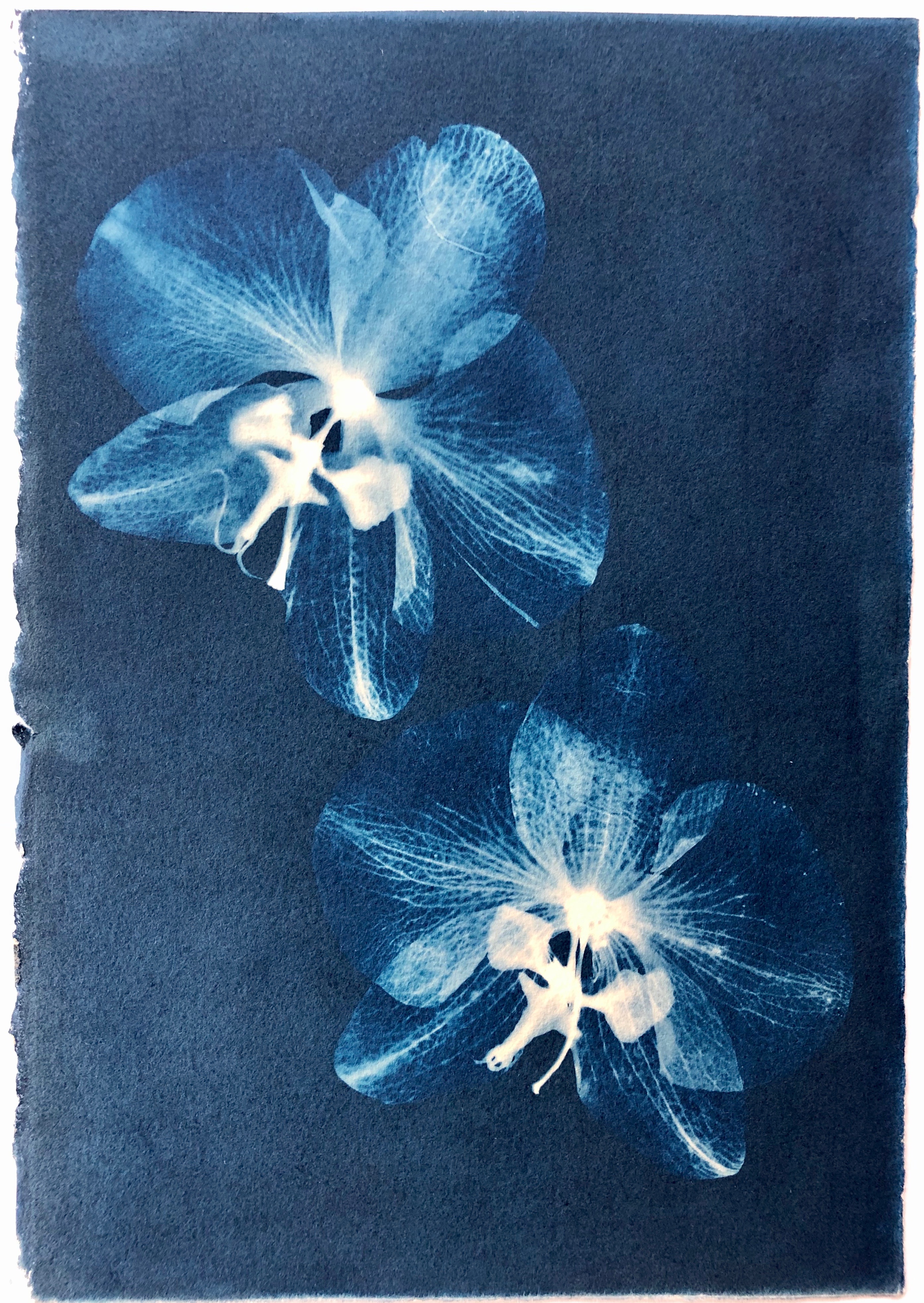
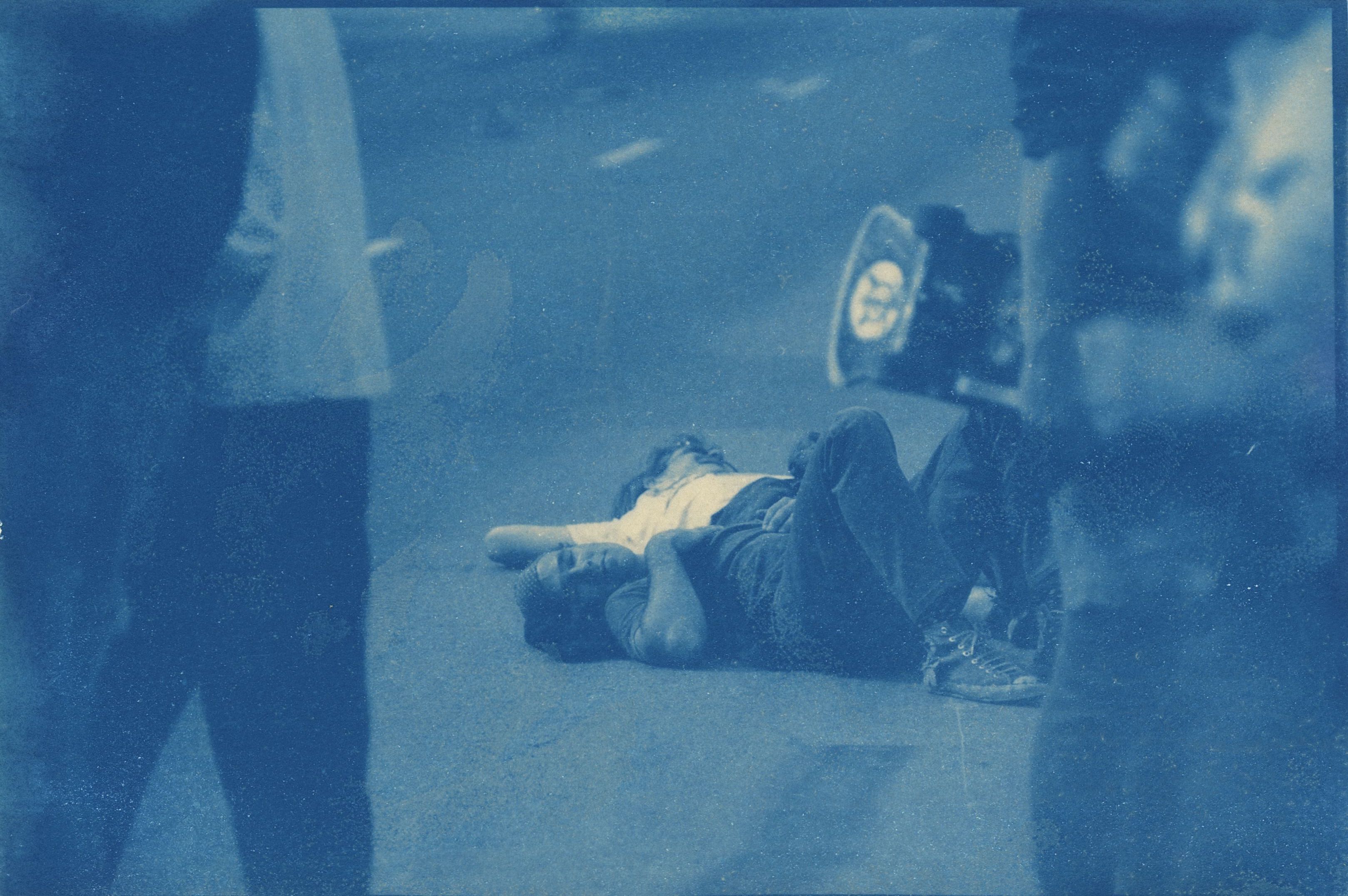
“Circles” cyanotype photogram
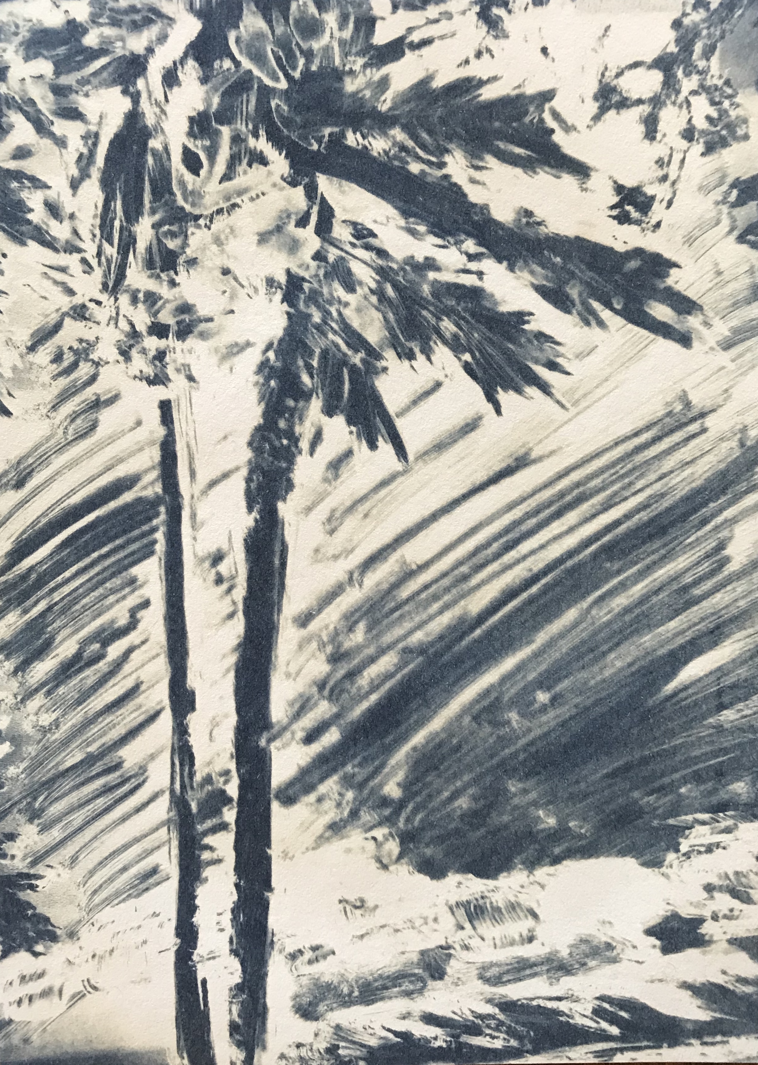
“Beach” cyanotype cliche verre
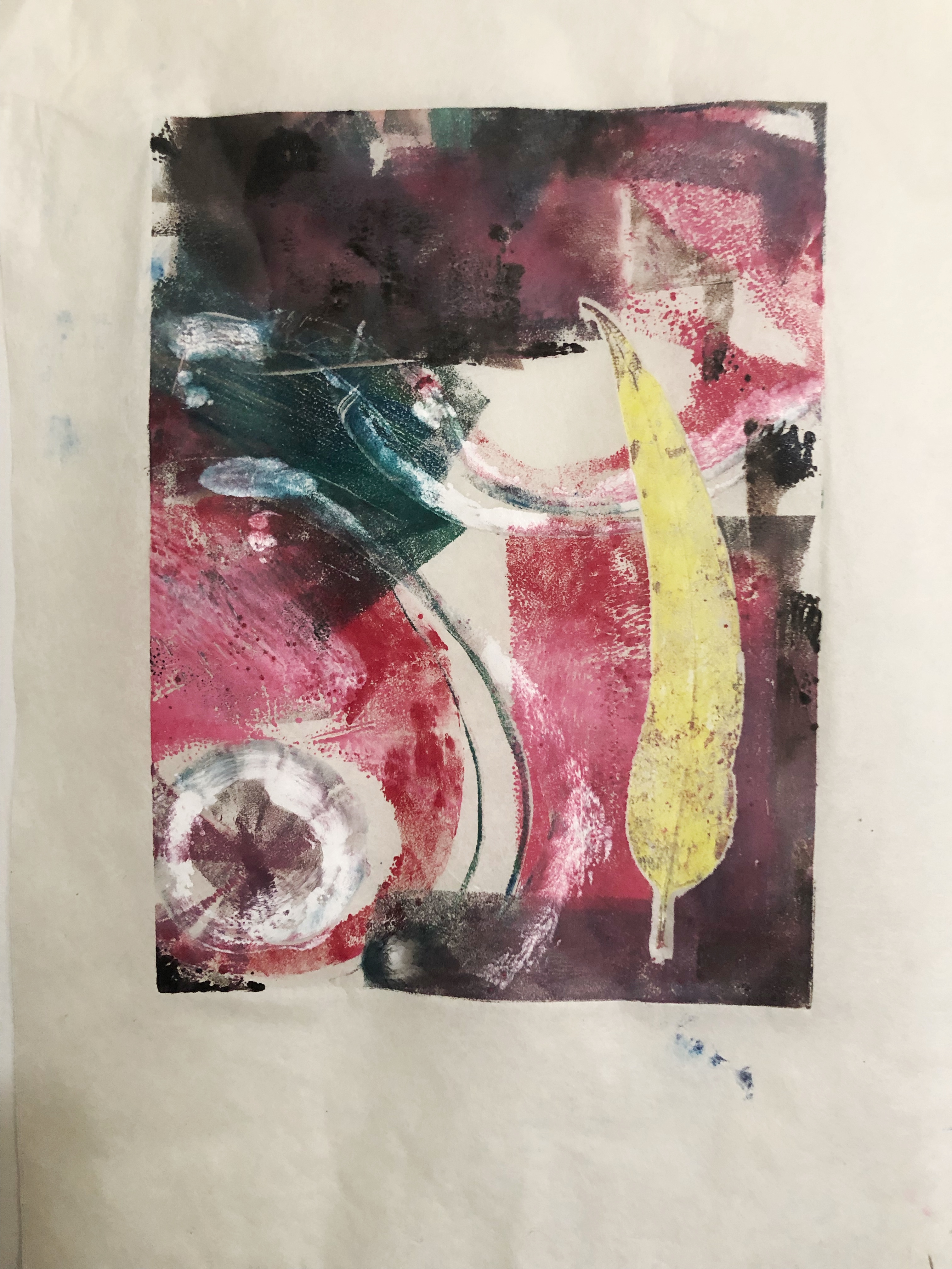
Elena Ibbetson:
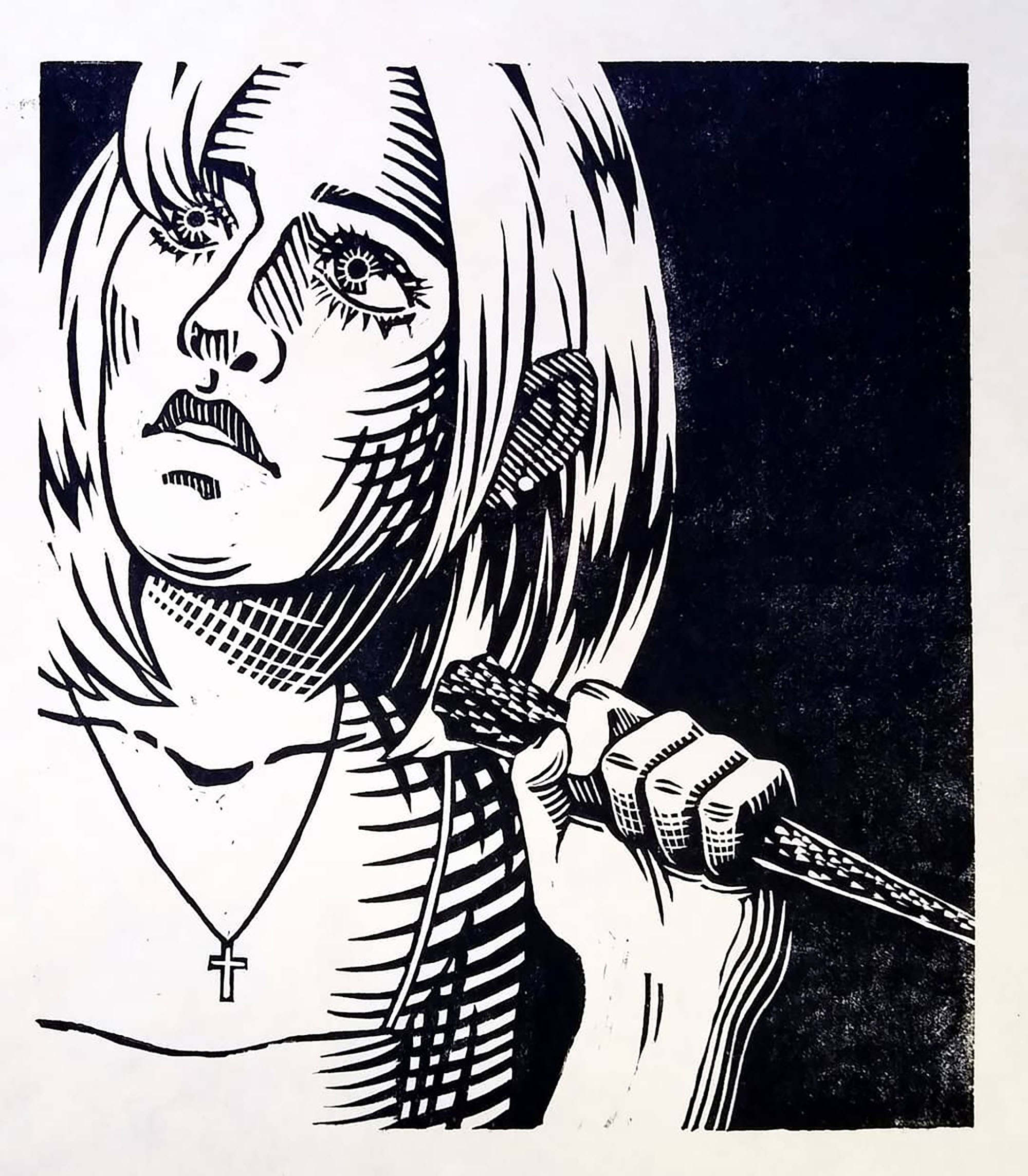

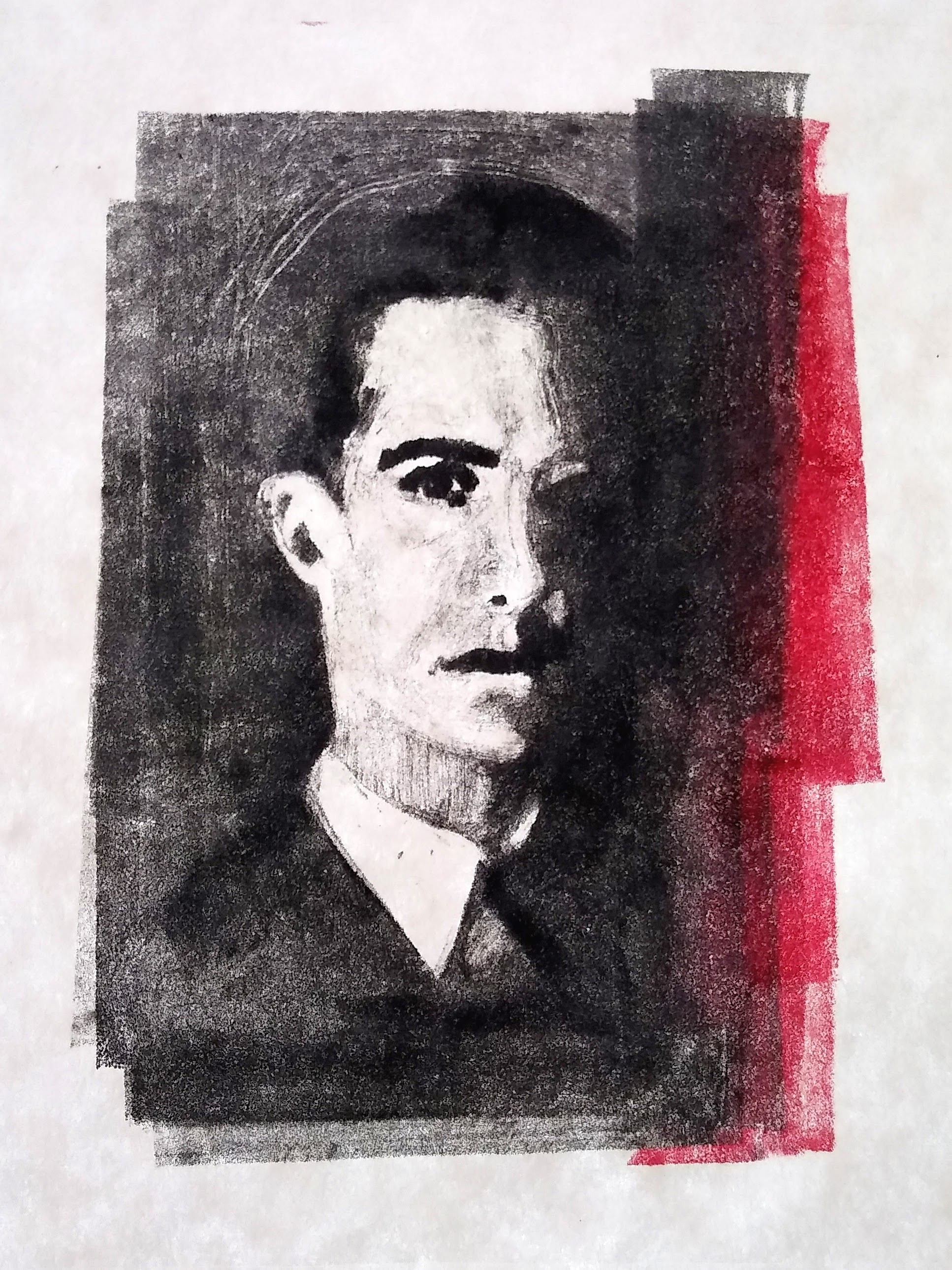
Ellory Erecius:
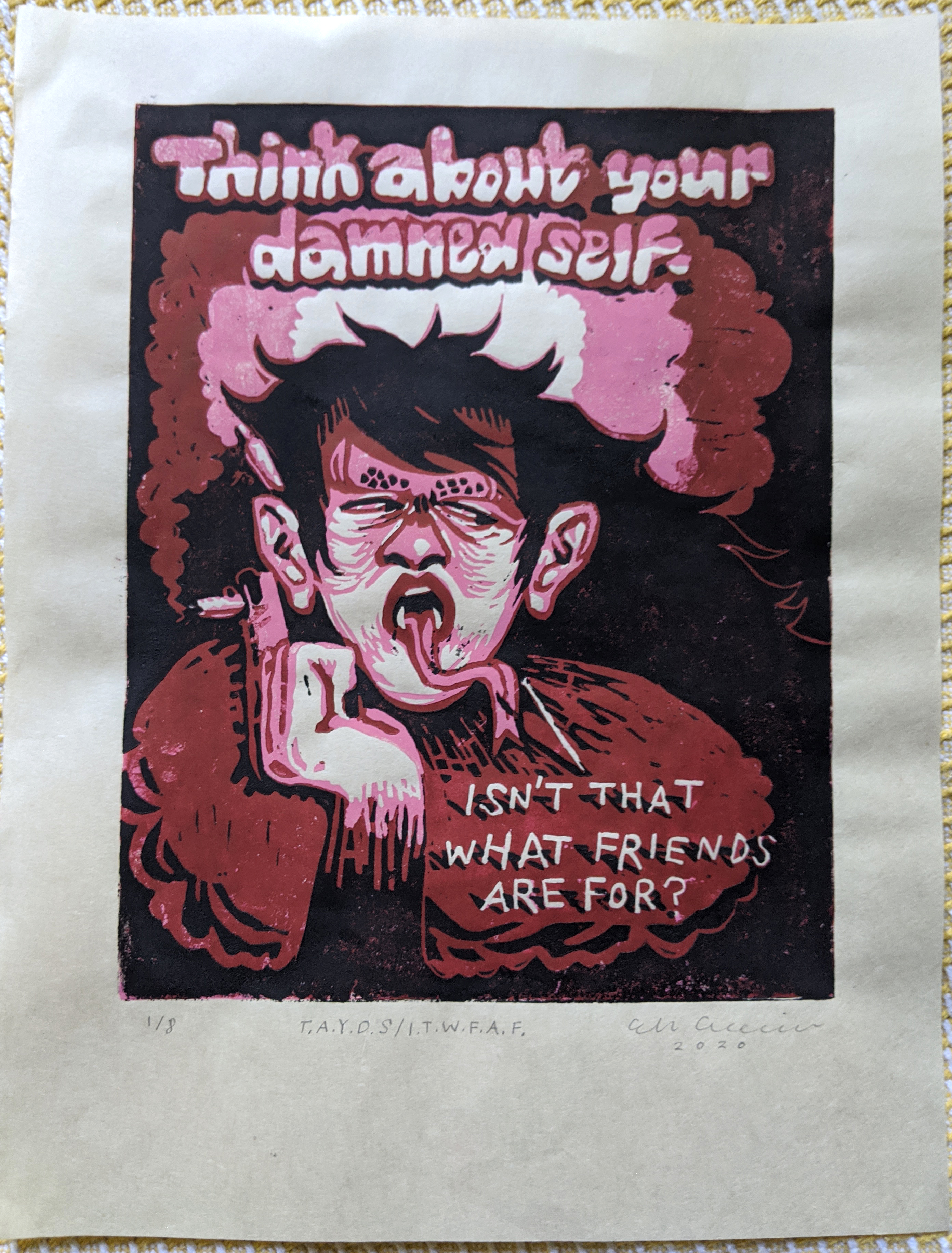
T.A.Y.D.S./I.T.W.F.A.F.
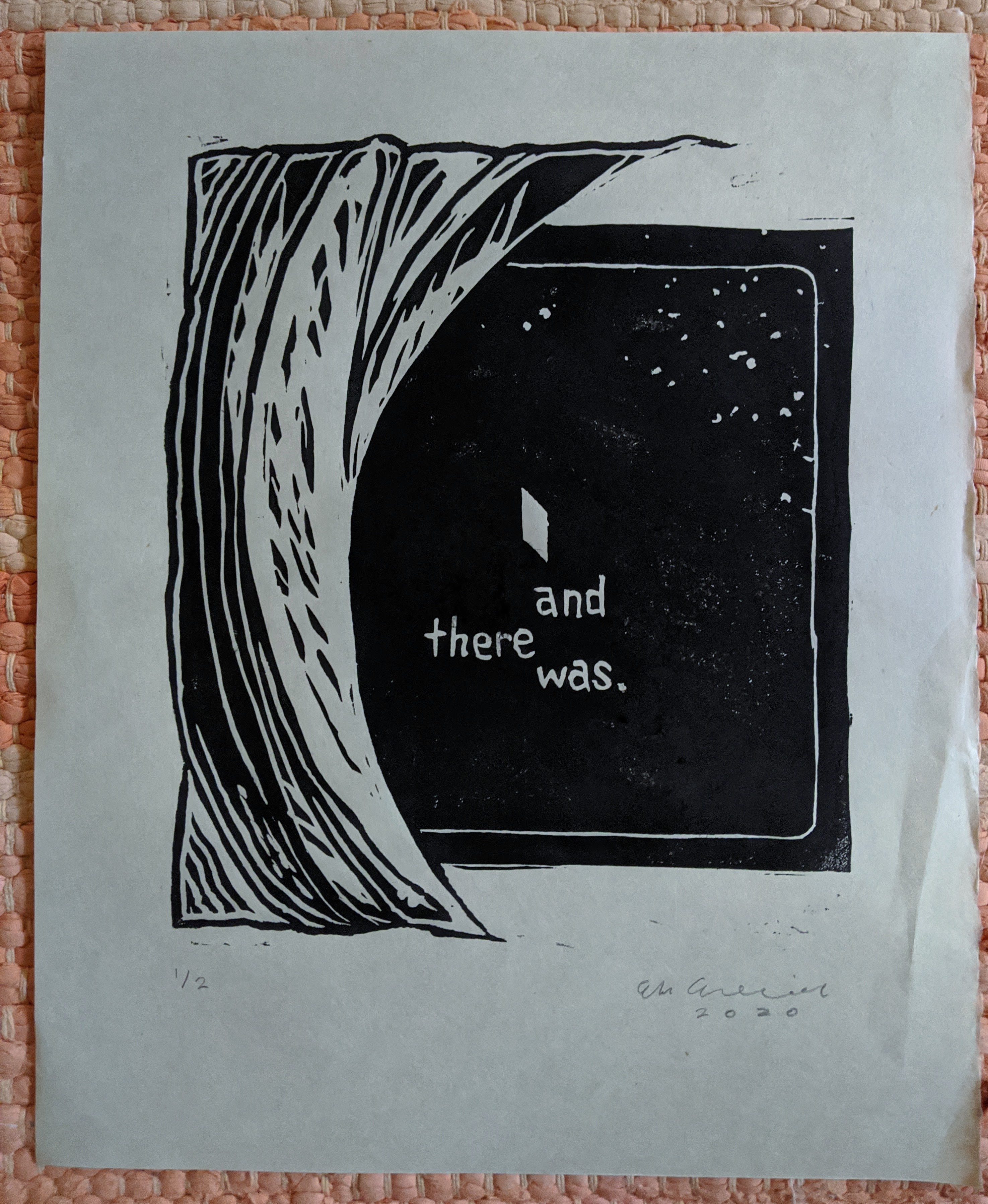
and there was.
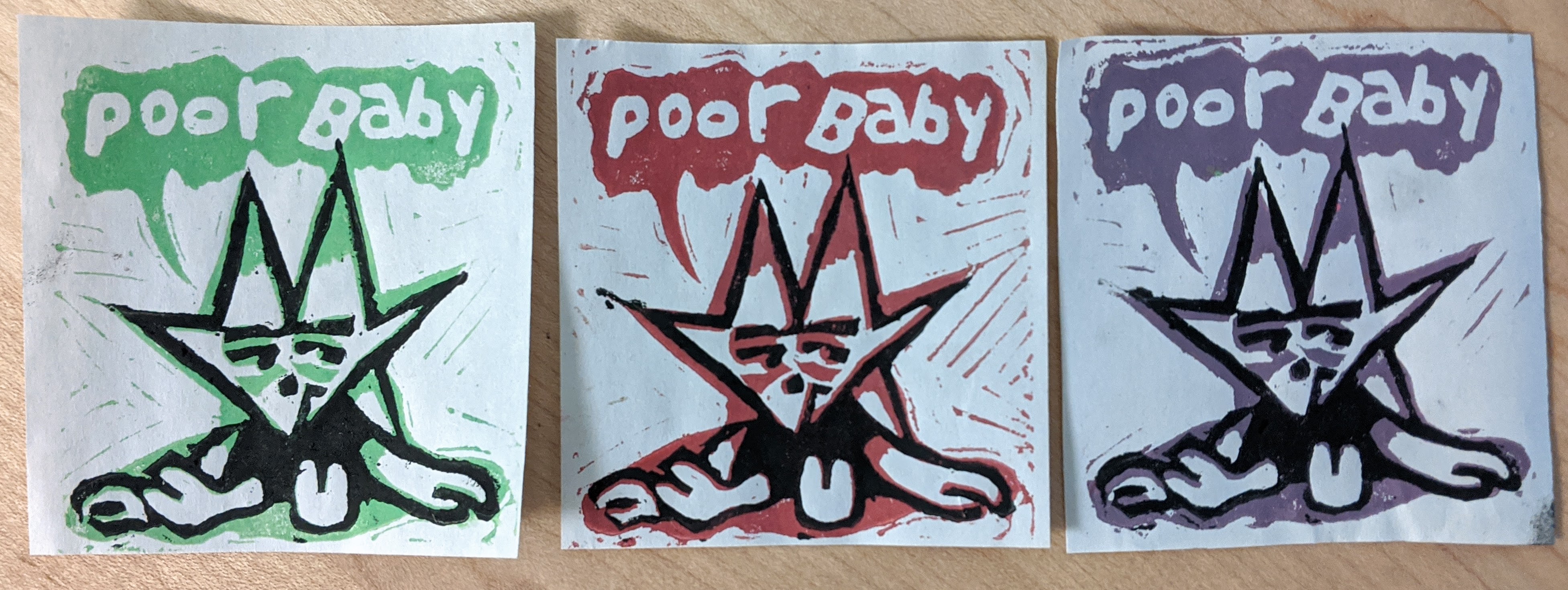
poor baby
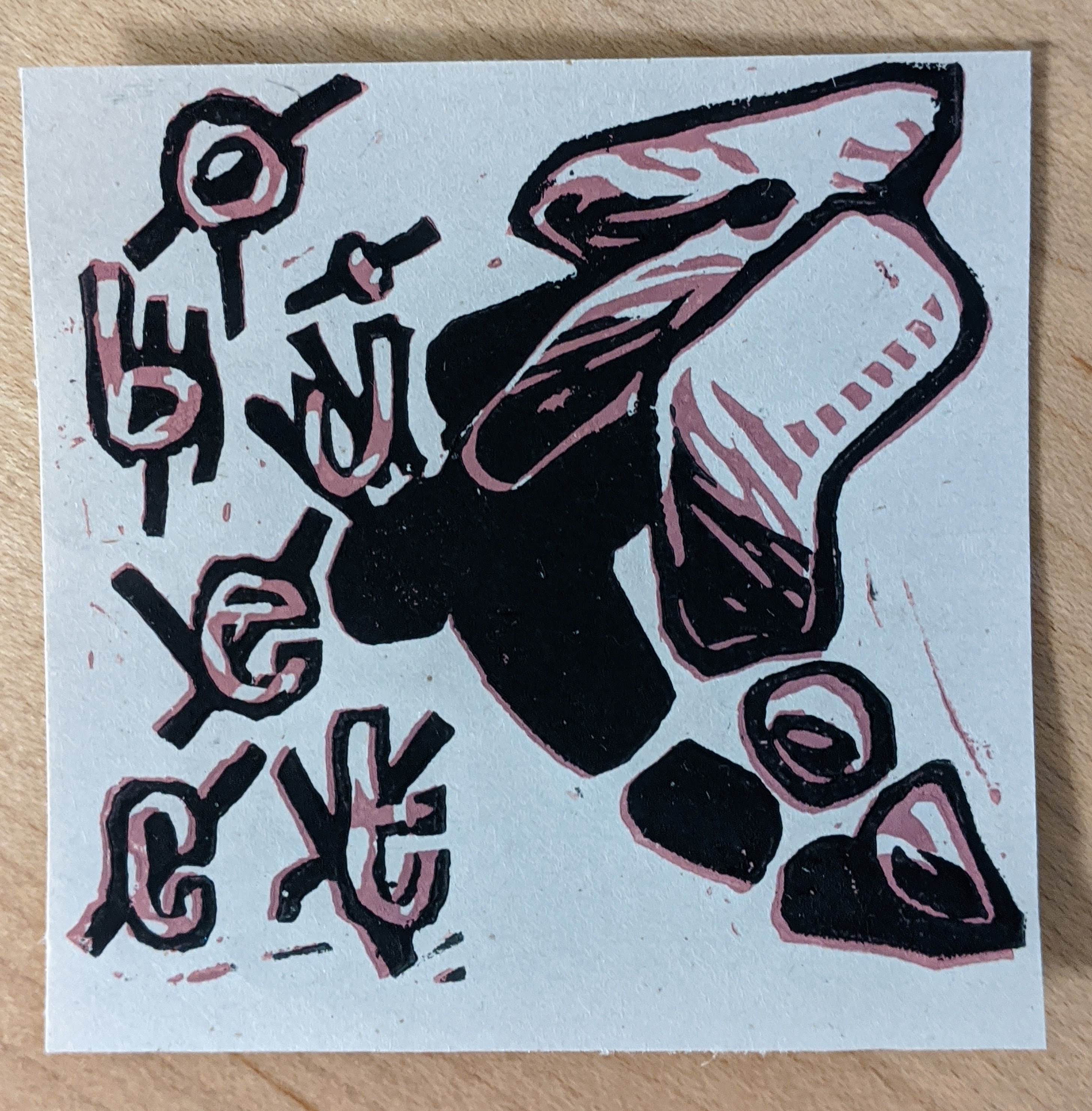
object

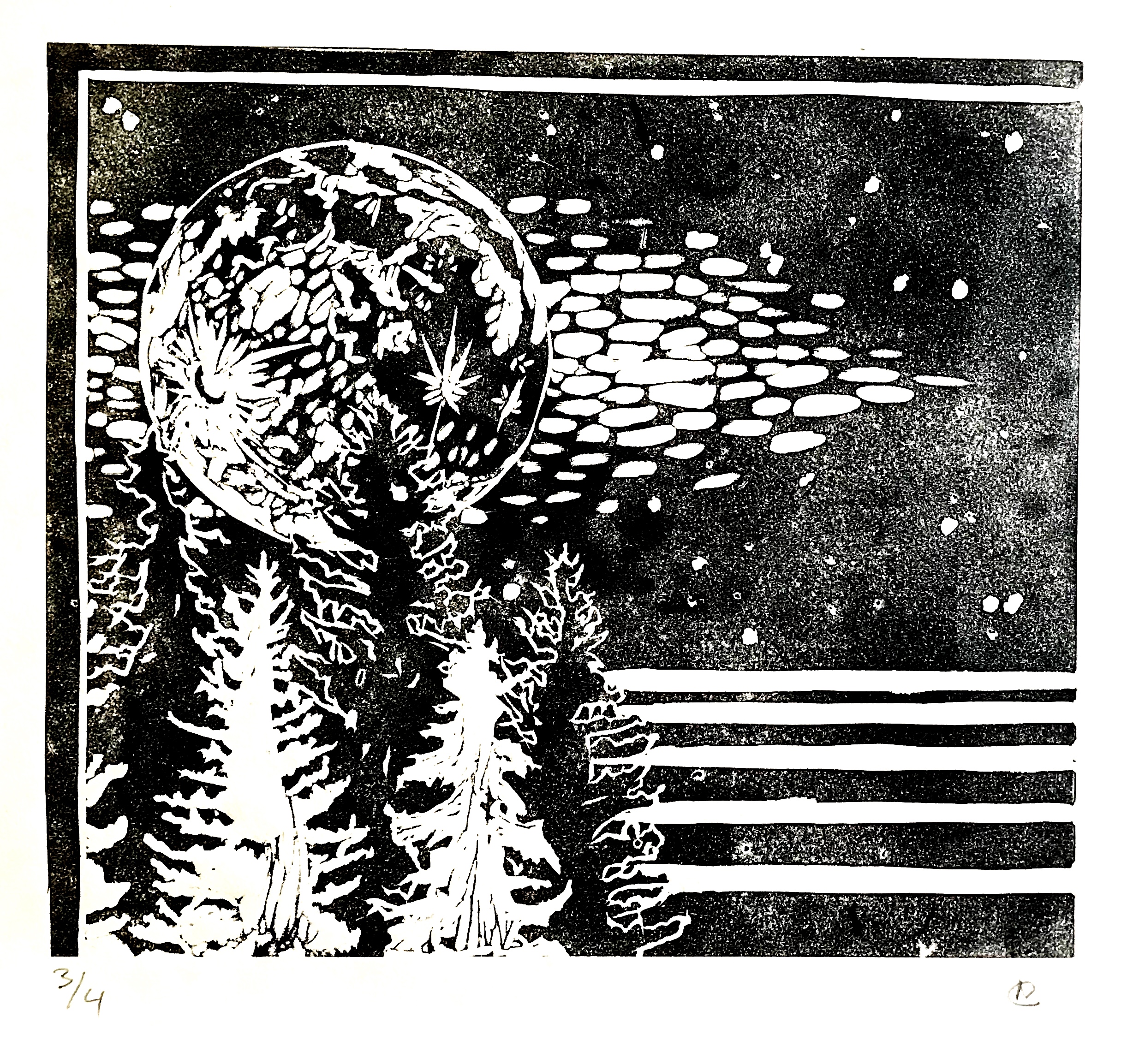
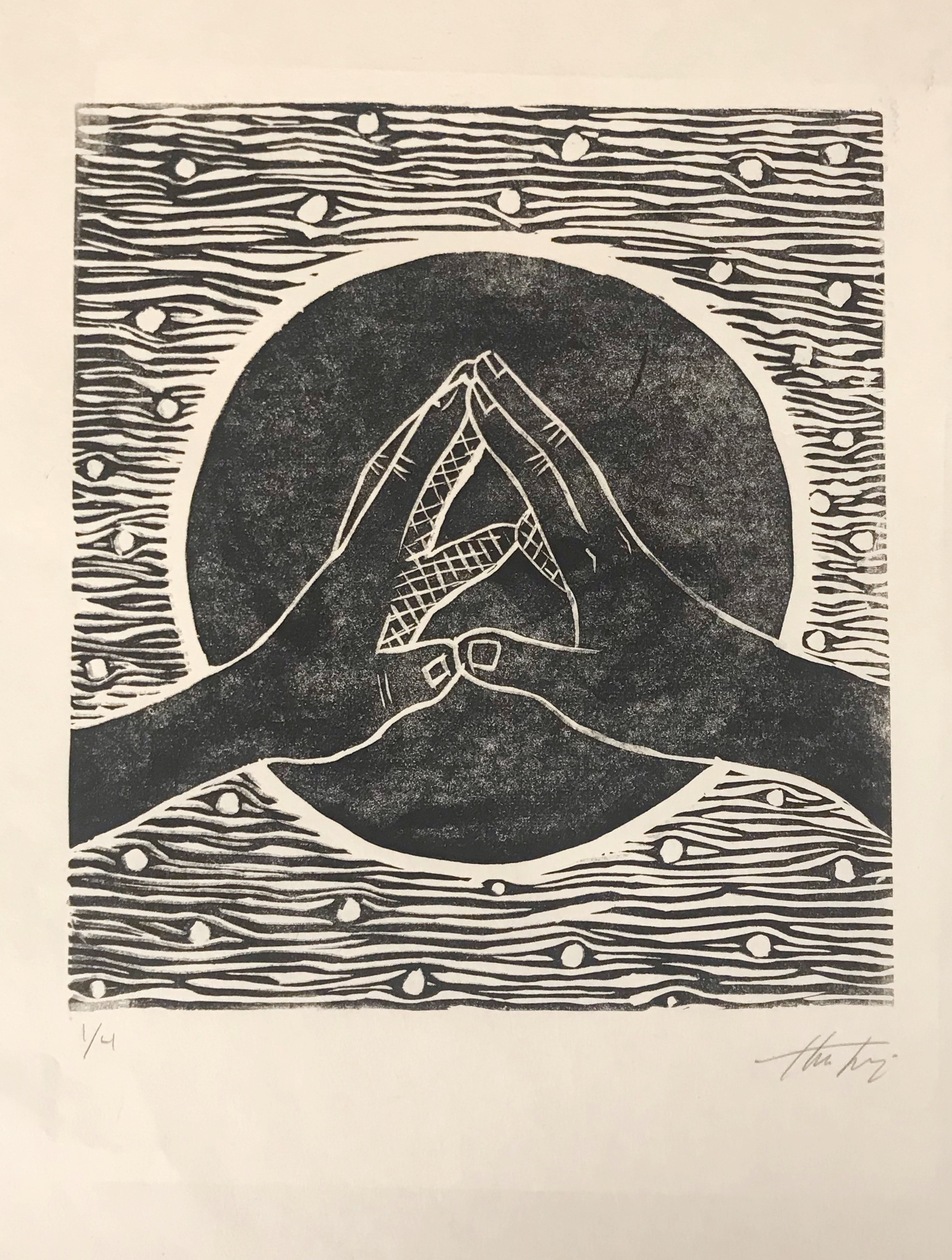
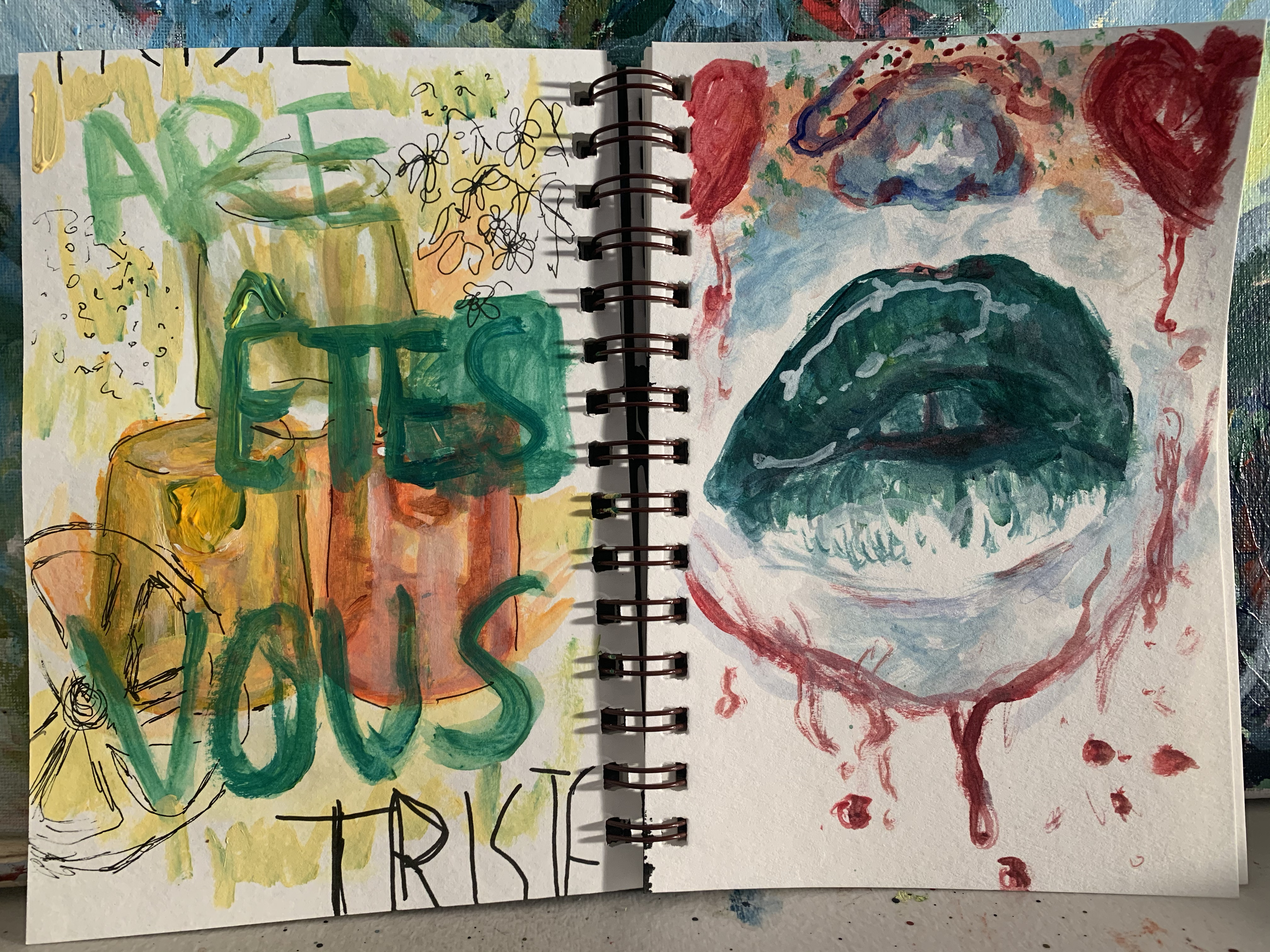
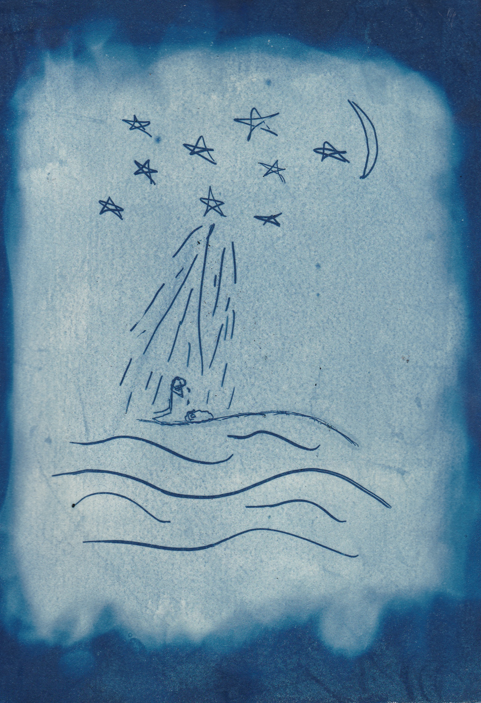
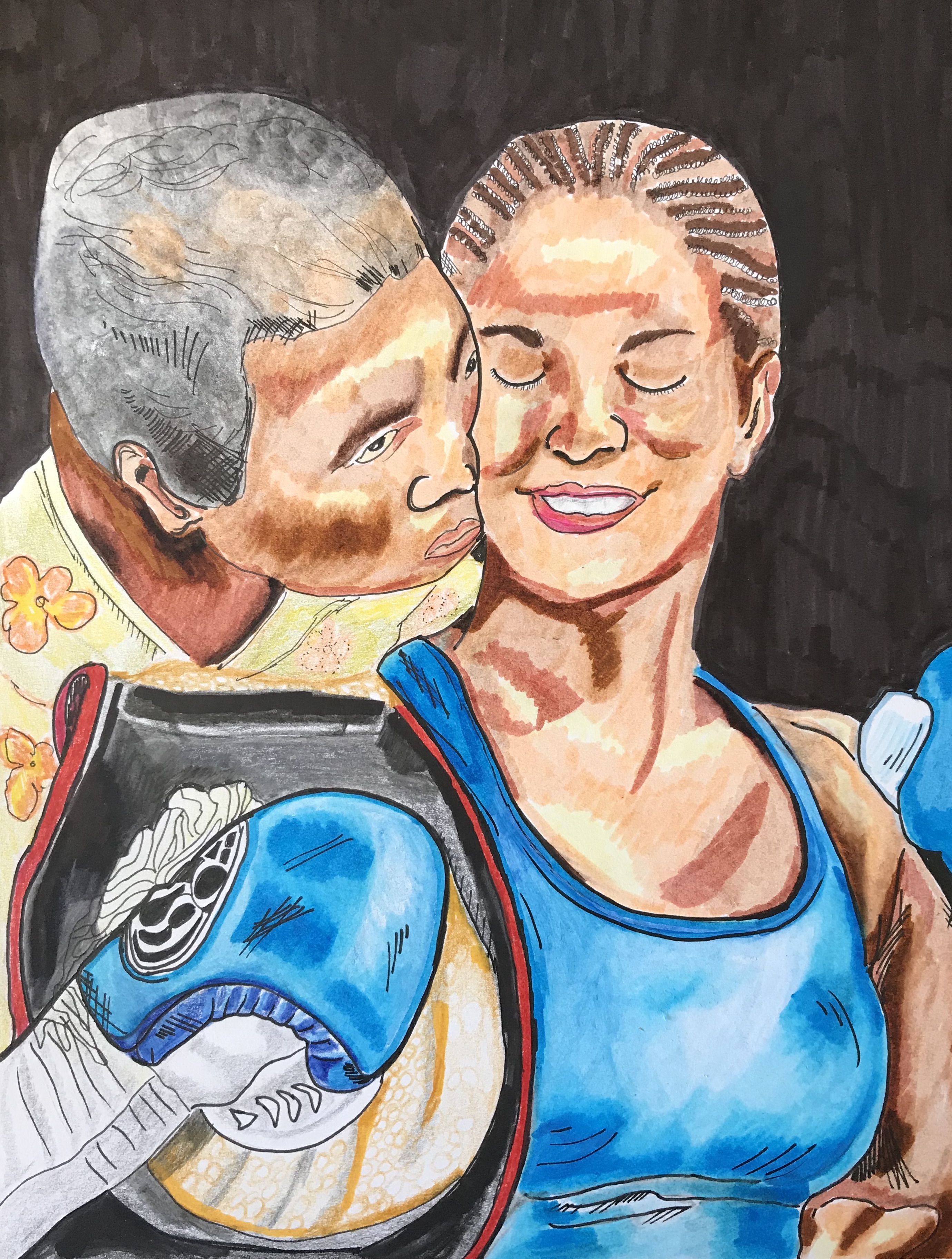
Heli Trejo:
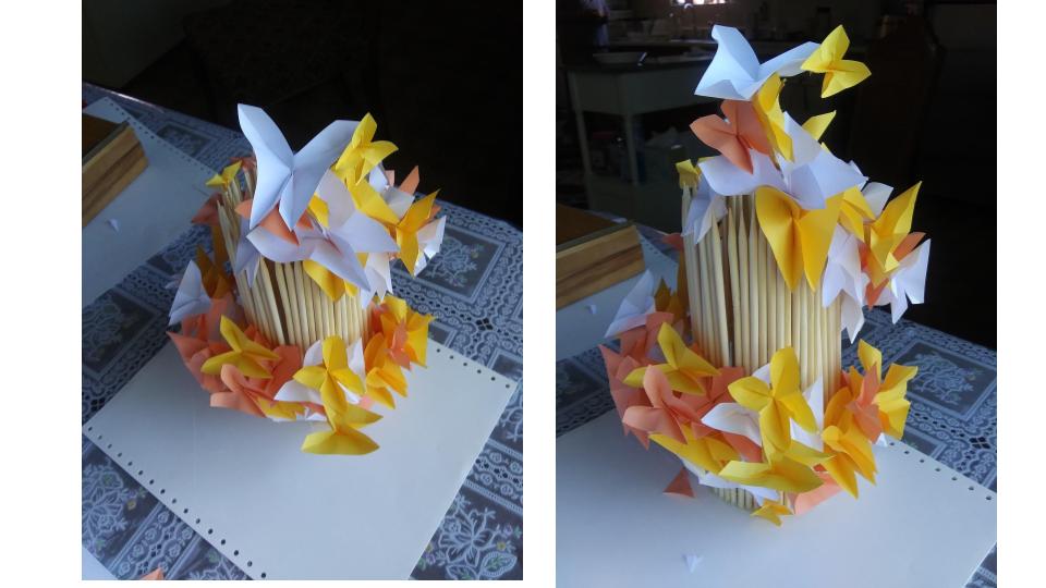
“Neon Fall” - Caligo relief ink on Koto Paper
“Home Rubbing” - Inktense Water-soluble pencil transferred to Koto paper
“Touch” - Caligo relief ink on KitiKata paper
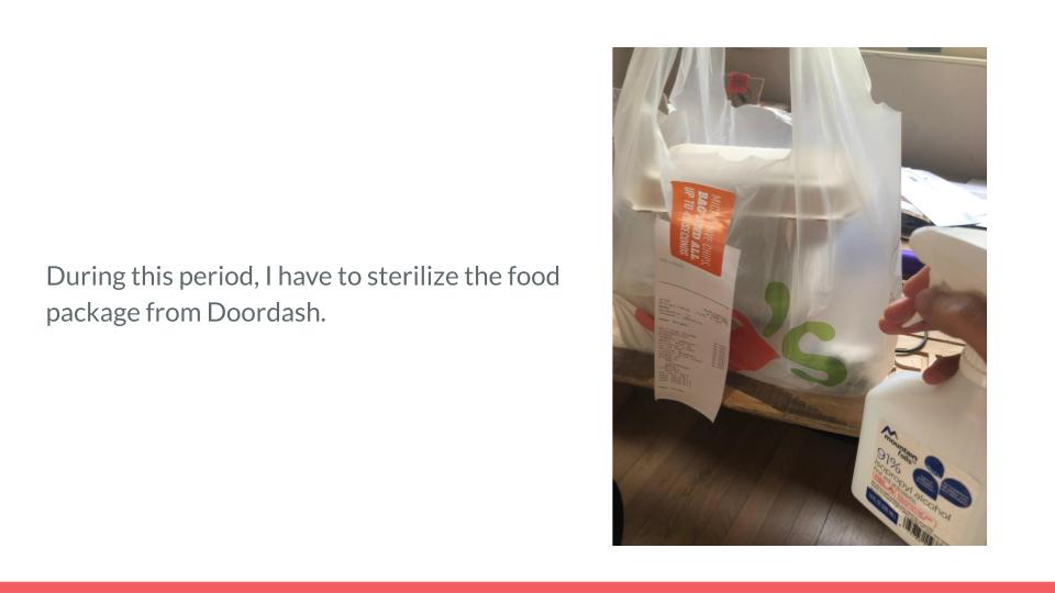
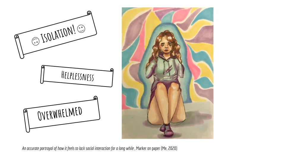
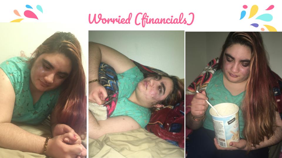
In a hopefully temporary method of living impacted by the pandemic, I look to emphasize an aspect of life that I have come to cherish while isolated - social interaction.
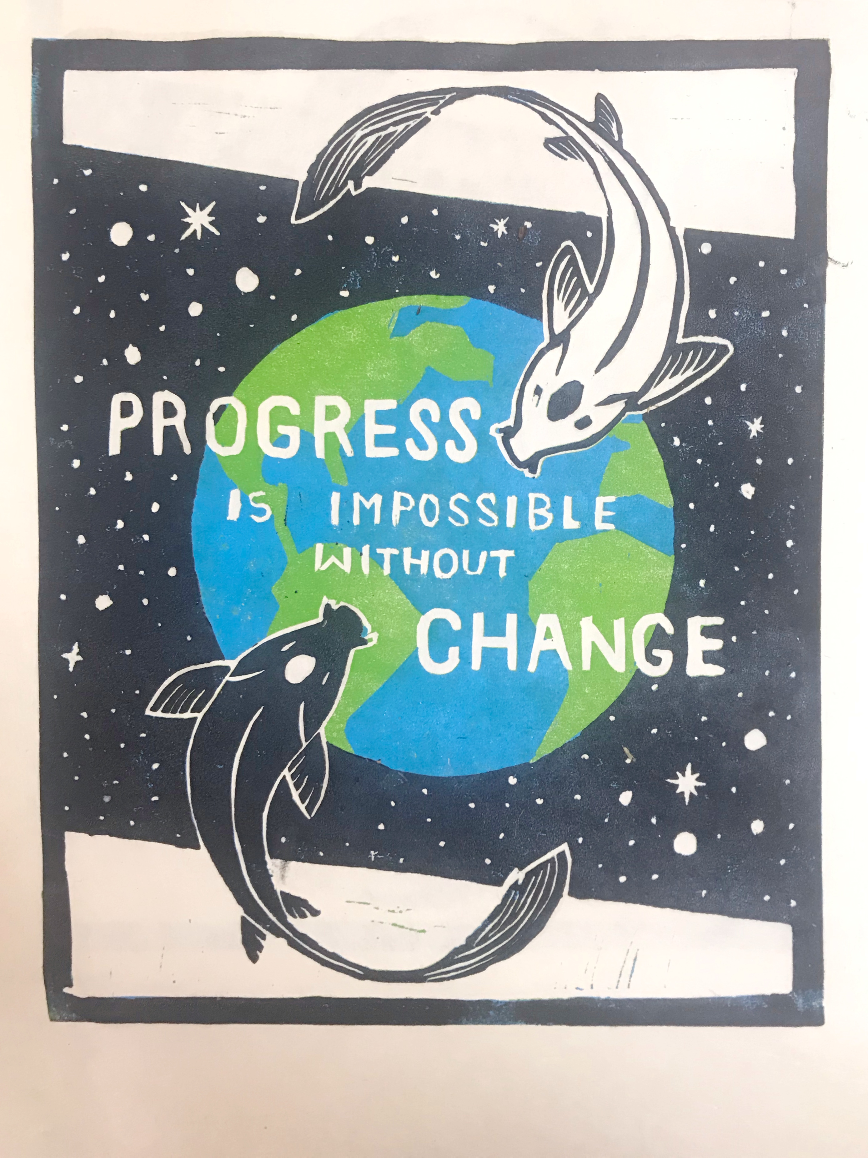
“Action” - Caligo relief ink on KitiKata paper
Our world is what we make of it, the power should be in the hands of the people. With the current state of our nation and world, I seek action that will ultimately change our lives for the better. I printed a small part of a quote by George Bernard Shaw that reads “Progress is impossible without change, and those who cannot change their minds cannot change anything”. This is also commentary on the ongoing battle against systemic racism and police brutality on unarmed black individuals, we cannot progress as a society unless we make crucial changes to the broken systems we suffer from.
Kiala Lujan:


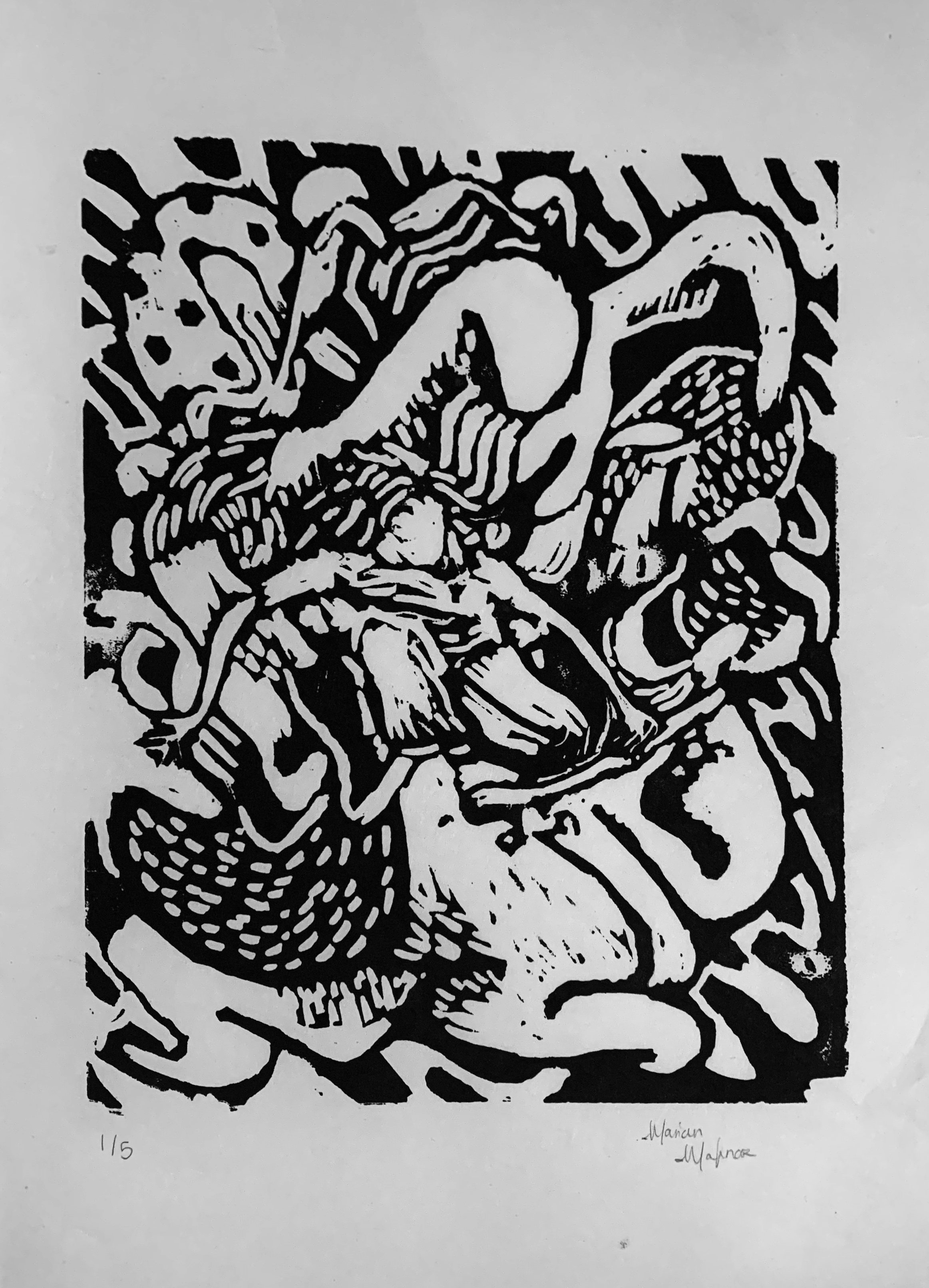
Marian Mafnas:

Marshall Rebecca:

Michaela Martinez:
Rock Rays
Monoprint tactile tracing of stone. Watercolor pencil on Kozo paper.
Spring Time
Monotype split fountain found objects print. Ink on Kozo paper
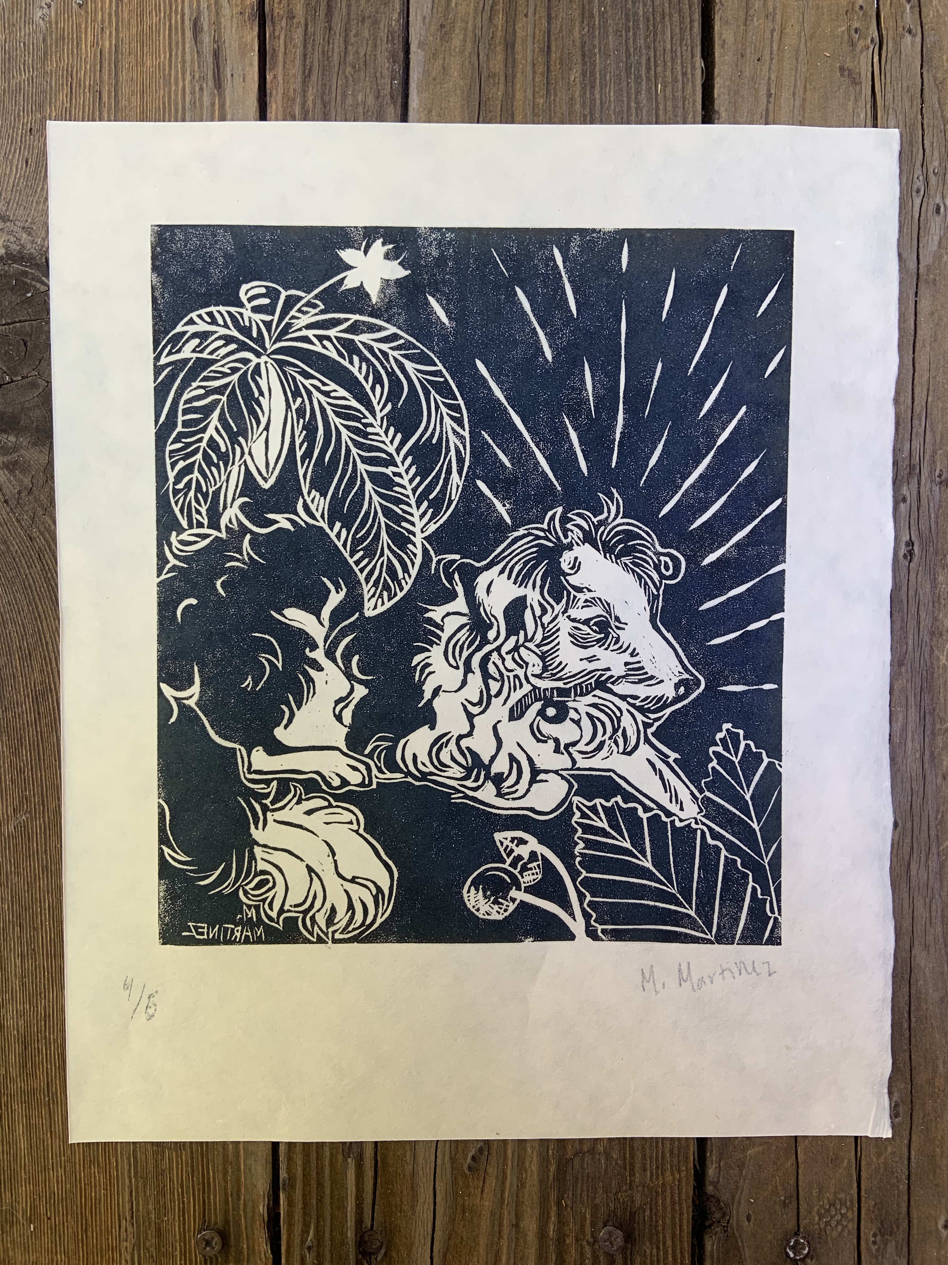
Molly in Nature
Linoleum Black and White Print. Ink on Kitikata paper
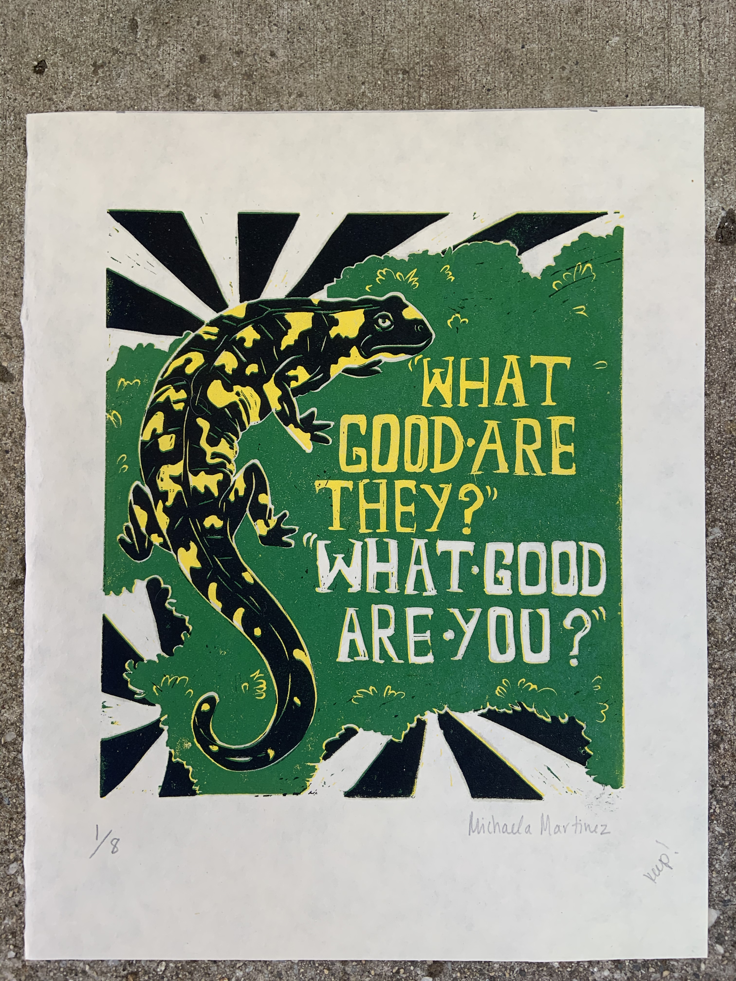
What Good Are They?
Linoleum 3 color reduction relief print. Ink on Kitikata paper. Quote from “Species in a Bucket” by Edwin Philip Pister.
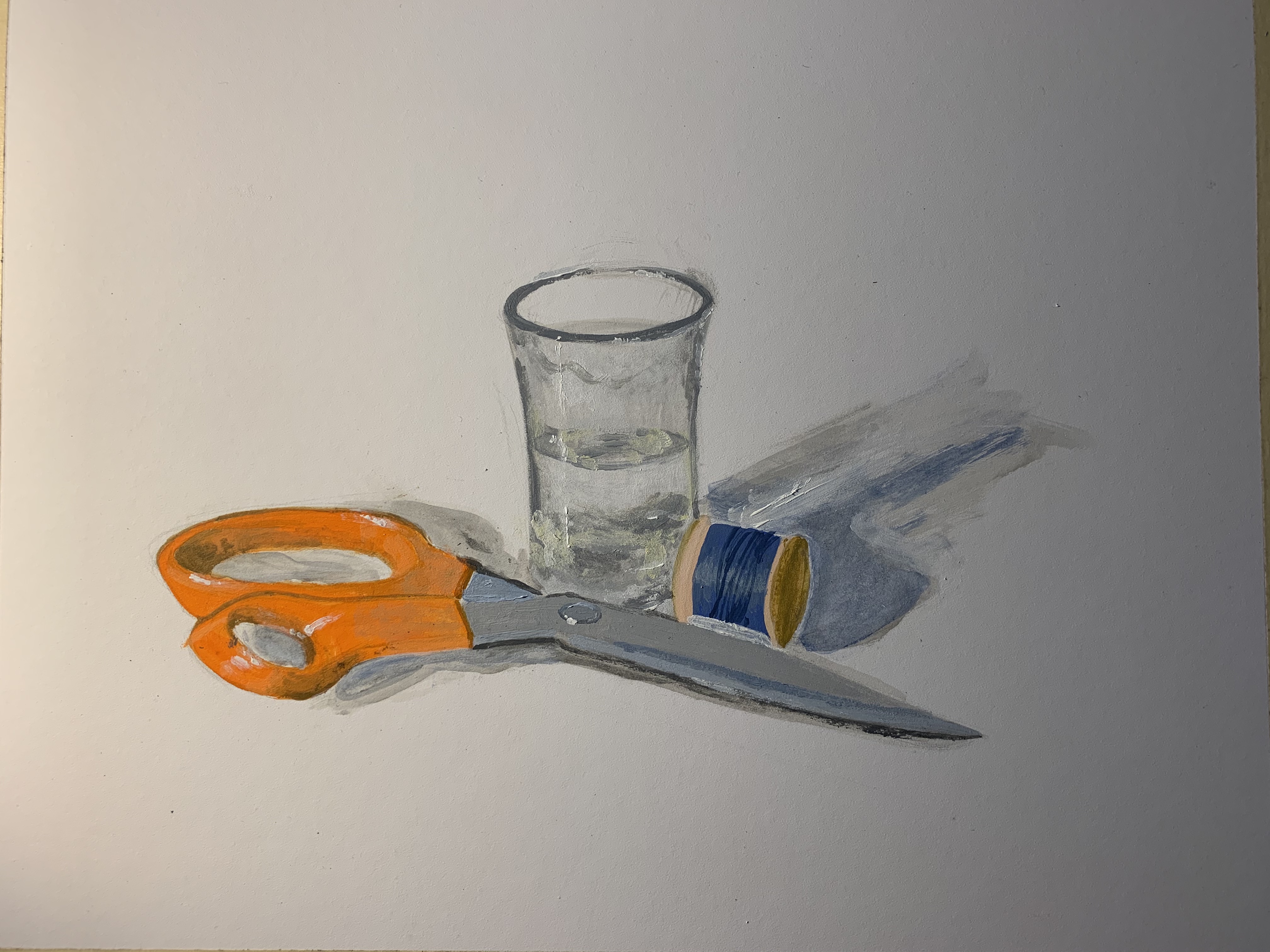
Palmer Conlon:
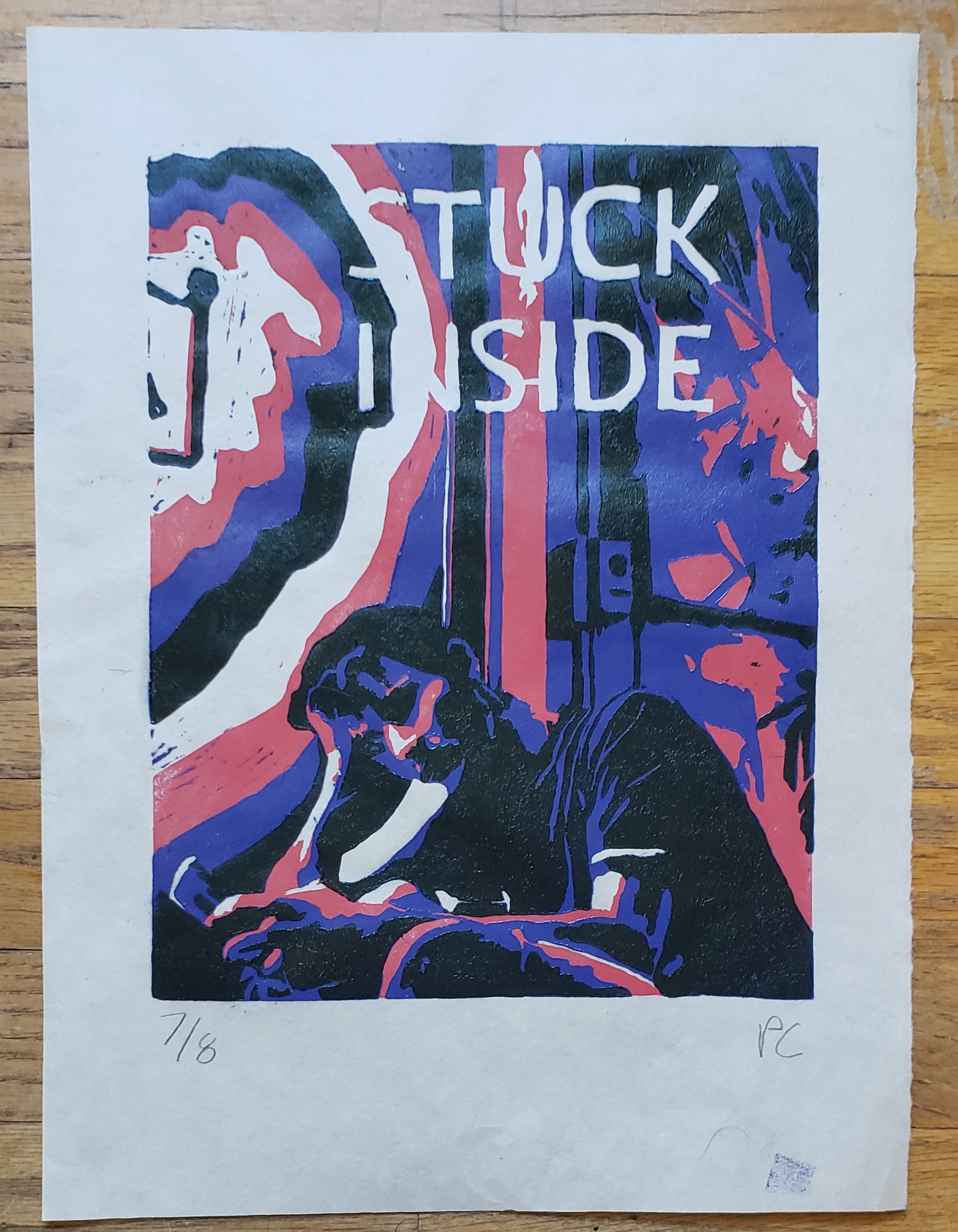
#1 - STUCK INSIDE - Three color reduction print from a carved linoleum block. Commentary on the current state of our lives in quarantine.
#2 - THE UNRELIABLE BUS - Black and white print from a curved linoleum block. Represents my mode of transportation during quarantine, as the bus schedule is quite unreliable.
#3 - UNTITLED - A split fountain color monotype from a plastic plate.
#4 - UNTITLED - A monoprint made using water-soluble pencils and tissue paper. This asymmetrical picture was taken right when the print was made.
Sunny Rolfs:

Art 20H: Introduction to Sculpture and Public Art
- Jennifer Parker
Akane Kaneko:

Anna Reagan:
Dylan Banks:


Ella Tracy:

Gillian Yu:

Grace Brieger:


Isabel Pacheco:
Katana Parker:

Kenneth Arnold:

Lee-Anna Meza:
Leica Tran:
Louise Balderas:

Mingliang Wang:
Mohini Batish:

Naomie Rumph:

Noah Fox:
Nungrutai Mullennix:

Raquel Rabines:


Samantha Marinez:

Art 20J: Introduction to Drawing and Painting
- Melissa Gwyn
Anita Pang:

Anna Reagan:
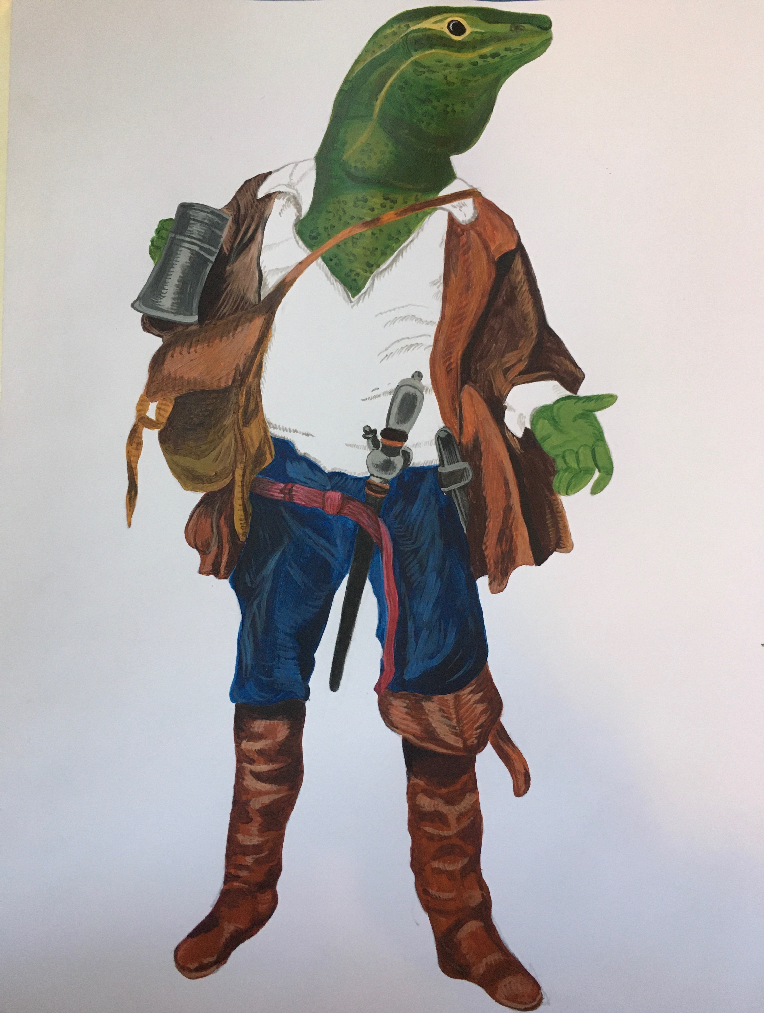
“Davy Jones’ Lizard” acrylic on paper
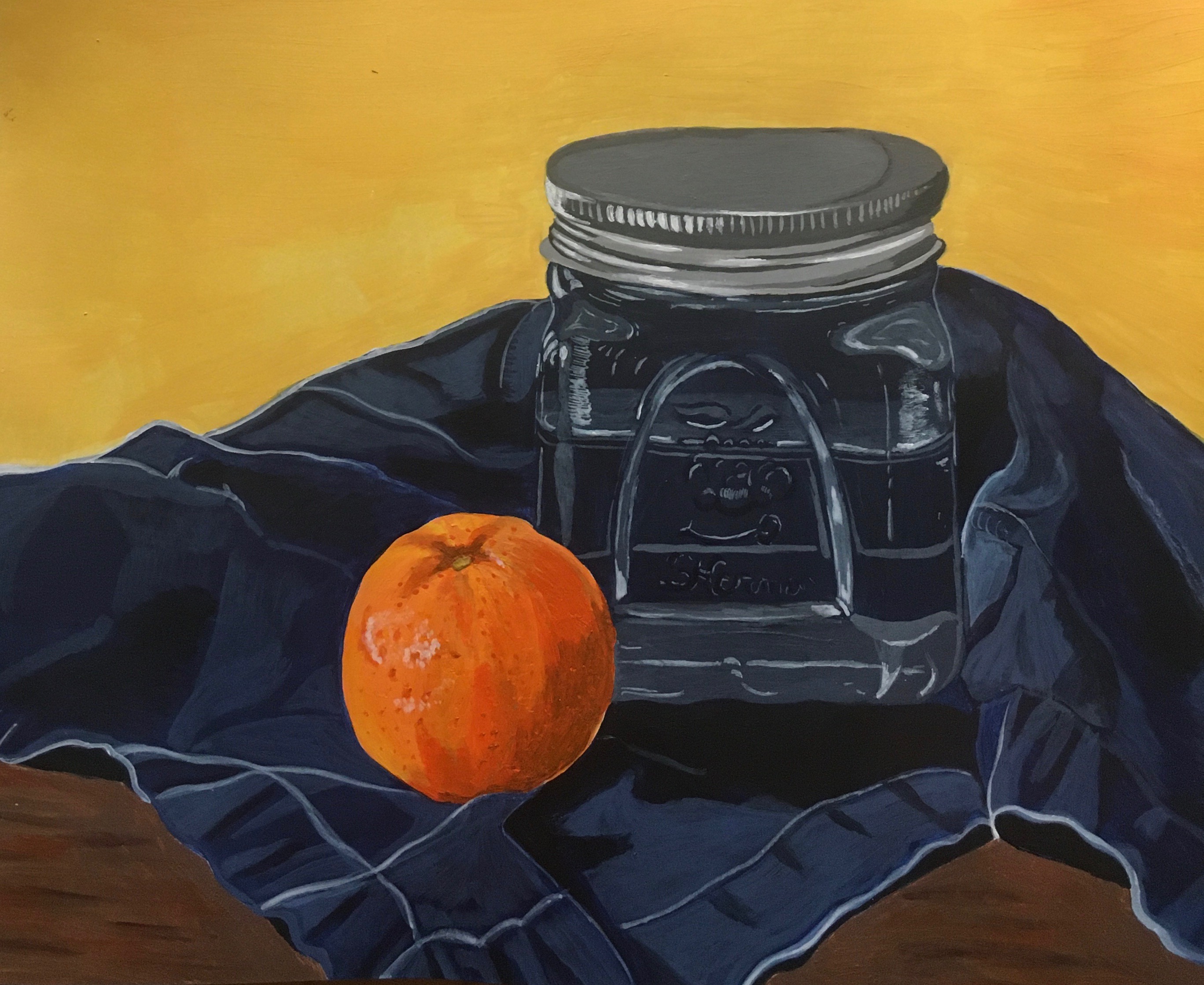
“Orange and Jar” acrylic on paper
“Backseat Buccaneer” acrylic on paper
“Seadog” acrylic on paper
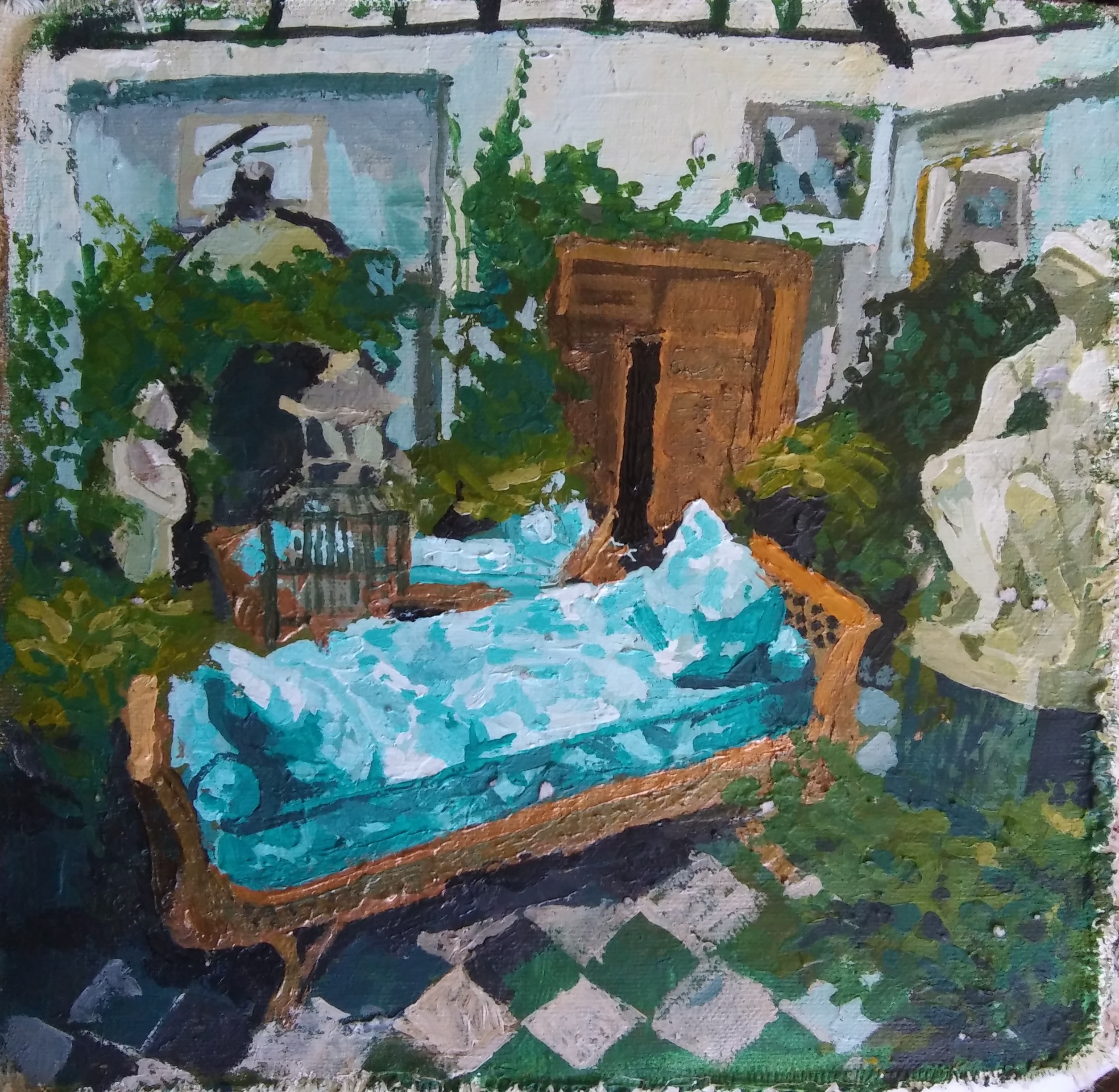
Audrey Merrill:
Jethro Yu:

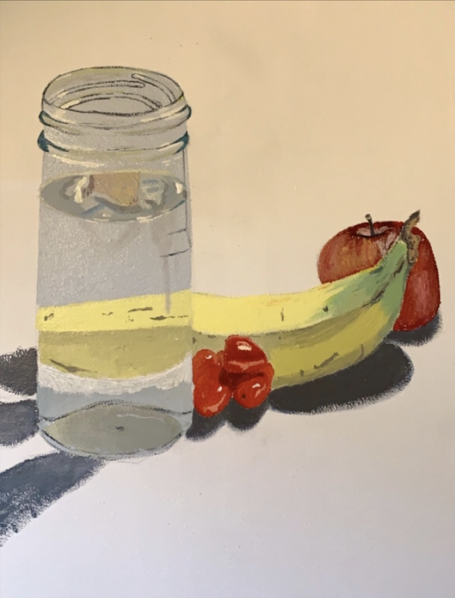
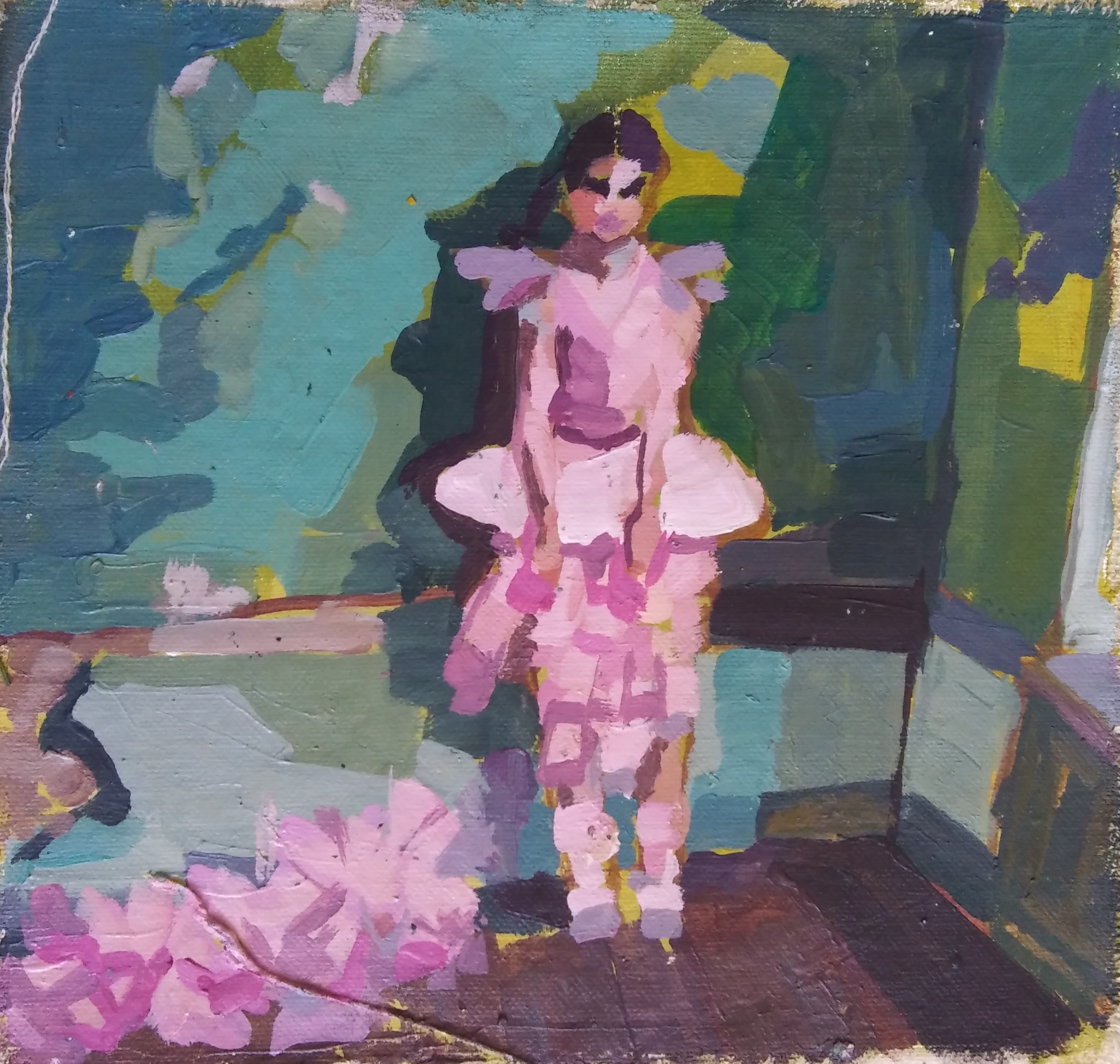
Katana Parker:
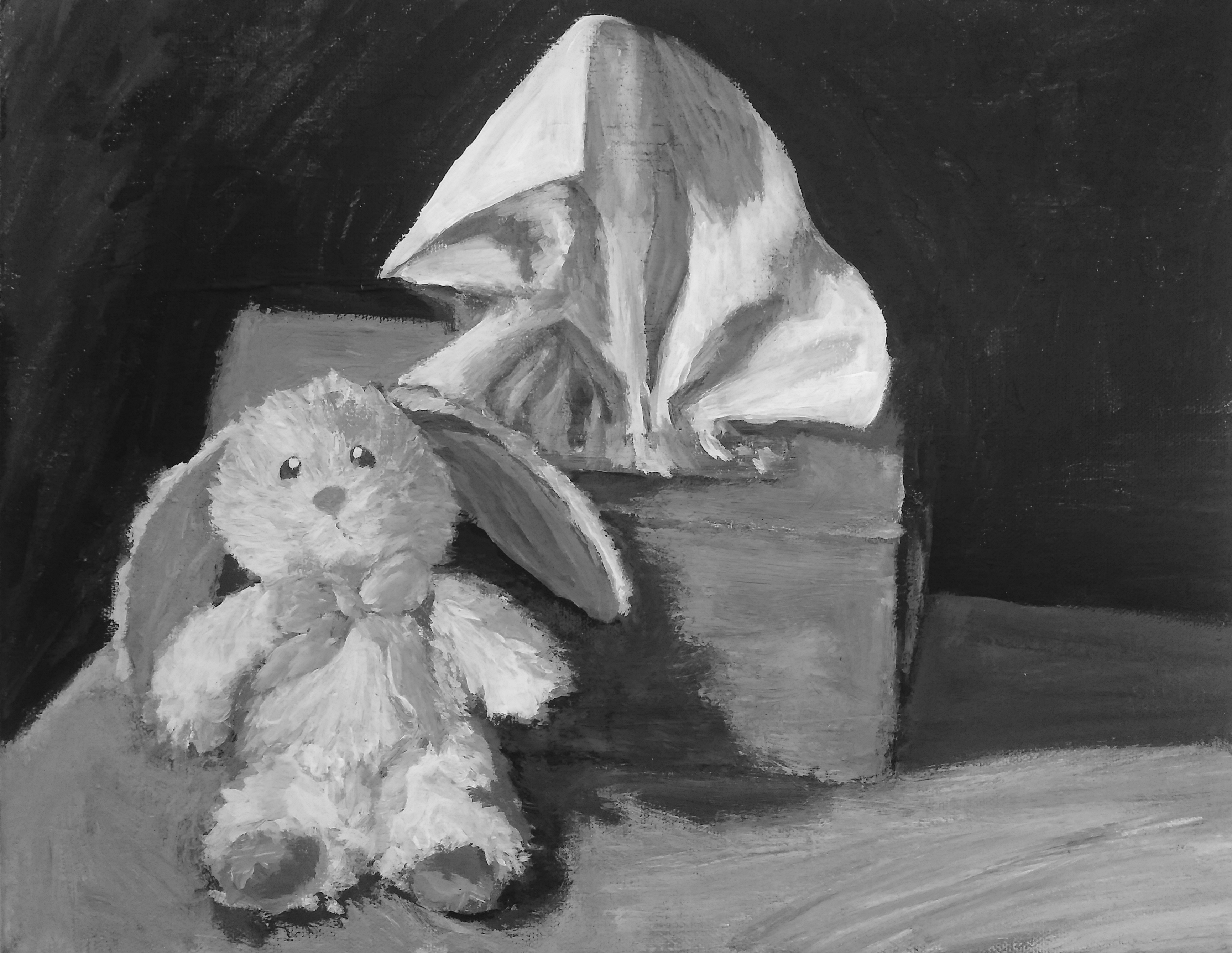
(Image #1) “Mr.Bunny and Tissues”
Observational practice, working with wash
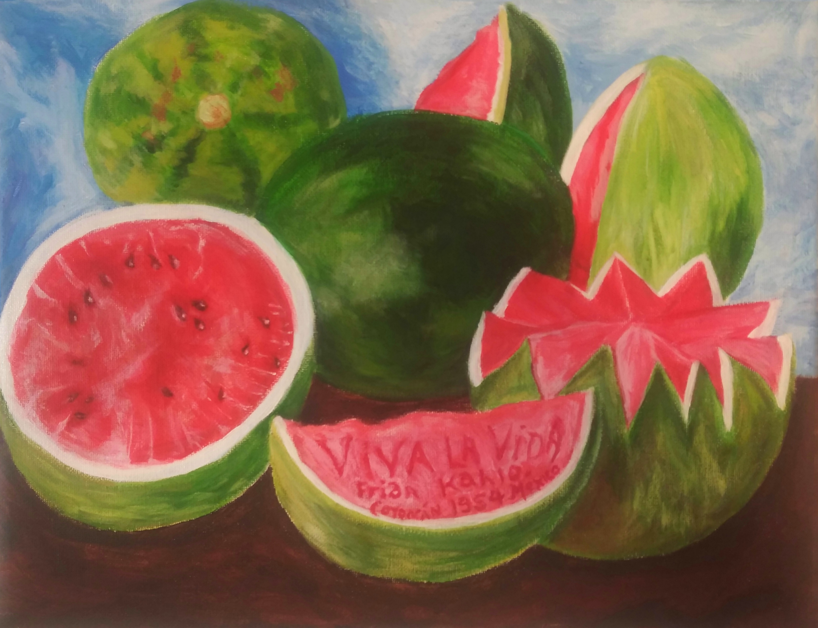
(Image #2) “Viva la Vida Emulation”
Painting emulation

(Image #3) “Still Life Drawing”
Observational practice
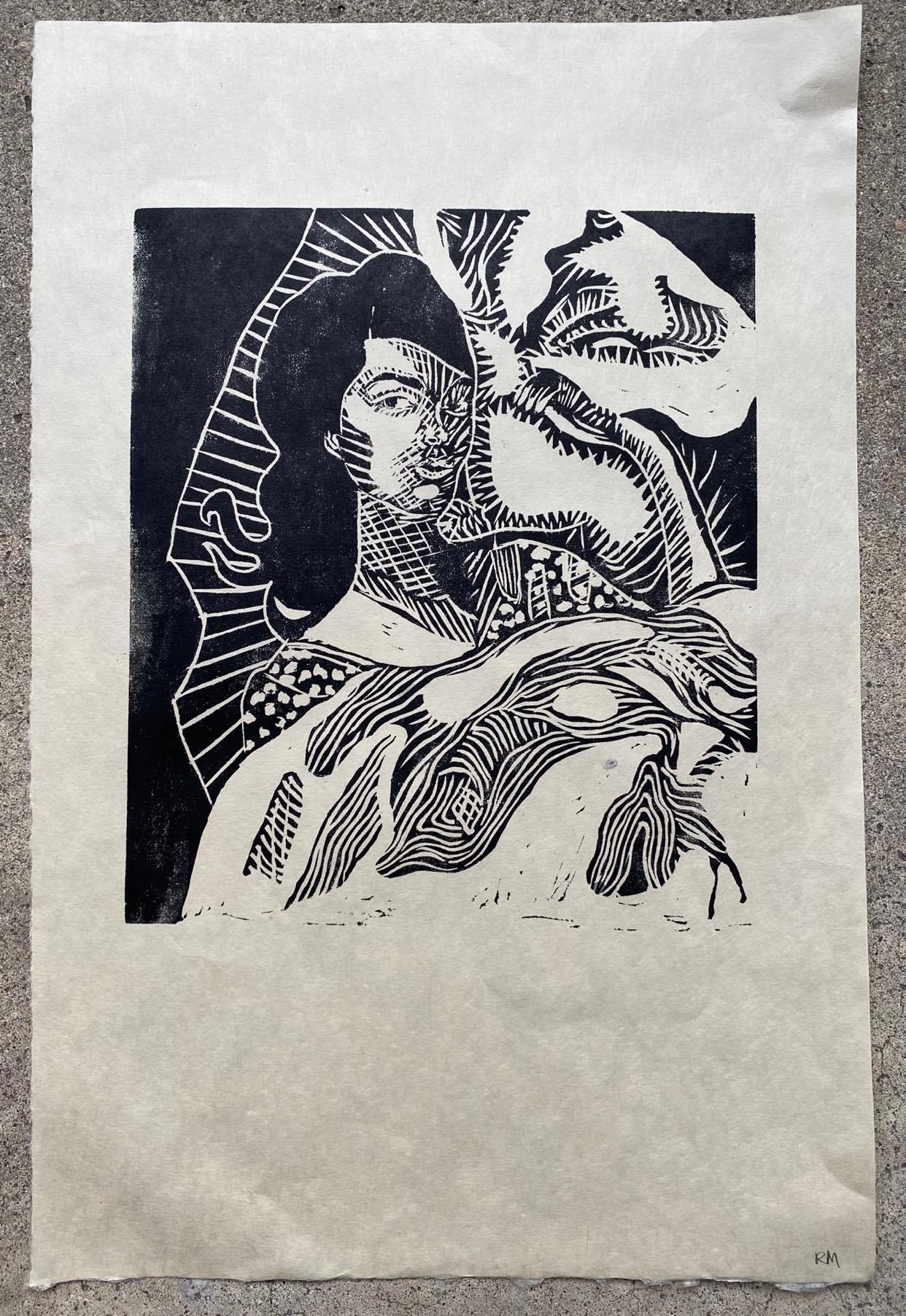
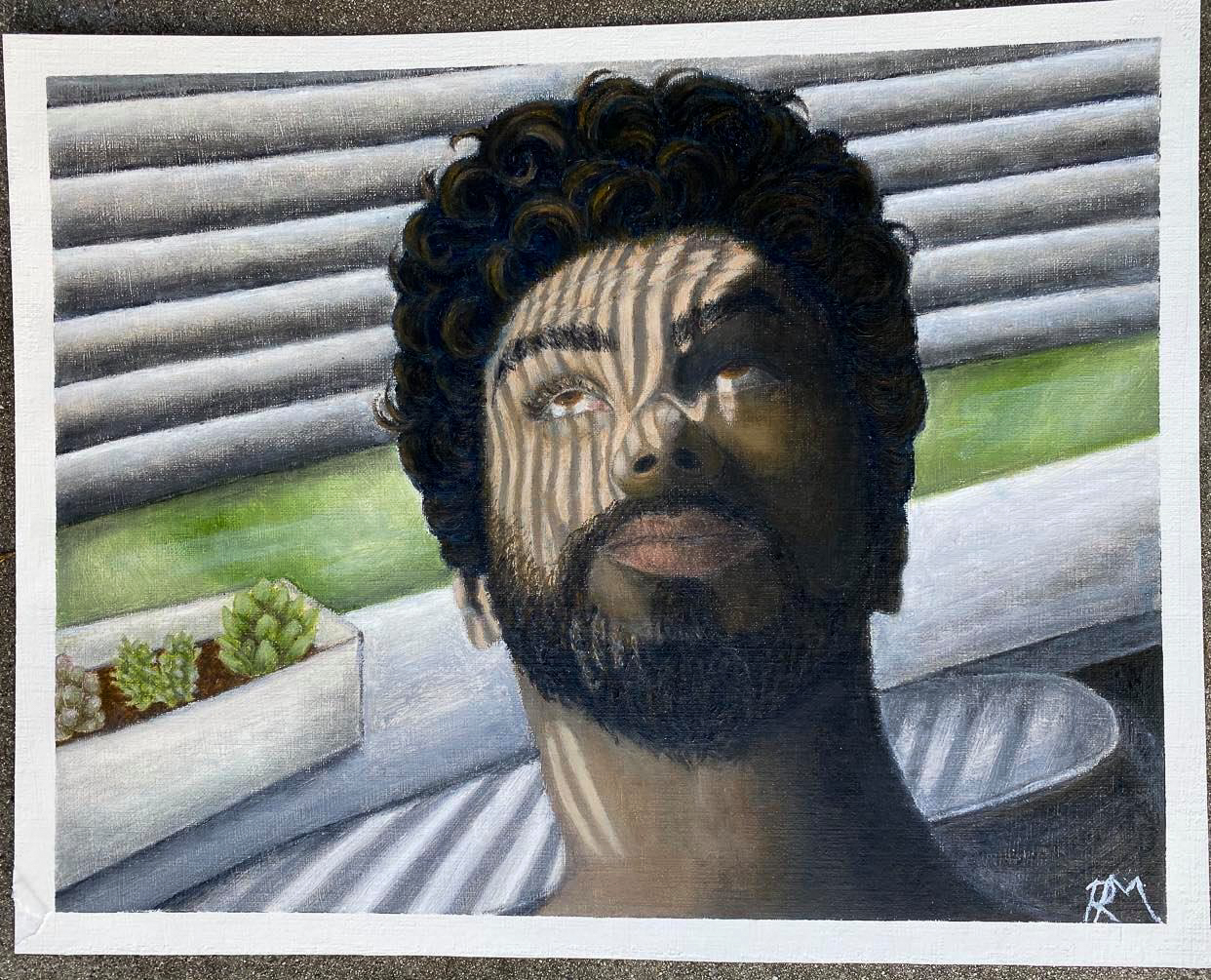
Reilly Mcdowell:
Theron:
Valerie Jackson:


Art 20L: Introduction to Drawing
- Grant Whipple
Sunny Rolfs:


Art 108: New Media and Social Practice Artmaking
- Elliot Anderson
https://www.instagram.com/babewiththepower2020/
Babe With The Power by Taite Mcloughlin, Griffin Conway, Nicole Tarvirdian, and Nina Scherer
https://www.instagram.com/jointheisolationnation/
Join the Isolation Nation by Ria Liu, Kerstin Van Den Oever, Donovan Yuen-Goh, and Selena Hyon
https://www.instagram.com/noplacelikehome.podcast/
No Place Like Home Podcast by Eric Seigel, Joseph Ernest Castro Padpad, Clarissa De Jesus, Dylan Banks, and Jordan James
https://www.instagram.com/new.era.tv/?hl=en
A New Era by Megan Chau, Itzel Gutierrez, Justin Jacobs, Yi Wang, and Houming Ruan
Art 119: Special Topics in Drawing
- Marci Washington
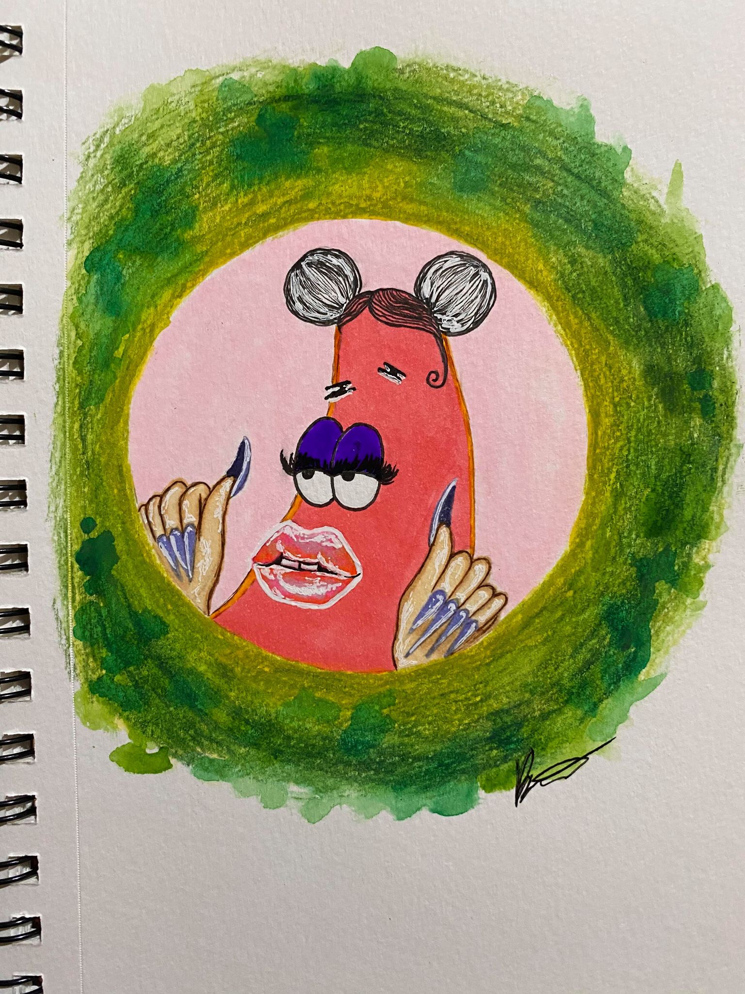
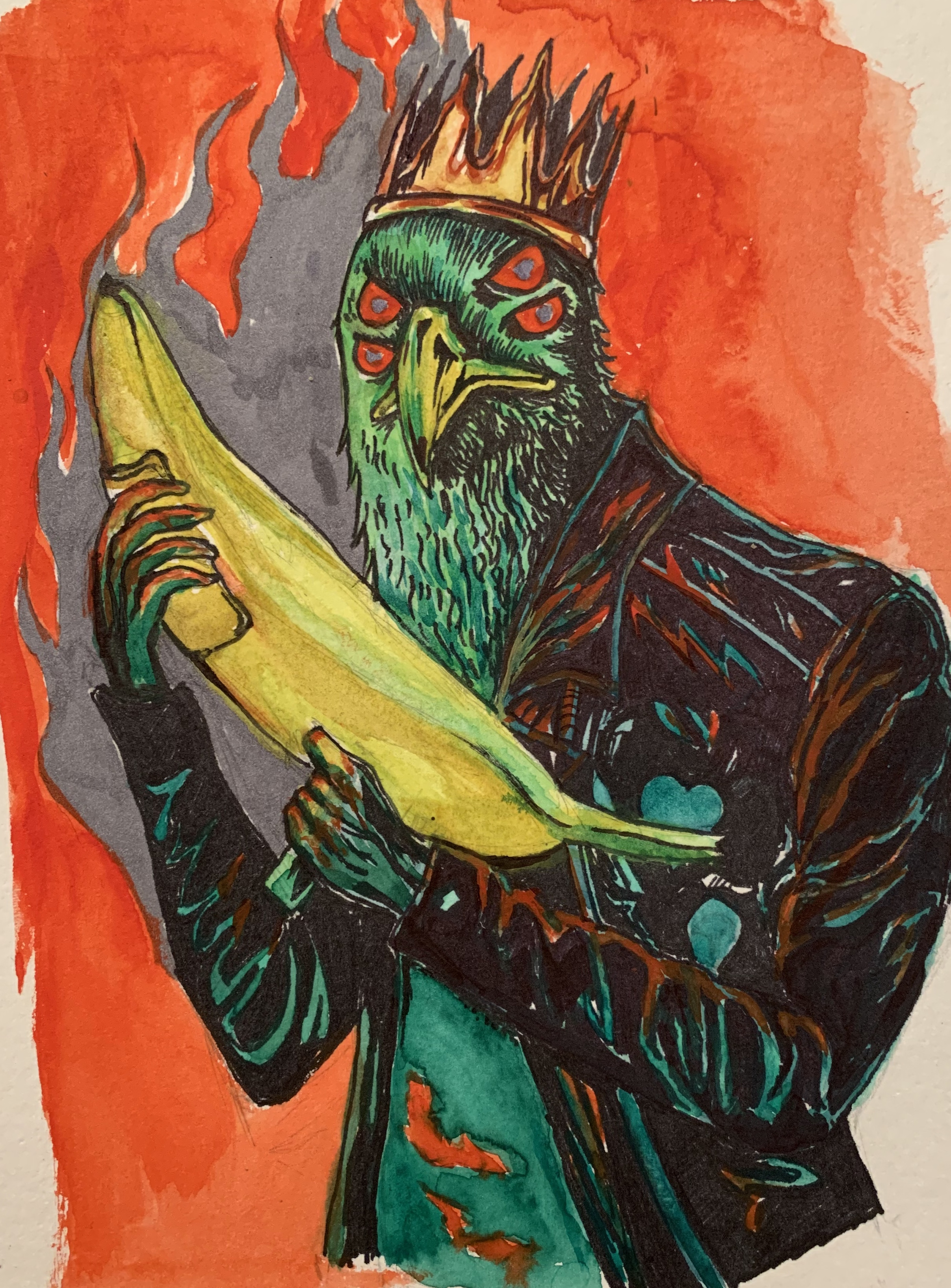
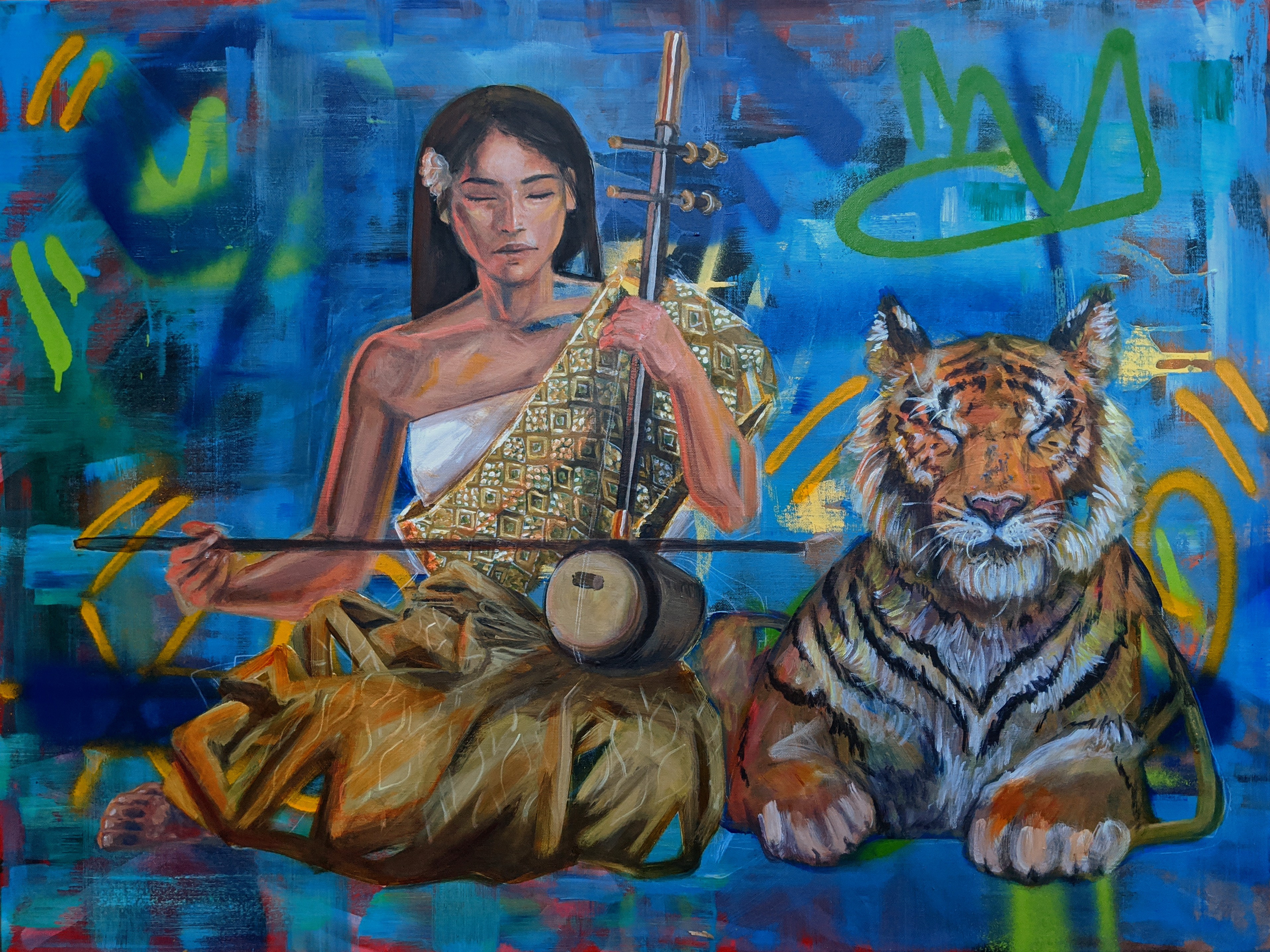
Connor Alexander:
This series is themed after Greek myths, taken into a modern scope through reimagining figures and stories as album covers. This is only a fraction of the covers I made, but this is a good representation of the varied styles and genres I used.
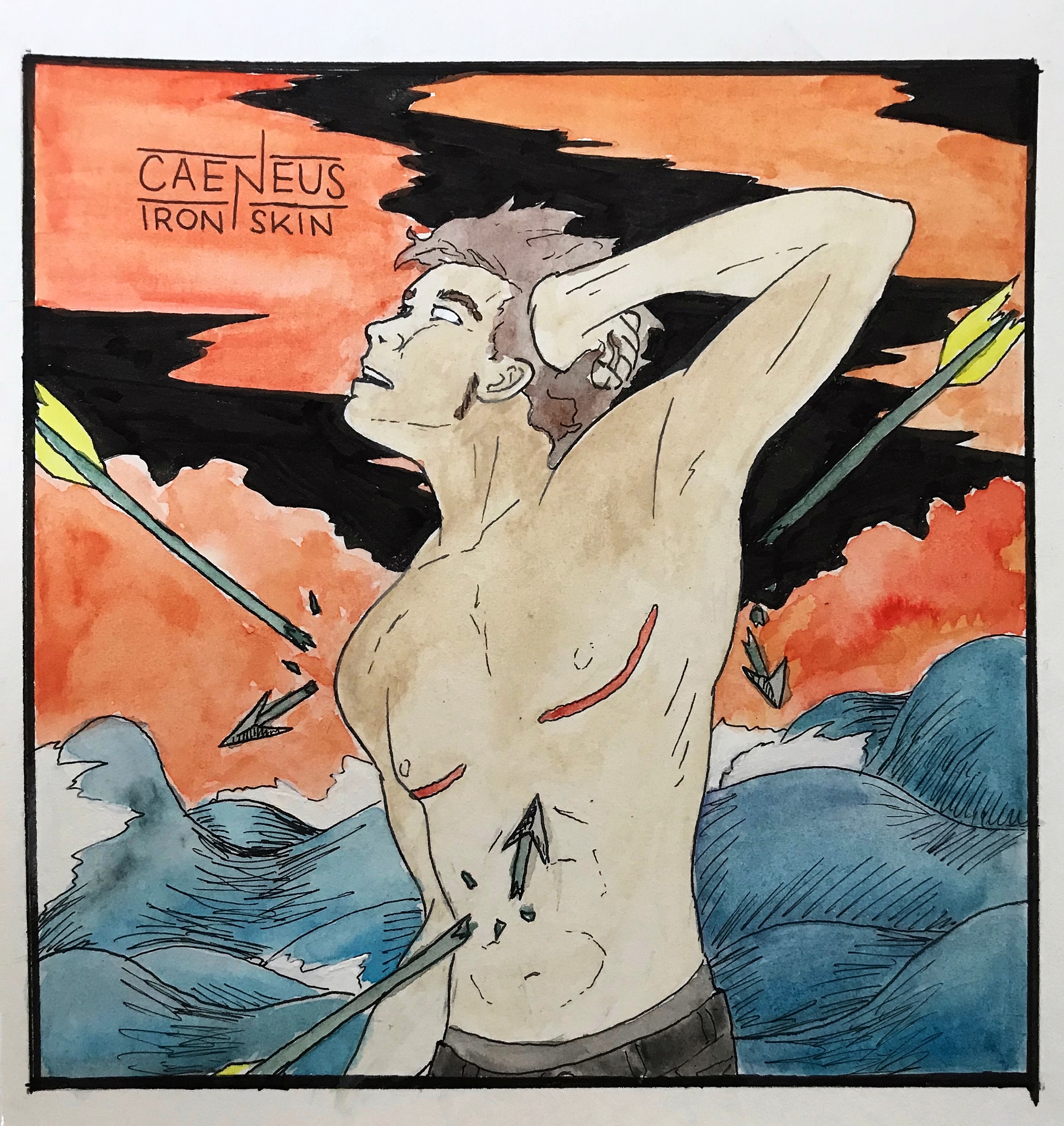
1 - “Caeneus - Iron Skin” marker, pen, watercolor, and gouache on paper
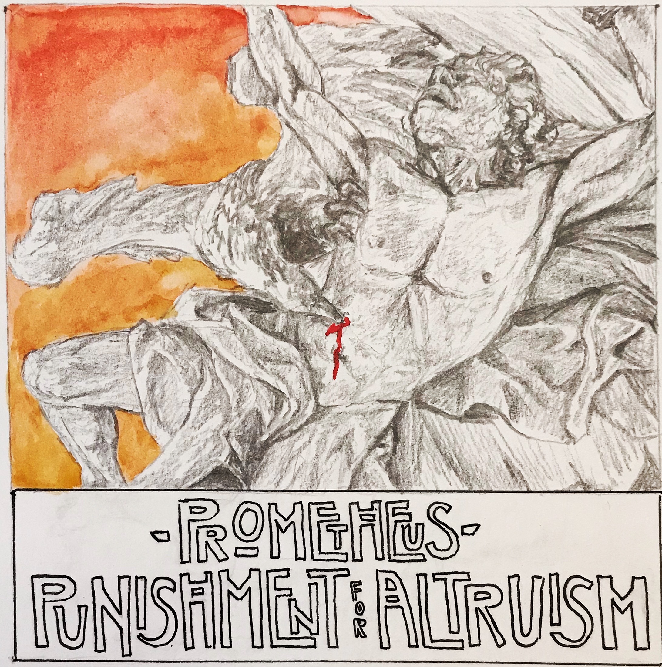
2 - “Prometheus - Punishment for Altruism” graphite, marker, pen, and watercolor on paper
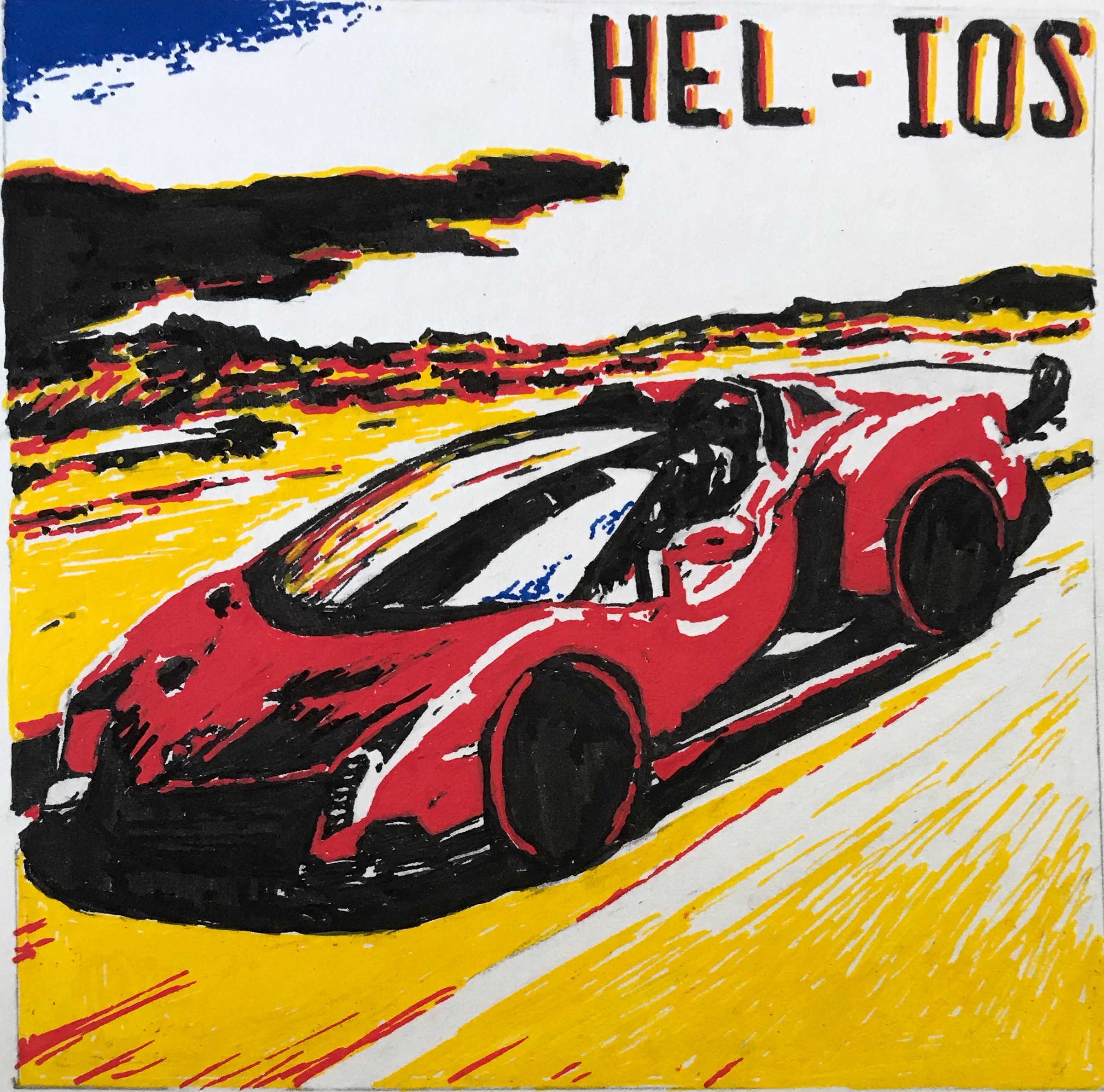
3 - “HEL-IOS” marker and pen on paper
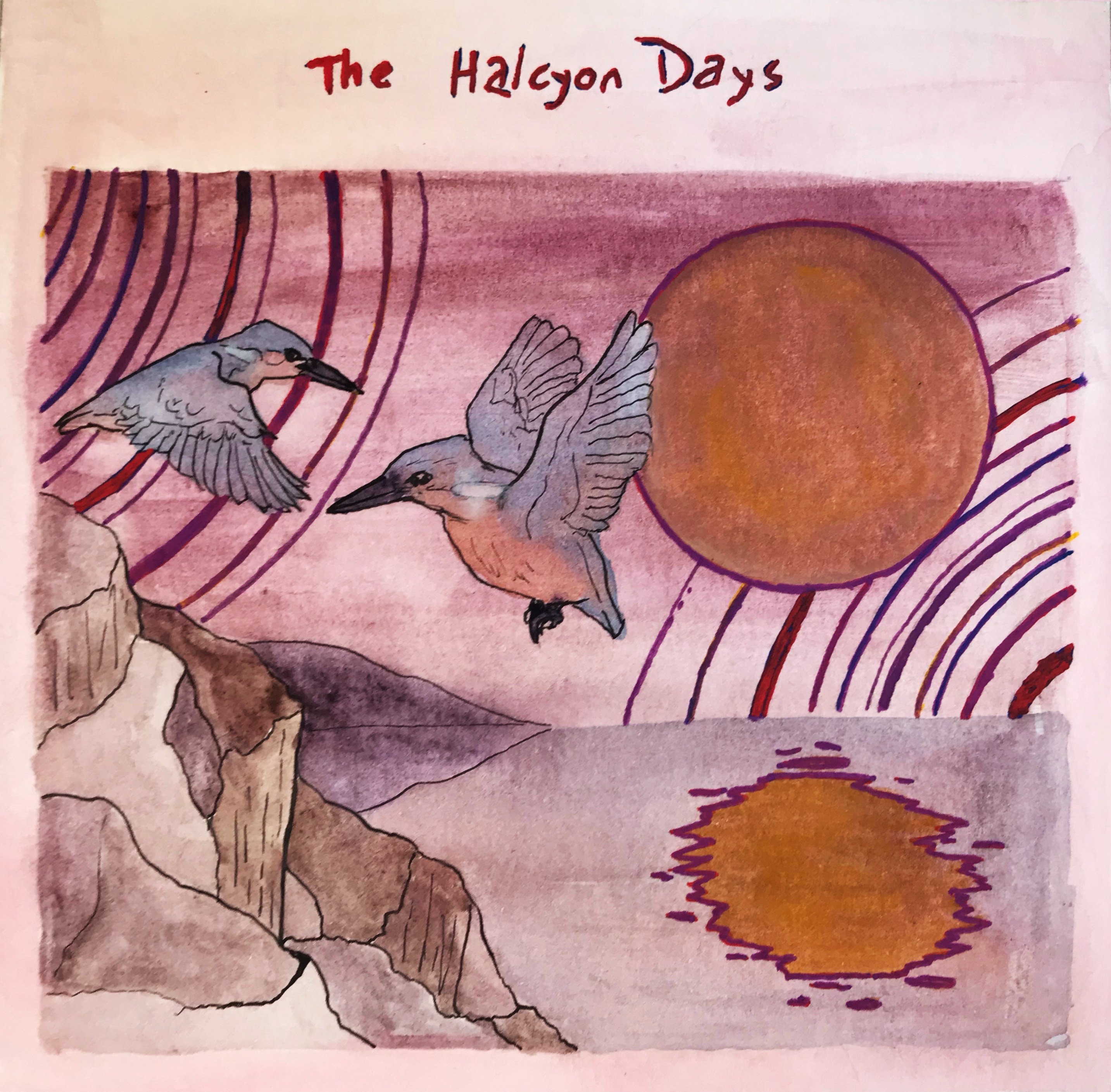
4 - “The Halcyon Days” gouache, pen, and marker on paper
Diane Wang:
Dominic Ramirez:
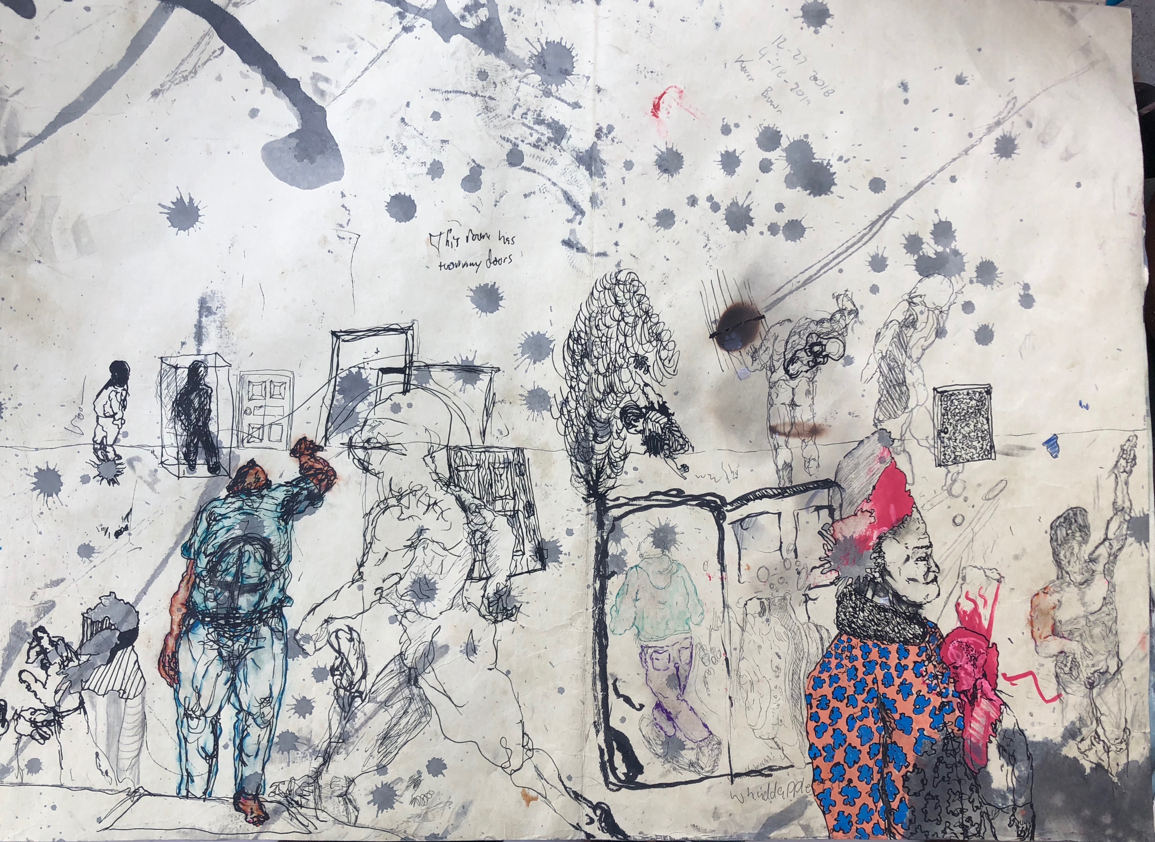
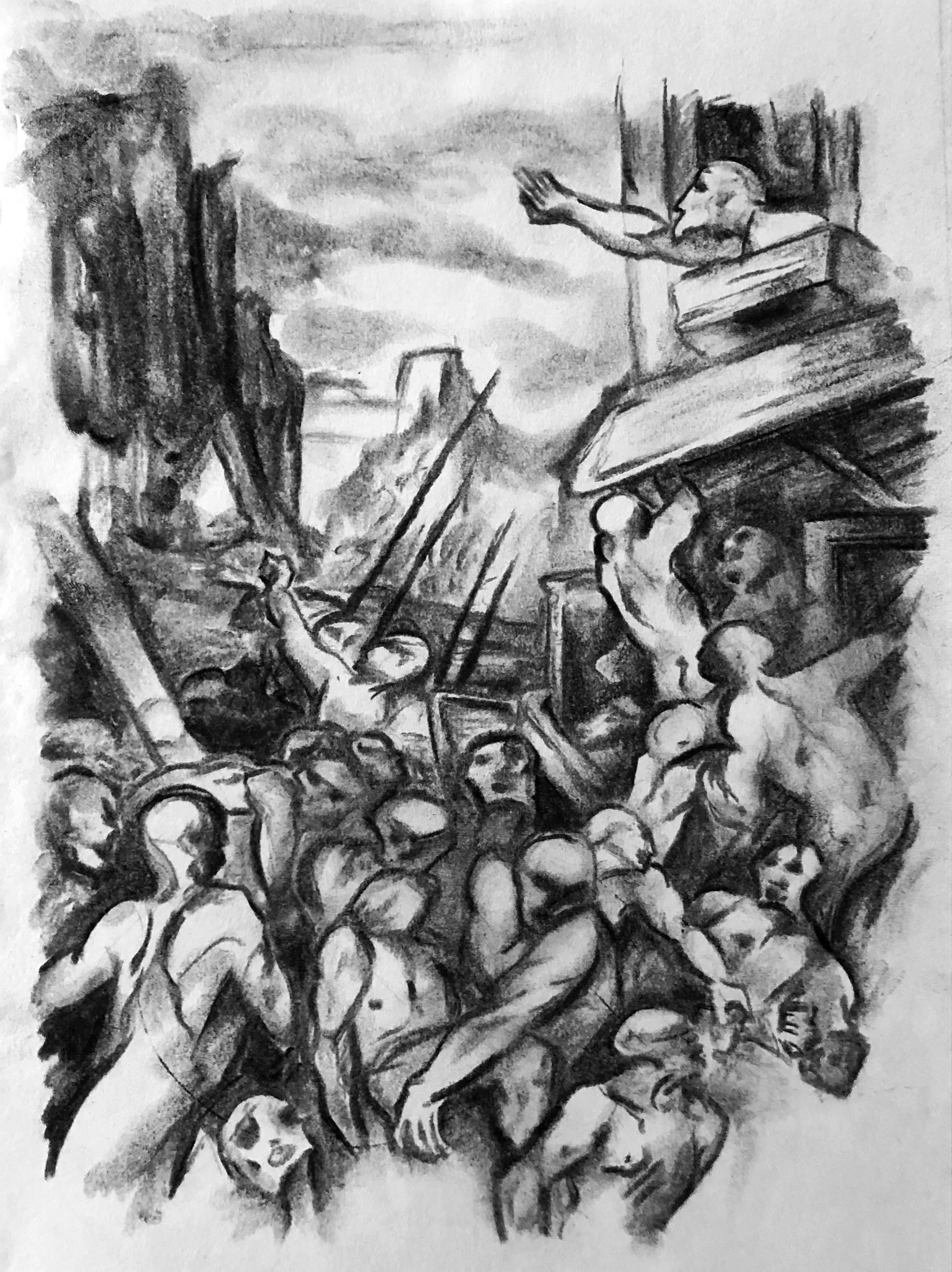
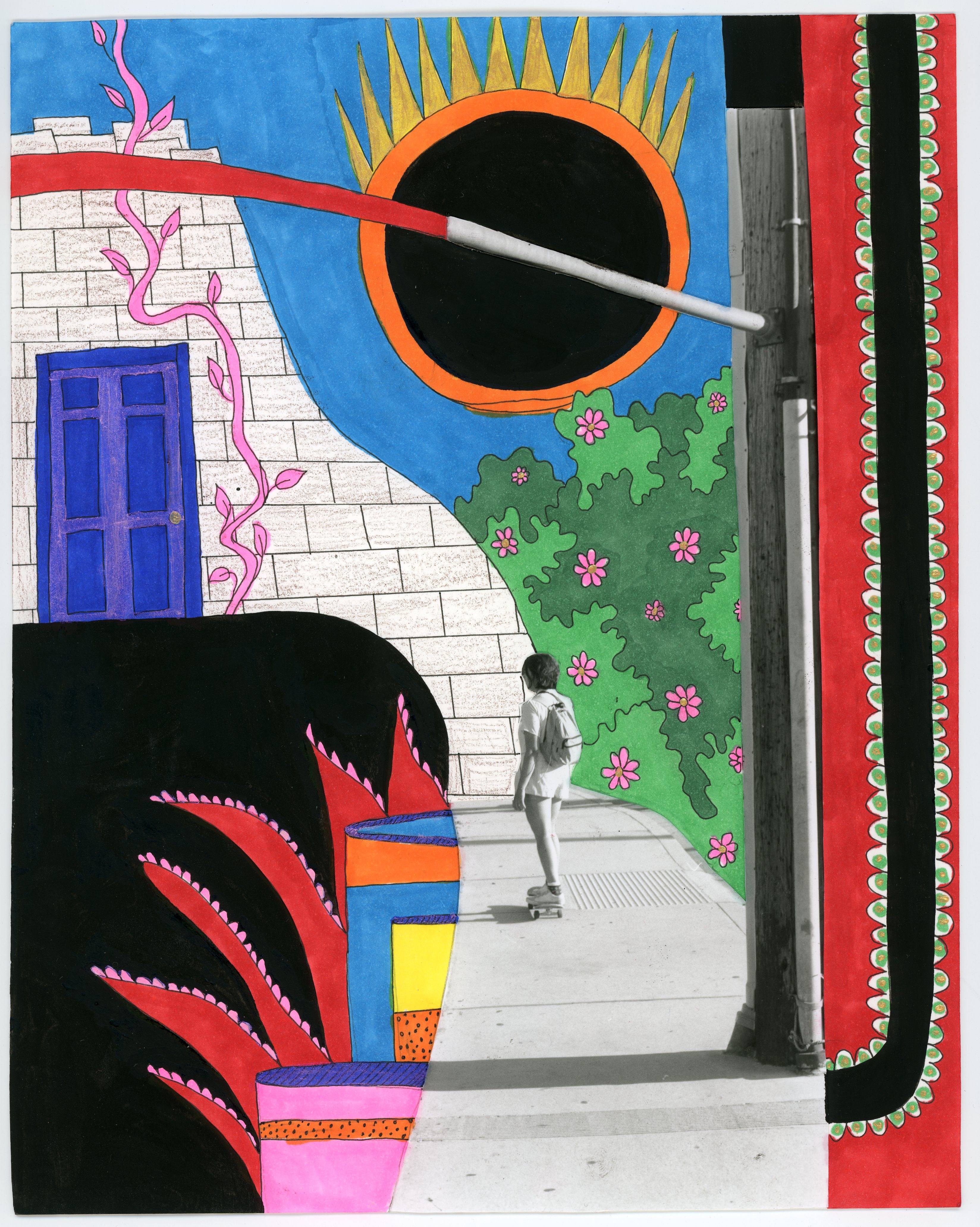
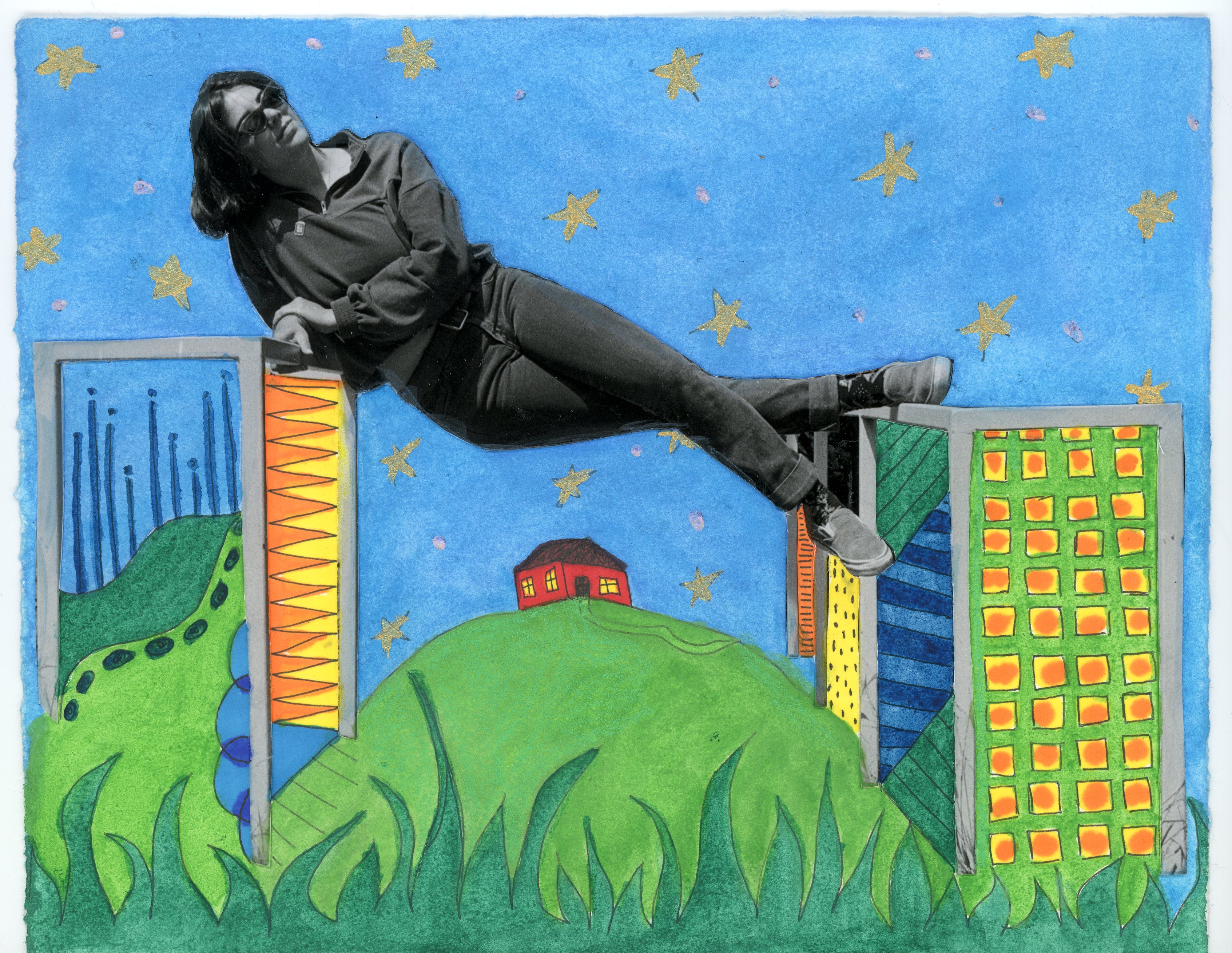
Image 1: Too many doors 22x36” Ink, marker and graphite on paper
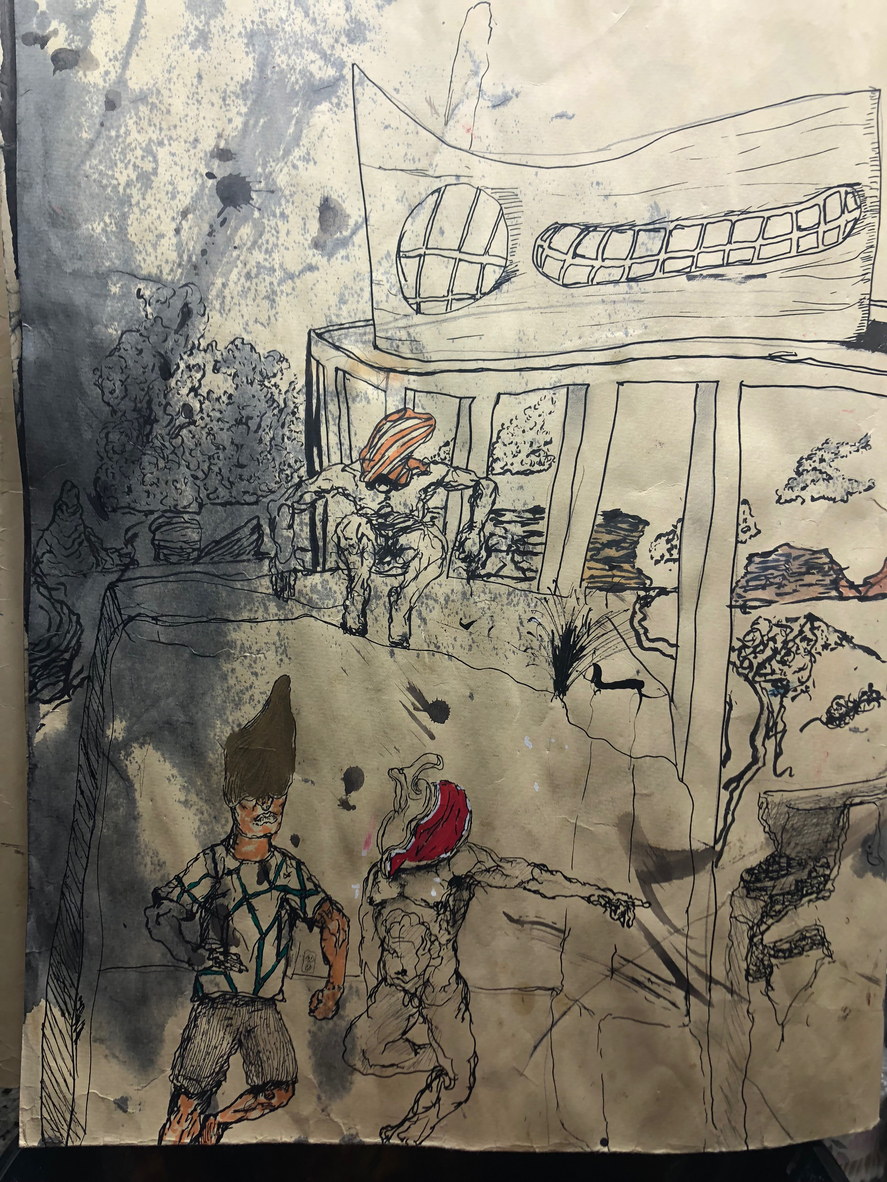
Image 2: Ruins of a wasteland part 1(Climbing dead city rubble) 38x24” Ink, oil paint pen, watercolor on paper
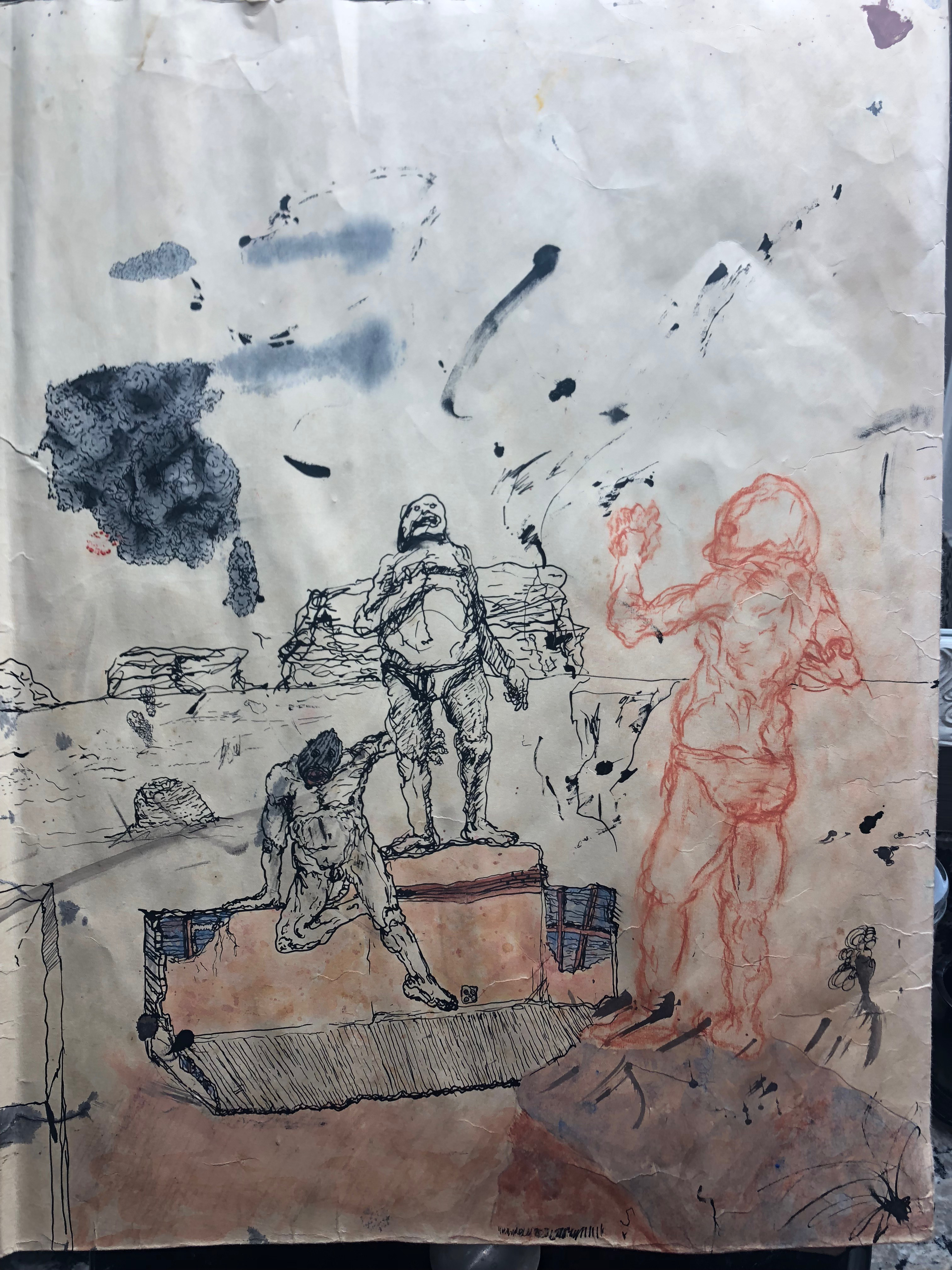
Image 3:Ruins of a wasteland part 2(The man lost in the desert sea) 38x24” Ink, conti, watercolor on paper
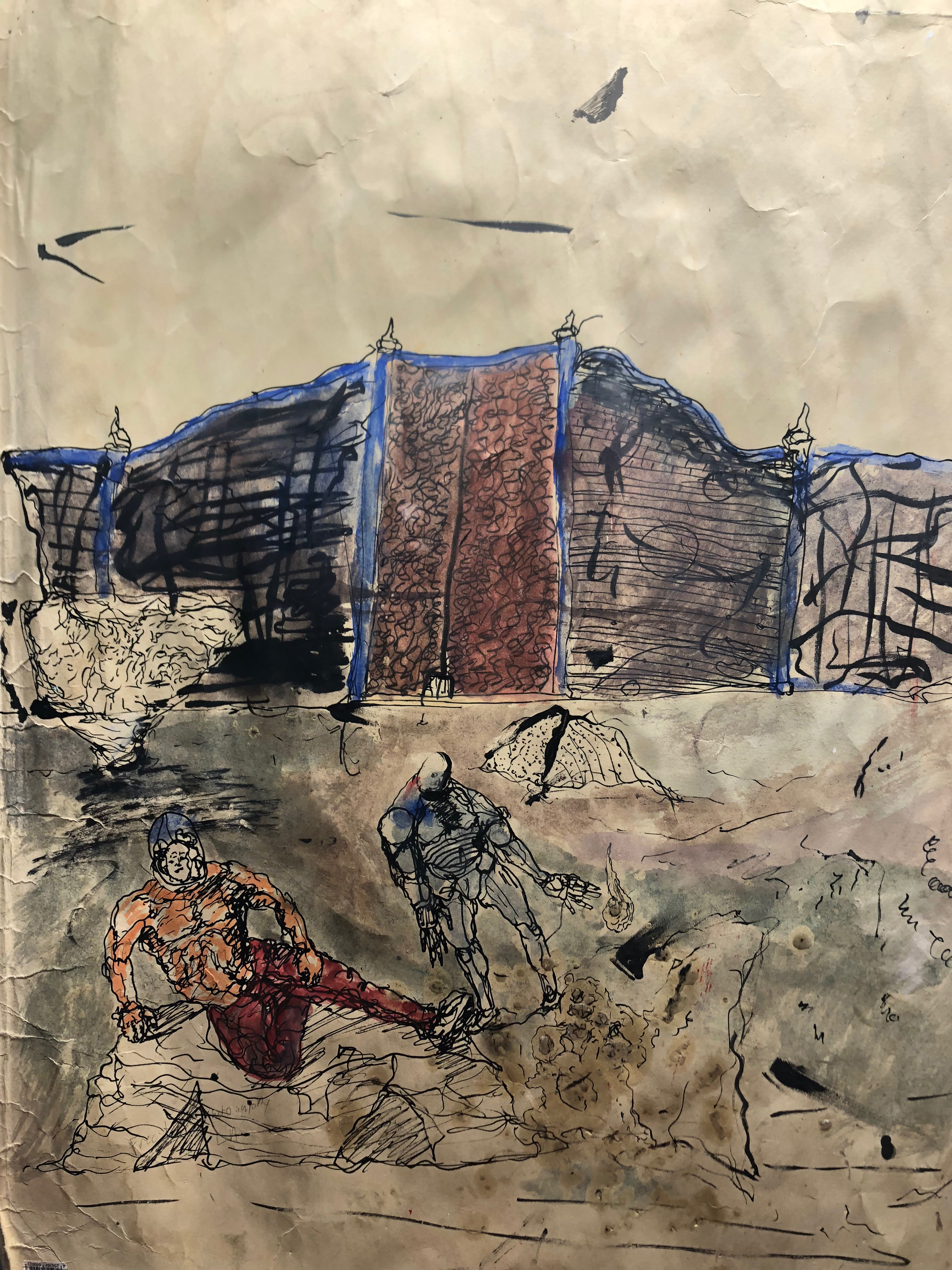
Image 4:Ruins of a wasteland part 3 (Outside the gates) 38x24” Ink, watercolor, wax on paper
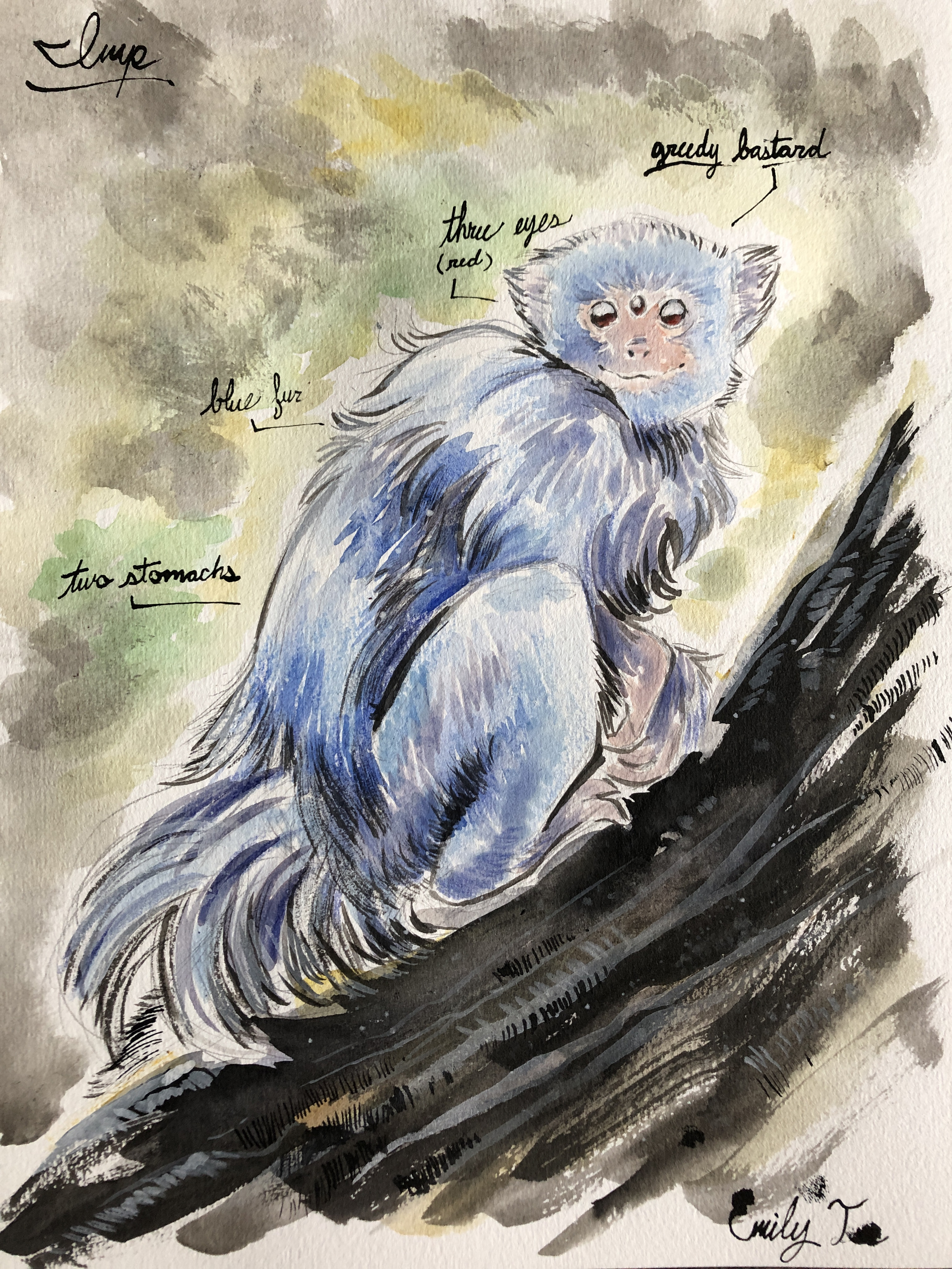
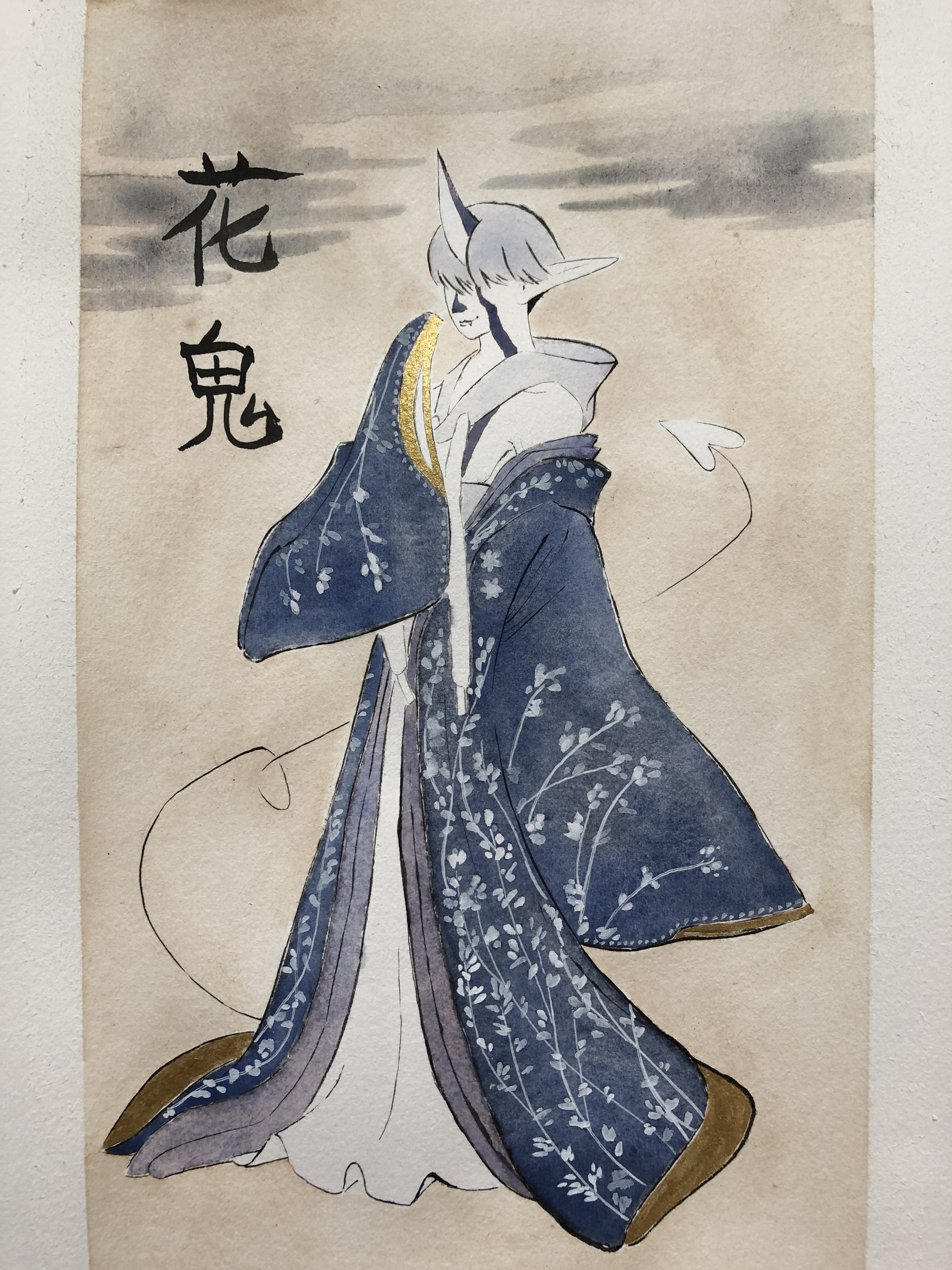
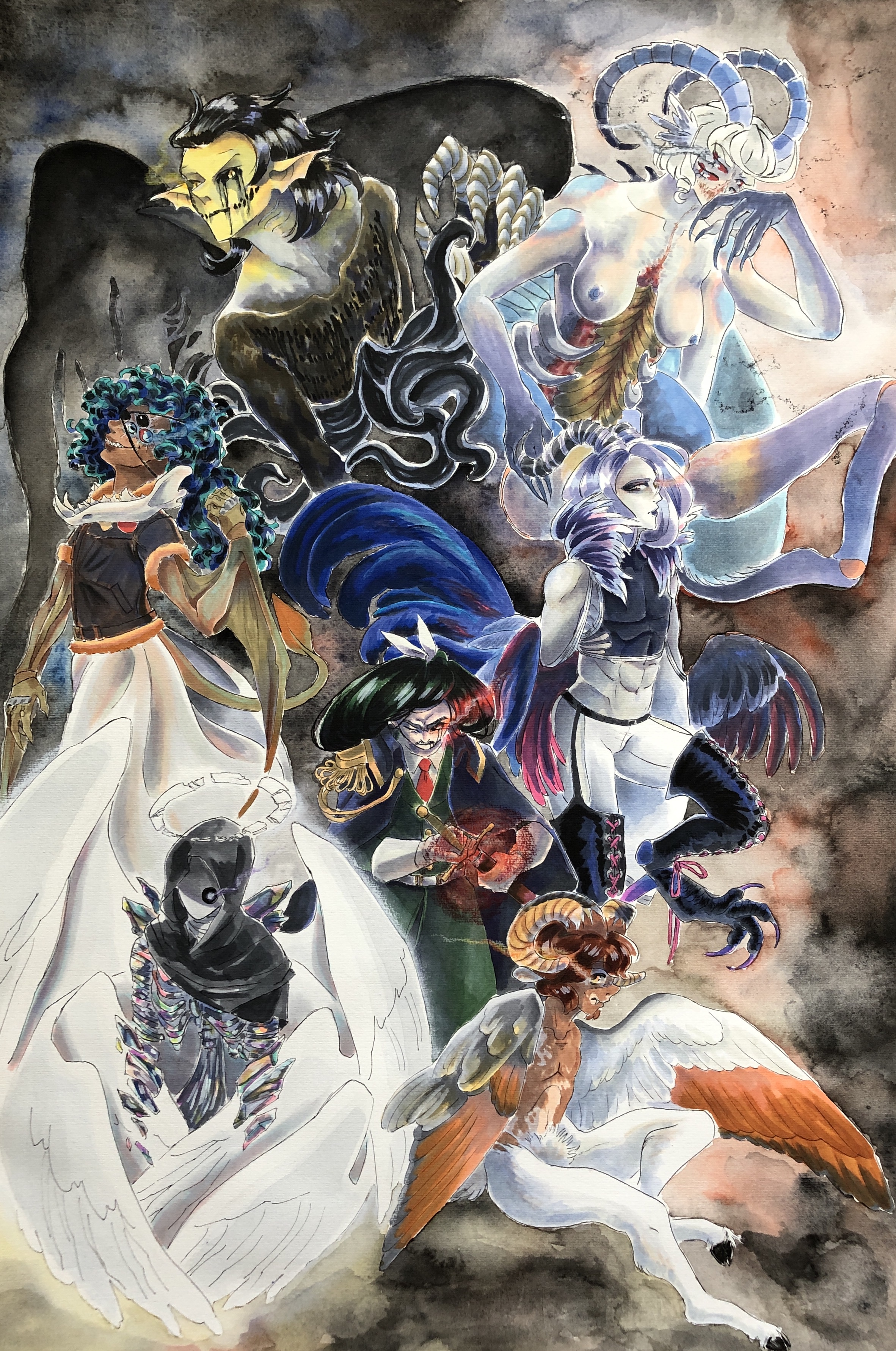
Emily Tse:
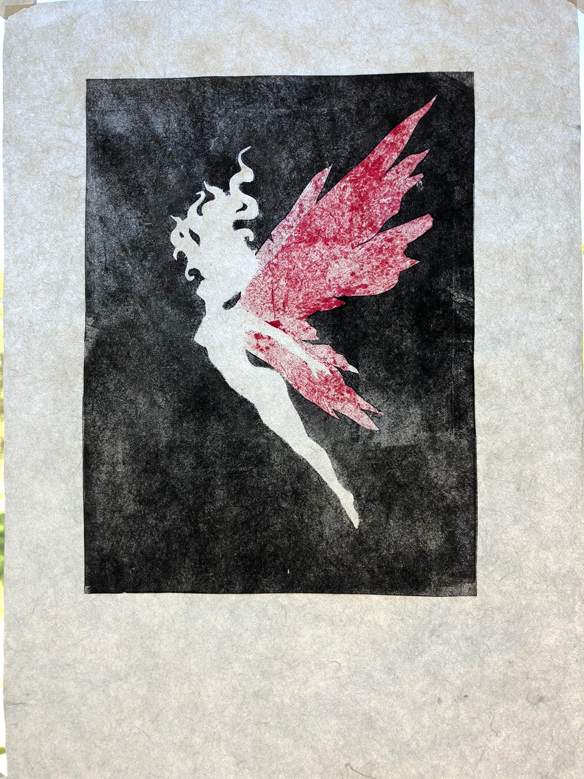
Griffin Conway:
This whole series was my response to the current pandemic and the resulting disconnect from nature and my loved ones, centering around monsters and intimacy. The primary materials I used for these illustrations were acrylic paint, pen, and sharpie markers.

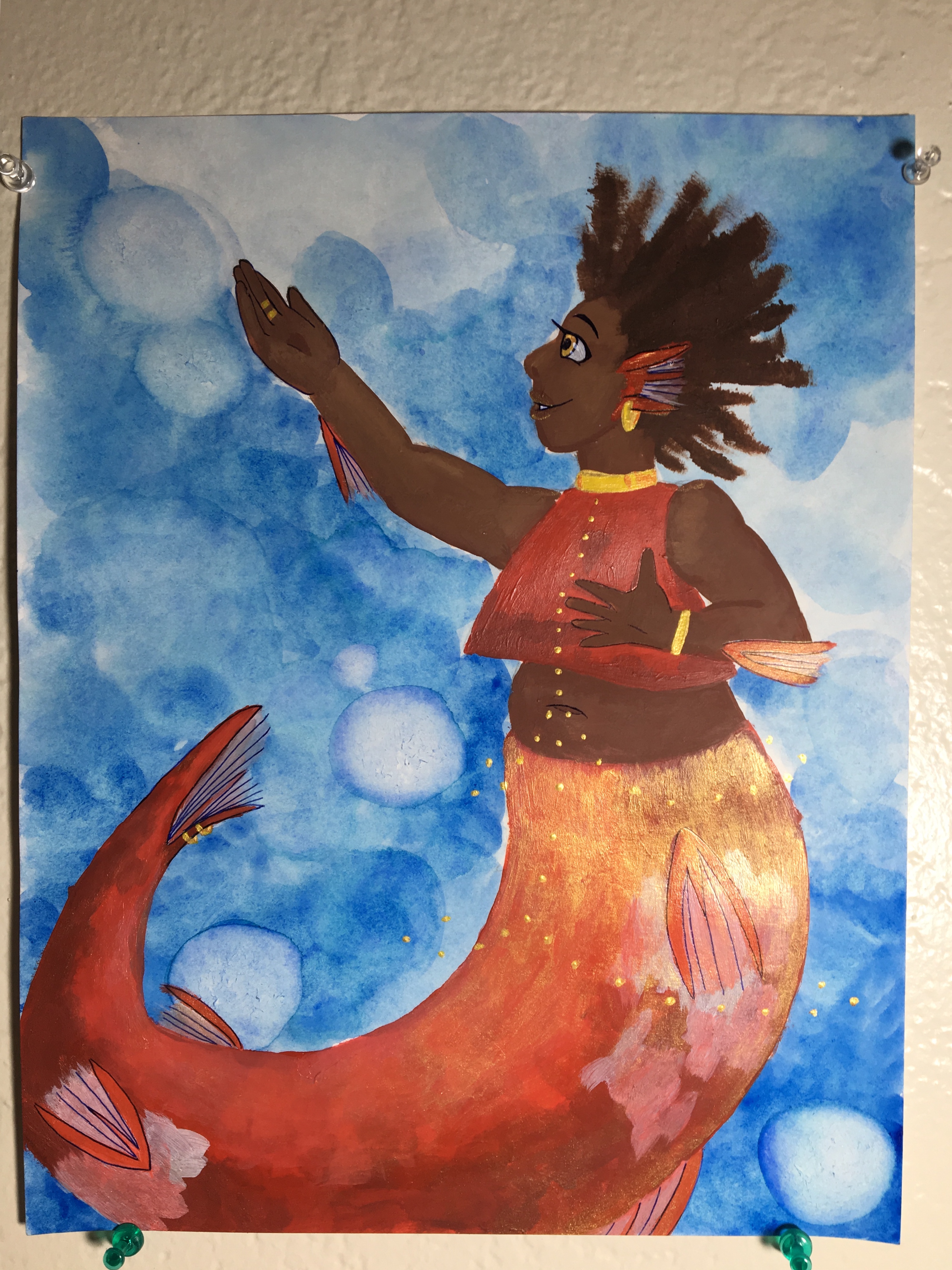
1&2- Mermaids: Social distancing can manifest in art in many ways, and the first way I chose to visualize social distancing was to keep the subjects in physically separate drawings. No matter how much the red and pink mermaids want to be together, they can never unite. I also wanted to play with things being unique and still matching; both of the mermaids are koi, but the pink mermaid is decorated with pearls and the red mermaid with gold.
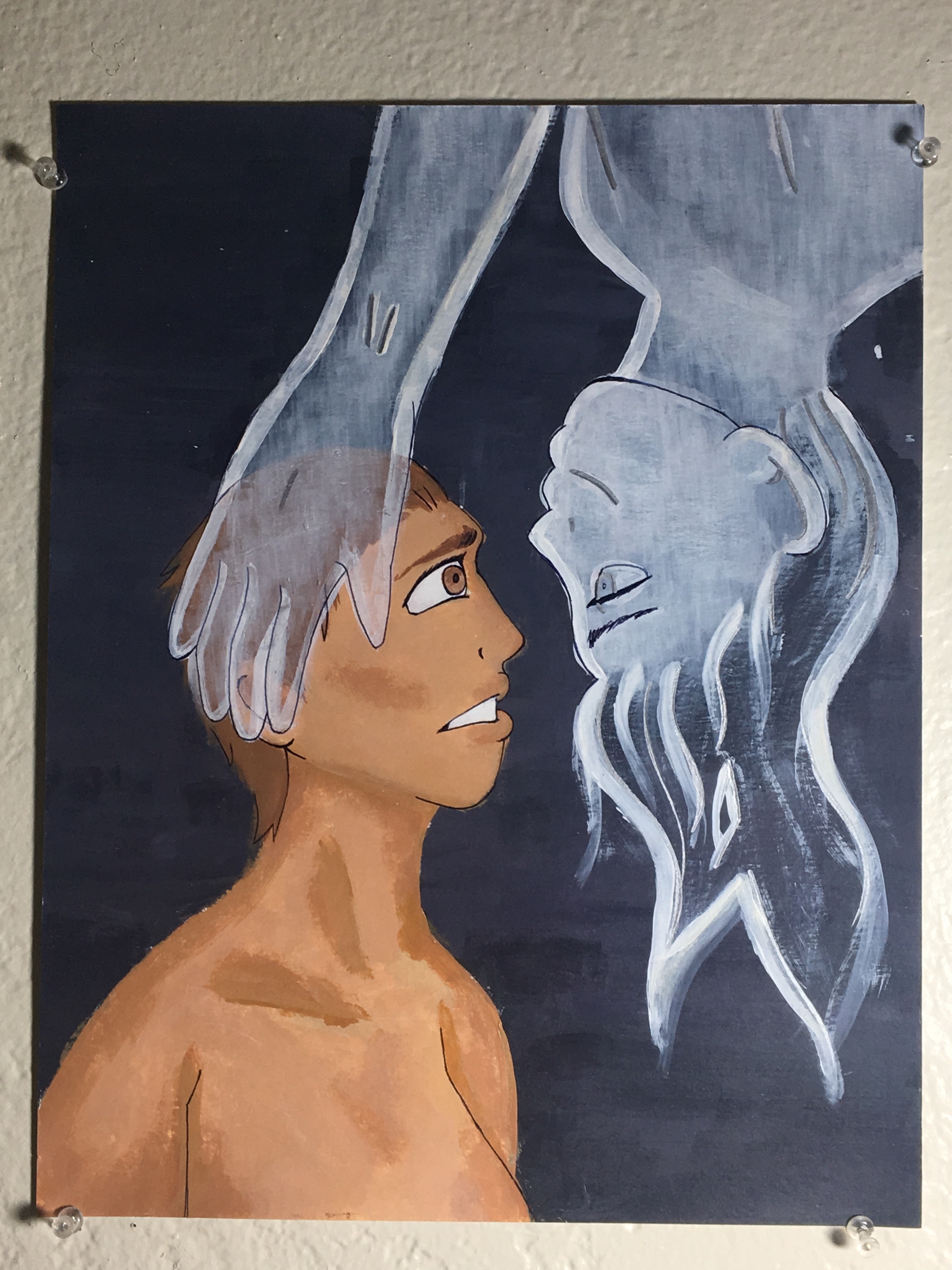
3- Ghost: A ghost, too, has many different meanings right now. I wanted to keep this piece a little more ambiguous. Could it be about the death of a loved one? The separation from them? The loss of the relationship itself? To let you in on a little lighthearted secret, the gray in the background is a very specific gray: the gray of Discord, a communications app. Specifically because I have many ghosts in my life, that are still here and yet not.
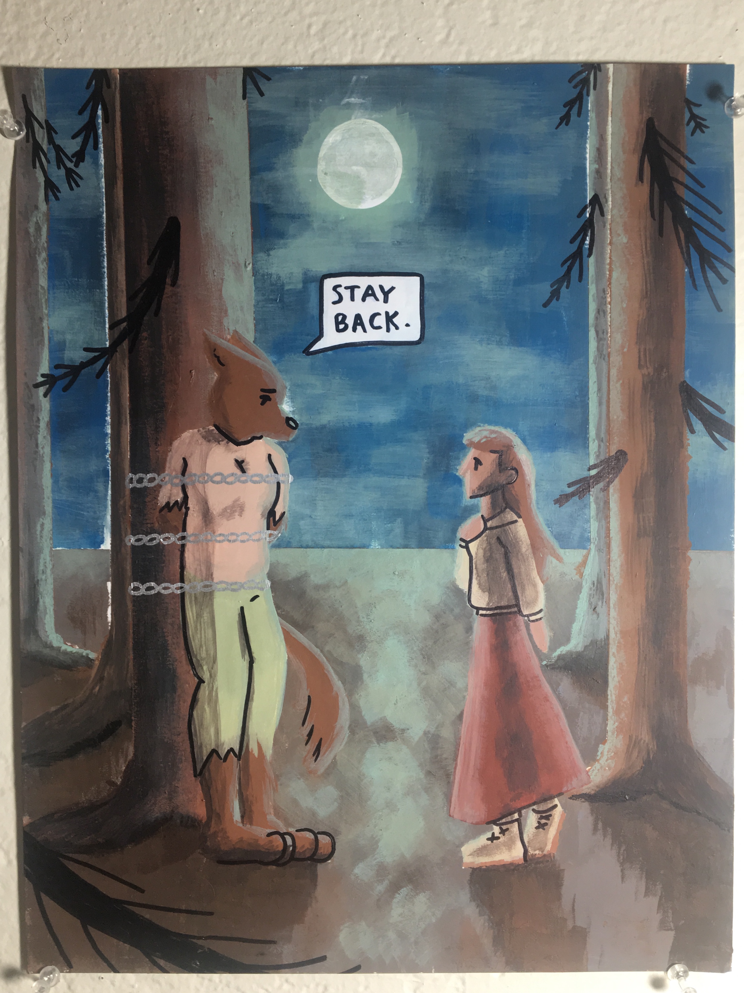
4- Werewolf: Again, the subjects in this piece may want to be together, but can’t. Here it’s more directly heartbreaking, as the werewolf girl warns the human that she may be dangerous, certainly metaphorical of current events. Even so, the human’s body language indicates that she may be willing to face that danger in order to help.
Joey Xiao:


Justin Jacobs:
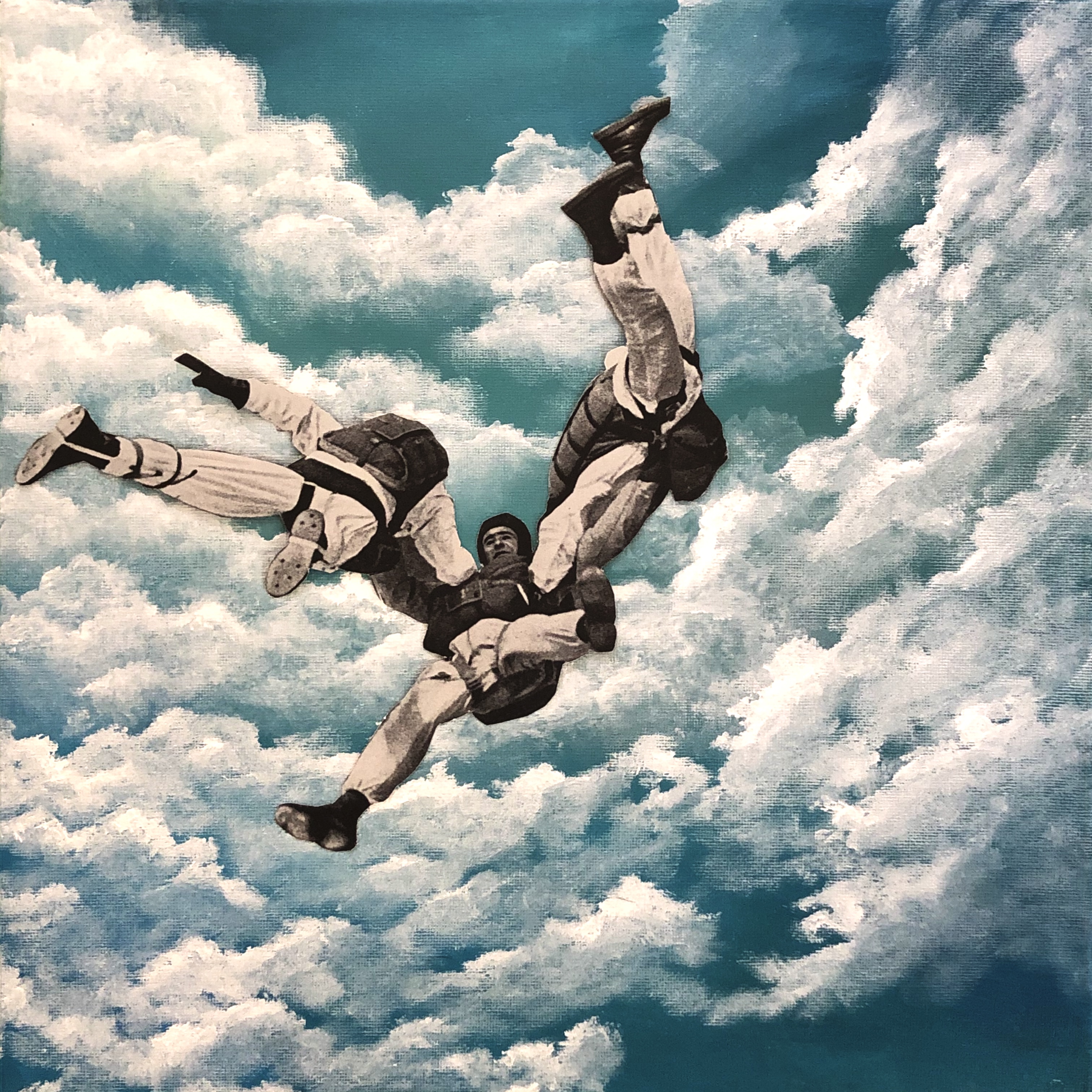
Scene 1, 2020, watercolor and ink

Ambulance , 2020, watercolor and ink
Plane dive, 2020, ink, chalk pastel, oil pastel

Lakester, 2020, watercolor and oil paint
Mallory Mahon:


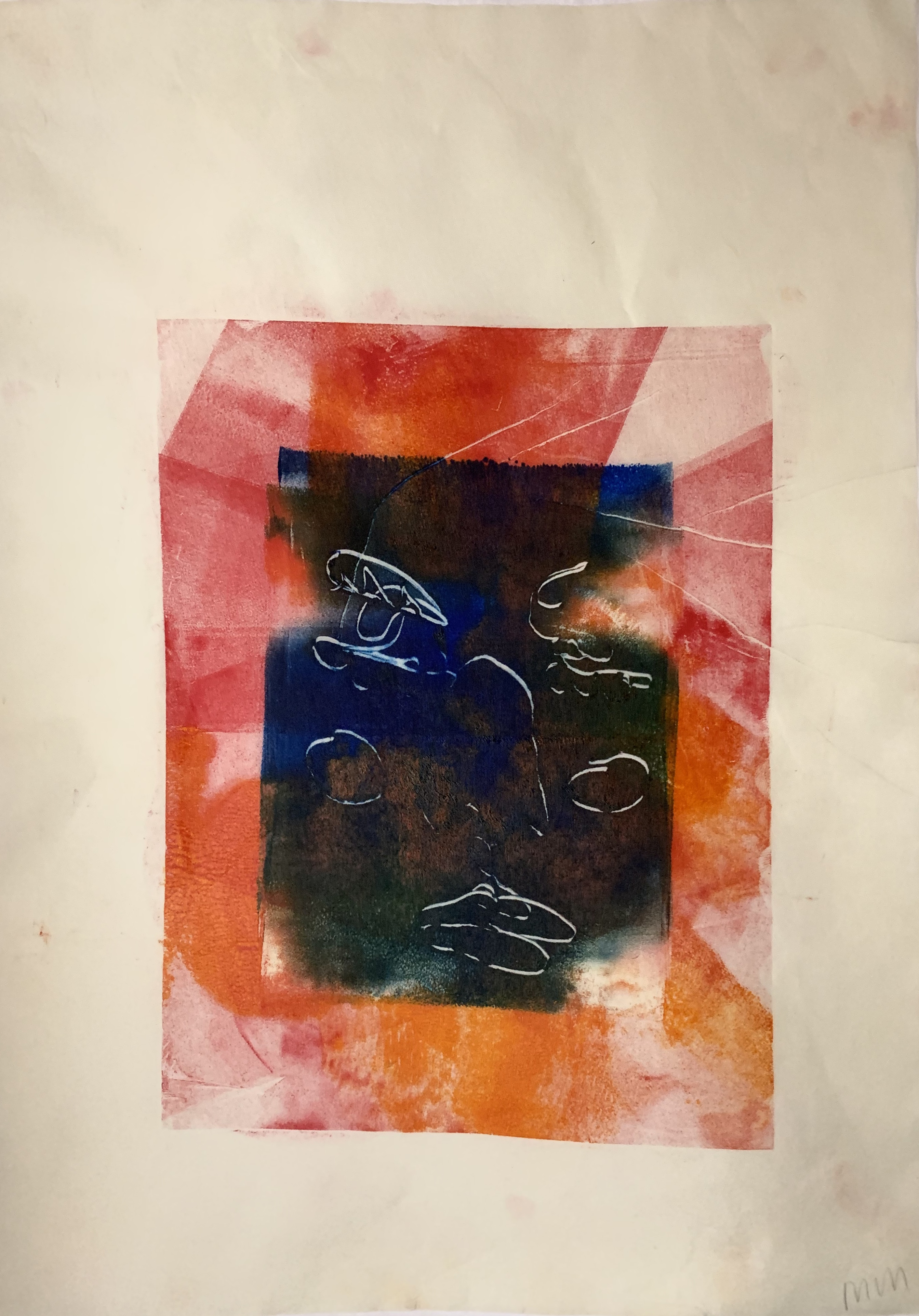
Marian Mafnas:
Megan Chau:
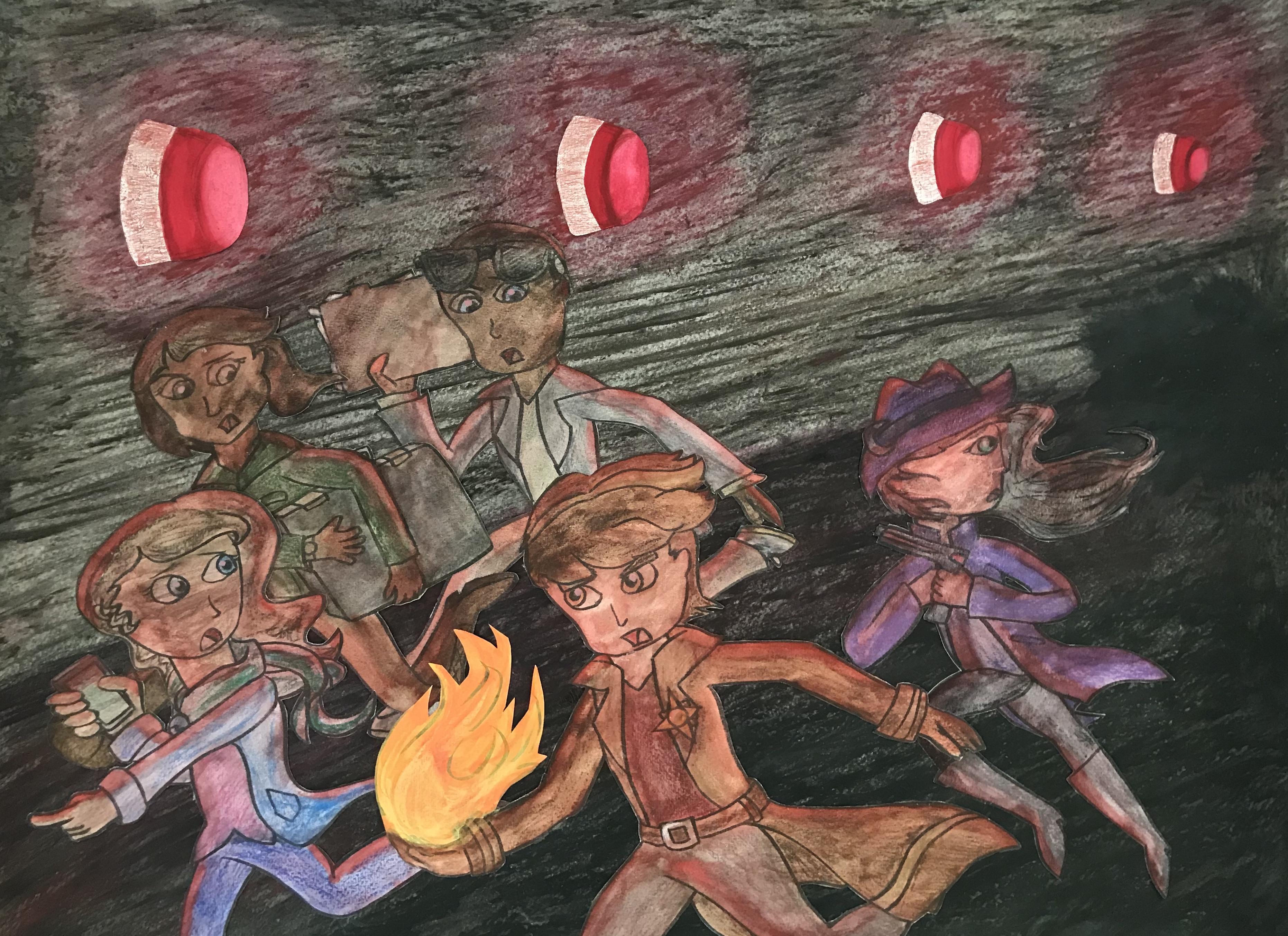
“Escape Pt. 1”
A collaged scene depicting my characters escaping from enemy territory.
Media: Watercolor, ink, color pencil, acrylic, gouache, oil pastel

“Escape Pt. 2”
A collaged scene depicting my characters escaping from enemy territory(continued from my first artwork).
Media: Watercolor, ink, color pencil, acrylic
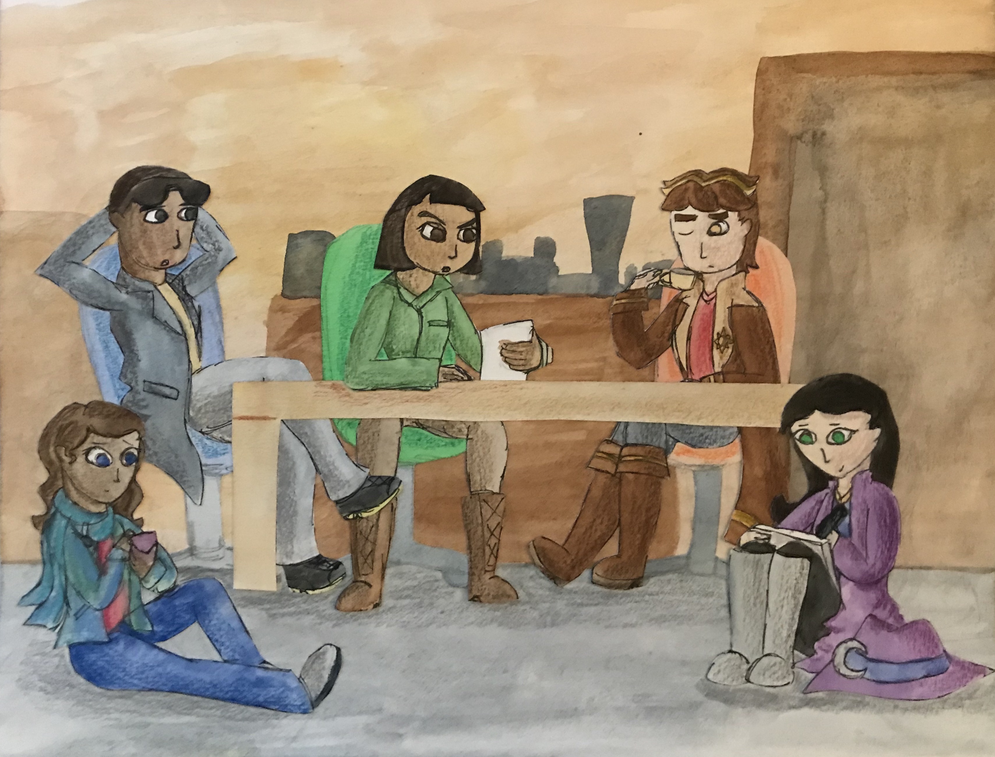
“Downtime”
Another collaged scene with my characters in a more tranquil setting.
Media: Watercolor, ink, color pencil

“Fire”
A collaged picture using one of my characters.
Media: Watercolor, ink, color pencil, charcoal, collage paper
Mia Weitz:

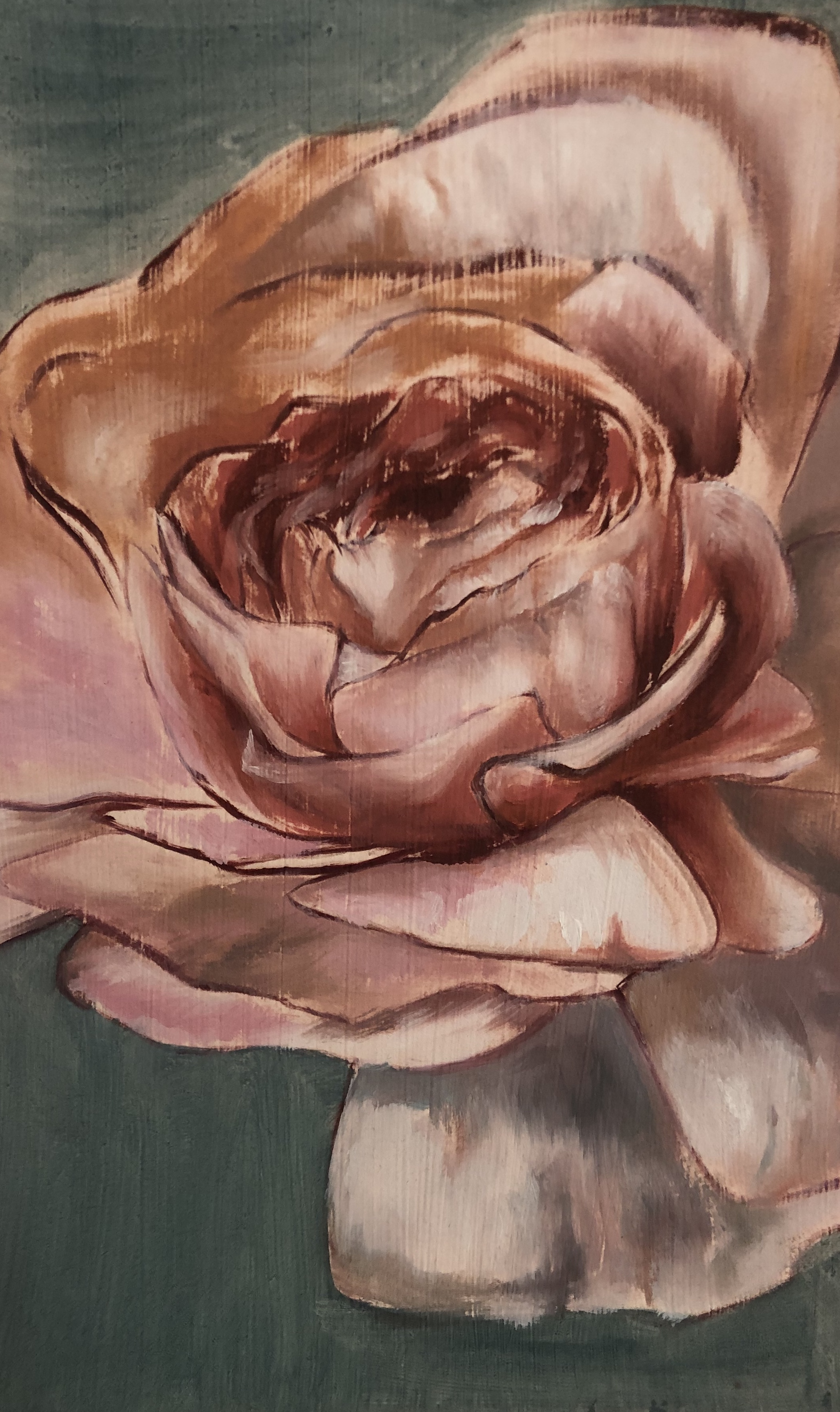
“Sporangium” Oil pastel over acrylic on paper, 12” x 18”
“La Vie en Rose” Oil pastel over acrylic on paper, 12” x 18”

“Lily” Oil pastel over acrylic on paper, 12” x 18”
“Fall” Oil pastel over acrylic on paper, 8.5” x 11”
Nina Scherer:
@NuhEyeNuh on Instagram, Twitter, and TikTok
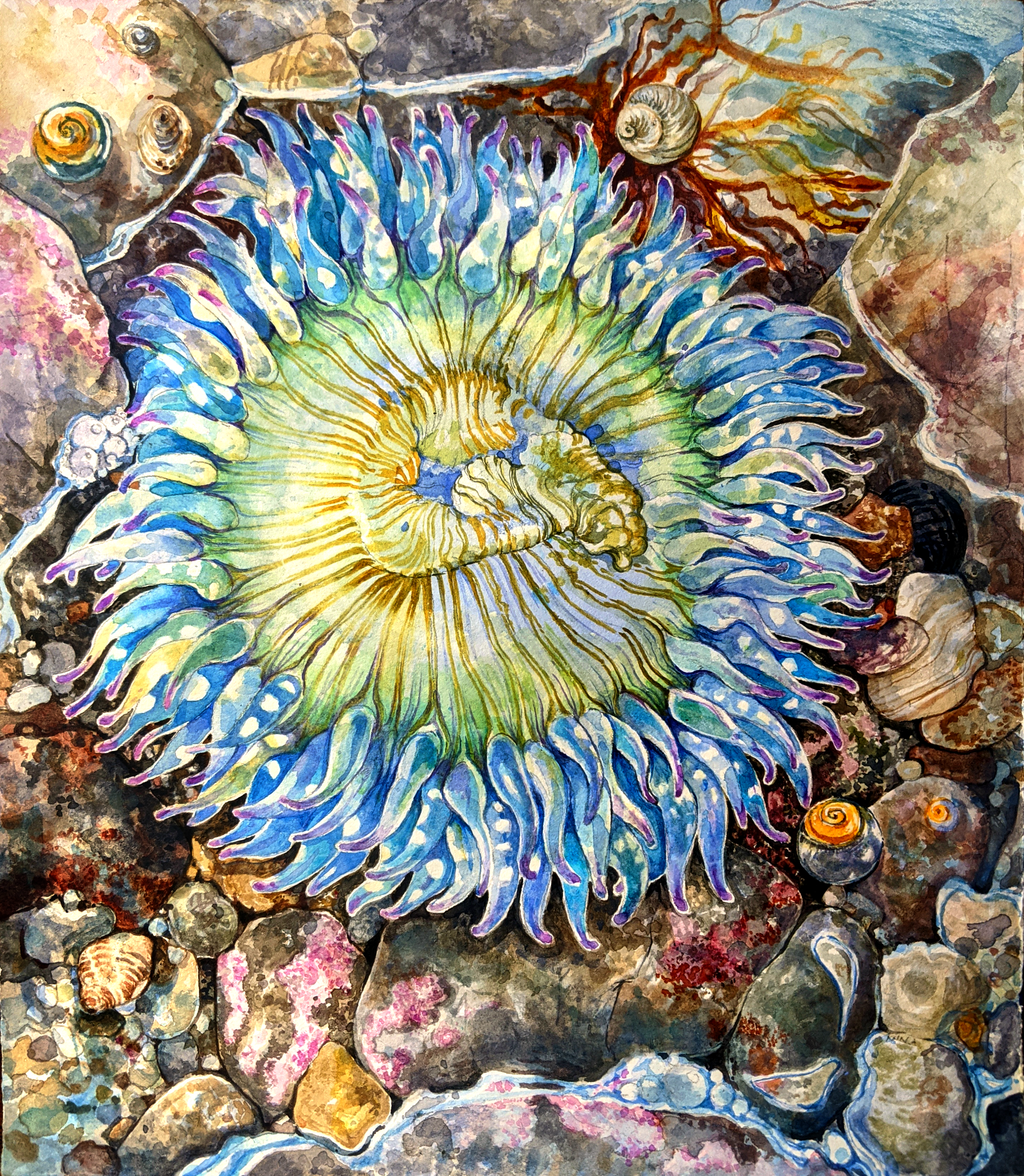
1- Anthopleura Sola 12x12” watercolor, gouache, and colored pencil on cold press
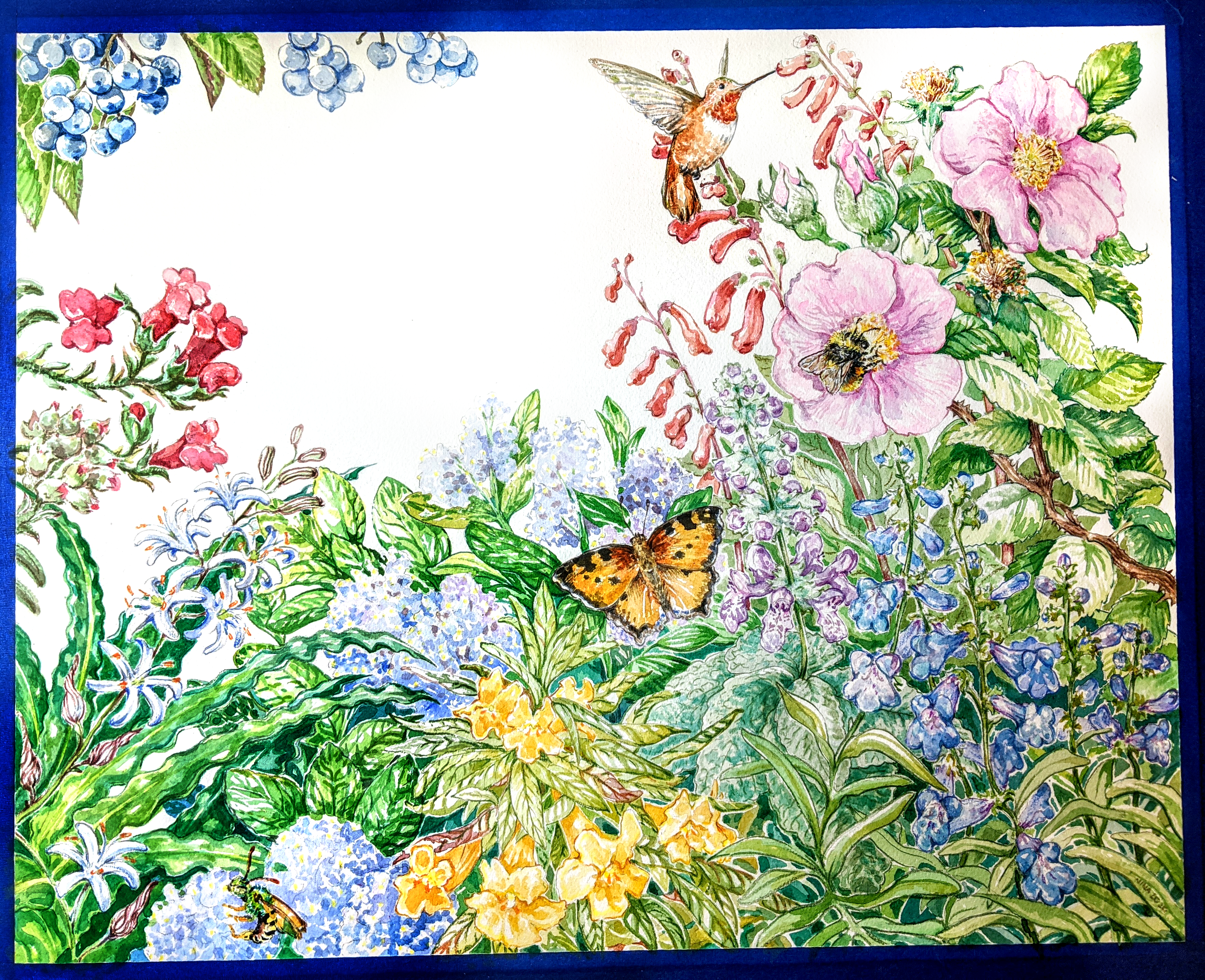
2- Pollinator Garden 20x16” watercolor and colored pencil on cold press
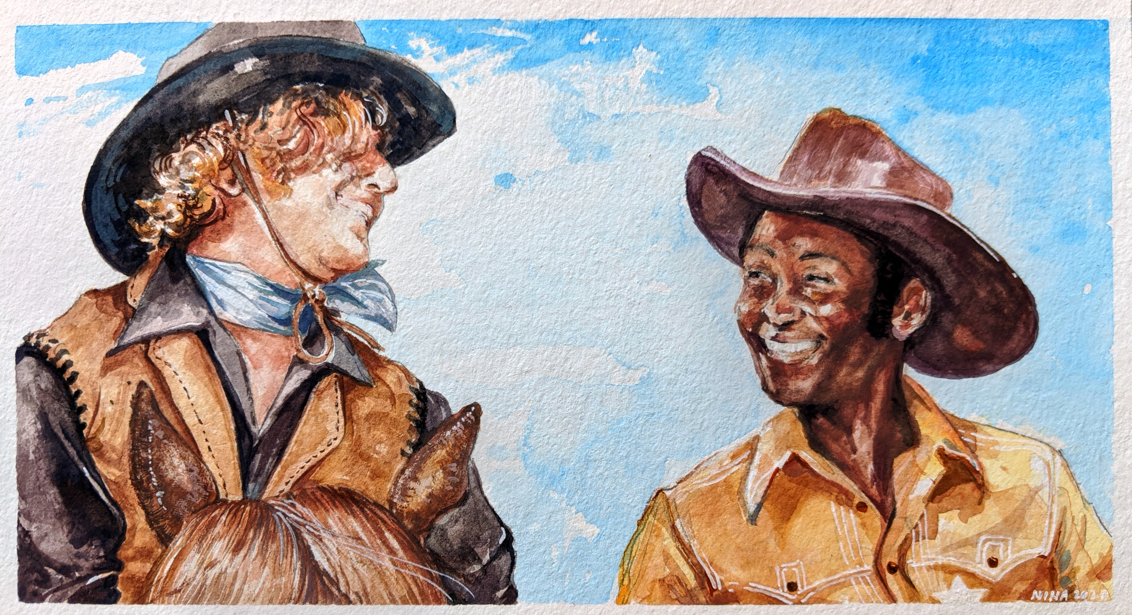
3- Gene Wilder and Cleavon Little in Blazing Saddles (1974) 8x5” gouache, marker, and gel pen on hot press
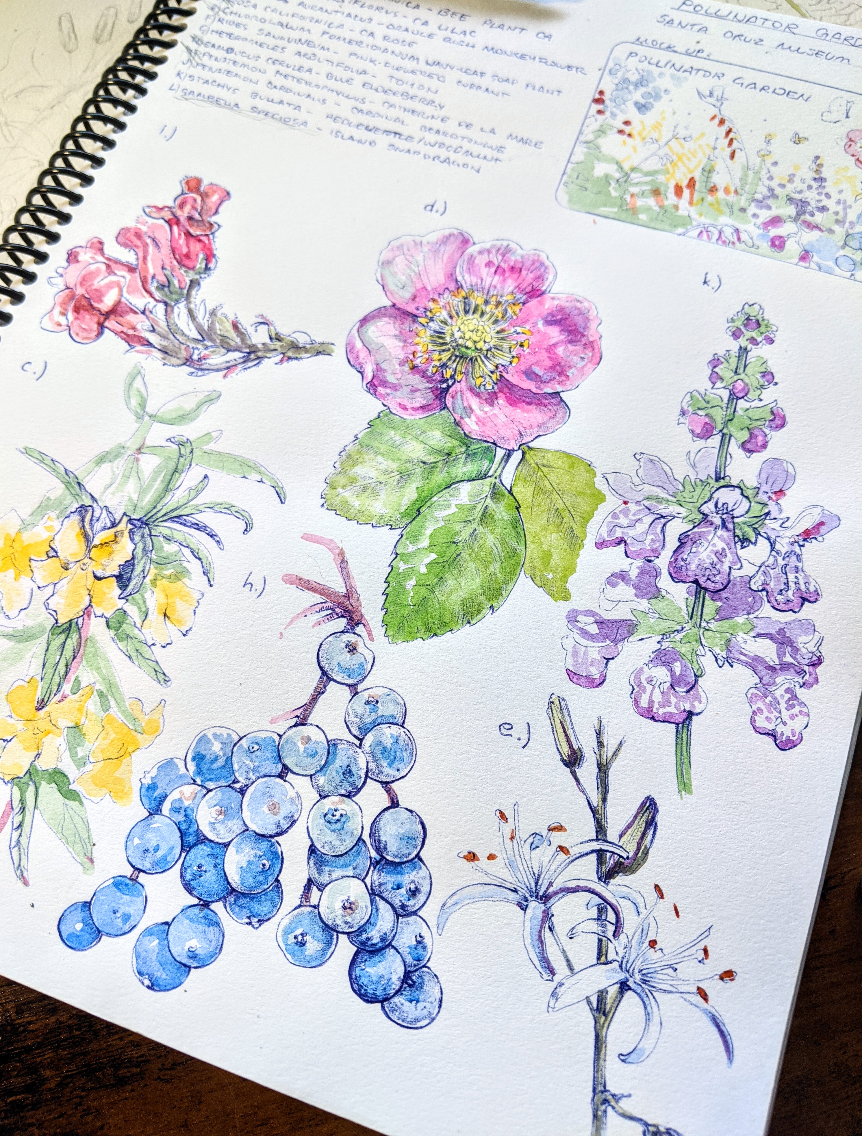
4- Pollinator Sketchbook Studies 9x12” Watercolor and ballpoint pen
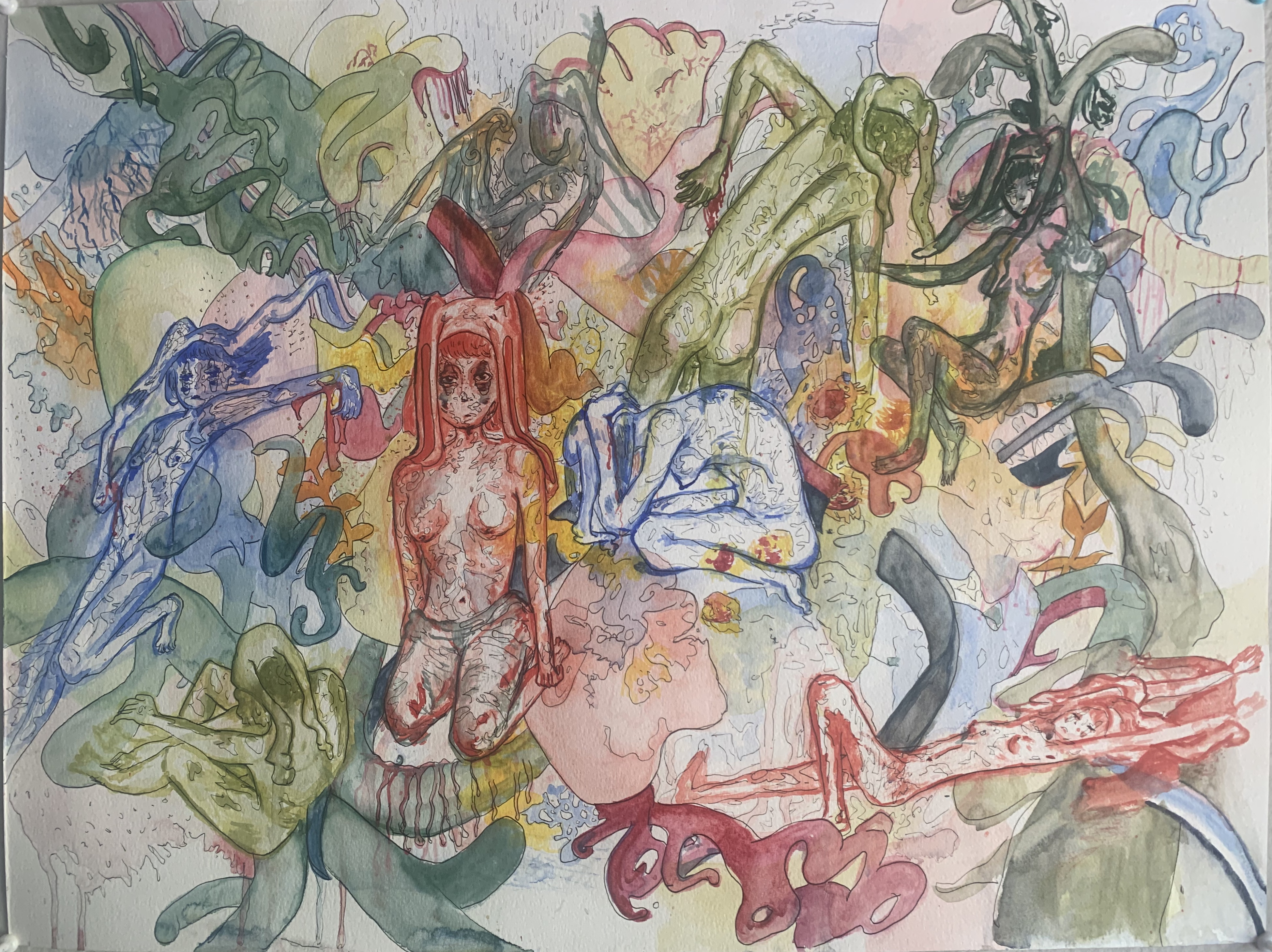
Rebekah-Lee:
Mixed Media: This series was inspired by the desire to explore human emotions. Each week, I would have a small series of sketches to choose which to finalize for that week’s illustration. I did this to explore and practice my ability to communicate complex emotional states without text or context. As an illustrator, it’s essential to be able to relate to viewers a person’s emotions without the aid of text, dialogue, or (sometimes) even context. So this series was to practice and polish that skill with the most complex and complicated feelings of all, my own.

I. “Grasping” [7.5”x11”]
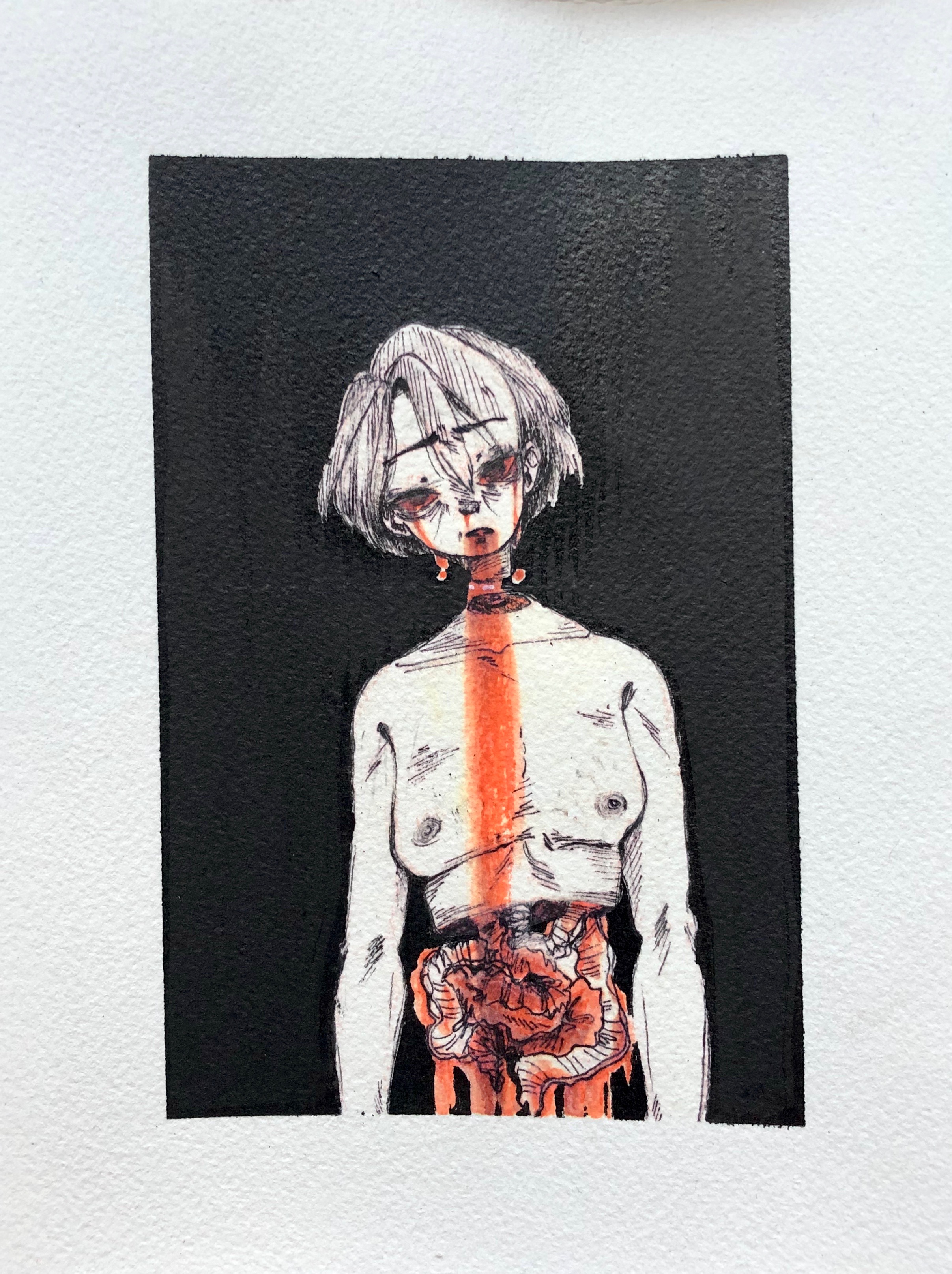
II. “Gorge” [5.5”x7.5”]

III. “Dissociative” [4”x6”]

IV. “Open” [5.5”x7.5”]
Josefina Sabatino:
Art 125: Environmental Art Studio
- Edward Shanken
Claire McKinney:
For this class, I explored an idea that I came up with called Street Gnomes, which are urban-dwelling humanlike creatures that steal socks from dryers, tend to feral animals, and craft stuff out of trash.
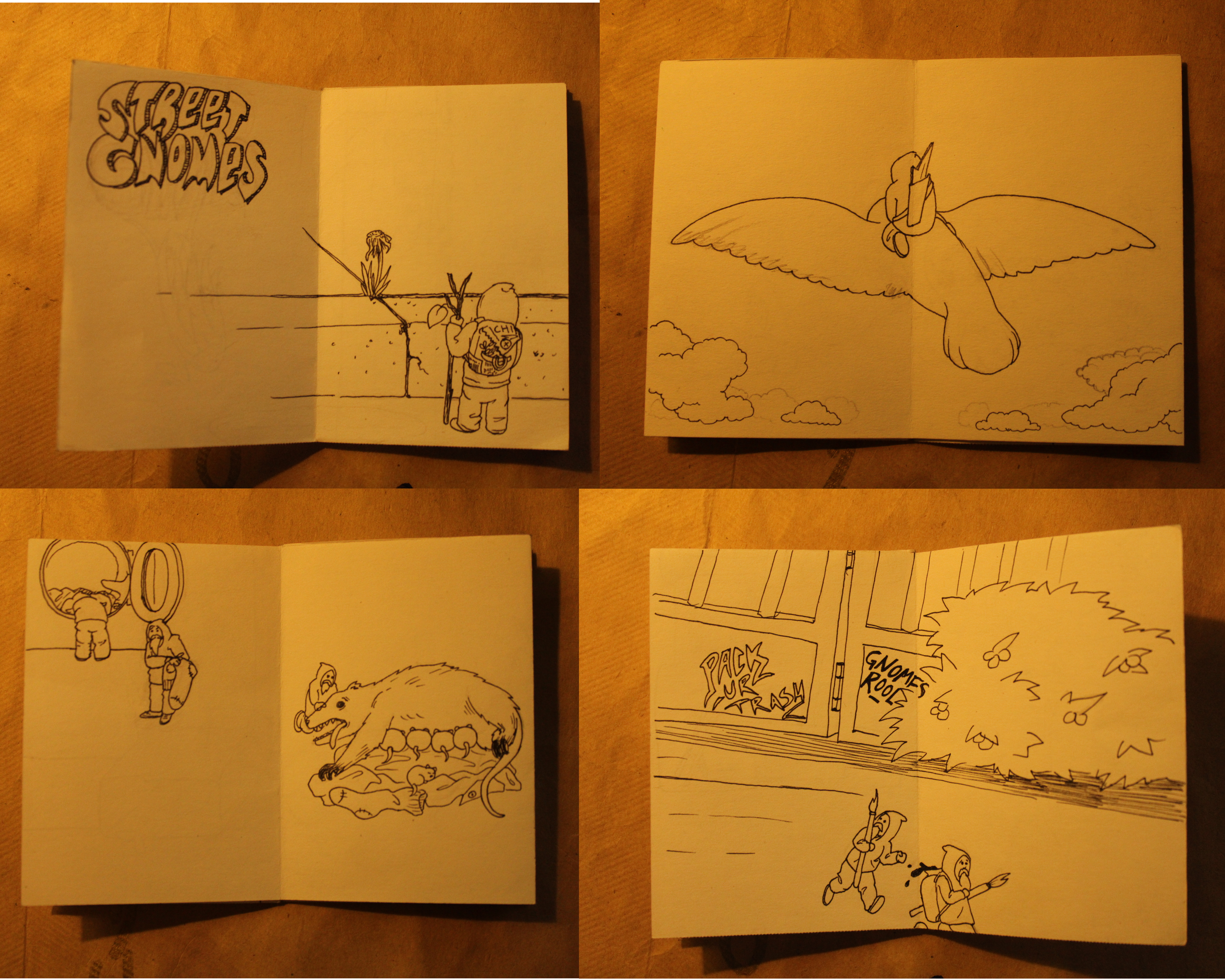
This picture shows a few different pages of the Street Gnomes comic, which was cut and folded from a single sheet of paper. It depicts gnomes helping a possum give birth, collecting rainwater, and causing trouble with some gnome graffiti.
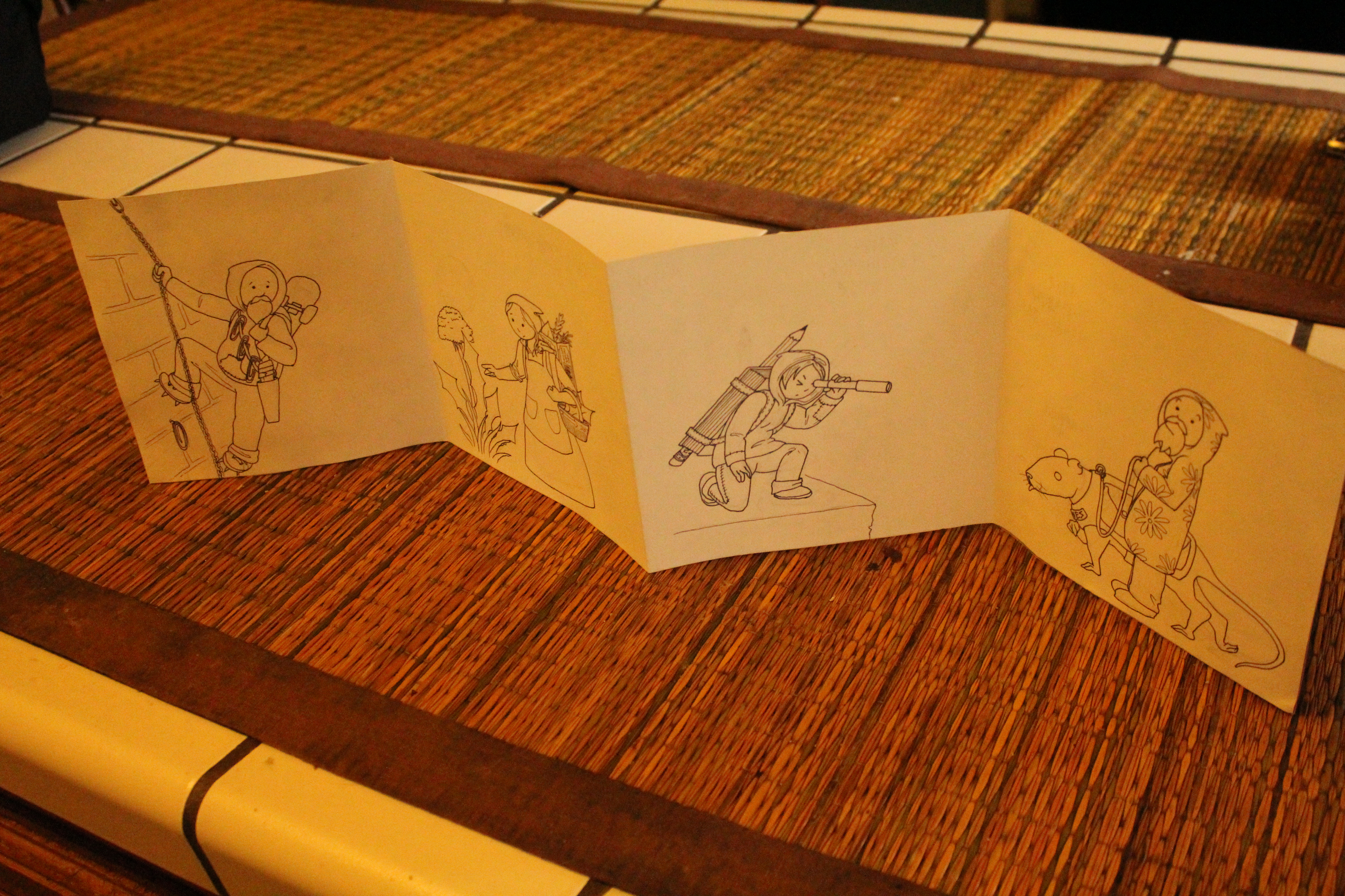
The second book I made was accordion-folded and shows some of the characters in the Street Gnomes universe: Gerald Fences, animal doctor, Cari Pots, master chef, Helen Woodchipper, recon expert, and Whisker Wilson the rat keeper with his favorite rat friend Bones.
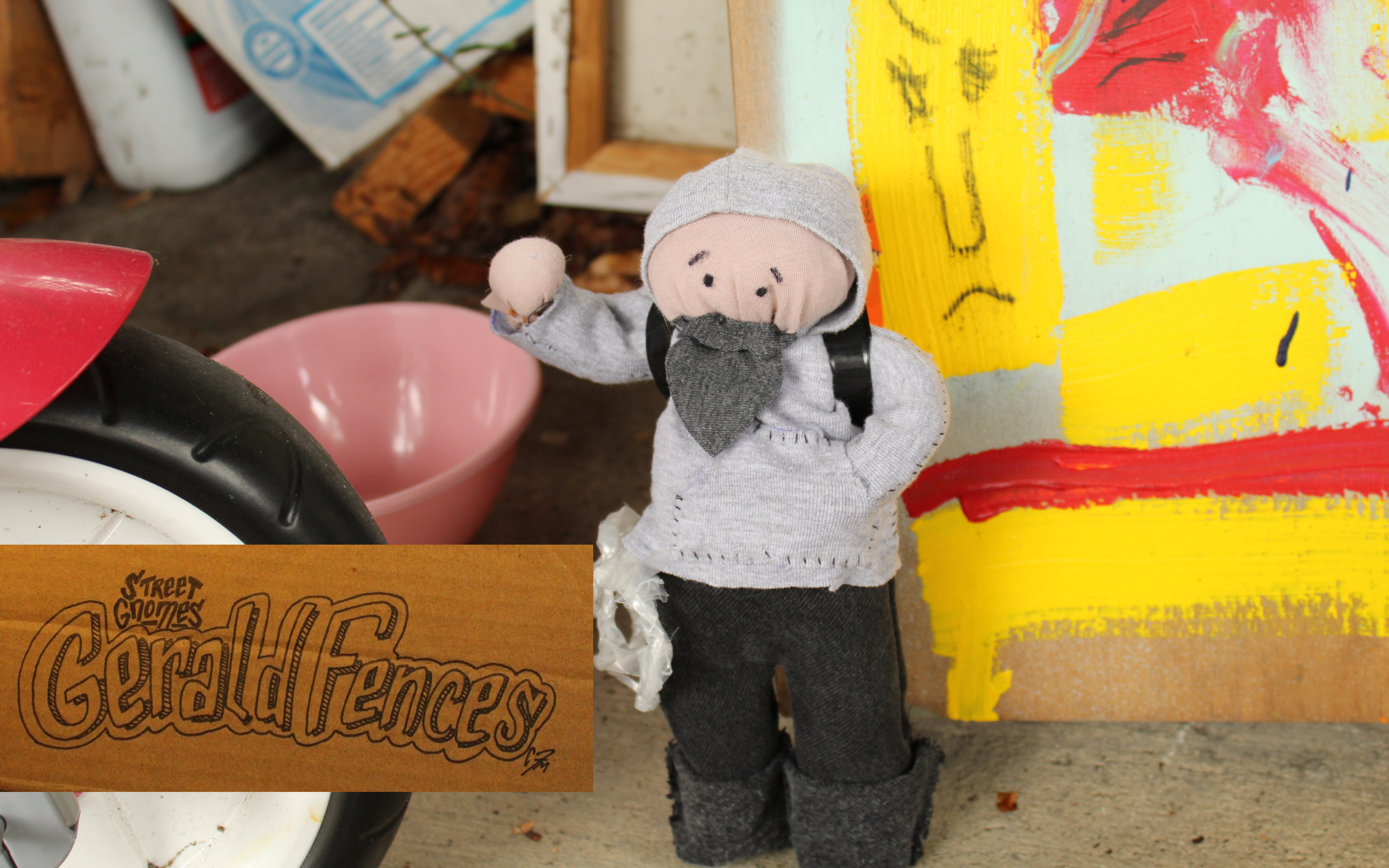
I crafted a Gerald Fences action figure out of old clothes that I hand sewed and made poseable with garbage bag twist ties. At his hip, he carries a length of gnome rope for lashings and climbing; I braided this out of some plastic sheeting that came with a case of pickles I stocked at my grocery store job. This cool logo was drawn on a piece of cardboard and shopped in.
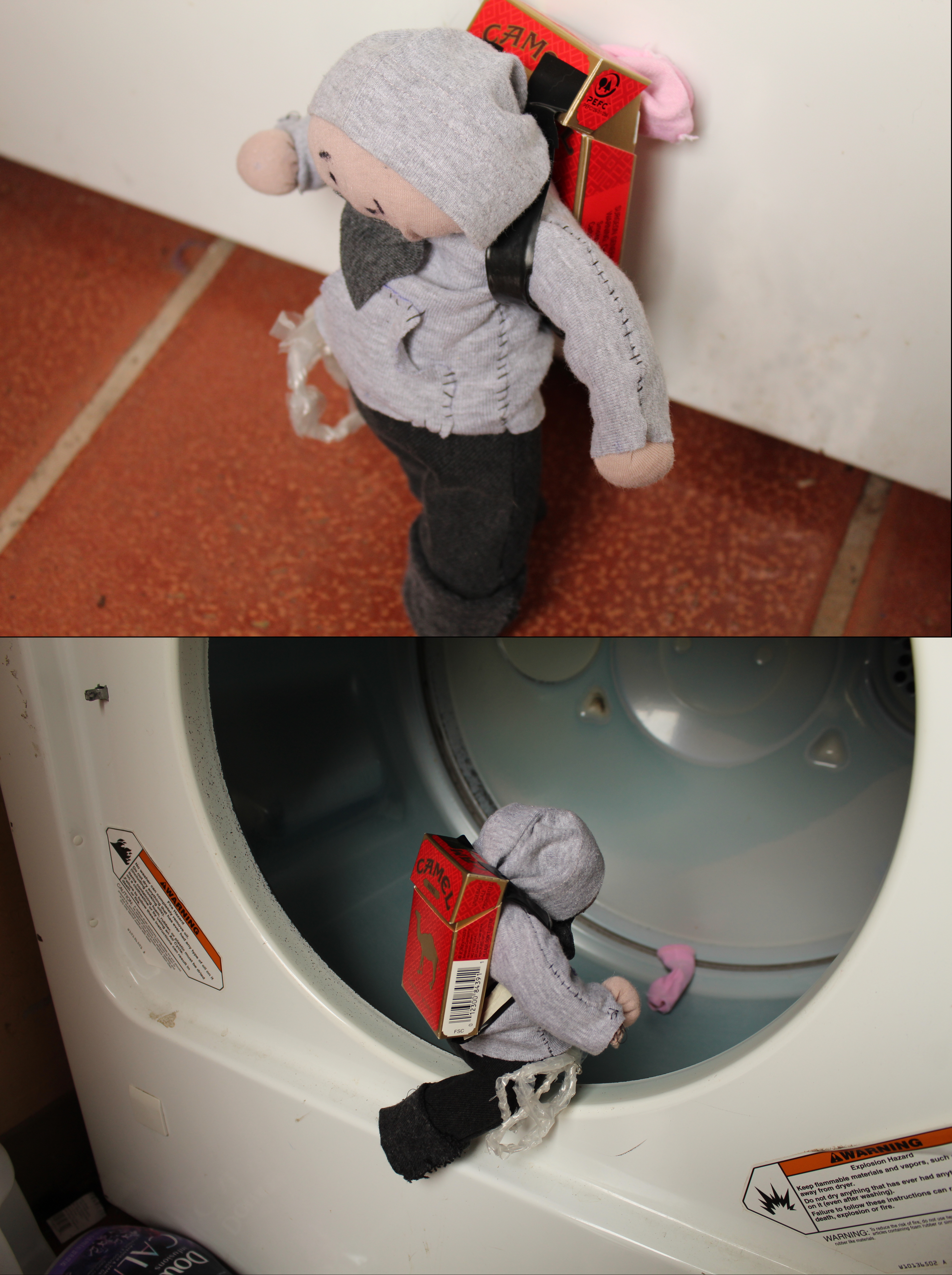
The final shots show Gerald in action: he climbs into a dryer and retrieves a small sock, possibly for crafting or to create a birthing nest for a pregnant raccoon. His backpack was made from an empty pack of cigarettes and electrical tape.
The idea behind Street Gnomes is to create a short comic series in this single-page format so that people can print and color their own comics at home. In the future, some kind of blog or website will be set up to host the printable downloads, more Street Gnome pictures, and tutorials on how you can make your own Street Gnome stuff with trash like I did. Street Gnomes should not be a profit engine, but an idea engine, and educational as well (learning how to reuse old trash, taking better care of our cities and urban environments, and so on).
If anyone is interested in following Street Gnomes, you can email me and I will update you when I can get a webpage with more comics set up. Email: cmpfsh@gmail.com
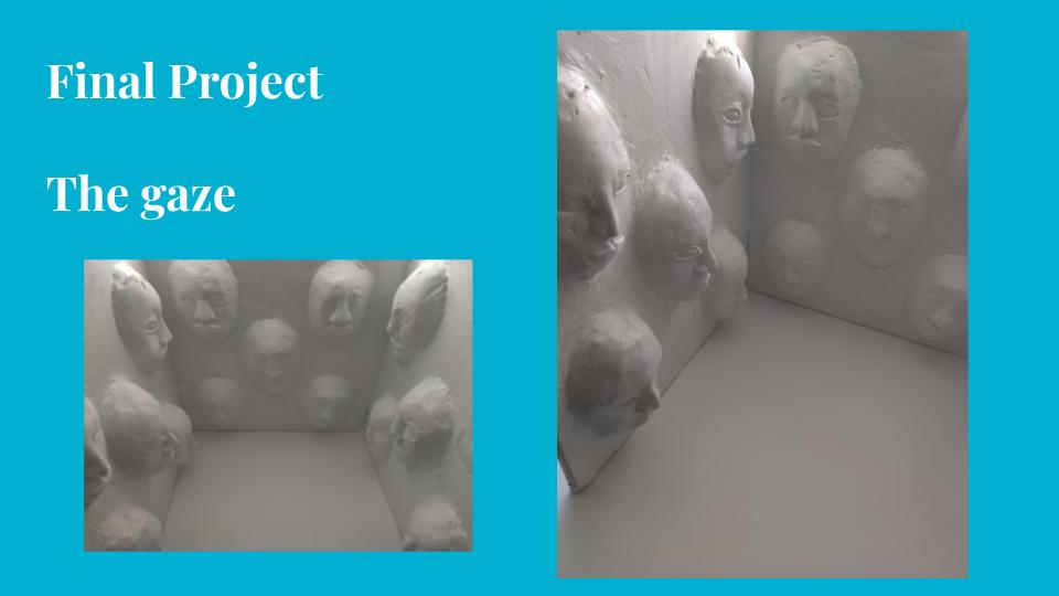
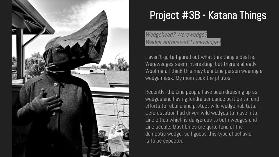
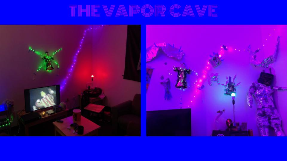
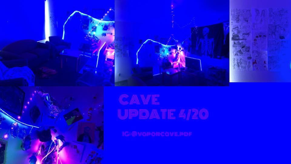
Katana Parker:
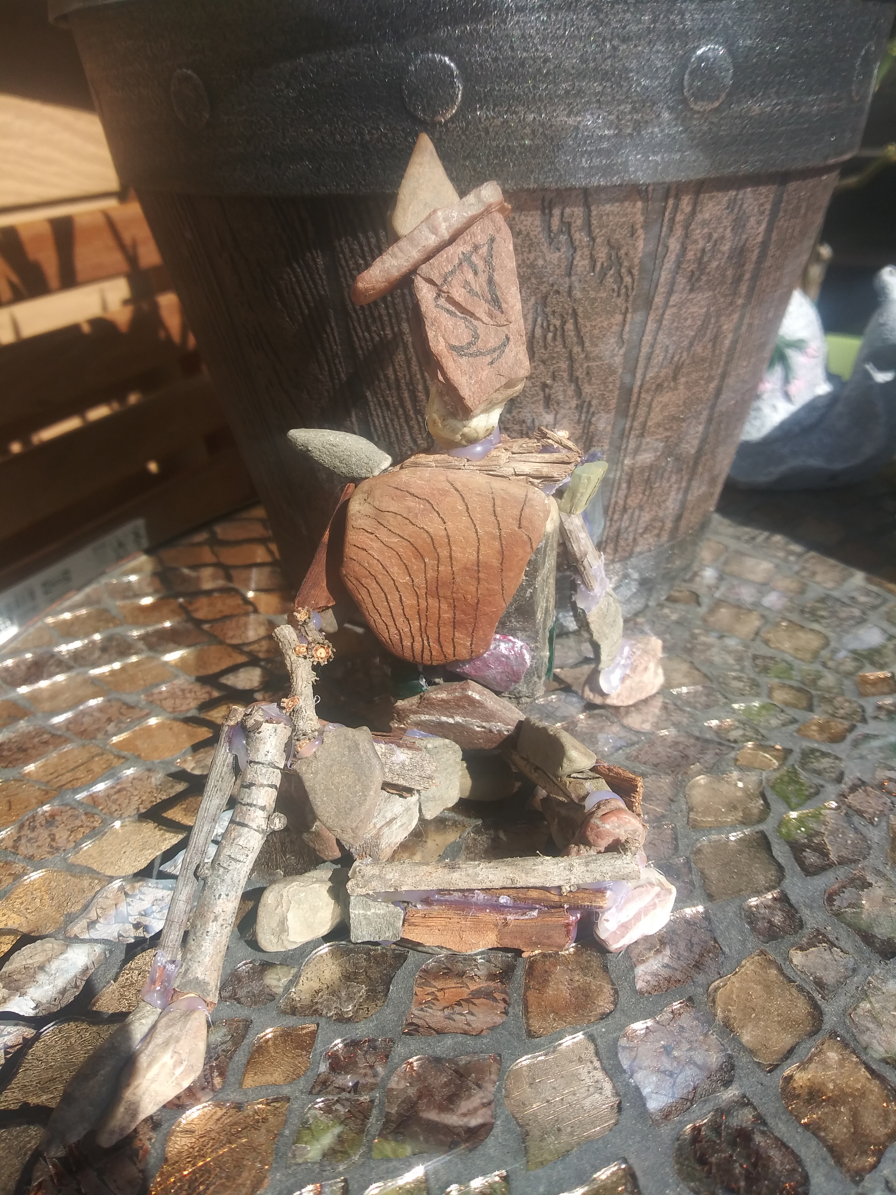
Line Guy
A Line guy made of mostly sticks and pebbles. Sort of a self indulgent project, as it deals with a small part of an ongoing passion project of mine. In short, this person needs to get some sun every now and then or they basically die. They will forget that they are alive if they don’t and it reminds them to appreciate being able to exist and experience being alive on our planet. I think the Line people remind me of the importance of getting some fresh air, sunlight, and appreciating being able to experience things on Earth.
The Line people are a made up people in the fictional world I’ve been having fun actively making up since highschool. They can be made of a variety of natural, artificial, and intangible materials, and their existence doesn’t make logical sense according to some people. Conceptually they are sort of living works of art and consider themselves objects that are part of the Earth.Pertaining to this class, I’ve thought more about them and their relationship to the Earth. I’m not much of a writer, but here’s the general idea regarding their origins I think:
Very very long ago the original Lines lived deep underground in caves. They were stuck in these dark caves for so long that eventually they forgot they could see and eventually stopped moving. One day, some explorers from the surface discovered the caverns. While spelunking, the explorers found countless works of ancient art, technologies, and treasures in the cave. Interested in making a profit off, the explorers began moving things out, including the Line people. Upon being brought to the surface and exposed to the sun, suddenly the Lines realized they could see and started moving. they were faceless, but once they were exposed to sunlight faces appeared on them. The explorers were absolutely terrified and left immediately. The Line people were amazed at how there suddenly seemed to be all these different things around them. The ancient Lines fell in love with all the unique qualities of the different things found on our Earth and found joy in being able to exist in such an interesting place. After that, the rest is basically history.
There are a few other things I could mention, and I’m probably forgetting some stuff, but that’s the gist of it.
Lily Kennard:
All of the pieces are made from found materials along the Des Moines River. Since 19993 there have been three “100-year floods”. Trash and driftwood pile up alongside the river after a major flood. This is where I collected the driftwood and other items I used to make my projects.
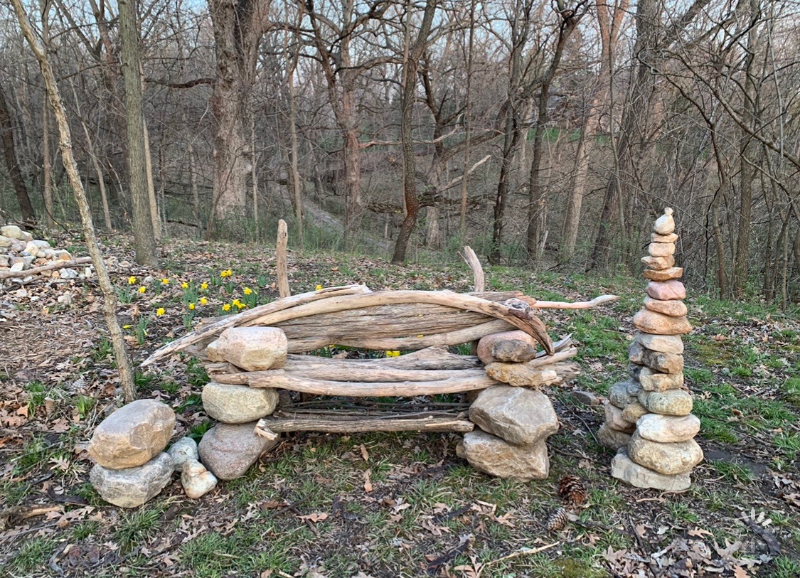
1- “Nature’s Chair” - This piece was inspired by Andrew Goldsworthy. This chair was made for my dad and was made out of found driftwood and rocks.

2- “Untitled”- This swing is also made out of a piece of wood I found by a river. I wanted to create something that is child-like and playful because I realized that the act of playing slowly disappears as one gets older.

3- “Drifted”- For this piece, I was inspired by a guest lecture from Annie Sprinkle and Beth Stephens. I created a human figure that was made out of driftwood to represent the connection between humans and nature.
Odalys Juarez:
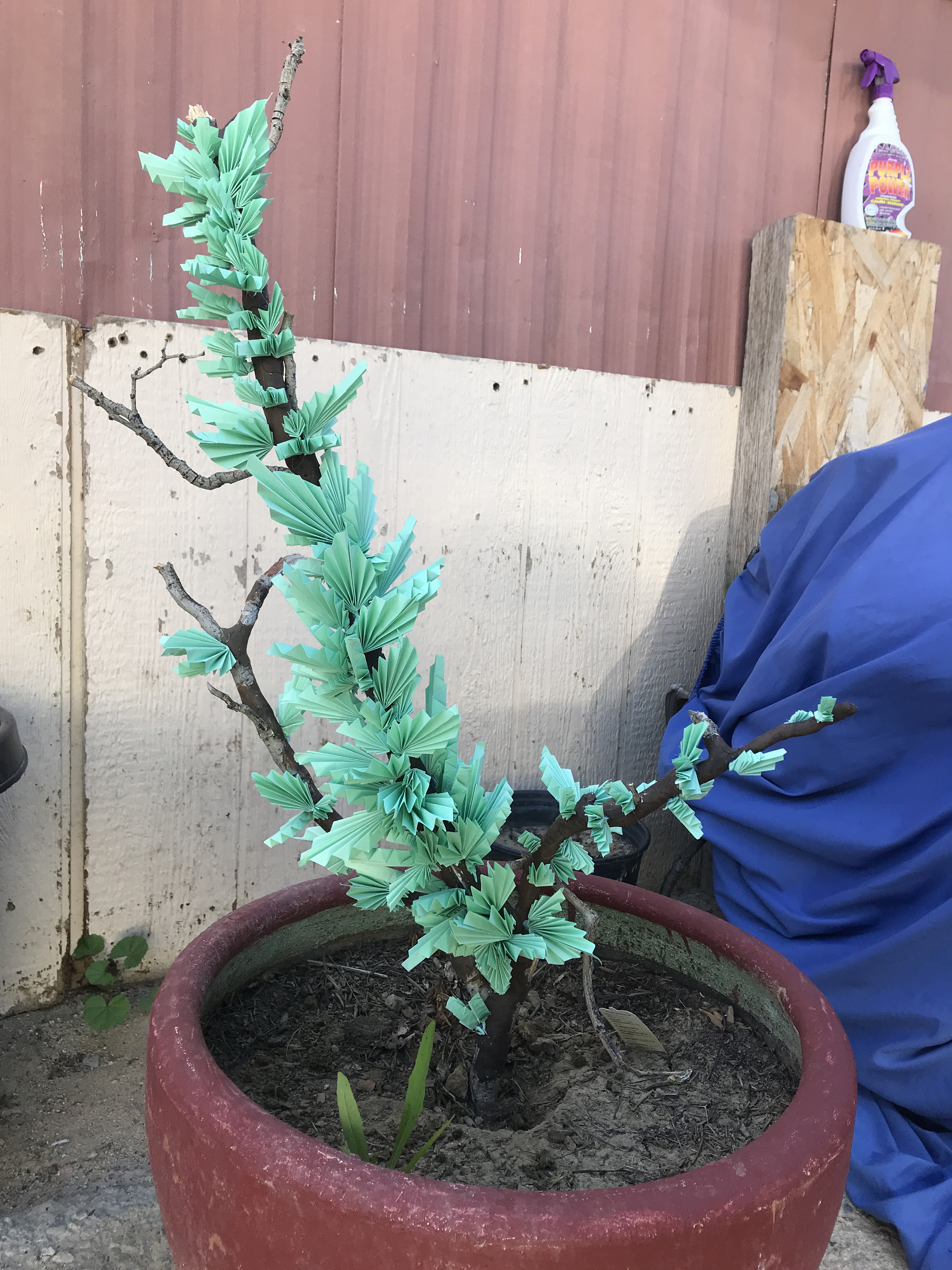
1. I made this “tree” using a dried branch that I partly covered in clay and added paper leaves. It was made in an effort to counter the decay and lack of life I saw in my yard and in the environment around me.
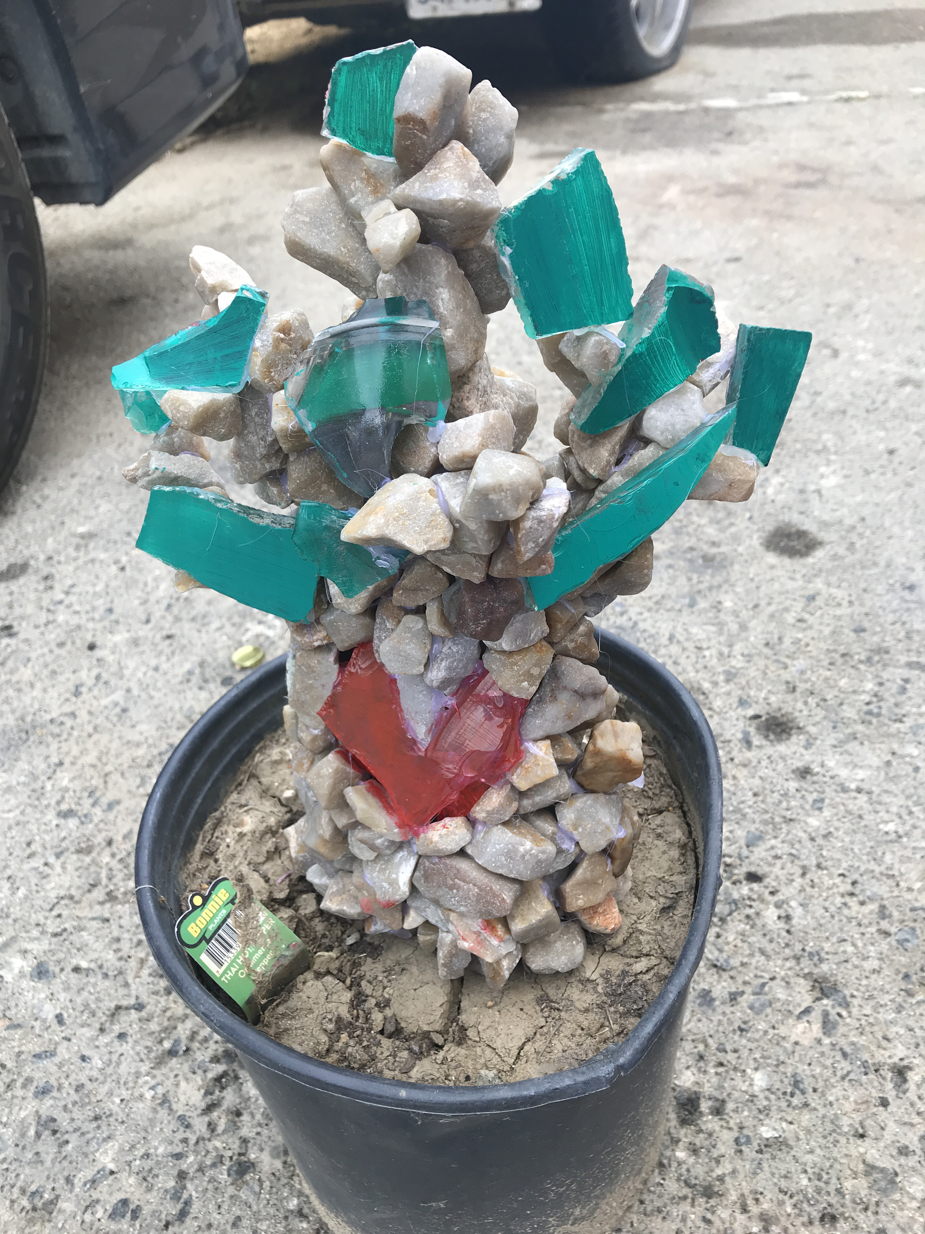
2. To add onto my first piece, I made another little “tree” using rocks and glass I found in the desert around me. Although I did not get the outcome I wanted I liked the color in this one and chose to add it here.
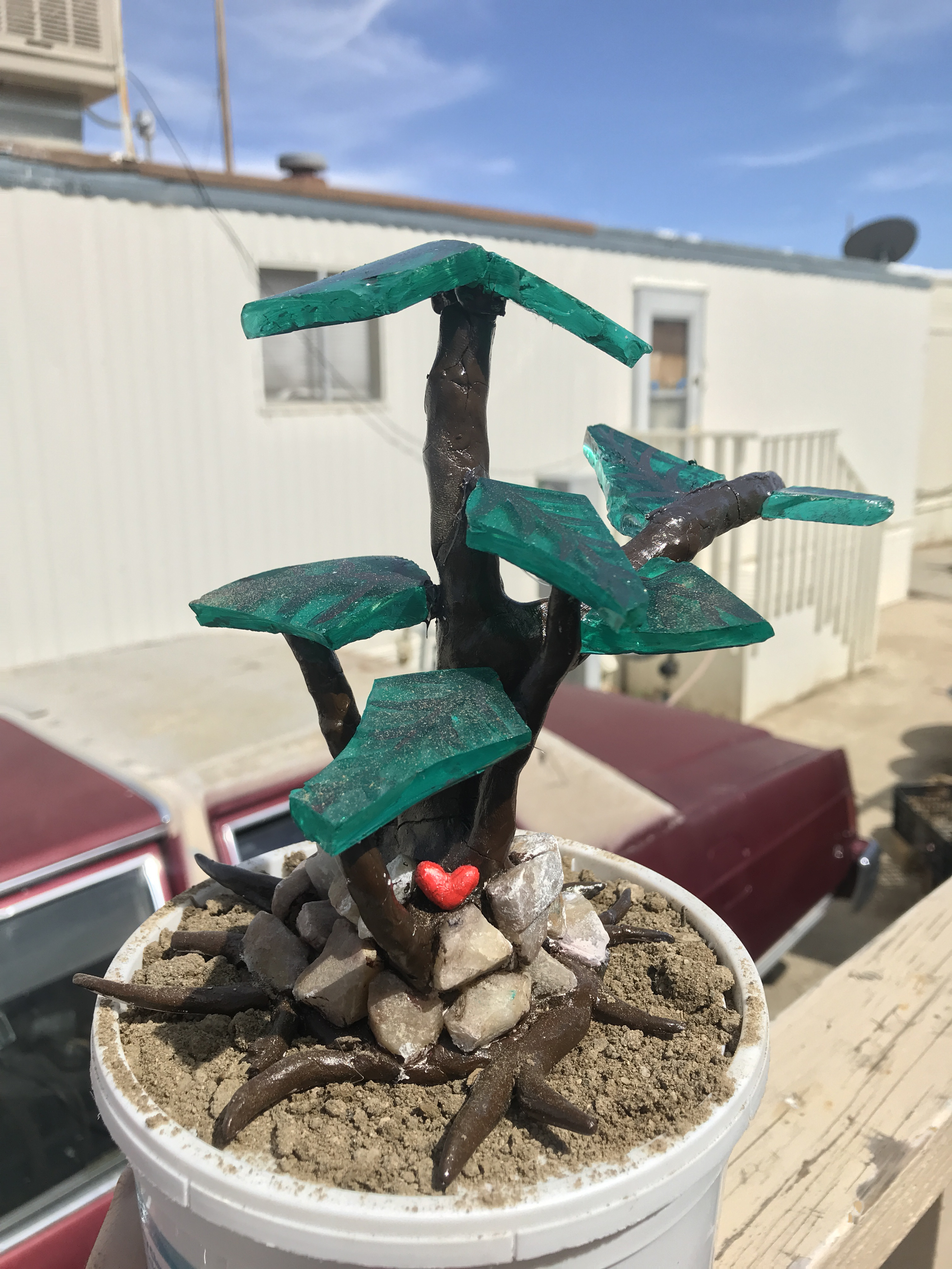
3. This final “tree” was made using characteristics from my previous projects. I set out to make this one smaller so that it fits in my bedroom. I put the glass, rocks, and clay together to take a more realistic approach in making a little tree. I felt like this last tree was the piece of life and color that the decay around me needed.
Sage Alucero

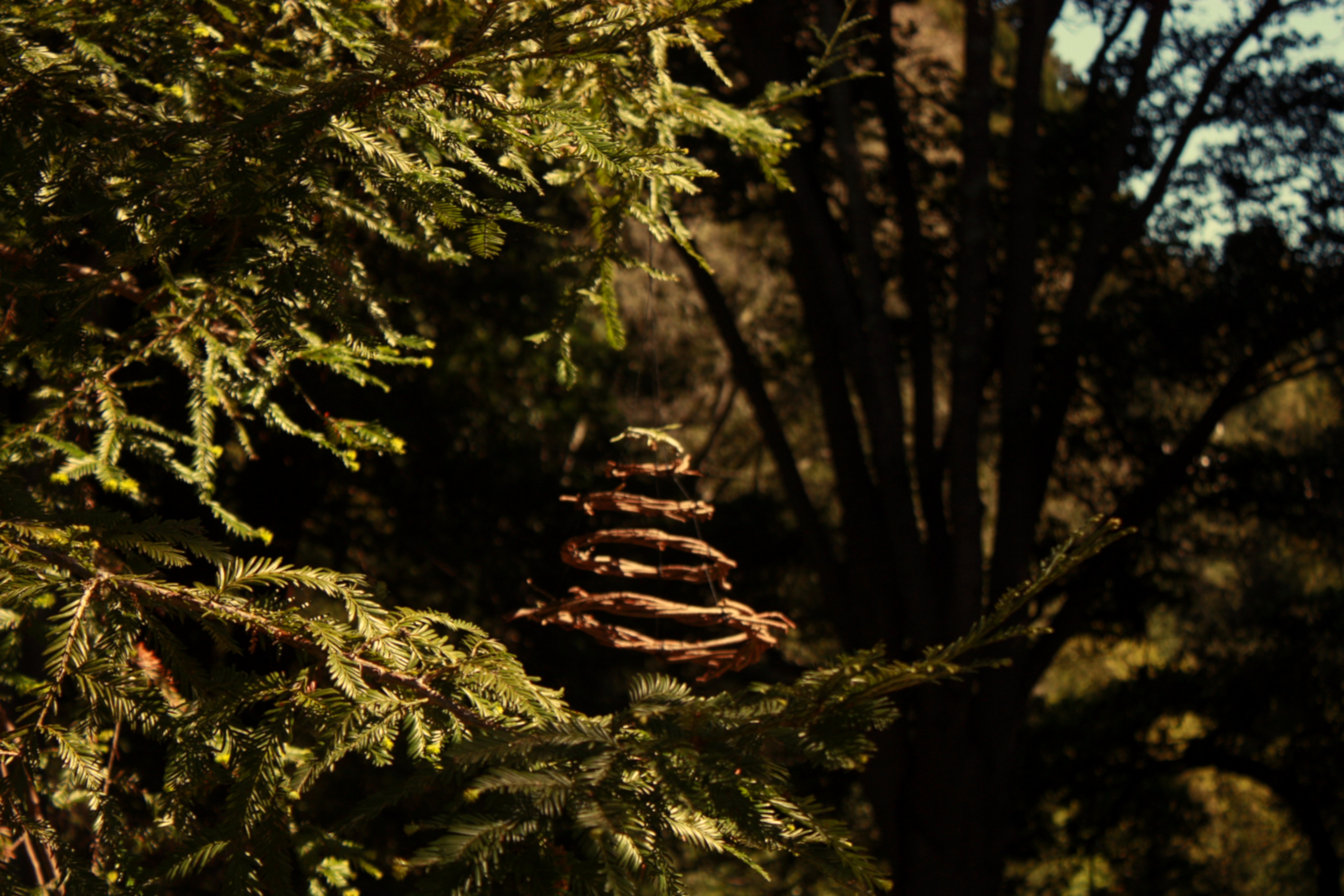
“Portal”
“Portal” is a hanging sculpture composed of five concentric rings. The lower four rings are made with redwood branches and the smallest, highest ring is made with sage and wrapped by grasses. The rings are held together and hung with black hemp cord. This sculpture is a visual communication of the liminal space we find ourselves in due to COVID-19. From mutual aid, to rent moratoriums, to the dissipation of air pollution, the orders to shelter in place have revealed how quickly we can and must shift to new ways of being.
Our decisions, intentions, and values open up worm holes in the shifting story of life on Earth. The collective’s ideas and dreams are tunnels which we swim through and experience as ‘reality’. We are in constant negotiation with the field of possibility.
Portal is a prayer for the well-being and spiritual growth of humanity. Reciprocity has manifested as humanity giving outpours of pollution, nature has returned the backhanded gift with the disappearance of species and dramatic changes of climate. The inverse potential exists, if we can bring about so much destruction, we can also invoke flourishing life.
The circle of sage is a bath of cleansing energy, it is the last ring before we enter a new era. With the blessing of this medicinal plant ancestor we are free to shed binding layers of doubt, greed, and perceived powerlessness. We are birthed again into a new moment, in which the people recognize ourselves as creators, as a global community, and as participants in the garden of life.
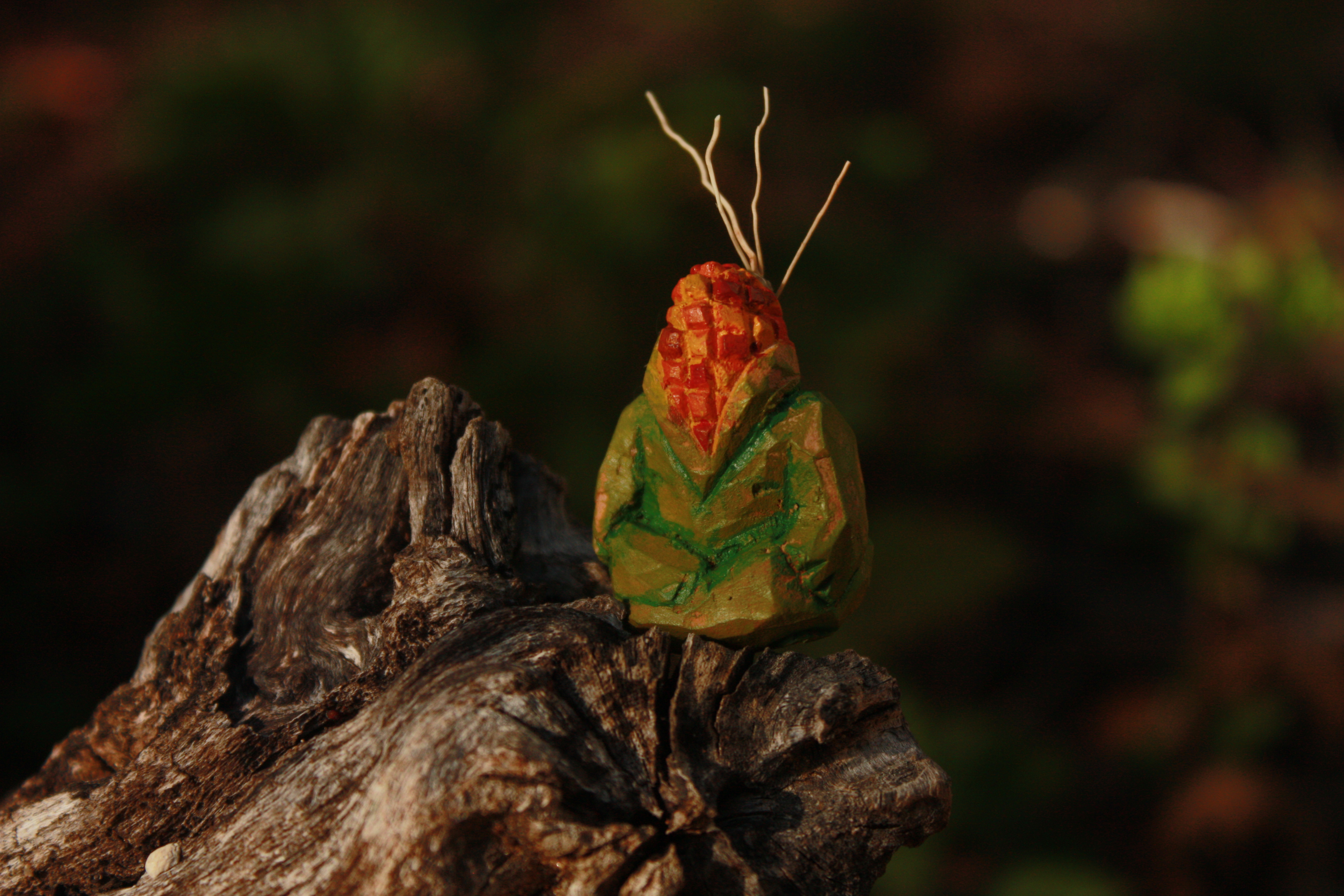
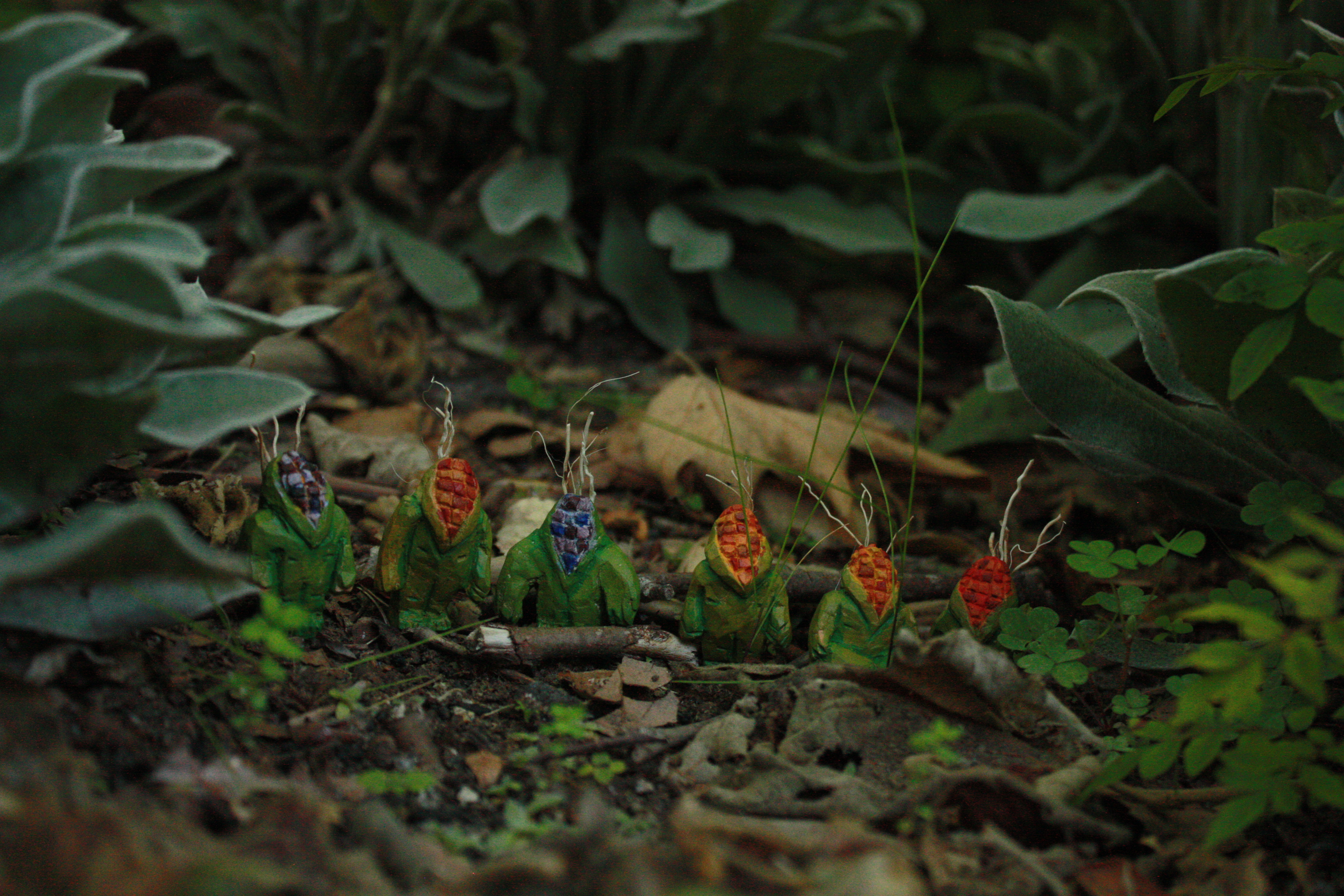
“People of Corn”
This family of corn people was inspired by the Maya creation story, which I read in Robin Wall Kimmerer’s book Braiding Sweetgrass. The deities try without success to create gracious human beings out of mud, wood, and light. It is only when they create humans out of crushed corn meal that these beings are grateful and able to praise life- thus fulfilling their purpose in creation. Their gratitude grants them the ability to continue living, and protect and nourish the Earth.
Each corn figure is about an inch and a half tall. They were carved from avocado pits and painted with acrylic. Rather than throwing away the inedible seeds, I was able to bring them new life through these figures. Seeds are an active representation of continuing life.
Although the story states the corn meal was white and yellow, the kernels of the corn people are brown, sienna, blue, red, and yellow. Their colors represent the fight to keep plant varieties thriving among the misguided practice of monocultures and the homogenization of seeds by corporations.
This corporate conformity, which patents seed strains and forces a homogenization on them, is an erasure of their evolving dialogue with land and the humans who tend to the land. History is told through seeds and their diversity. I see this same violence of erasure among humans. To thrive, we must celebrate diversity in seeds and people and ensure that each are safe, free from harm, loved, and listened to so that the next generation may bloom.
Art 137: Outdoor Painter's Project
- Peter Loftus
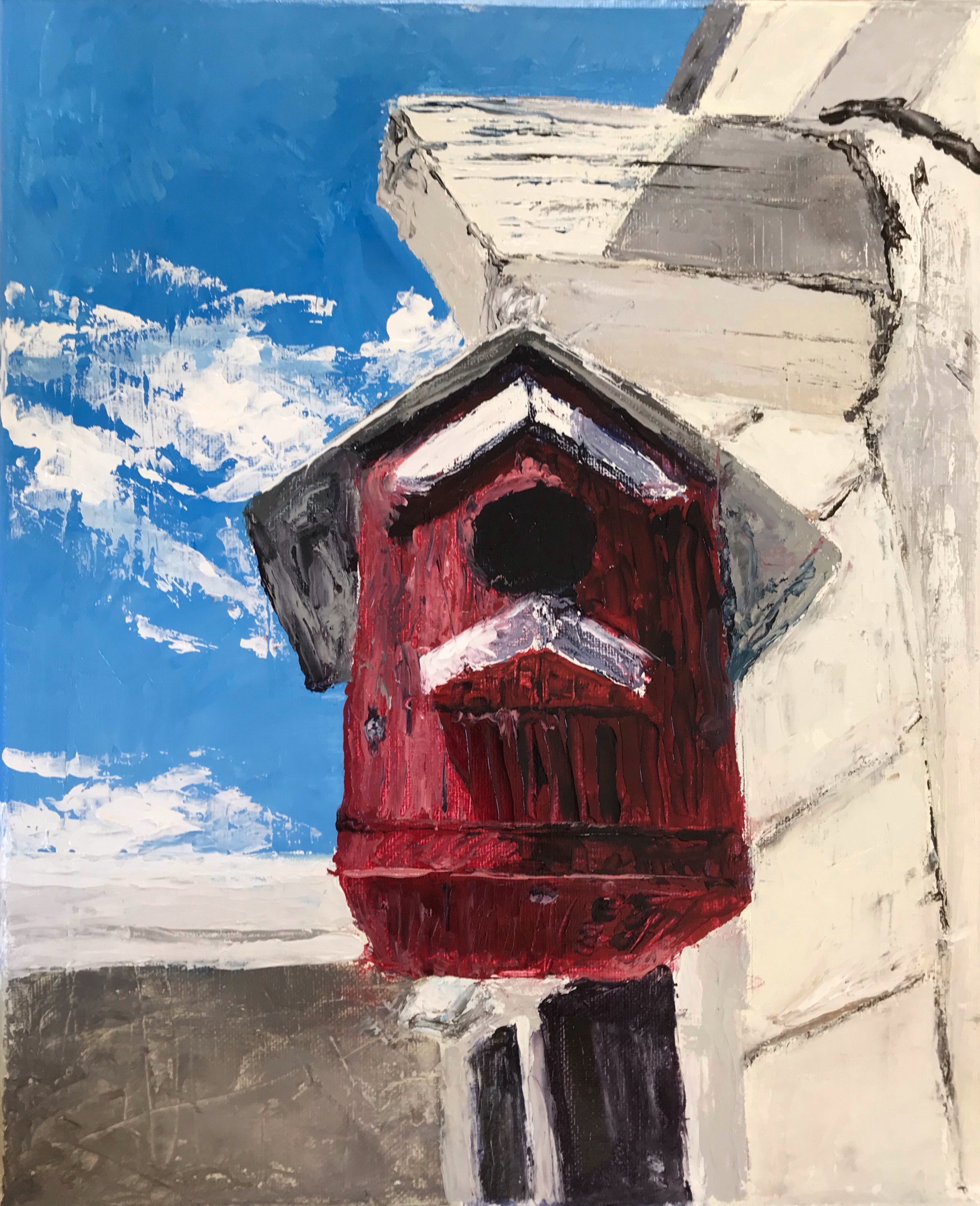
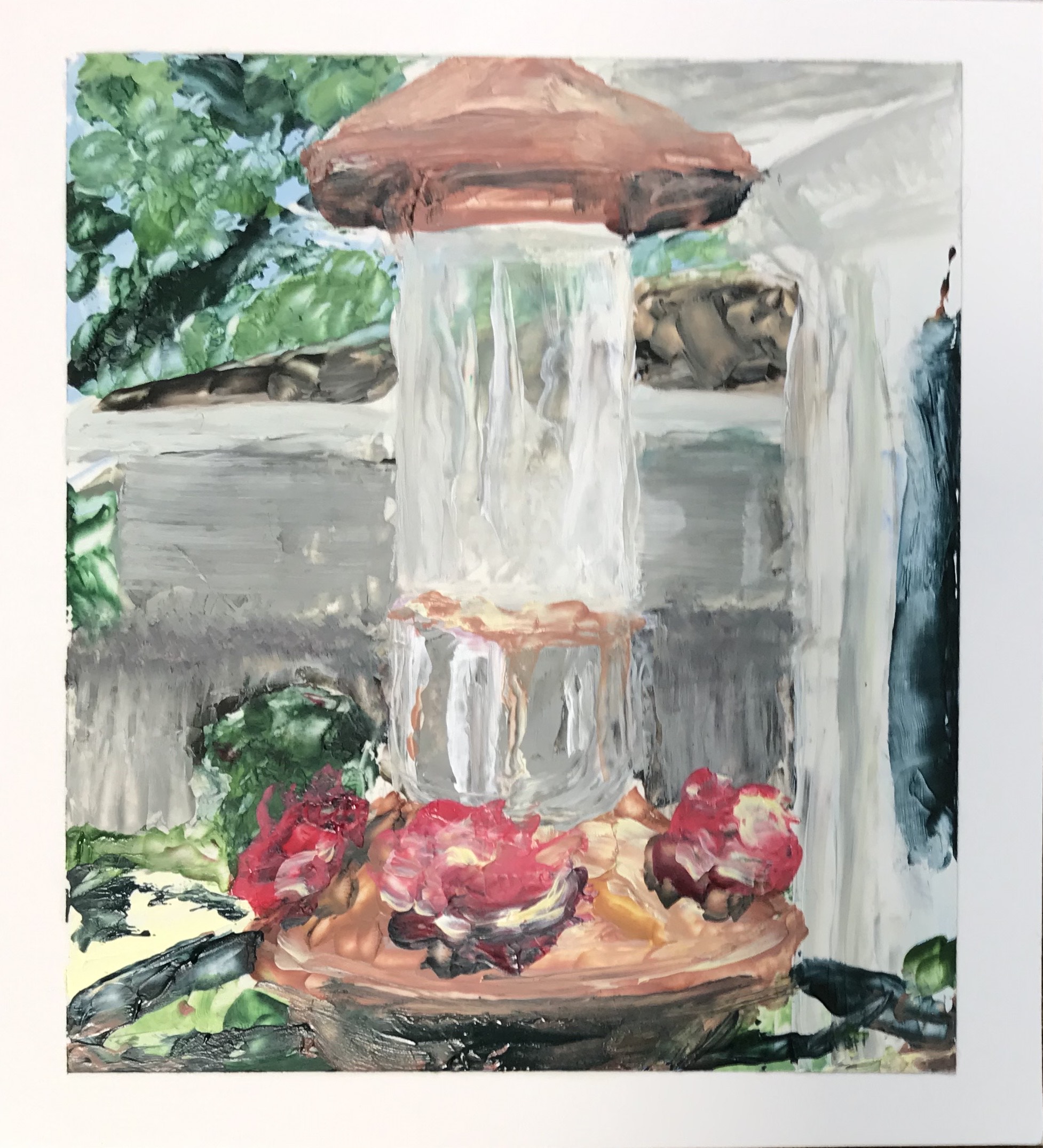
Alicia Persaud:

Warm Afternoon at the Park, 12”x12” oil on canvas, Spring 2020
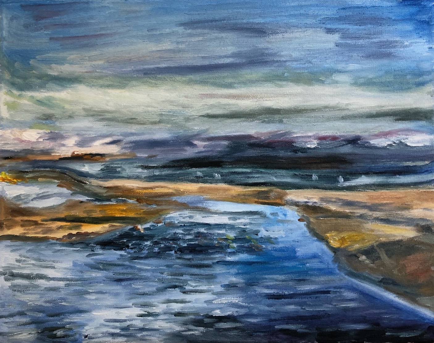
Solitude, 11”x14” oil on canvas, Spring 2020
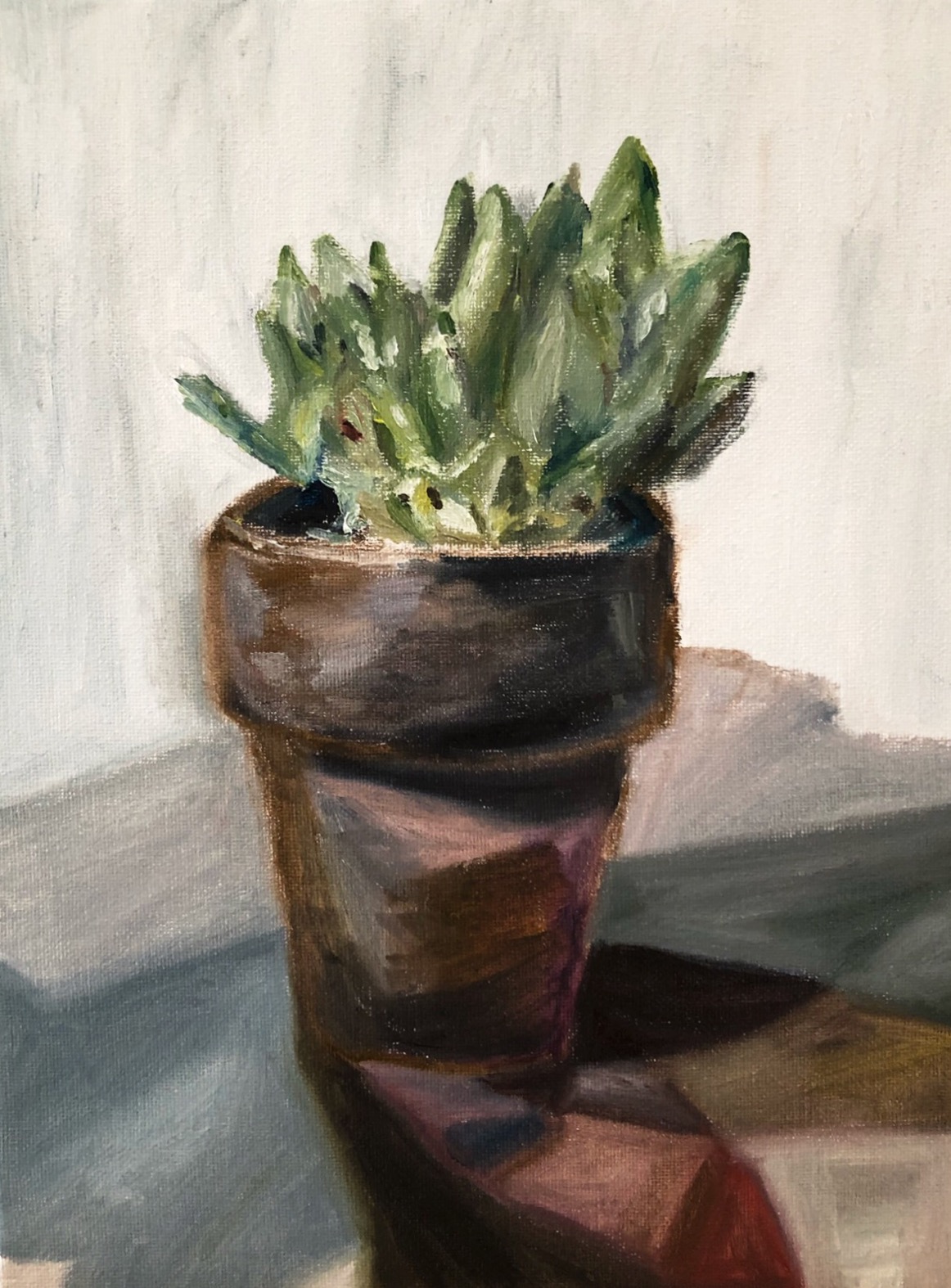
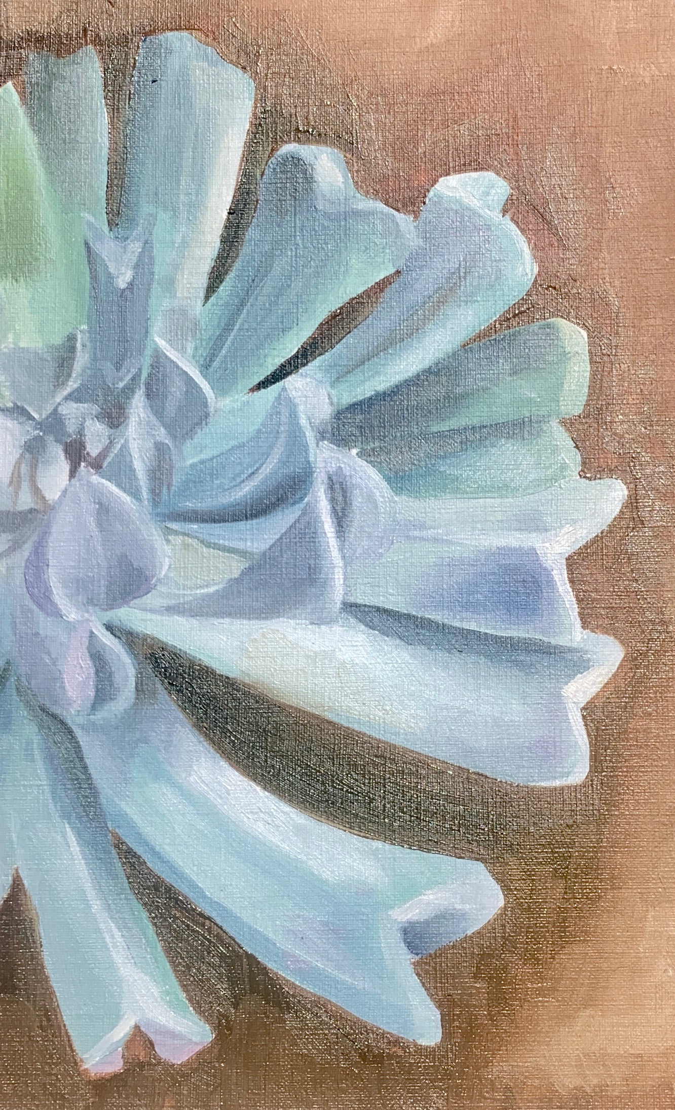
Pachyveria, 9”x12” oil on canvas, Spring 2020
Springtide, 12”x12” oil on canvas, Spring 2020
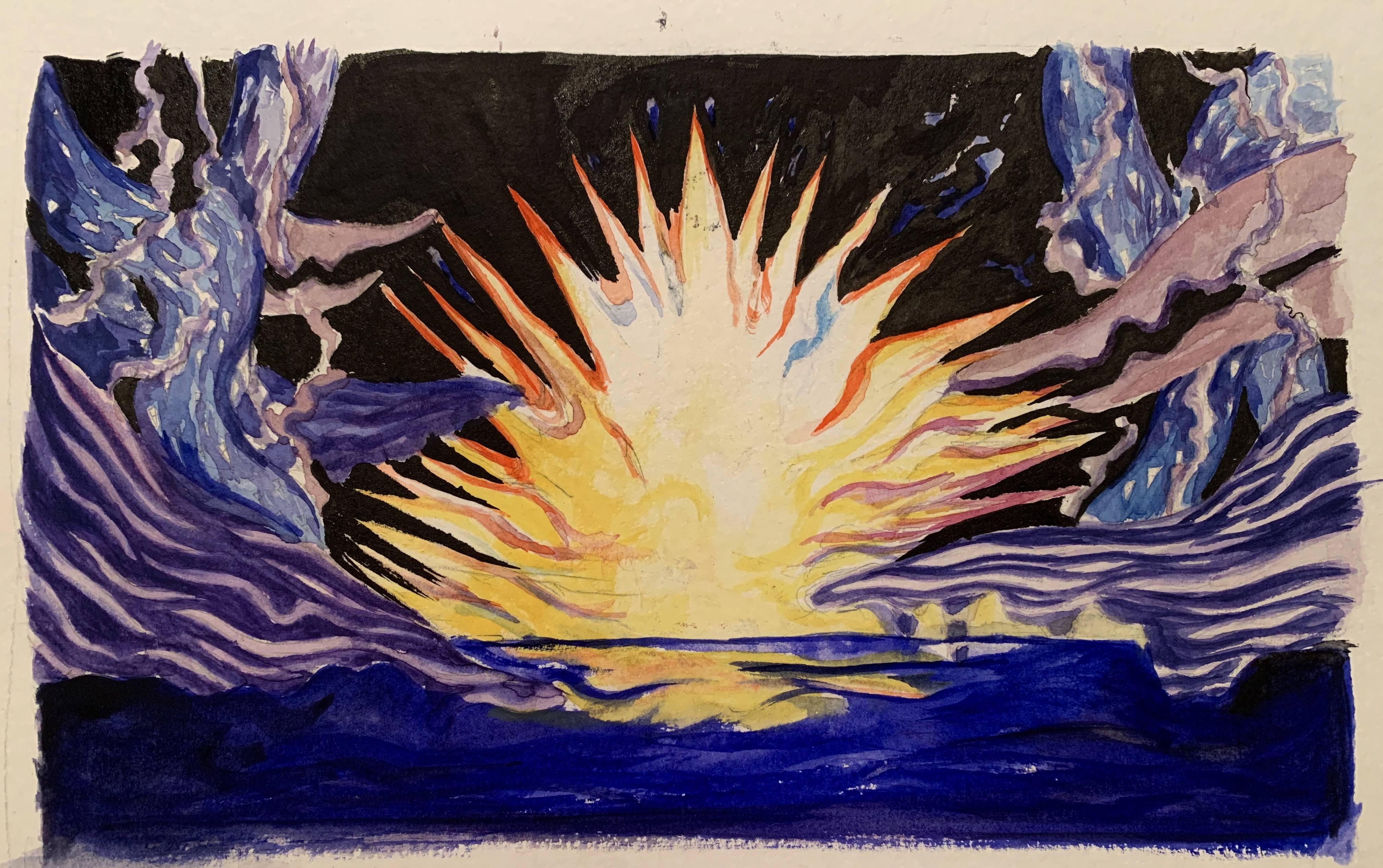
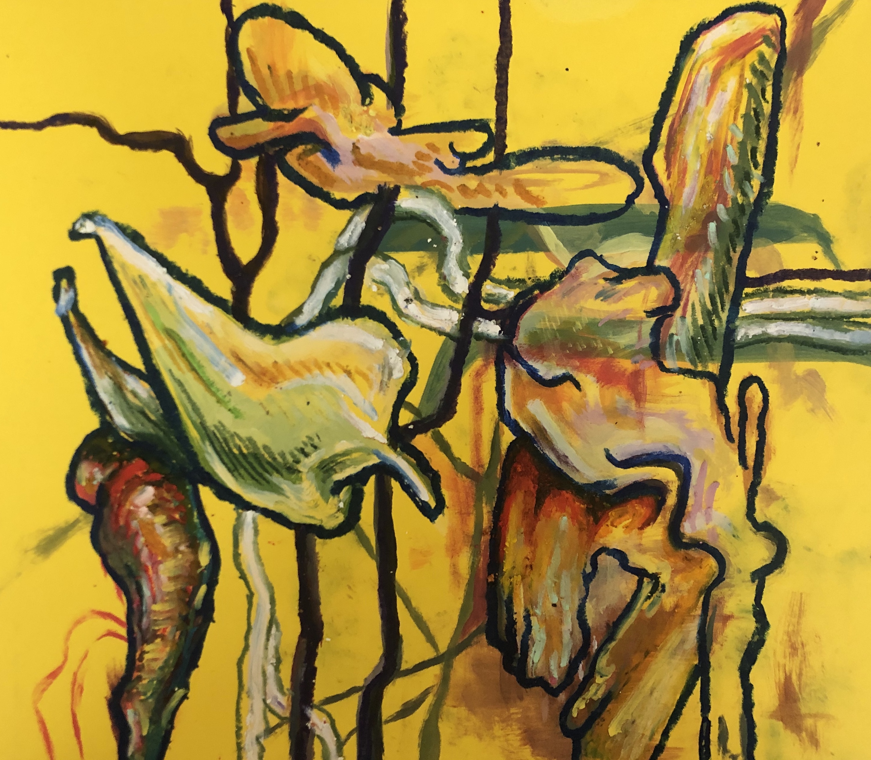
Connor Alexander:
1 - “They Don’t Pay Rent” oil on canvas
2 - “They Don’t Pay for Food Either” oil on board
3 - “Help I Got Lost in the Lowes” oil on board
4 - “I’m Trash and so is This” oil on canvas
Gissele Coghlan:
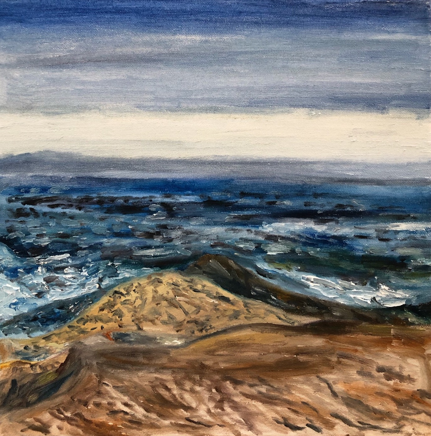
1. Cloudy Days on the California Coast

2. Morro Bay Rock
3. Banksia Seed Pods
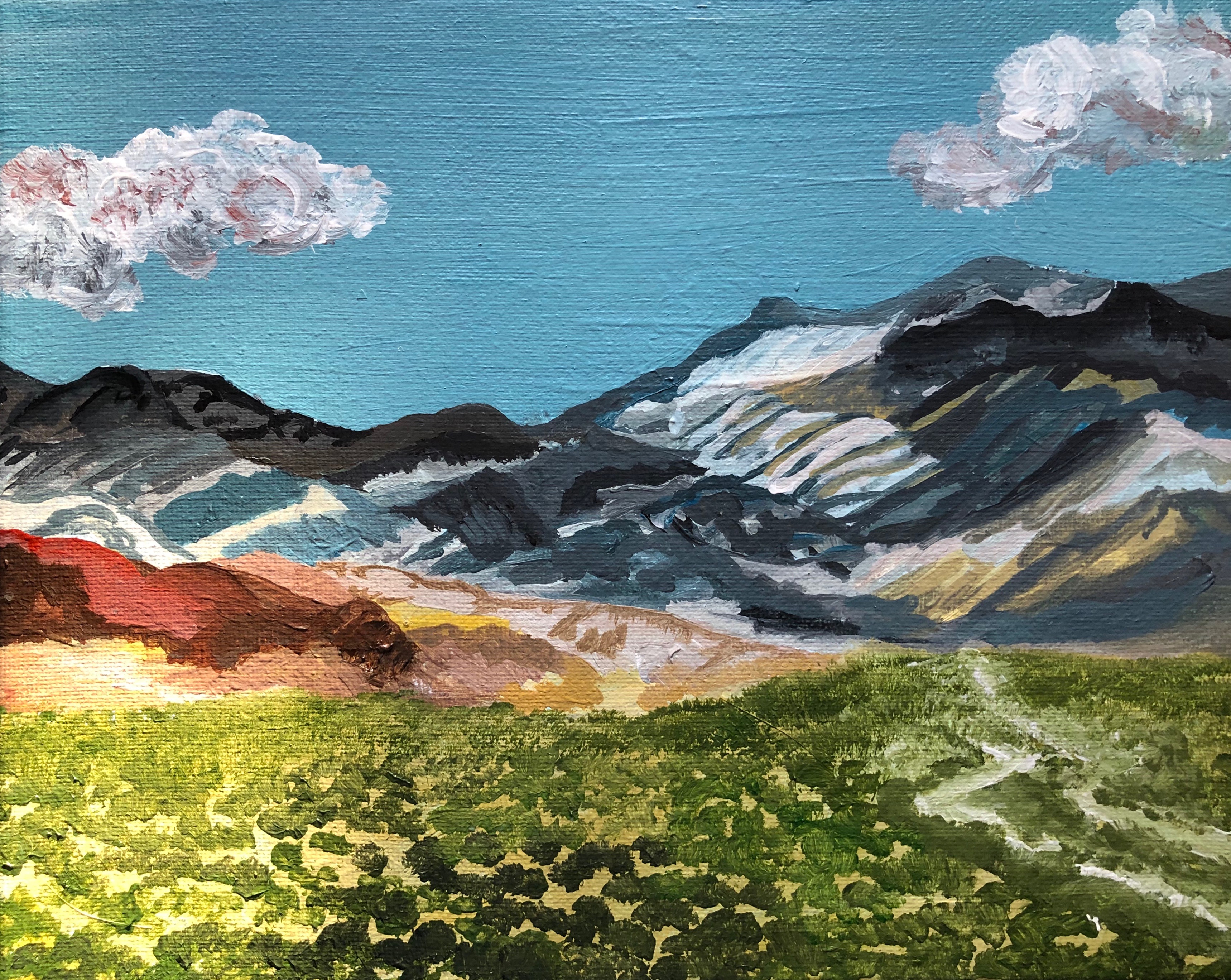
4. Death Valley Mountains
Lily Kennard:
1- 12”x16”, oil on canvas
2-12” x 16”, oil on canvas

3- 12” x 16”, oil on canvas
4- 6’’ x 8”, oil on canvas
Rebecca Northup:
Shanti Nagwani:

10x8” acrylic on canvas
8” acrylic on canvas panel
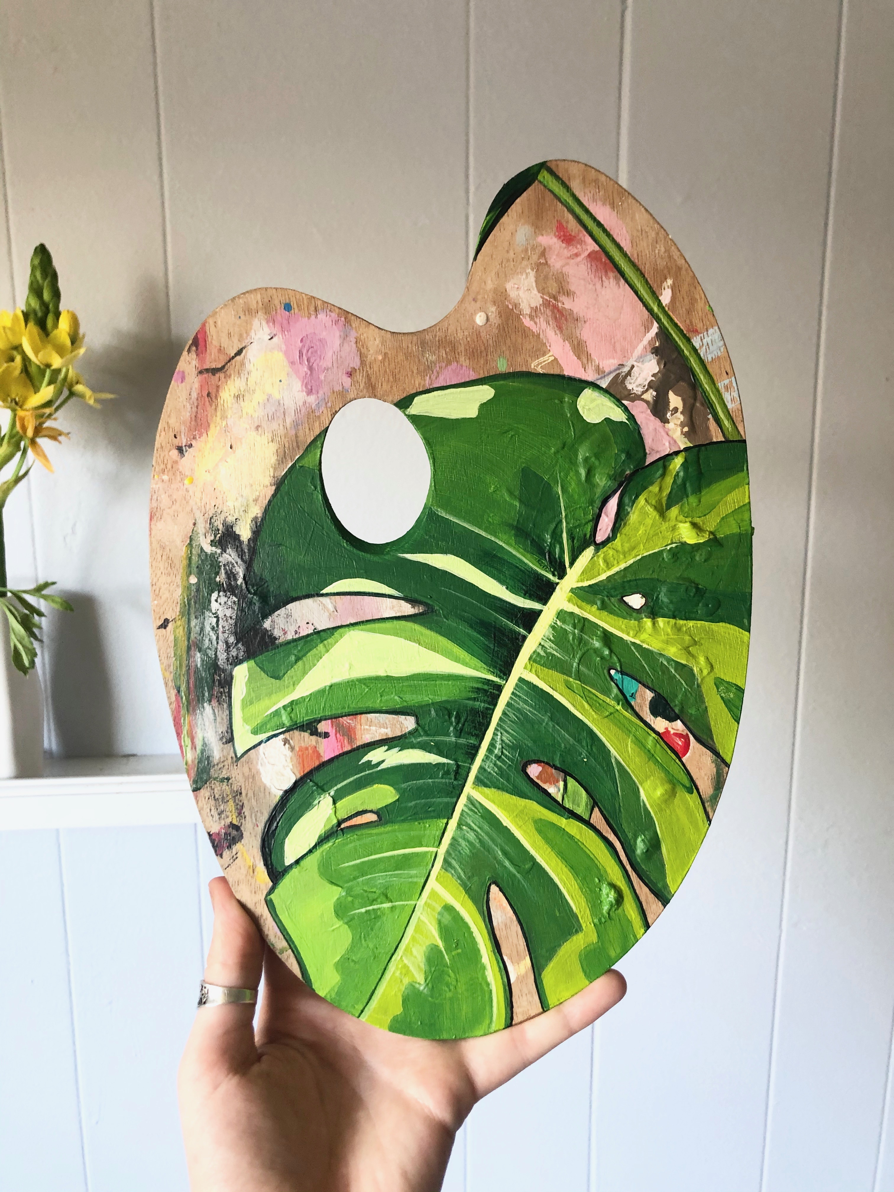
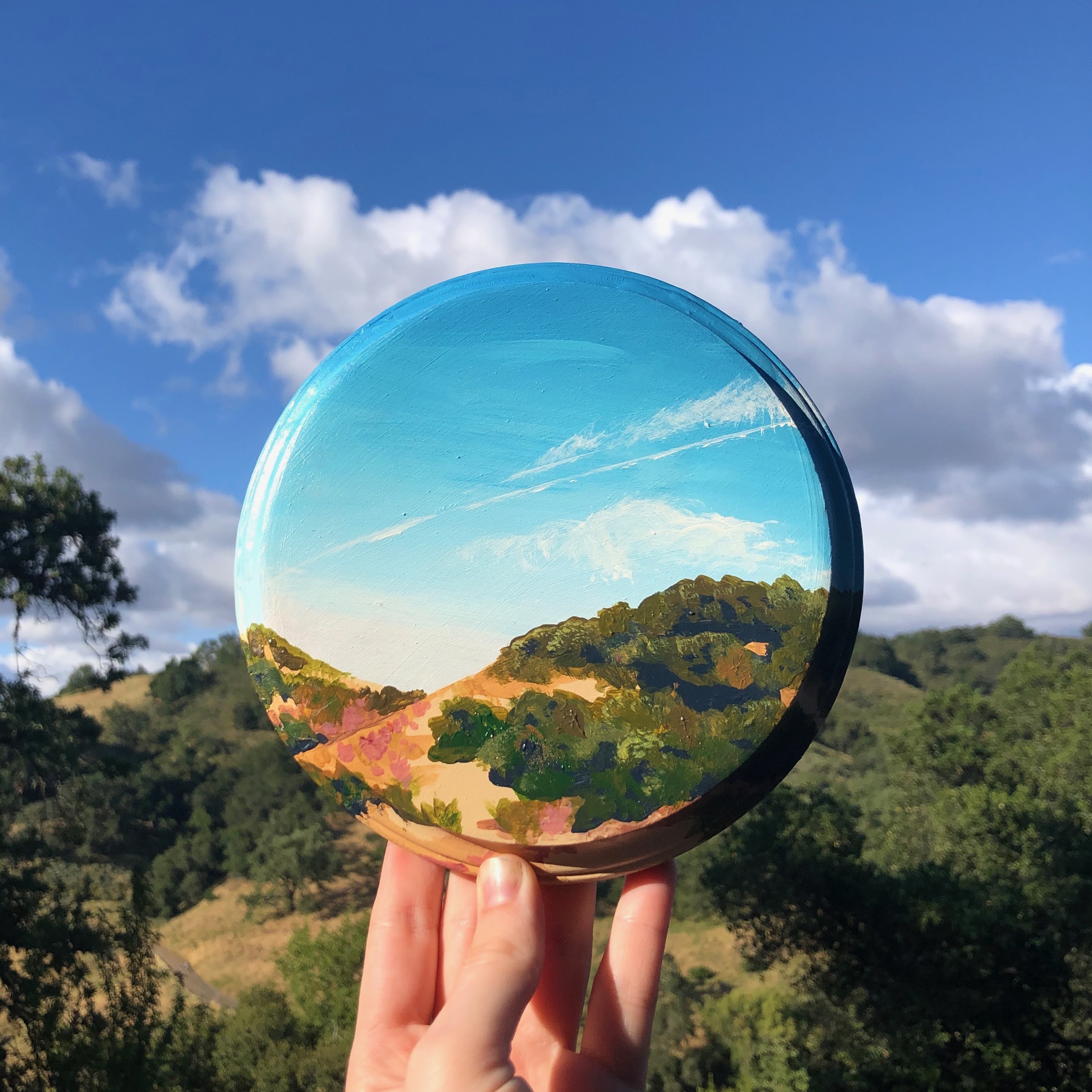
12x9” acrylic on wooden palette
6” acrylic on wood
Art 138: Facture and Meaning
- Melissa Gwyn
Andrea Vidales:
Study #1
Oil on canvas
8 x 10
Study #2
Oil on canvas
8 x 10

Better Days
Graphite on paper
5 x 7
Super 8
Oil on wooden panel
12 x 12
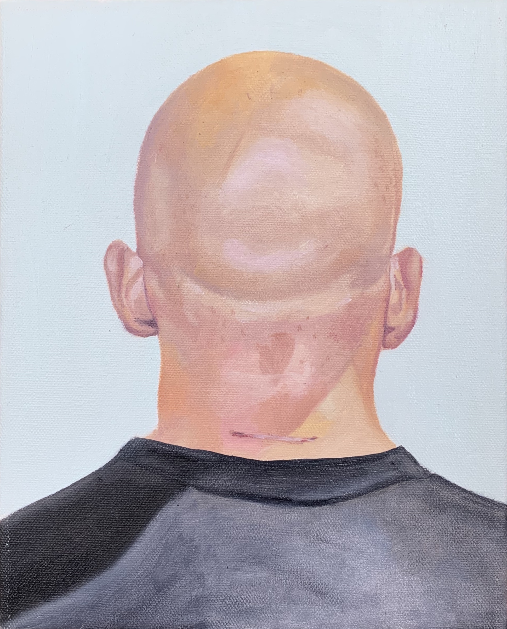
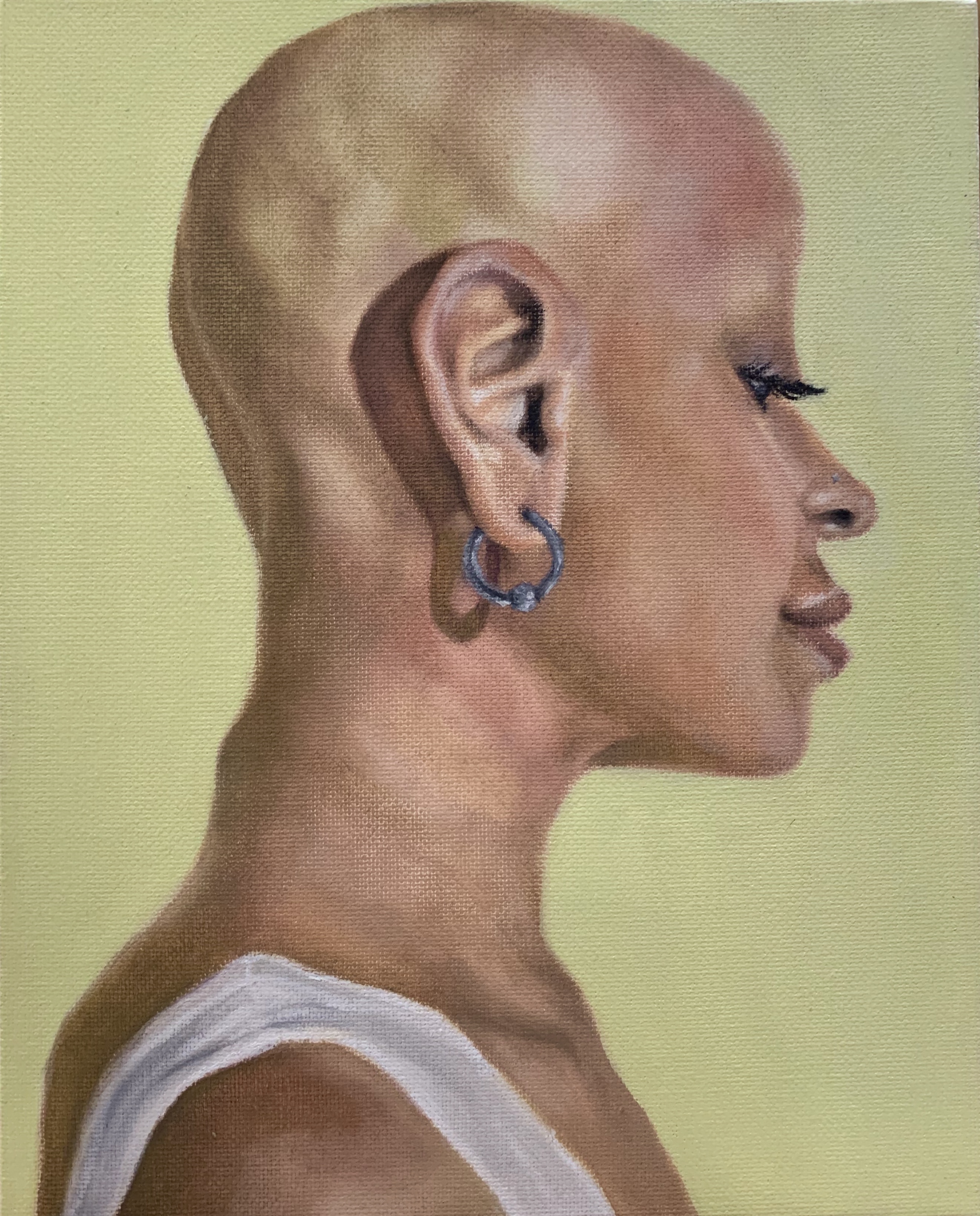
Cam McKay:

Ezra, oil on paper, 15” x 12”
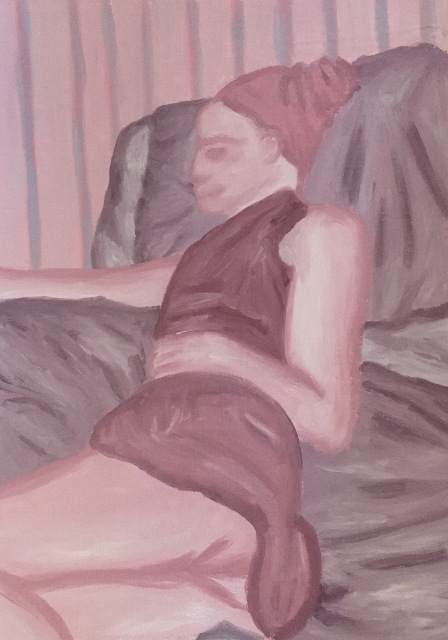
In Bed, oil on paper, 15” x 12”
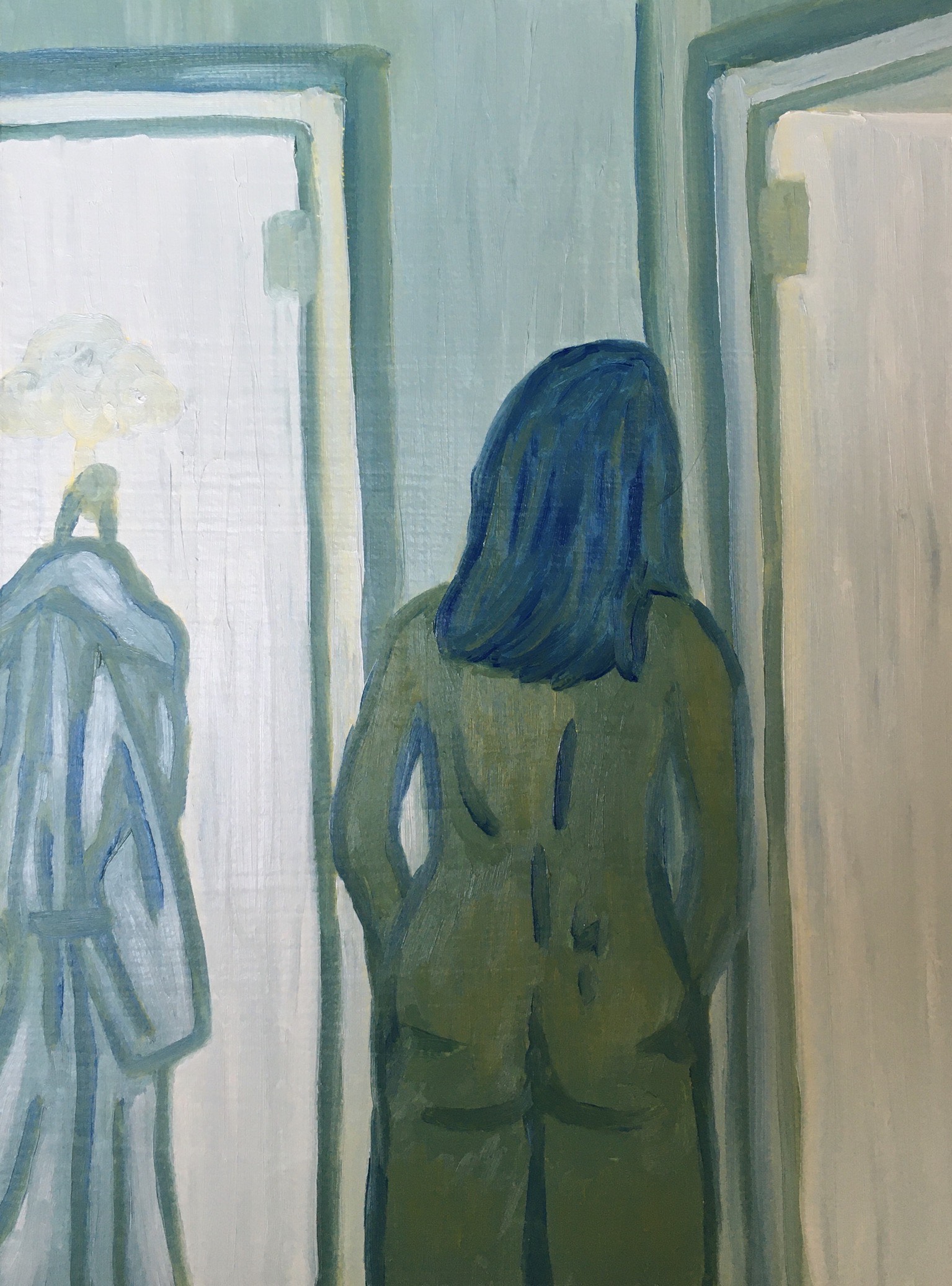
Bathrobe, oil on paper, 15” x 12”
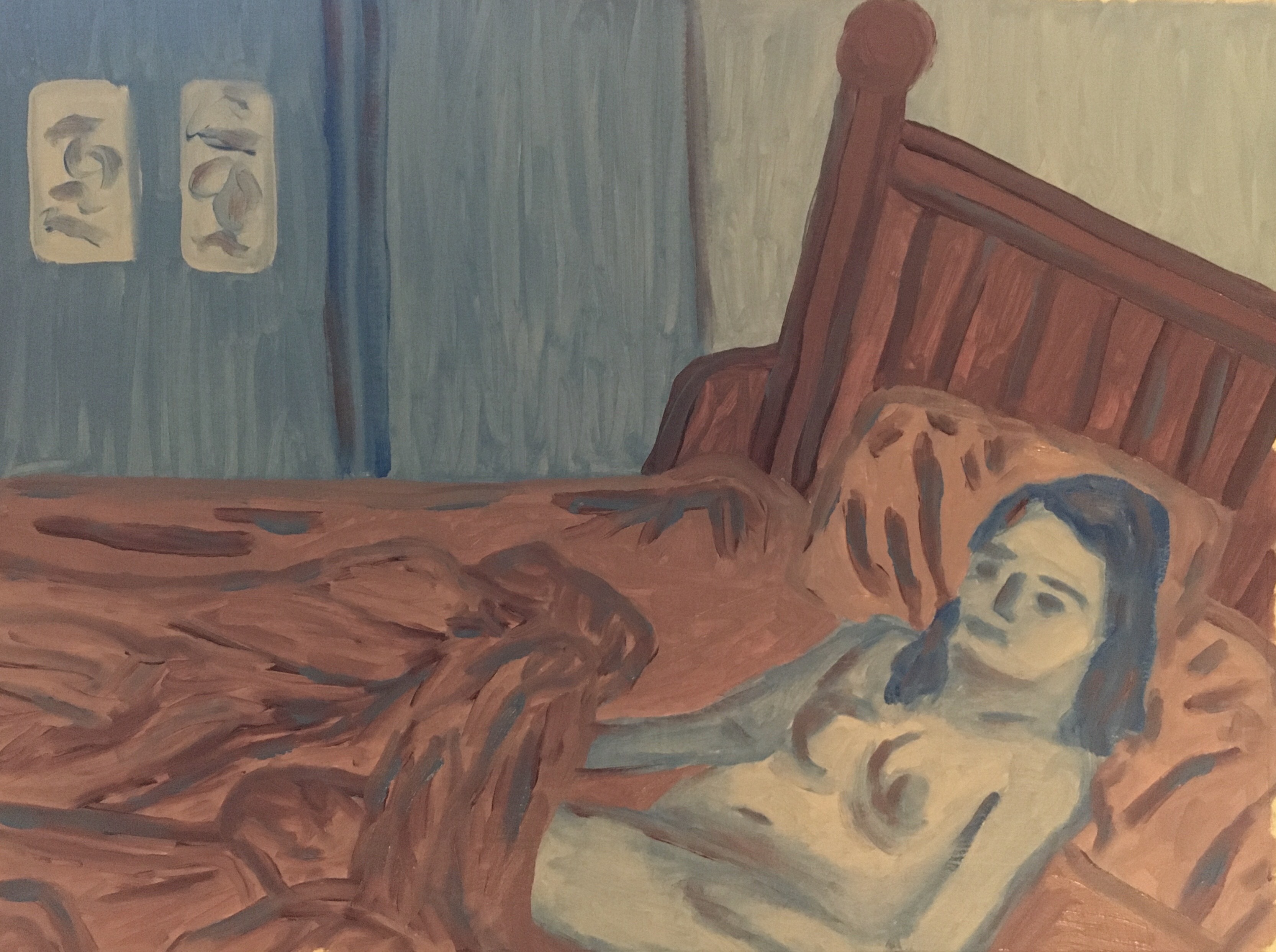
Rise and Shine, oil on paper, 12” x 15”
Chloe Calhoun:
Blue Hour
Oil on Clayboard
8 x 10”
I Can Still See You From Here
Oil on Paper
15 x 22”
No Surprises, Please
Gouache on Paper
5 x 7”
Emily Love:
Rooted Tree
Oil on Paper
11x14”
Clover Flowers
Oil on Board
11x14”
Jack’s Peak
Oil on Paper
9x12”
Oyster Shells
Oil on Board
8x8”
Marian Mafnas:

Morgan Tomfohr:


Rebecca Marshall:


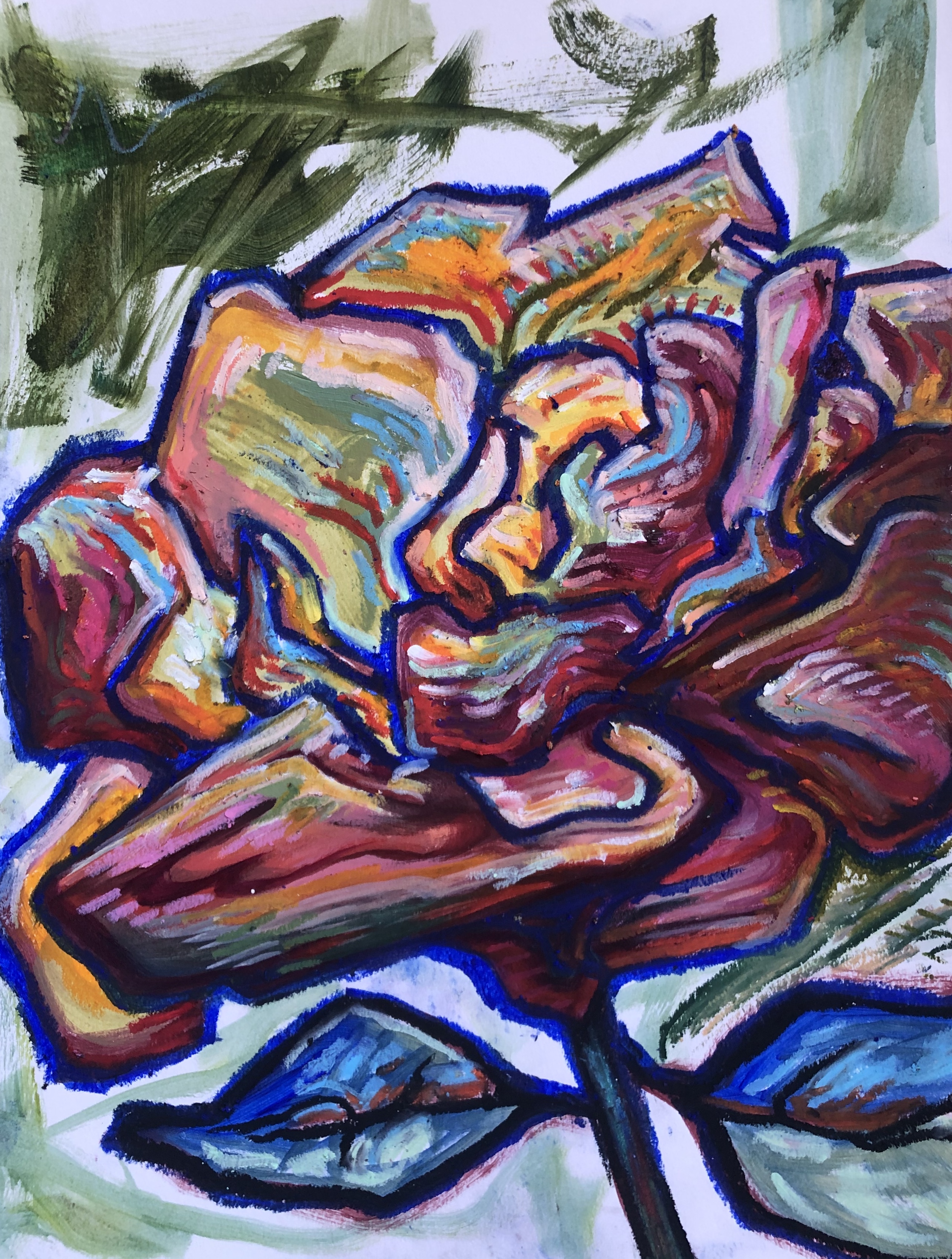
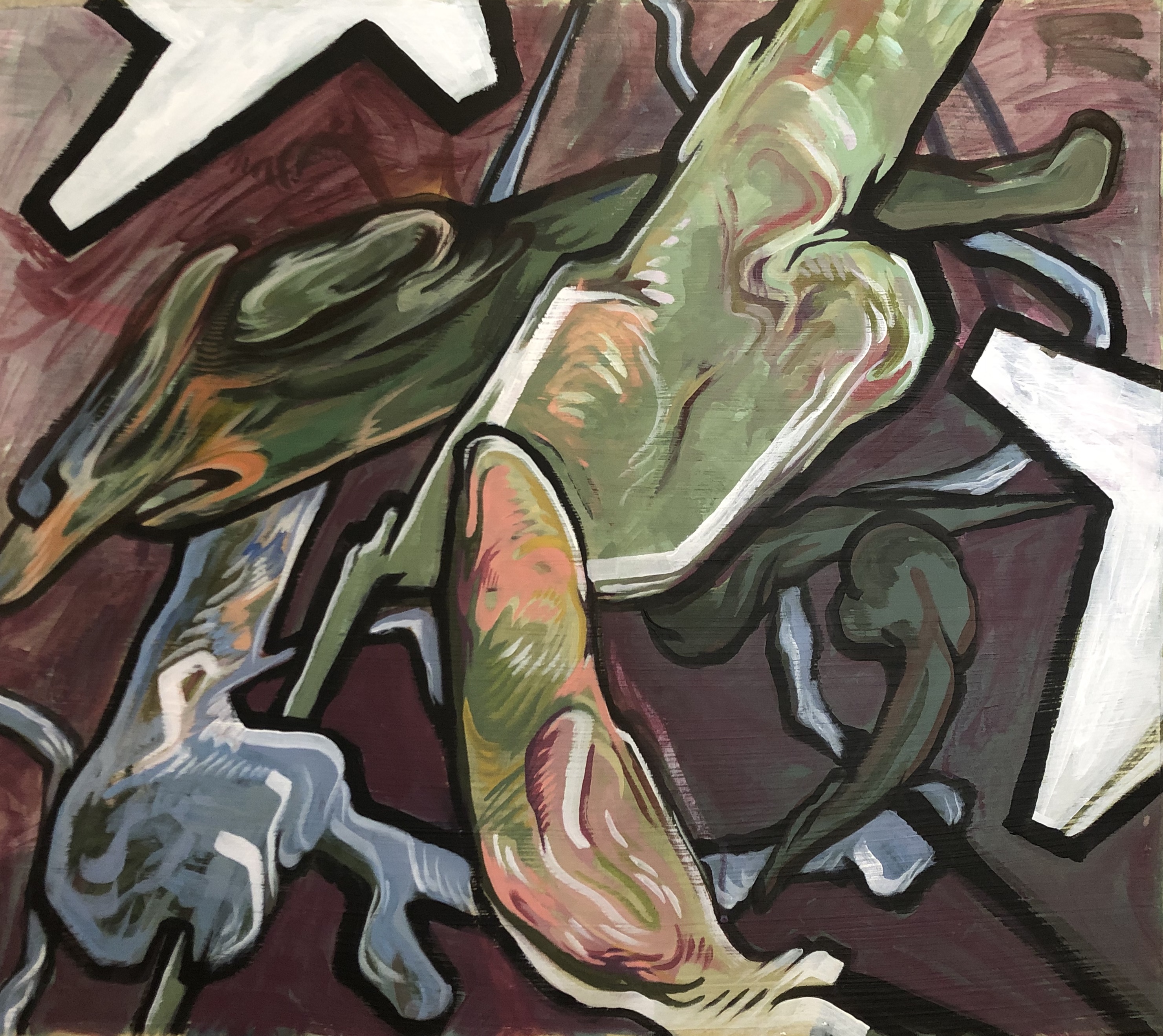
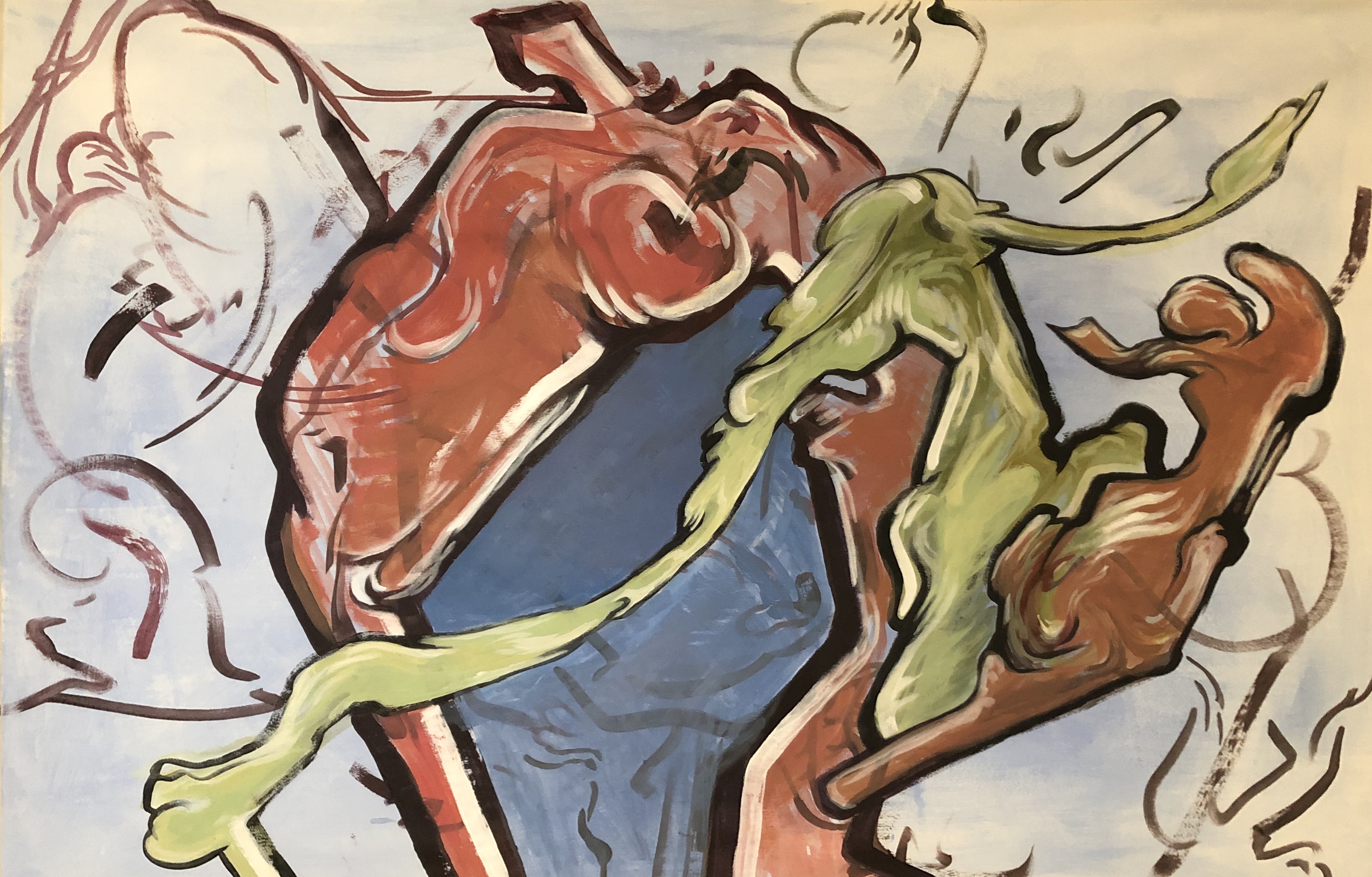
Mia Weitz:
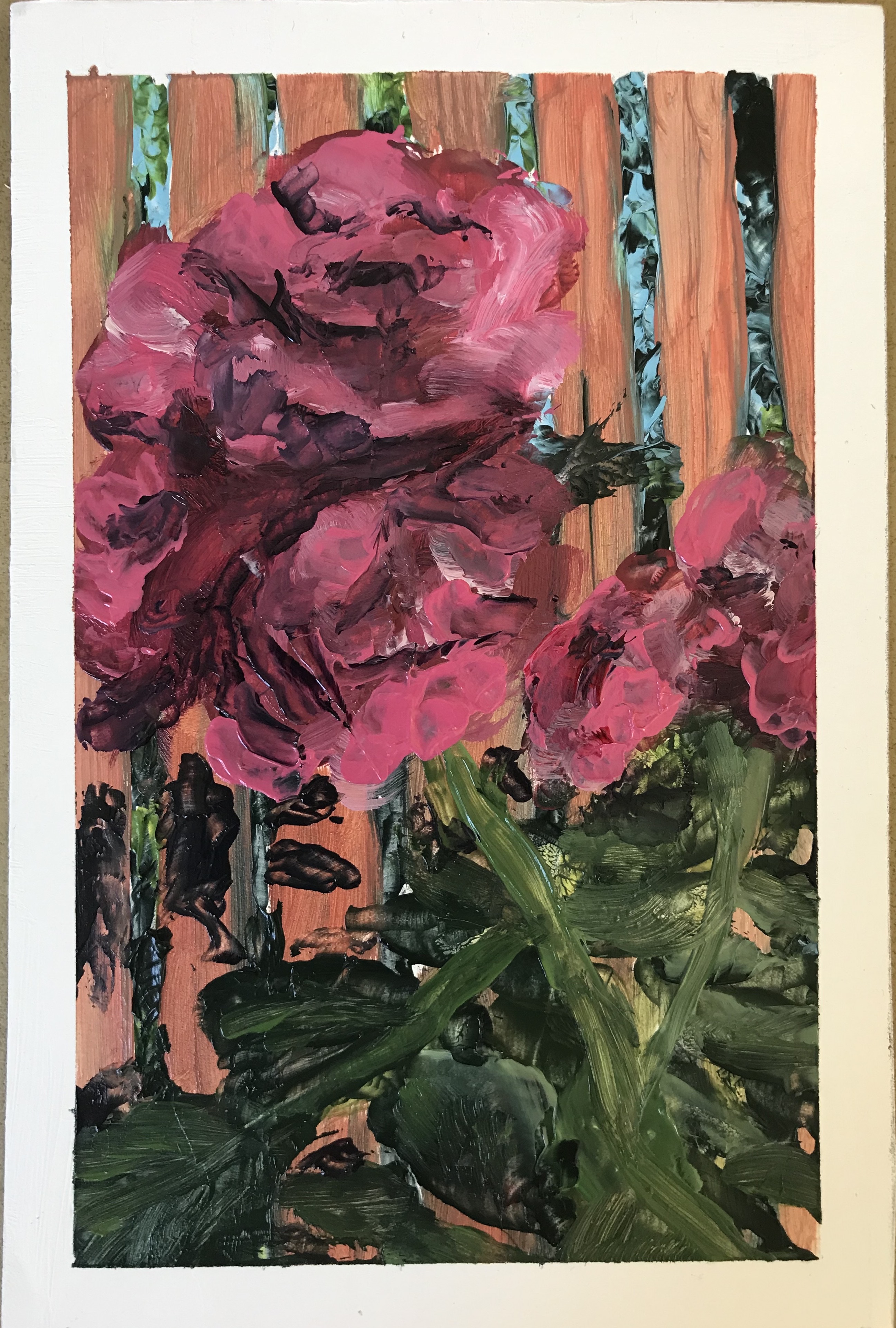
“Airborne” 26” x 22.5”, acrylic on paper
“Mirepoix” 40” x 26.5”, acrylic on paper
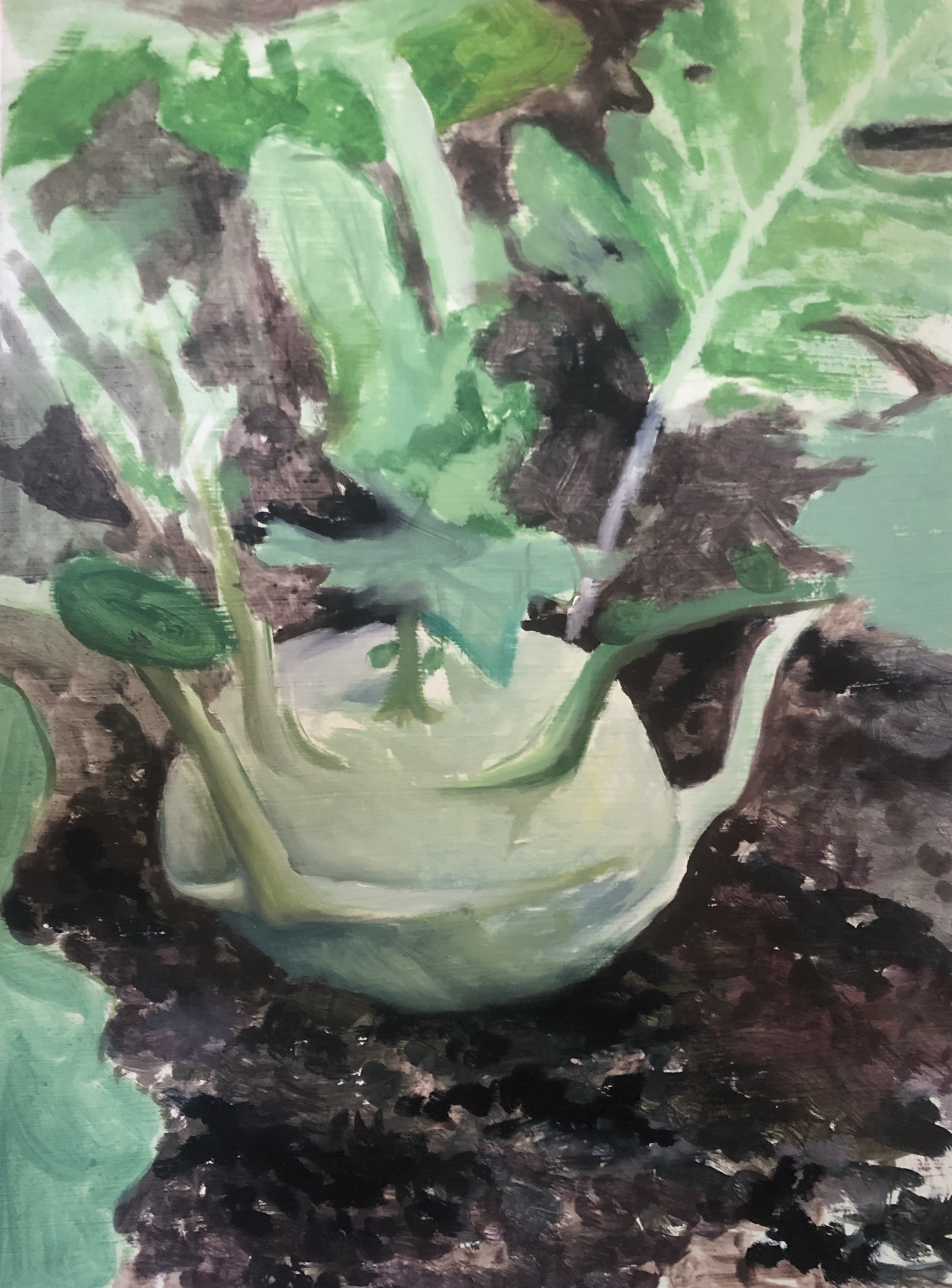
“Kohlrabi” 11” x 15”, oil on paper
“Rose Study” 7.5” x 11”, oil on paper
Odalys Juarez:
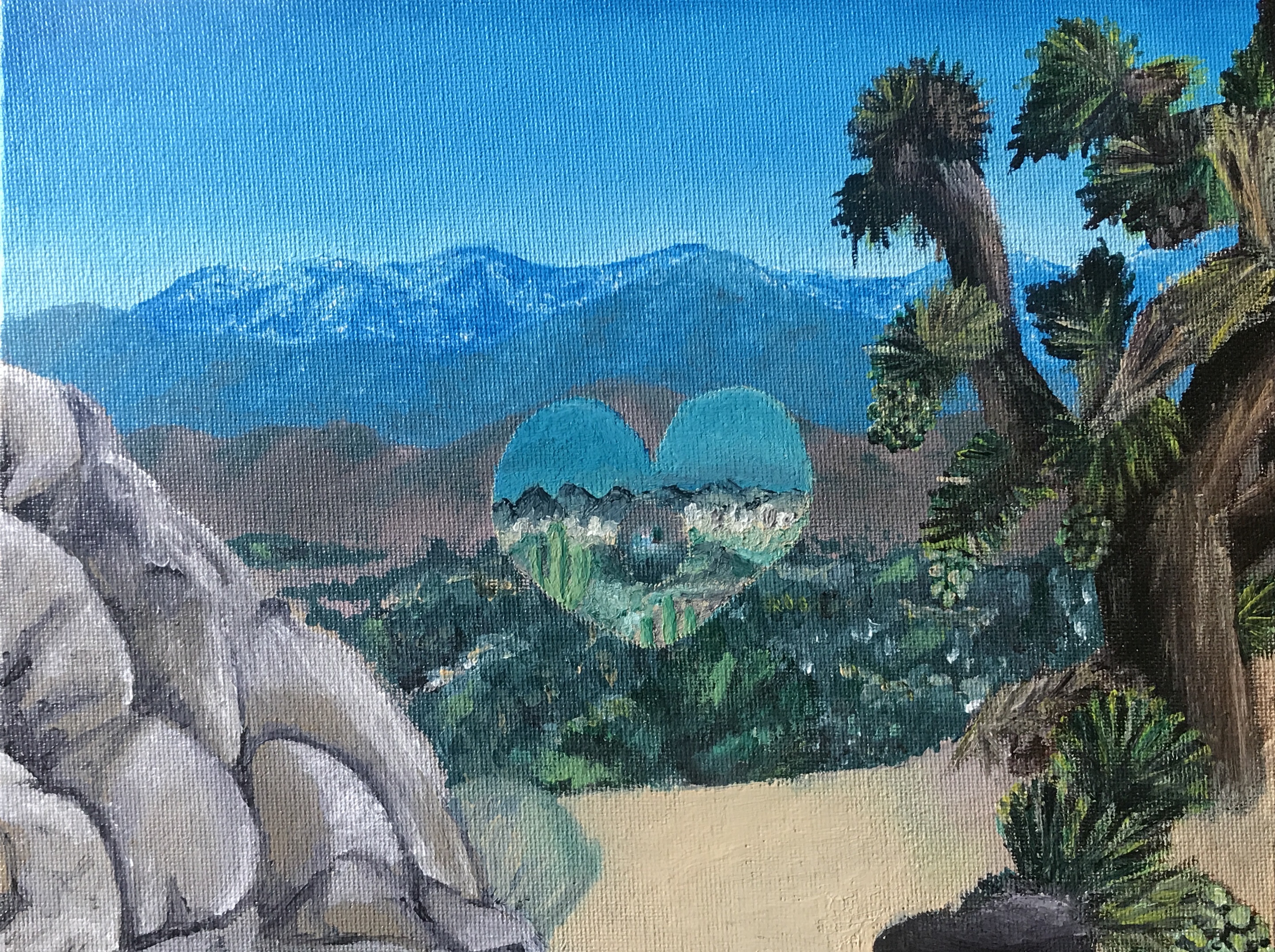
1. A Home Stays
Acrylic on canvas
8 x 10”
This is a landscape painting requested by my aunt. It is of the town she was raised in. The heart in the middle, which she wanted, is of a city in Arizona where she lives now.
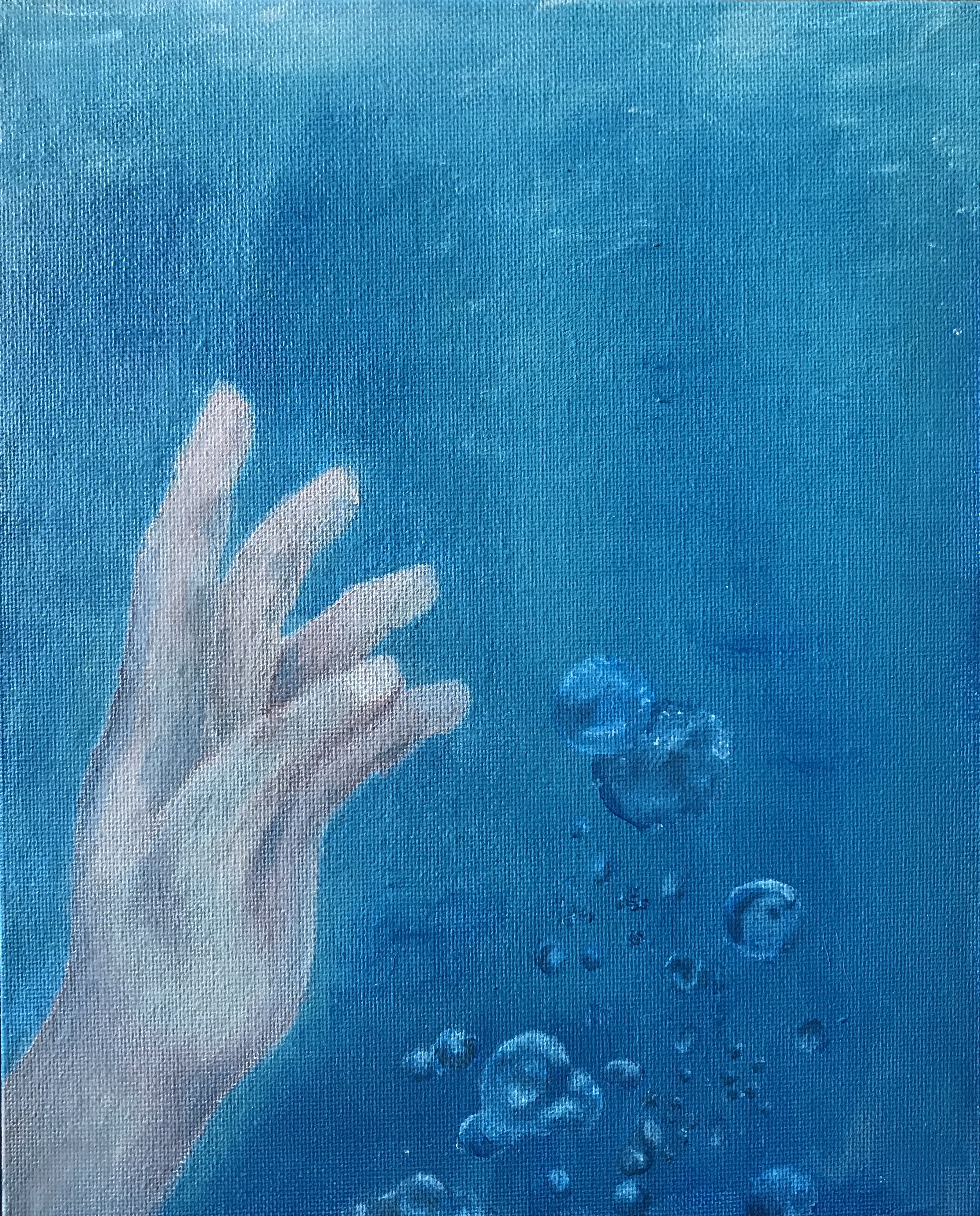
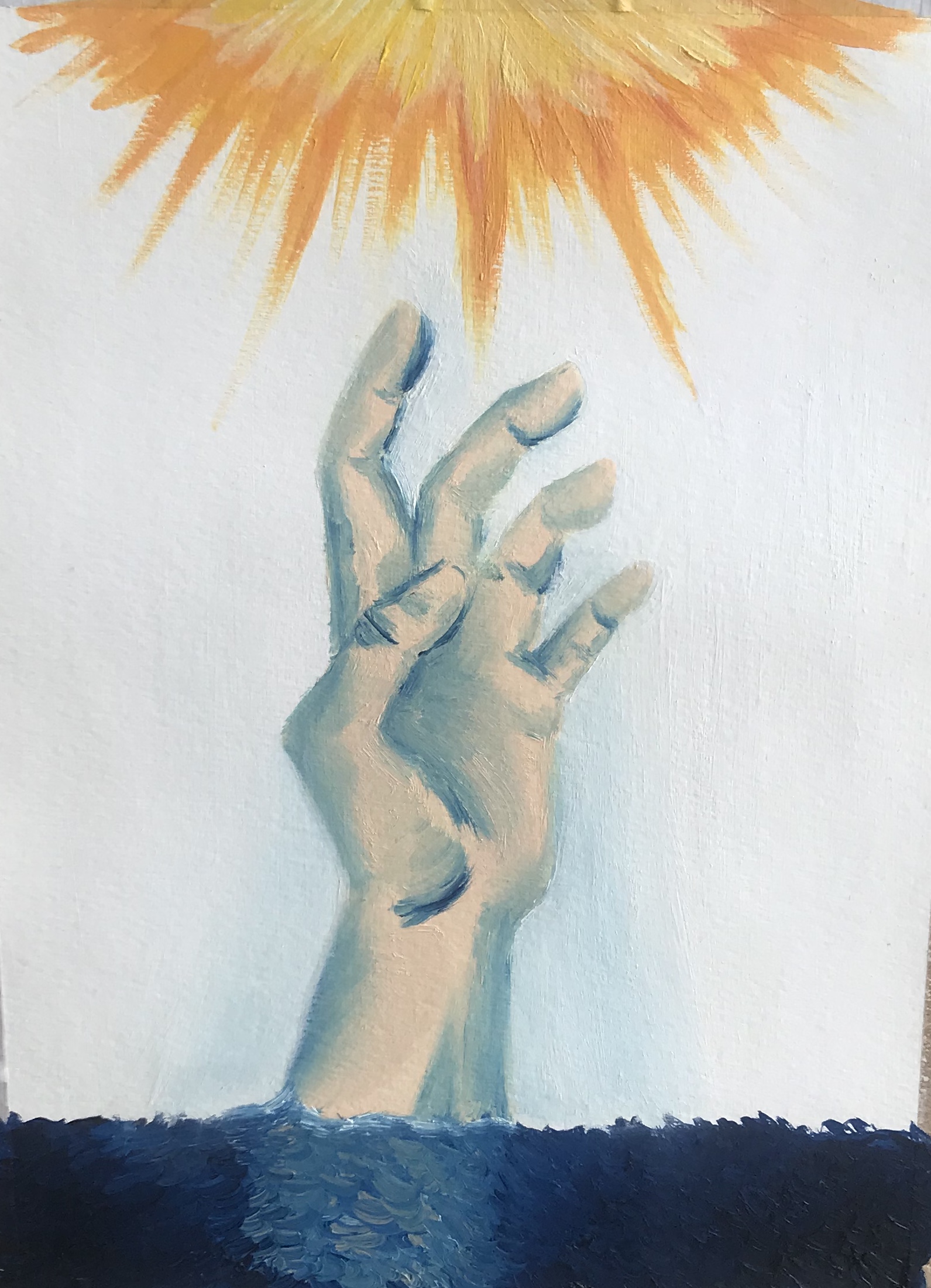
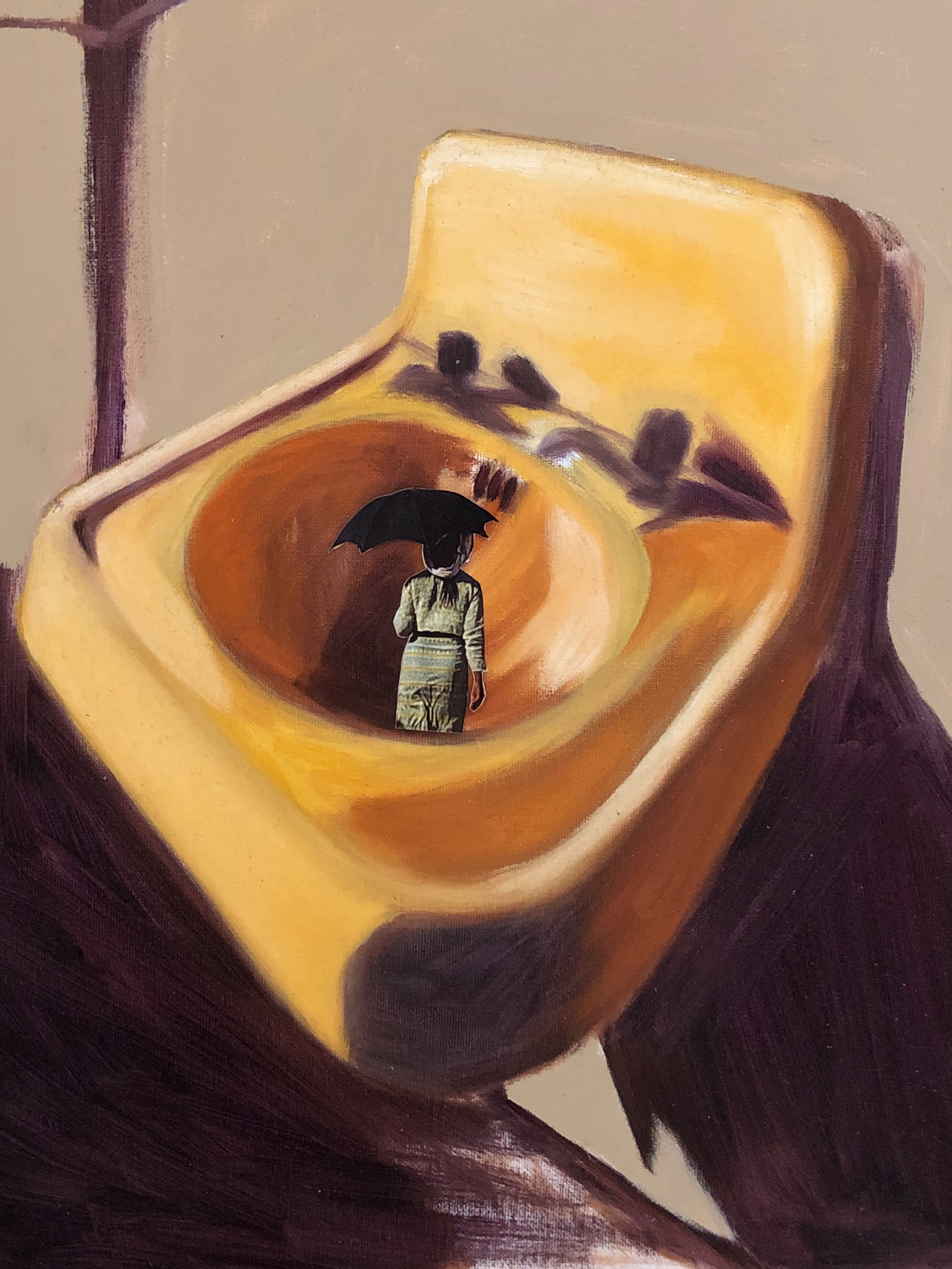
2. Reaching the Surface
Acrylic on canvas
8 x 10”
This one is a hand underwater. This was created in a moment when I felt overwhelmed by everything around me. I wanted to express what I was feeling in an effort to move past it.
3. Free Spirit
Acrylic on canvas
8 x 10”
This painting is just something I wanted to have fun. I didn't really know where it was going. I was just trying to go wherever my heart desired.
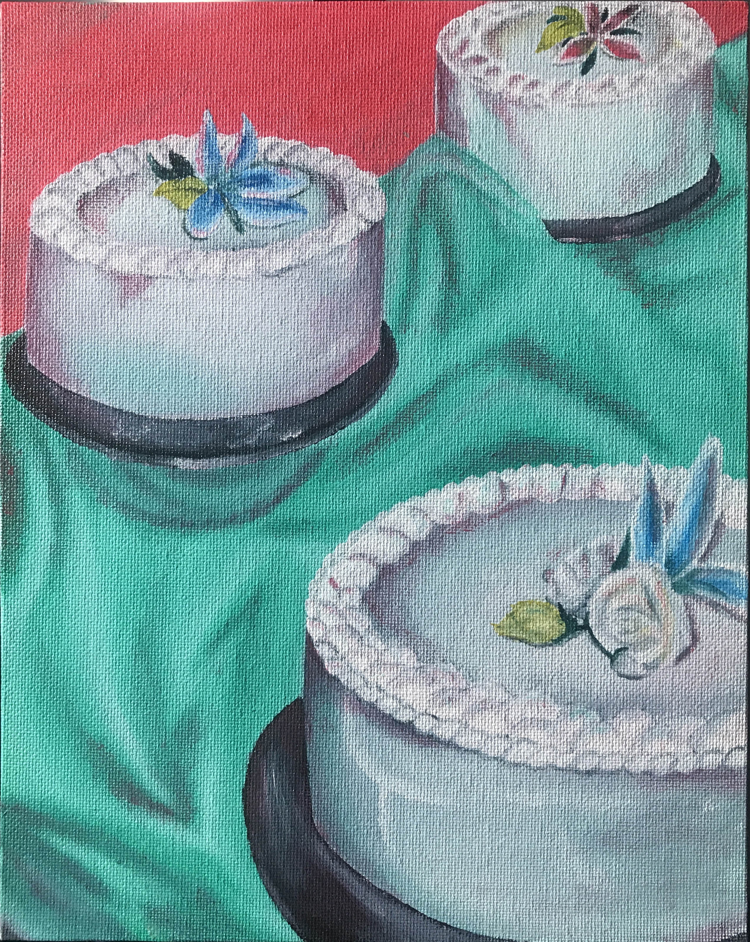
4. Quince Memories
Acrylic on canvas
8 x 10”
This last painting is a set of cakes from a picture of my quinceañera. It was originally a painting I was not happy with, but after feedback and some adjustments, I found myself happy with the final piece.
Peter Armusewicz:


Sarah Lynn:


Shanti Nagwani:
49x49” acrylic on canvas

49x49” acrylic on canvas
Sierra Garcia:
This artwork focuses around the expression of color, texture and space. The process of applying layers of paint to a surface is liberating and relaxing. On a hard day, applying a color such as "zombie flesh" pink to a painting both resonates with my feelings, and somehow creates a beautiful, chunky mess on the surface. This contradiction between beauty and disgust is the glue that holds this series of pieces together.

“Zombie” (15x24)

Untitled (15x16)

Untitled (10x20)
“Map” (15x24)
Art 158: Advanced Photography
- Norman Locks
Aaron Martinez:
Luz de Fuerza / Digital Image
Abrazo Espinoso / Digital Image

Corazón Árido / Digital Image
Vida Marchita / Digital Image
Coby Oblak:
"Together in Solitude"
The Idea behind this project began from the lack of interaction that people get during isolation. Based on the grim reality that many are facing I felt like I wanted to combat that and have a little fun while doing so. I wanted to poke fun at that concept by portraying activities typically done with multiple people and replacing all the individuals with one person, in this case me, and my clones. Portraiture is not one of my skills so this project was an interesting and yet gratifying experience. I definitely had fun getting into the characters’ heads and imagining how they would play off of eachother, and in doing so hope that the project is as enjoyable for you as it was for me.

Elvert Perez:
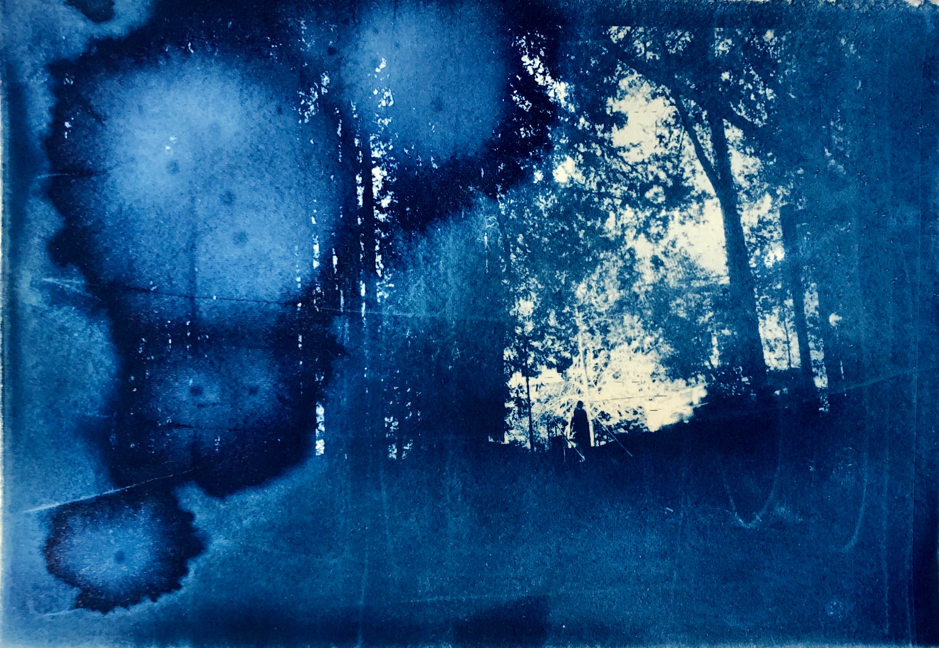
Dreamland
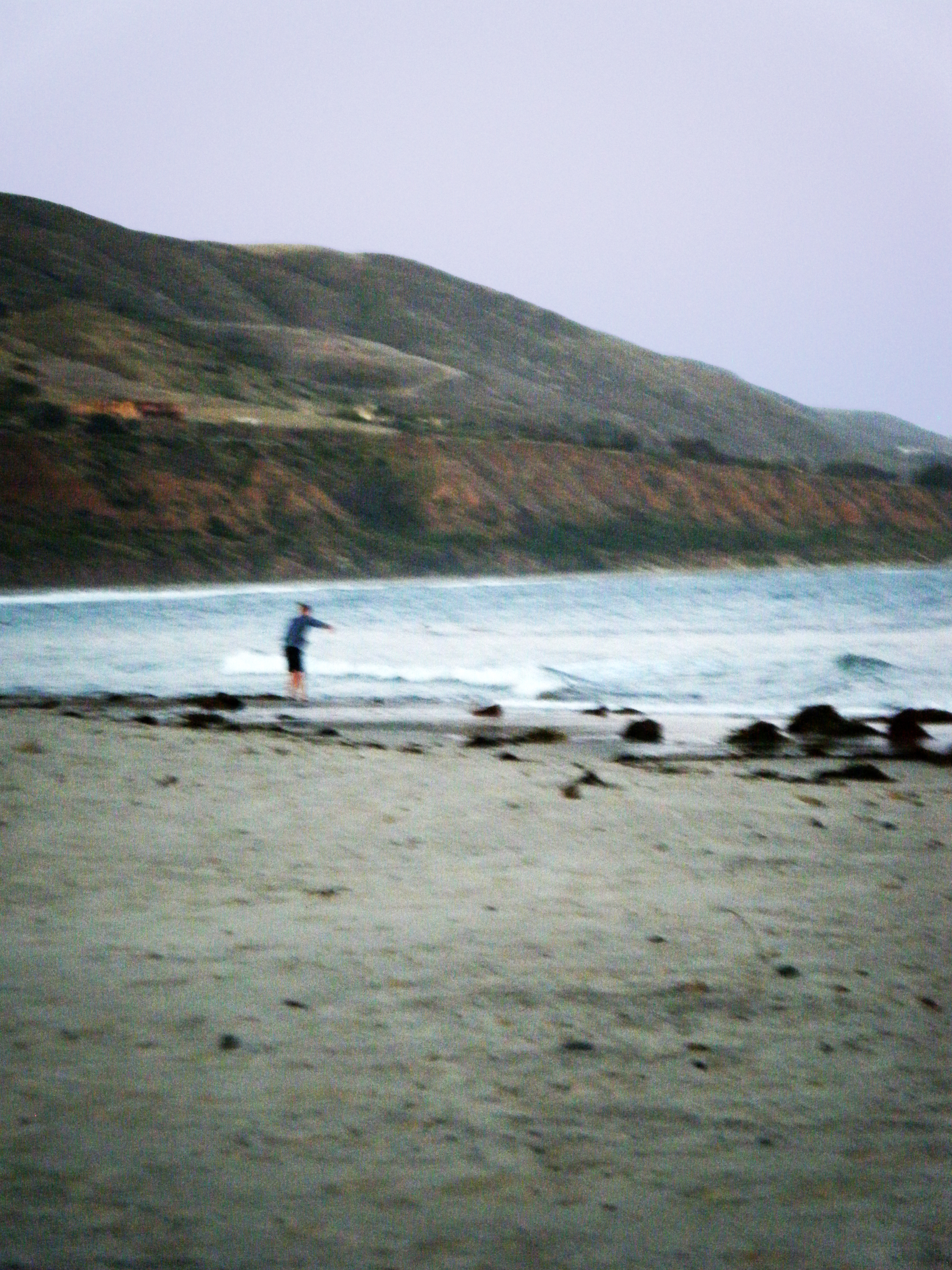
Sometimes, I feel like I’m moving through life. I’m neither a participant or a viewer; neither dead or alive. When my reality becomes overwhelming, I recede from others and can think of nothing but sleep. My dreams are tied by a loose narrative where I surrender control to a nonsensical prophecy. In the Dreamland series, I want to capture the essence of dreams by capturing landscapes through different perspectives. The series consists of photos taken throughout the day. The project began from a place of loss and unknowing, and ended in a place of appreciation and humor within myself.

Blue Sky Above

Lost in Thought
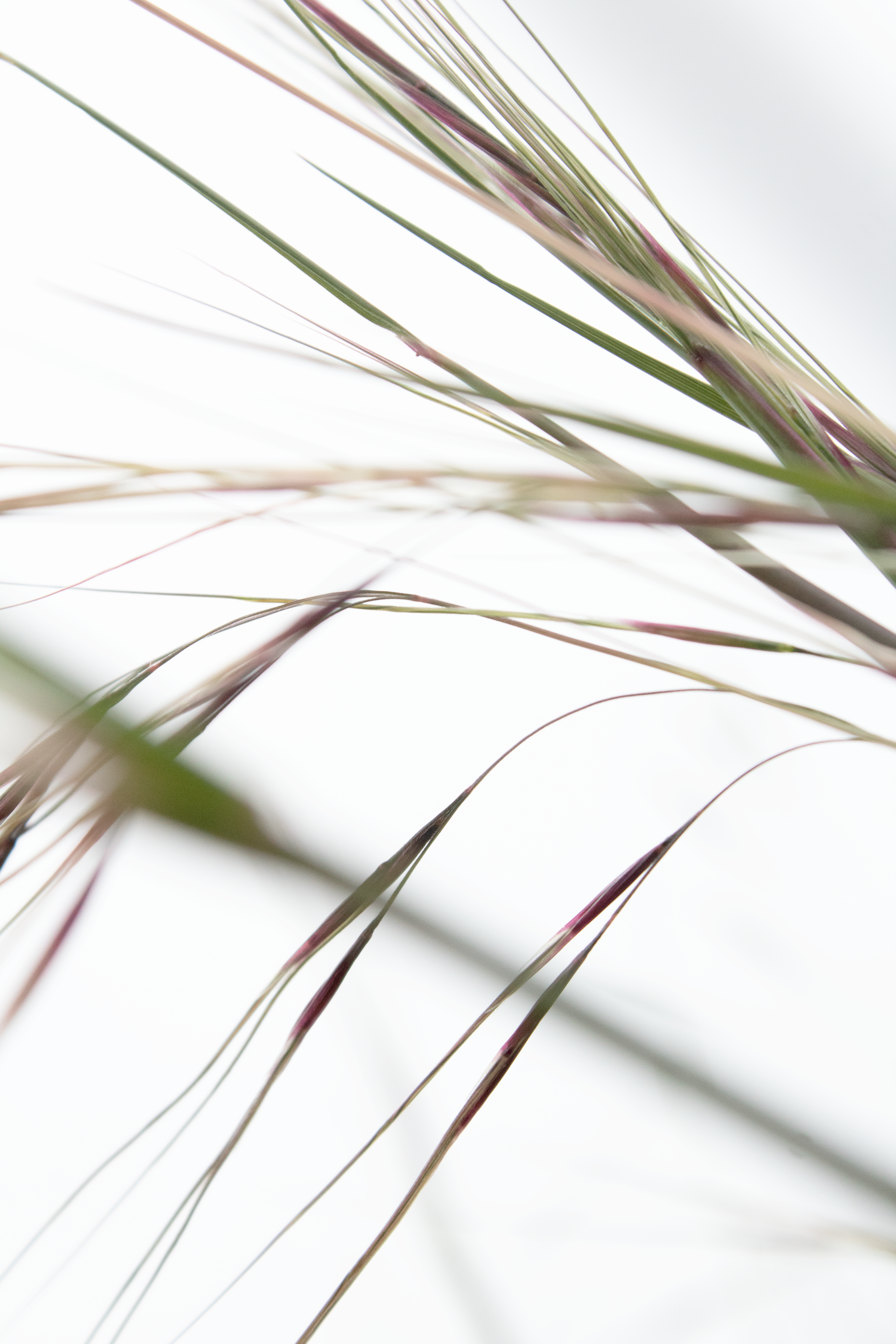
Grass no. 1
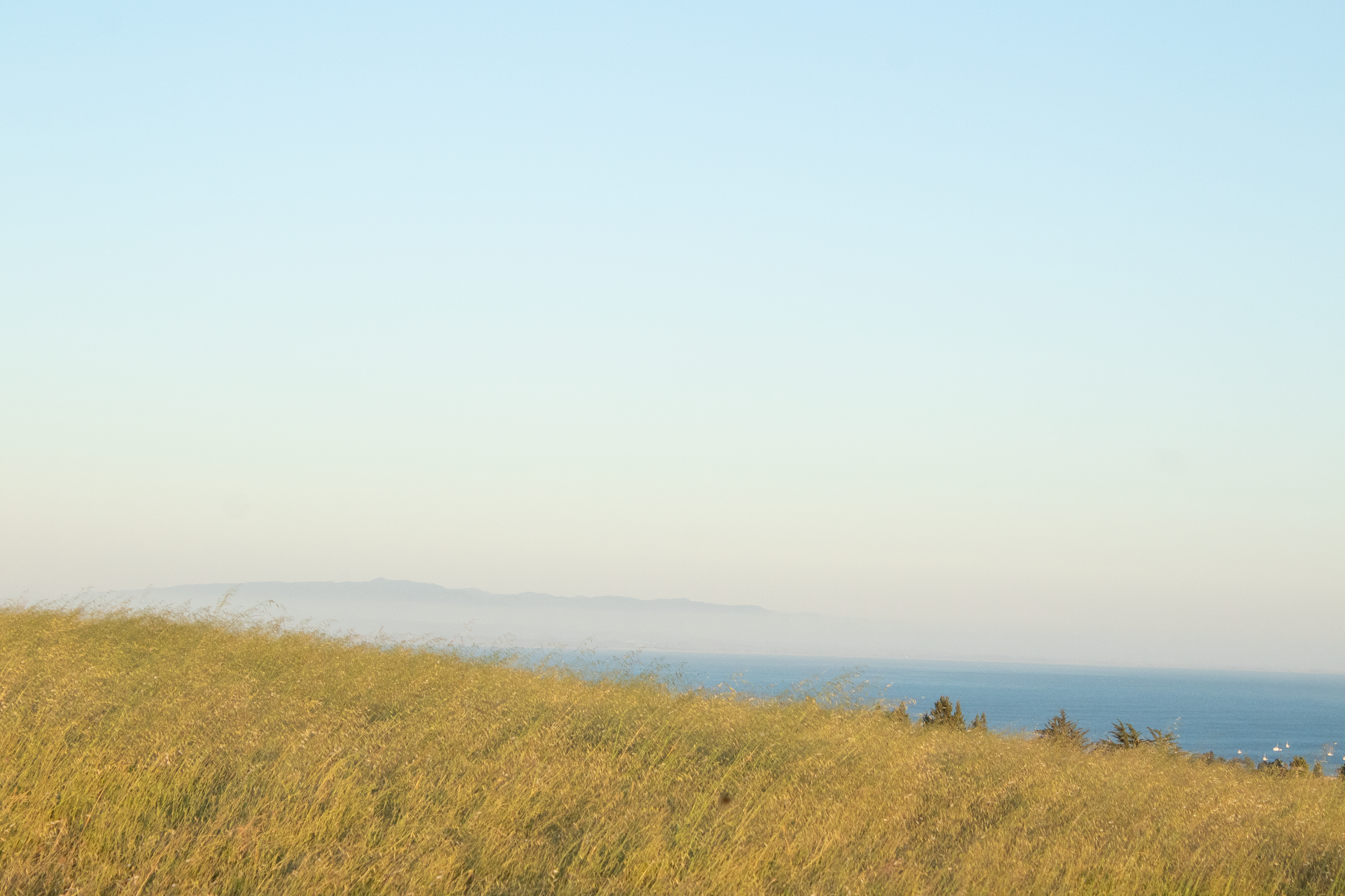
Beauty in Comfort
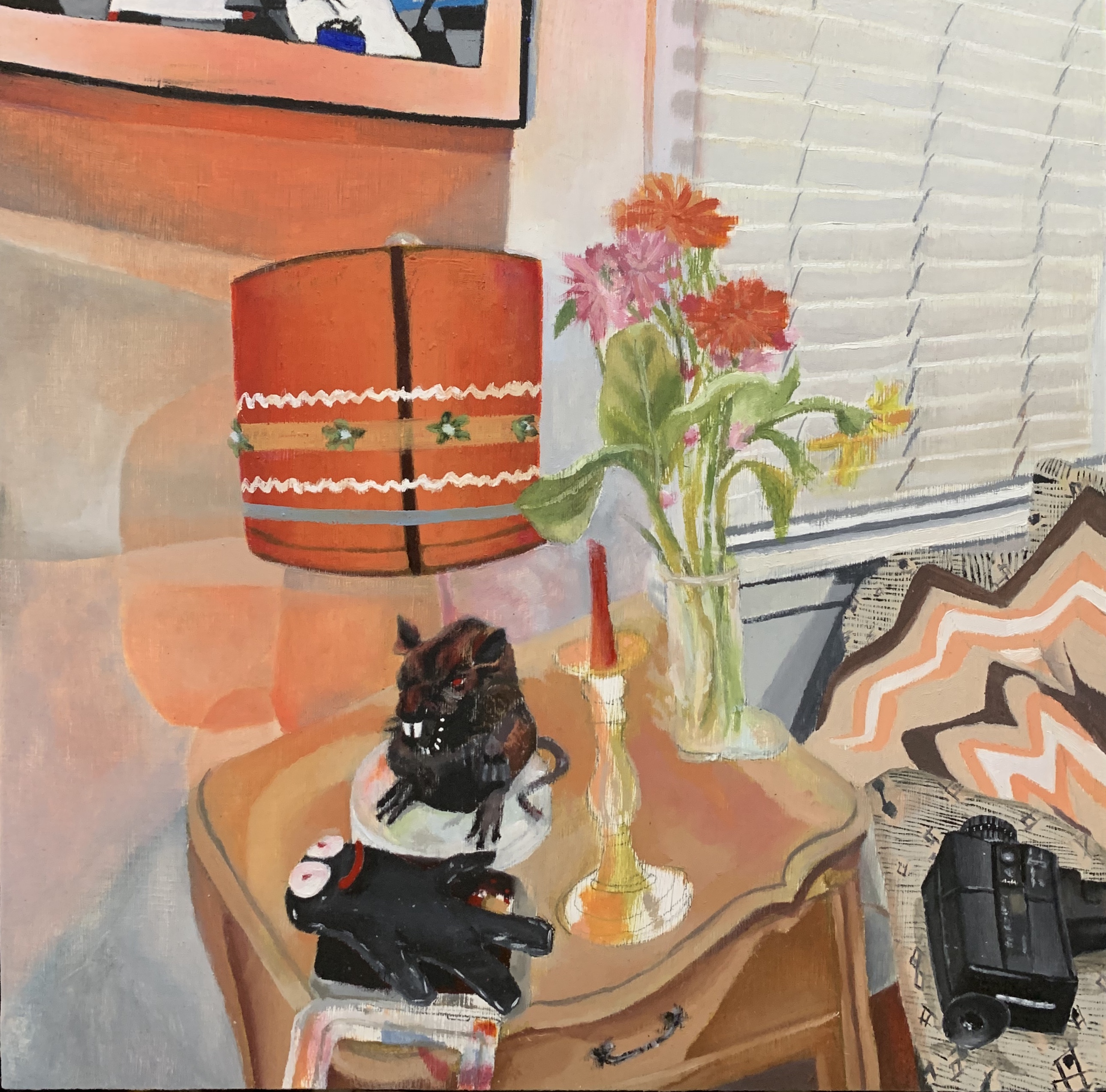
Jess Mezzie:
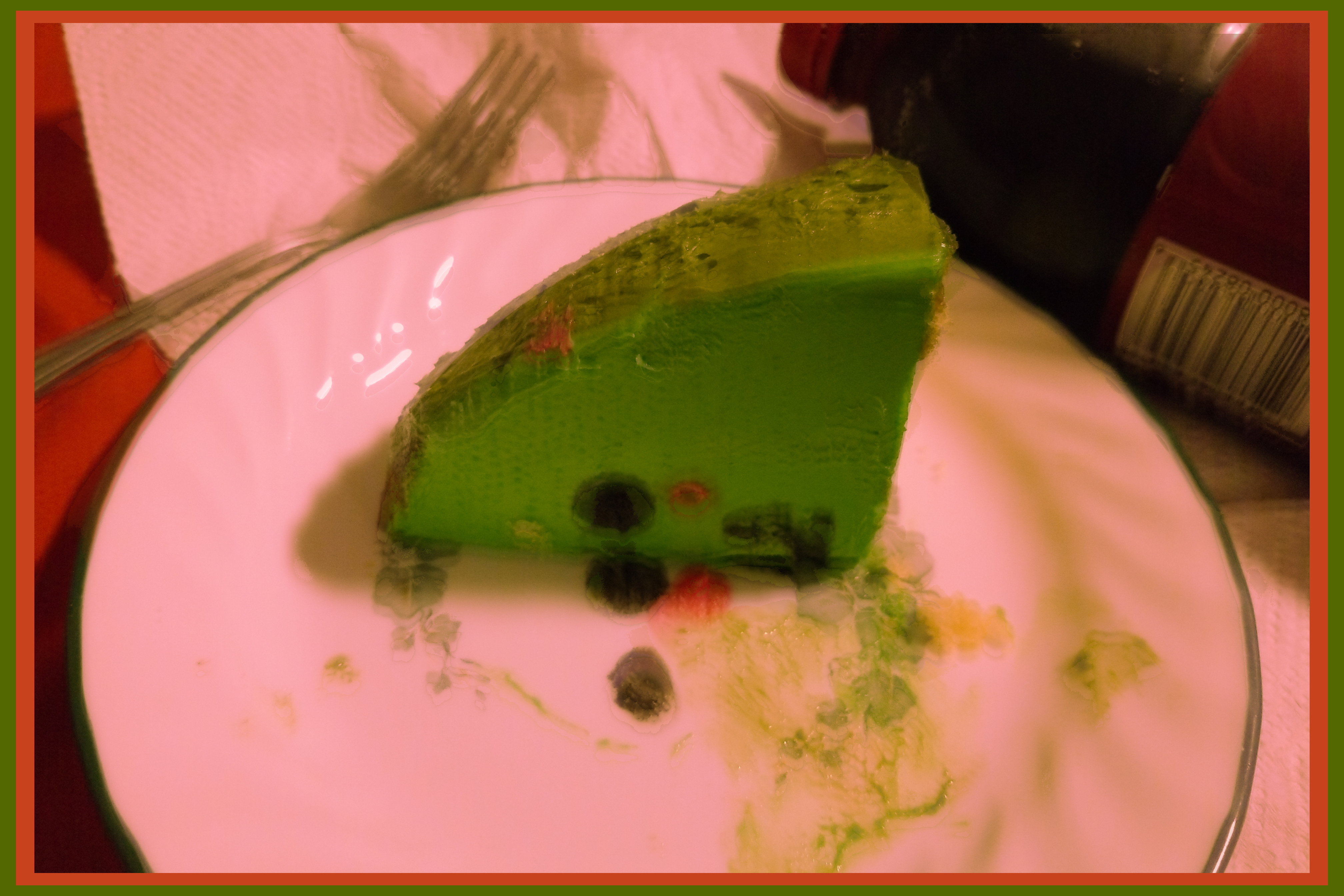
“Depression Meal”-digital photograph of a piece of birthday cake edited in photoshop
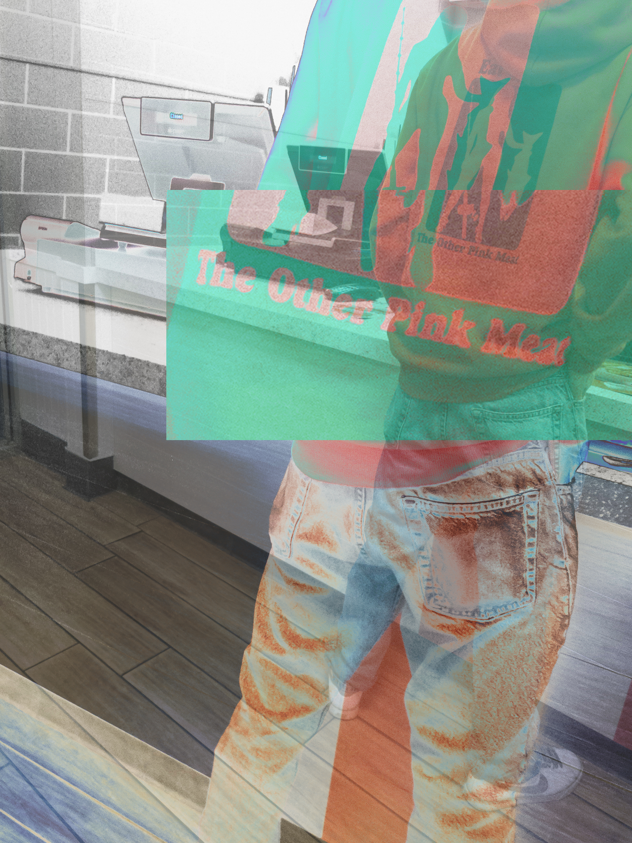
“Pink Meat”-digital photograph of a man in a hoodie edited in photoshop
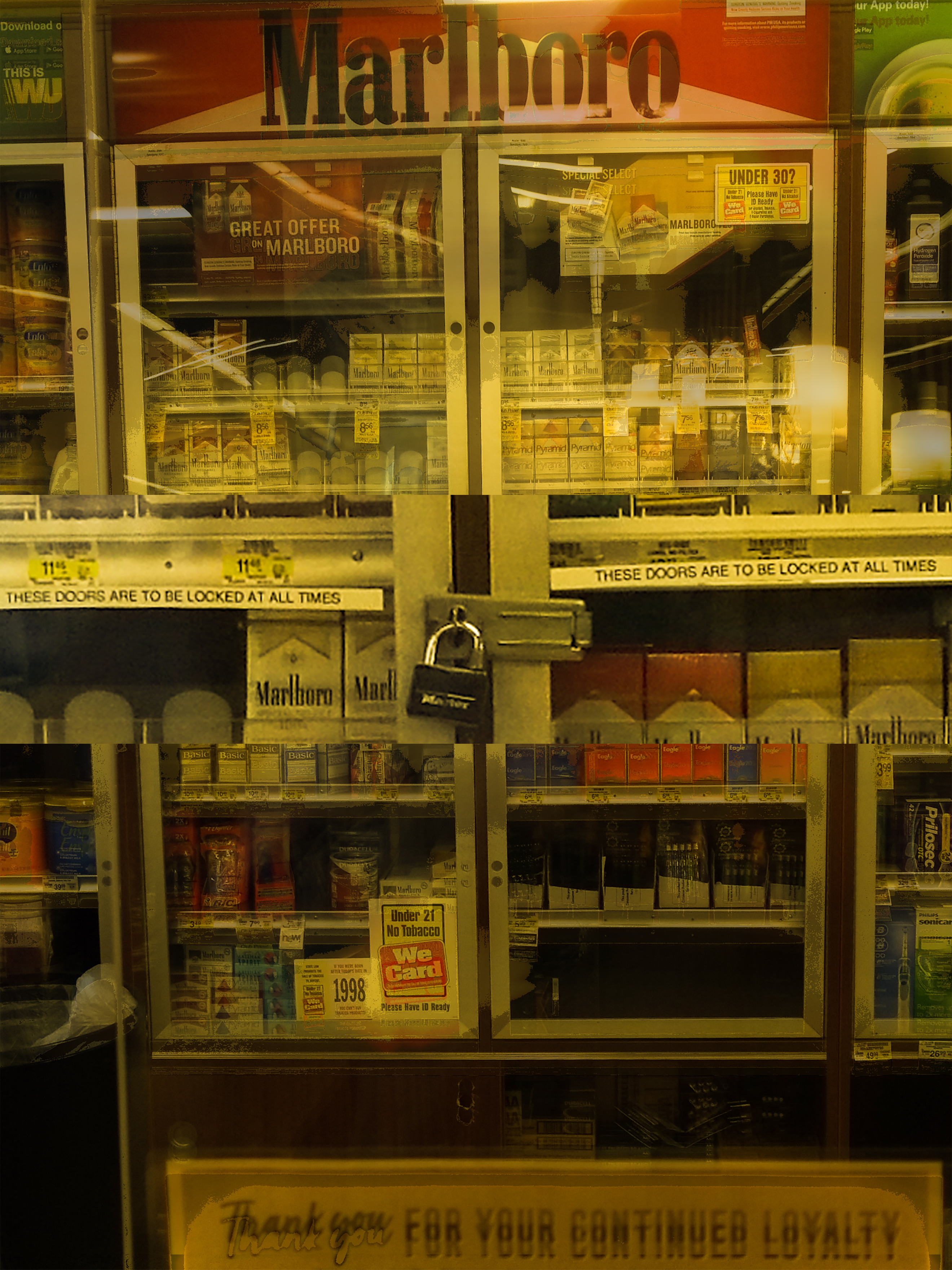
“Loyalty”-digital photograph of a cigarette display at Safeway edited in photoshop

“Baby Rats”-digital photograph of my pet rats edited in photoshop
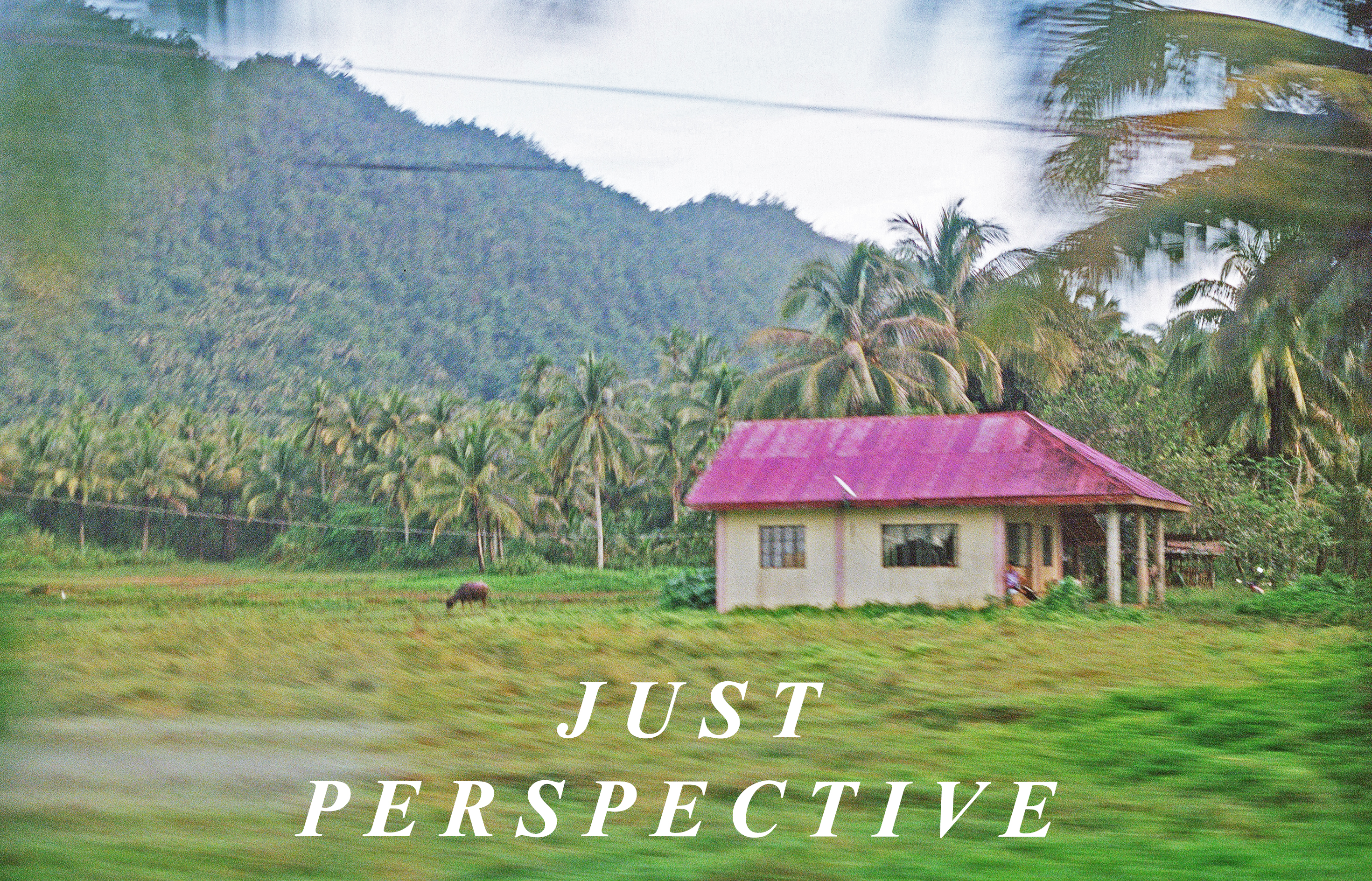
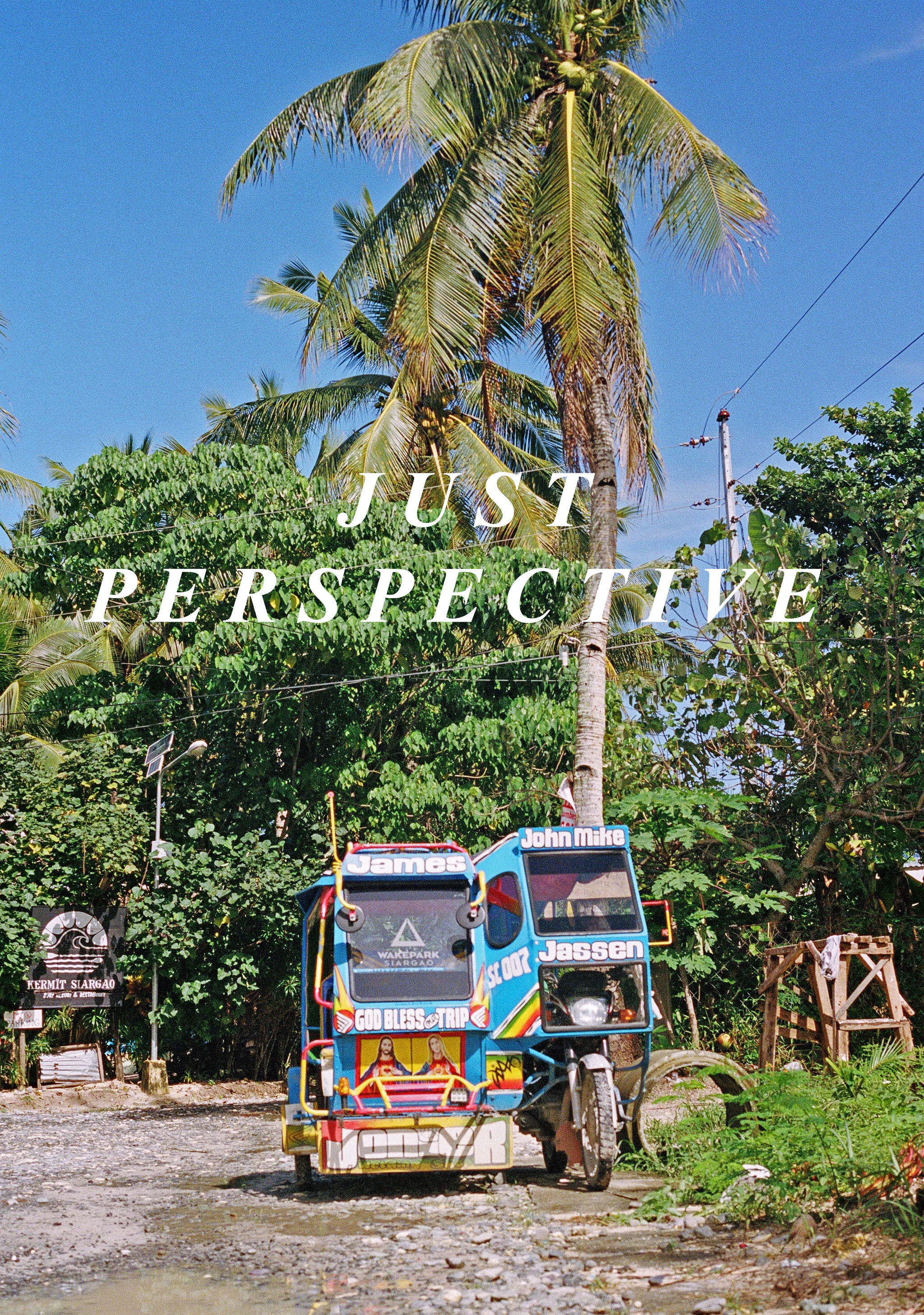
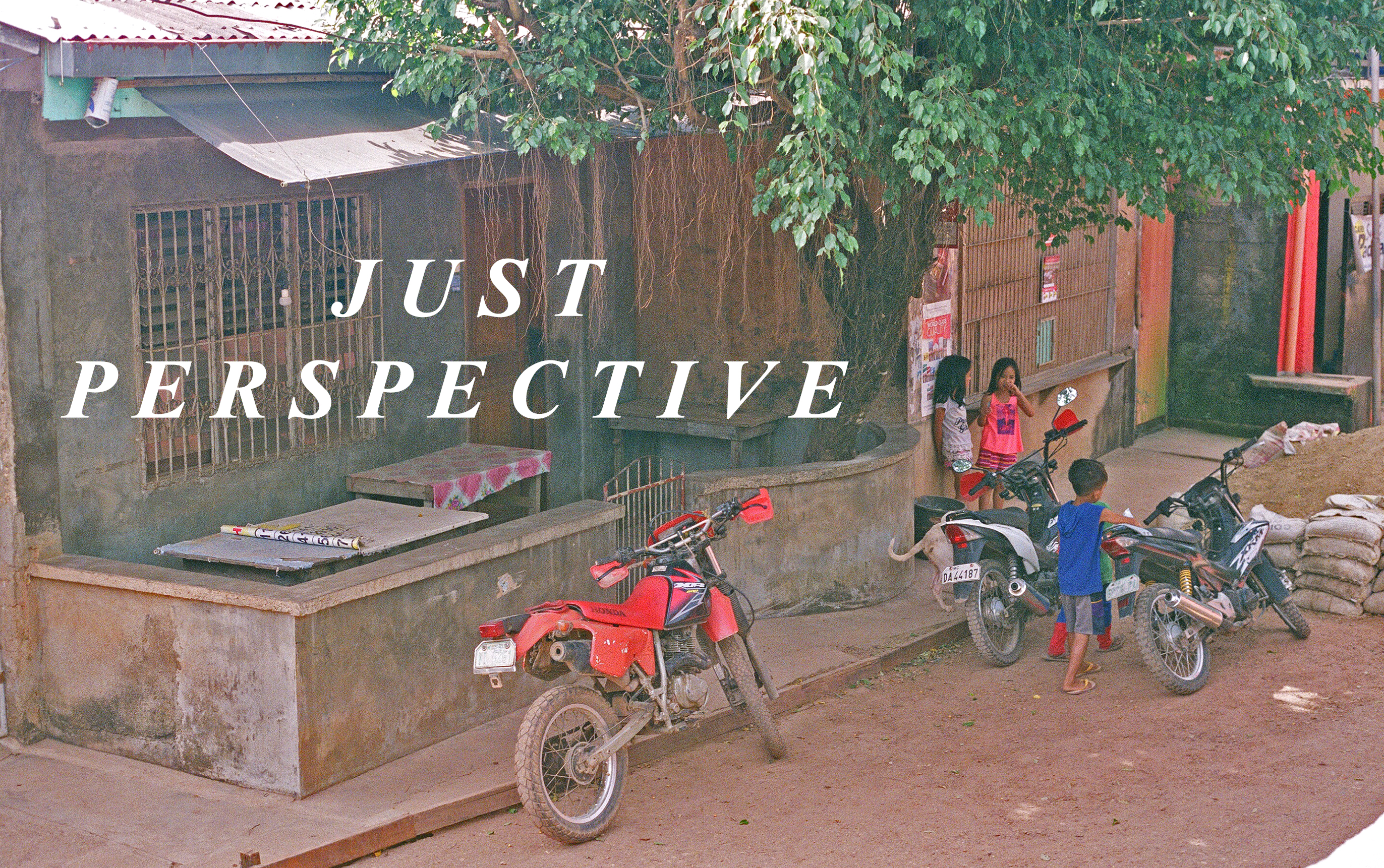
Joseph Padpad:
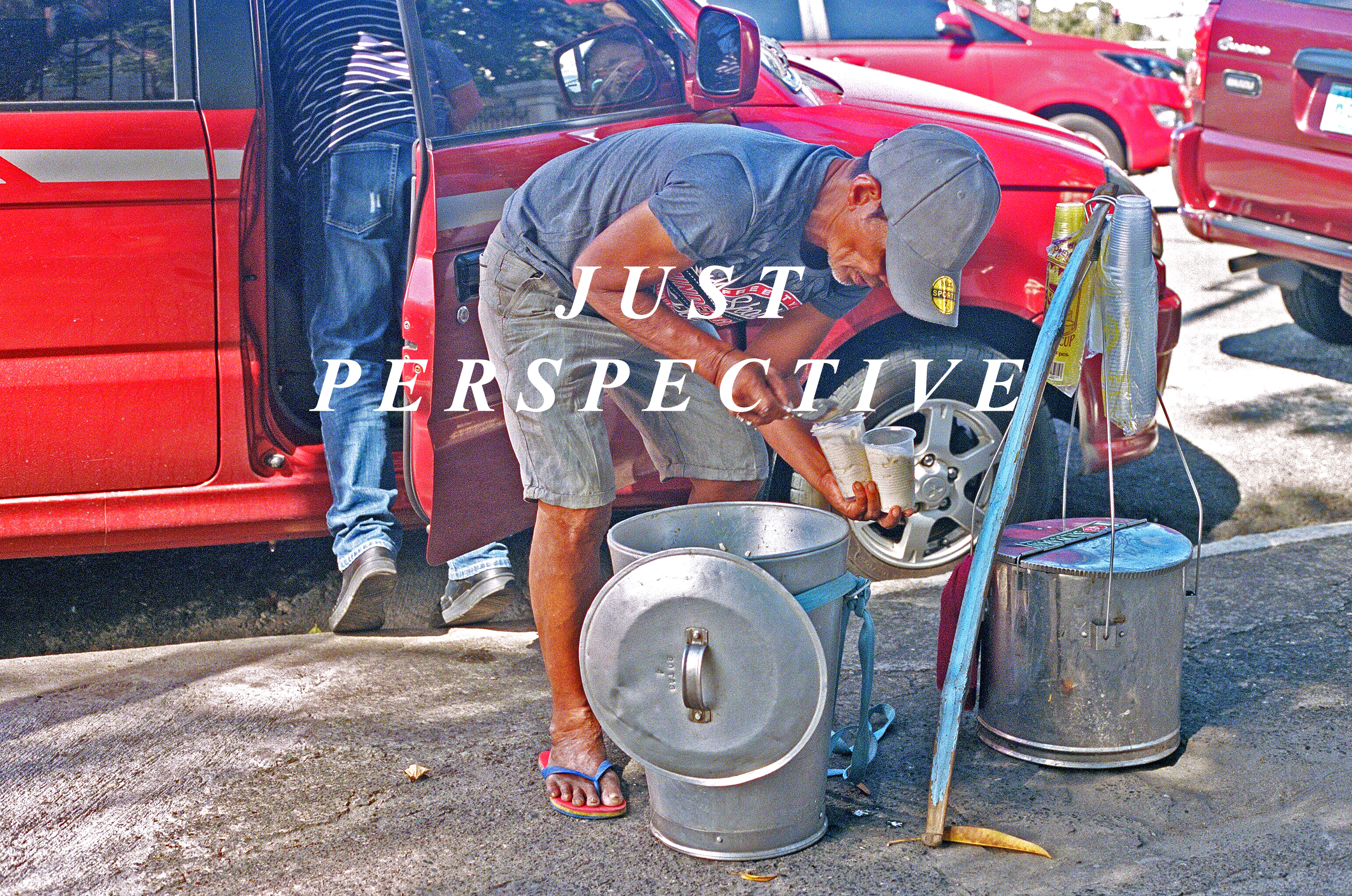
Just Perspective
JP, otherwise known as Just Perspective, is a creative project.
“Just” meaning simplicity, necessity, and the righteous direction we believe individuals should abide by. “Perspective” referring to the angles we as humans see life, society, culture, and the environment surrounding us.
We are firm believers in the fact that the world already has everything it materialistically needs. This is why we look to repurpose, reuse, and recycle what has already been gifted to us. With the help of artists, we give these gifts more meaning as a way to educate and enlighten for a better future.
If you support this endeavor, we encourage you to join as we push the story of progression and betterment for our own generation alongside the many generations to come. We merely want the best for everyone now, and later. That is Just Perspective.
Artist Statement belonging to the preview from the collection Motherland.
This is where my story begins, in a chaotic yet tranquil, humbling, and loving land— the Philippines. With both of my parents being Filipino immigrants, my roots are found in the rich soil of these islands. Whether one looks deep into the Philippine history to find the narratives of Lapulapu battling for our independence from imperial Spanish colonialism, Whang-od’s preservation of Kalinga tattooing, or José Rizal’s written works as a nationalist and polymath, it is evident that our people have been fighting the endless fight. The amazing demeanors that have been developed by the rich Filipino history, heritage, and culture can be seen within contemporary Filipinos like Manny Pacquaiao, Joseph “Jo Koy” Herbert, Bruno Mars, the Jabbowockeez, Jordan Clarkson, Lea Solanga, Vanessa Hudgens, and Rhuigi Villaseñor. It is beautiful to see how far our people have gone and continue to go in these very days.
As a student, photographer, creative, and aspiring entrepreneur, I look up to every single one of these names hoping that I can fill similar shoes one day. I want to inspire as many people as I can to have pride in where they come from and that is why I selected this to be the first project. With visuals, clothing, and written works I want to tell stories that I wish will inflict a determination, love, and attitude that is as strong as those who come from the Philippines.
That being said, here are some photos that give you a -perspective- into the Philippines. As soon as I am able to do so, I will be creating a collection that draws inspiration from my motherland, the Philippines. For now, please enjoy these photographs. They are what I will be using as my guide for these first creative pieces.
These are some of the occupations seen throughout the Philippines. These photos were taken specifically in Manila, which is otherwise known as the capital of Philippines. There are individuals driving tricycles around to sell snacks, drinks, and other Filipino cuisine. There are garbage men who actually spend their shifts grabbing bags from home owners(a standard home there is not the same as our homes here in the United States). There are bus ticketers that hang off the back of a “Jeepnee” truck to let individuals on and off the transportation service.
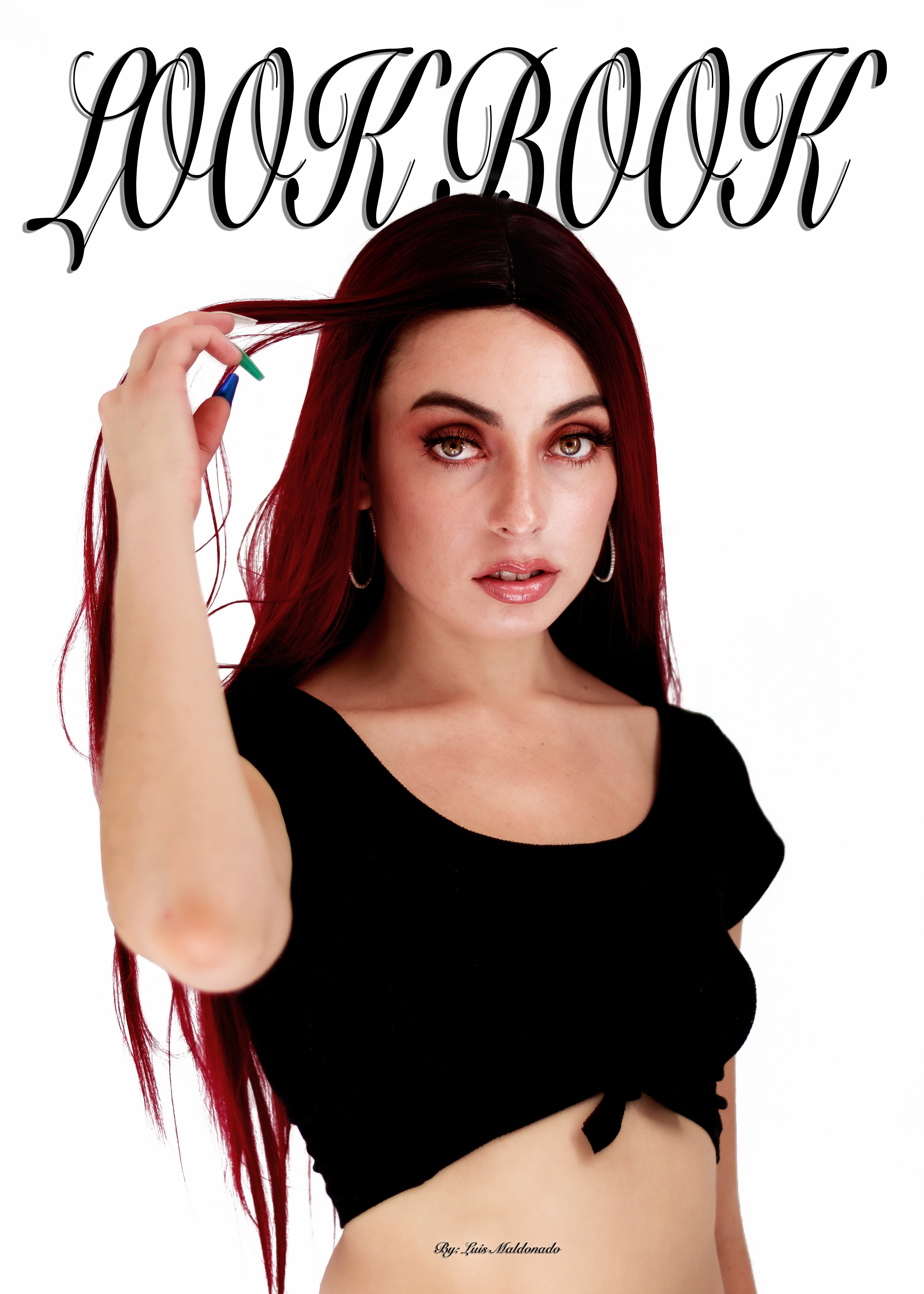
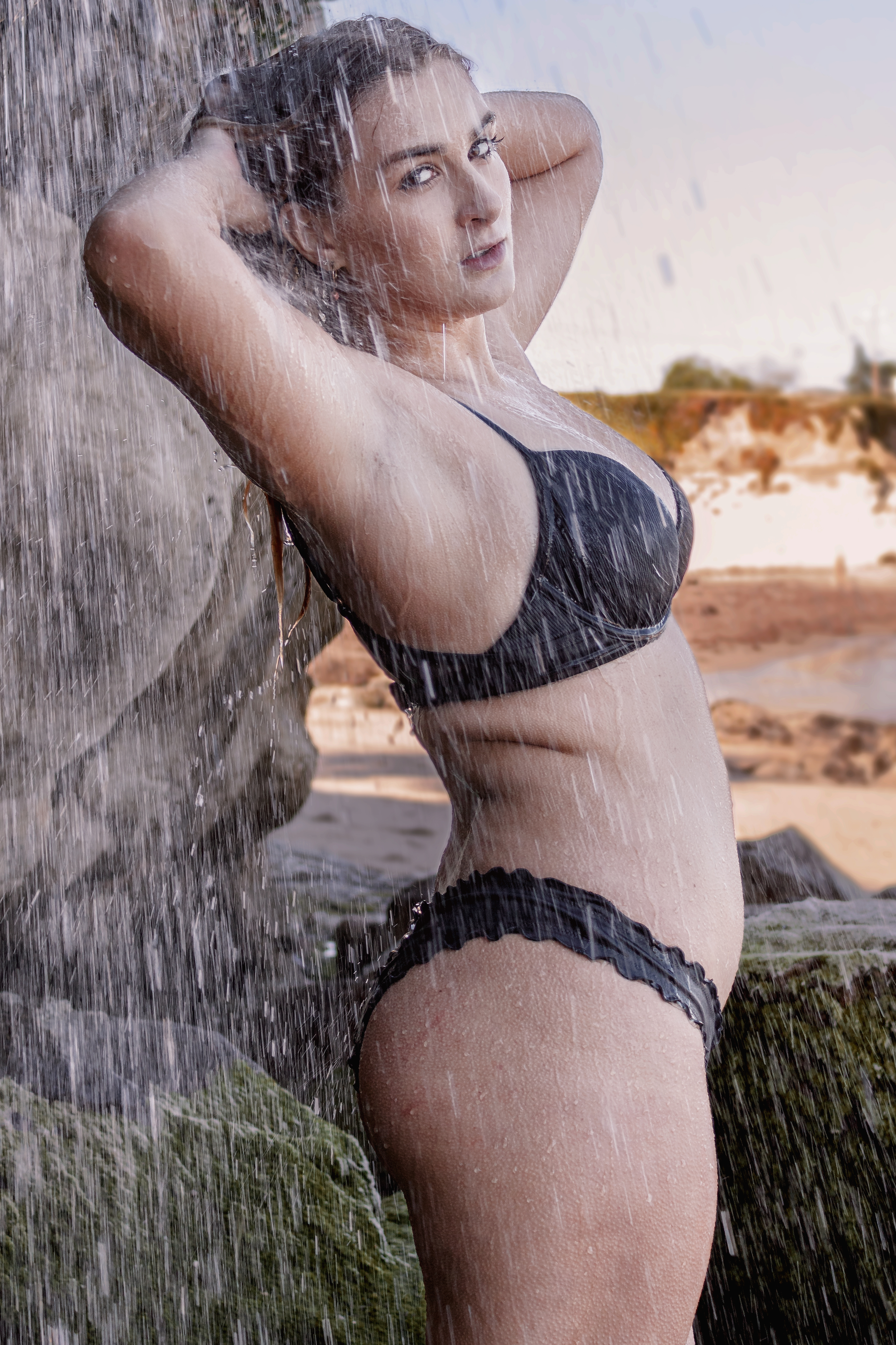
Luis Maldonado:
Look Book is a physical platform for myself as a photographer to present some of my best work in the industry of fashion photography. This series in particular is based on women's lingerie and bikinis because it’s something I was working on at the time and with summer approaching I thought it makes sense.
I found myself doing this kind of photography from one day to another, it began when my girlfriend asked me to take a set of photos to send out to a company. The photos turned out really good and gave me a boost in confidence and morale so we kept shooting and posting on social media platforms. Post after post more photographers and models started to notice the posts and wanted to collaborate and work to get content for their own pages.
One of my most proud accomplishments to date was being invited to shoot behind the scenes for Lil Yase and Beachmaster’s music video “No Photos” and landing one of my shots as the songs cover. This gave me another boost in confidence in my work. Apart from being really exciting times, the people I was meeting and the connections I was making also made it really fun and exciting.
I want to continue doing this type of work because I enjoy working with people. I feel like they bring a different type of emotion and vibe to a photograph than a car or a landscape. I also think that this may be a good market for me as I like the idea of shooting for commercial purposes. I would like to eventually shoot for magazines and clothing companies and even celebrities and influencers who market themselves and their image. This book is a stepping stone towards that goal as I have compiled some of my best work in a specific category showcasing my skill, aesthetic and innovations which are highly valued in this field.
This is not a final book, I think this idea can be expanded upon and solidified with more time and more work. In my ideal world I would separate the book in two, separating work done outdoors from the boudoir/ lingerie shoots. This is going to be a project that I will revisit as I continue to shoot.


Sophie Zukoski:
Title: How to Disappear
Title: To Be Alone
Title: In The Dirt
Art 159-01: Special Topics in Photography
- Kathleen Perry-Dyer
Jared Guzman:
SOMETIMES
Over the course of three weeks Luis Maldonado, a fellow photographer, and I participated in a photographic conversation through text message. We showed each other a glimpse into each others’ worlds and would sometimes connect. The conversation felt disparate, like we were each having our own discussion. I would send a photograph about coffee and he would send one back about pizza. I would send a photograph of my garage and he would send one back of his computer, but we would never send any text to each other.
The project was intended to be a quick and easy way to get to be acquainted with people in the class, but I found that the conversation, to me, was more interesting and exciting than that. The fact that Luis and I didn’t connect very well and yet we still conversed incited a disconnect that many of us experience every day. We don’t always make connections with people. And those connections that we do make only sometimes blossom into a friendship.
That idea, that we pass by people every day (or, at the very least, before COVID-19, did), fascinated me and made me want to experiment with the project further through its presentation.

Kat Javiniar:

Rodrigo Ramos:
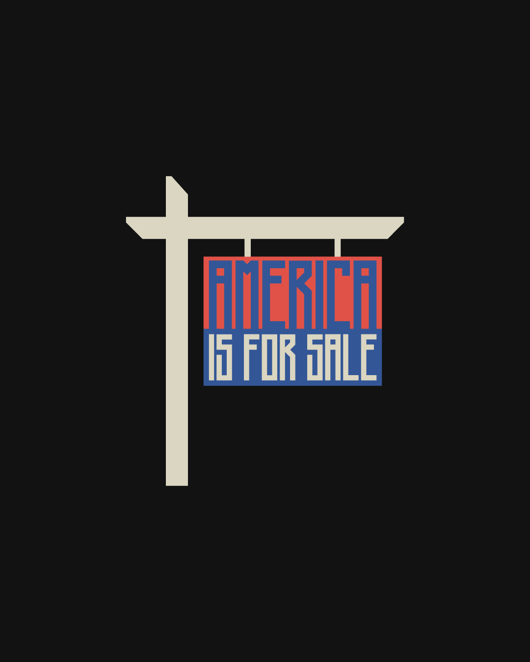
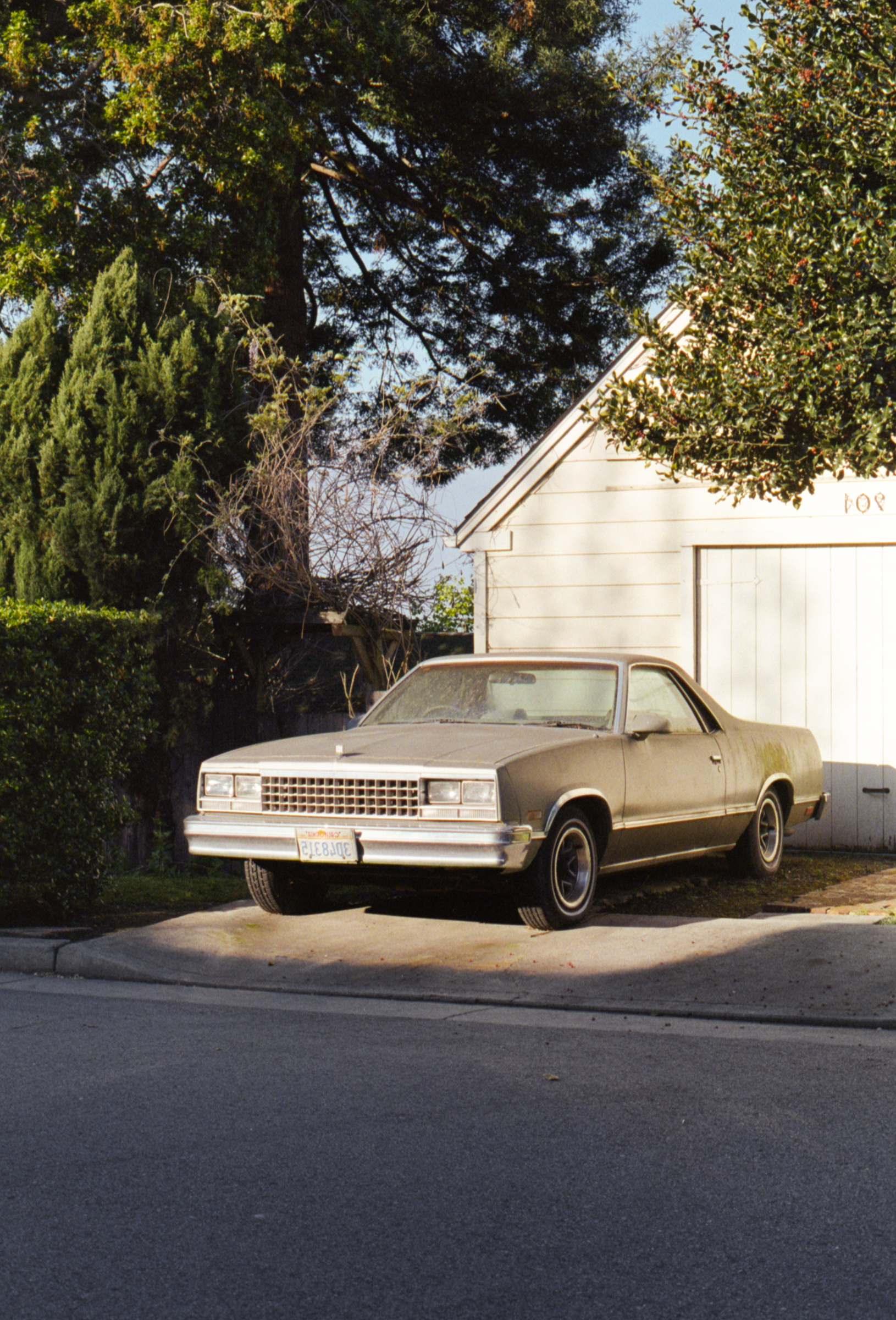
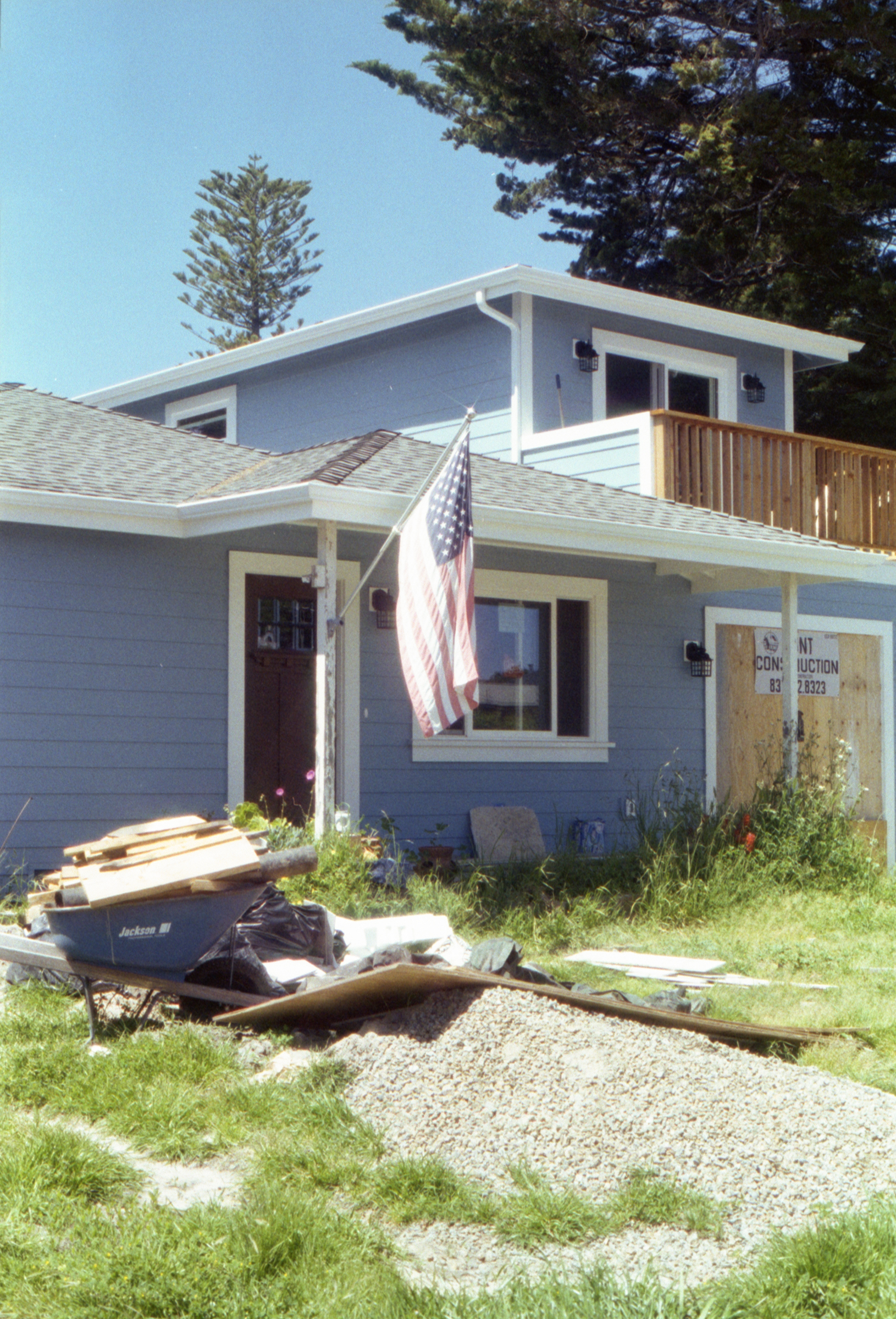
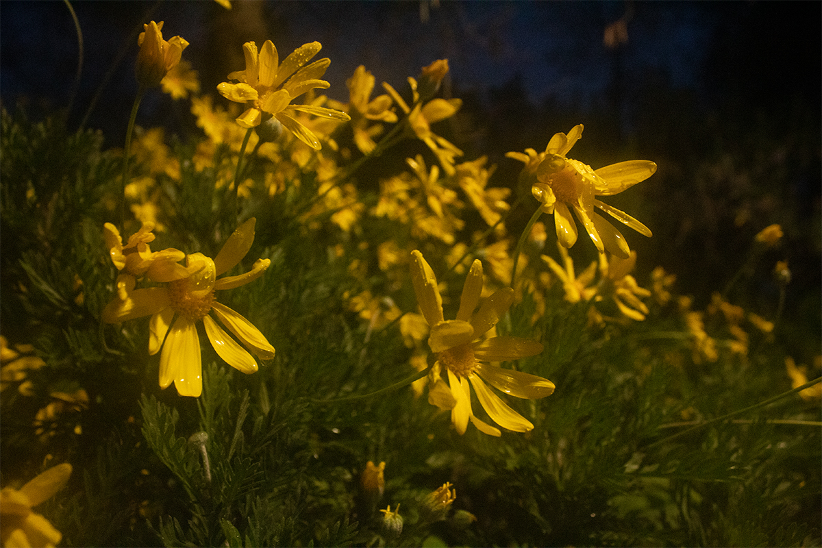
America is For Sale
America is For Sale serves as an extension of my previous work White Picket America by responding to a similar idea of the ‘American Dream.’ The American Dream is different for everyone but ultimately consists of propaganda and cultural influences. I am interested in dissecting its effect on my upbringing through visual interpretation. While White Picket America depicted romanticized environments and was intentionally captured to appear distant from reality, America is For Sale aims to signal the outgrowth of the fantasy.
America is For Sale illustrates the downfall of the ‘American Dream’ through its portrayal of abandoned symbols and Americana environments. Objects and aesthetics that were once perceived as symbols of the American Dream are now replaced by modern cravings. My work additionally serves as social commentary that questions the national ethos while examining it through the lens of an immigrant background.
As a child of immigrant parents, I was encouraged to assimilate and adapt to American customs. I was led to believe that the best thing for me to do was to ‘land a safe job and afford a nice home.’ This ideology is embedded in the Mexican American experience and ignores the desire to pursue a career in the arts.
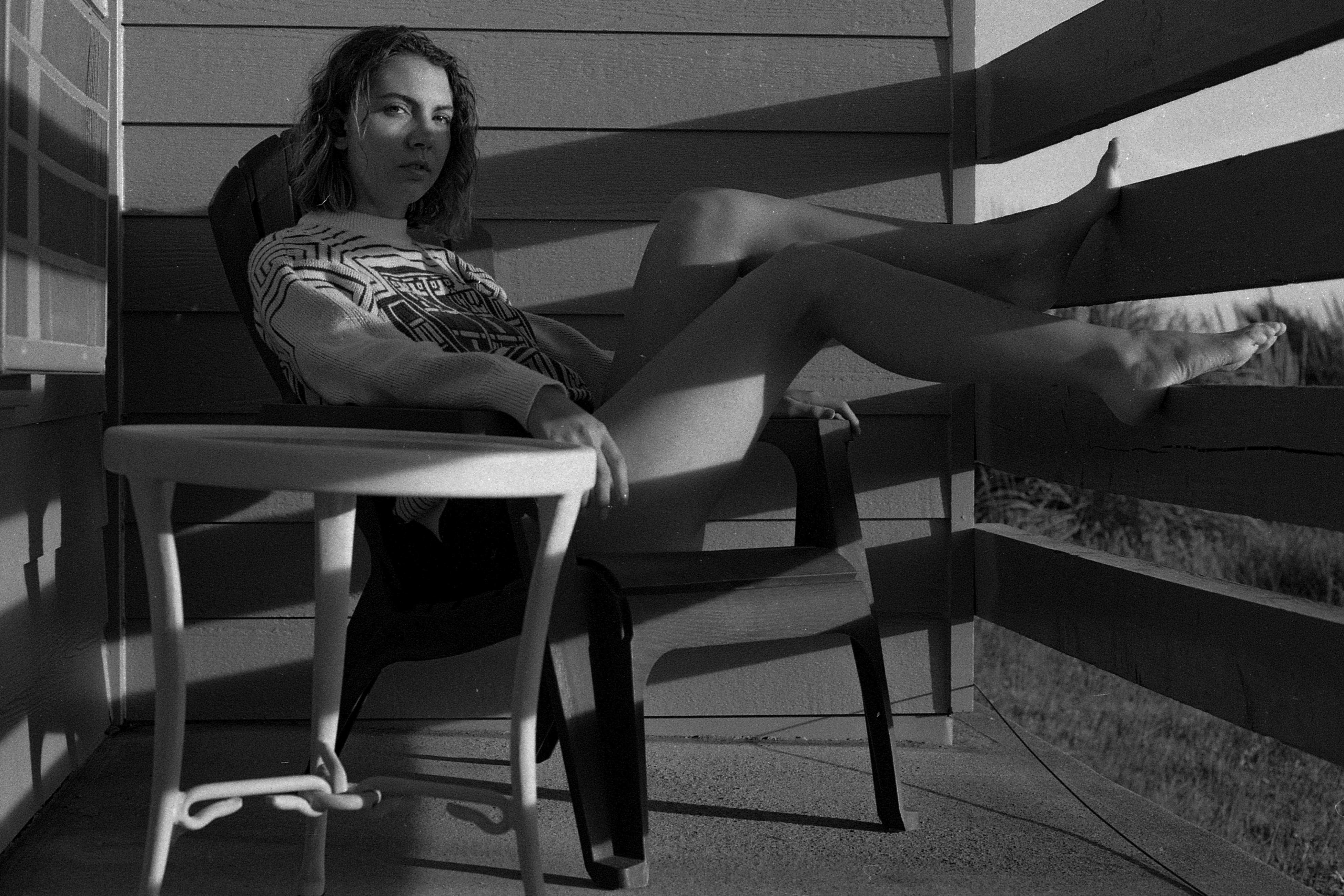
America is For Sale was captured on a Canon AE-1 Program 35mm Film Camera with Kodak Gold 200 and Kodak Portra 400 film in Santa Cruz, CA.
www.rawdrigo.com
www.instagram.com/rawwwdrigo

Art 159-02: Photographic Studio, Working at Home
- Norman Locks
Elvert Perez:
Dreamland
Sometimes, I feel like I’m moving through life. I’m neither a participant or a viewer; neither dead or alive. When my reality becomes overwhelming, I recede from others and can think of nothing but sleep. My dreams are tied by a loose narrative where I surrender control to a nonsensical prophecy. In the Dreamland series, I want to capture the essence of dreams by capturing landscapes through different perspectives. The series consists of photos taken throughout the day. The project began from a place of loss and unknowing, and ended in a place of appreciation and humor within myself.

Reprieve
Flowers Under Artificial Light

Sci-Fi Study Leaves
Moonlight, Light Bulbs, and Angles
Kat Javiniar:

Lacey Smith:
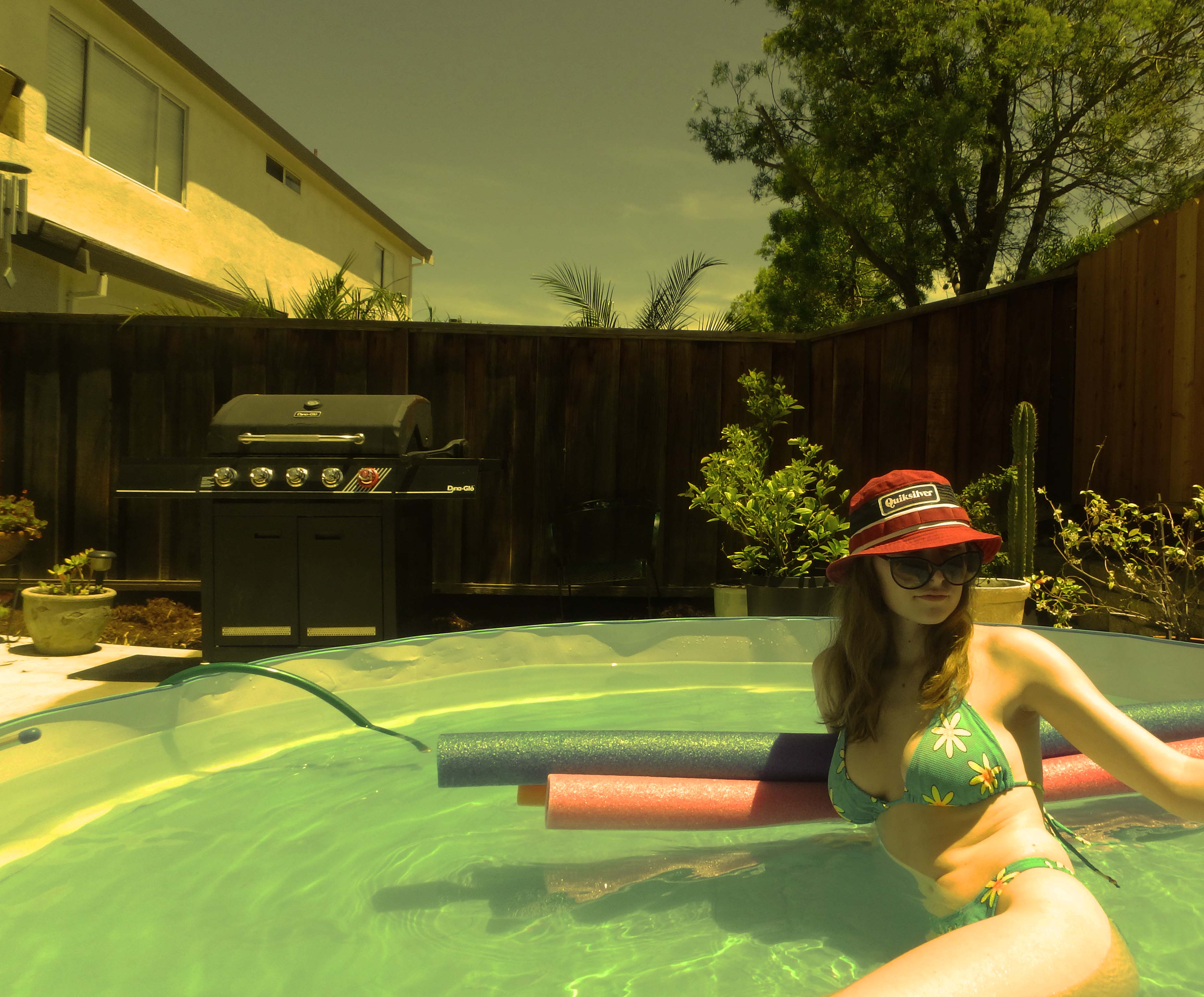
This quarter was definitely a challenge for me. I had to figure out how to bring my love and interest for the beach and surf culture to an inland location. I did this by focusing on little details and having them be able to show what the theme was. Photo 1 is a self portrait in a kiddie pool set up in my backyard. For photos 2 and 3 I had set up a still life with things around my house. And for 4 it is again a self portrait. Thanks! :)

Sam Fleischmann:

Manifest Dream House - digital collage
Untitled - digital photo

Untitled - digital photo
Art 166: Art of Bookmaking
- John DeMerritt
Angel Gonzales:

Cam McKay:
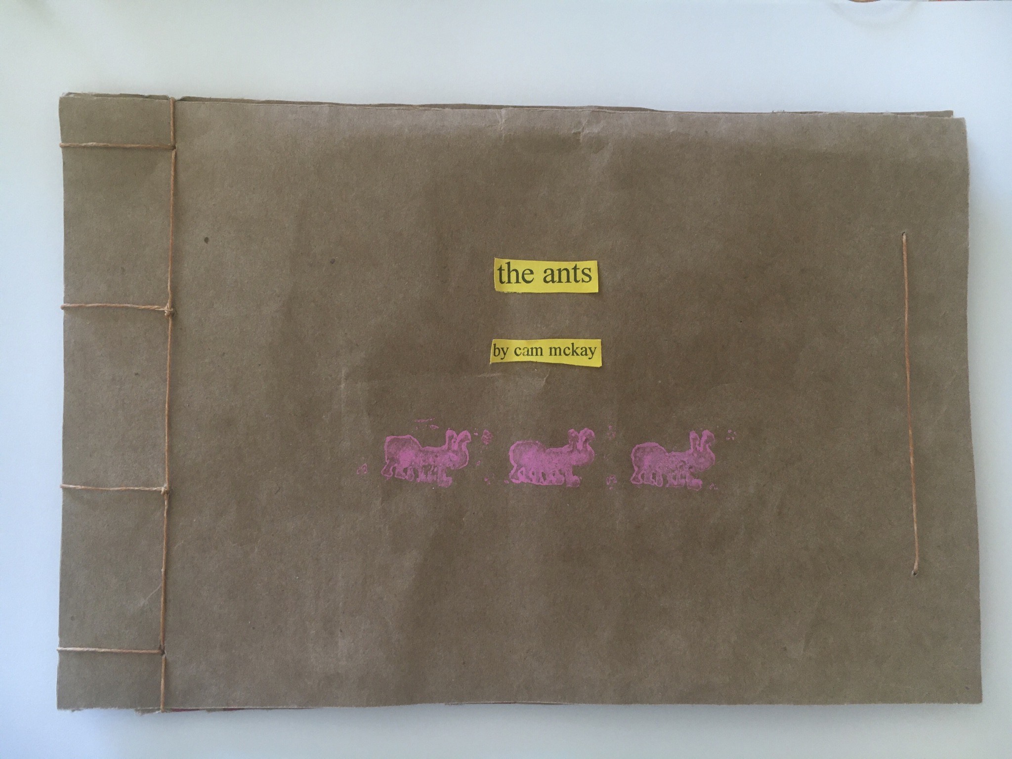
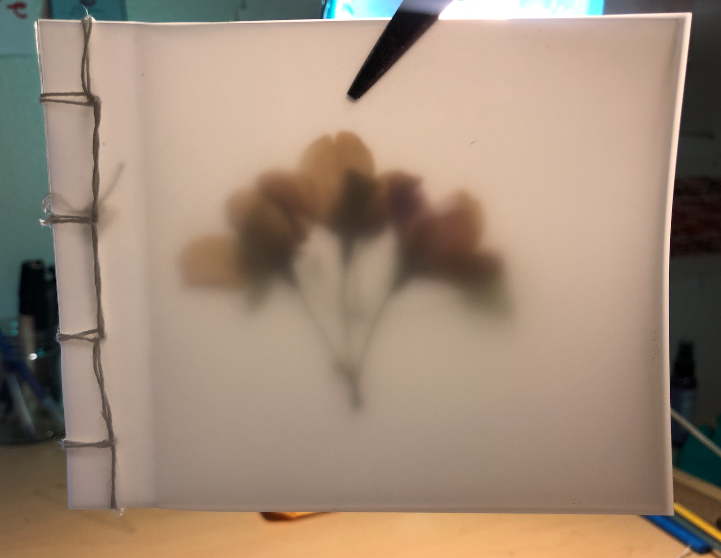
The Ants, cover
The Ants, binding

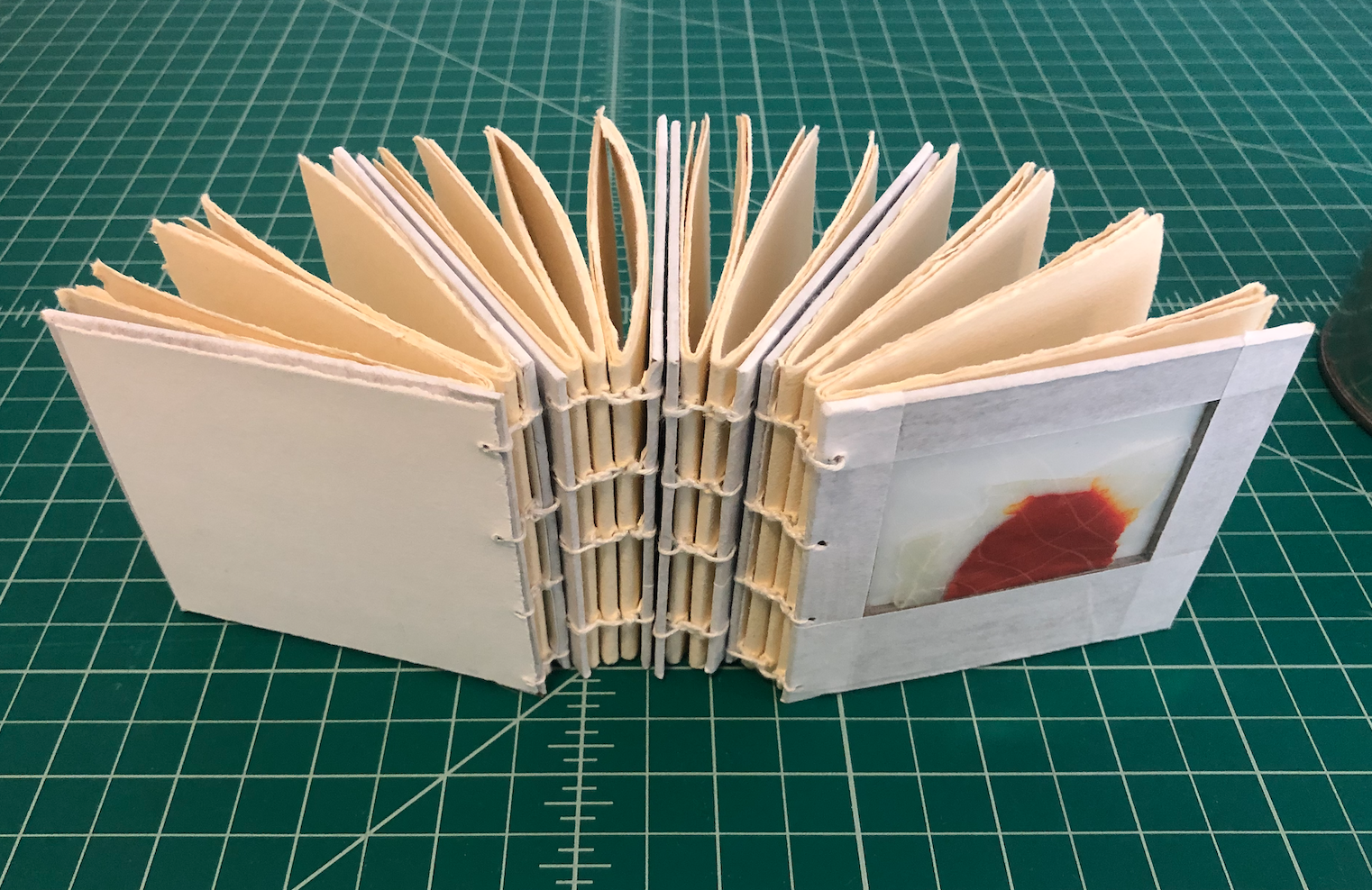
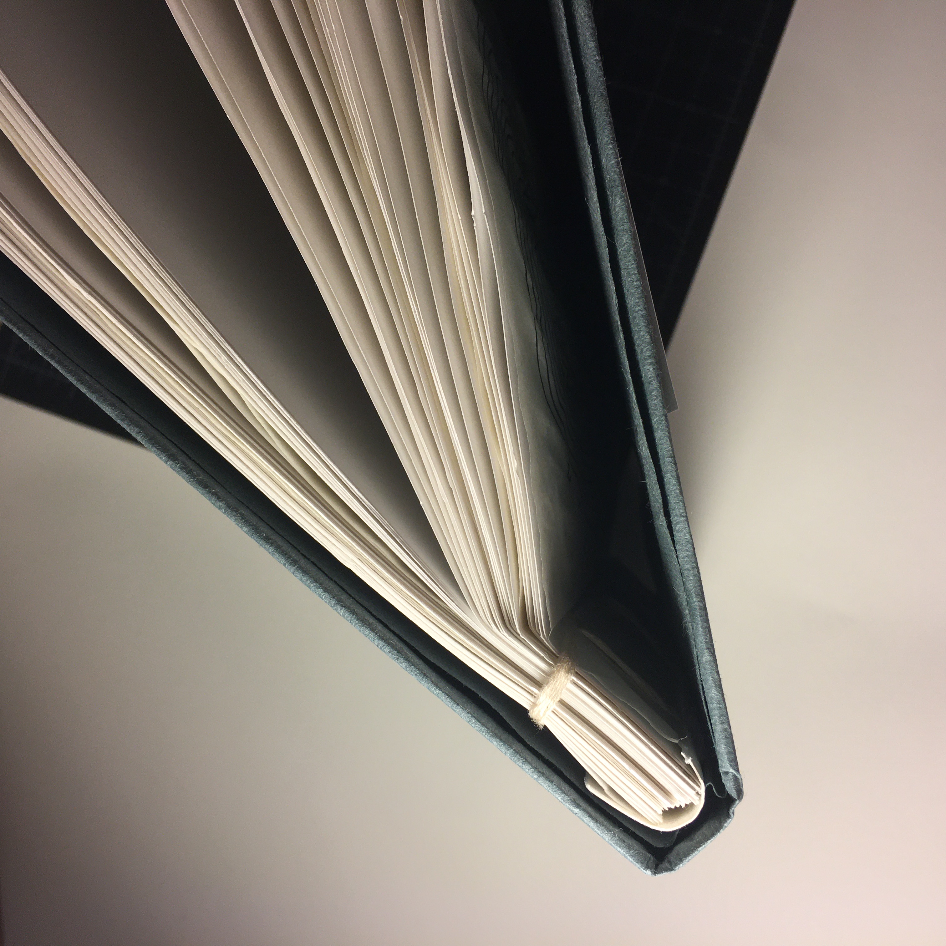
The Chrysalis, cover/pages

The Chrysalis, text
Claire McKinney:

This first book was folded from a single sheet of paper and drawn in a heavy woodcut-esque style. It was made to look like a CD cover insert for a black metal album for a band I made up called Calliphorid (the family name for a genus of blowfly). The logo somewhat resembles a fly, with fine hairs coming off the tails of the letters to make them look like insect legs. The imagery throughout the book has numerous references to COVID-19 and everything that came with it: corruption, violence, isolation, exploitation, and of course Tiger King. The members of my fake band are Mary Hate and Thrashley Olson, on saxophone and drums respectively.
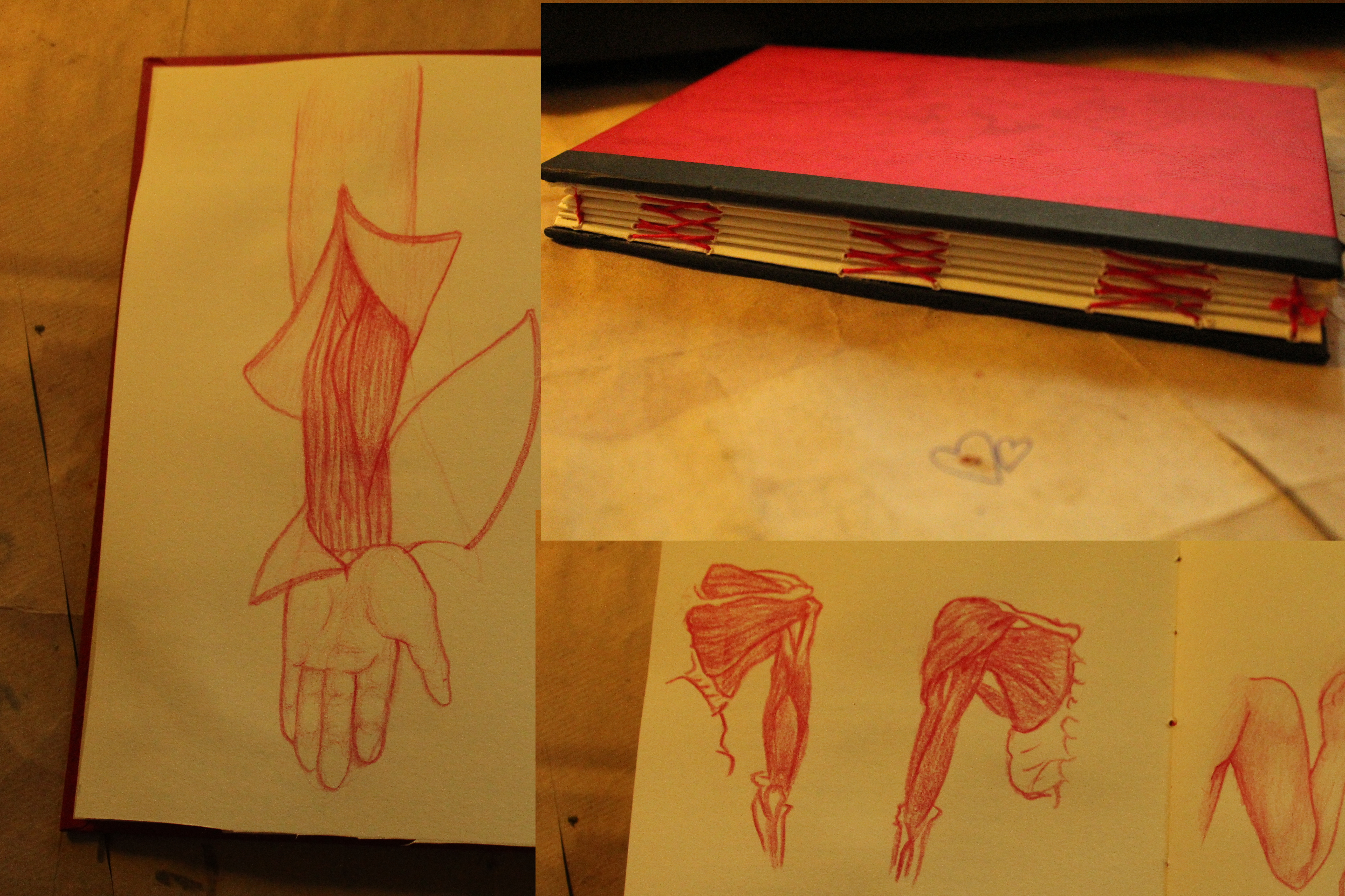
After an assignment that had me deconstruct a book and identify its parts, I reassembled mine into a sketchbook for figure studies, all of which are done in red pencil. Some of the studies were drawn on the original text block and pasted into the sketchbook pages. I called it the Cenobite’s sketchbook, because some of the figure studies are somewhat violent and sexual in nature, with flesh being peeled away from musculature and disembodied limbs in sexually suggestive positions.

The third project shown was an accordion book that measured about two feet long. It was done in teal colored pencil and depicts a ghostly parade of recently extinct and critically endangered animals.
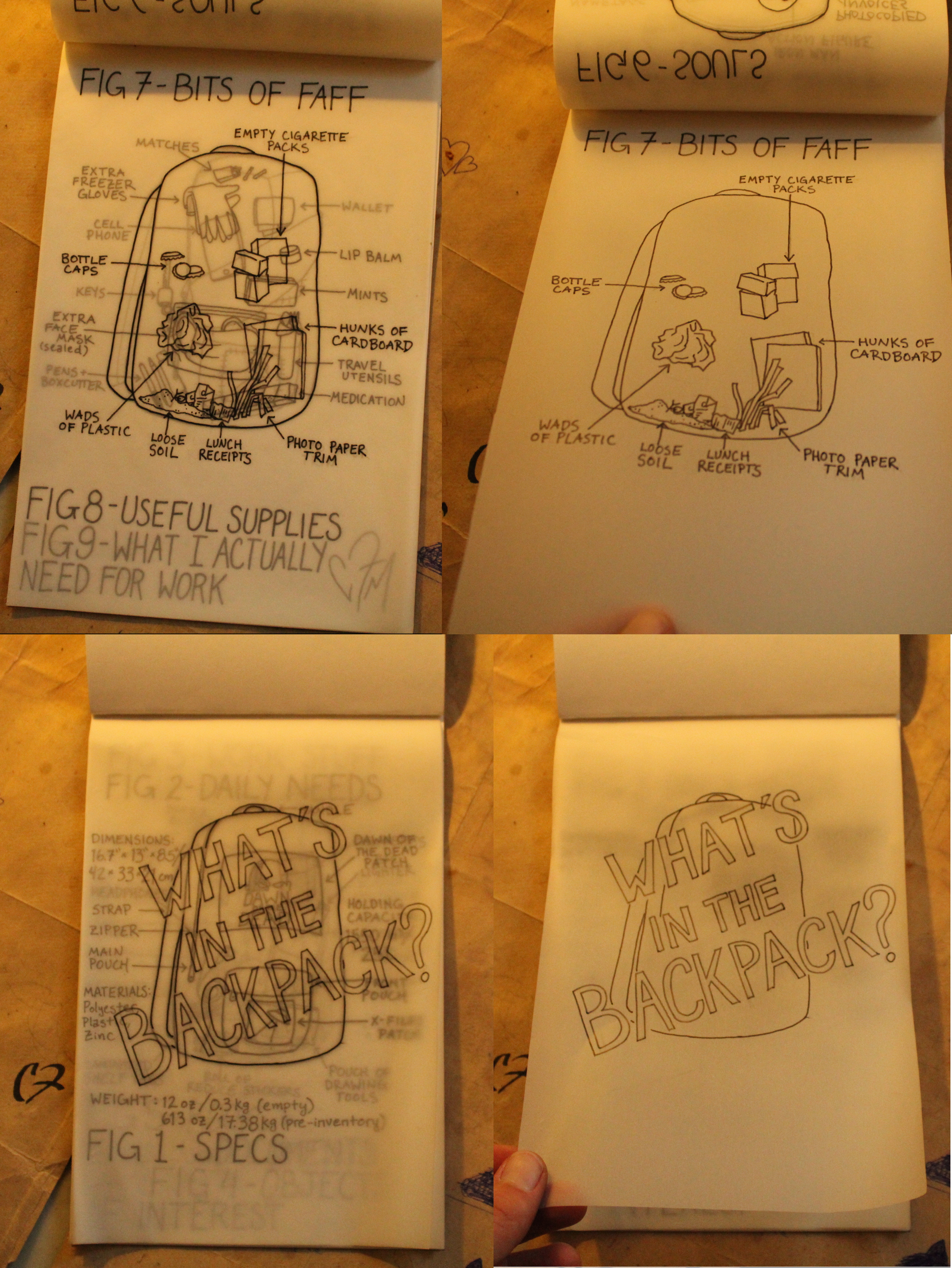
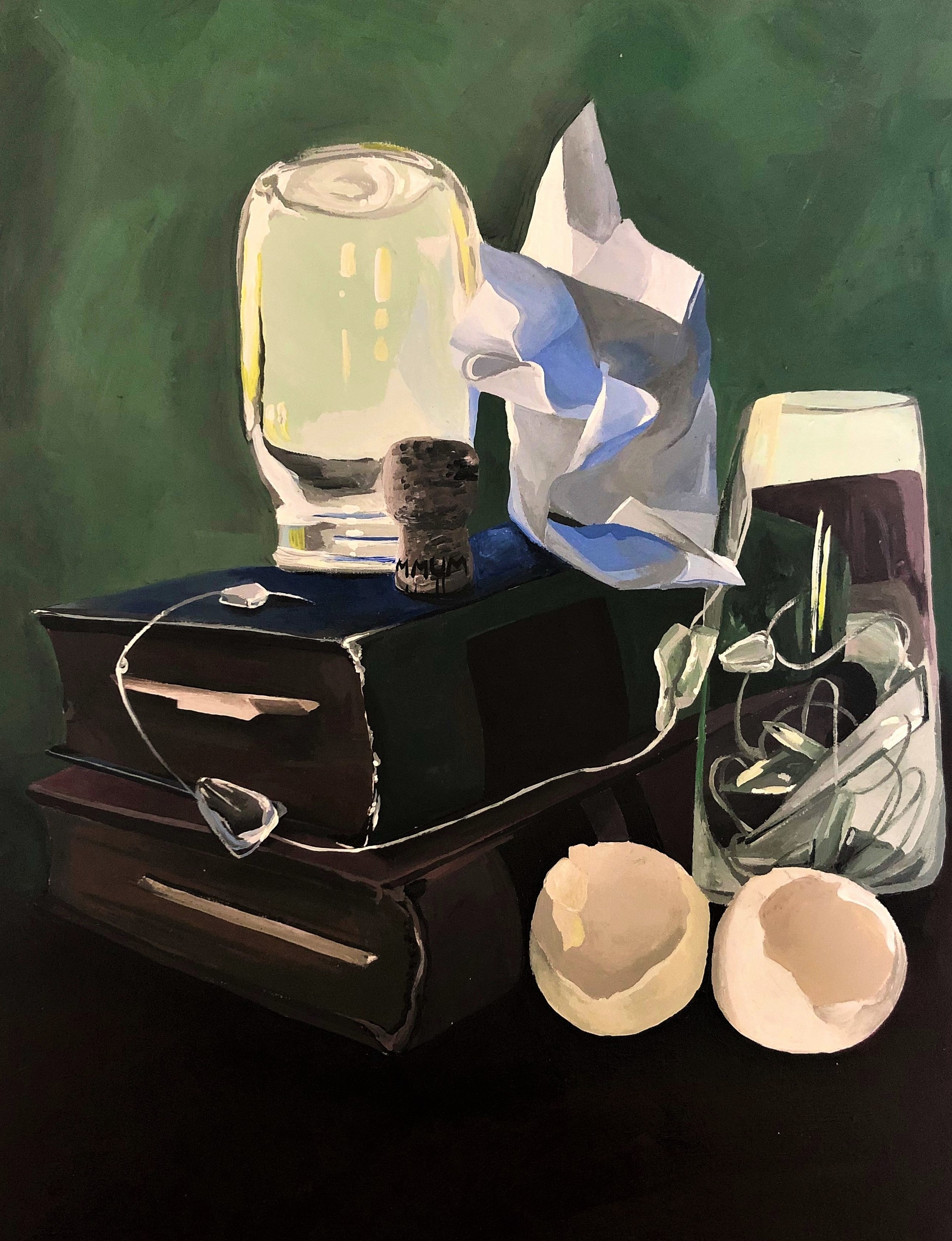
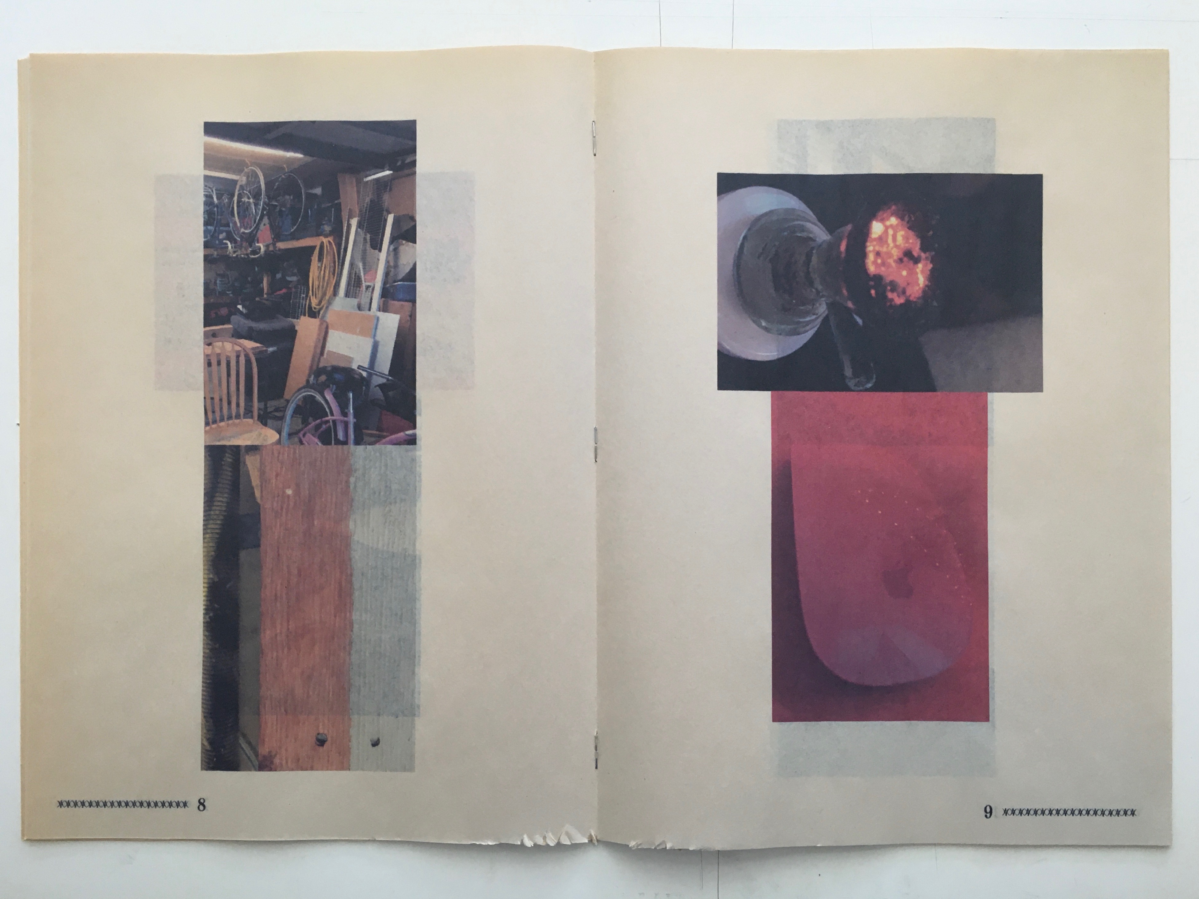
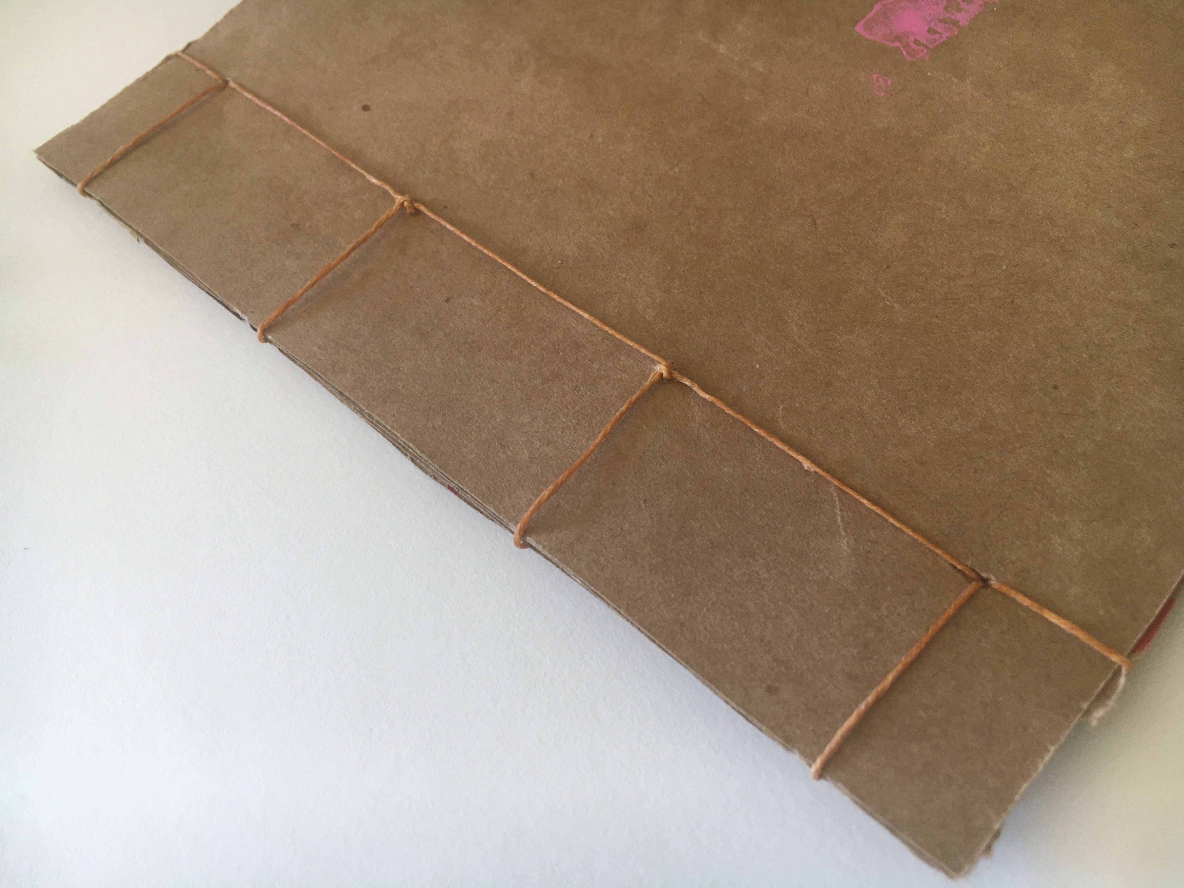
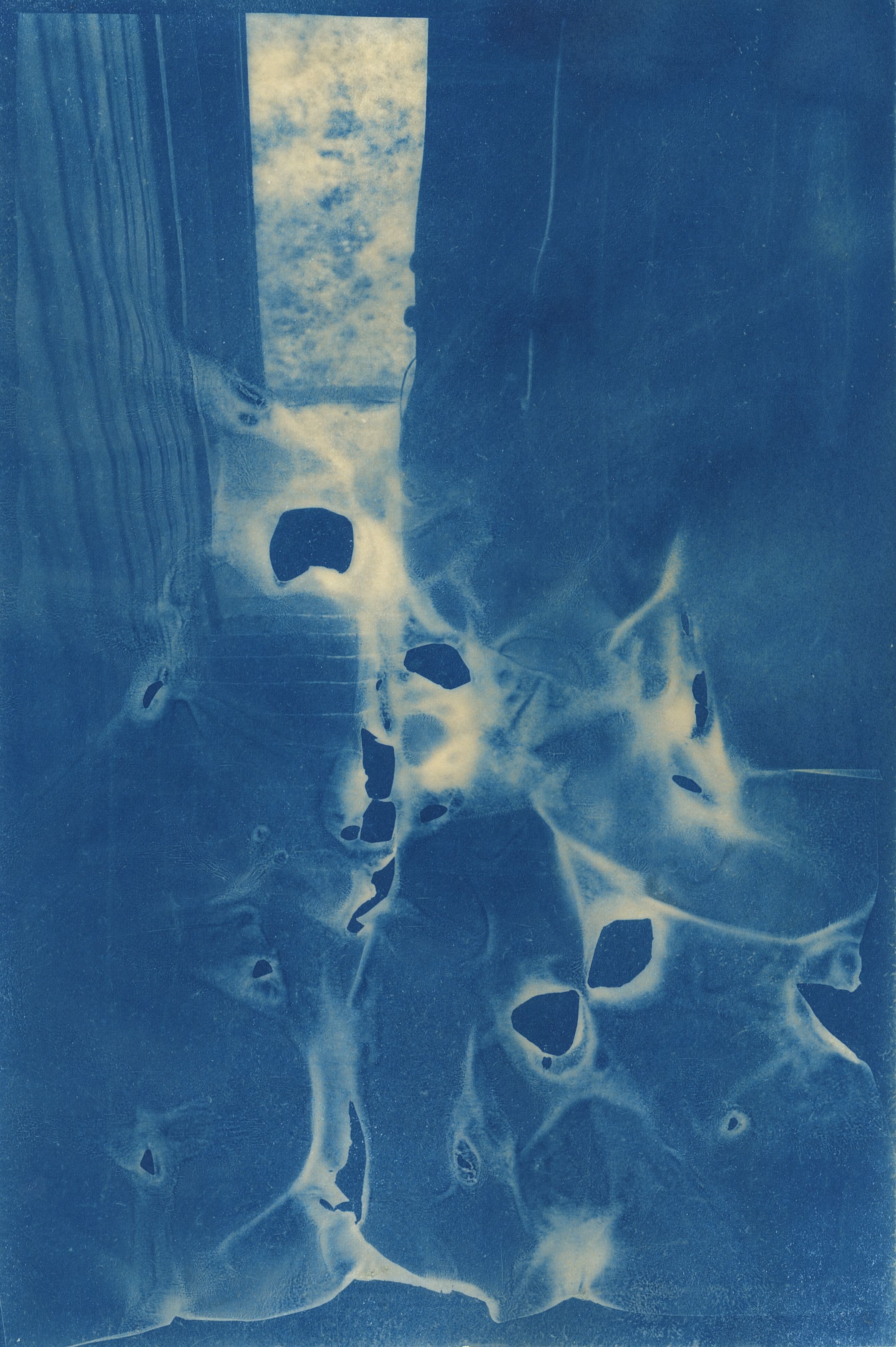
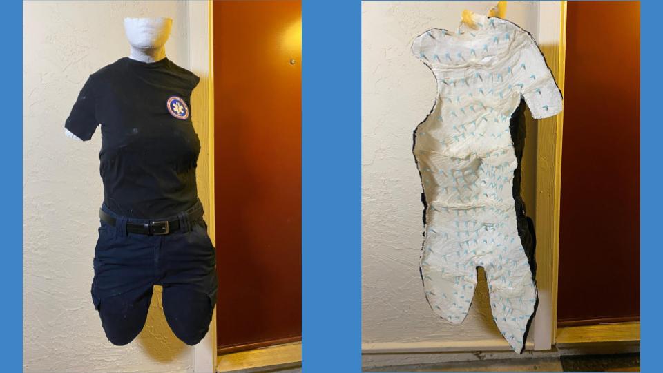
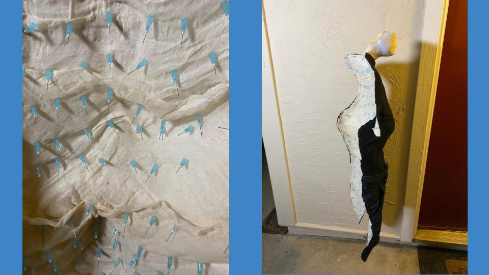
This stab-binding project was done with tracing paper and is an exploration of all the things I dug out of my backpack at the end of a long week as an essential worker during the very start of the quarantine. I weighed, inventoried, and documented everything in the backpack and recorded it in this art book.
Danielle Del Rosario:

Jared Guzman:
Chamomile
I do want to qualify that my experience with COVID-19 was very ideal compared to some in other situations, and that I have been very lucky to have not run into any significant physical hardships despite everything that happened in the world around me.
I come from North Natomas, a little-known suburb located thirteen miles north of the city of Sacramento. Up until I moved to Santa Cruz, that one home was all I had ever known. When I moved to Santa Cruz and into the dorms of Porter College, everything in my life was thrown out of equilibrium. I didn’t even know when and where to eat, it seemed. Fast forward four years, my last year at UCSC as an undergraduate student. I have made friends, lost friends, found communities, and found a new understanding of my self. And then the global pandemic of COVID-19 hit. Following state-wide issues of stay at home orders, many of us at UCSC were forced out of their (already tumultuous) lives in Santa Cruz to relocate elsewhere.
Again, my life was thrown out of equilibrium. This time, though, instead of trying to figure out how to navigate where to eat and what friends to make, I had to navigate my old home. I had already made homes for myself elsewhere, in the sands and seas of Santa Cruz. I had left that part of my life symbolically behind. And when I came back, things were different. They were the same, but they were different. My mom stopped dyeing her hair, letting the gray in it grow out. My dad had survived a septuple-bypass heart surgery. One of my siblings had gotten married and had kids, another had forged a life for themselves in downtown Sacramento, and the youngest had performed and marched with a professional drum corps.
But those changes I understood, at least intellectually. I understood that people move on, and that people grow old, and that people do things differently as they grow older. I did the same, by moving to Santa Cruz. Of course, there is a difference between understanding something and experiencing it, but I was at least somewhat prepared for them. What caught me off guard was that my home - my space - looked different. A new patio being built here, and some previously-owned-couches being replaced by other previously-owned-couches there; that was the way of life in my home in North Natomas. And those changes, combined with the changes that my people had experienced, multiplied into something entirely new. I saw the world both physically and metaphysically differently. My time in other places changed my worldview and what used to be my physical habitat changed alongside it.
And so this project was my observation and reconciliation with those changes. It feels different. Instead of feeling entirely at home with the space, I felt like an observer watching from the sidelines. But yet at the same time, it felt familiar.
Jocelyn Lee:
Joshua Zupan:
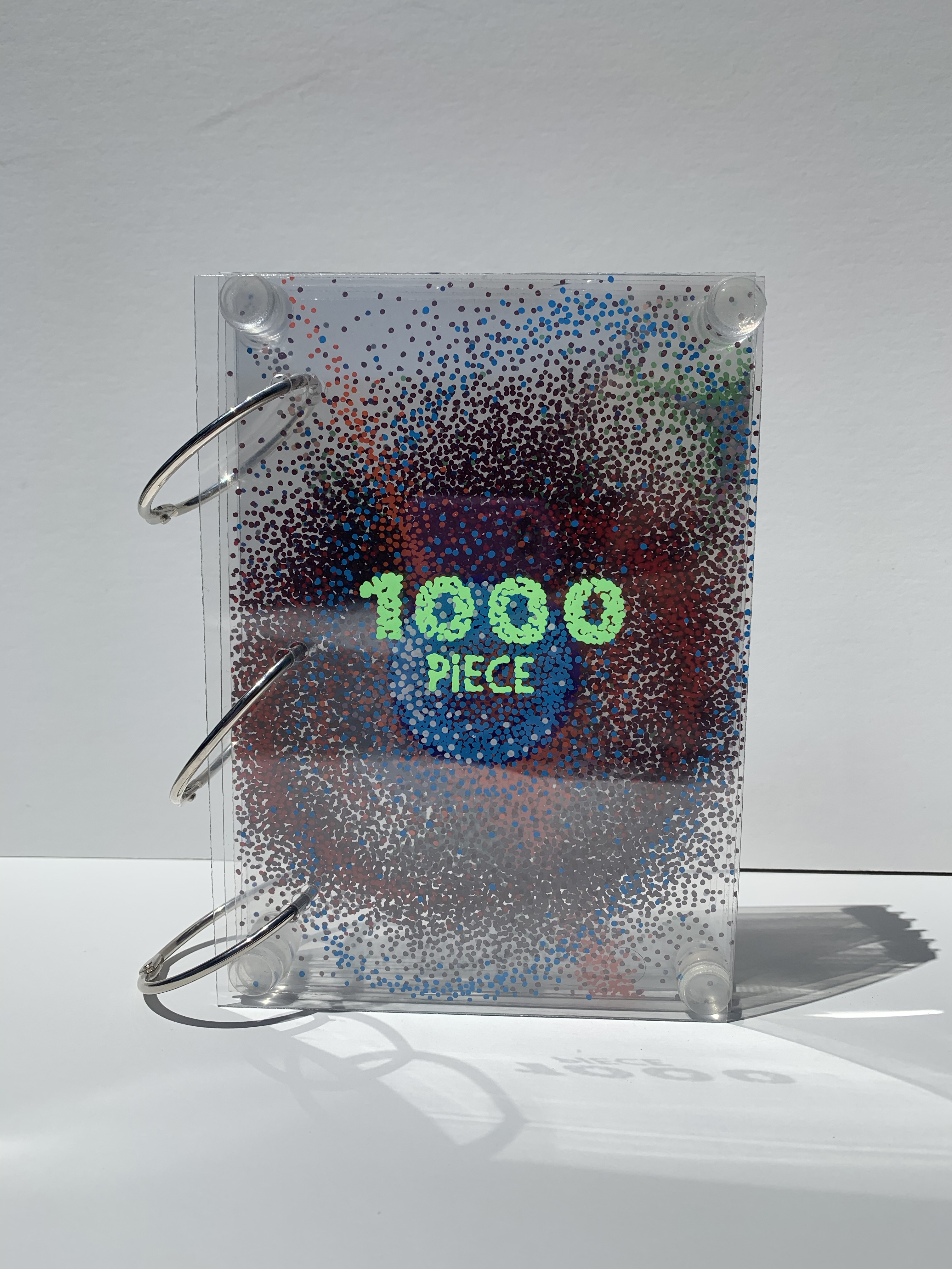
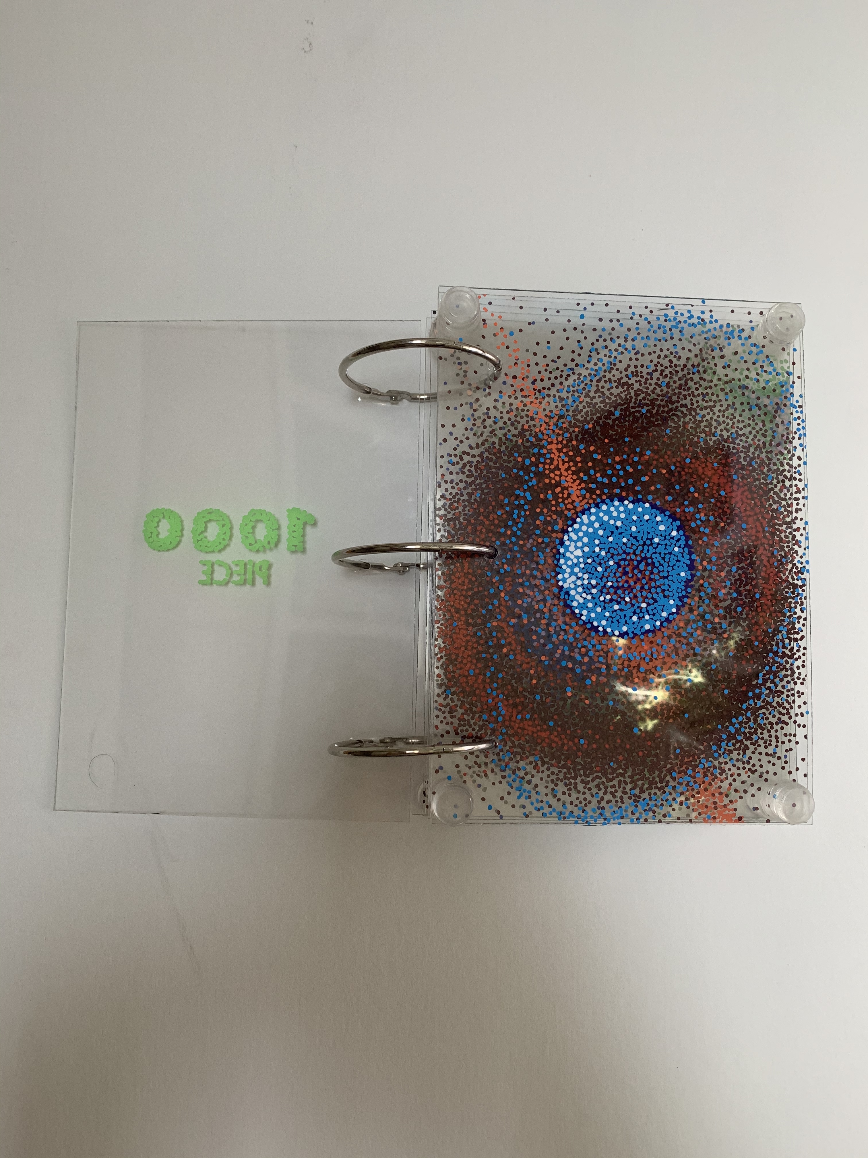
1000 Piece is a final project for Art 166 - The Art of Bookmaking with futuristic and science fiction related motifs.


Morgan Tomfohr:
Natalie Del Castillo:
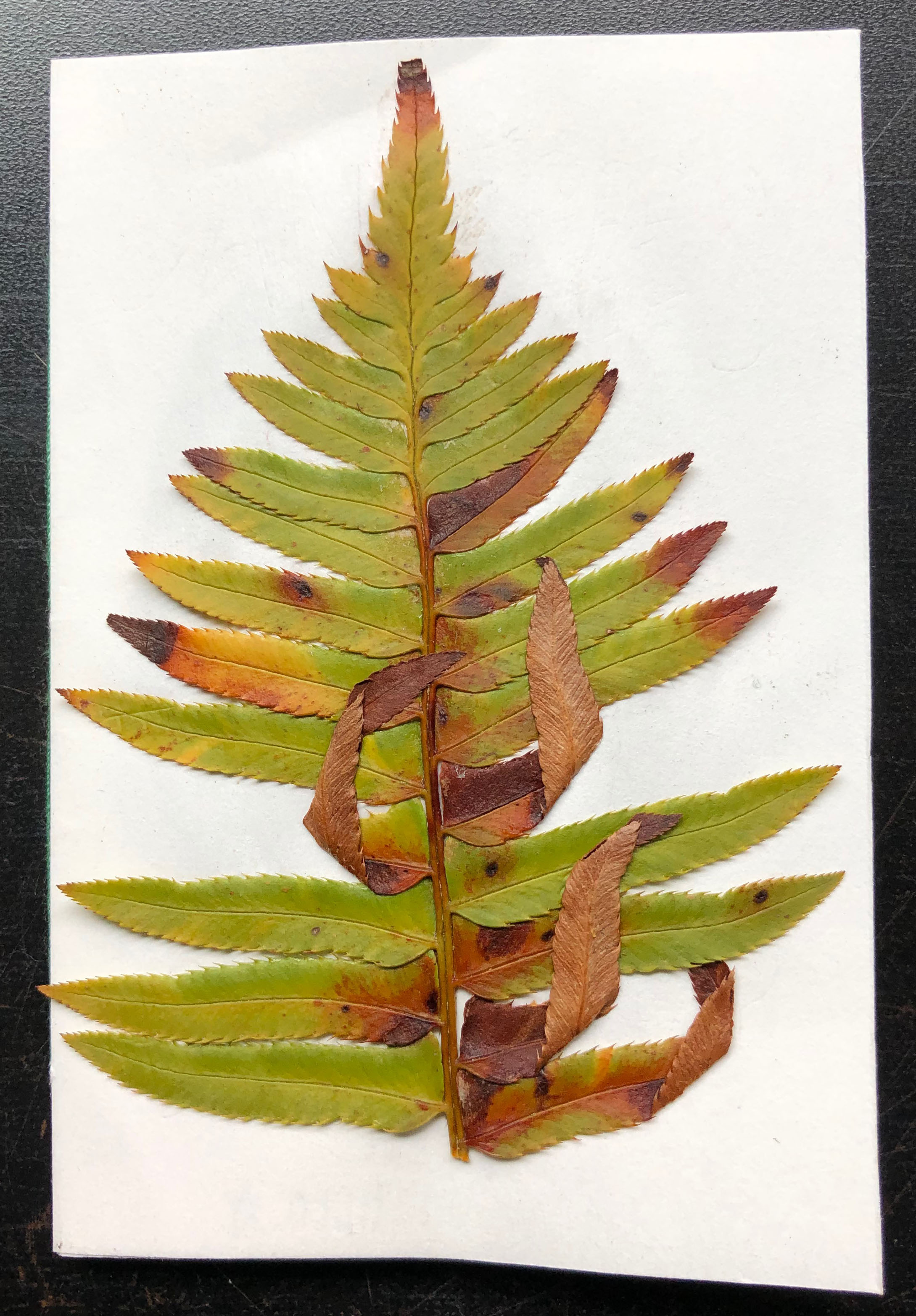
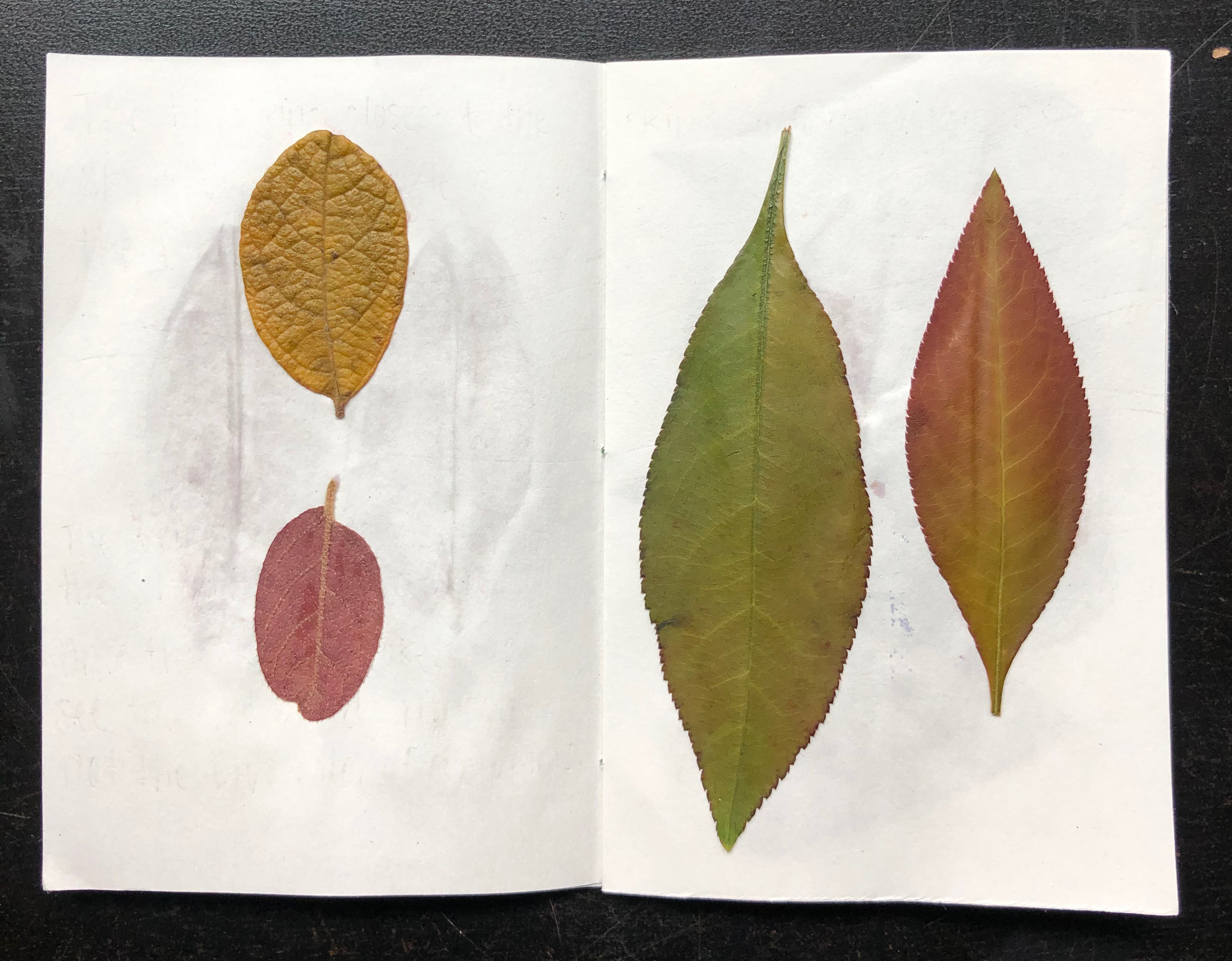
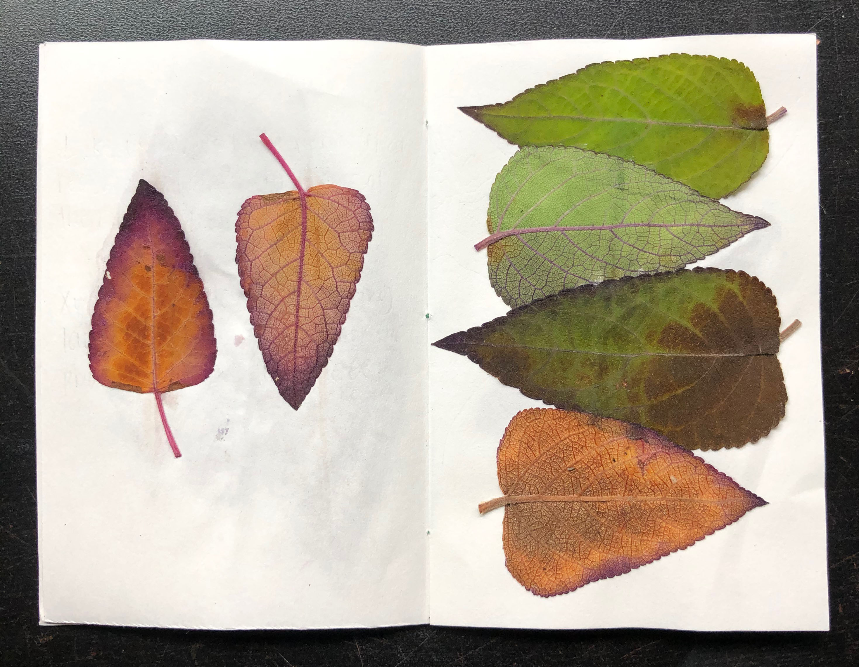
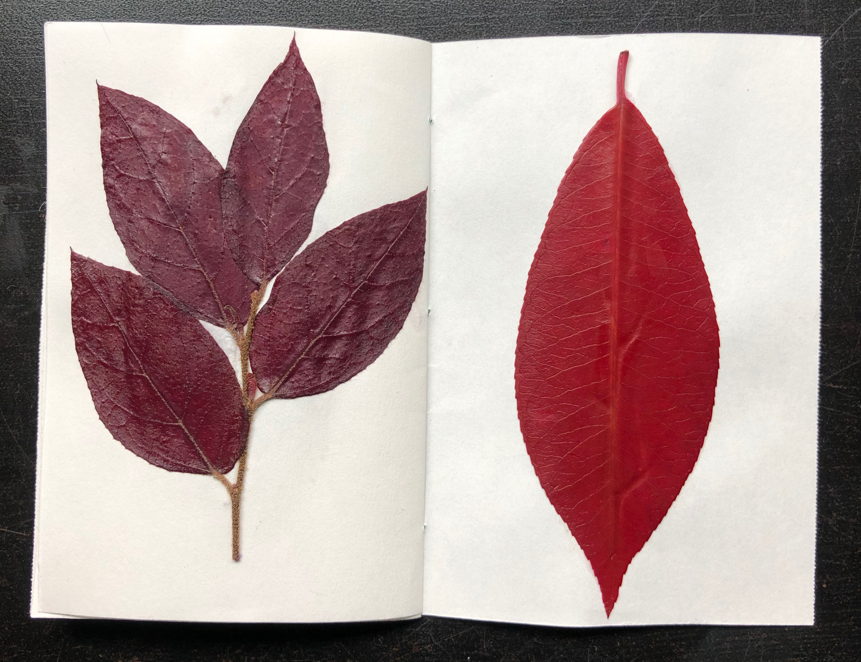
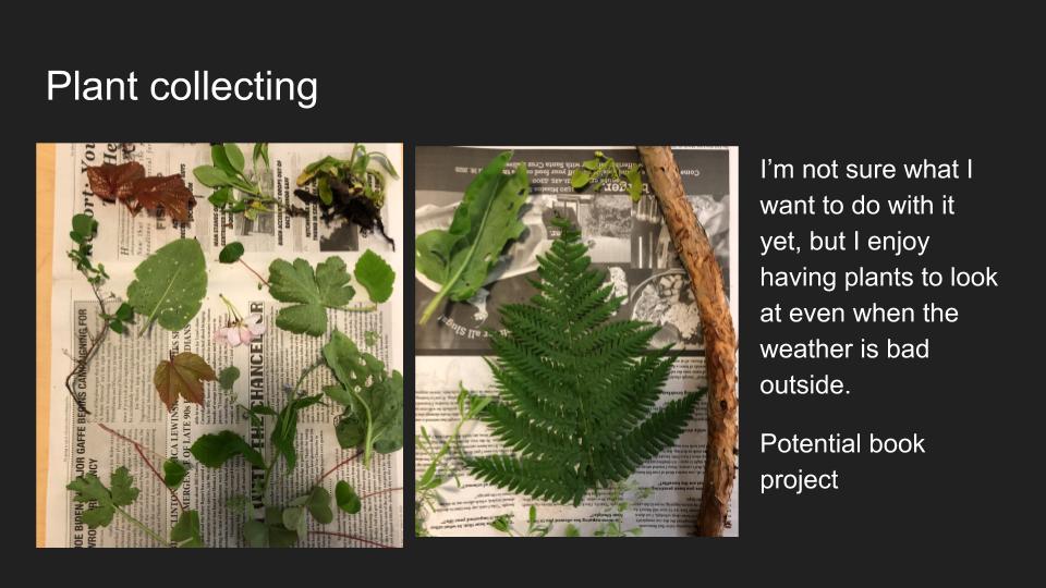
This pamphlet book is a small handheld herbarium. At the time it was made, I was thinking about the oxygen that lives in trees/shrubs and the role of UV light, and how these affect the color of the leaves. These specimens were sourced from different parts of campus and my own neighborhood.
Art 169: Special Topics in Printmaking
- Sarah Sanford
Alicia Persaud:

Recall, 11”x15” mixed media on BFK paper, Spring 2020
Echoing Thoughts, 11”x15” mixed media on BFK paper, Spring 2020
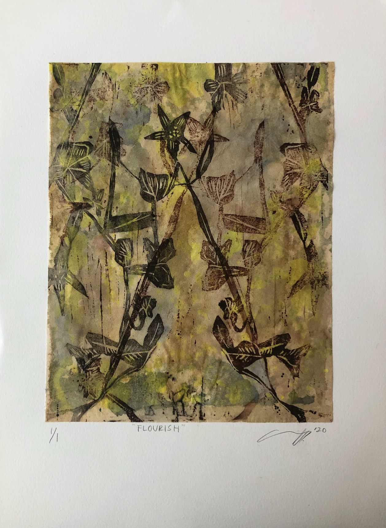
Flourish, 11”x15” mixed media on digital kozo paper attached to BFK paper, Spring 2020
Introspection, 22”x30” mixed media on BFK paper, Spring 2020
Jess Mezzie:
“Moving Out”-Relief and stencil print with watercolor crayon and painter’s tape on light blue Stonehenge paper

“Golden Hour”-Relief and monotype print on layered kozo paper

“It’s Too Late”-Magazine transfer collage on Rives BFK paper

“It’s Too Early”-Magazine transfer collage on Rives BFK paper
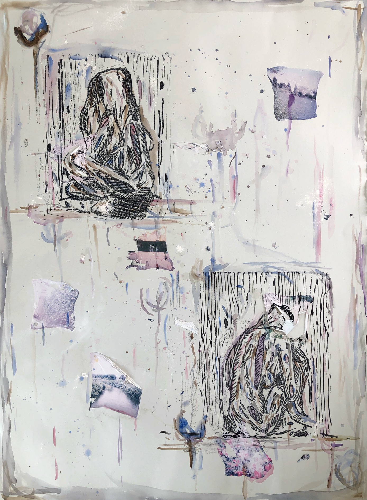
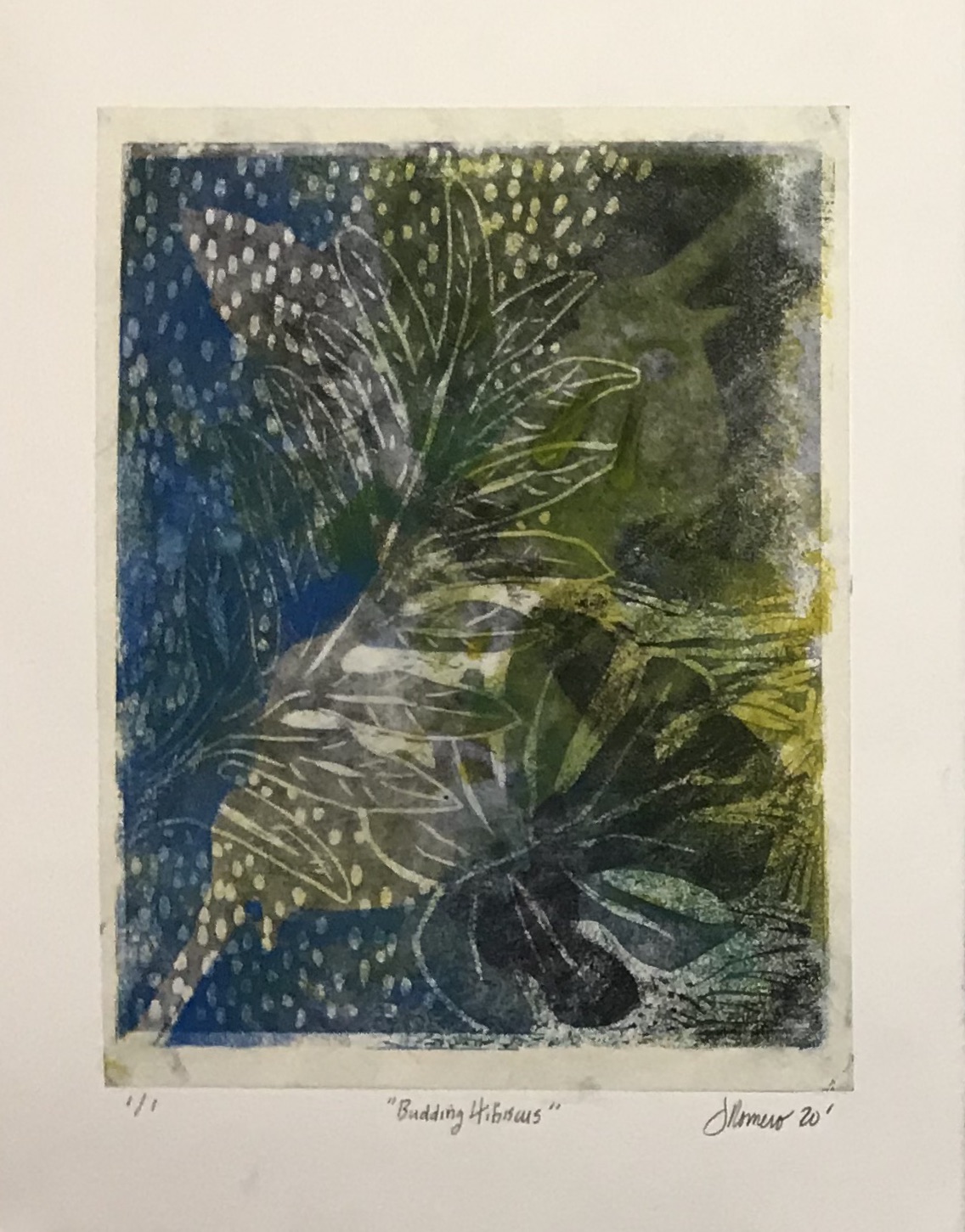
Jody Romero:

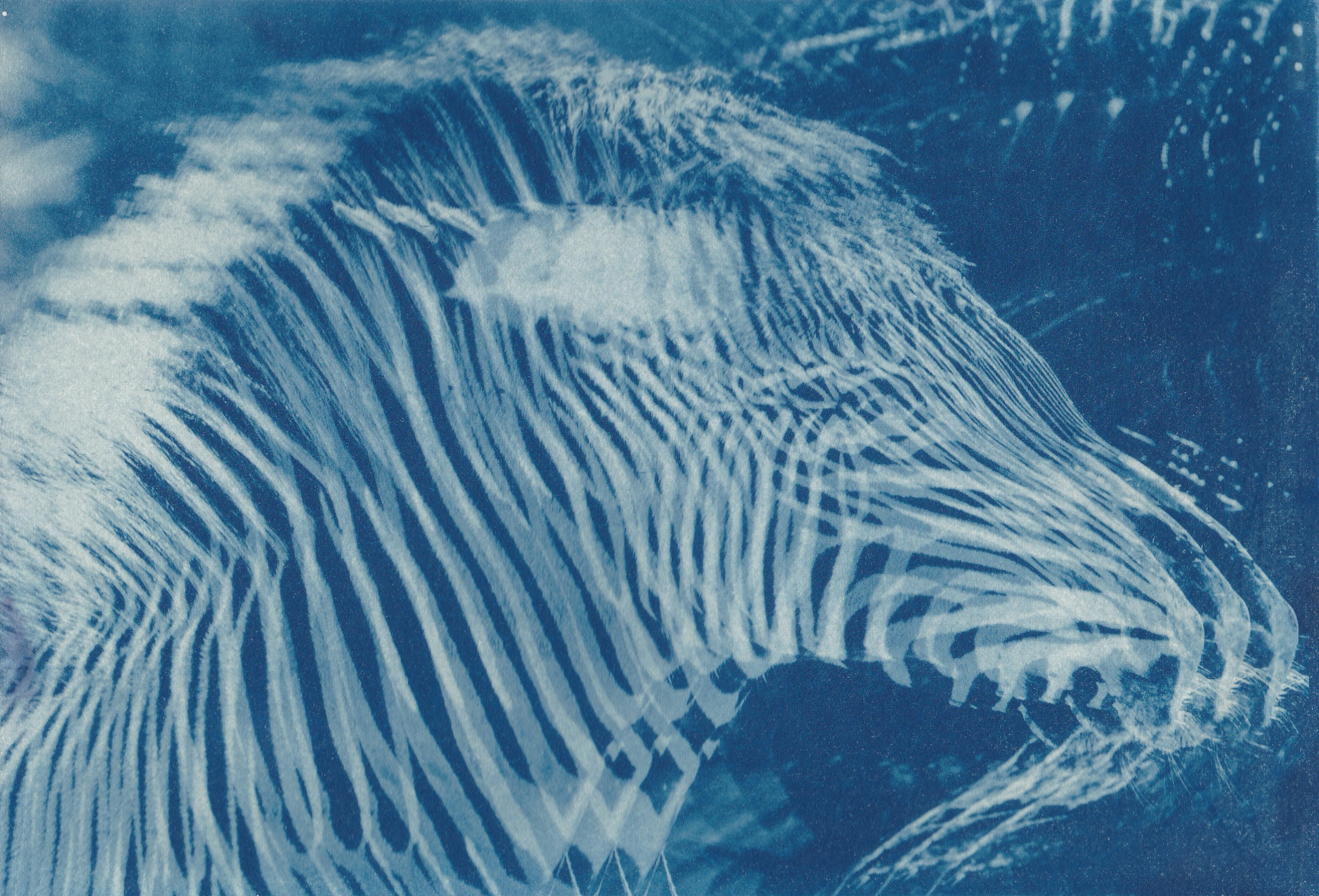
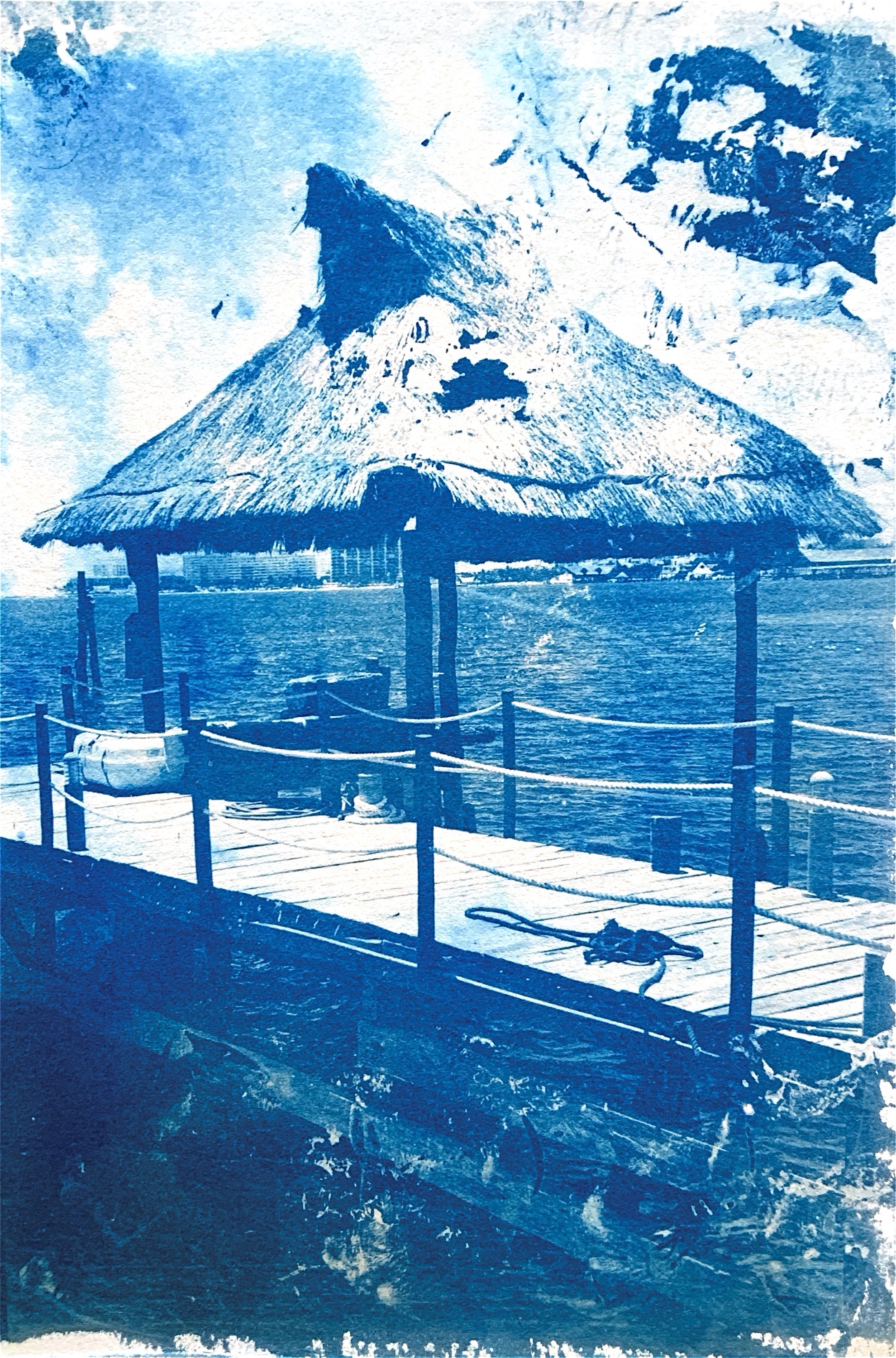
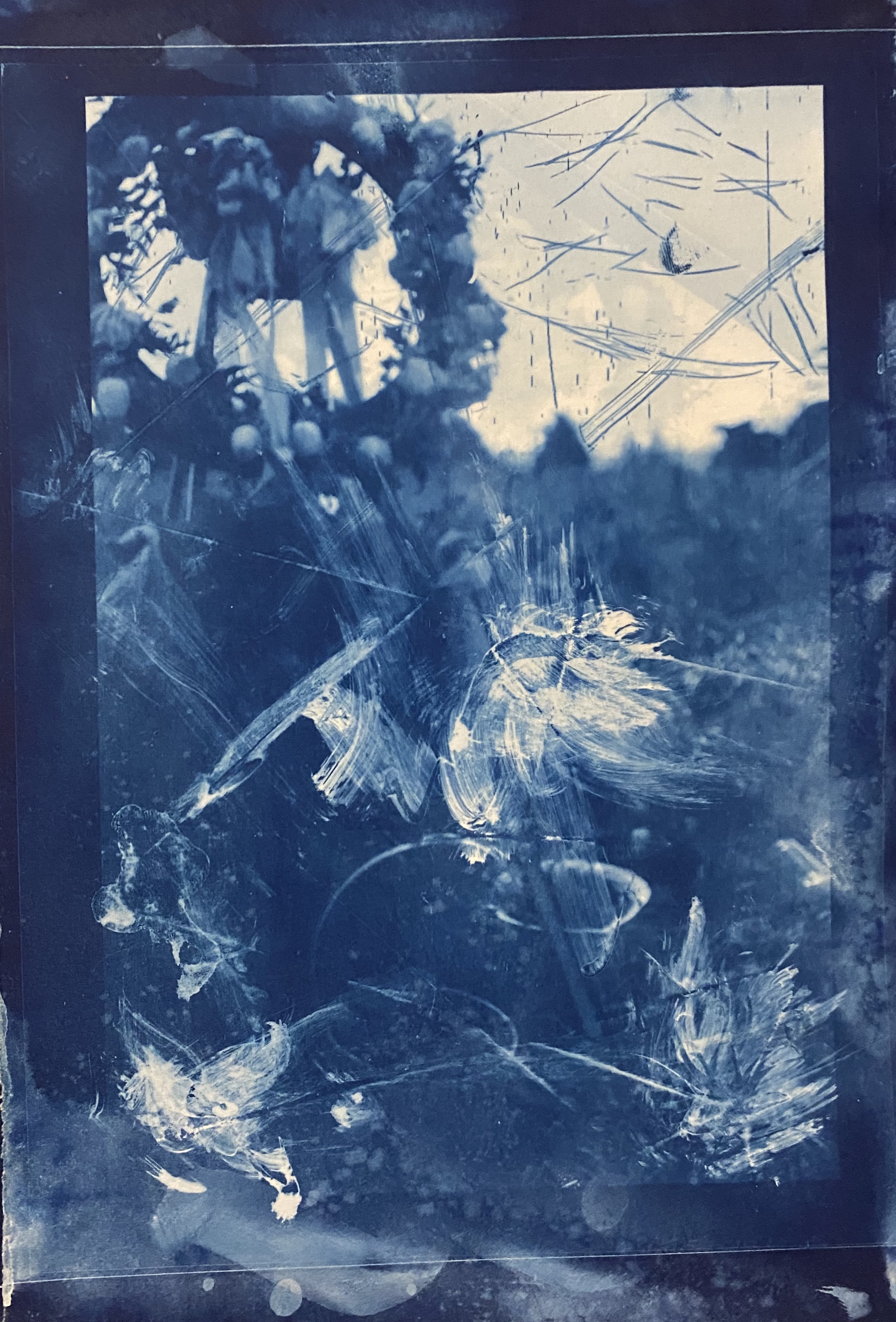
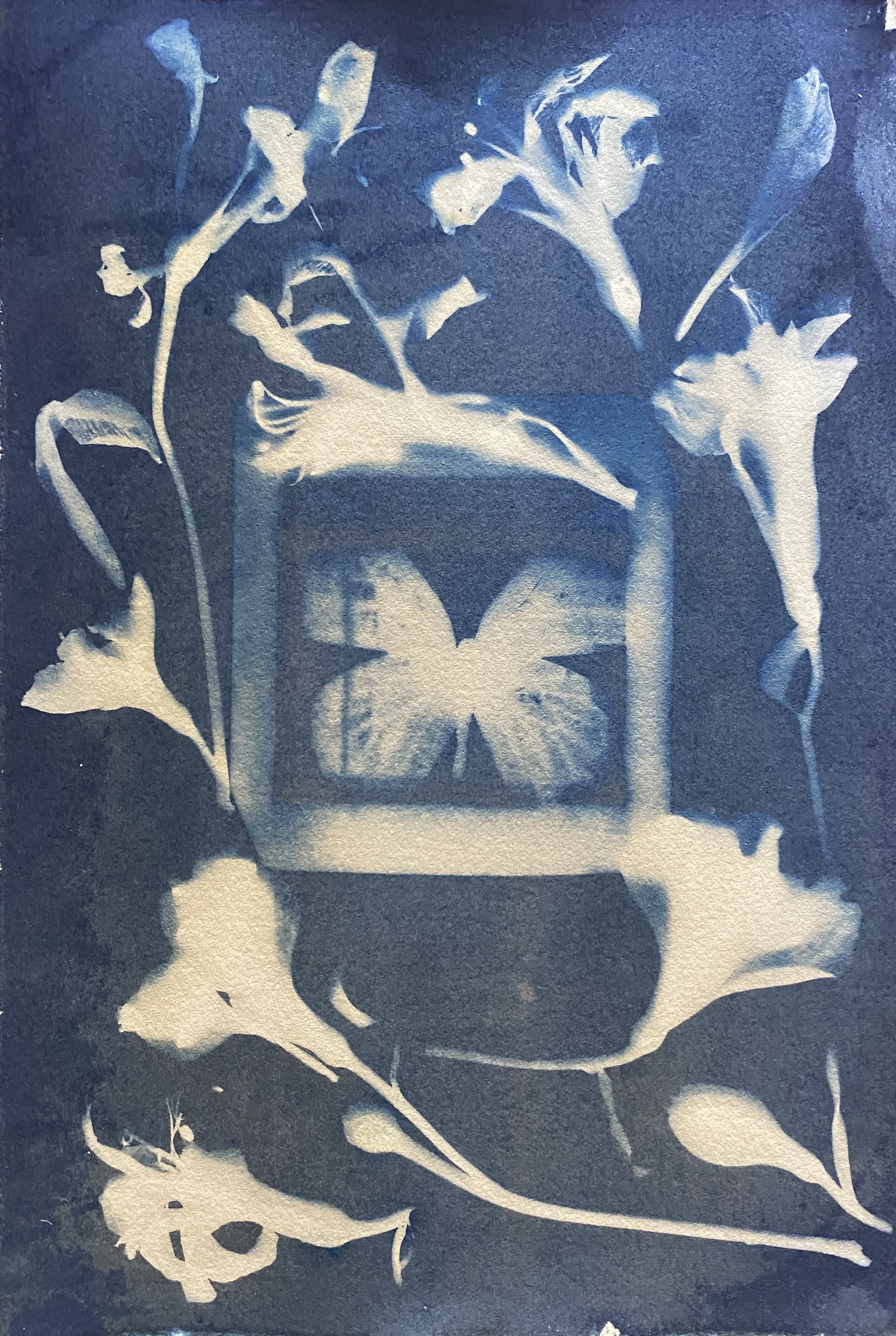
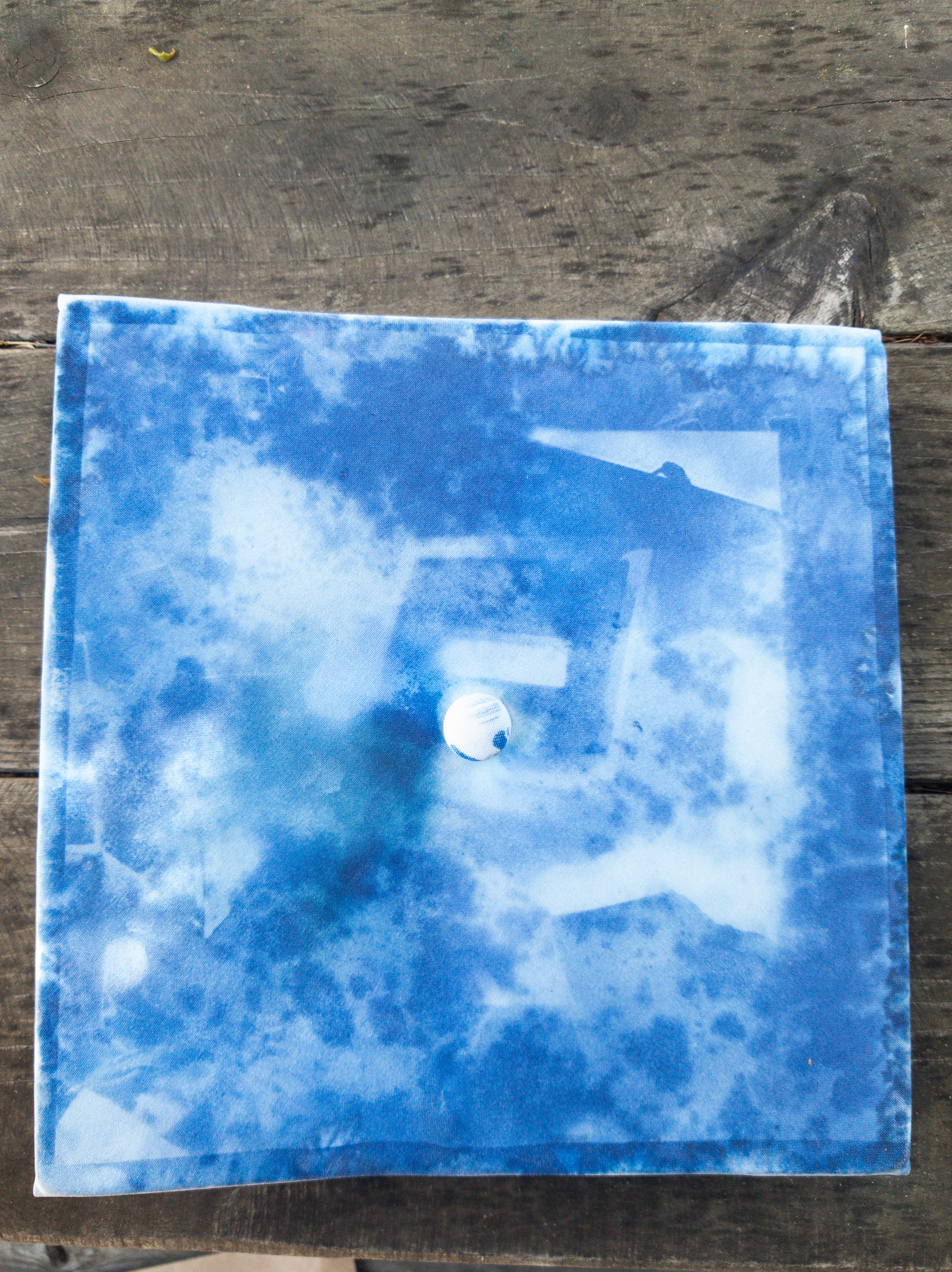
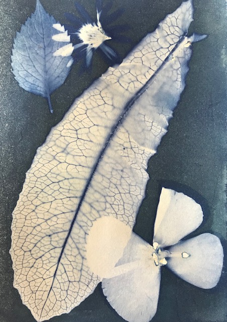
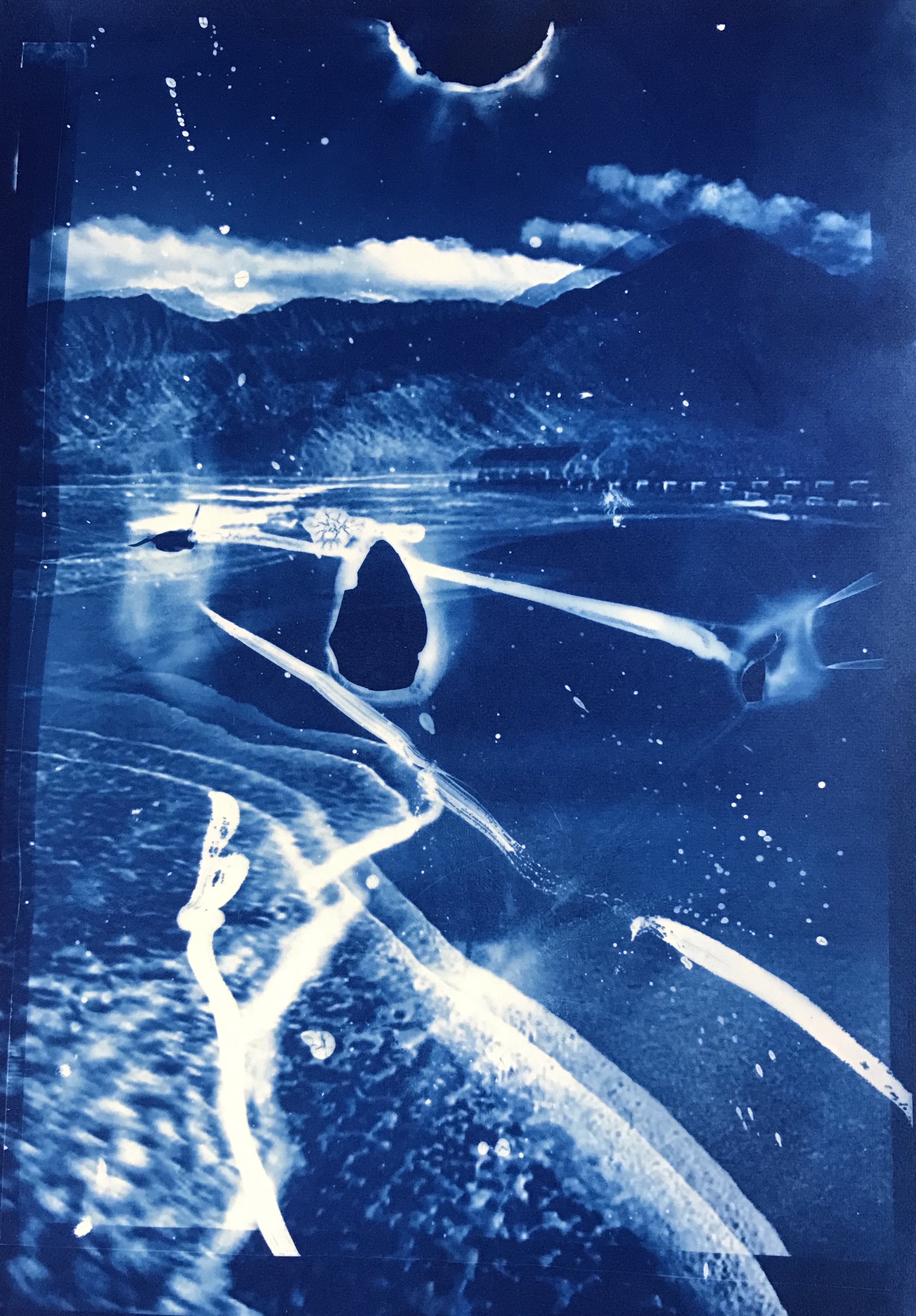
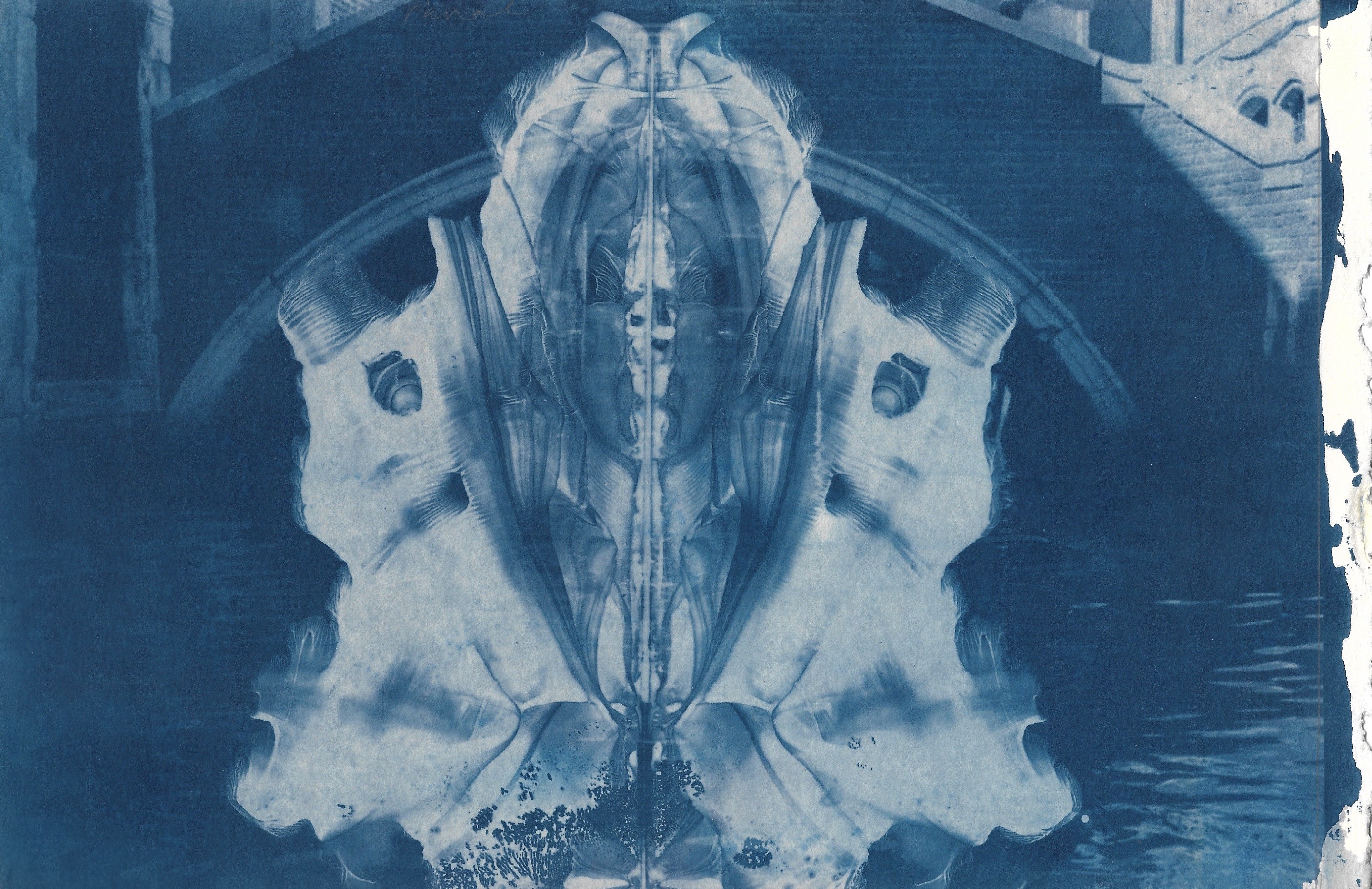
Art 169-02: Special Topics in Printmaking: Cyanotype. The heliographic image
- Enrique Leal
Aaron Martinez:
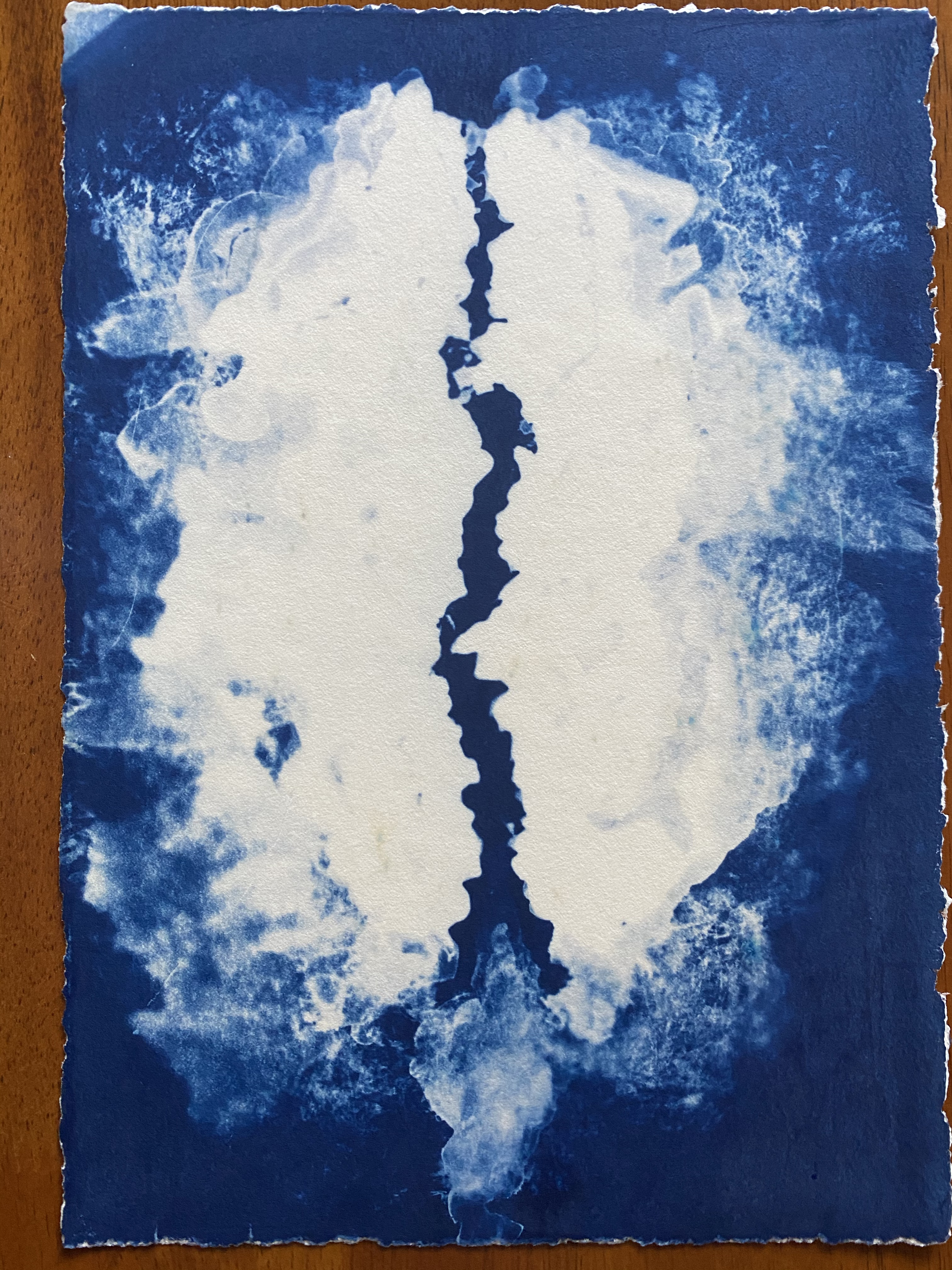
Flood in my Heart / Cyanotype / 6.5” x 9.5”
Paralyzed Stripes / Cyanotype / 9.5” x 6.5”

Trust and Loyalty / Cyanotype / 9.5” x 6.5”

A Timeless Photograph / Cyanotype / 6.5” x 9.5”
Diego Reza:
Art IG: @ agua.de.platano
 :
:
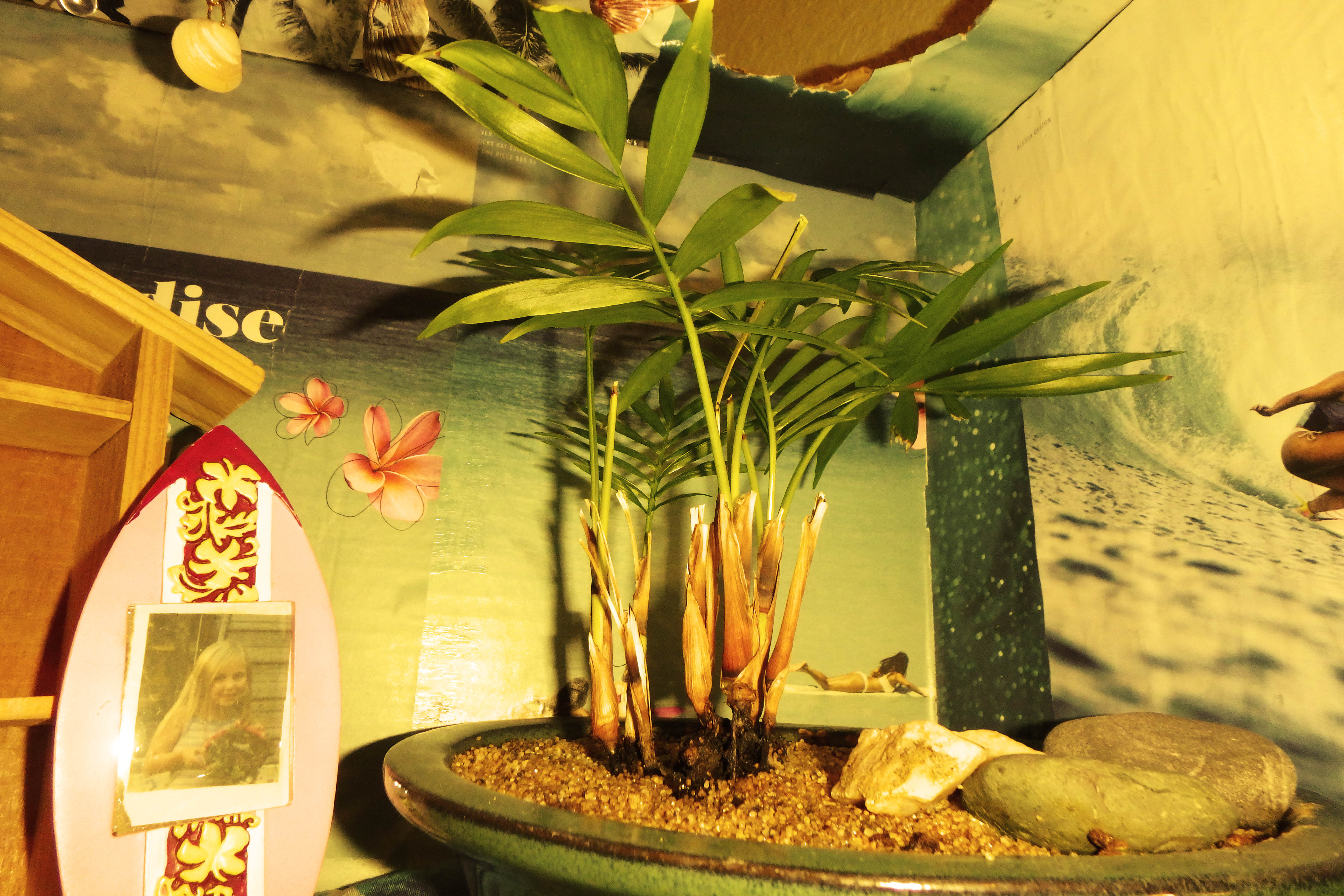
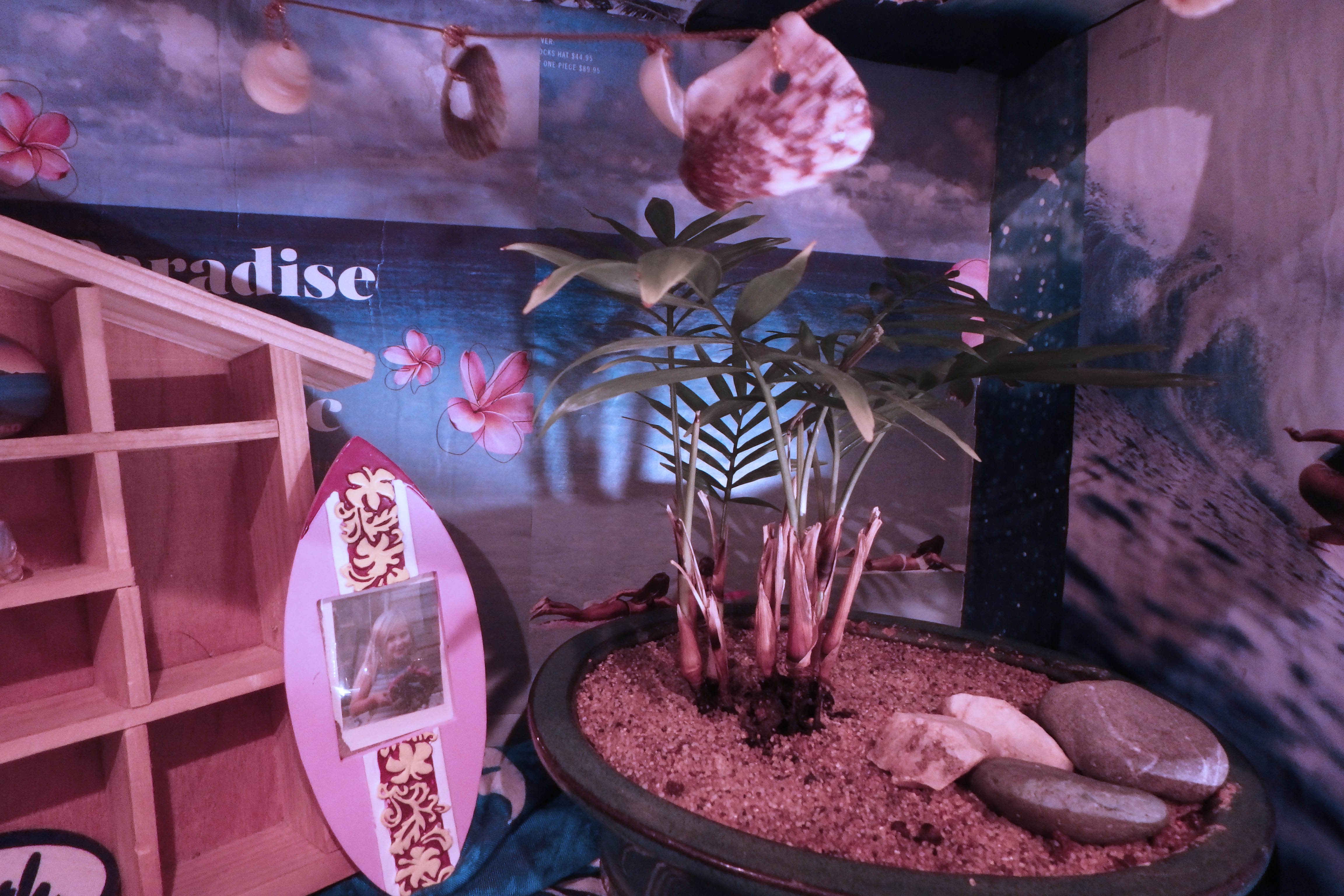
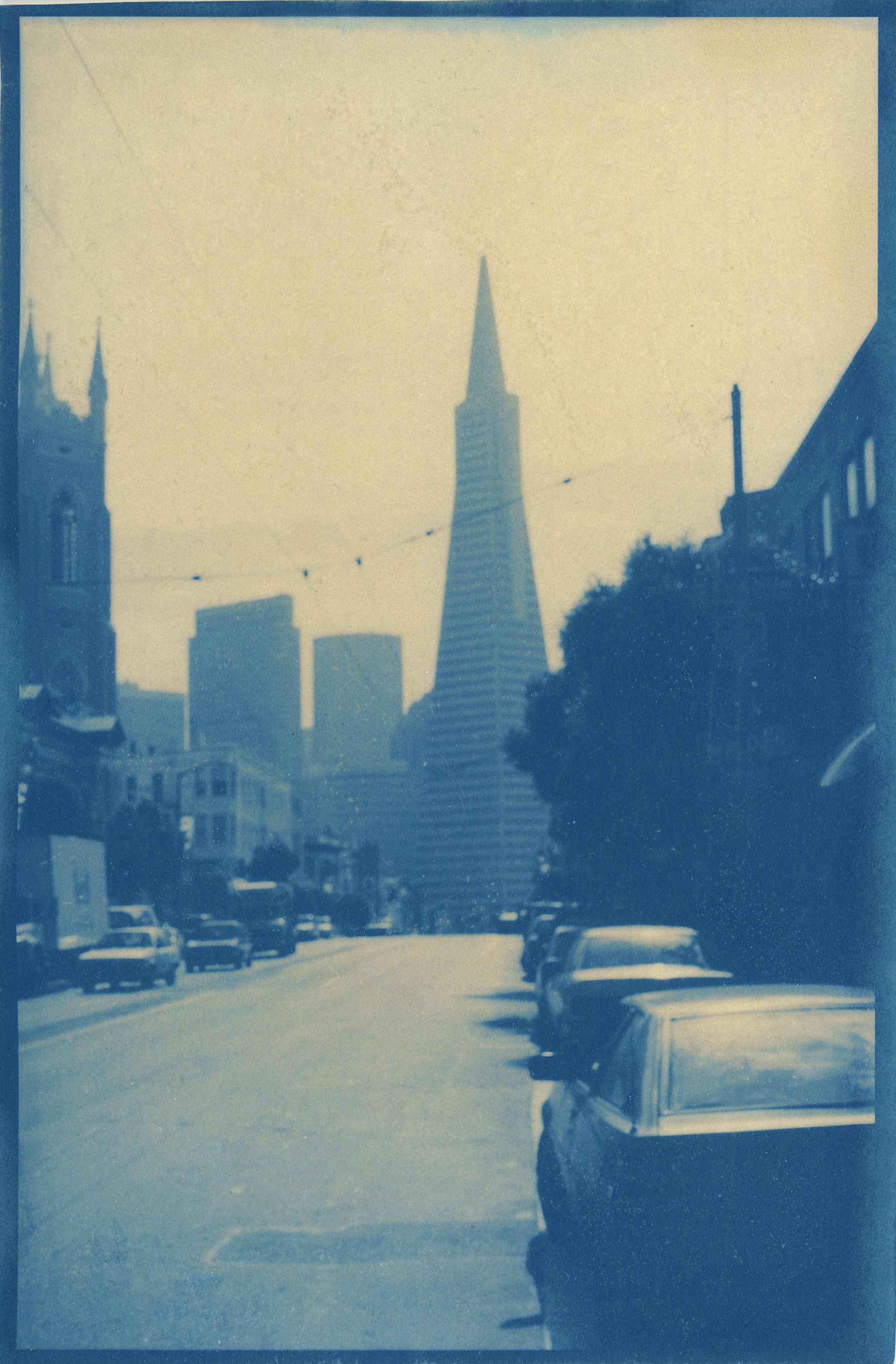
1. “Old Paradise” Distorted Cyanotype Photograph on Rives Paper, May 2020

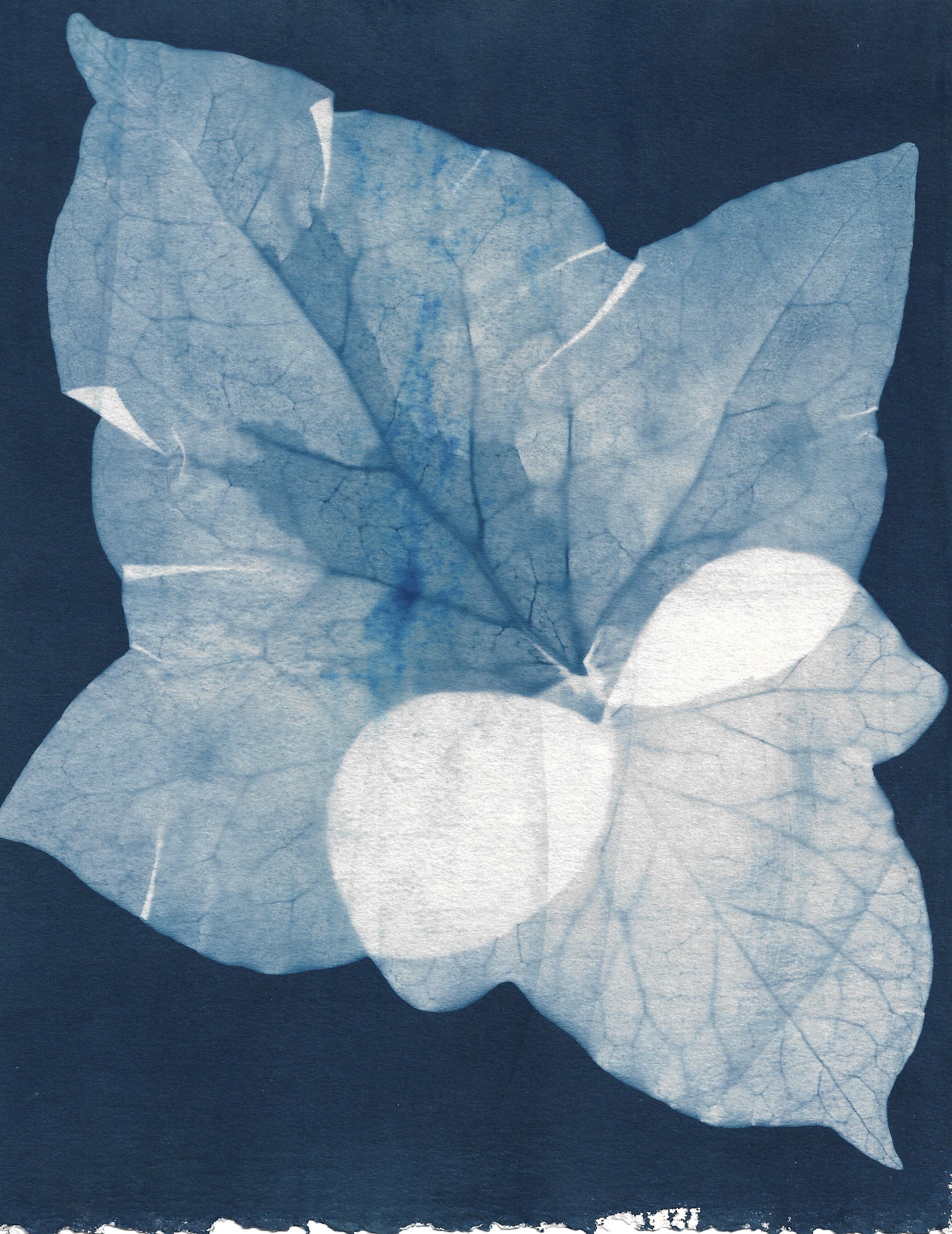
2. “Blue Hydrangeas” Cliché Verre on Rives Paper, April 2020
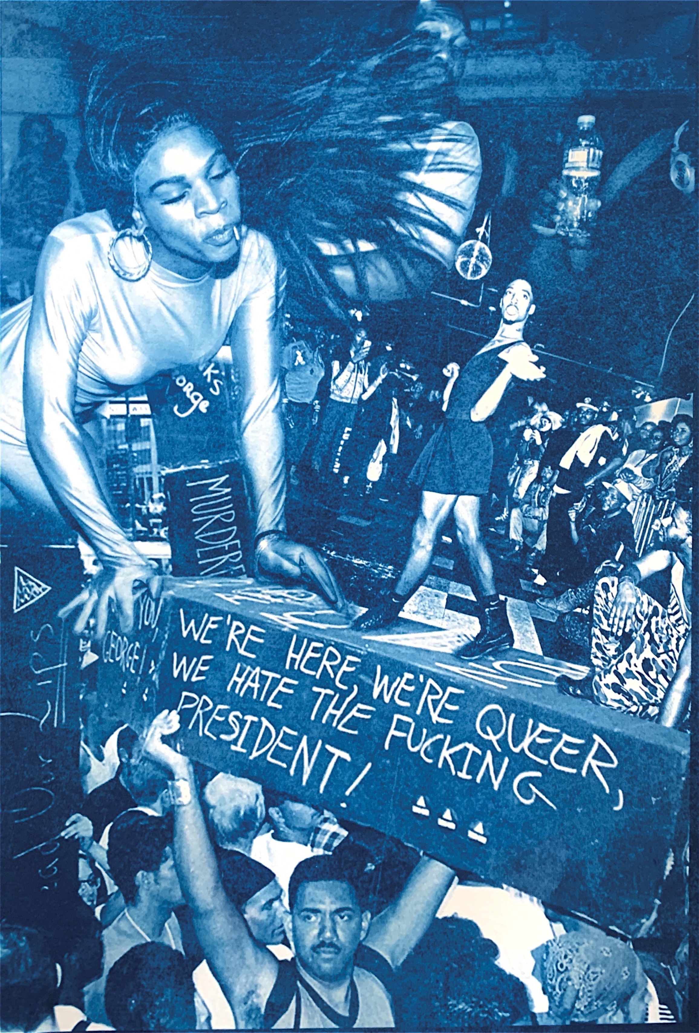
3. “Queer” Photomontage Cyanotype on Arches Platine Paper, June 2020
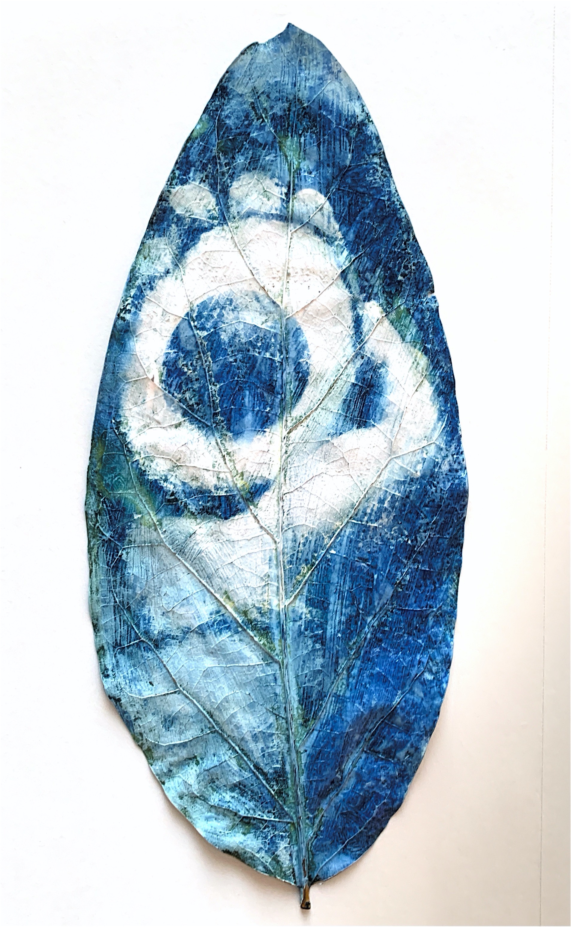
4. “Nurturing” Cyanotype Photograph on Avocado Tree Leaf, June 2020
Dominic Ramirez:
Instagram @dominicramirez

Image 1: Brother on film 9½ x 13”
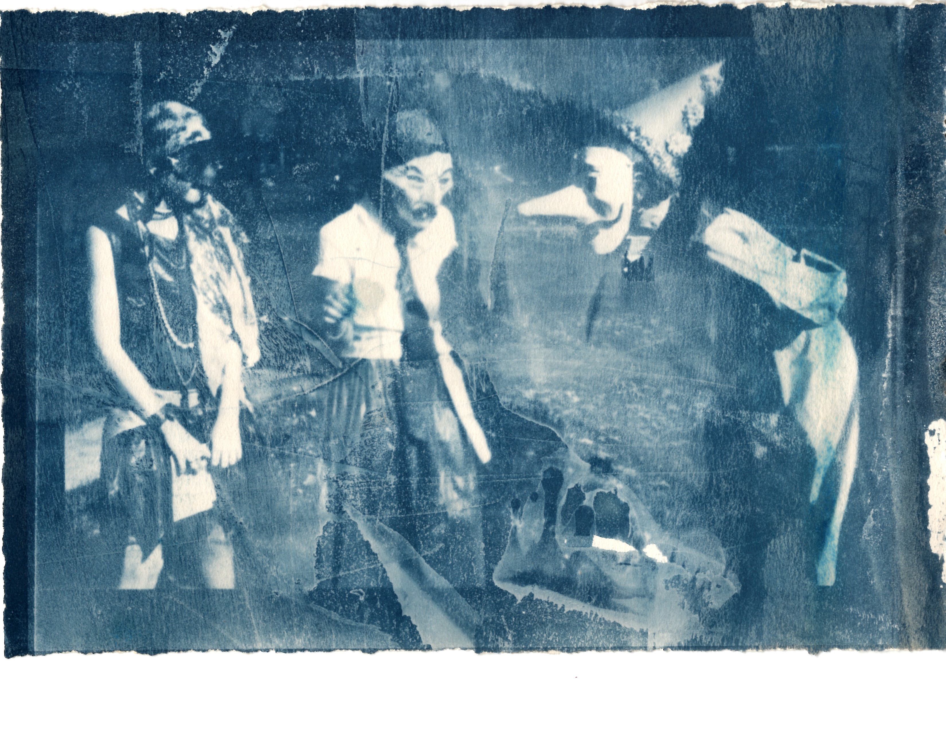
Image 2: Important conversations 6 ¼ x 9 ¼”
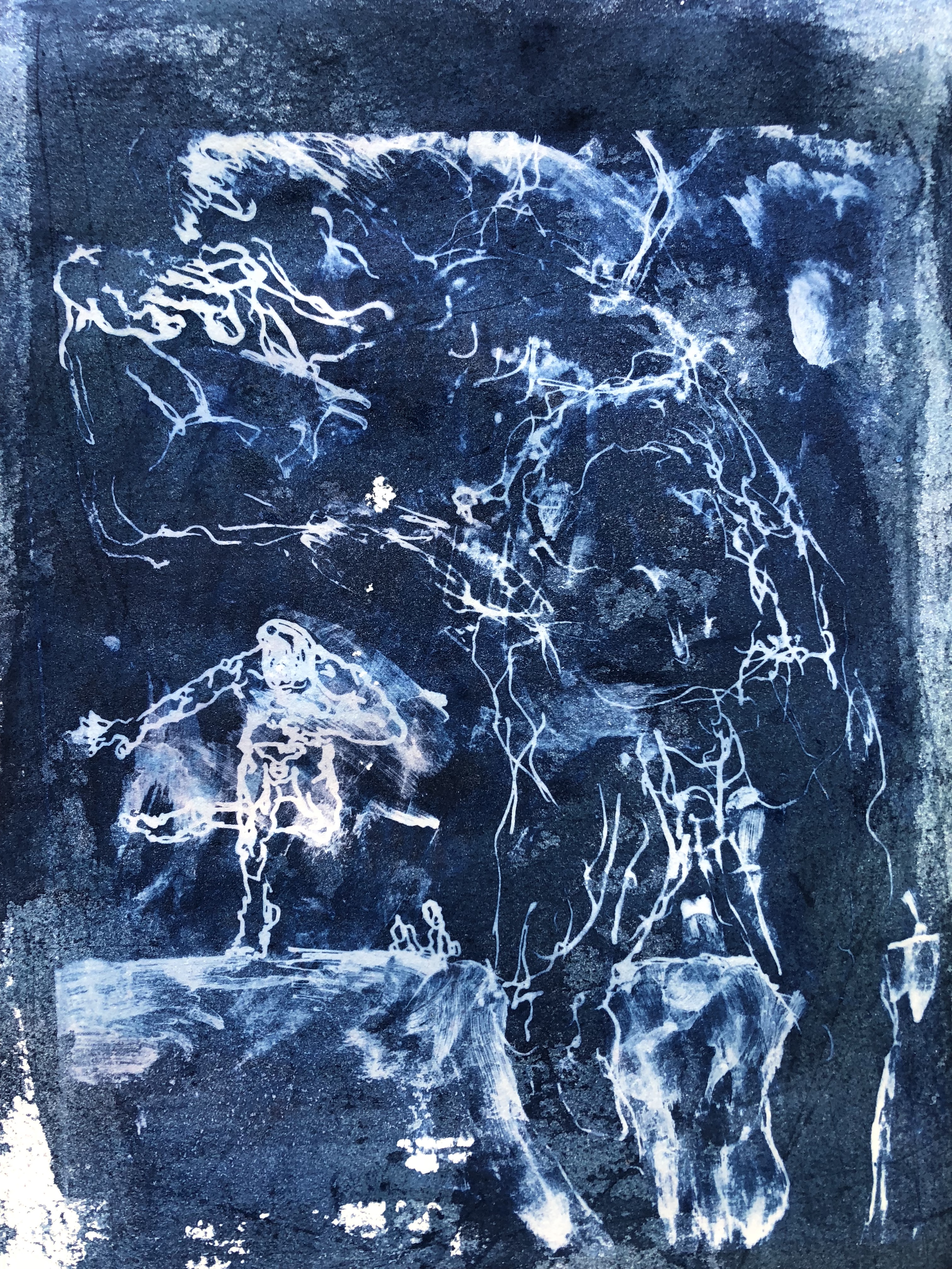
Image 3: I lost my head 9½ x 13”
mage 4: Dog children 6 ¼ x 9 ¼”
Emma Barndt:

Jennifer Villegas:

Jess Mezzie:
“The Digital Graduate” Cyanotype of a graduate with a computer for a head on a white graduation cap

“Spider Web” Cliche Verre cyanotype on Rives BFK paper

“41st Street” Distressed negative cyanotype on Rives BFK paper
“Neighbor” Distressed negative cyanotype on Rives BFK paper
Jody Romero:
Kaelene Jensen:
“Engulfed” (6.5” x 9.5”)
“Old Love” (6.5” x 9.5”)
“Ivy” (6.5” x 9.5”)
“Distressed Venice” (6.5” x 9.5”)
Natalie DelCastillo:
Cement Tree, Cyanotype, Spring 2020
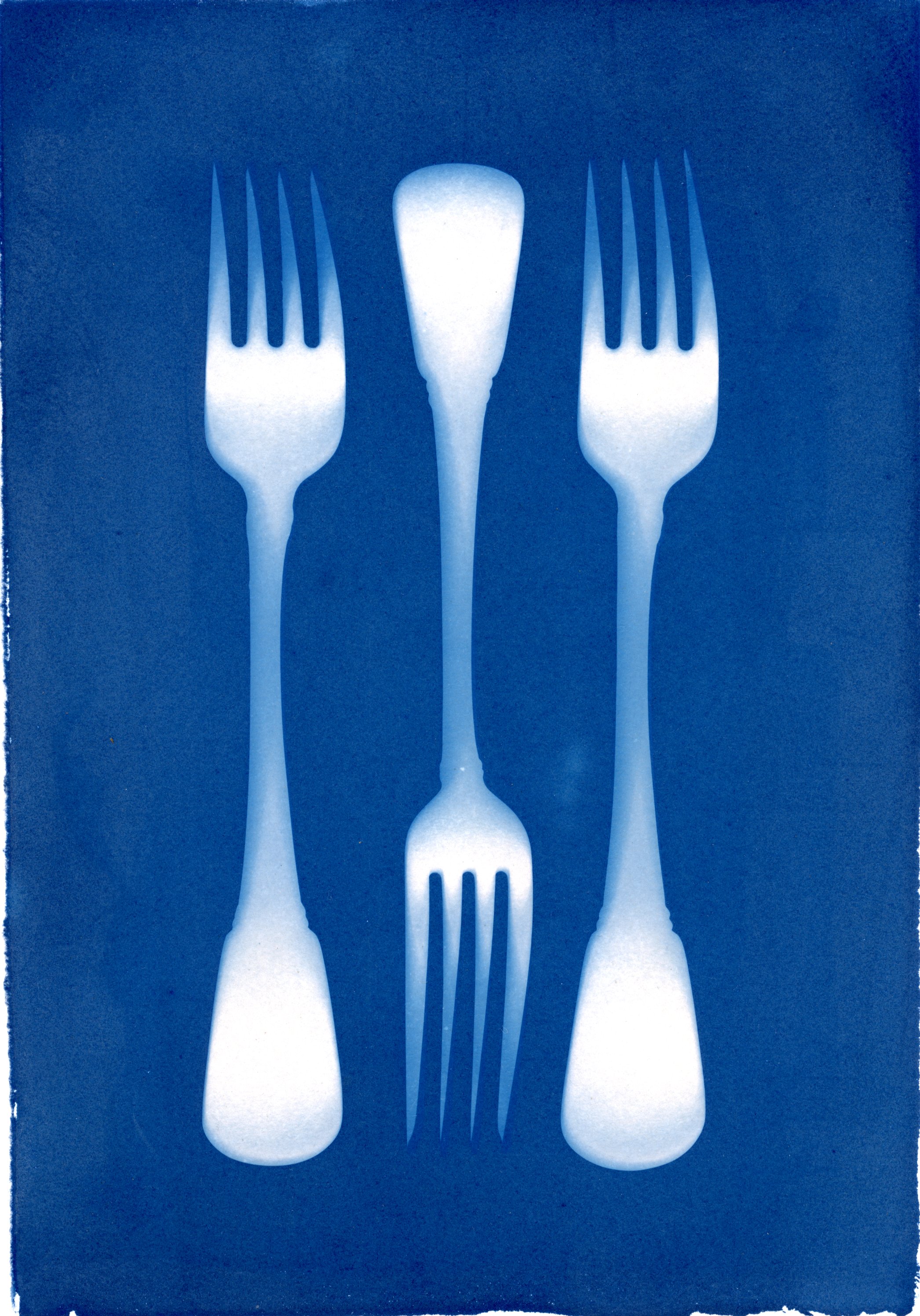
Forks at Noon, Cyanotype, Spring 2020

Fungal Waves, Cyanotype, Spring 2020
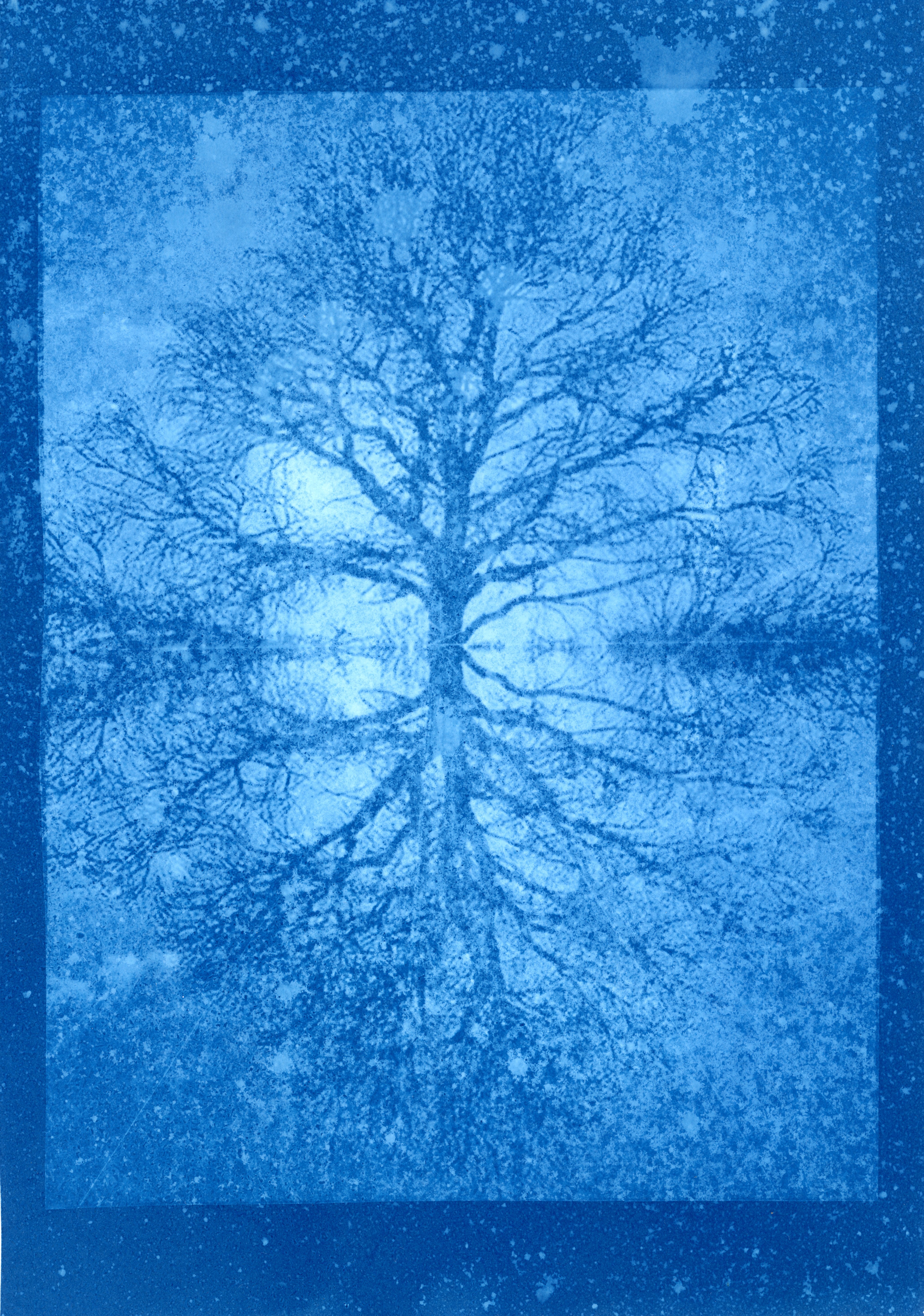
Reflection, Cyanotype, Spring 2020
Rebekah Lee:
I. “Orchids” (6.5”x9.5”)

II. “Cliche Verre” (6.5”x9.5”)
III. “Memory” (6.5”x9.5”)
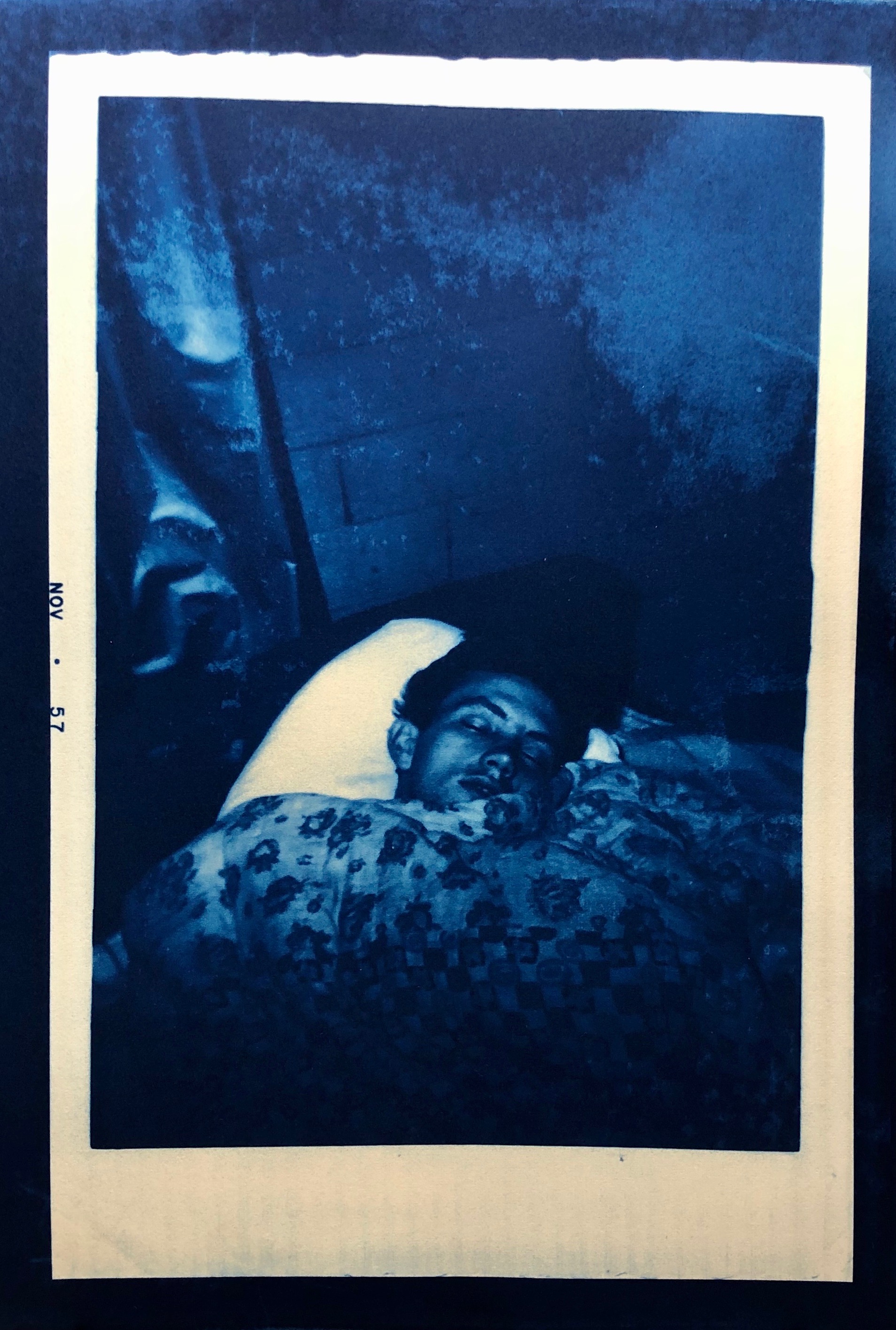
IV. “R.E.M.” (7”x10”)
Sean Maydoney:

Simone von Kugelgen:

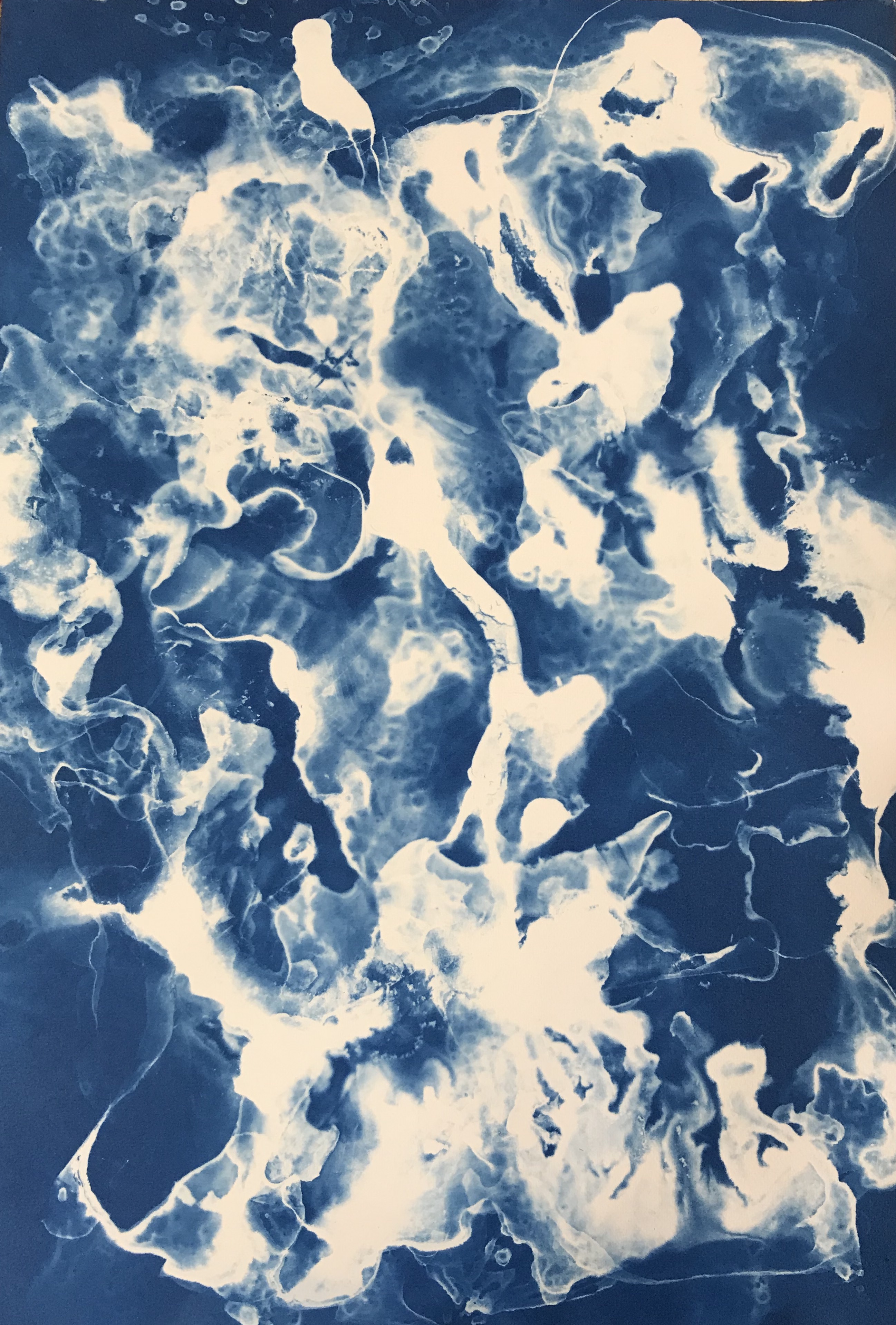
“Fire Gauge”, 6.5”x9.5”, cyanotype paper
“Pandemic”, 6.5”x9.5”, cyanotype on paper
“Neurological”, 6.5”x9.5” cyanotype on paper
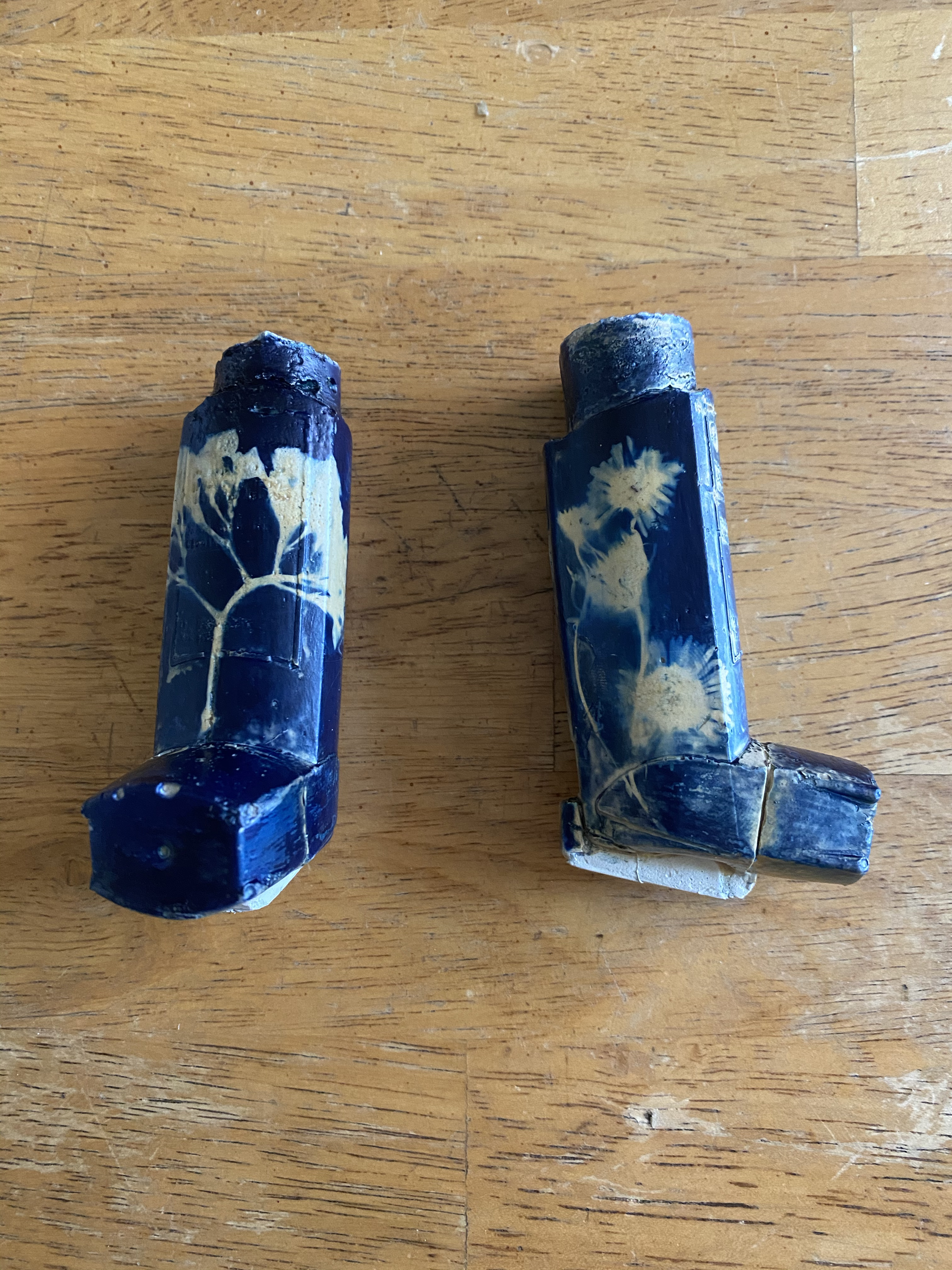
“Breathlessness”, 1”x3”x2”, cyanotype on cast concrete inhalers
Art 189-01: Special Topics in Sculpture: Art + Social Distancing During a Pandemic
- Jennifer Parker
Angel Gonzalez:


Bryant Hernandez:


Cameron Edwards:


James Dupen:

Perception #1, the ability to see
Digital collage utilizing both personal and stock photography.

Perception #2, being or becoming aware
Digital collage utilizing both personal and stock photography

Perception #3, a mental impression
Digital collage utilizing both personal and stock photography

Perception #4, external stimuli
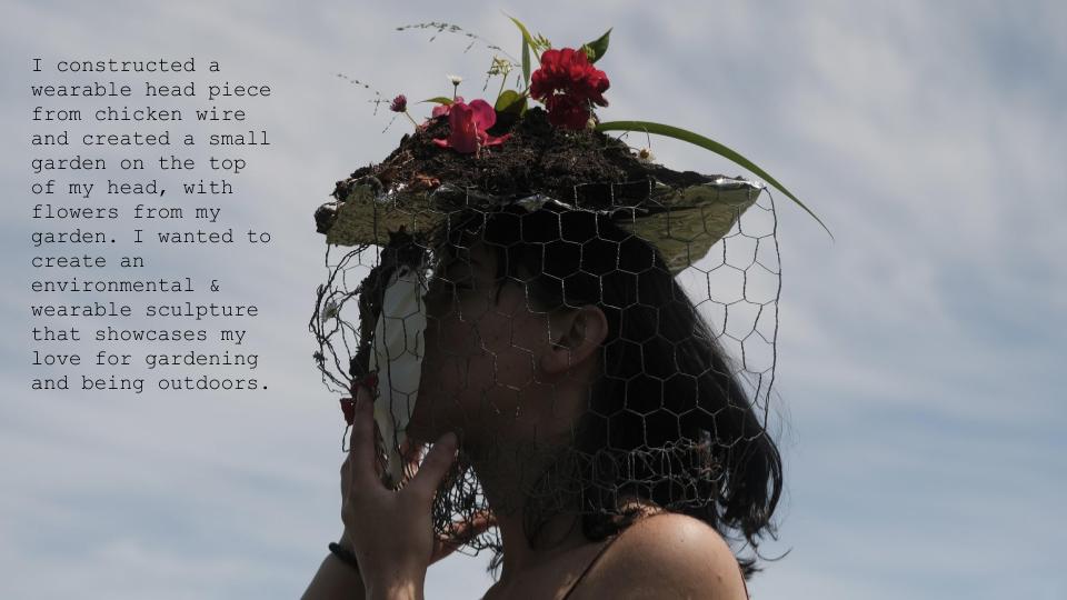
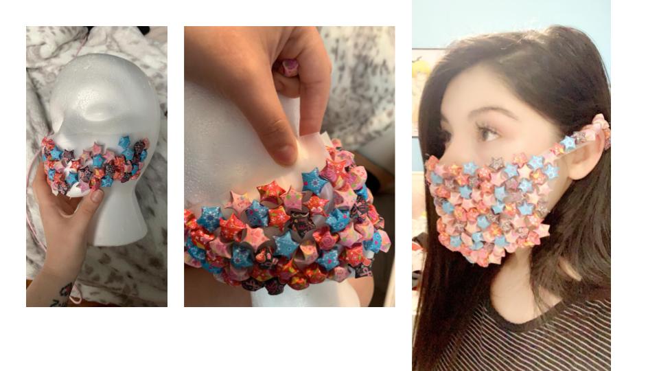
3d sculpture consisting of flowers, jewelry, and a gask mask.
I’ve been on many journeys in my life, found homes in so many places, but I still don’t feel any closer to finding myself. This feeling of uncertainty -in myself, in the world, in everything- is what drives my art. Sometimes my art is gross or scary, I like to embrace these emotions. I feel like art has a tendency to focus on feelings that we are comfortable with, I strive to do the opposite. I want to make you uncomfortable, I don’t want everyone to like my art.
I like to work with different mediums in my art, one drawing may have everything from pencil to acrylic but it’s this mix of materials that I really enjoy. I like to work with the weird textures and ‘mistakes’ that show up as I work through a piece. I want the viewer to feel like they can almost see the different layers of a piece, like they can see the process of me thinking what to put next. I work in a lot of messy fragments that I slowly piece together as I work. Eventually this collage of lost parts starts to fit together and make sense and then suddenly I know what I’ve been drawing this whole time.
Being queer has left me with the options of either; being a queer artist and letting my body define me and my practice, or feeling like I have to hide who I am and who I was. I’m still not sure where I stand or where I want to stand on this idea. On one hand, I appreciate that people are interested and generally accepting of my identity. However, I feel almost fetishised in a way. Sometimes it’s hard to tell if people like me for who I am or what I am.
Lizbeth Leon Beltran:


Malachi Ross:

Olivia Cruz:
Palmer Conlon:

Simone von Kugelgen:
Zhen Cao:
Art 189-02: Special Topics in Sculpture
- Figure Sculpture - Sean Monoghan
Claire June Apana:
As a child, I was obsessed with origami as it was a means of exploring my asian heritage through art. I was mesmerized by the look and feel of origami papers and found it fascinating that I had the ability to create delicate works of art with a readily available material. My passion for beautiful papers followed me into my career in photography.
My works focus on the concept of Impossible Realities: Paradoxical ways of life that are absolute. Through our actions we are able to inspire change. Previous installations have included a combination of medias in order to convey a nuanced sense of experience. Photography, videography, sound sculptures, paintings, sculpture, and performance create a unique environment for the viewer.
My recent works are performances in which I hand fold massive photographs into sculptures. By integrating origami patterns onto a traditionally two dimensional medium, I am able to create a complex and dimensional photographic sculptures. In manipulating the raw material, I reconstruct the narrative into a new form. Through collective action and solidarity we can contain the chaos around us in order to design stability for all. My art practice is a way of taking control by means of creation.
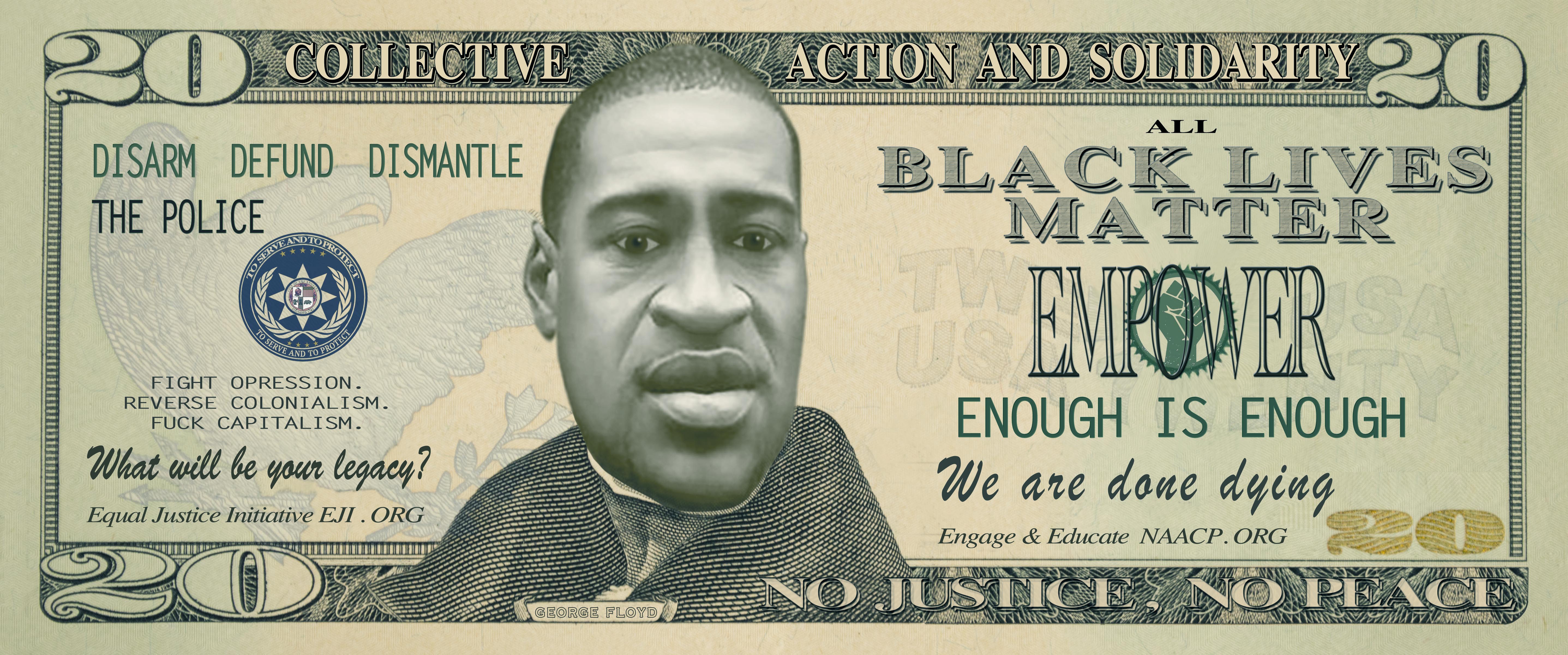
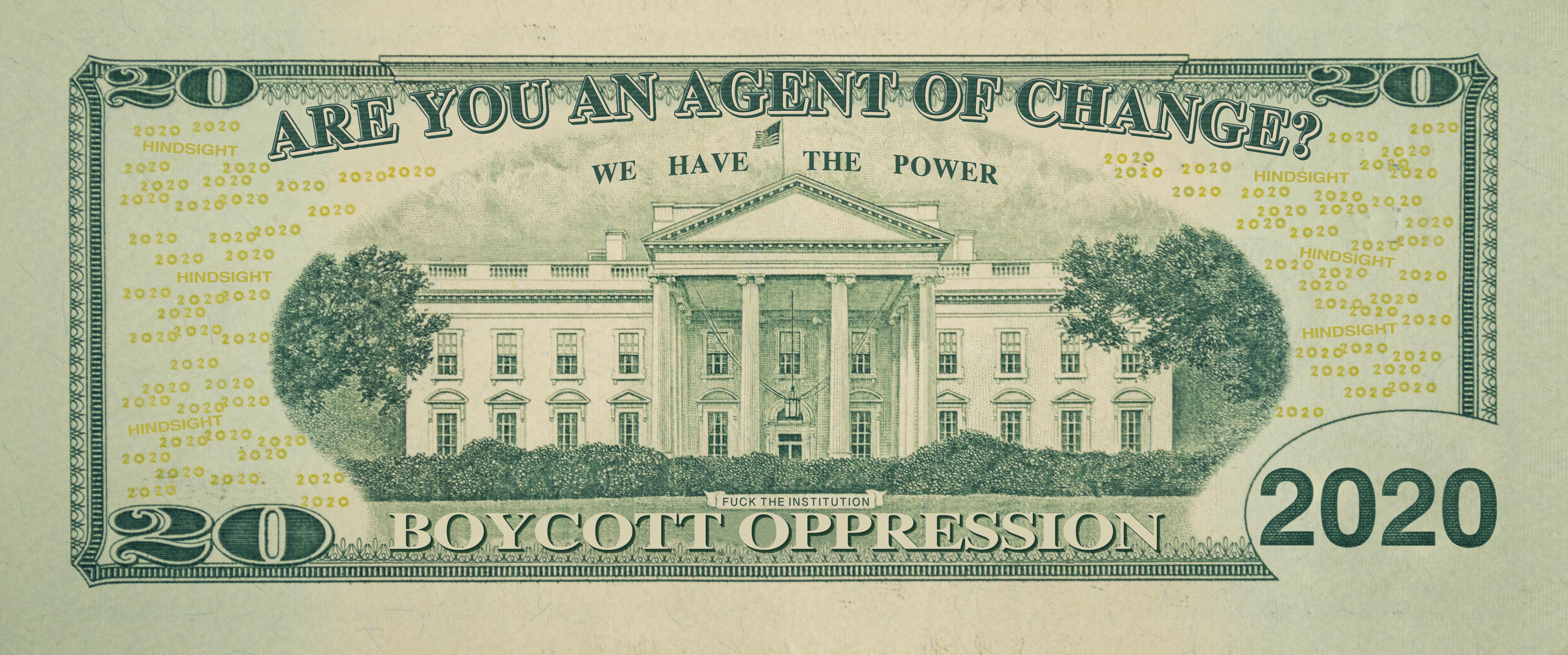
ARE YOU AN AGENT OF CHANGE? (2020)
Double-Sided Laserjet Print 2”x5”
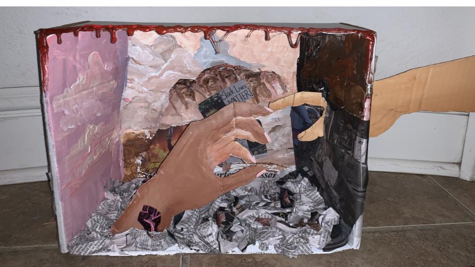
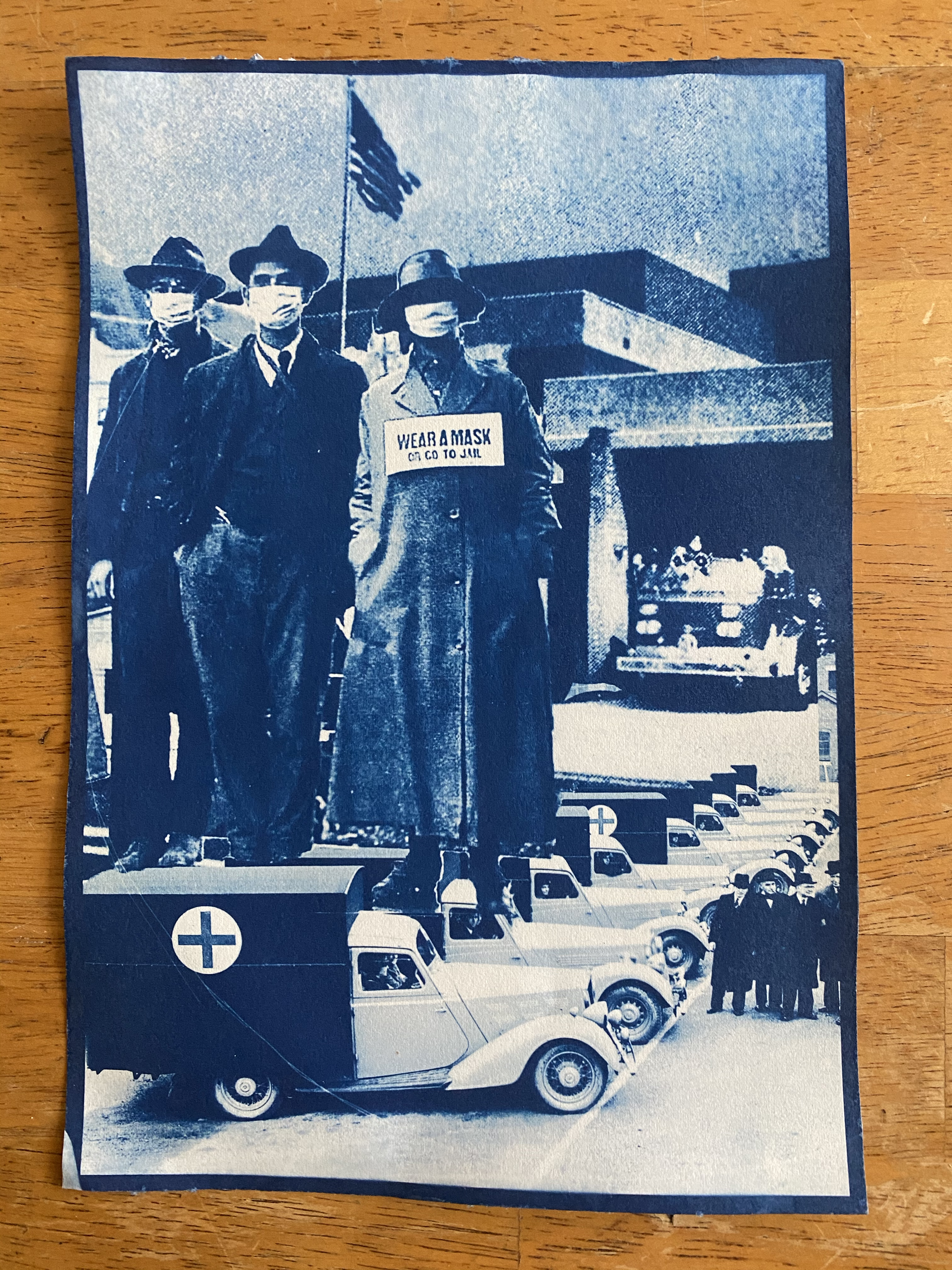
Initially inspired by UCSC’s COLA Strike, this second iteration of ARE YOU AN AGENT OF CHANGE? was created in response to most recent wave of Black Lives Matter protests and demonstrations. This artwork serves as information meant to serve the community, wherever one’s intellect or integrity reside. It memorializes George Floyd onto our currency while providing information on where to educate, engage, and donate towards the movement. In creating money, the work provides people with what they want (money) and what they need (information).
*Files available for free to anyone that would like to print these and hand them out at protests and demonstrations.*
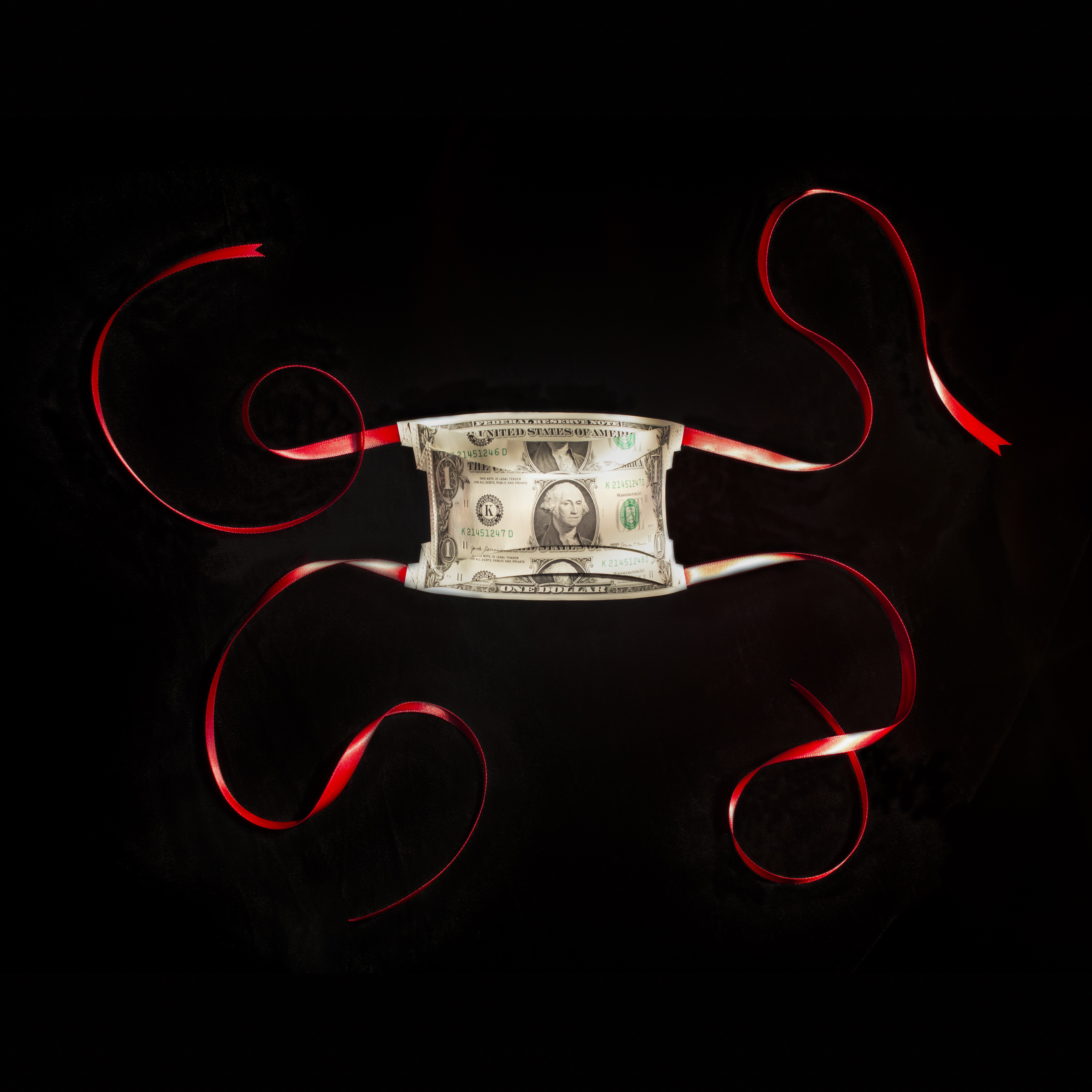
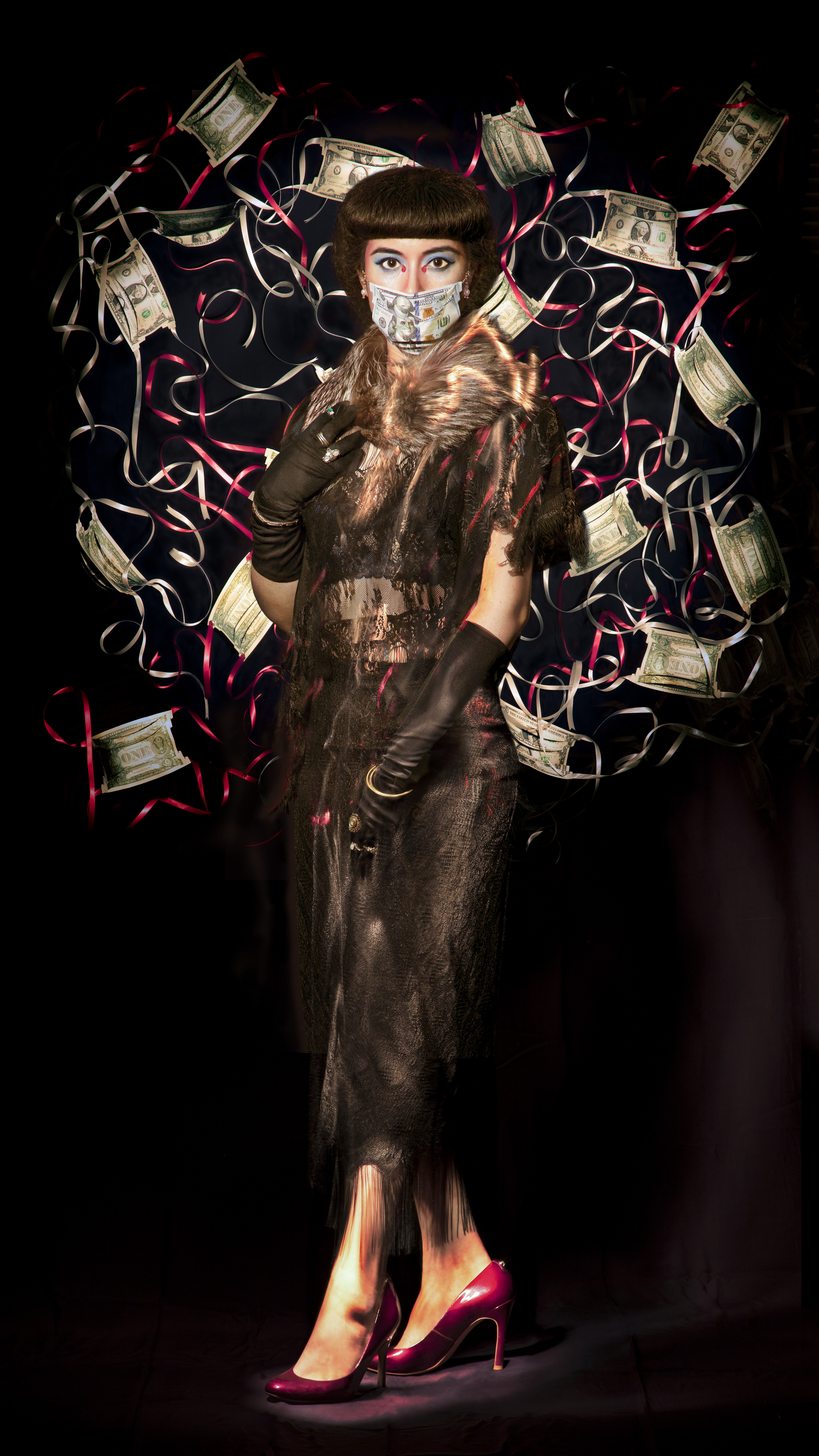
PUT YOUR MONEY WHERE YOUR MOUTH IS. (2020)
Folded U.S. Currency, Invisible thread, Double faced satin ribbon/ gold chain.
Sculptures and photo series.
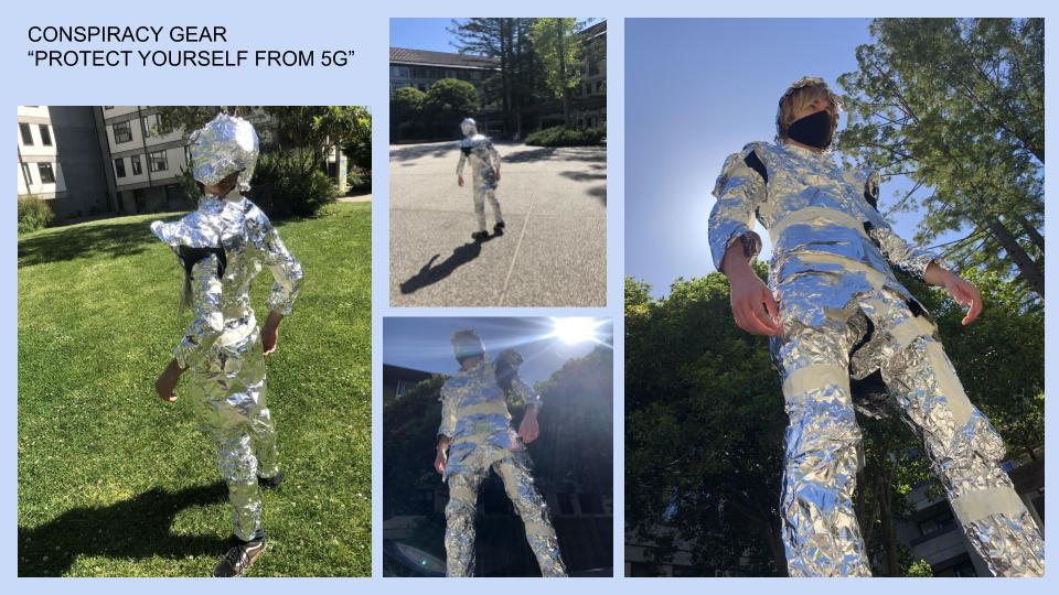
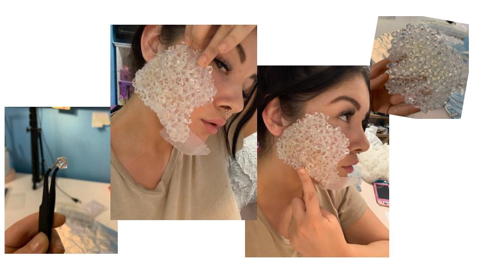
PUT YOUR MONEY WHERE YOUR MOUTH IS was created in response to the lack of personal protective equipment available to our nurses, doctors, and other medical staff during this COVID-19 pandemic. This is a message to our politicians; a call to put your
money where your mouth is. If the government cares about the livelihoods of our medical professionals then they should stop selling lifesaving equipment (made in the United States for US hospitals) to other countries that bid higher than we are able to pay. Protect the people against the disease that is Capitalism.
In light of the horrific public lynching of George Floyd, the masks have become even more relevant. This is a critique of the United States' spending. More than half of the US's budget is spent on military and war. We have militarized our police and yet our country is unable to equip doctors with the proper protective gear. We have the funds and the power. We must reallocate according to the People's Budget and defund the police.
Art 190B: Senior Project
- Elizabeth Stephens
Charlie Korman:
Dominic Ramirez:
Instagram @dominicramirez
Image 1: Why is it green? 5 x 6½ ft Oil on canvas
Image 2: Let me think about it 5 x 6½ ft Oil, ink, charcoal on canvas
Image 3: Getting lost 5 x 6½ ft Oil, acrylic, ink, charcoal on canvas
Jody Romero:

Justin Jacobs:
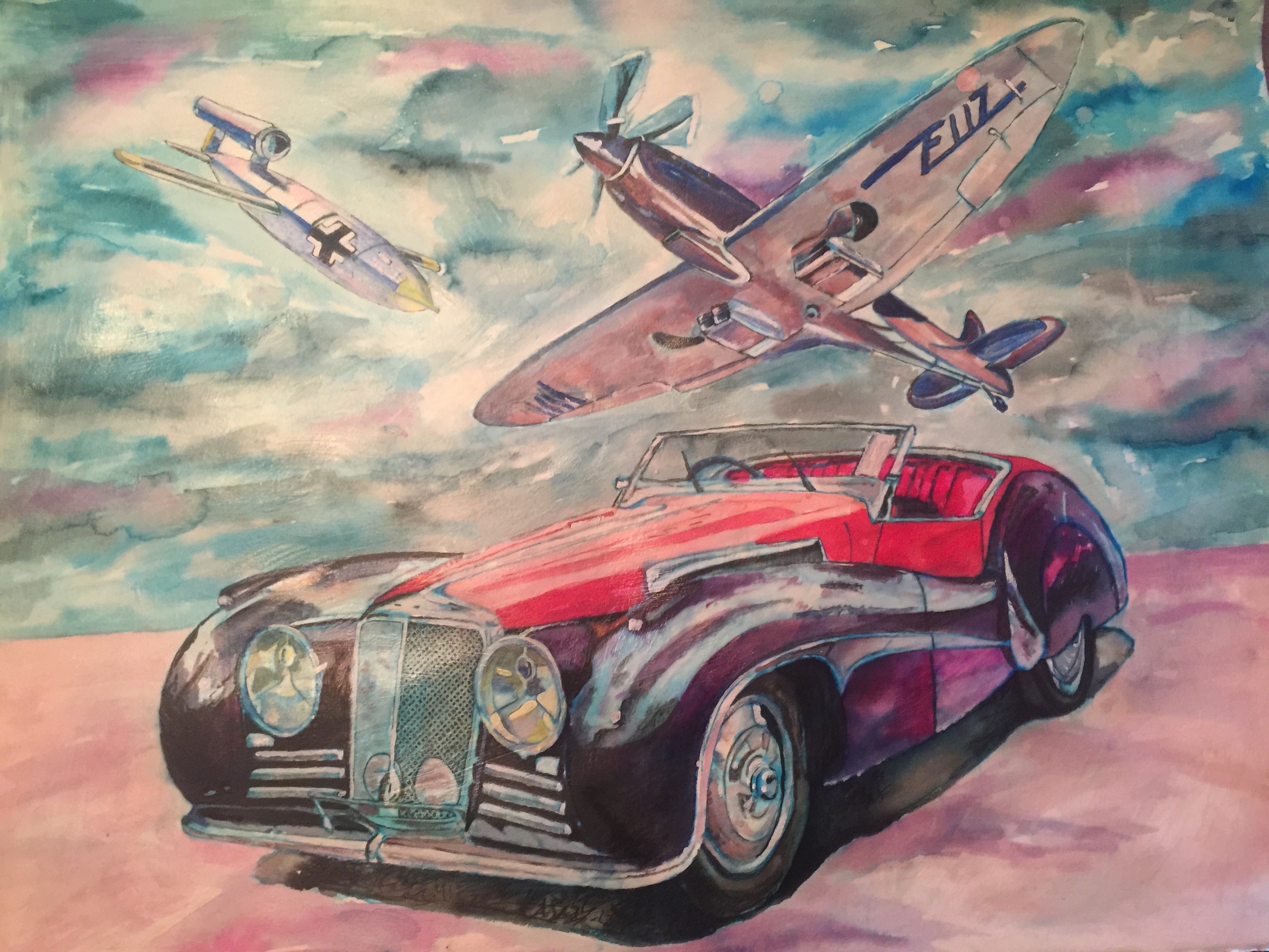
British Defense, 2020, watercolor and oil painting

Lakester, 2020, watercolor and oil paint
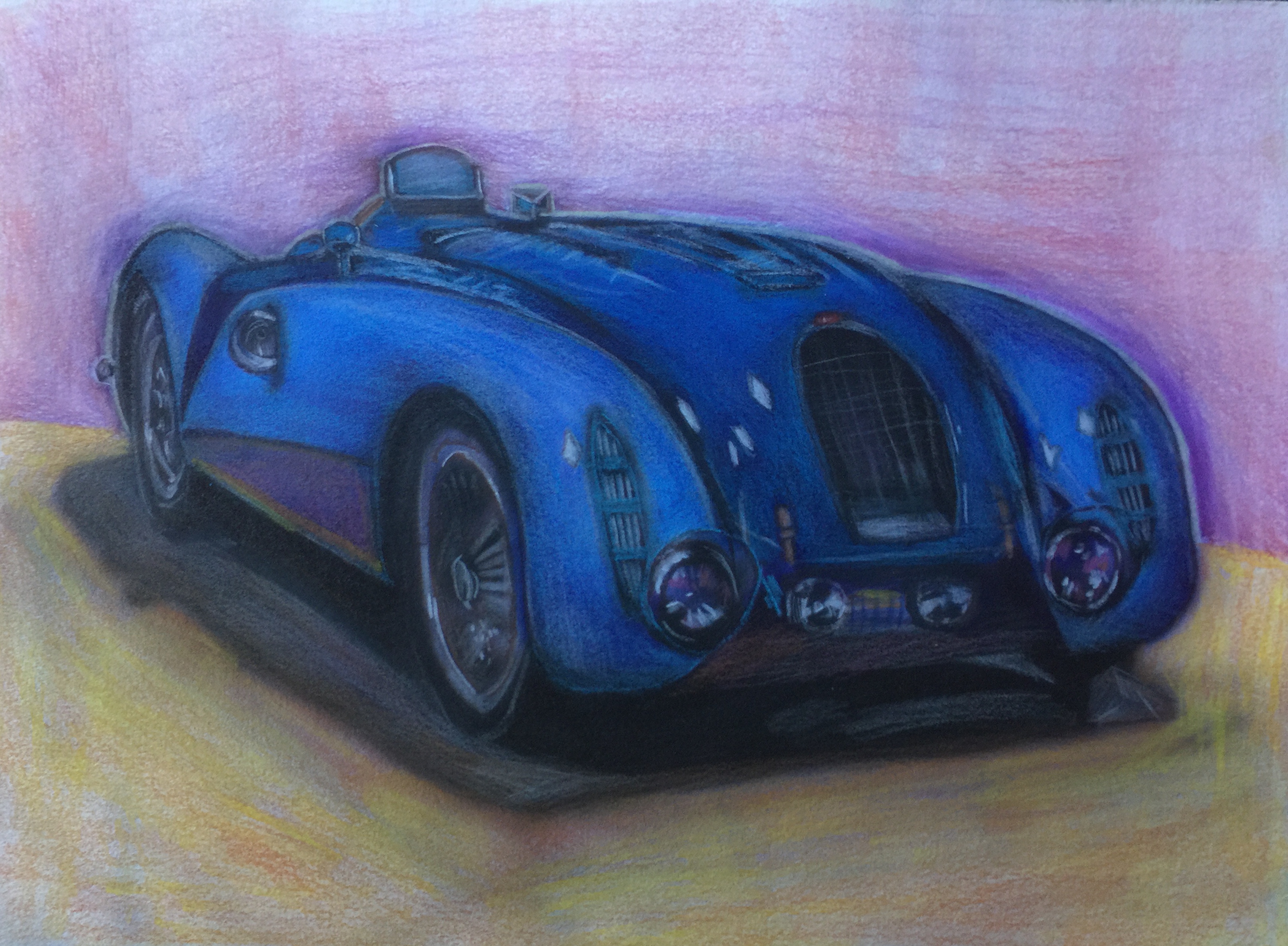
1936 Bugatti 57g, 2020, Airbrush and colored pencil
Kaleigh Jones:
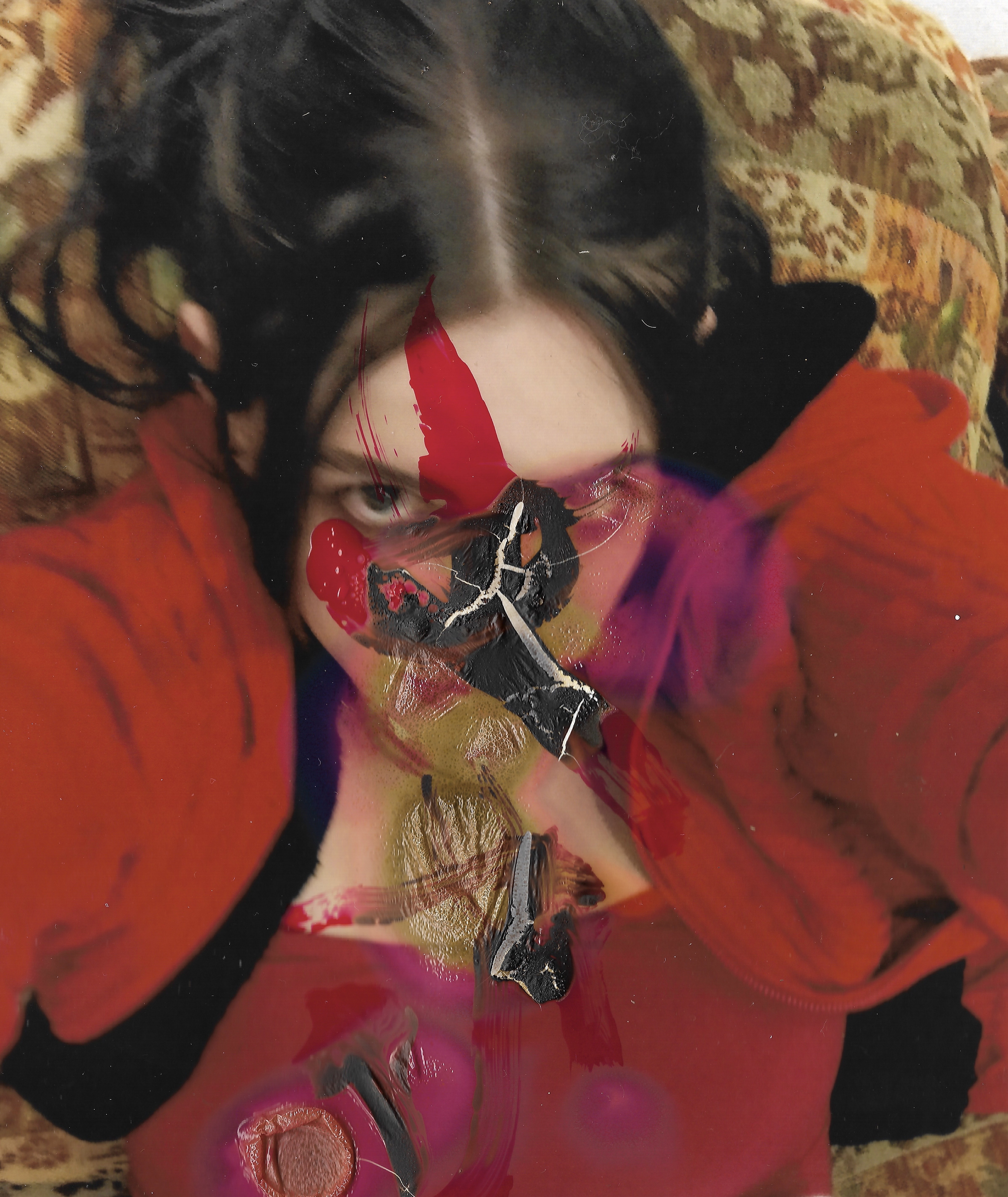
I Have Bled Here Before, 2020, nail polish on burnt color emulsion photograph
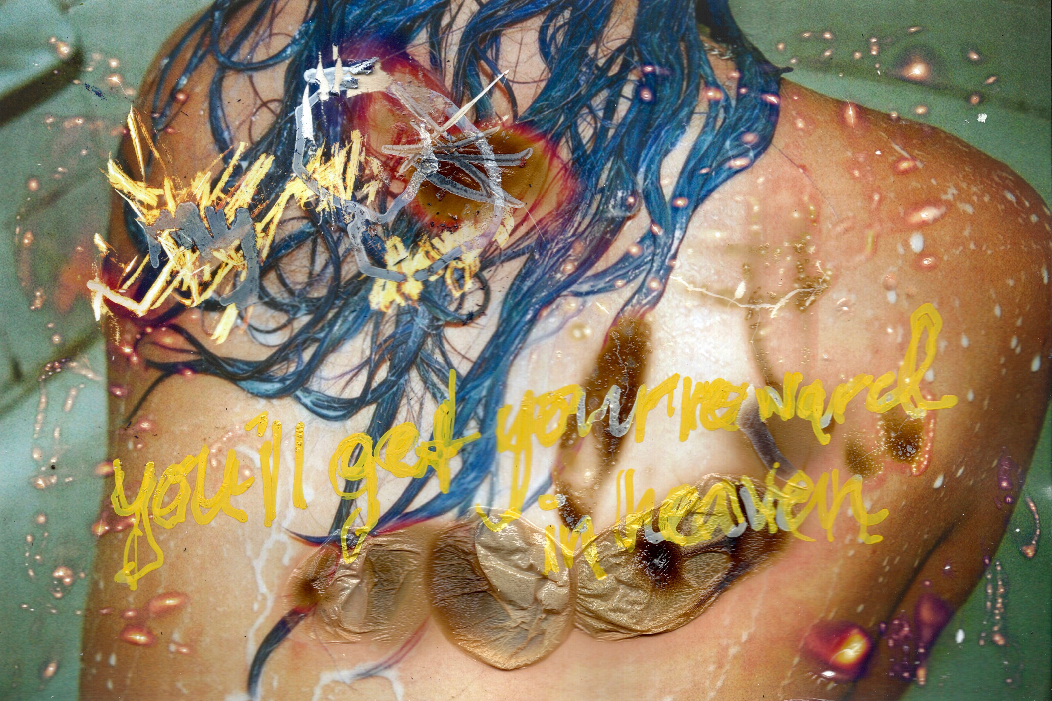
Heaven, 2020, paint pen on burnt color emulsion photograph
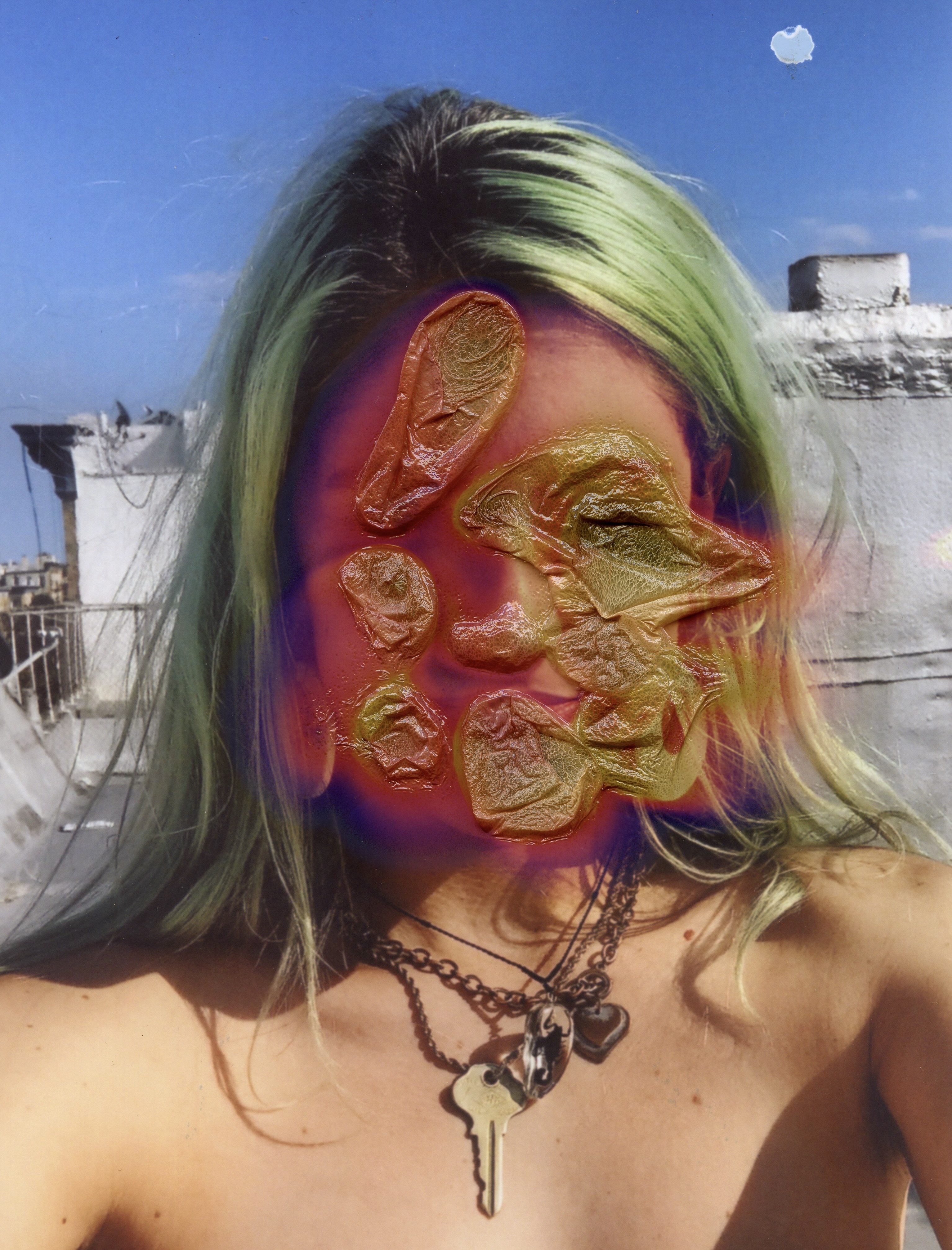
I’ll Leave The Screen Door Open, 2020, burnt color emulsion photograph

A Restless Body Cracks and Rolls, 2020, burnt color emulsion photograph
Nina Scherer:
@NuhEyeNuh on Instagram, Twitter and TikTok
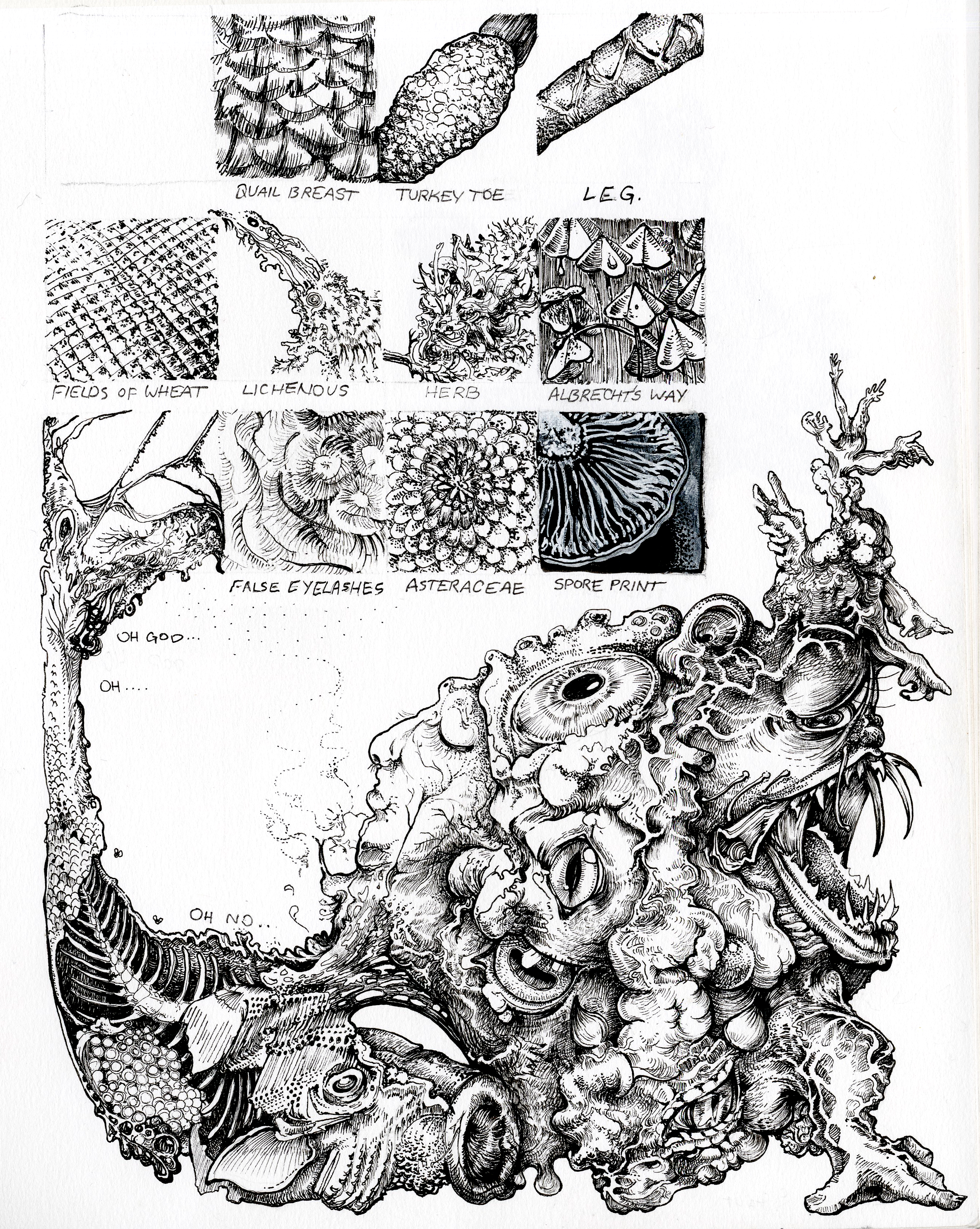
Textural Analysis 9x12” pen and ink

Backyard Nasturtiums 11x10.5” watercolor and concentrated acrylic on cold press
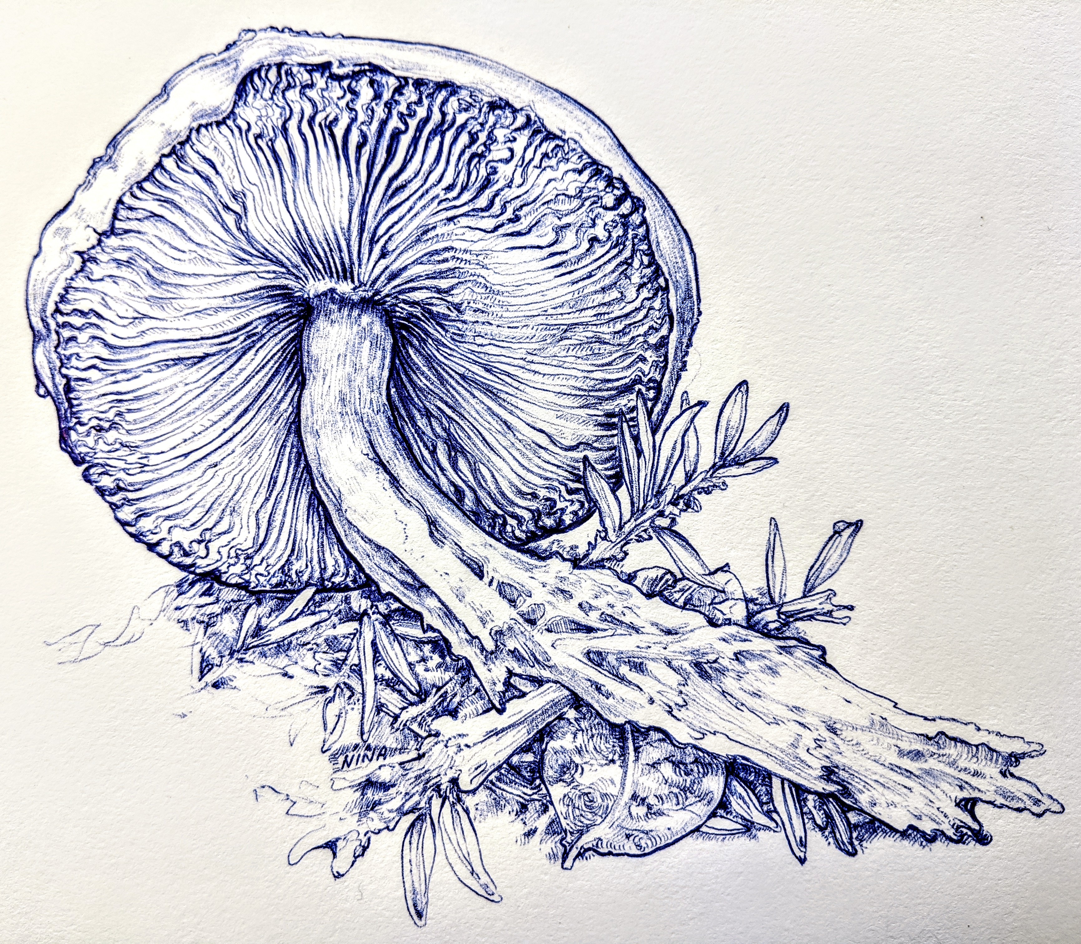
Agarics 7x7” ballpoint pen
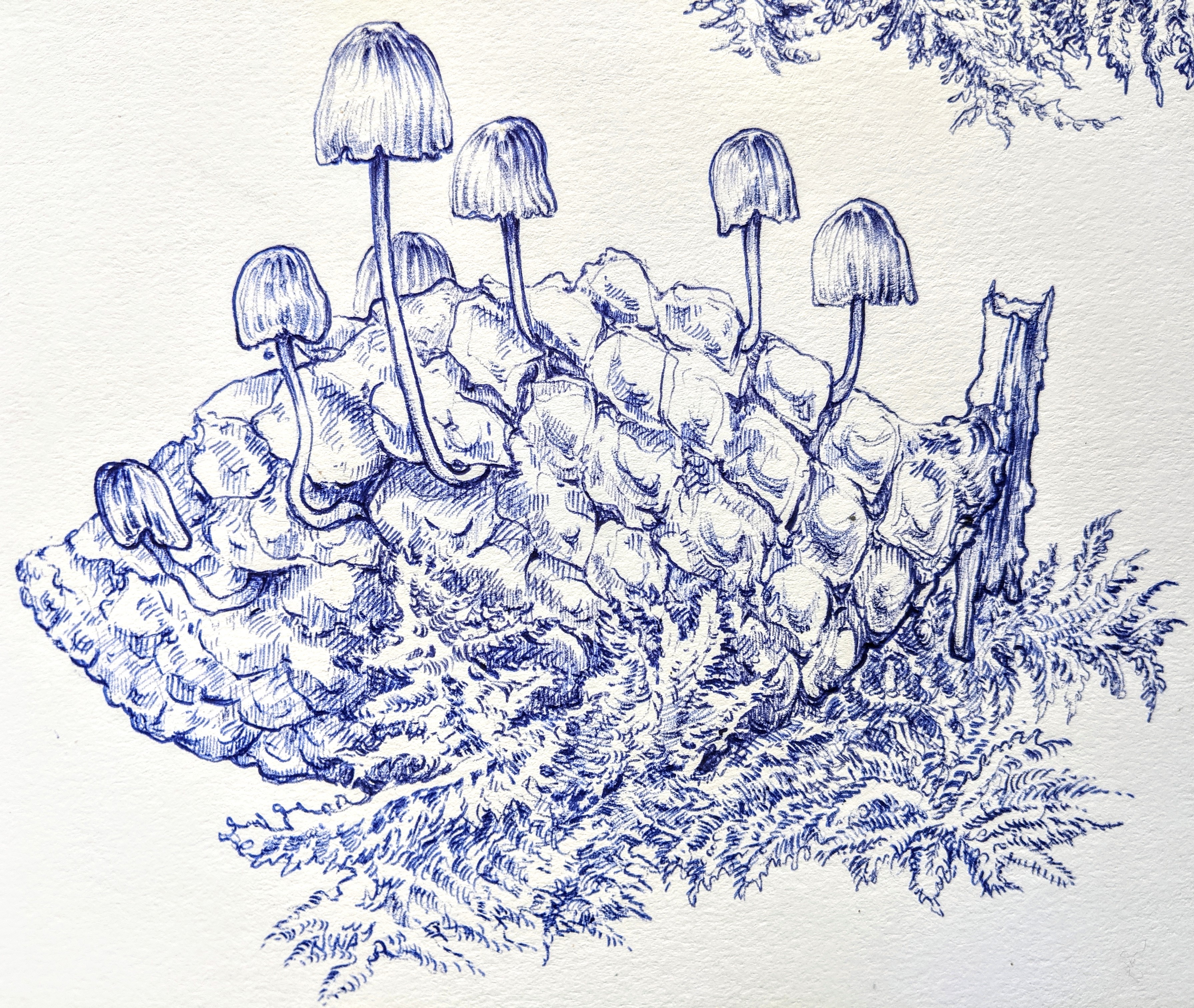
Mycena Purpureofusca 9x8” ballpoint pen
Paige Carlson:
Peter Armusewicz:
Sabatino Josefina:

Sarah Bun:

Sierra Garcia:

Independent Studies
Alejandra Rubio
For my independent study I worked closely with Enrique Leal to explore Mokulitho. Mokulitho combines the drawing potential of Lithography with the carving marks of wood block printing by using plywood as the service on which you create. I was fortunate enough to learn Mokulitho on the Moku Hanga trip to Japan. When the shelter was put in place I was really upset about not being able to spend my last quarter at the print studio and started brainstorming possibilities of making prints at home. This was an experimental process, trying to find the materials that worked best with this medium. It was a lot of failing at first but in the end I was able to successfully pull an edition of prints that all reflect the emotional journey through this process of exploring the medium and navigating an ever changing world.

Alicia Persaud:
(Independent Study with Norman Locks)
Lake in Spring, 6”6.5” watercolor on polaroid photographs, Spring 2020

Fall in Chinatown, 22”x30” mixed media on BFK paper, Spring 2020
Revisit, 15”x22” mixed media on BFK paper, Spring 2020
Renew, 15”x22” mixed media on BFK paper, Spring 2020
Charlie Korman:
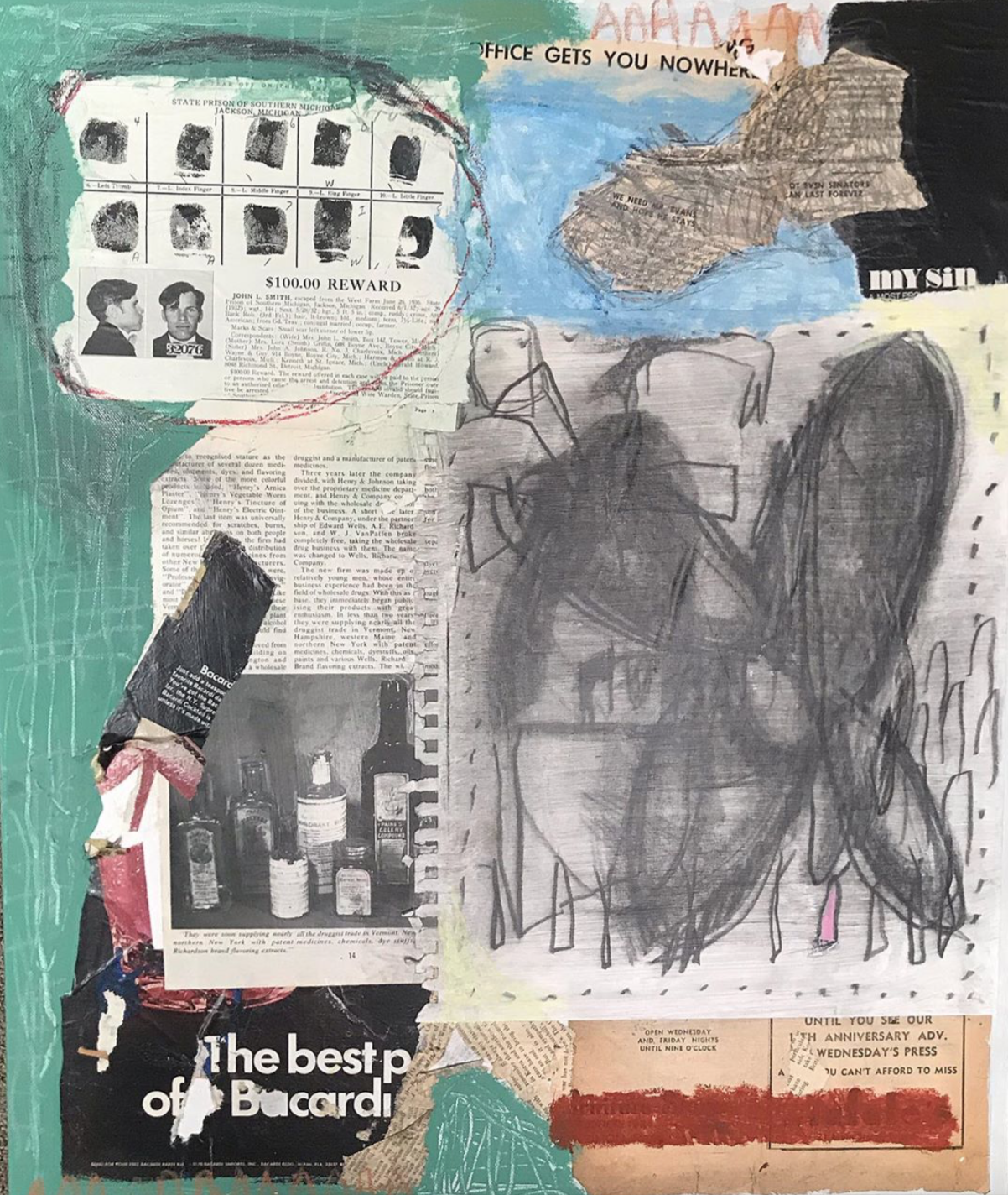
Untitled (Airplane Eddie), 2020. Acrylic, oil, watercolor, ink, pastel, wax crayon, spray paint, gouache, found material, collage, graphite. 54 x 72 in. on unstretched canvas.
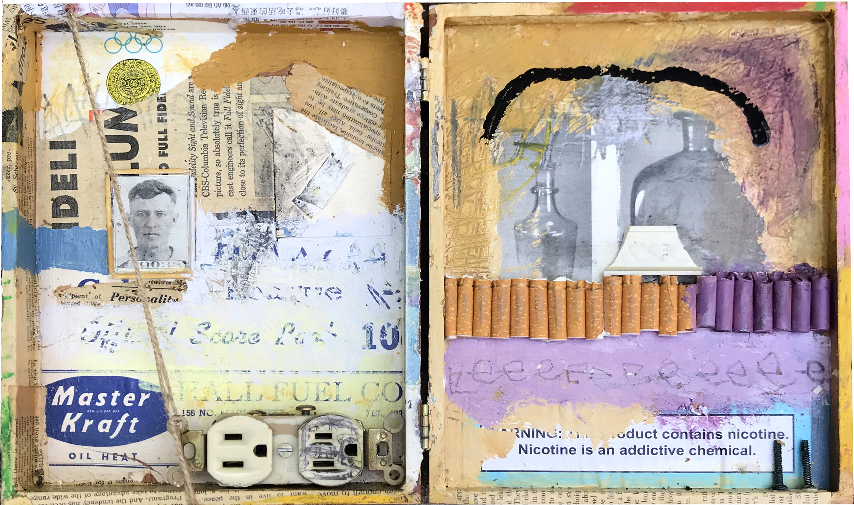
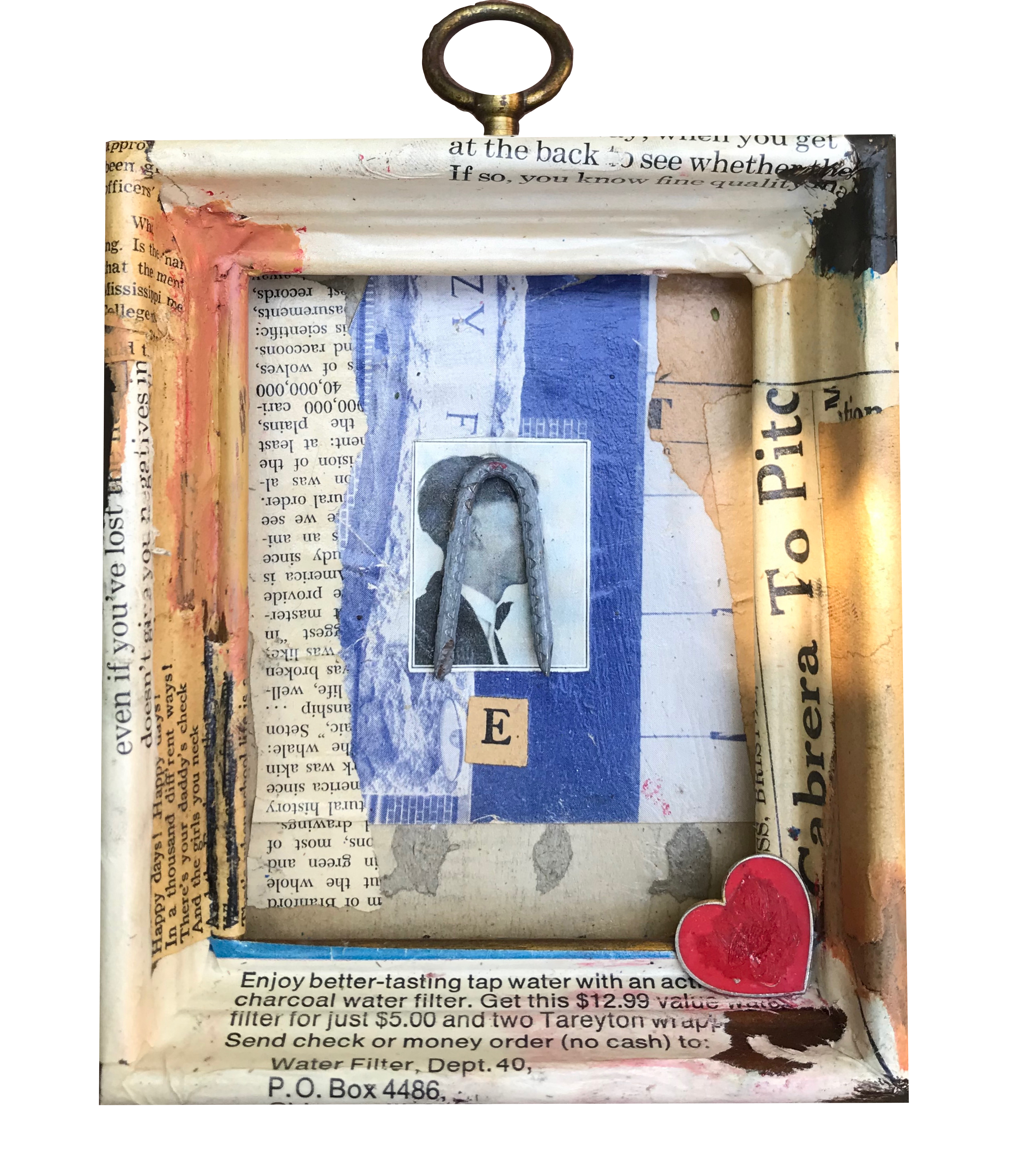
Homage to Joseph Cornell, 2020. Cigar box, acrylic, oil, crayon, found electrical outlet, cigarette butts, plastic, gouache, twine, toothpicks, screws, found material. Dimensions variable.
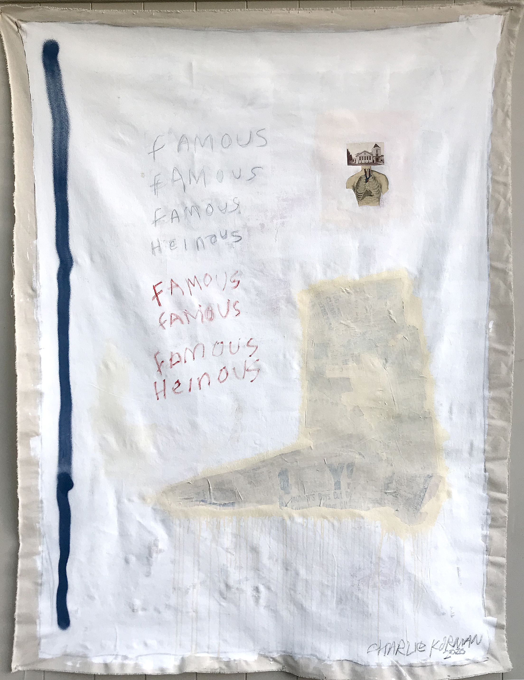
Addendum, 2020. Acrylic, spray paint, permanent marker, found material. 54 x 72 in. on unstretched canvas.
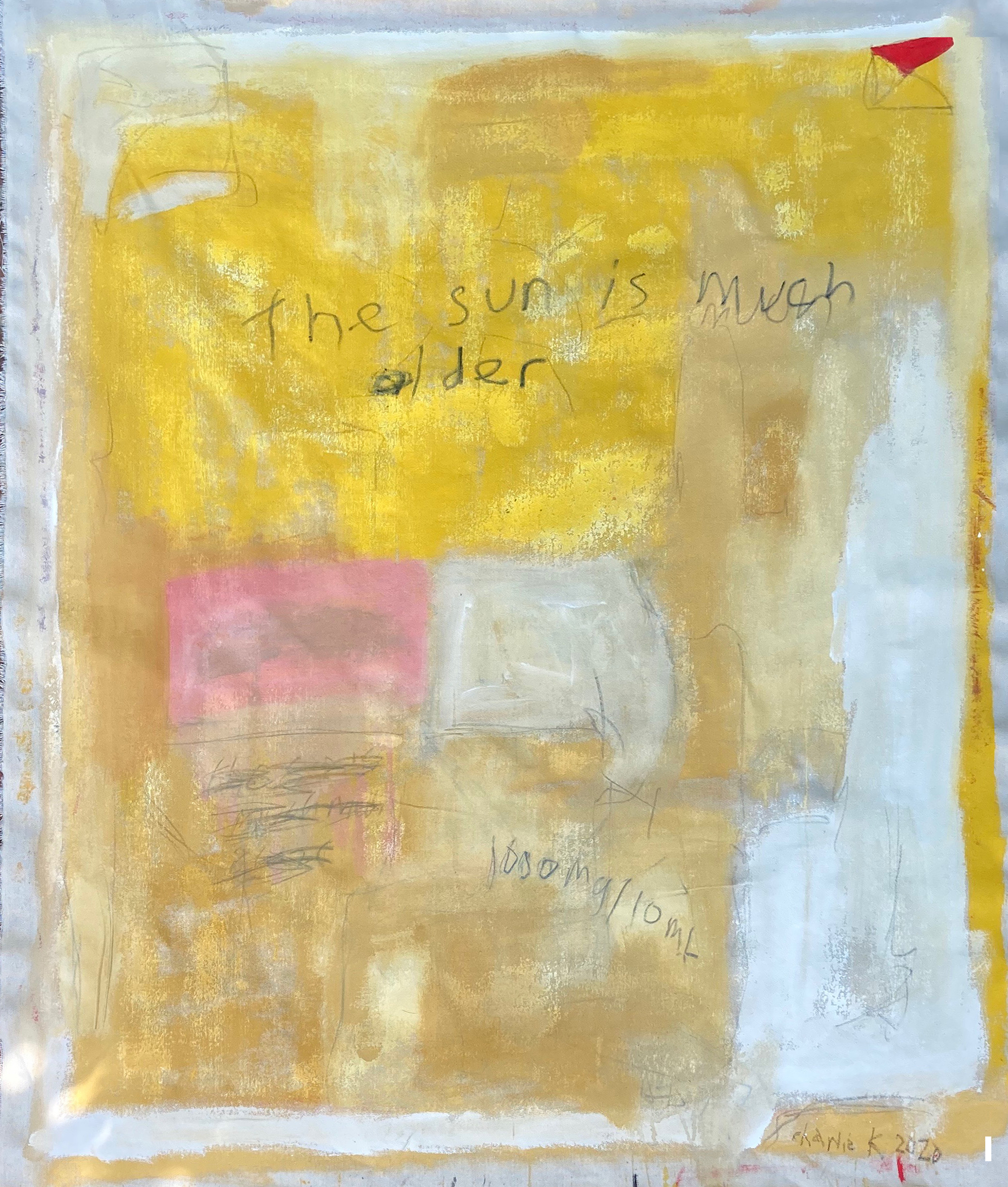
Regina, 2020. Acrylic, glue, graphite. 27 x 36 in. on unstretched canvas.
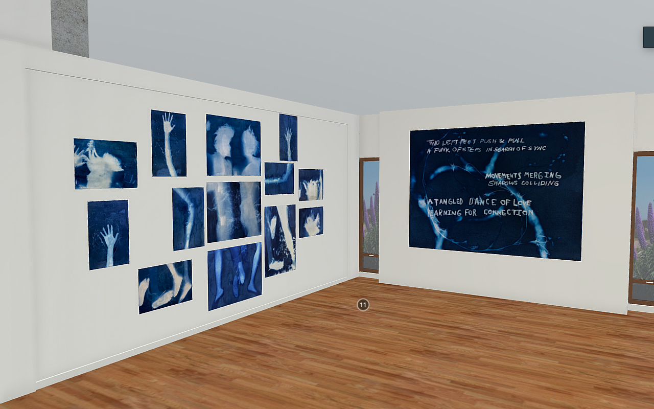
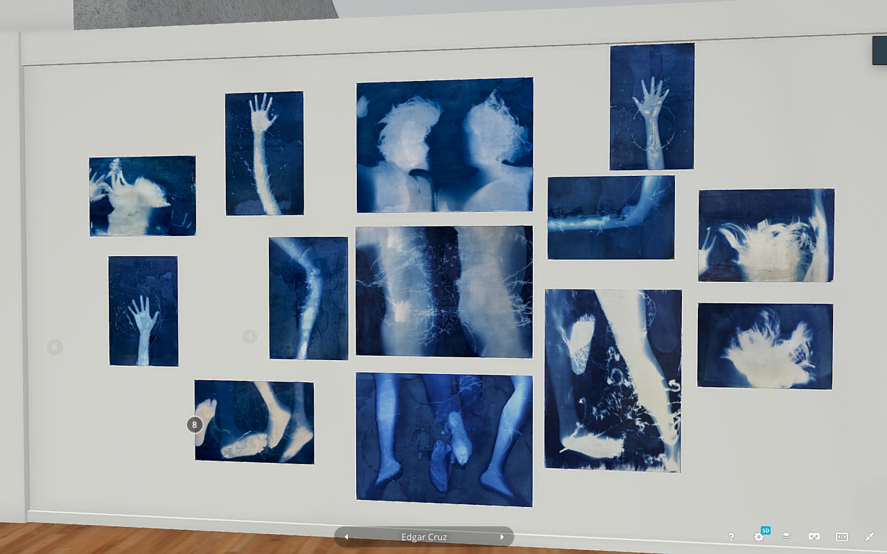
Edgar Cruz:

Emet Levy:

Gissele Coghlan:
For my independent Study I worked with Dee Hibbert-Jones on her animated documentary films. I used PhotoShop and a Wacom tablet in order to help. As for my own project with her guidance, I used linoleum in order to create stamps of peoples beloved pets. I attached the stamps onto cherry wood blocks. I began to experiment using the stamps on both paper and canvas tote bags. This project was such a pleasure because it filled my heart with joy to see how happy people were to have artwork of their pets.

1. Three Good Boys
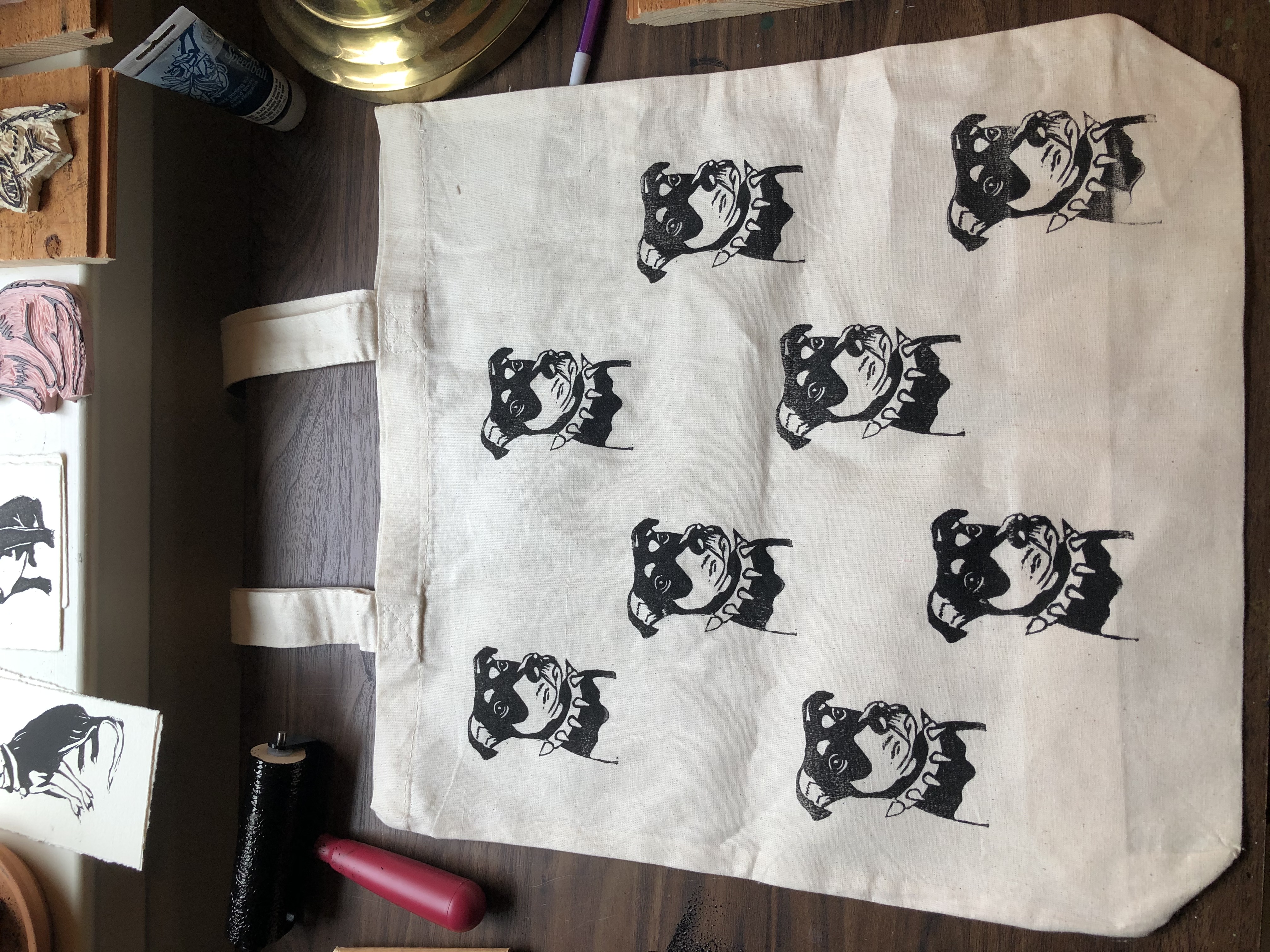
2. Jake Bag
3. Shaggy & Smokey-Eyed
4. St. Francis
Lucinda Gold:
My goal for this strange quarter was to work excessively and exclusively with line, as it has always been a great source of calm for me. These drawings are all at least 18 X 24 inches because my second goal was to allow my ideas to take up more space on a surface. These images covertly explore Non binary identities.
“Hate to Burst Your Bubble”- black ink on paper 20X23
“Nobody Sees You Like I do”- 18X24 Black ink and colored pencil on newsprint.
“Lonely Sidewalk”- Made up of 6, 20x23 inch black ink drawings (this was my main project for the quarter)
Grand(person), Detail from “Lonely Sidewalk”- 20x23 black ink on paper
Mallory Mahon:


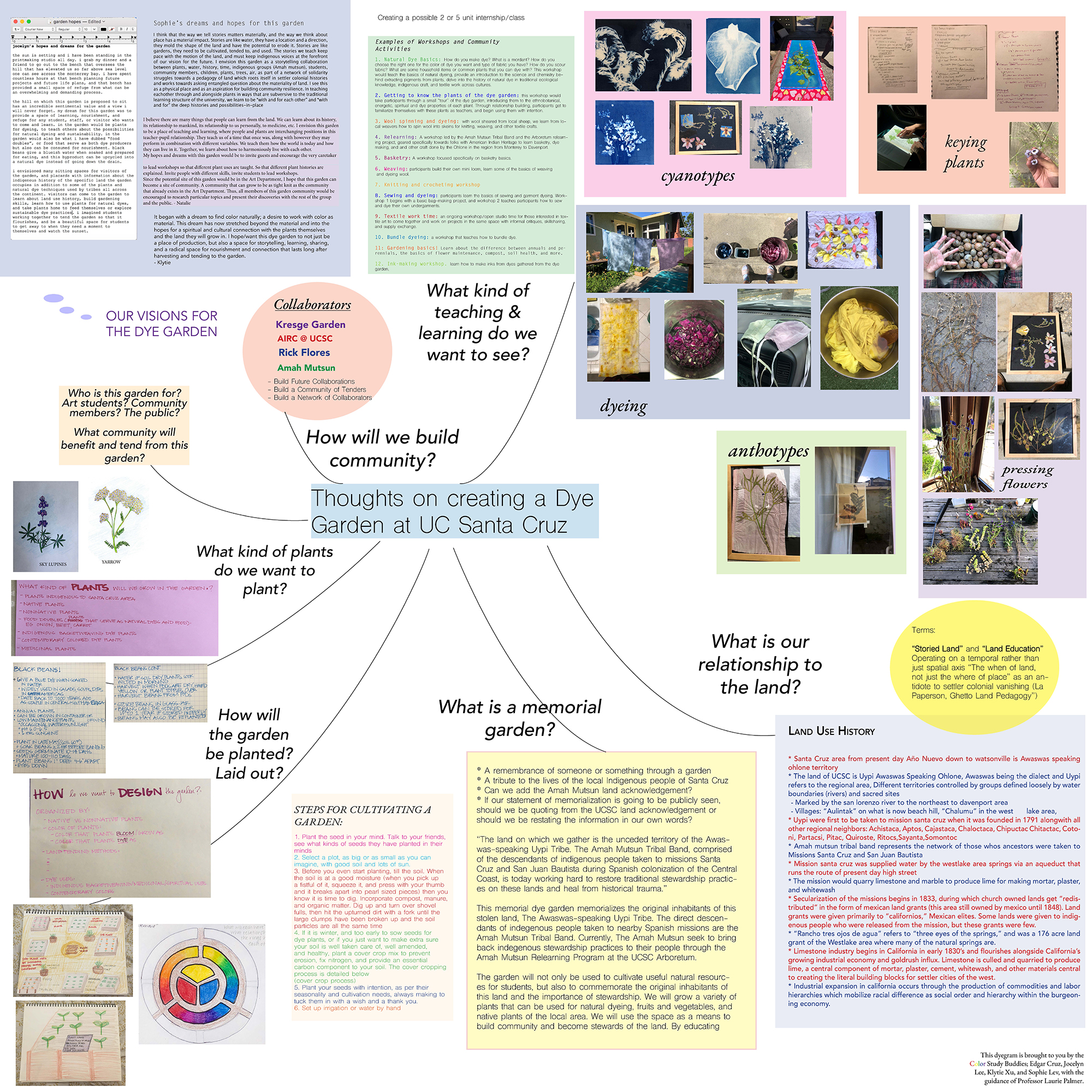
Materiality of color - a group independent study with Laurie Palmer:
THE MATERIALITY OF COLOR an independent group study conducted in collaboration with Laurie Palmer, Edgar Cruz, Natalie Del Castillo, Jocelyn Lee, Sophie Lev, and Klytie Xu
Inspired by the possibilities of learning via small group seminar, Laurie Palmer invited a group of students to explore the materiality of color on a more intimate and freeform level than her usual course. We met at the end of winter quarter to discuss our spring plans to study together, and discuss what we envisioned for our studies and what we hoped to accomplish regardless of where or how we would meet for class.
There was interest in the nomenclature, perceptions, physics, and feelings behind colors. What is color in the mind, and what is color in the physical? We have pondered the first color of the universe, and asked if we can truly believe what our eyes see. We have considered colors for their queerness, and traced histories of pigments that were centuries ago more valuable than gold.
In an attempt to bridge the gap between the physical and metaphysical, we have found great potential in natural dyeing and alternative printing processes that heavily involve plants and their pigments. Meeting once a week via zoom, we have explored natural dyeing made from found plants or supermarket veggies. Now we investigate how we might utilize these natural subjects to serve as a sort of archive of color, time, and being.
Since the inception and formation of this independent group study have we dreamed of planting a dye garden. We hope to plant our garden on the south facing hill close to the Solitary Garden in the Art Department, and perhaps a second site by Kresge Garden. The garden was originally conceptualized to be a dye garden: a garden where students could grow plants and make natural dyes from them.
The garden has since (metaphorically) grown into a larger conceptual project that leaves this group unsure if this garden can simply be called a dye garden now. We have grown a network of collaborators when conceptualizing our intentions with the garden, and they have inspired us to view the dye garden as beyond a place of just growing plants to use for dyeing.
We first met with Allyson Makuch, an environmental studies graduate student and artist who implored us to consider our role in land stewardship and how we can form meaningful relationships with the land we intend to cultivate. Allyson helped us see that though the garden may not be in the ground and planted yet, the garden had been planted in our minds.
Inspired by Allyson's invitation to understand our role in land stewardship better, we spoke next with Rick Flores, who is a horticulturist and steward of the Amah Mutsun Relearning Program at the UCSC Arboretum. We are hoping to collaborate and promote the Amah Mutsun Relearning Program and bring further education of indigenous land use practices used in the Santa Cruz area. Our garden aims to have a local focus on the indigenous tribes that are still very much alive and practicing these land stewardship practices today, while drawing connections to similar or starkly contrasting practices used by other tribes across the country. This led us to think of our garden not just as a place to grow dye materials, but to memorialize the histories of the land and its indigenous people. We hope to keep in close contact and build a collaborative relationship with the Amah Mutsun and Chairman Valentin Lopez of Amah Mutsun tribal band.
We have also invited the American Indian Resource Center (AIRC) on the UCSC campus to collaborate with us and help us understand how to respect the land we intend to put our garden on. The AIRC has enthusiastically accepted our invitation to collaborate, and as our relationship grows we hope to learn more about how we can honor and educate others about local indigenous land use practices and how we can incorporate this into the design of our garden. Through this we hope to also bring a broader understanding of natural dyeing practices used by tribes locally and compare these practices with contemporary dyeing practices nationally.
What we have submitted for Open Studios this Spring 2020 is a diagram of our hopes, dreams, and conceptual musings regarding our dye garden. We have had many questions for the design and intentions of this garden, and though they remain unanswered it is in the unknown that we find collaboration, dialogue, and deeper understanding. We have considered what the design of the garden may signify, and what the inclusion of non-native or invasive species in our garden may mean. We have wondered who will tend the garden and how we might communicate that knowledge, and we have had dreams of community strengthening and relearning to care for the land we occupy. The garden we have planted in our minds has grown much bigger than just a plot of land to grow plants for natural dyeing, and instead we have started growing what we hope is a place of community and learning surrounded by color.
Morgan Tomfohr:
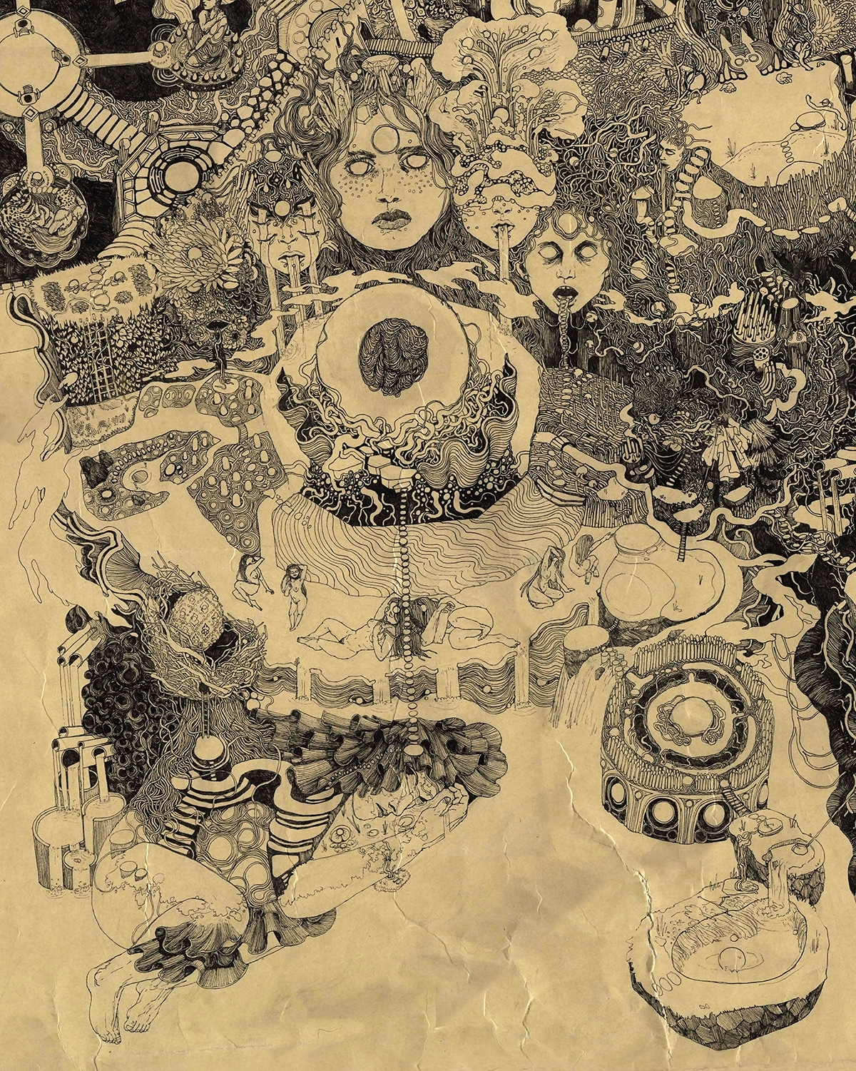
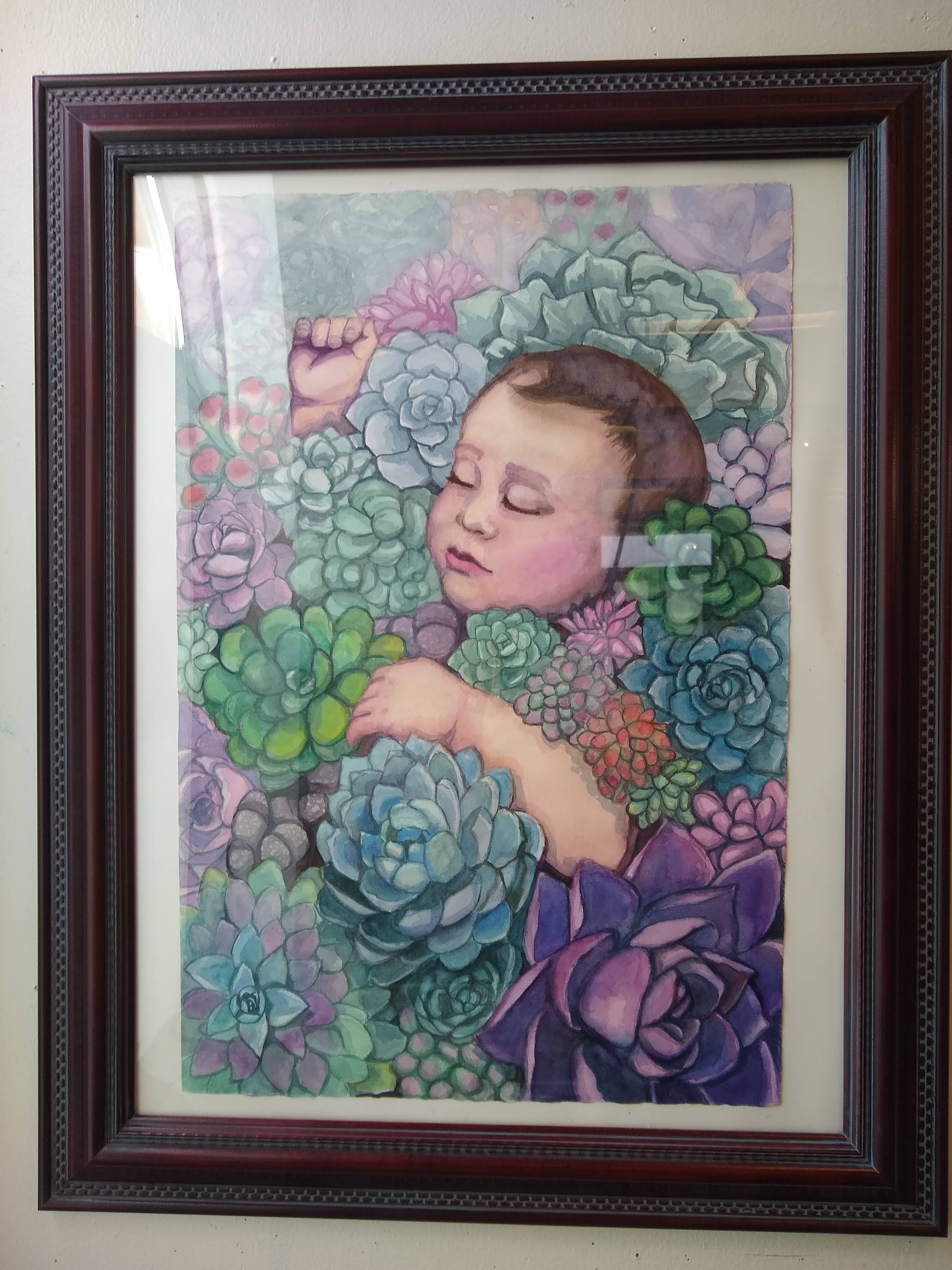
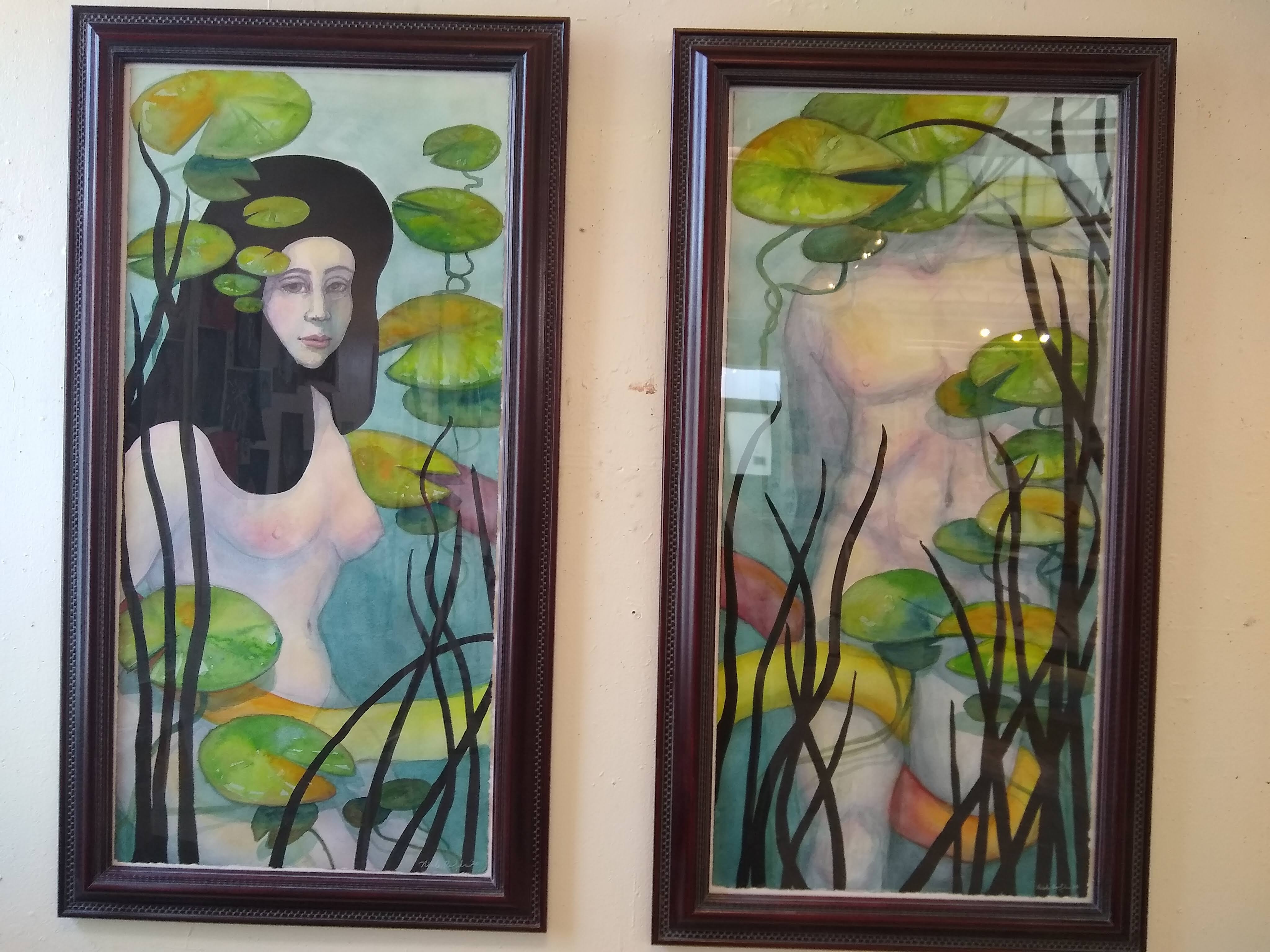
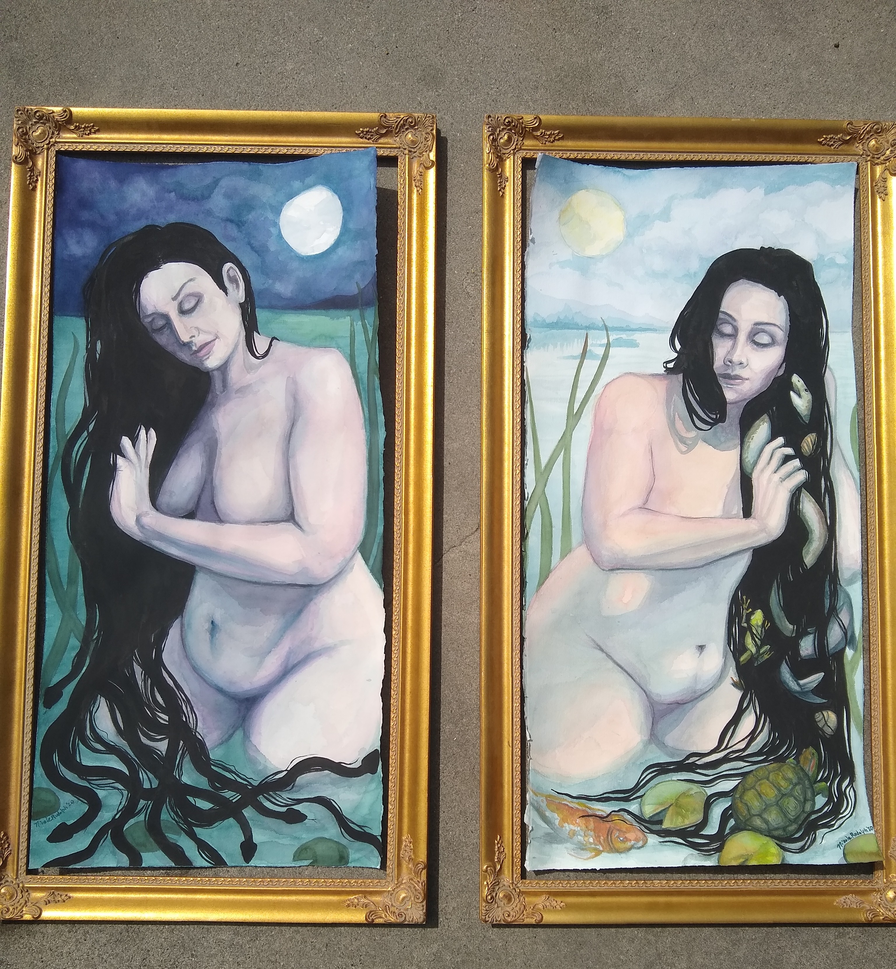
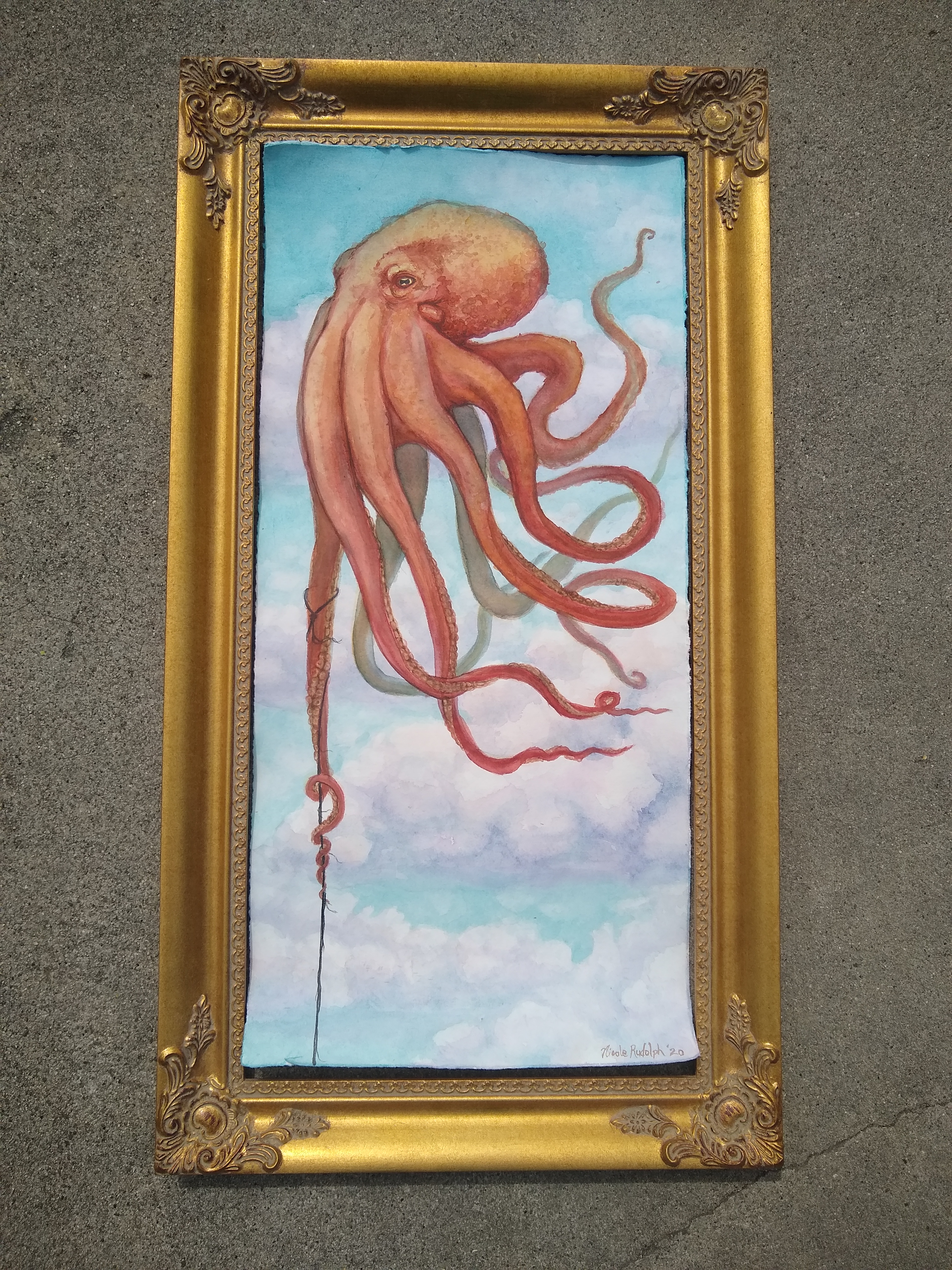
Nicole Rudolph-Vallerga:
Rodrigo Ramos:
Independent Study: Enrique Leal
“¡HUELGA!” is a multi-media wearable art project in the form of Chicanx inspired screen printed T-shirts.
The “T-shirt” has become a means of self expression as wearable art. T-shirts are affordable and highly visible, making them the perfect tool for political activism. For this reason, I chose T-shirts as the appropriate canvas for my designs. More specifically, my canvas of choice were Pro Clubs chosen for their popularity in the Chicanx community for being affordable yet high quality. Coincidentally, the fabric is made in the USA while the shirts are assembled in Mexico, much like Chicanos are raised in America while their roots stem from Mexico.
IRWIN page: https://art.ucsc.edu/sesnon/rodrigo-ramos

Image #1:
1900s - Pancho Villa, The Mexican Robin Hood:
Francisco “Pancho” Villa was a Mexican Revolutionary General celebrated for his relentless protection of the poor. Fighting alongside Emiliano Zapata, the pair dreamed of a democratic Mexico that opposed the dictatorship of its time. When designing the graphic, I set out to capture his relentless energy by recreating his recruitment poster from 1915. The Bullock Museum writes, “Villa was one of the most well-known military leaders of the Mexican Revolution, due in large part to a deal he made with Hollywood to film many of his battles. Villa actively recruited soldiers and mercenaries outside of Mexico for his army. This advertisement specifically targeted skilled professionals, promising weekly payment in gold for dynamiters, machine gunners, and railroaders. He obtained the gold by confiscating it from Mexican banks.”
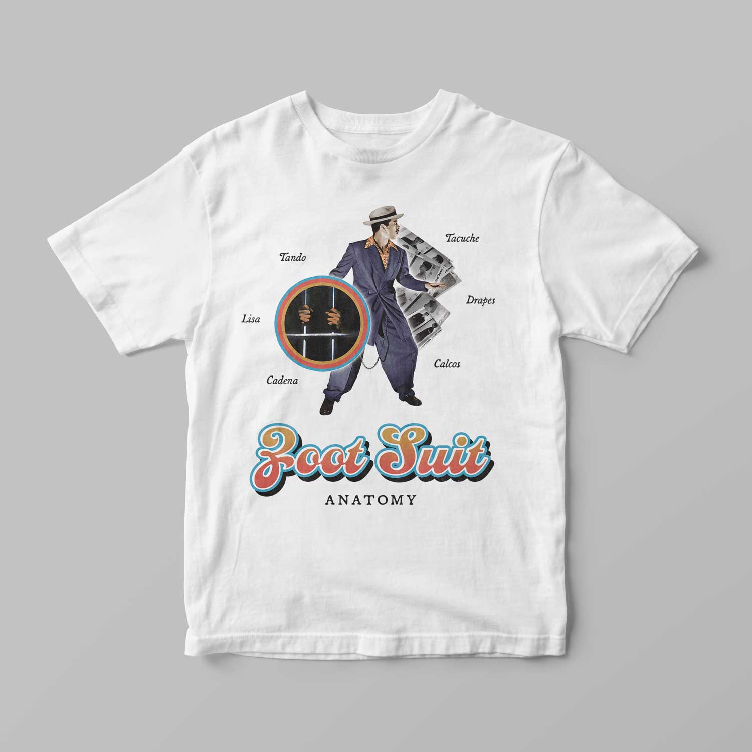
Image #2:
1940s - Zoot Suit Riots, Pachucos vs. Servicemen:
The Zoot Suit Riots of the 1940s are especially significant for its common exclusion from American history. A group of American Sailors attacked and stripped Mexican Americans wearing Zoot Suits because they were seen as ‘unpatriotic' for their excessive use of fabric during World War II. The Mexican Americans, also referred to as Pachucos, were wrongfully jailed due to the racist motives of the Los Angeles Police Department. The criminals who beat and stripped them were left untouched and were even defended in the media. For my design, I chose to highlight Germán Valdés, known as ‘Tin Tan.’ Germán was a Mexican actor who often employed Pachuco wear and slang in his movies inspired by his close proximity to the culture. Behind him are the booking photos of the Mexican youth that were wrongfully arrested.
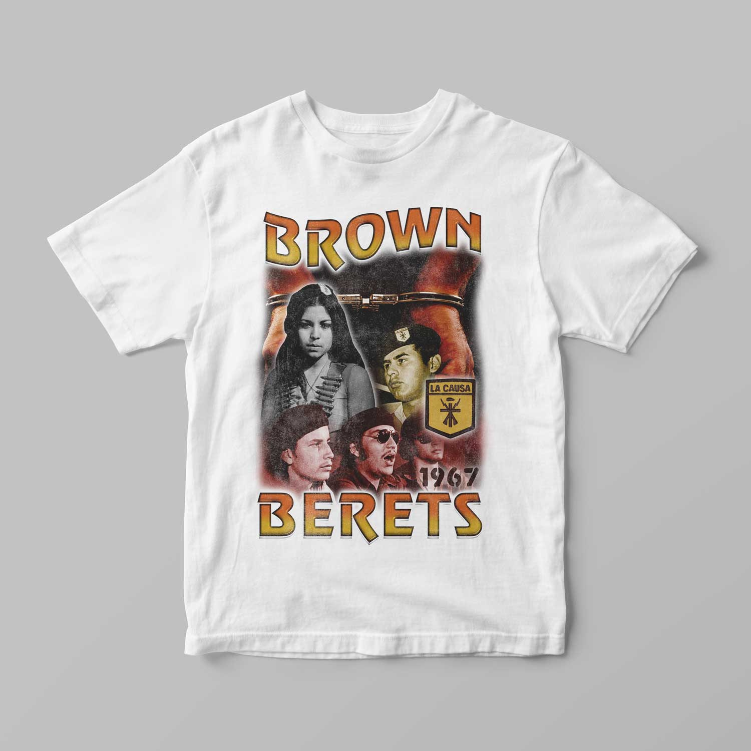
Image #3:
Late 1960s - Brown Berets, Los Boinas Cafes:
The Brown Berets is a Chicano activist group inspired by the Black Panthers. Originally named Young Citizens for Community Action, the Brown Berets continue to fight against police brutality and inequities in the education system among other social issues. During the 1970s, women in the movement felt as though they were being treated unfairly for their efforts since they made up a huge majority of the action planning and groundwork. For this reason, I chose to highlight a woman figure in my design that symbolizes the famous corrido (or ballad) of “La Soldadera” by wearing a cross harness of bullets. I included an image of the founder of the Brown Berets, Dr. David Sanchez along with imagery chosen to represent police brutality.
Stephanie Segur:
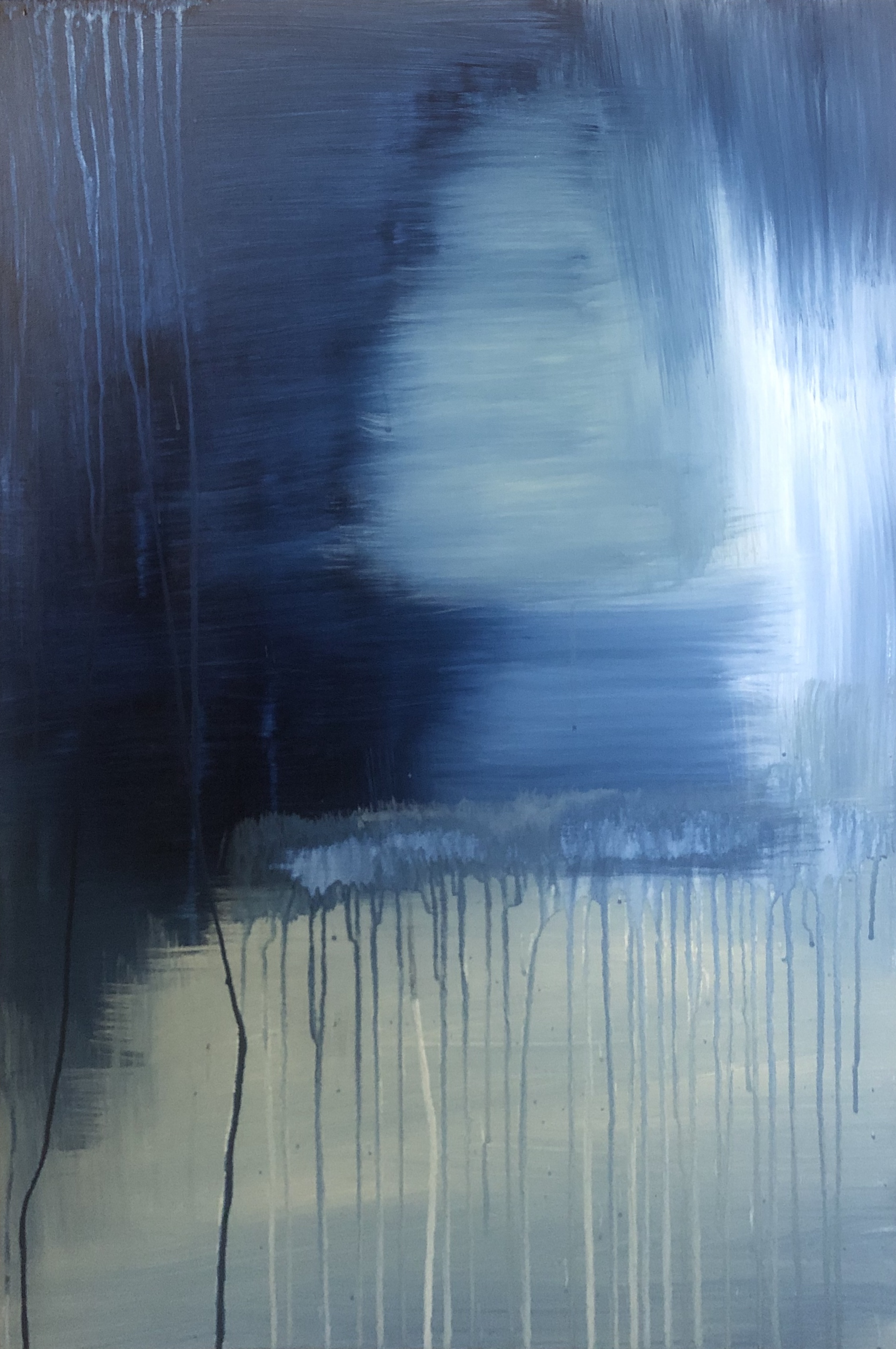
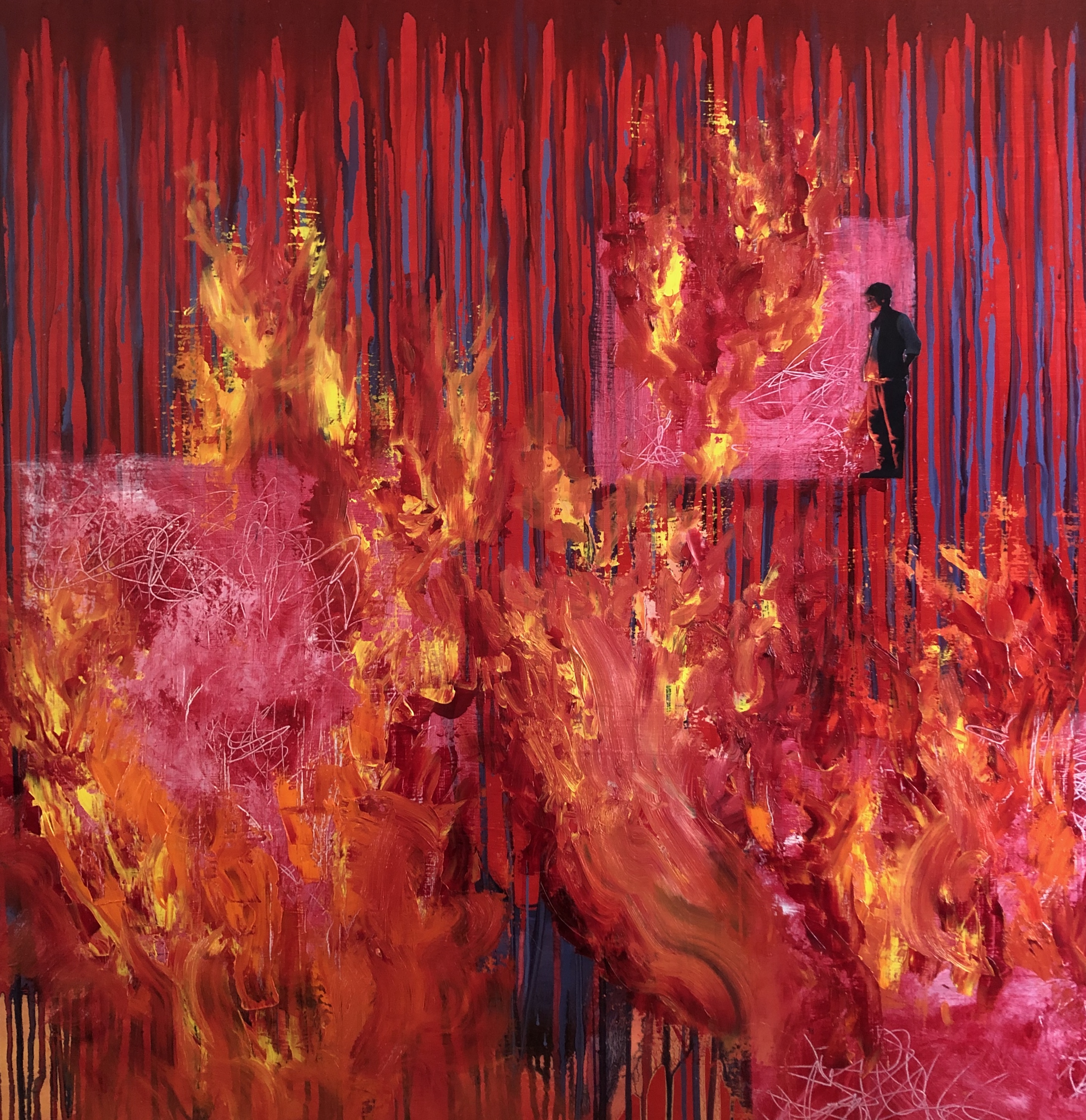
1. "new day, blue day", Acrylic on Canvas, 24" x 36", 2020. This abstract piece was created through my experiences during this pandemic. At this point, the days seem to bleed together.

2. "glimmer", Acrylic on Canvas, 24" x 36", 2020. This painting is the counterpart to my "new day, blue day" piece. It is meant to represent my glimmer of hope, to see the light shining through these depressing days in hopes for better days ahead.
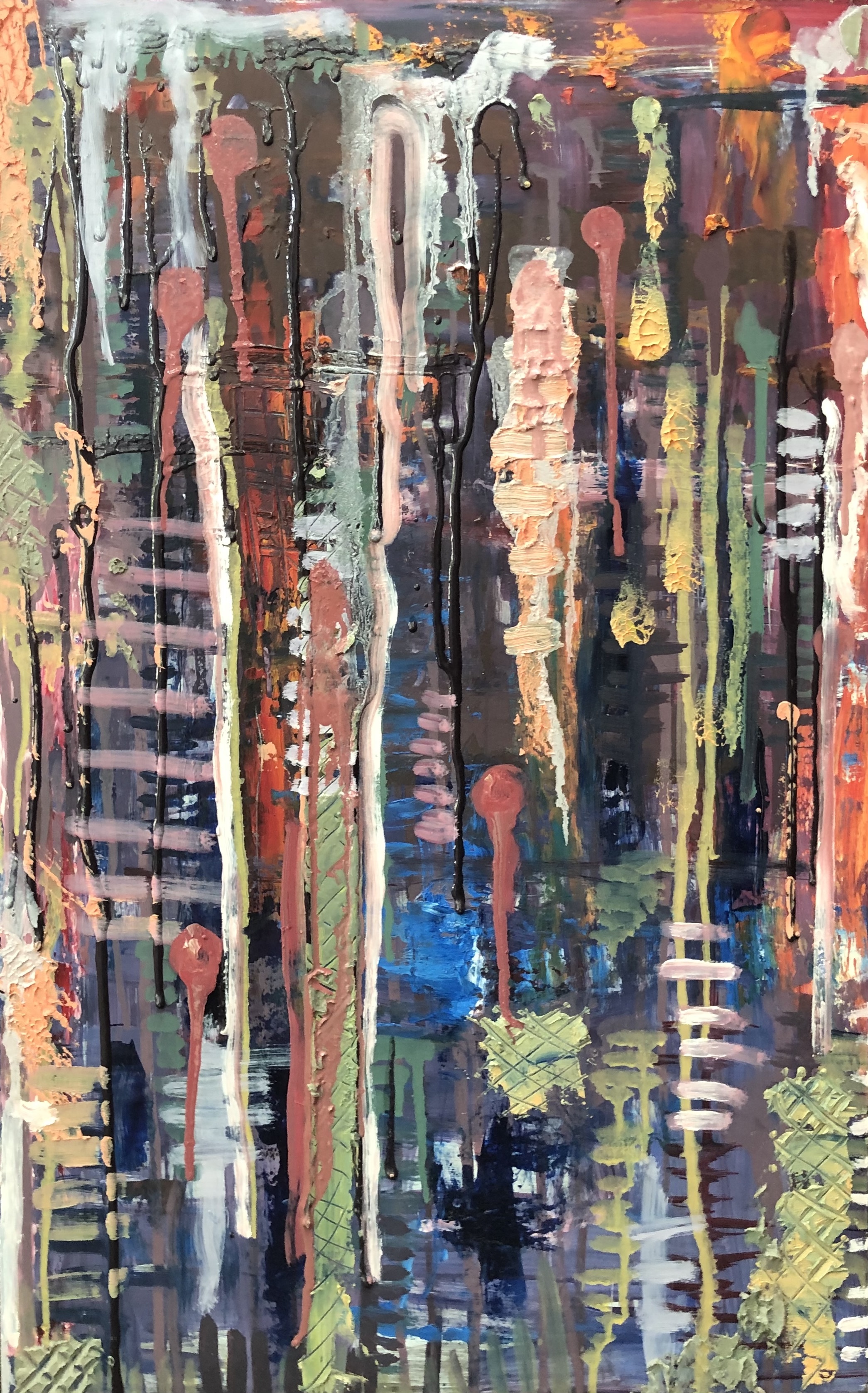
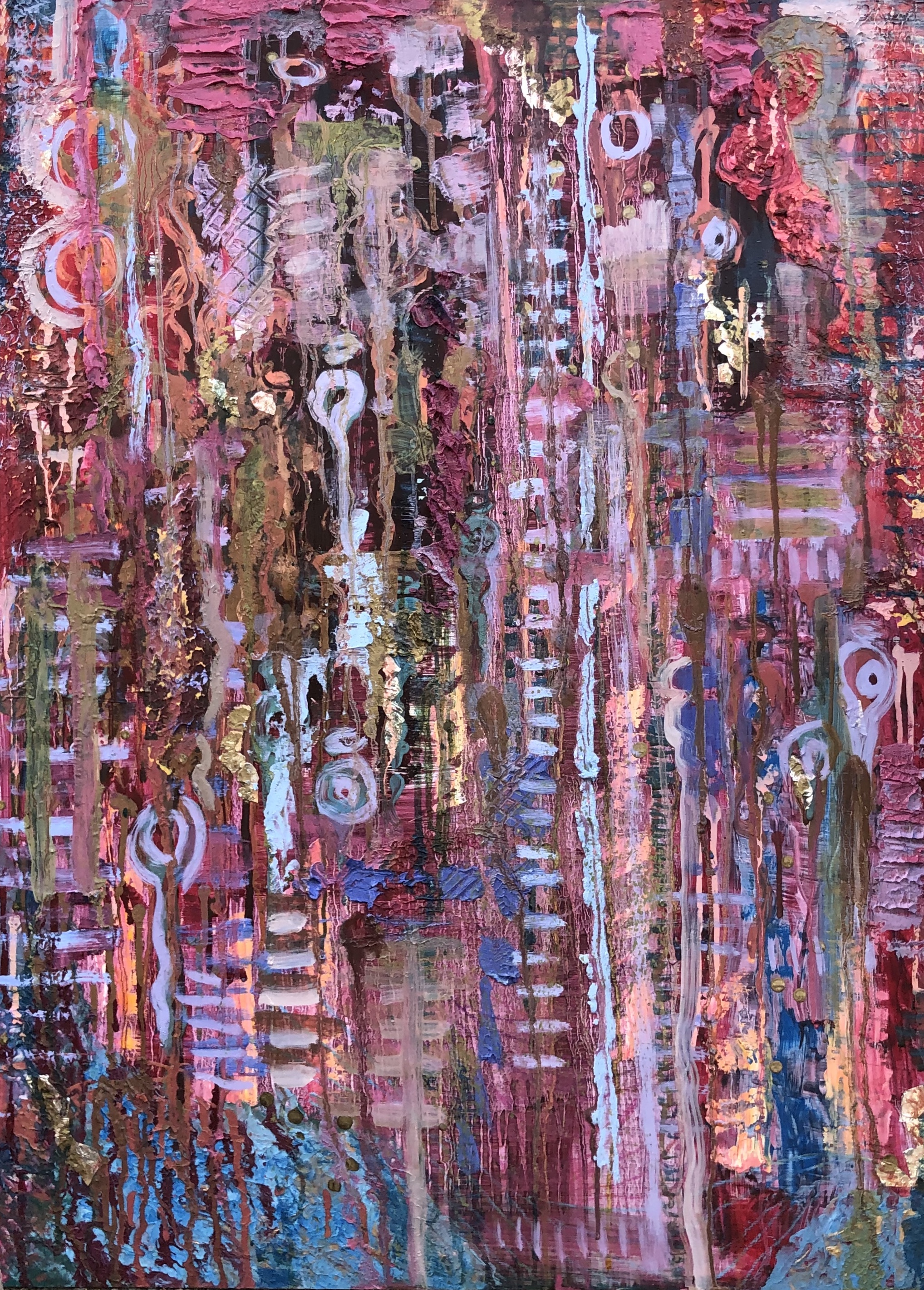
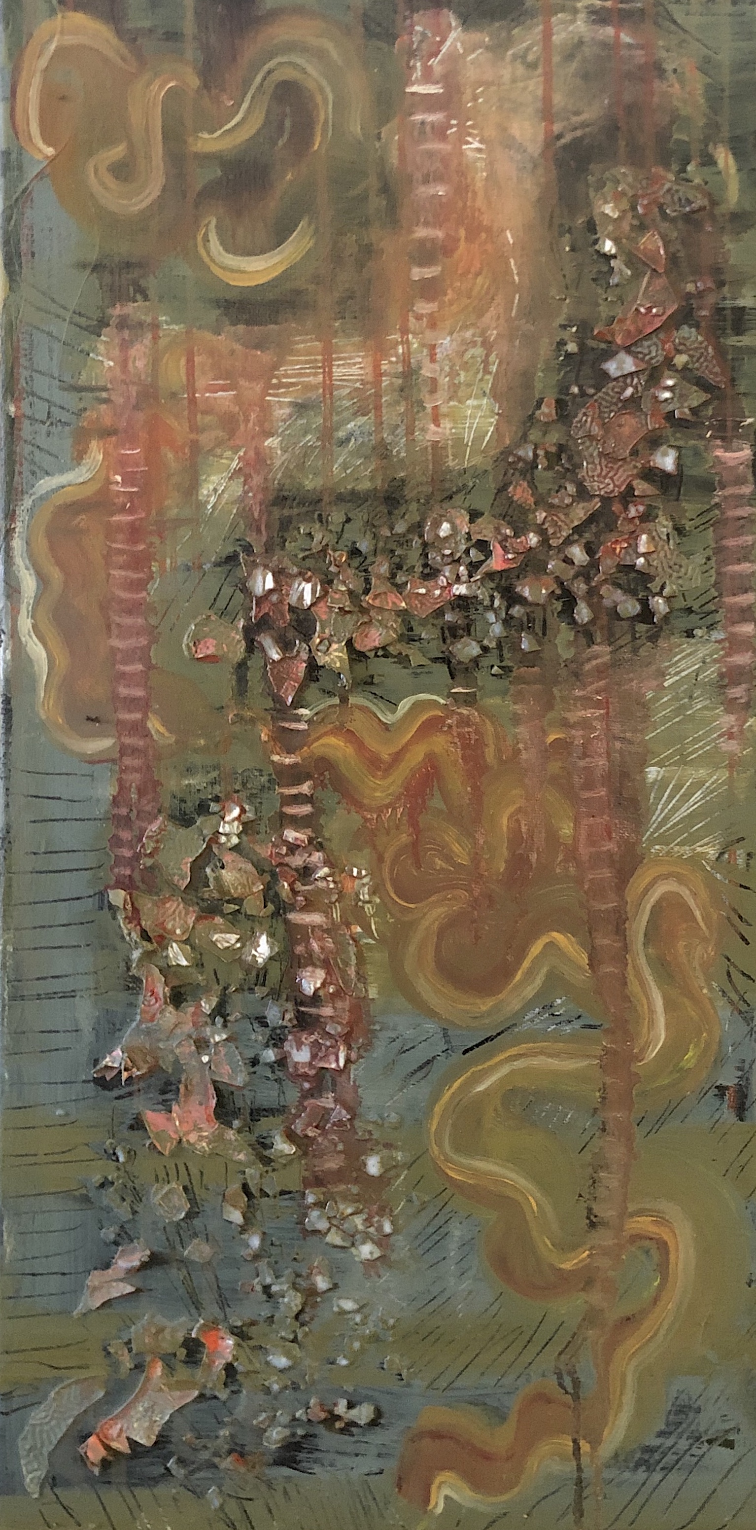
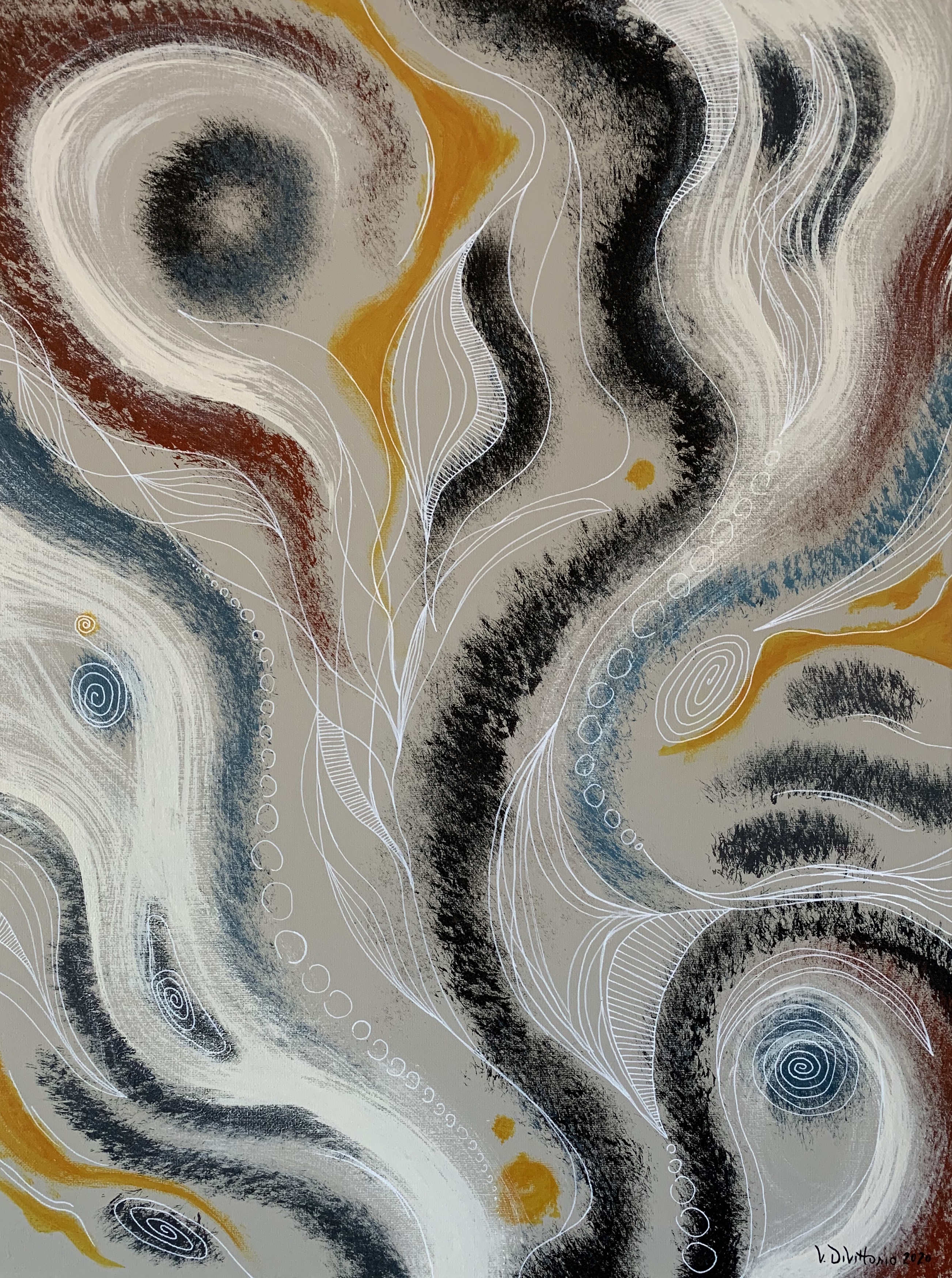
Vanessa DiVittorio:
Abstract Painting (Acrylic)
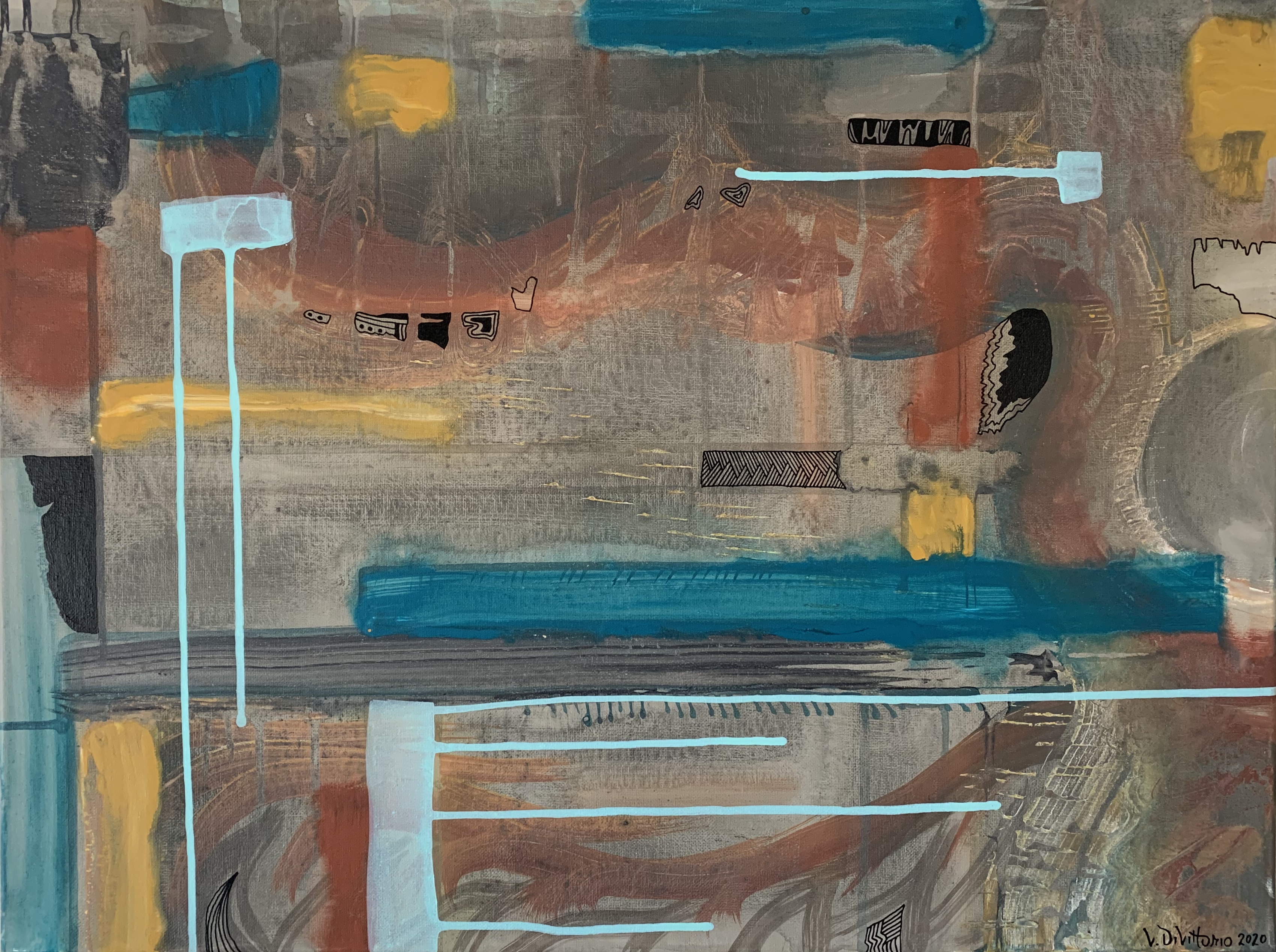
Metropolitan Schmaltz, 2020. Acrylic. 18x24 in. Stretched Canvas.
Capricious Clime, 2020. Acrylic. 18x24 in. Stretched Canvas.

Aero Fusion, 2020. Acrylic. 18x24 in. Stretched Canvas.
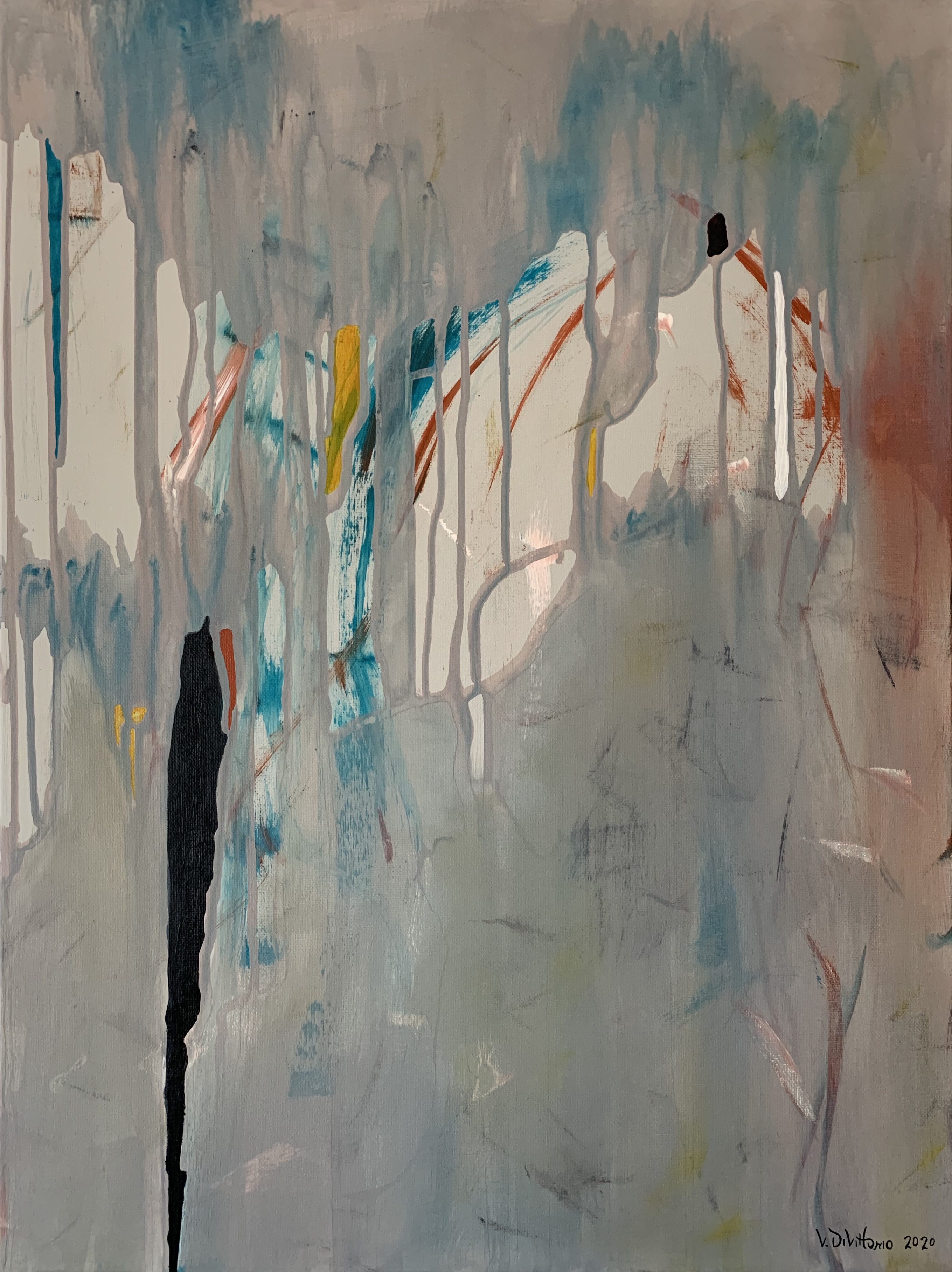
Black Lives Matter, 2020. Acrylic. 18x24 in. Stretched Canvas.
Abstract Drawing/Painting (Watercolor)
Woe Lazaretto, 2020. Watercolor. 9x12in. Watercolor Paper 140lb Cold Press.
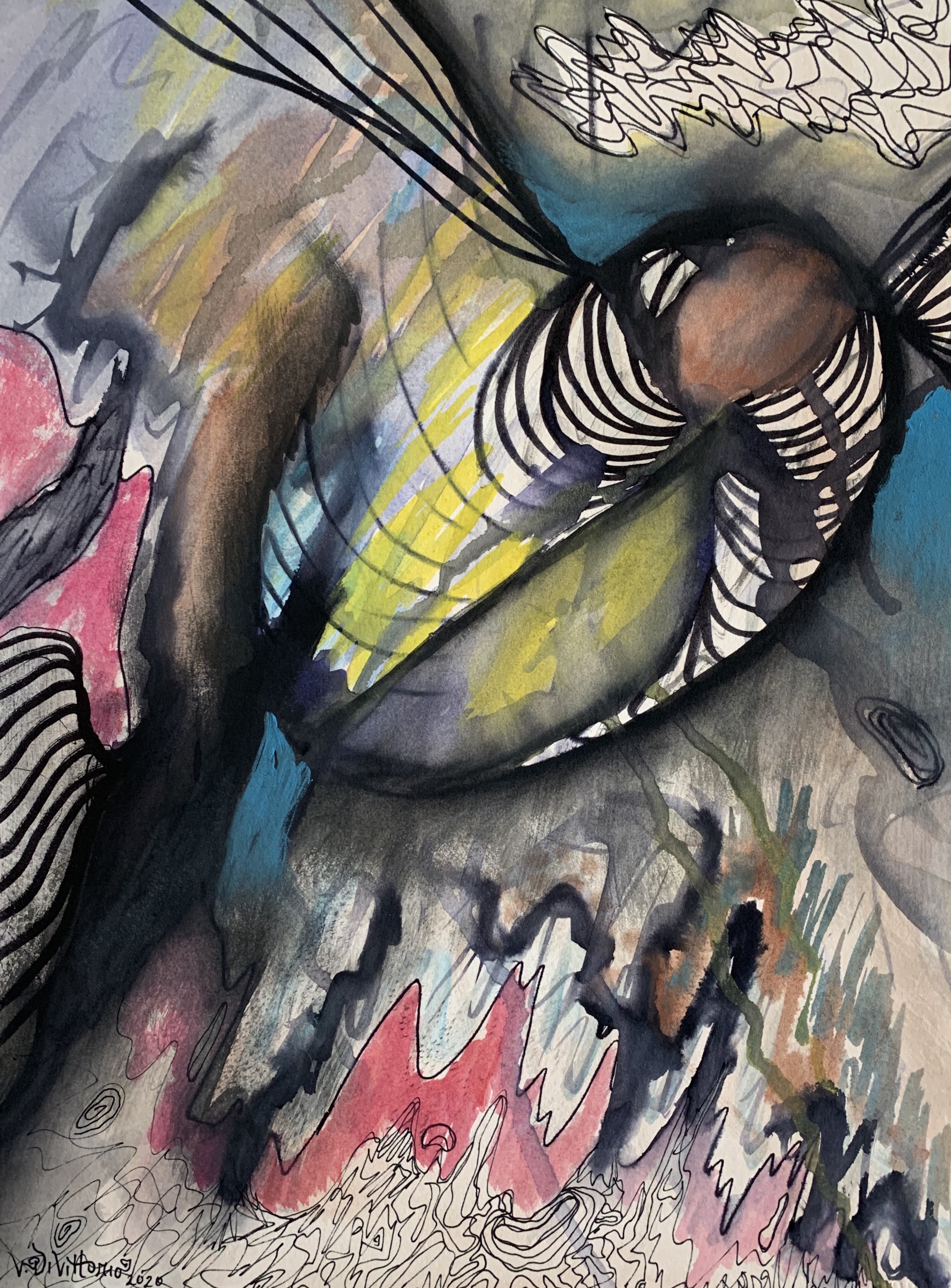
Bound by None, 2020. Watercolor. 10x12 in. 100% Rag Watercolor Paper 300lb Hot Press.

Abaca Shmacka, 2020. Watercolor. 11x15 in. 100% Rag Watercolor Paper 300lb Hot Press.

Macrona Siphon, 2020. Watercolor. 11.25x15 in. 100% Rag Watercolor Paper 300lb Hot Press.
Bio:
The past two years studying Art at the University of California Santa Cruz have been the most fulfilling creatively and emotionally. I’ve found the most freedom in Abstract Art: I can be anything. The canvas and I have a symbiotic relationship: without it, I have no surface and without me, it has no color. When painting on this surface, there is a compromise, a slight resistance, and a release of emotions. The palette knife, amongst other various tools, is not just for textural and visual qualities. I’m scraping away my insecurities to reveal the passionate layers of myself. There is also loss of control as the paint drips glide down the canvas and I love that! Acrylic paint colors I gravitate to are secondary, tertiary, and beyond. I find that the richness of red-oxide, oceanic blue-green, creamy off-white, and bark reddish-brown, among other colors give my paintings an other worldly dreamy feeling. My intention with what I create is to exhibit a range of expressionism with elements of biomorphism, while also exploring the expanse of my mind.